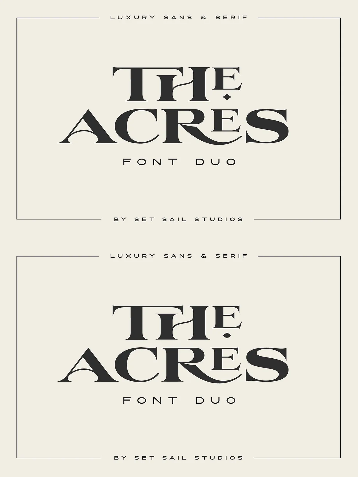
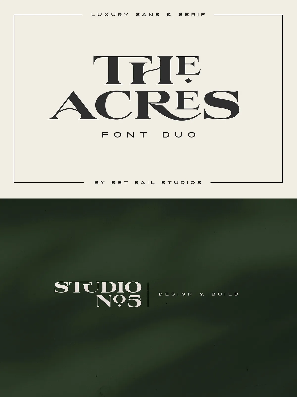
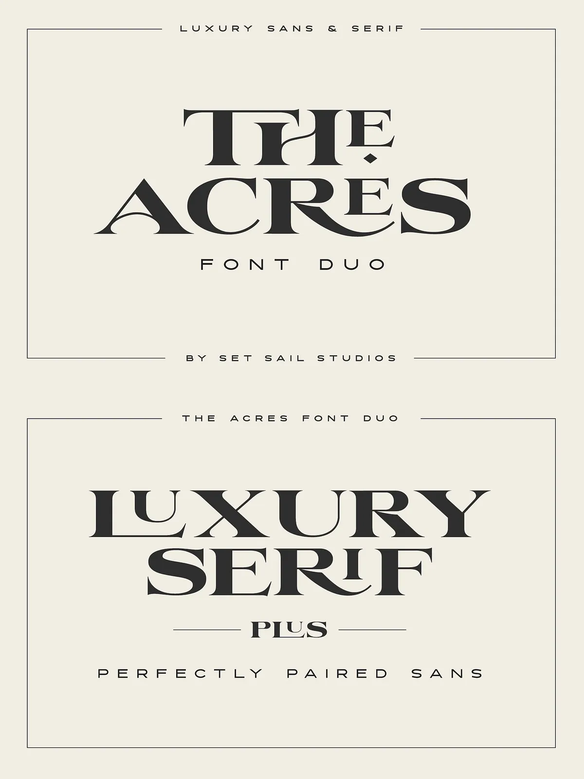
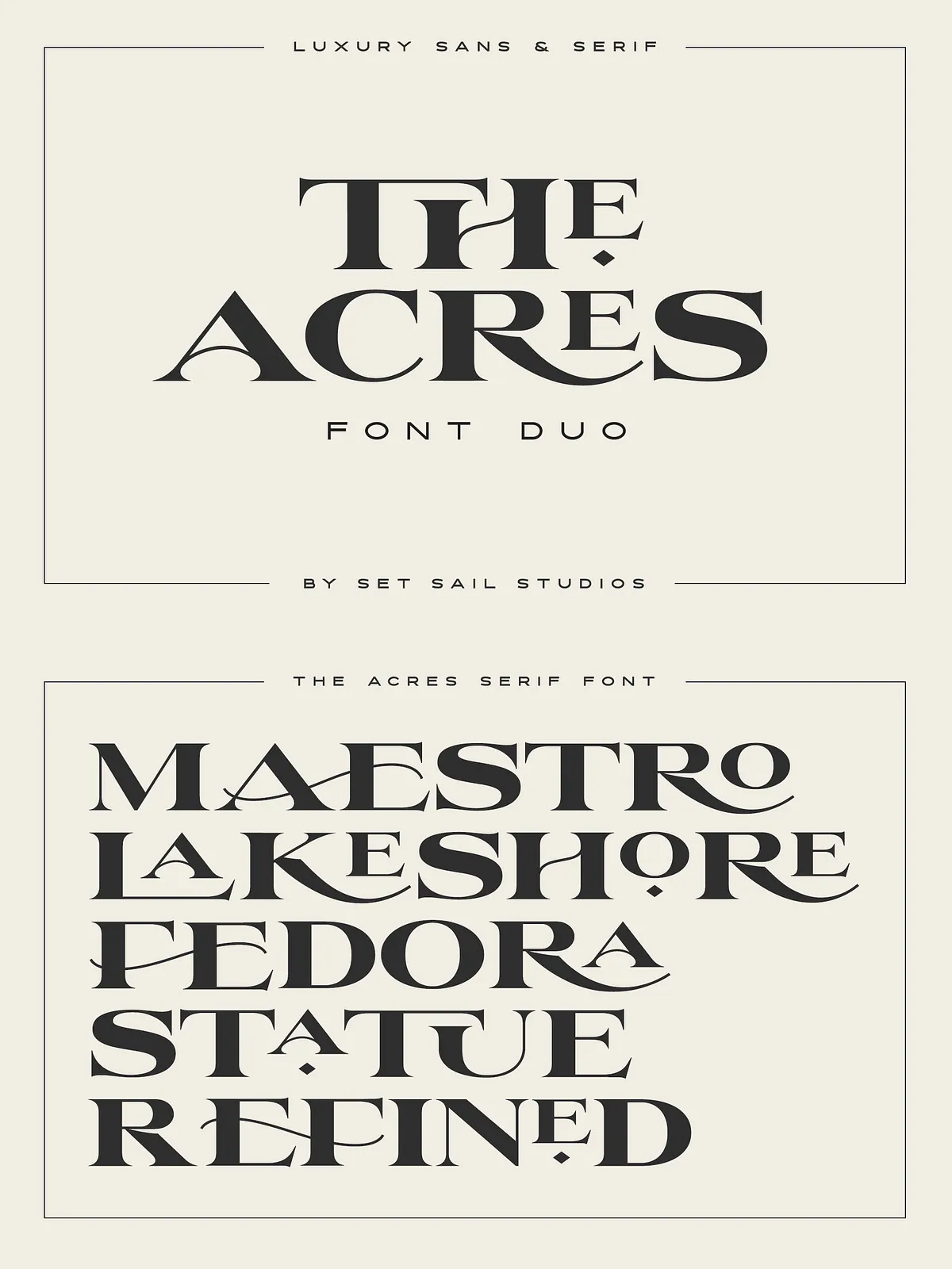
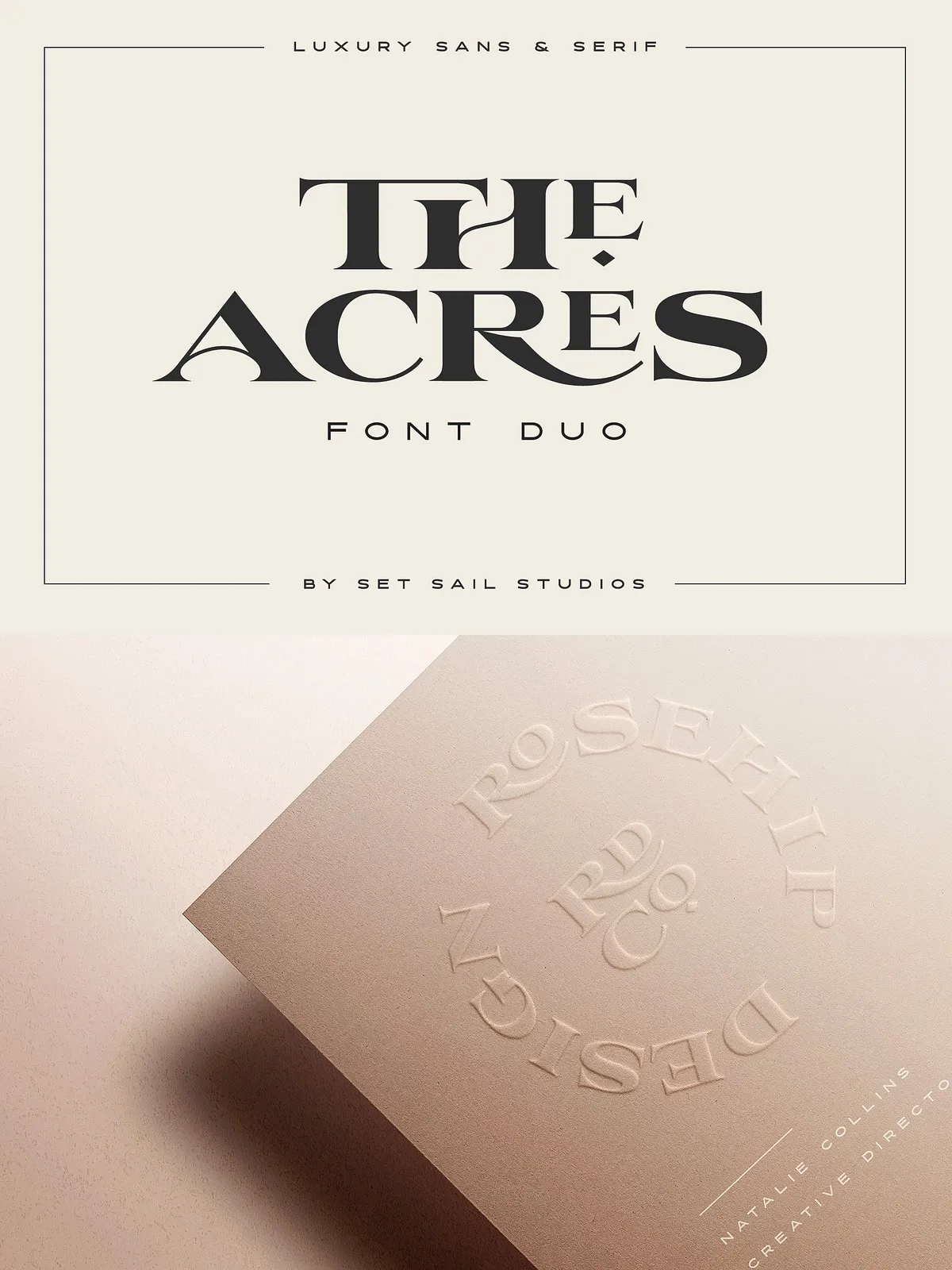
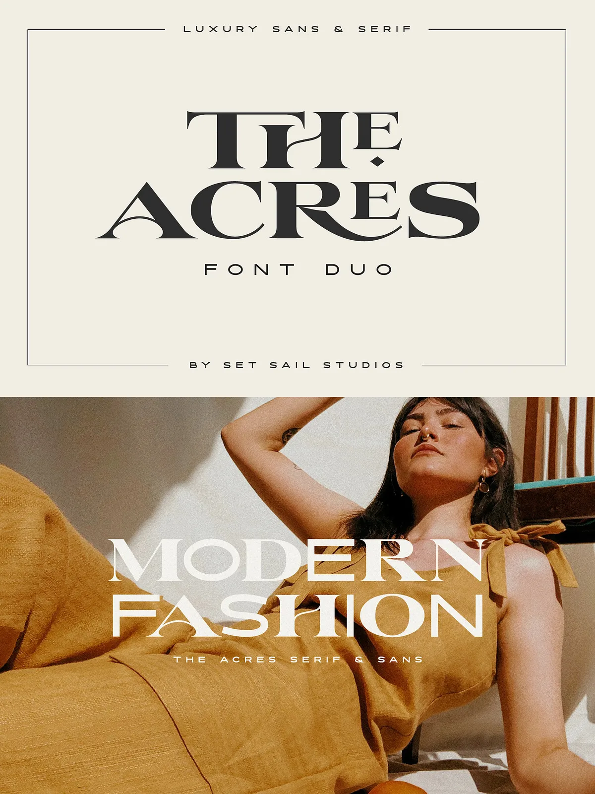
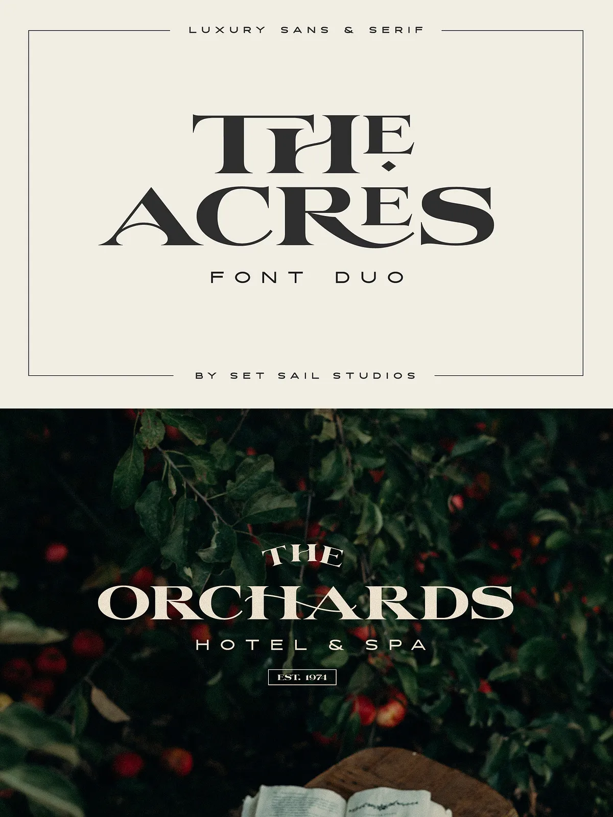
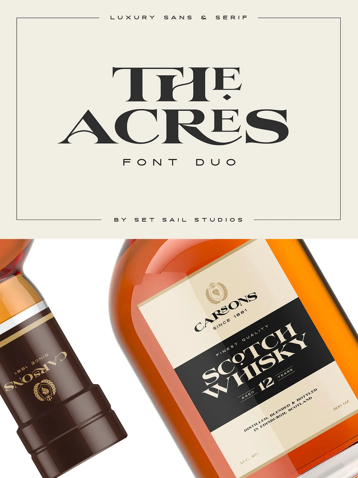
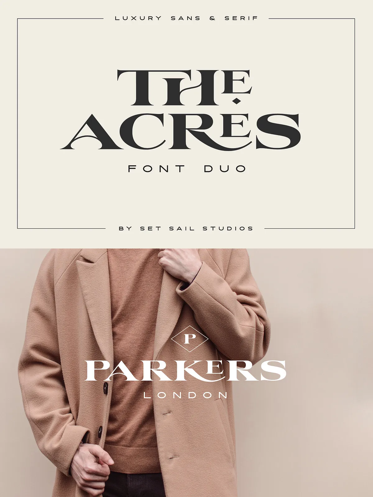
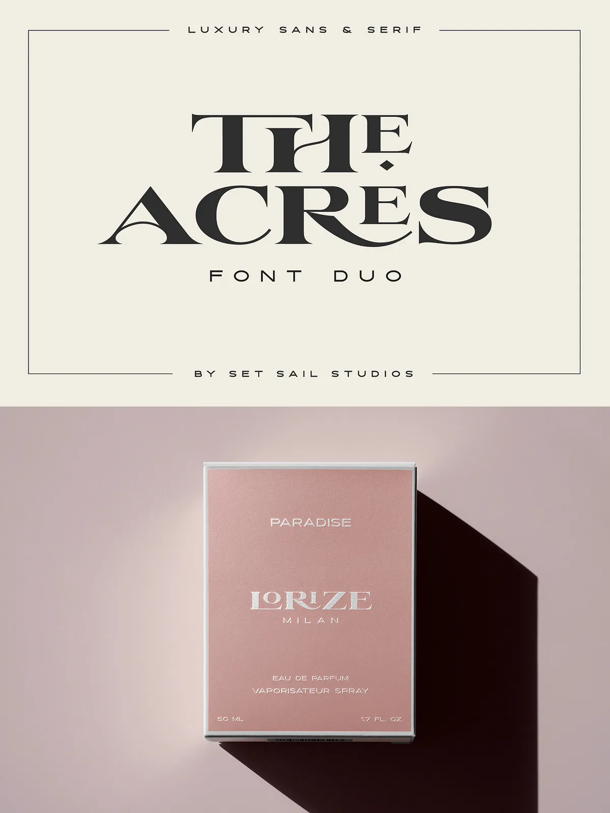
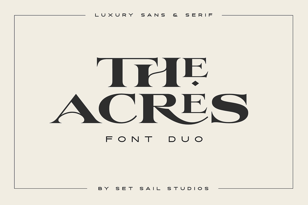
The Acres Font Duo offers a sophisticated and harmonious combination of two all-caps fonts—a wide, high-contrast serif and a simple, elegant sans-serif—designed to work seamlessly together. This font duo eliminates the often painstaking search for the perfect font pairing by providing typographic partners that complement each other flawlessly. Whether you are creating luxury branding, editorial layouts, or experimental typography, The Acres Font Duo delivers style, versatility, and refinement.
Distinctive Design and Purpose of Each Font
The Acres Serif is characterized by its wide letterforms and striking high contrast between thick and thin strokes. This design choice gives it a commanding presence and a high-end aesthetic, making it ideal for luxury branding, headlines, and display use where impact and elegance are paramount. Its classic yet bold style evokes sophistication and timelessness.
In contrast, the Acres Sans offers a clean, minimalist sans-serif design that serves as the perfect secondary text companion to the serif. Its simplicity and elegance provide balance and readability, allowing it to support the serif font without competing for attention. Together, these fonts create a dynamic typographic system that can be used independently or combined for striking visual effects.
Innovative Typography: Ligatures and Stylistic Features
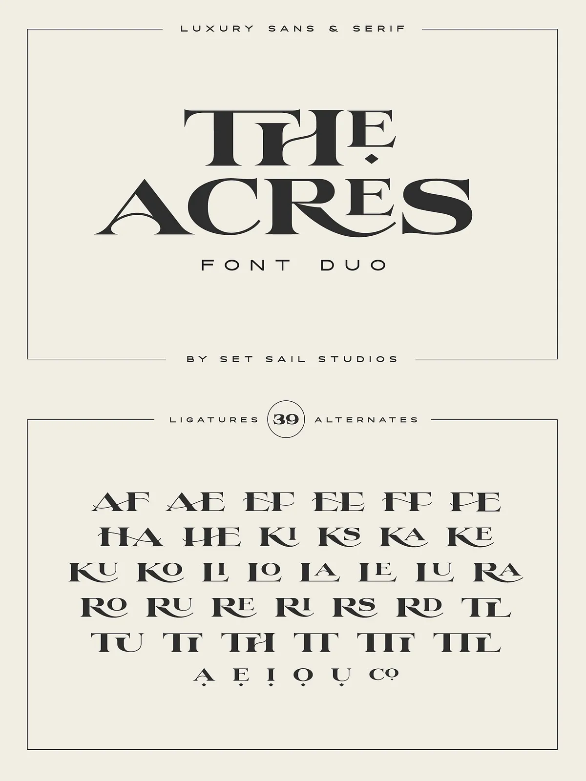
The Acres Serif font includes 33 specially designed ligatures that cover double and triple letter combinations, enhancing the fluidity and customization of your typography. These ligatures activate automatically in OpenType-capable software when typing in all caps, providing a seamless and polished look. If you wish to disable ligatures temporarily, simply turn off caps lock, as the font’s ligatures only function with capital letters.
Additionally, the font features raised small-caps for the vowels A, E, I, O, and U. These can be accessed by enabling the ‘Stylistic Alternates’ feature and typing the letters in capitals, adding subtle typographic nuance and sophistication to your text. For even greater control, all special characters and ligatures can be manually inserted via the Glyphs panel in your design software.
Extensive Multilingual Support for Global Projects
Understanding the importance of international communication, both fonts in The Acres Font Duo support a broad range of languages. This includes full character sets for English, French, Italian, Spanish, Portuguese, German, Swedish, Norwegian, Danish, Dutch, Finnish, Indonesian, Malay, Hungarian, Polish, Croatian, Turkish, Romanian, Czech, Latvian, Lithuanian, Slovak, and Slovenian. This extensive language coverage ensures your designs maintain consistency and professionalism across diverse linguistic contexts.
Creative Flexibility and Experimental Typography
One of the most exciting aspects of The Acres Font Duo is the ability to combine the serif and sans fonts even within the same word. This experimental approach to typography allows designers to push creative boundaries and develop unique, eye-catching layouts that stand out in branding, editorial design, and digital media. The duo’s complementary styles provide a perfect balance between boldness and simplicity, making it easy to craft visually compelling compositions.
Why Choose The Acres Font Duo?
- Perfect Pairing: Designed to work together flawlessly, saving time and effort in font selection.
- Luxury Aesthetic: High-contrast serif and elegant sans-serif create a refined, upscale look.
- Advanced Features: Includes 33 custom ligatures, stylistic alternates, and manual glyph access for enhanced typography.
- Multilingual Support: Extensive language coverage broadens your design’s reach and usability.
- Creative Freedom: Mix fonts within words for innovative and experimental design possibilities.
