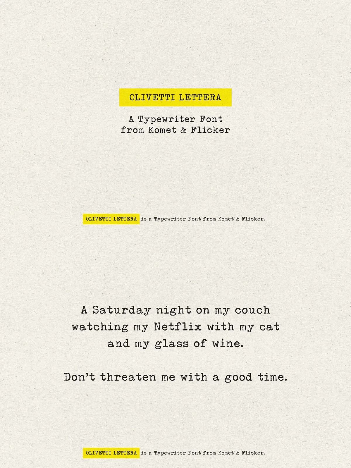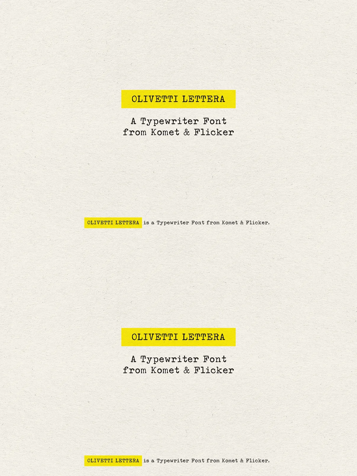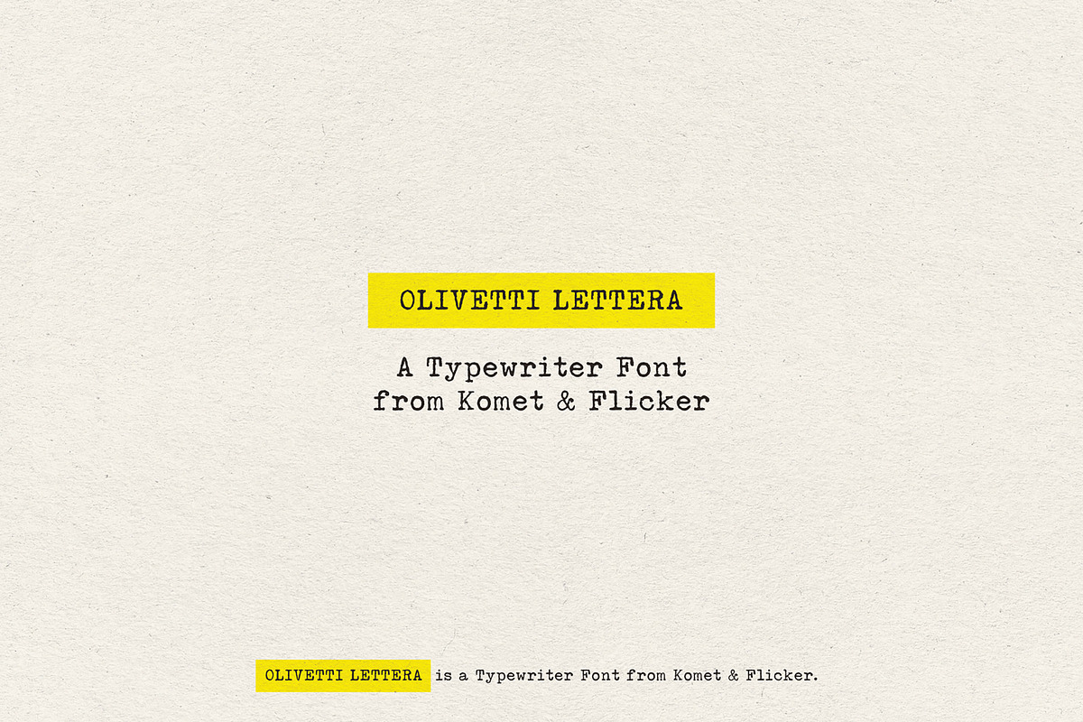
Olivetti Lettera captures the mechanical elegance and tactile imperfections of the classic Olivetti Lettera 35 typewriter and translates that authentic analog voice into a usable digital serif. The design preserves the uneven stroke textures, slight misalignments, and purposeful weight contrasts that give vintage typewriter text its unmistakable personality. Designers who want to evoke nostalgia, craft editorial pieces with character, or add a handcrafted feel to branding will find Olivetti Lettera an immediate, active choice.
Design Features
Mechanical Texture and Human Imperfection
Olivetti Lettera intentionally emphasizes subtle irregularities: slightly varied terminal shapes, textured stems, and modest optical shifts that mimic typebar impact. These details actively produce a lived-in, tactile surface that reads as both historic and expressive. The result is a font that clicks and clacks visually—inviting readers to pause and connect.
Readable Serif Proportions
Despite its vintage inspiration, Olivetti Lettera maintains balanced proportions and clear counters to ensure legibility at body sizes and display scales. The serif forms anchor letter shapes and guide the reader’s eye across lines of type. The face performs reliably in print, on screen, and in hybrid media where tactile warmth and readability must coexist.
Character Set & Language Support
Complete Latin Coverage and Multilingual Support
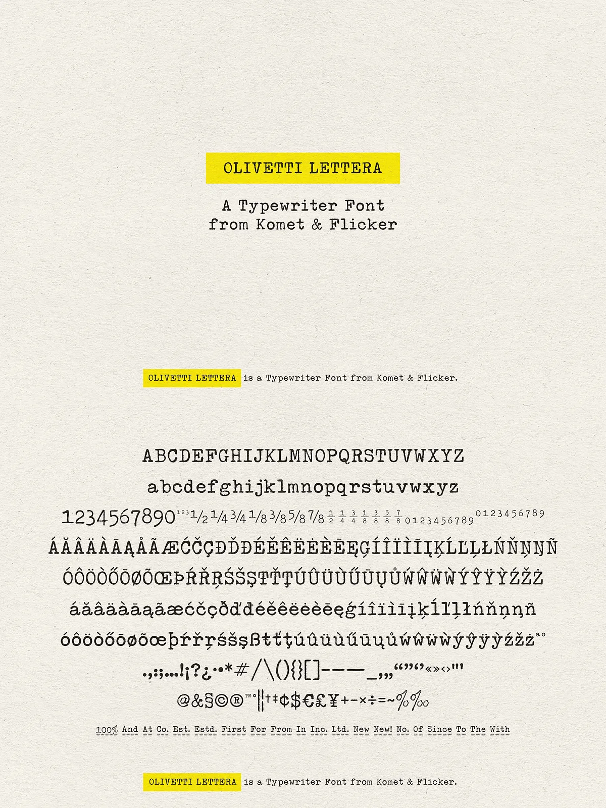
Olivetti Lettera includes a full A–Z uppercase and lowercase basic Latin set along with extended Western and Central European characters. Designers can deploy the font confidently for projects that require accented characters, currency symbols, and common punctuation across Western languages. The font actively supports multilingual editorial layouts and packaging copy without fallback compromises.
Specialty Glyphs & Fraction Styles
Custom Connecting Word Glyphs and Ready Fractions
To enhance authenticity, the family includes a set of 20 custom connecting word glyphs designed to simulate natural word joins and ink spread between letters—perfect for headlines, subheads, and logotype treatments that demand an organic typewriter look. The font also delivers two pre-made common fraction styles so you can place numeric ratios and measurements quickly and consistently.
Usage & Accessing Extra Glyphs
Accessing Glyphs in Popular Design Tools
In Adobe Illustrator, access the extra custom glyphs by opening the Type → Glyphs panel; Illustrator displays the connecting word glyphs for easy substitution. In Adobe Photoshop, open Type → Panels → Glyphs Panel to insert alternate glyphs or fractions. These workflows enable designers to actively swap in special glyphs without manual kerning or raster edits, streamlining production while preserving the vintage aesthetic.