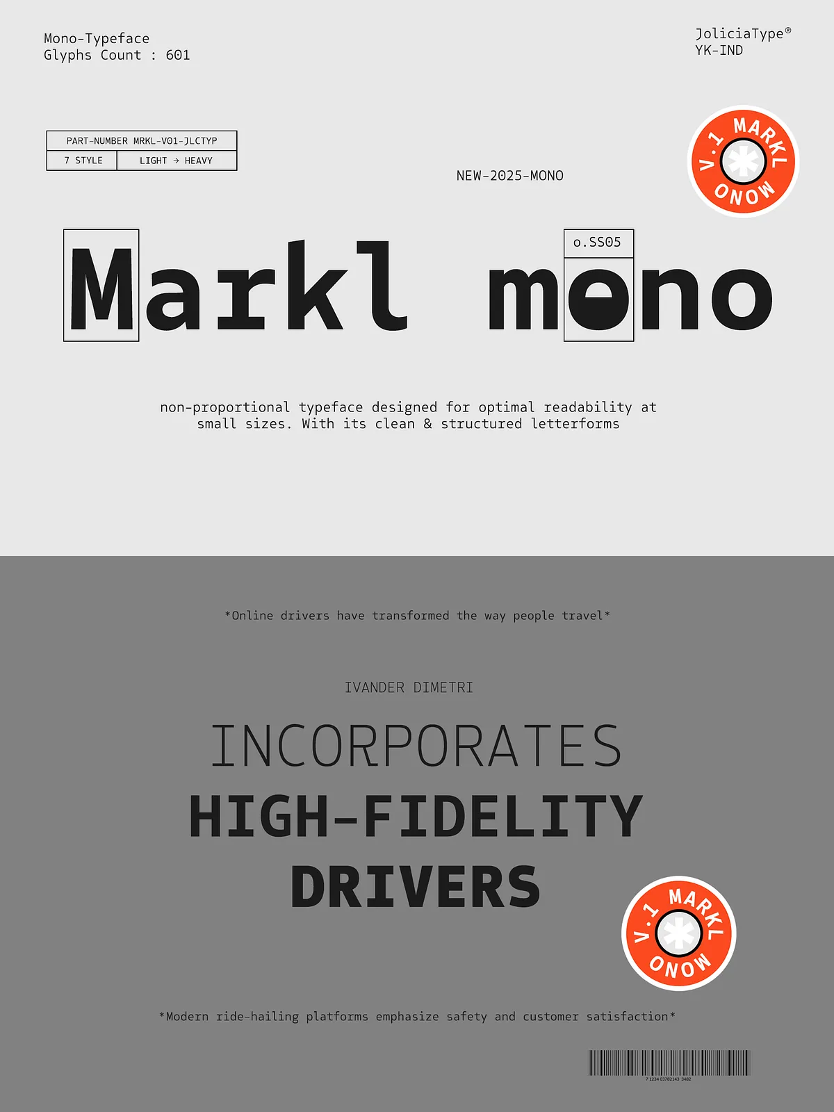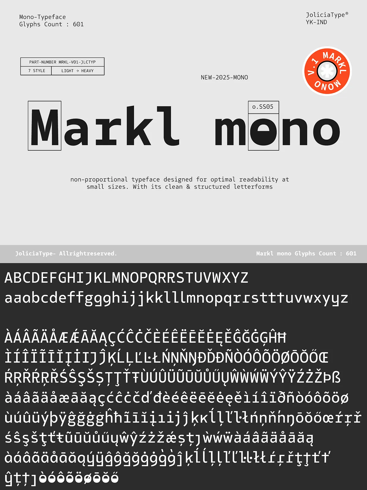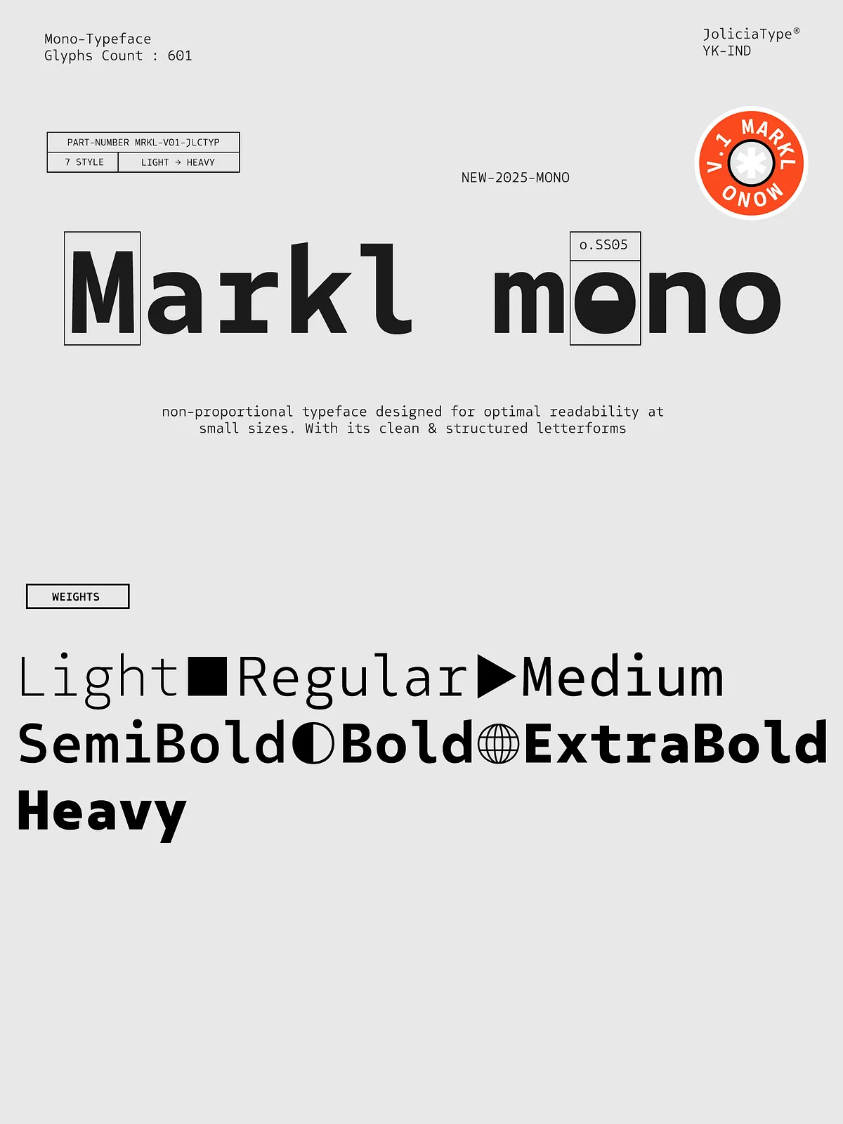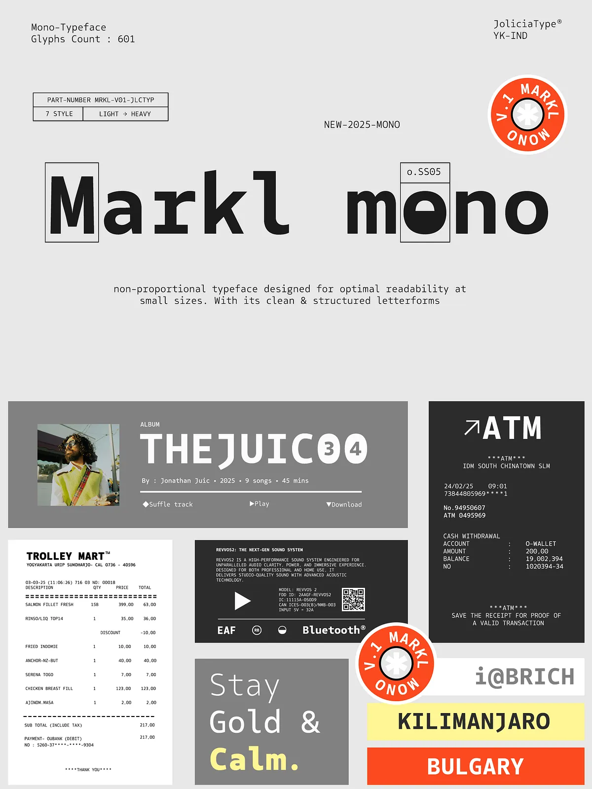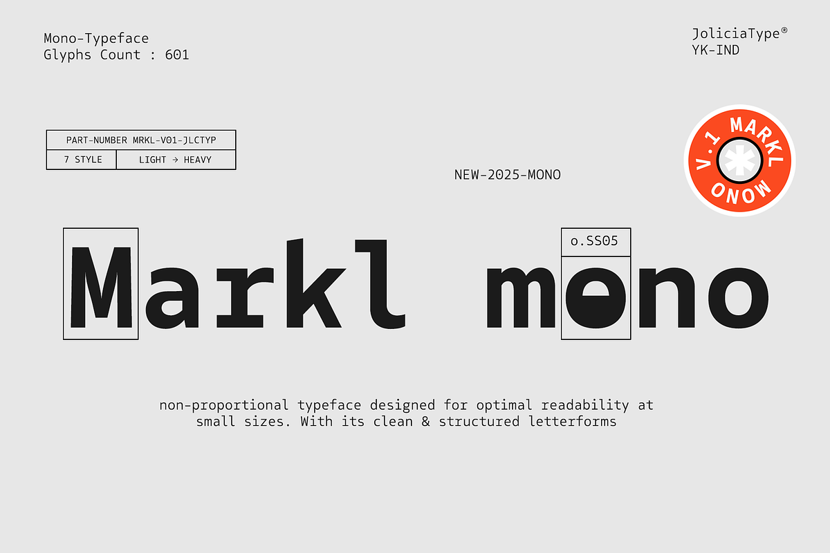
Markl Mono is a non-proportional monospaced typeface engineered for precision and clarity. With seven distinct weights ranging from Light to Heavy, the family delivers a clean, balanced appearance that holds up at small sizes and in dense technical contexts. Designers and developers choose Markl Mono when readability, alignment, and a steady rhythm matter most.
Design & Readability
Non-Proportional Structure for Predictable Layouts
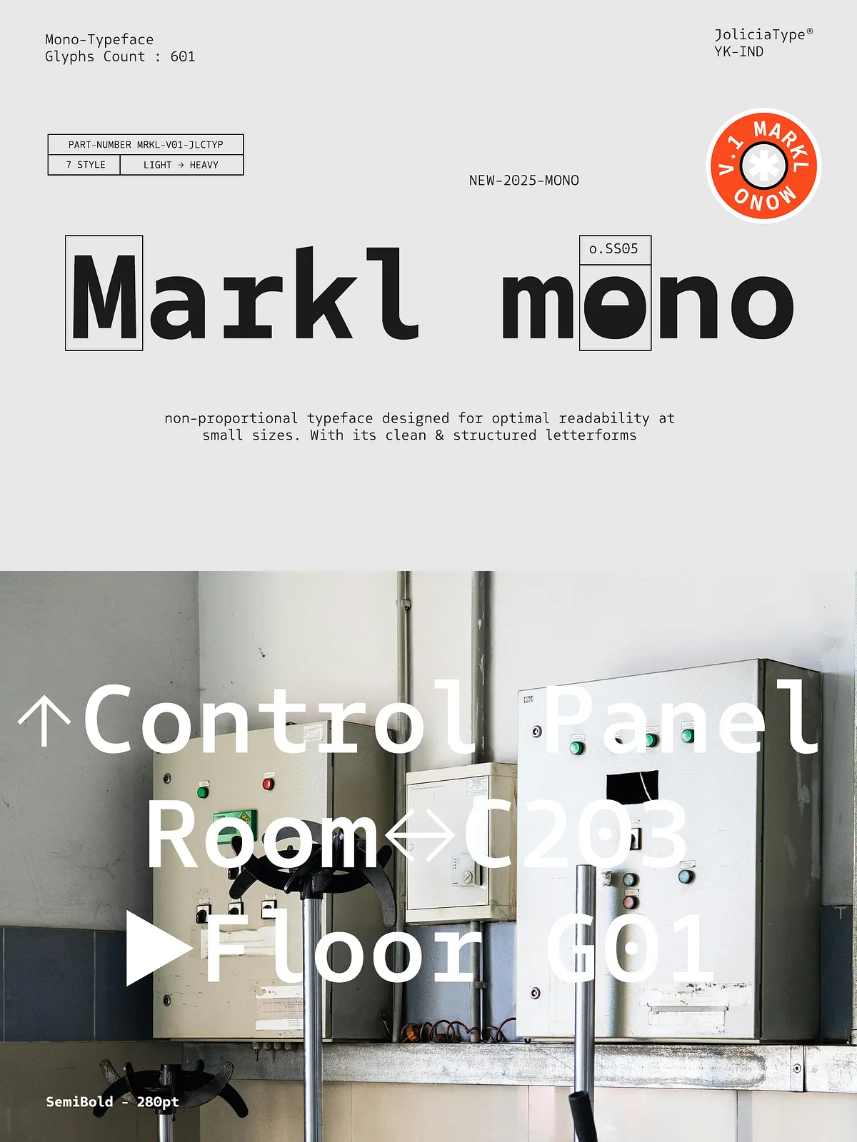
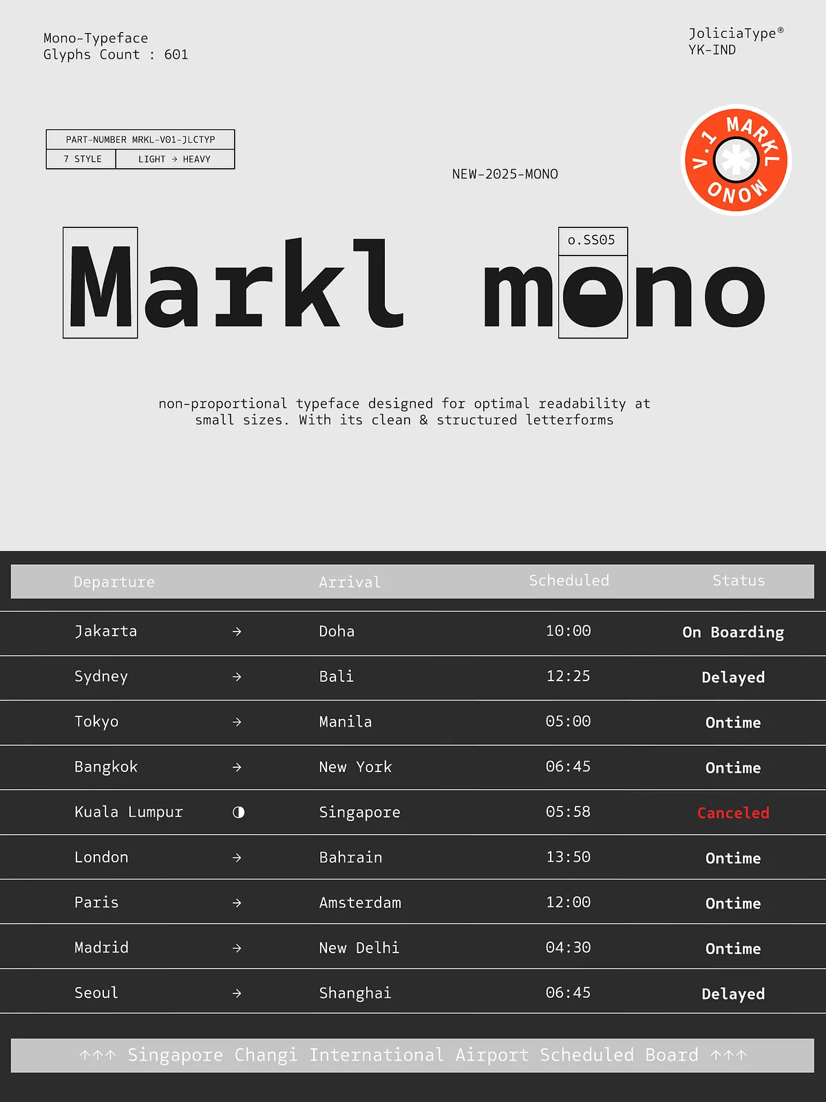
Because every character occupies the same horizontal space, Markl Mono enforces consistent column alignment and predictable metrics. This structural consistency improves legibility in code editors, tables, UI mockups, and tabular editorial formats. The face emphasizes open counters, neutral terminals, and moderate x-height to maintain clarity across sizes and weights.
Active Details That Aid Reading
Markl Mono balances technical restraint with thoughtful design: strokes remain steady, shapes avoid excessive contrast, and spacing flows with a measured rhythm. These active design choices reduce visual noise, helping readers scan lines quickly and accurately—especially in interfaces, documentation, and data-dense layouts.
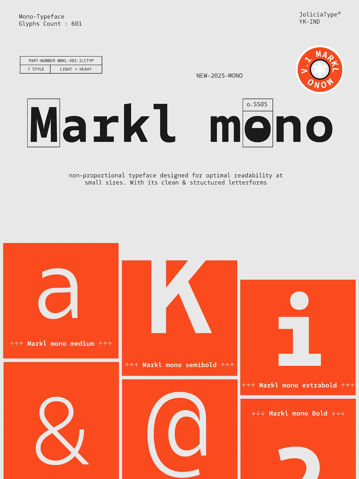
Weights & Glyph Inventory
Seven Weights, Extensive Glyph Set
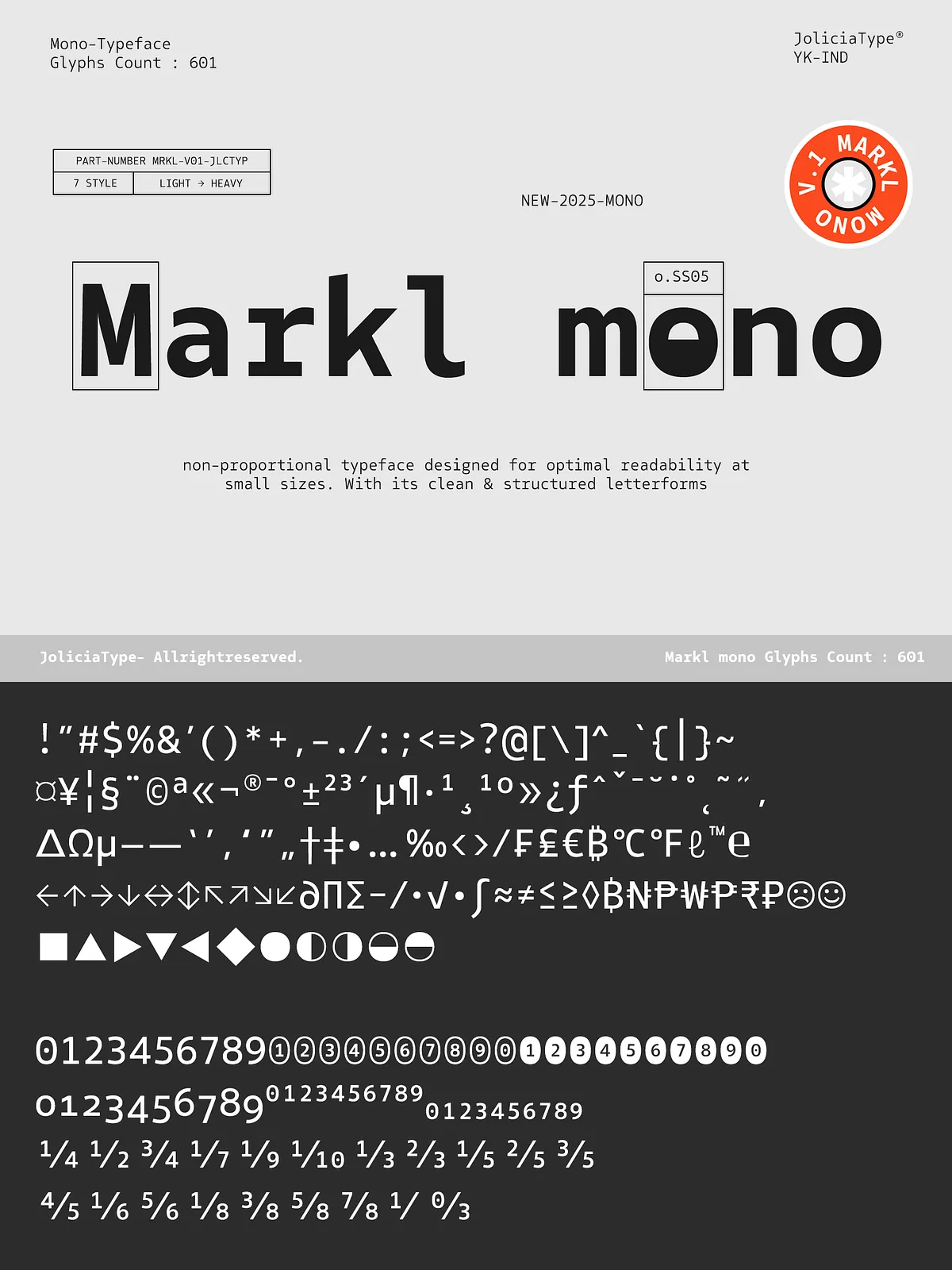
The family spans seven weights from Light to Heavy, enabling subtle typographic hierarchy without sacrificing alignment. Markl Mono includes a total of 601 glyphs, covering core Latin characters, numerals, punctuation, and extended symbols needed for professional applications. This breadth supports multilingual usage and technical notation without frequent fallbacks.
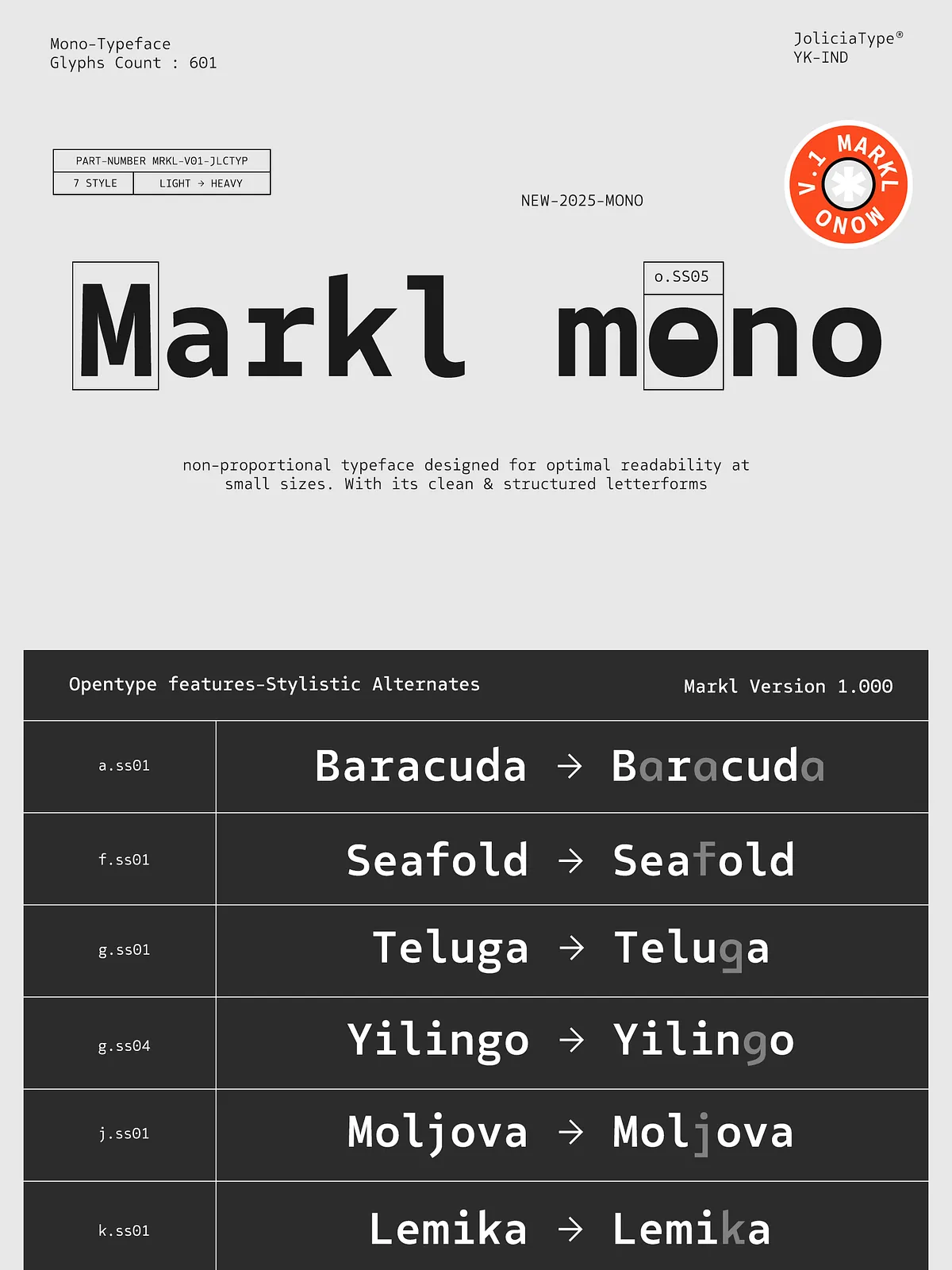
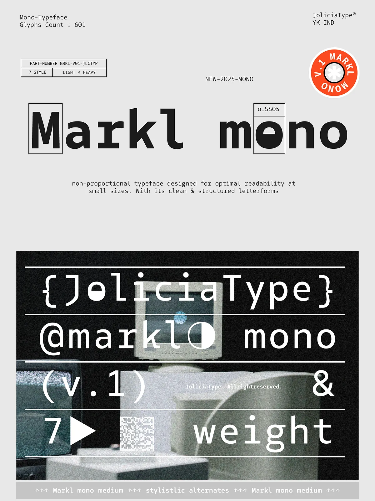
Alternate Characters & Access
Flexible Alternates for Design Control
Markl Mono ships with alternate glyphs for selected letters—R, a, f, g, j, k, l, r, t, y, and o—so you can tailor visual tone without switching type families. Use alternates to refine letter fit, improve rhythm in UI labels, or craft distinctive logotypes while keeping monospaced alignment intact.
How to Enable Alternates
Access alternates via your design application’s glyph or OpenType panels. In Adobe Illustrator and Photoshop open the Type → Glyphs panel to preview and insert alternatives. Many modern code editors and layout tools also support OpenType stylistic sets or glyph substitution, enabling quick swaps in production workflows.
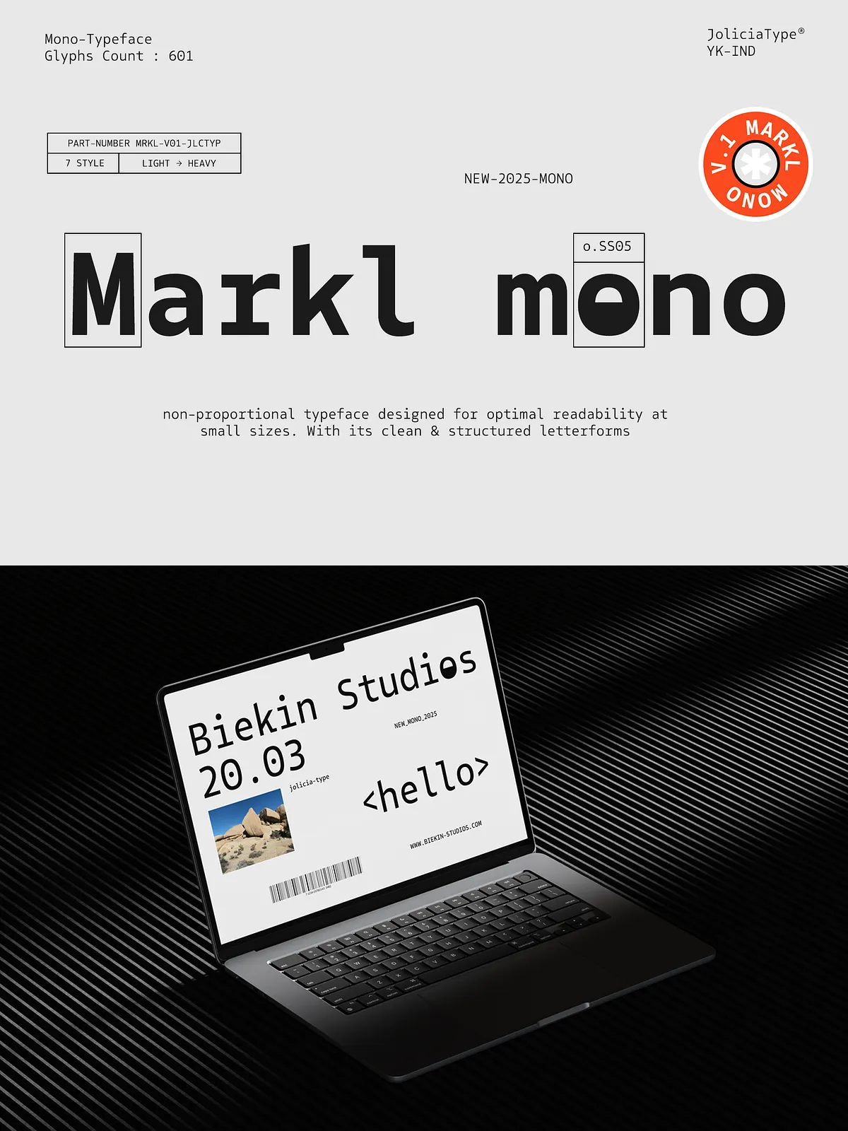
Primary Use Cases
Where Markl Mono Excels
- Code editors and developer tooling — clear character shapes reduce ambiguity in common glyphs like l, 1, and I.
- UI and product interfaces — predictable metrics simplify alignment of labels, buttons, and data fields.
- Editorial and technical documentation — tabular data, tables of figures, and specs appear tidy and consistent.
- Design systems — the steady rhythm helps maintain visual order across components and screens.
Pairing Suggestions
Contrast with Sans and Serif Faces
Pair Markl Mono with a neutral sans-serif for body copy when you need a modern, clean interface. For editorial projects, combine it with a humanist serif to add warmth while preserving technical clarity. Use heavier weights of Markl Mono for headings in data-rich layouts to emphasize structure without losing alignment.
Technical Details & Licensing
Formats, Web Use, and Licensing Notes
Markl Mono typically ships in OpenType (OTF) and TrueType (TTF) formats; request WOFF/WOFF2 for web deployments. Confirm the included license to determine permitted uses (desktop, web, app, or enterprise). For high-volume distribution or embedding in applications, secure the appropriate extended license to avoid interruptions in production.
What’s Included
Files and Features
- Seven weights from Light to Heavy
- Total of 601 glyphs covering Latin basics and extended symbols
- Alternate glyphs for R, a, f, g, j, k, l, r, t, y, o
- OpenType features and stylistic alternates for flexible substitution
- OTF/TTF files; request WOFF/WOFF2 for webfont use