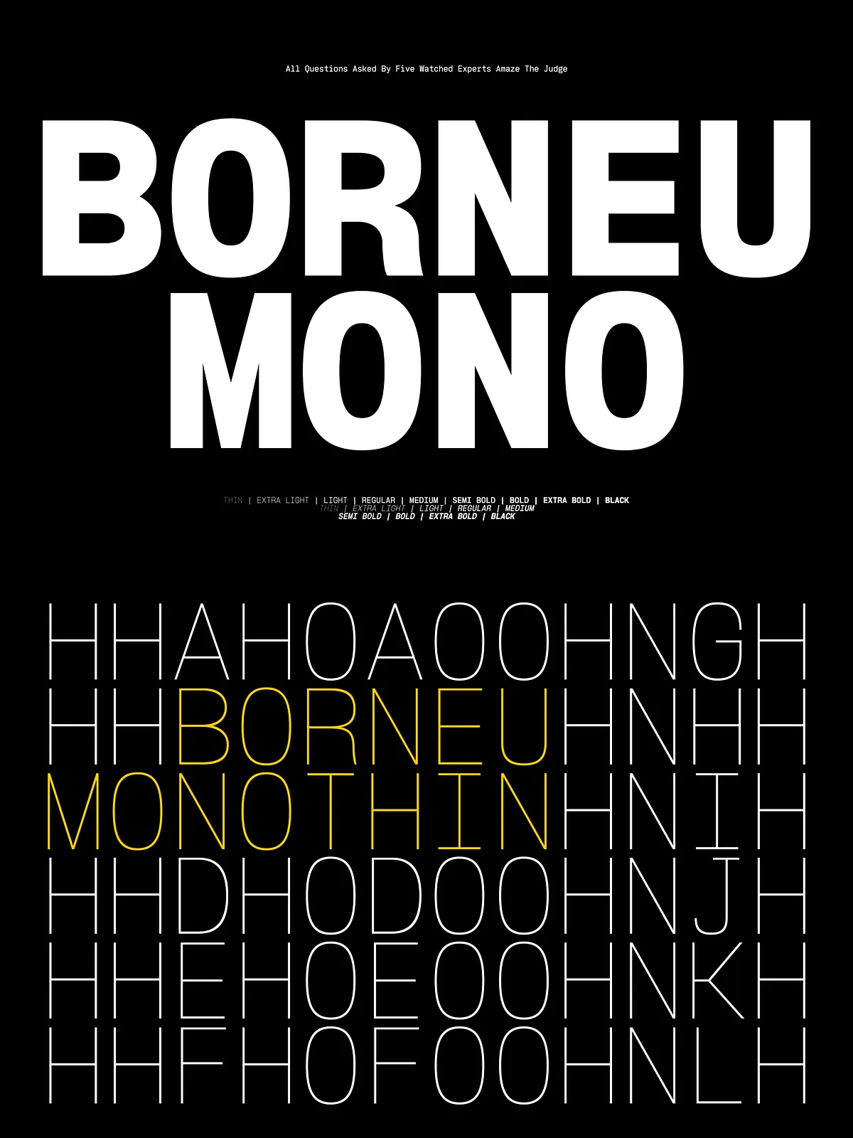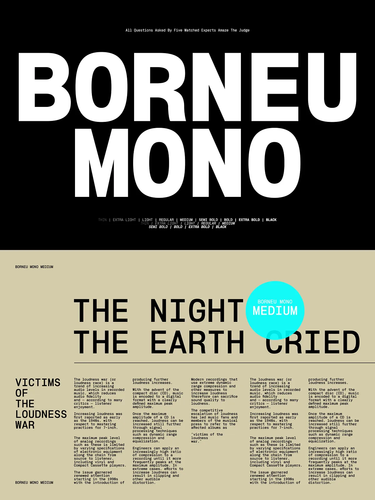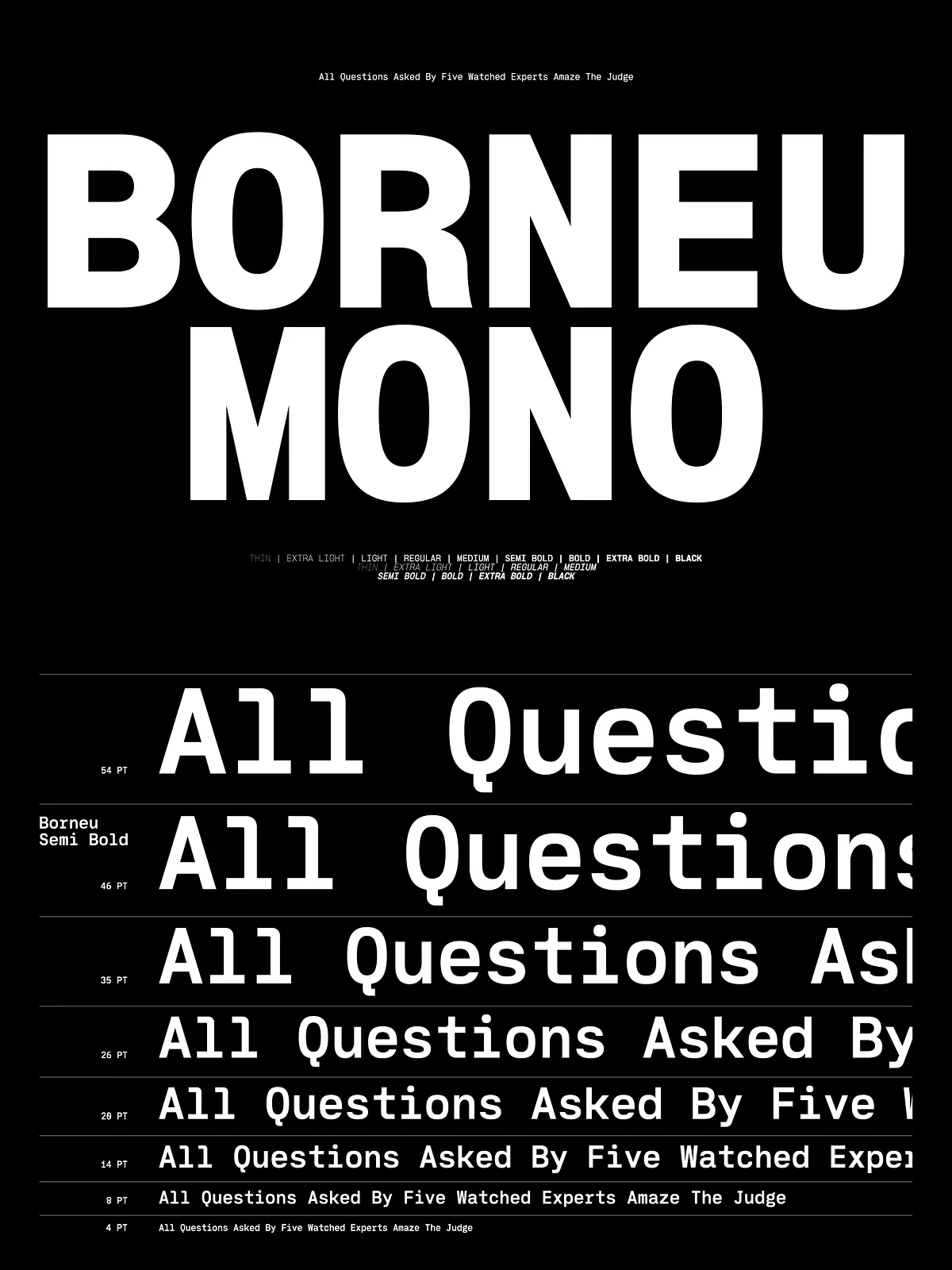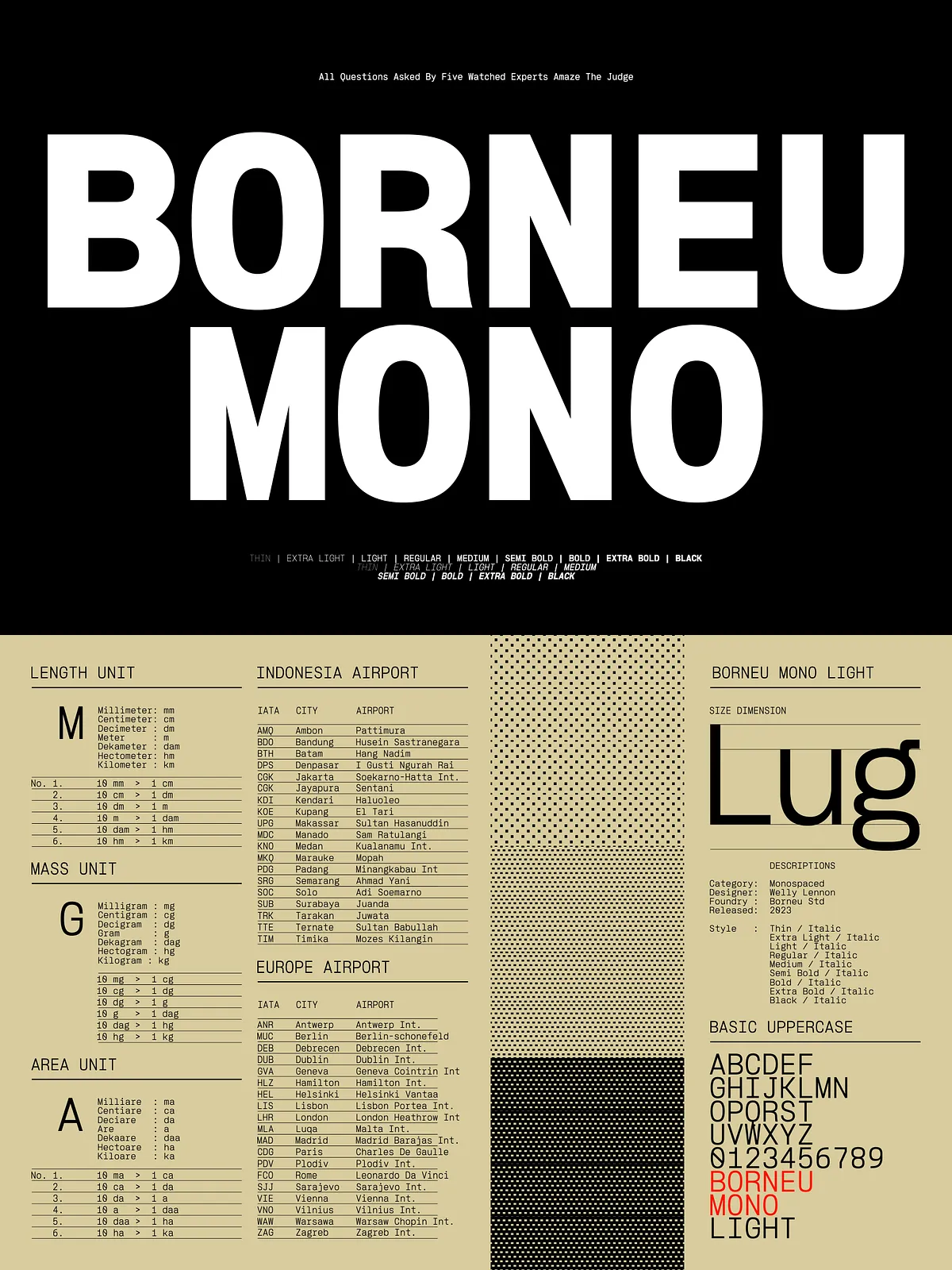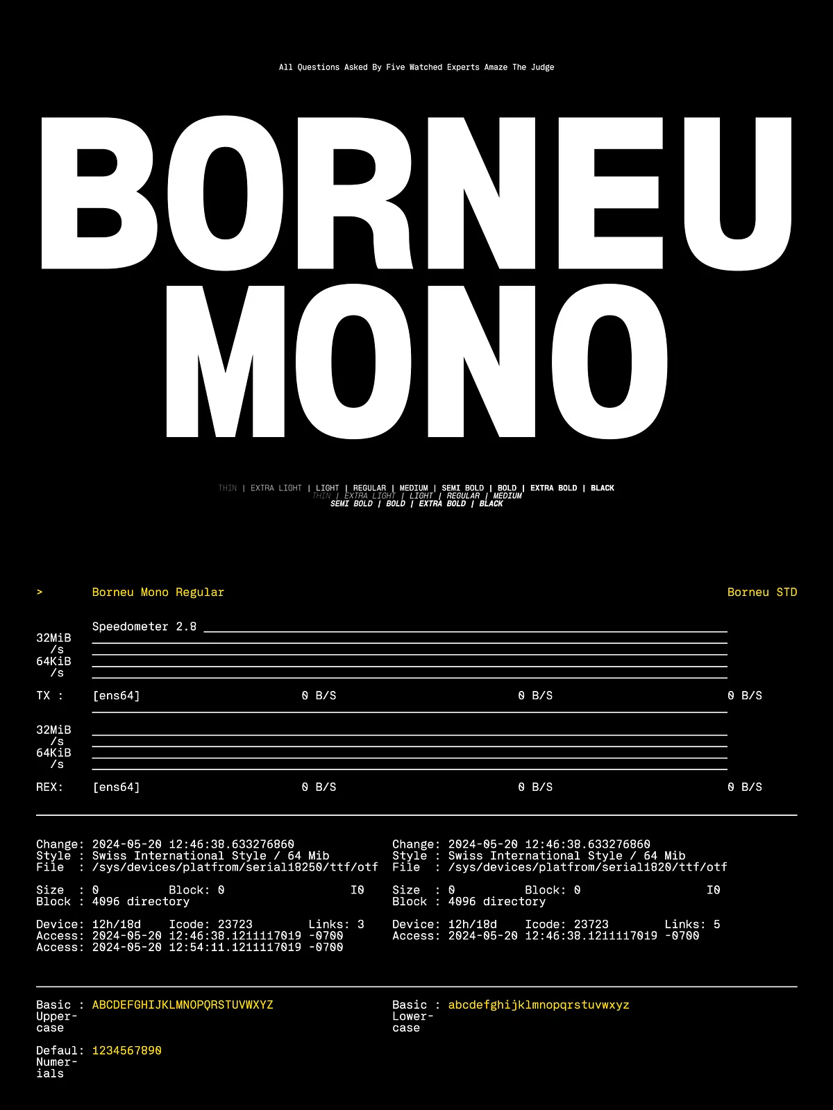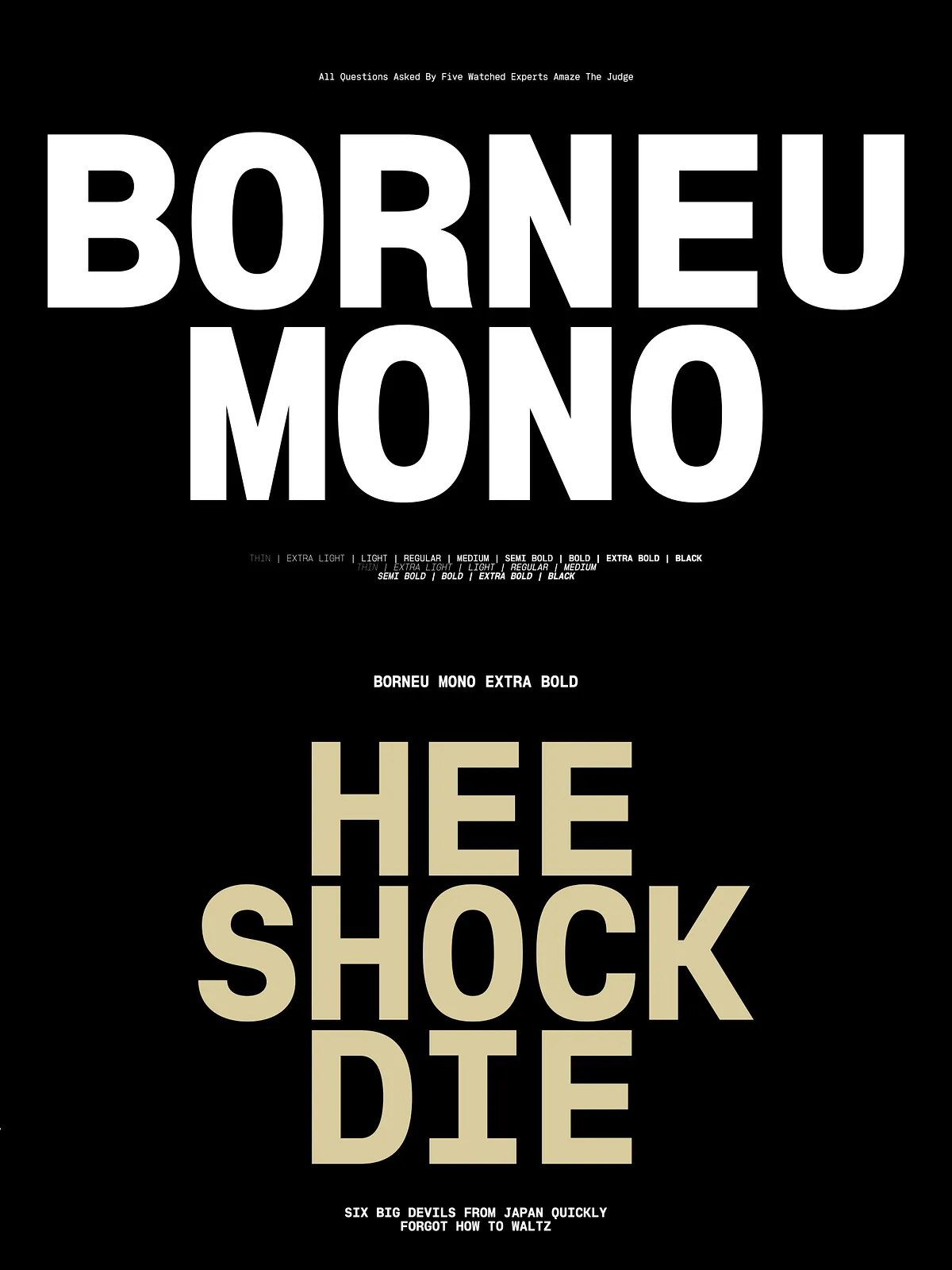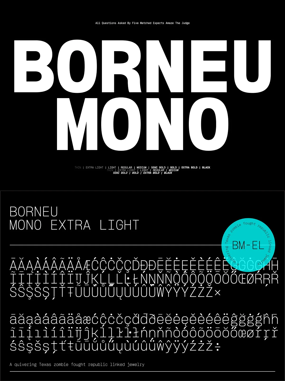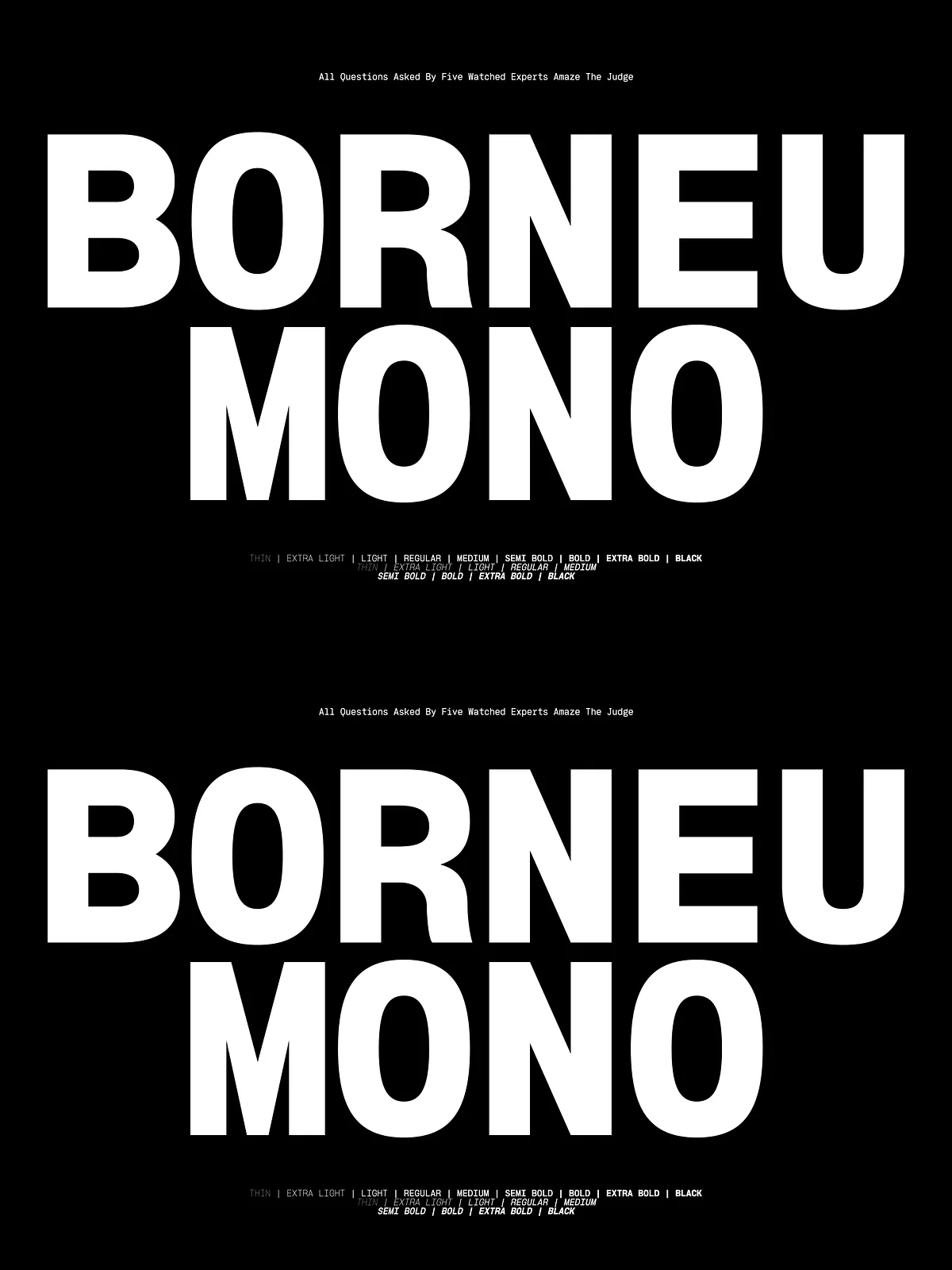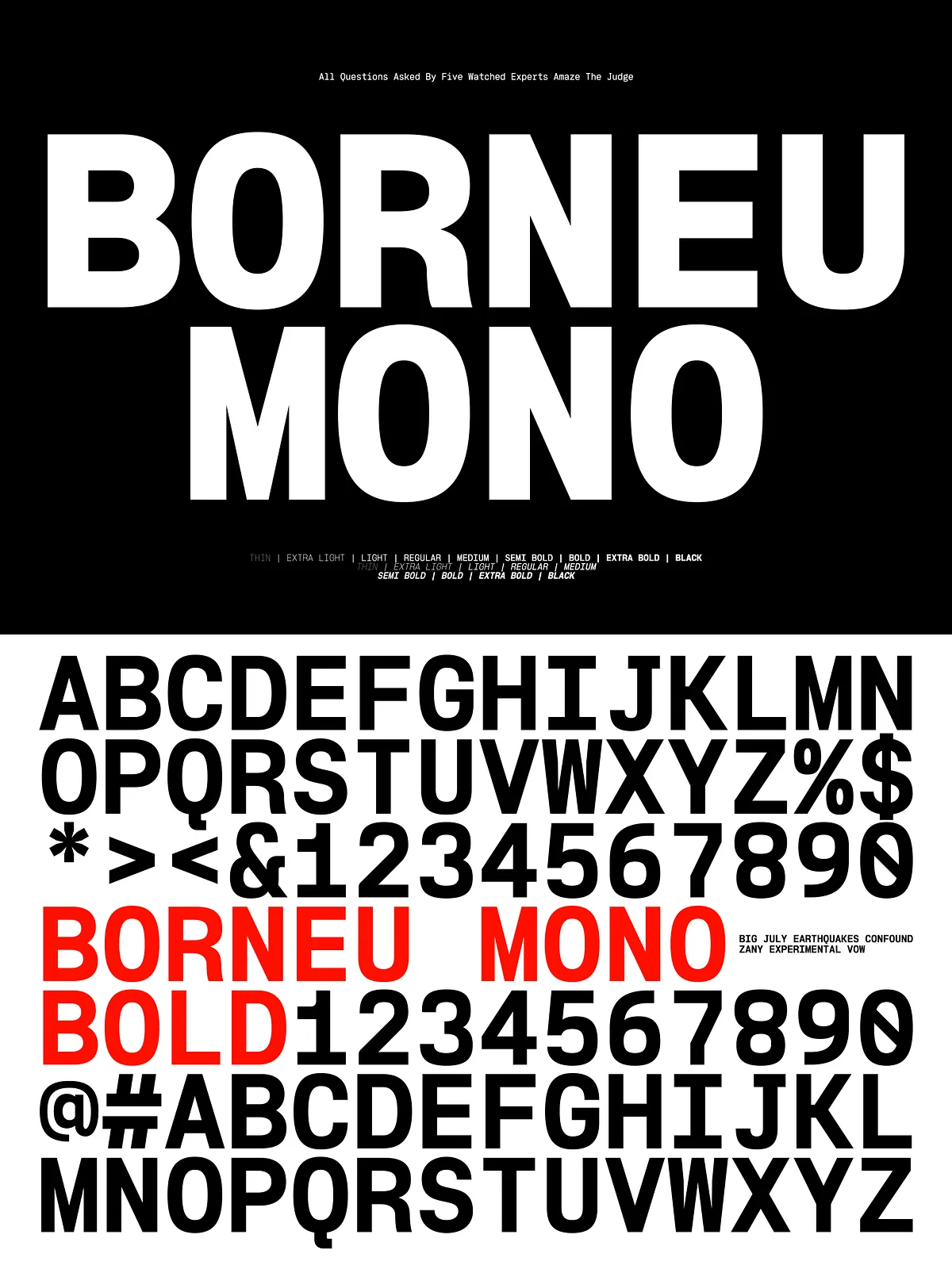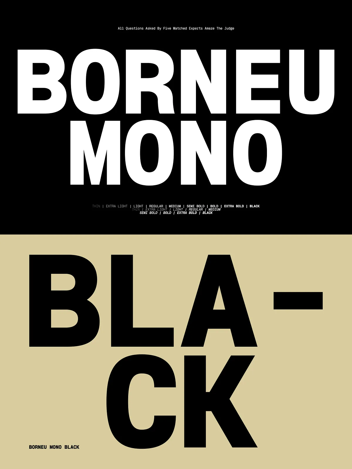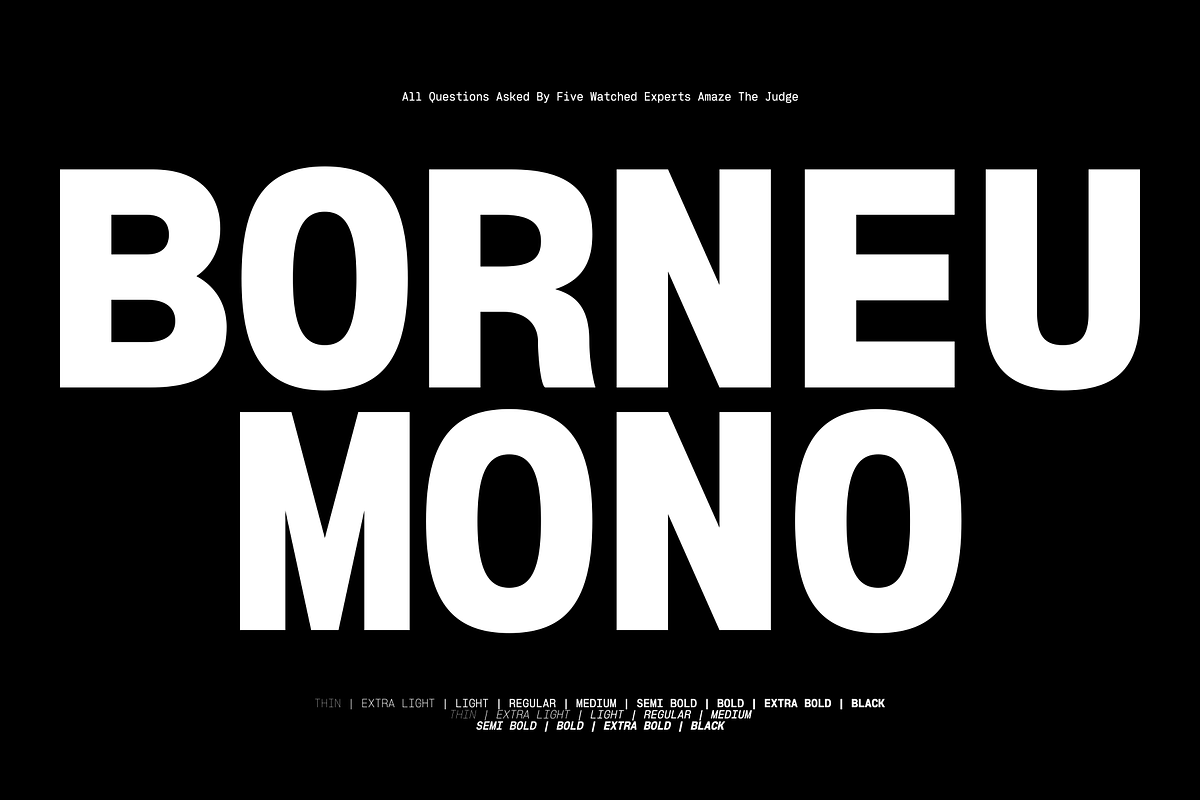

Borneu Mono is a purpose-driven monospaced typeface created to meet the practical and aesthetic needs of graphic designers. It balances mechanical rhythm with humanist proportions to deliver a type system that reads well at both large display sizes and compact body text. Whether you are composing headings, coding interfaces, designing labels, or building editorial layouts, Borneu Mono supplies the clarity, consistency, and personality required for professional results.
Design Intent
Borneu Mono focuses on predictability and legibility. Each glyph aligns to a uniform character width—this preserves consistent vertical rhythm and makes text blocks and columns easier to measure and align. At the same time, carefully tuned counters, stroke endings, and spacing ensure the face retains warmth and readability, avoiding the cold rigidity that can afflict lesser monospaced designs.
Key Characteristics
- Monospaced discipline: Equal character widths create dependable grids for tables, code samples, captions, and multi-column layouts.
- Dual-purpose readability: Optimized shapes render crisply at headline sizes while maintaining comfortable reading at body sizes.
- Neutral but expressive: A restrained voice that supports brand messaging without overpowering other visual elements.
- Clear punctuation and numerals: Distinct figures and punctuation ensure accuracy in technical, editorial, and interface contexts.
- Consistent vertical rhythm: Predictable line metrics help designers control leading and alignment precisely.
Practical Features
Borneu Mono ships with the essentials designers expect. It includes full uppercase and lowercase alphabets, numerals, punctuation, and basic symbol sets that cover most western-language projects. The typeface behaves predictably across platforms and requires no complex setup—install and begin laying out text immediately.
Ideal Use Cases
Borneu Mono excels across a broad range of design applications because it marries technical precision with visual balance. Use it to:
- Anchor brand identities where a modern, technical, or editorial tone is needed.
- Render code samples, developer documentation, or UI mockups where monospaced alignment improves clarity.
- Compose packaging copy and product labels that require structured typographic grids.
- Set magazine columns, captions, and fact boxes that benefit from rhythmic line lengths.
- Design posters and headlines that call for a bold, geometric presence while maintaining legibility.
Technical Details & Compatibility
File Formats & Platforms
Borneu Mono is distributed in standard web and desktop formats for broad compatibility. Designers can deploy the face in OTF/TTF files for print and desktop applications and in WOFF/WOFF2 for web embedding. The font installs on Windows and macOS and functions in major design tools such as Adobe Creative Suite, Affinity, and common web development environments.
Performance & Production
The consistent character widths simplify layout tasks and speed up production. When used in digital interfaces, Borneu Mono maintains a steady visual rhythm across responsive breakpoints. For print, the even metrics reduce typographic surprises when reflowing copy between different page grids.
Installation Tips & Best Practices
- Install desktop fonts via your system font installer and restart design apps to ensure proper loading.
- When embedding on the web, prefer WOFF2 for optimal compression and fast loading times.
- Use tracking and leading adjustments to tune the visual color for specific sizes—slightly tighter tracking often benefits display uses, while relaxed leading improves body text legibility.
- Combine Borneu Mono with a neutral sans or serif for contrast in UI and editorial systems—use the mono face for structured data and the companion face for flowing copy.
Licensing & Support
Borneu Mono comes with a straightforward licensing model suitable for desktop publishing, web embedding, and digital product use. Review the vendor’s license for details on commercial and extended usage. If you require enterprise deployment or custom licensing, contact the type foundry or distributor for tailored options and technical support.
Get Started
Borneu Mono empowers designers to work faster and craft cleaner, more controlled layouts. Install the family, test its rhythm in your most common workflows, and use its steady grid to enhance alignment, legibility, and typographic precision. If you have questions about pairing, metrics, or deployment, reach out to the foundry or your vendor support for practical guidance.