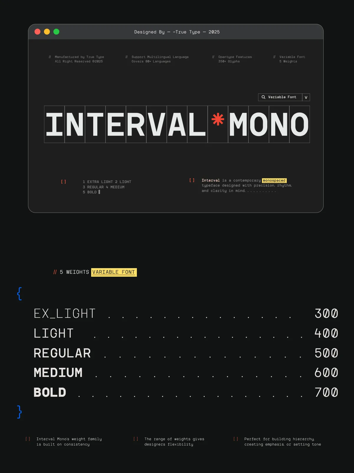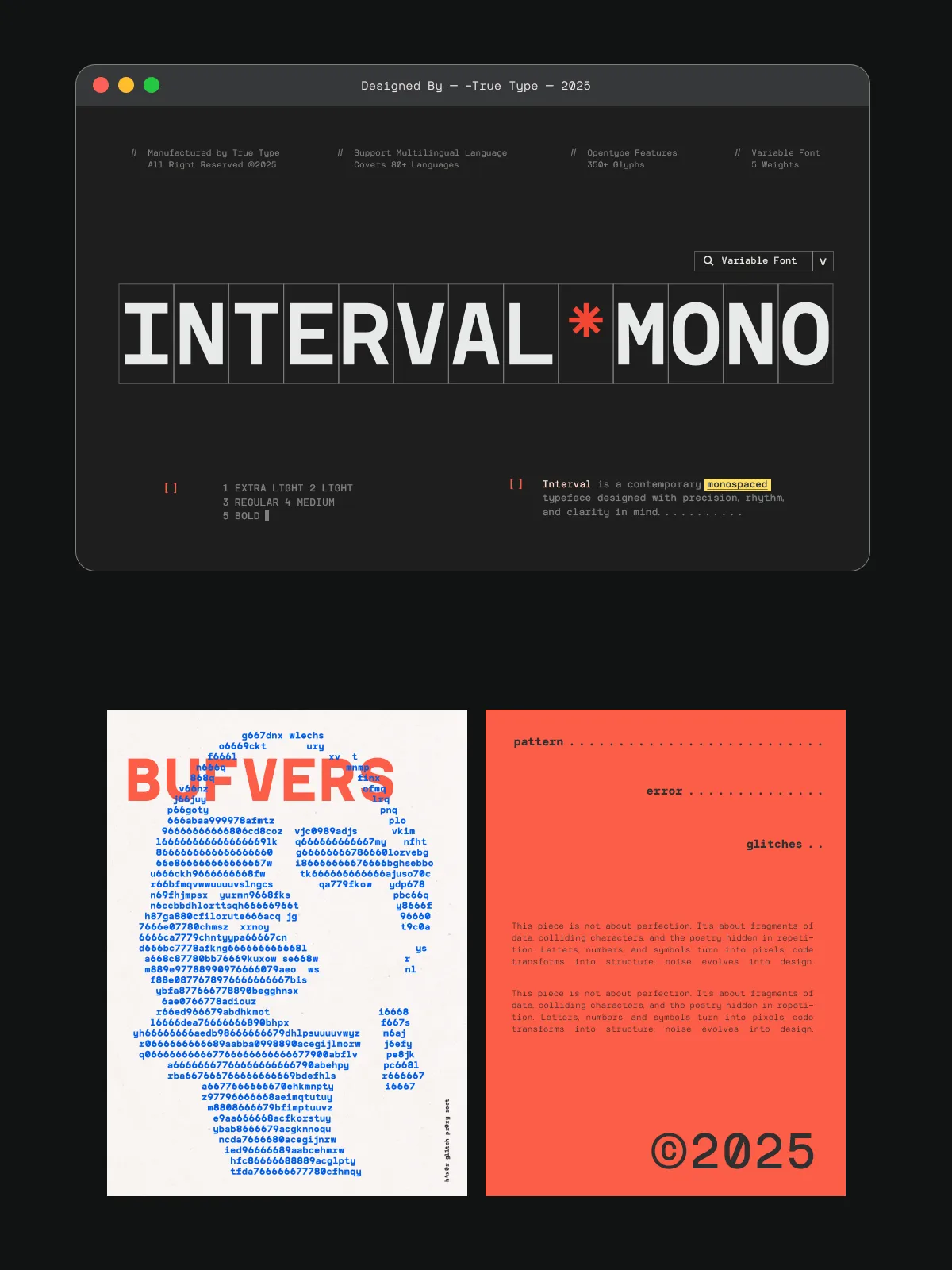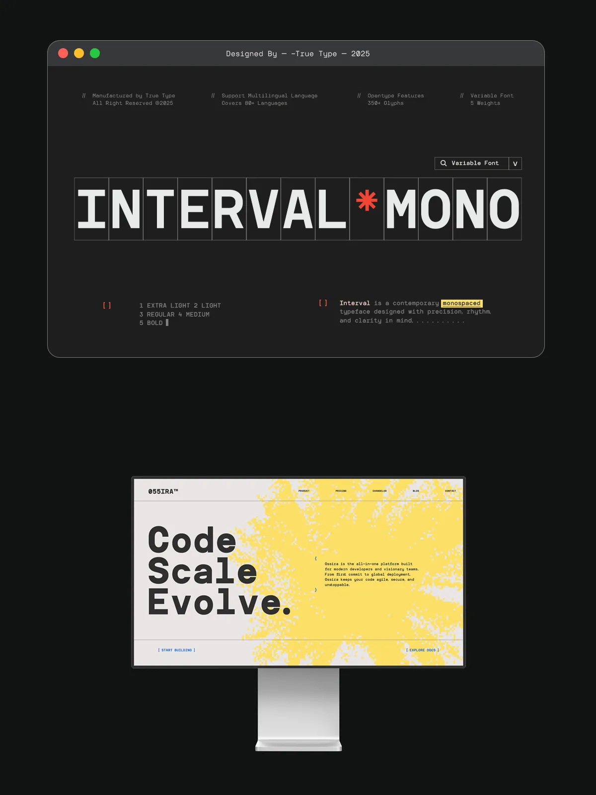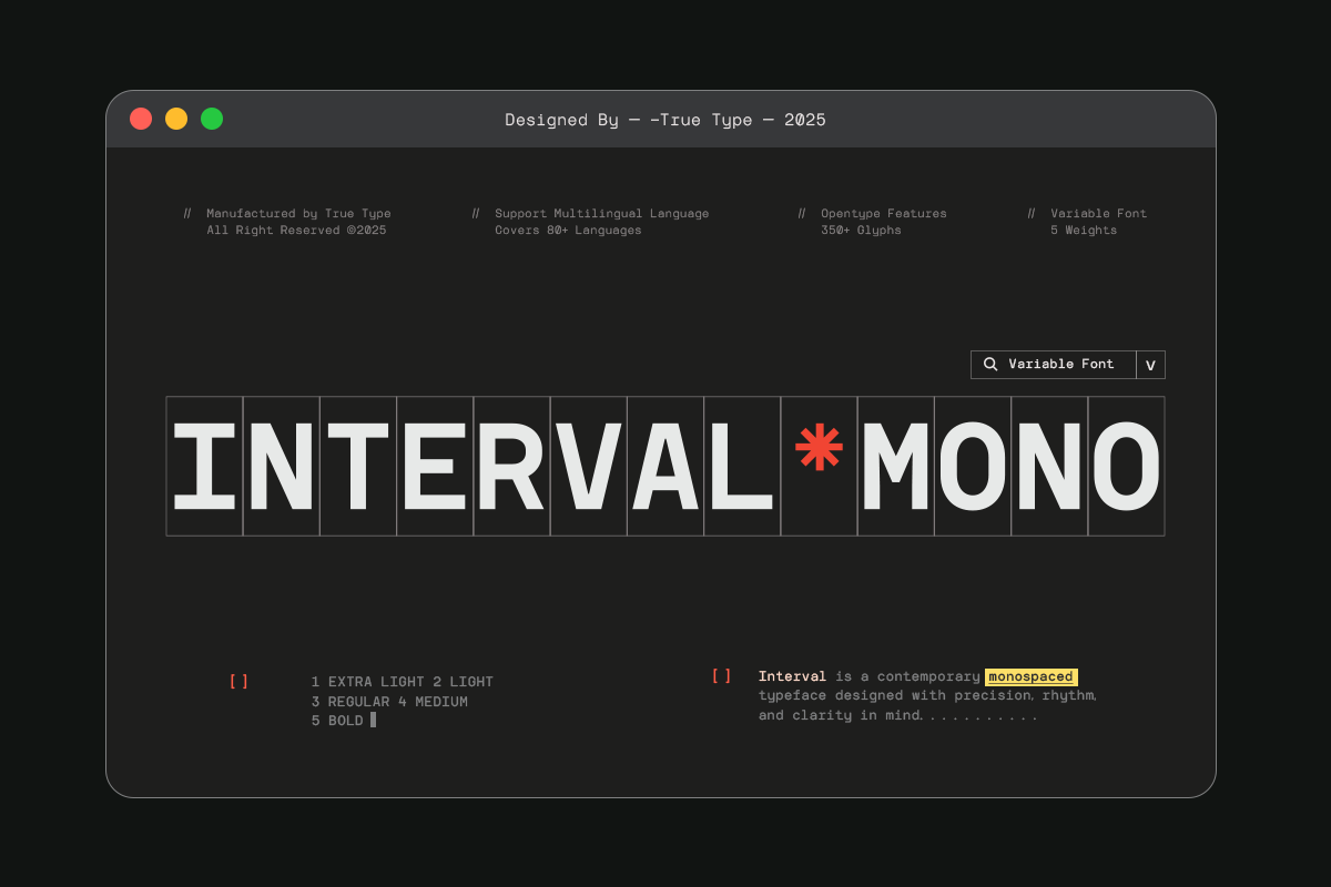

When you need typography that speaks with authority, consistency, and elegance, TRT Interval steps forward as the ideal choice. More than just a font, it’s a deliberate fusion of geometric discipline and human-centered design—crafted for creators who value both structure and soul. Inspired by the clean lines of classic monospace and geometric sans serif designs, TRT Interval redefines digital typography with a refined balance of function, rhythm, and aesthetic harmony. Whether you’re designing a user interface, writing code, crafting a brand identity, or shaping editorial content, this font delivers uncompromised clarity and expressive versatility.
Why TRT Interval Stands Out in a Crowded Design Landscape
1. Perfectly Balanced Monospaced Geometry
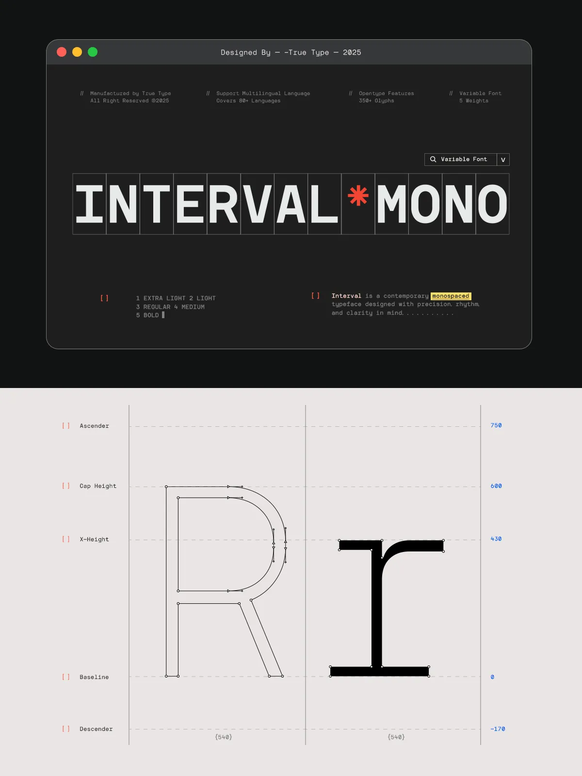
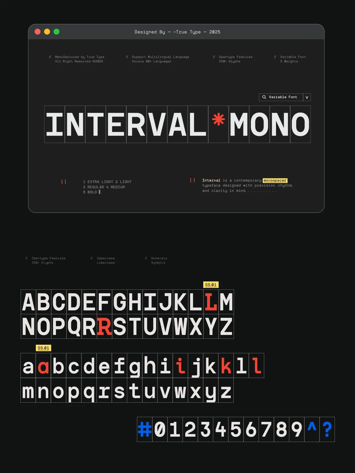
Every character in TRT Interval is constructed on a strict modular grid, ensuring uniform character widths and consistent spacing across all languages and scripts. This precision makes it indispensable for:
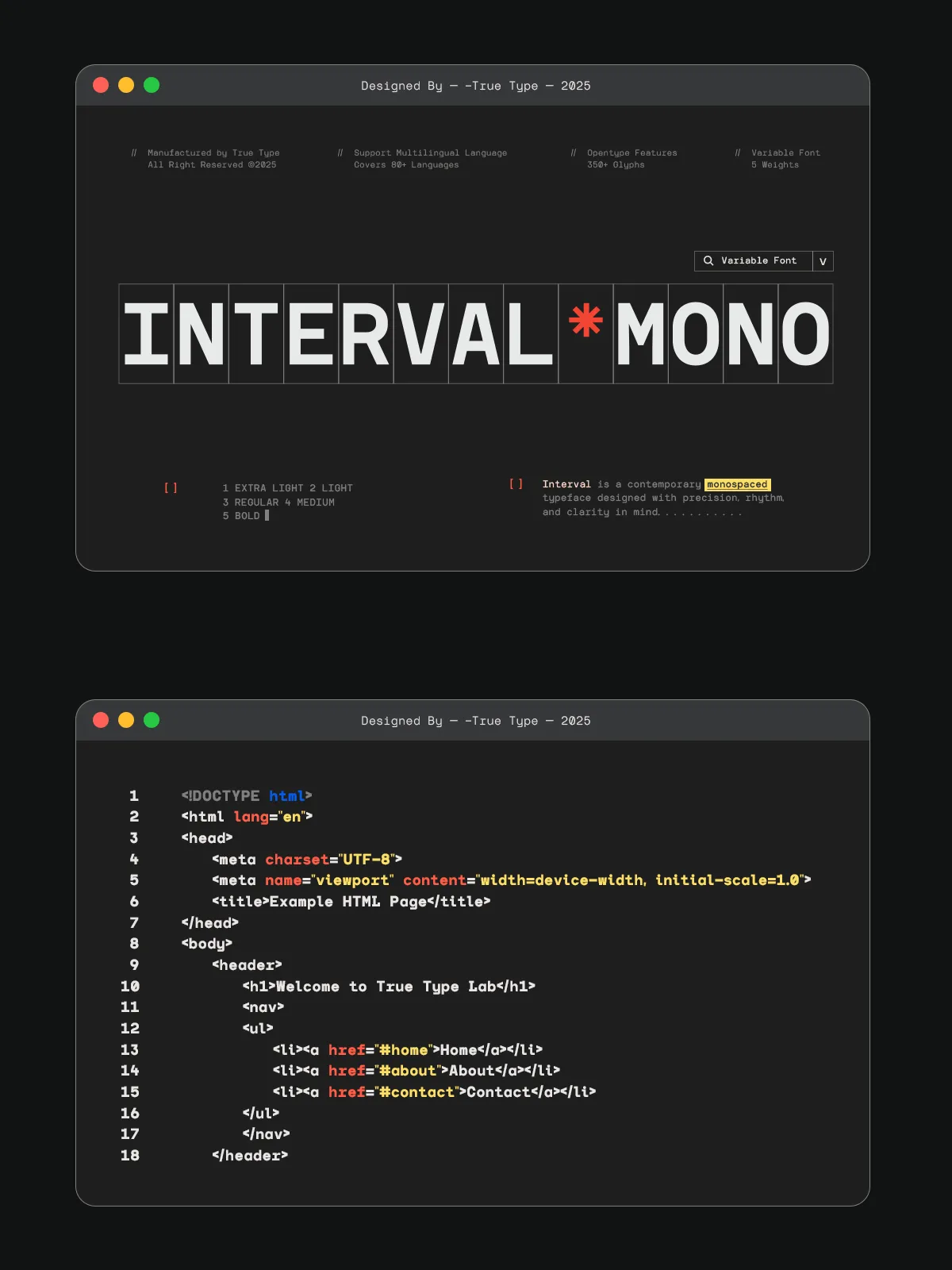
- Coding environments — where alignment and predictability are essential.
- Data visualization and terminal design — for clean, readable outputs.
- Editorial layouts — where rhythmic typographic flow enhances readability.
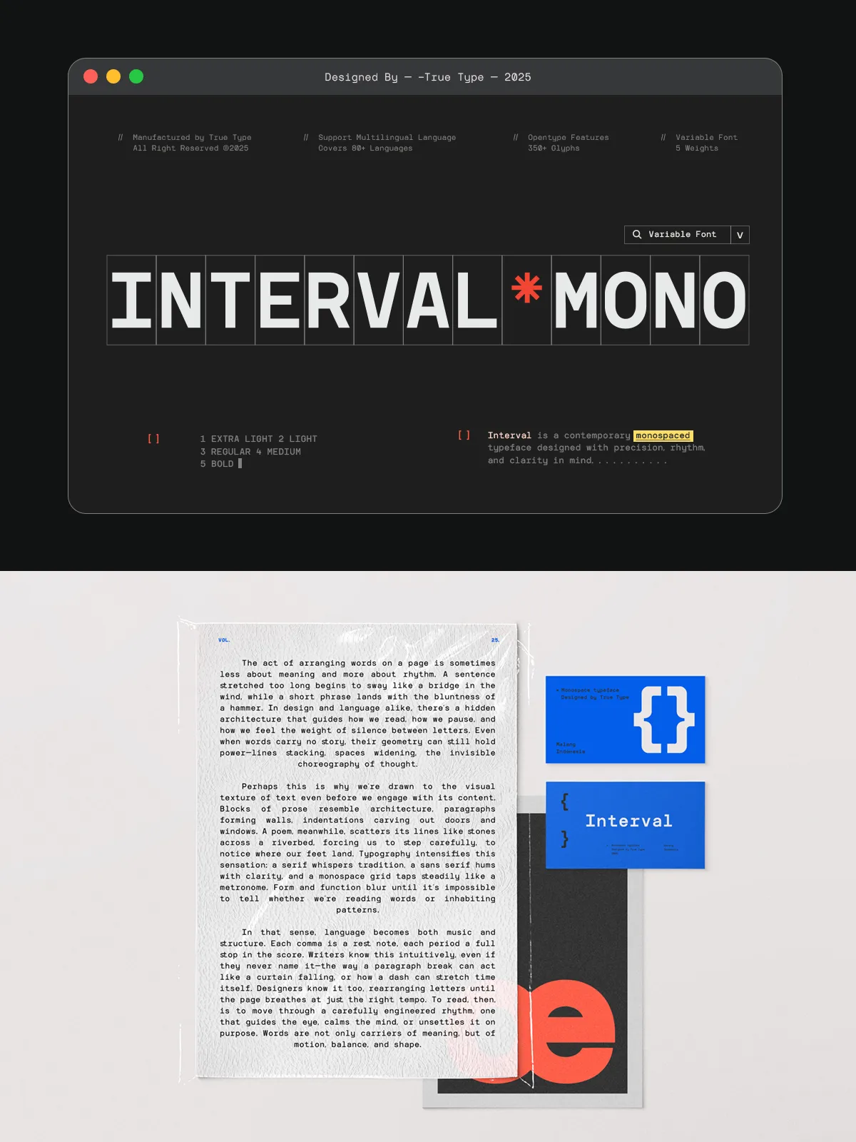
- Branding and digital interfaces — where identity must remain sharp and cohesive.
Yet, unlike impersonal mono-spaced fonts, TRT Interval introduces subtle, thoughtful variations in stroke modulation and glyph detailing, giving a sense of movement and warmth to an otherwise rigid structure.
2. A Human Touch in a Machine-Derived World
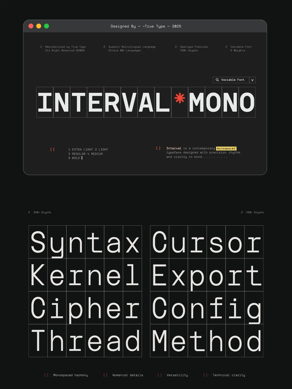
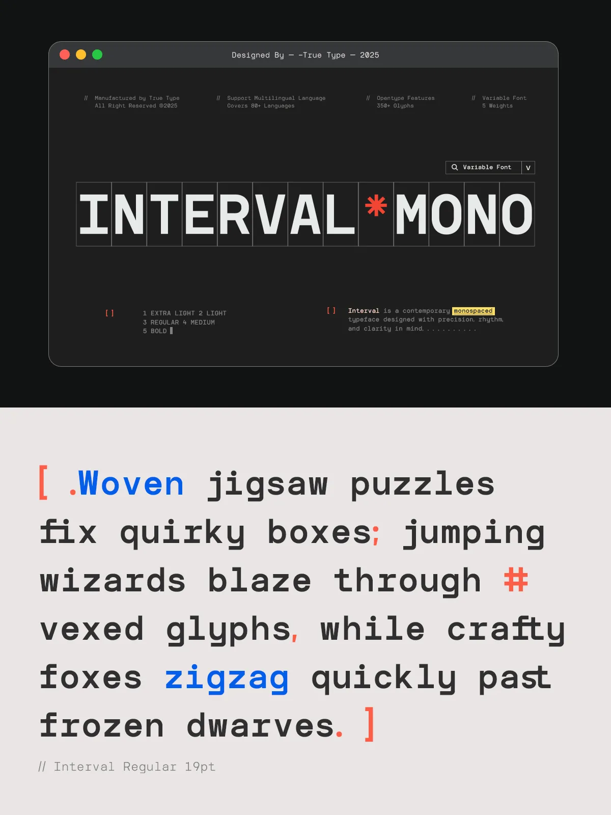
While rooted in geometry, TRT Interval refuses to feel machine-made. Select glyphs—like the lowercase ‘a’, ‘g’, and ‘s’—feature carefully calibrated curves and counter forms that reflect natural handwriting rhythms. These micro-details prevent visual fatigue and make the typeface more inviting, especially in long-form reading. The result? A font that’s technically flawless yet emotionally resonant—a true bridge between logic and creativity.
3. Designed for Dynamic Applications, Not Just Static Text
TRT Interval isn’t just for static designs. It thrives in dynamic environments:
- Web applications — with optimal character width and spacing, it renders cleanly at all screen sizes and resolutions.
- Mobile and tablet interfaces — its consistent spacing ensures touch targets and text blocks remain intuitive.
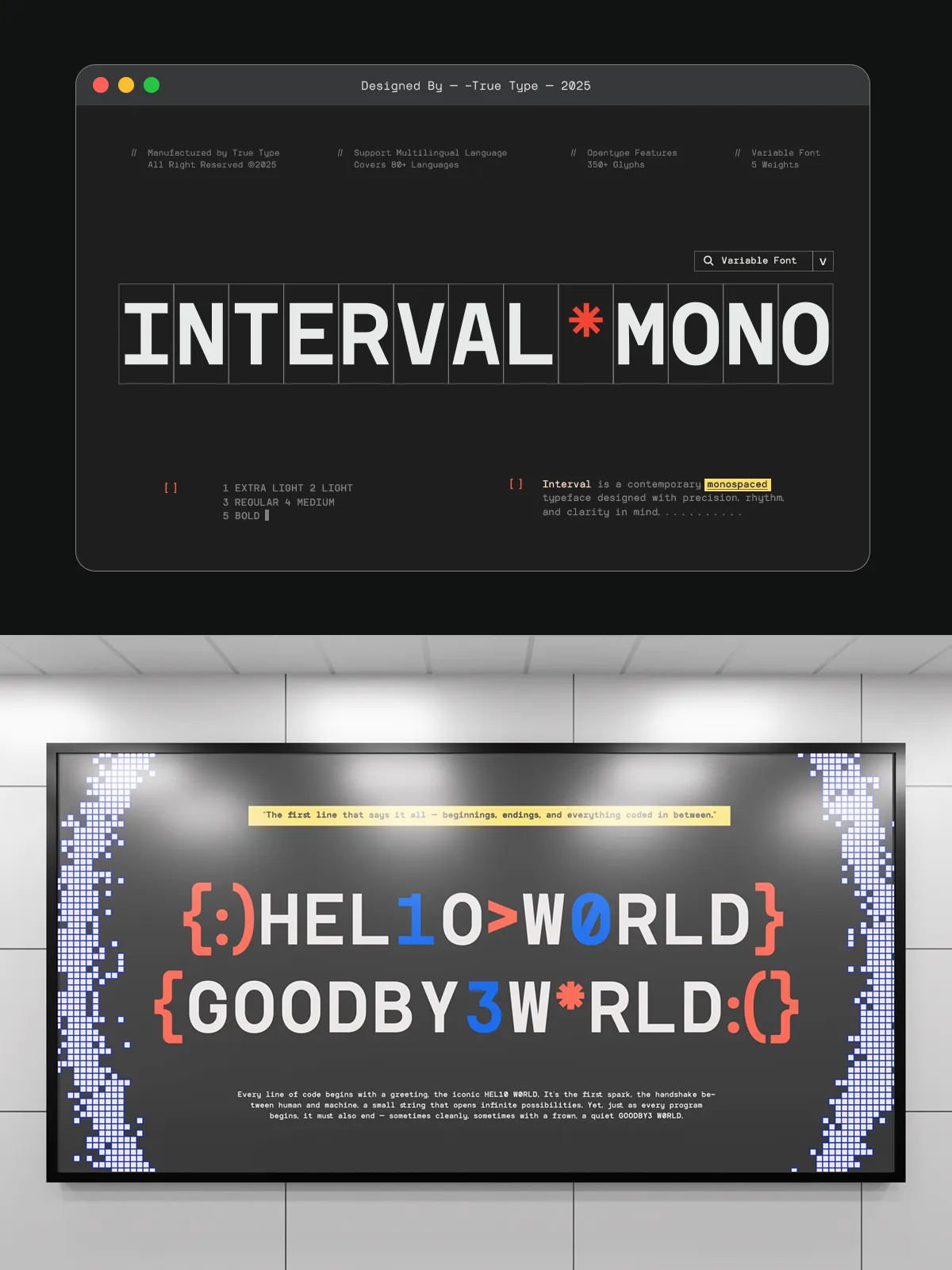
- Real-time code editors — the clear distinction between similar characters (e.g., O vs. 0, I vs. l) reduces errors and increases efficiency.
- Video titles and motion graphics — its clean lines and sharp contrasts translate beautifully across animation.
This adaptability is engineered into every glyph, not tacked on as an afterthought.
Technical Excellence for Professional Workflows
TRT Interval ships with robust OpenType support, including:
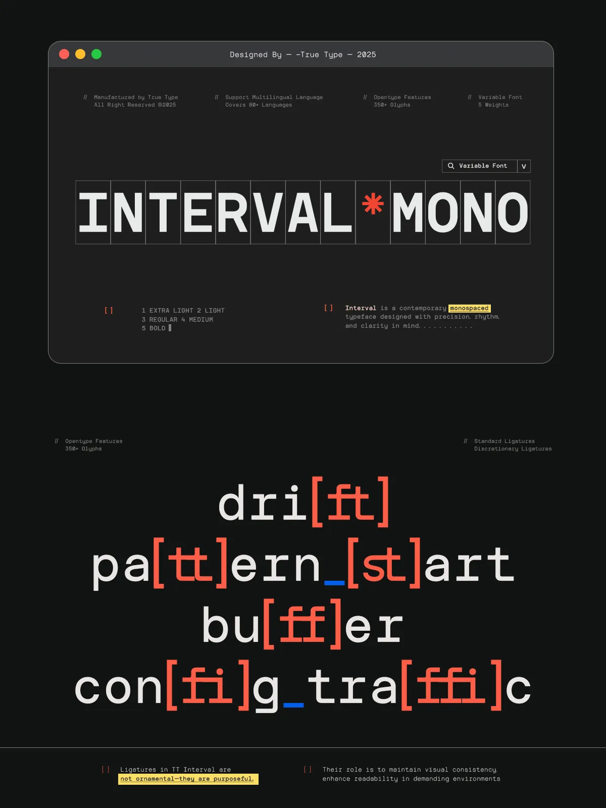
- Advanced ligatures for improved text flow
- Small caps, old-style and lining figures, fractions, and numerators/denominators
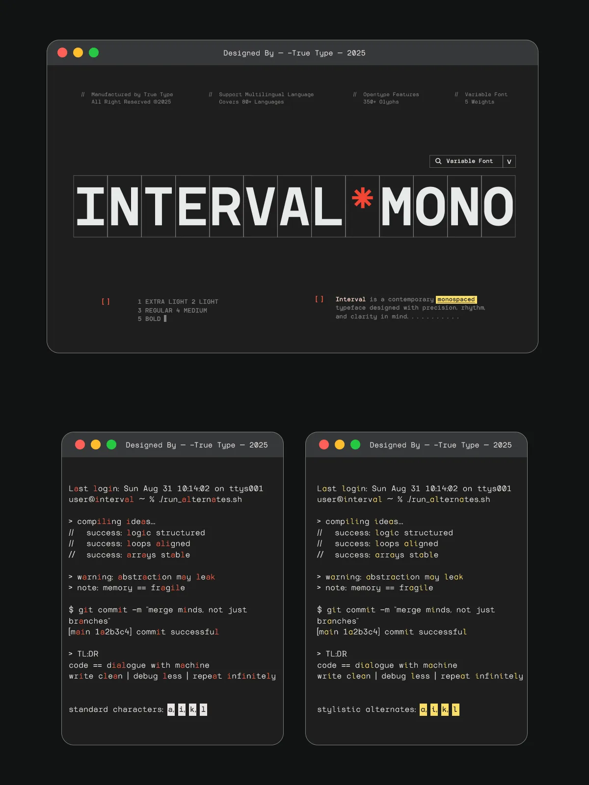
- Contextual alternates and stylistic sets for creative variation
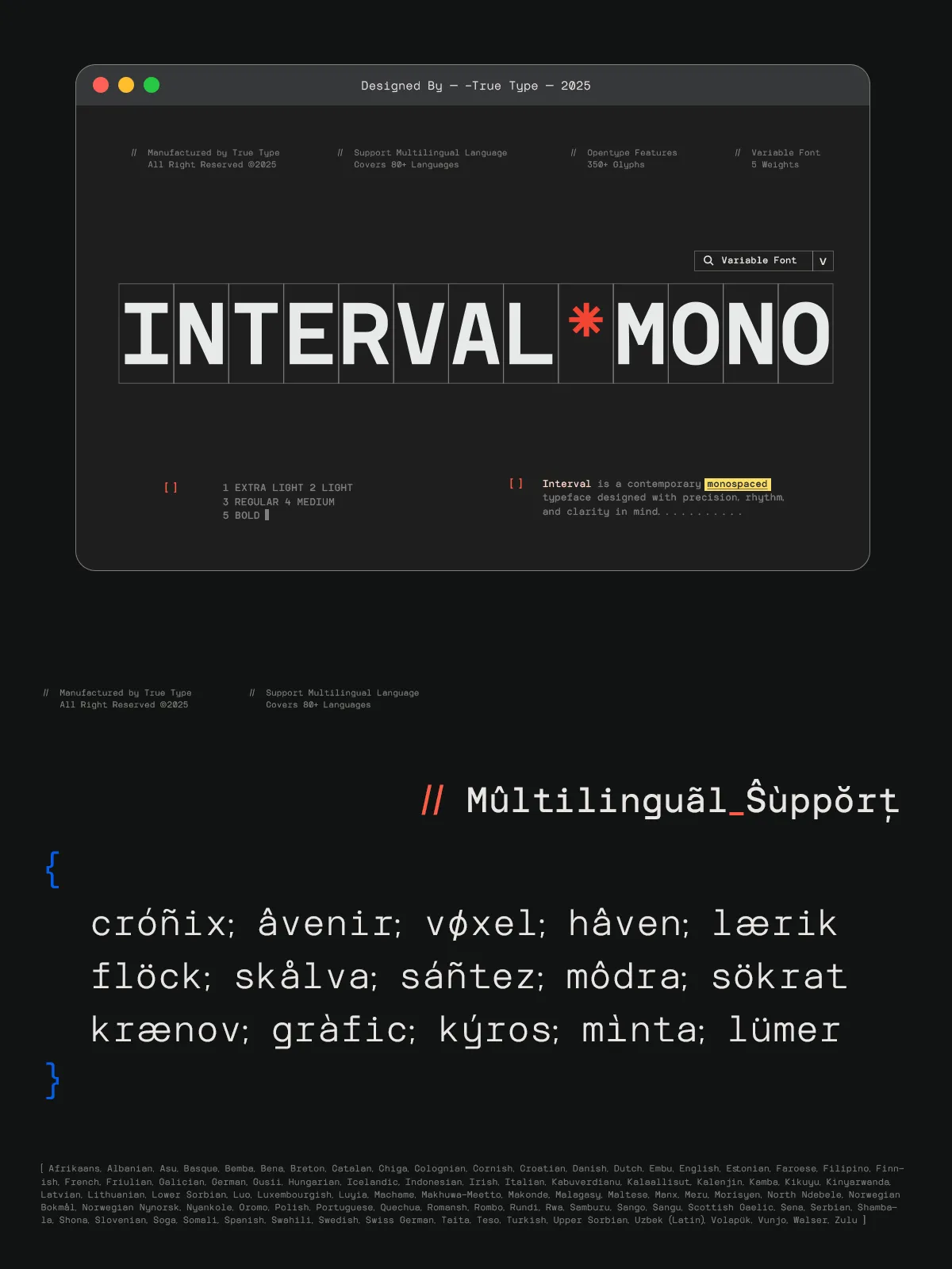
- Full language coverage for Latin, Cyrillic, Greek, and extended European scripts
- Support for variable font (WOF2/VF) formats for scalable on-screen performance
With true kerning pairs and intelligent hinting across all weights, TRT Interval ensures typography remains sharp, readable, and consistent—across platforms, devices, and screen sizes.
Seamless Integration Across Design Ecosystems
TRT Interval is purpose-built for modern workflows:
- Adobe Creative Suite — fully compatible with Photoshop, Illustrator, InDesign, and After Effects.
- Web environments — use WOFF2 embedding for lightning-fast loading and optimal SEO performance.
- Design tools — seamlessly integrates with Figma, Sketch, Affinity Designer, and Adobe XD.
- Developer tools — ideal for terminal themes, syntax highlighting, and code blocks in documentation.
No matter where you work, TRT Interval fits in without friction.
Best Practices for Maximum Impact
- Pair with a clean sans-serif — such as Inter or Montserrat — for body text to create contrast without losing coherence.
- Use condensed weights for tight layouts — ideal for sidebars, navigation, or mobile menus.
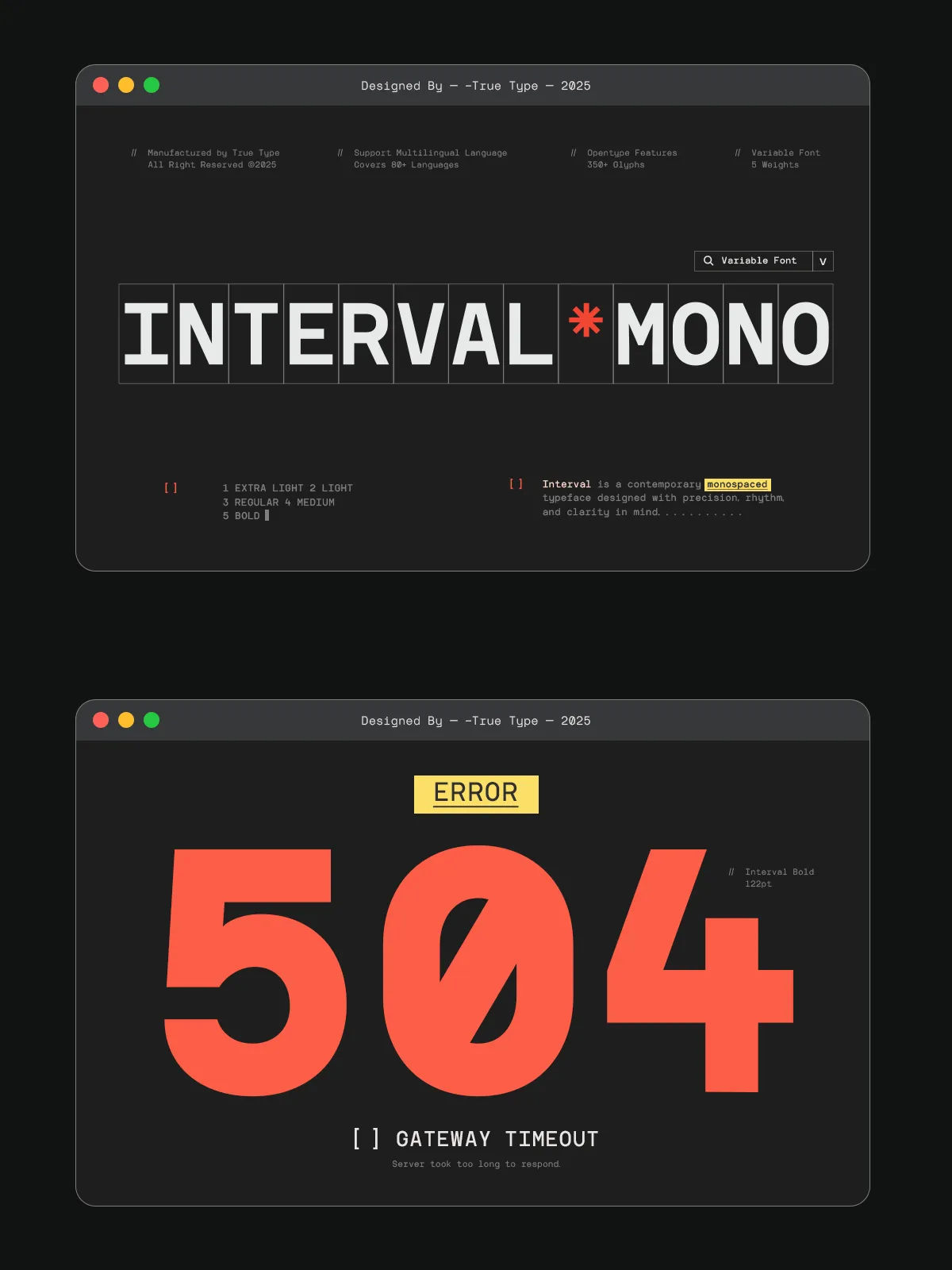
- Apply expanded weights to headlines — to create visual authority in banners, posters, or landing pages.
- Opt for italics in pull quotes — the true italic style adds narrative depth without compromising readability.
- Always test at smaller sizes — TRT Interval maintains clarity down to 10px, ideal for small UI elements.
License & Commercial Use
TRT Interval is available under a flexible commercial license. It supports single-user desktop use, web embedding, app integration, and product packaging. Volume licenses are available for agencies, enterprises, and software platforms. Custom builds—including support for additional languages or glyph variants—are available upon request. Designed for freedom, innovation, and legal clarity, TRT Interval empowers creators to build without boundaries.
Unlock Your Next Project with TRT Interval
Stop relying on fonts that compromise clarity for style—or efficiency for appearance. With TRT Interval, you get both. This is typography that understands purpose, performance, and beauty—unified in a single, powerful typeface. Download the full family today and transform how your words are seen, read, and remembered. Whether you’re coding the future, writing a brand story, or designing an interface for human connection, TRT Interval ensures your work stands out—not just for what it says, but how it says it.