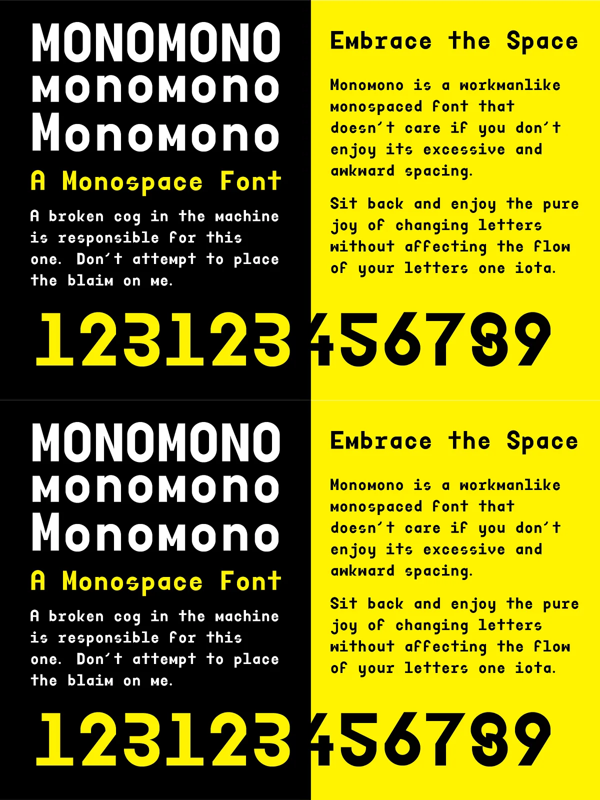
Step into the industrial heart of typography with Monomono — not just a font, but a design philosophy. Born from personal experimentation, this monospaced typeface refused to be tamed. It started as a private project, a little rebellion against conventional spacing and rigid alignment. But then, something unexpected happened: it caught fire. Now, Monomono is a full-blown, chunky, unwieldy creative force — and it’s entirely uninterested in conforming to your expectations.
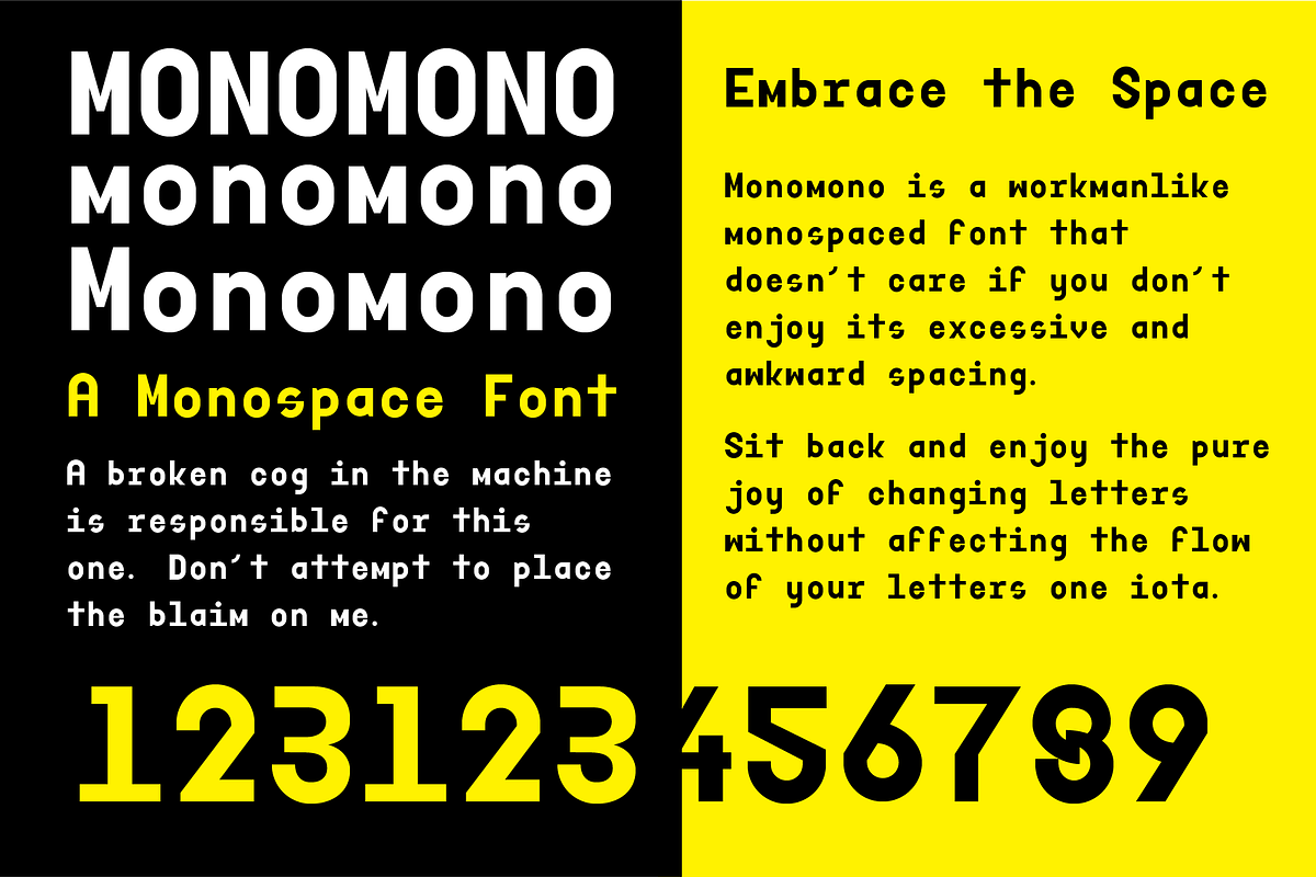
Monomono doesn’t care if you like its awkward spacing. It doesn’t apologize for its excessive letter gaps. And most importantly — it refuses to kern. That’s not a flaw. That’s a feature.
Design with Freedom, Not Constraints
Monomono is built for creators who value expression over perfection. When you use this font, you’re not just typing — you’re making a statement. The lack of kerning means that spacing stays consistent across all characters, so changing one letter doesn’t disrupt the rhythm of your layout. That’s not a bug. It’s design integrity.
Perfect for:
- Coding and terminal UIs — where uniform spacing is essential, and visual chaos is part of the aesthetic.
- Avant-garde posters and experimental layouts — where rhythm and structure are more important than traditional readability.
- Artistic headlines and editorial design — where boldness and unpredictability elevate the visual drama.
- Branding for radical, industrial, or “do-it-yourself” aesthetics — because Monomono already has a personality.
• The Beauty of Chaos
Its exaggerated character spacing doesn’t break the flow — it defines it. Every line feels like it’s marching forward with its own momentum, independent of neighboring letters. It’s not messy. It’s intentional. It’s typography with attitude.
• A Font That Owns Its Weirdness
Monomono doesn’t try to be subtle. It doesn’t hide. It doesn’t flatter. It’s proud of being chunky, industrial, and slightly awkward. It’s the font for artists who refuse to bow to design norms, and for developers who want their code snippets to look like poetry.
Structure That Speaks for Itself
Monomono is a single-style font family, designed with a clear mission: eliminate the burden of fine-tuning spacing. There are no stylistic alternates, no ligatures to confuse the flow. Just clean, consistent, character-by-character spacing across all text.
This makes it ideal for use in:
- Text editors and IDEs
- Art installations and physical typographic displays
- Minimalist or maximalist branding where contrast is key
- Fonts used in generative art and digital glitch aesthetics
Future-Ready, But Not in the Way You Expect
There’s a kerned version on the horizon — but only if one day you really, truly miss the control of fine-adjusted spacing. Until then, enjoy the freedom of design without responsibility. Monomono is a font that says: “Here’s your canvas. Now do something real with it.”
Delivered in OTF – Made for Creative Workflows
Monomono is available in OTF (OpenType) format, ensuring compatibility with industry-standard design tools:
- Adobe Creative Suite (Illustrator, InDesign, Photoshop)
- Figma, Sketch, Affinity Designer, and CorelDRAW
- Microsoft Office (2010 and later)
- Web integration via WOFF/woff2 for dynamic, responsive websites
No compromises. No extra steps. Just pure, unfiltered typography.
Commercial License – Use It Without Limits
Monomono comes with a full commercial license, so you can use it freely in:
- Branding and identity design
- Print and digital advertisements
- App and website interfaces
- Merchandise, packaging, and promotional materials
- Client projects and public-facing deliverables
No credits. No hidden fees. Just you, your project, and the uncompromising power of Monomono.
Make Your Mark with Monomono – The Font That Doesn’t Care
When you choose Monomono, you’re not opting for ease. You’re choosing truth in design. You’re choosing a typeface that refuses perfection — and in doing so, finds its own kind of brilliance.
Download Monomono today and let your work speak in its own loud, clear, unfiltered voice.