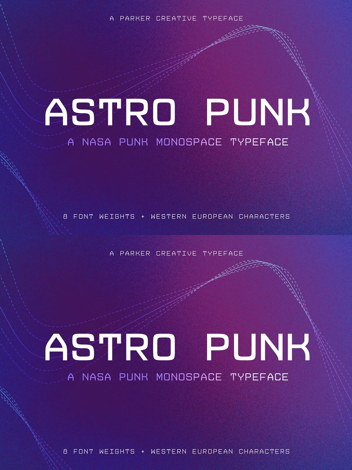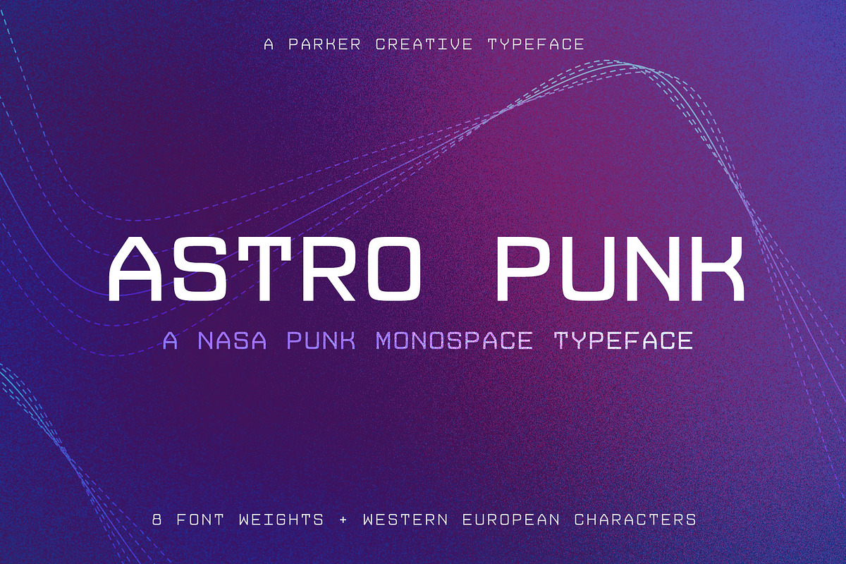
Astro Punk channels the raw, boxy aesthetic of early computer consoles used during the 1960s Space Race. This original, retro-futuristic monospace typeface delivers a low-resolution, technical look while preserving clear legibility and strong character distinction. Designers who need a typeface that reads like instrumentation, terminal displays, or technical schematics will find Astro Punk purpose-built for those tasks.
Each glyph exhibits the measured, mechanical geometry of vintage hardware readouts while remaining modern and practical for contemporary workflows. Astro Punk emphasizes recognizable character sets, stylized numerals, and expressive symbols that perform reliably across technical documentation and space-themed creative projects. For a reference listing and vendor page, see the Astro Punk entry on FontPath: [Astro Punk Font – FontPath](https://www.fontpath.com/font/T22545/astro-punk).
Key Features
- True Monospace Metrics: Every character occupies the same horizontal space so text aligns precisely without kerning adjustments.
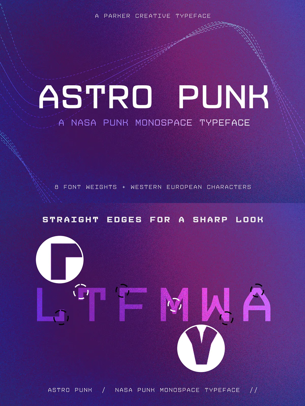
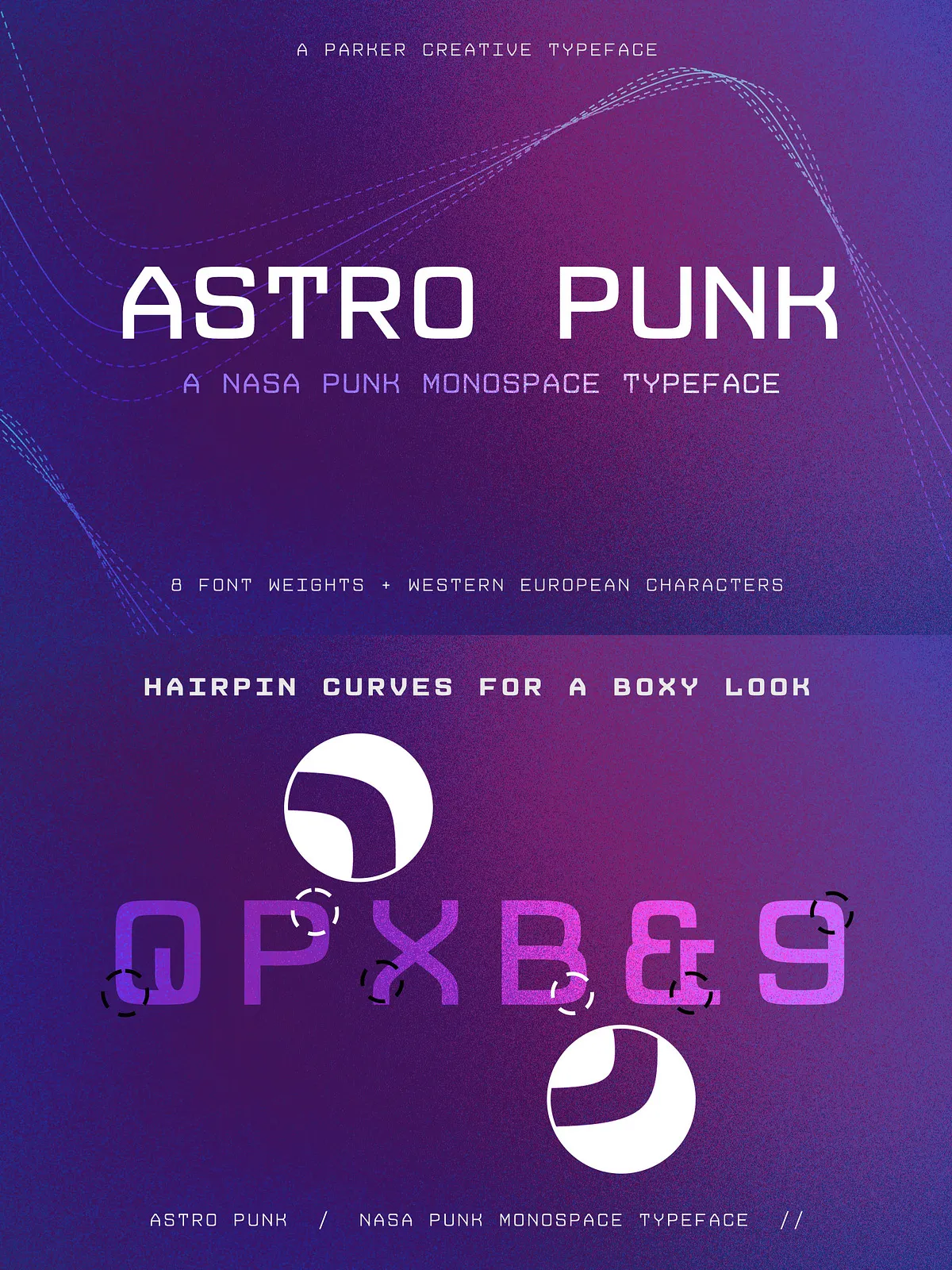
- Retro-Futuristic Aesthetic: Boxy, low-resolution shapes evoke vintage computer consoles and space program interfaces.
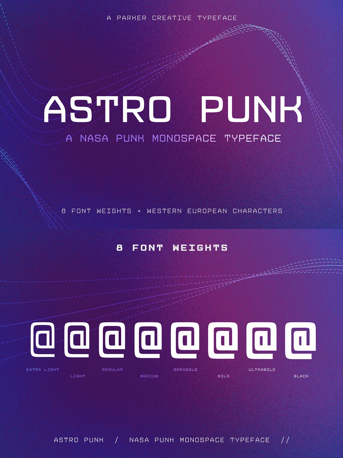
- Wide Range of Weights: Multiple, carefully balanced weights—mathematically instanced—ensure consistent detail across light to bold styles.
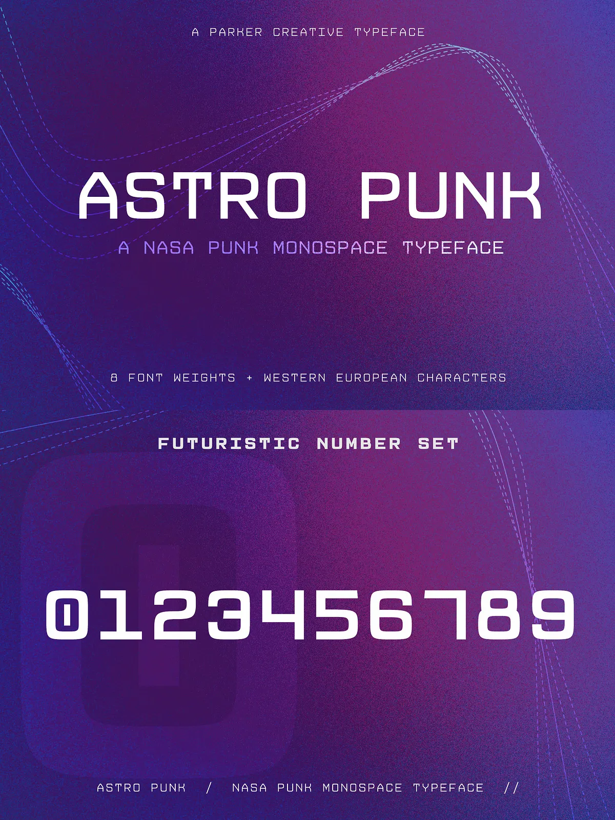
- Technical-Grade Numerals & Symbols: Highly stylized number sets and symbols support architectural drawings, schematics, and data displays.
- Western European Character Support: Includes essential Latin characters and punctuation for most Western European languages.
- Engineered for Precision: Designed for predictable rendering in design apps, CAD mockups, and code-like layouts.
Why Choose Astro Punk
Astro Punk performs where accuracy, alignment, and period-specific style matter. Use it to evoke the tactile, engineered feel of mid-20th-century computing while leveraging modern font production quality. The typeface balances nostalgia with technical rigor: shapes stay faithful to the retro inspiration while maintaining clarity at small sizes and robustness at display scale.
Practical Applications
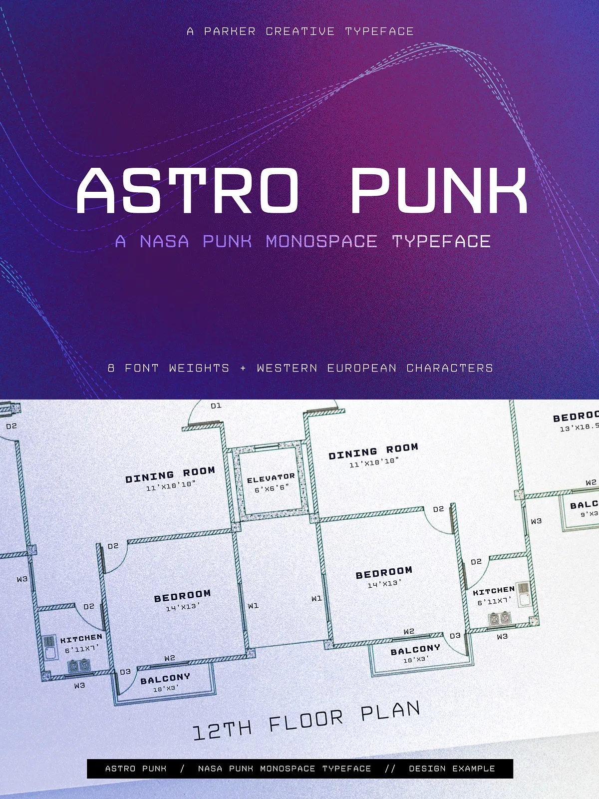
- Architectural Documents & Construction Drawings: Rely on consistent monospace metrics for dimension tables, legends, and schematic annotations.
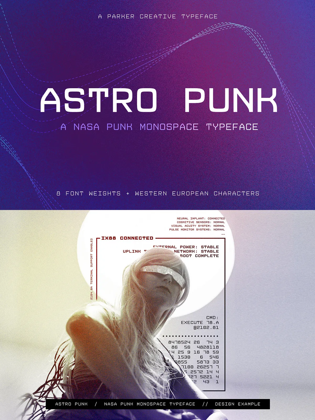
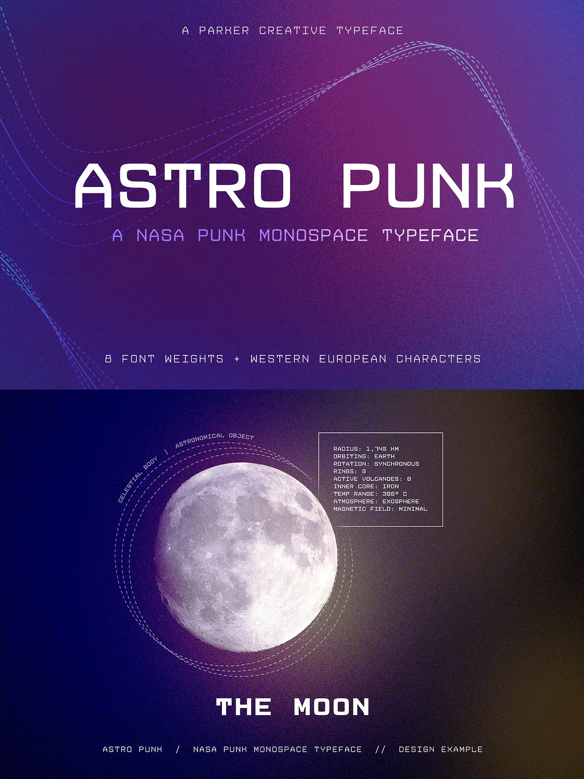
- Space-Themed Branding & Design: Use on packaging, posters, and event materials to create an authentic Space Race visual identity.
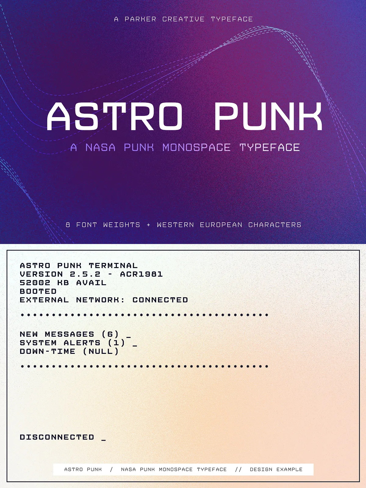
- Technical Interfaces & HUDs: Integrate into UI mockups, dashboards, and heads-up displays to achieve a retro-technical look.
- Editorial & Poster Typography: Apply to headlines and callouts that require bold, mechanical presence.
- Film, TV, & Game Graphics: Implement for onscreen console readouts, in-game terminals, or science-fiction set dressing.
Technical Details & Compatibility
Astro Punk ships as a professionally produced font family with multiple weights. The family is mathematically instanced to keep stroke contrast and spacing consistent across weights, preserving detail and legibility. Because it is a true monospace font, designers do not need to add kerning to achieve optical alignment—columns, tables, and stacked text will remain visually aligned by default.
- File formats: Standard desktop and web font formats (OTF/TTF/WOFF) depending on the vendor package.
- Character set: Western European Latin, numerals, punctuation, and extended symbol set for technical use.
- Weights: Multiple weights from light to bold, each balanced to preserve the typeface’s cubic character at every weight.
- Supported environments: Works in Adobe Creative Cloud apps, Affinity, Figma, Sketch, popular CAD export workflows, and modern web browsers (when webfont formats are included).
Licensing & Delivery
Astro Punk is typically distributed through type vendors and foundries; licensing options vary by seller and intended use (desktop, web, app, broadcast). Confirm the license terms on your vendor page before deploying the font in commercial projects. For vendor details and purchase options, consult the Astro Punk listing: [Astro Punk Font – FontPath](https://www.fontpath.com/font/T22545/astro-punk).
How to Use & Best Practices
Apply Astro Punk for monospace-driven interfaces, tabular data, and period-inspired branding. Use it in combination with a neutral sans for body copy to highlight headings and technical callouts. For maximum authenticity, pair Astro Punk with grid-based layouts, vector line-art, and muted space-age color palettes that complement its mechanical geometry.
Quick Tips
- Keep body text in a readable sans serif; reserve Astro Punk for headings, labels, and technical readouts.
- Use fixed-width containers and CSS monospace settings for consistent alignment on the web.
- Test numerals and symbols in context (tables, dimension lines) to ensure the stylized numbers read clearly at intended sizes.