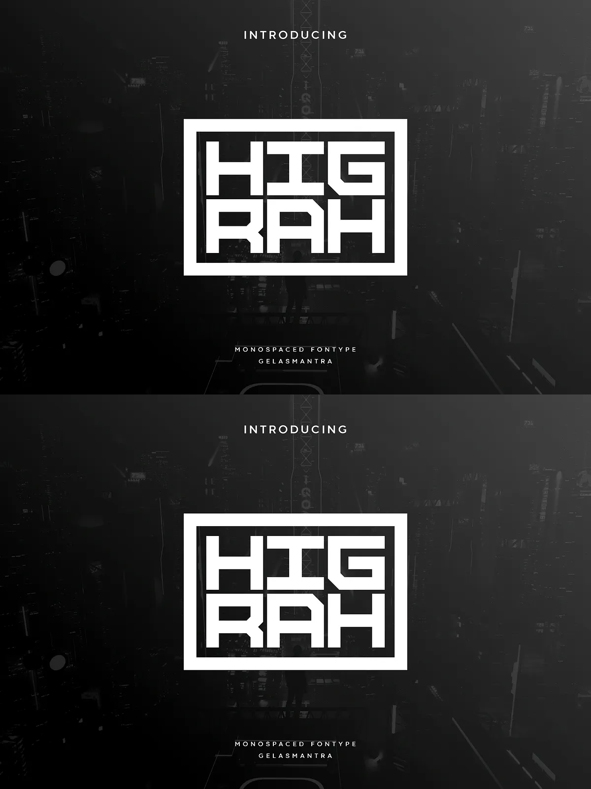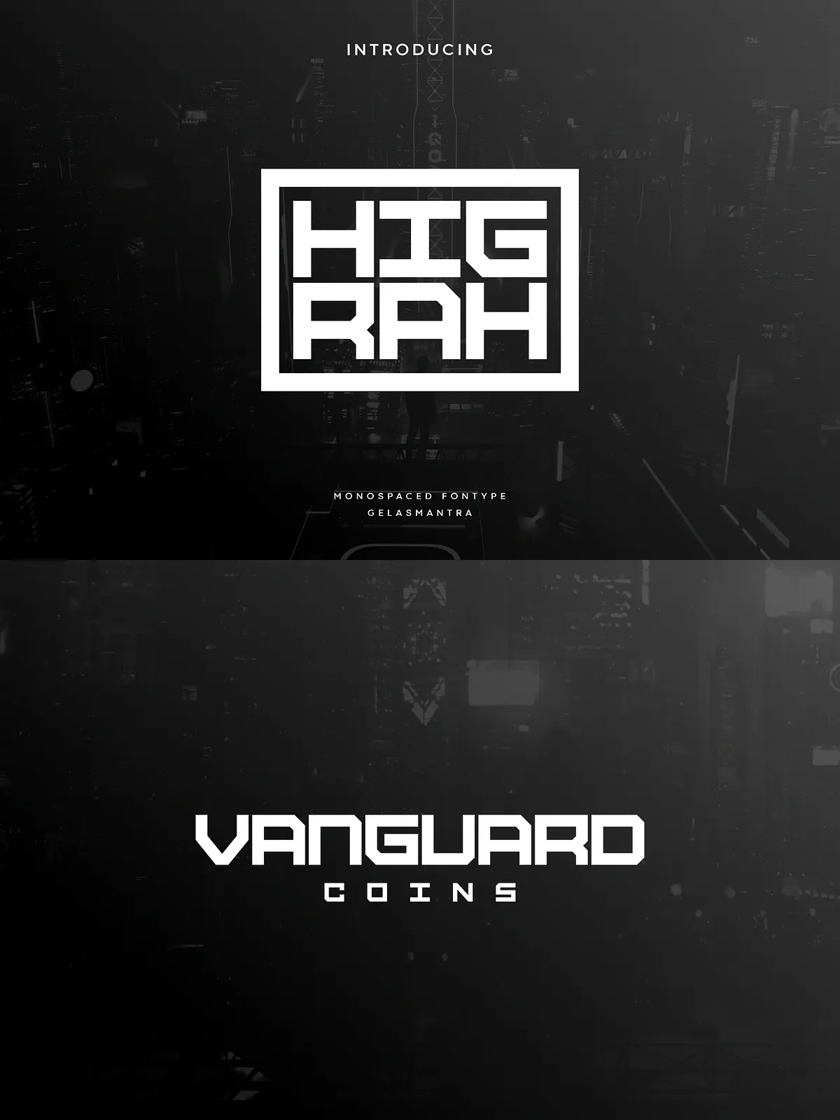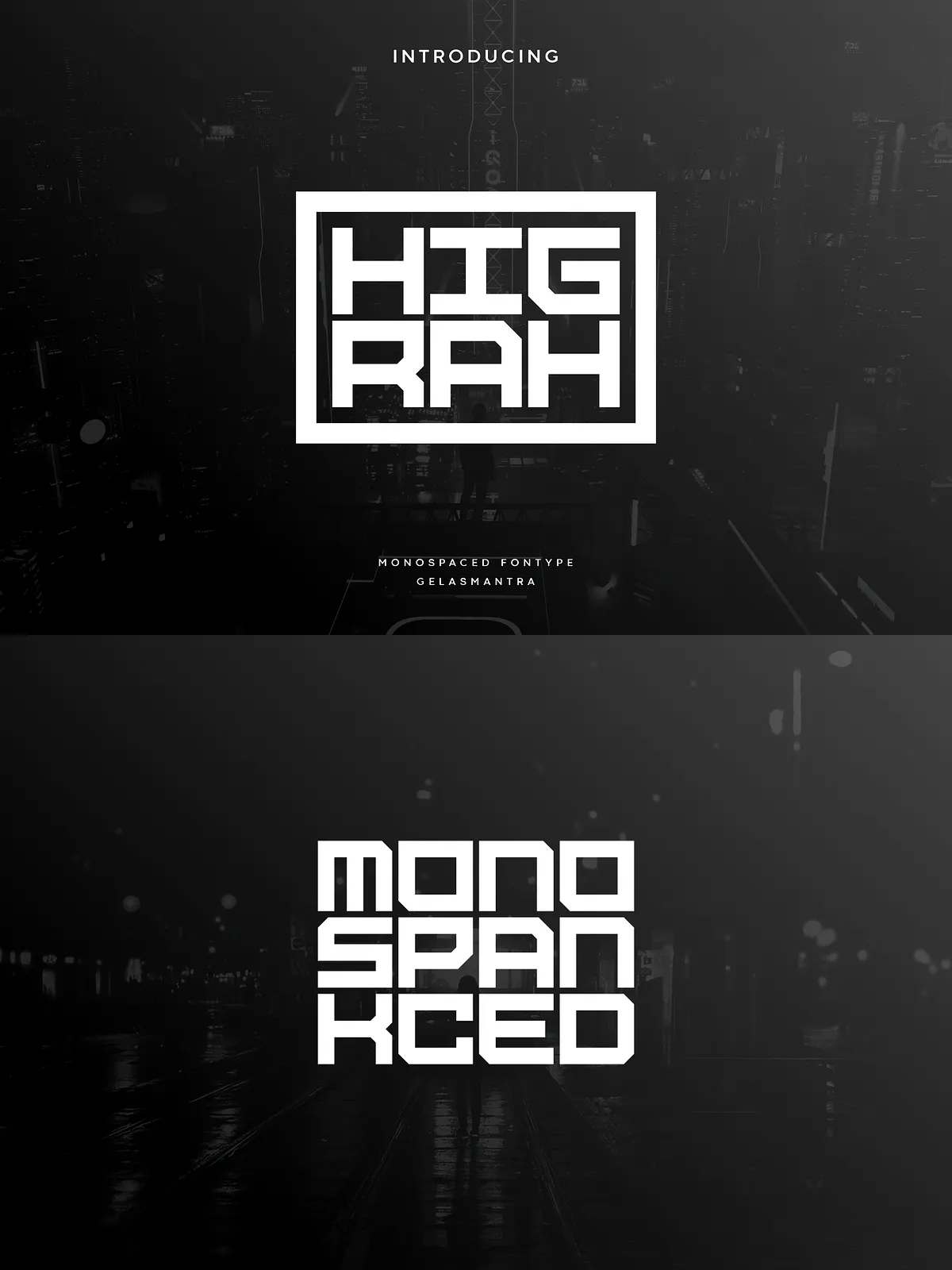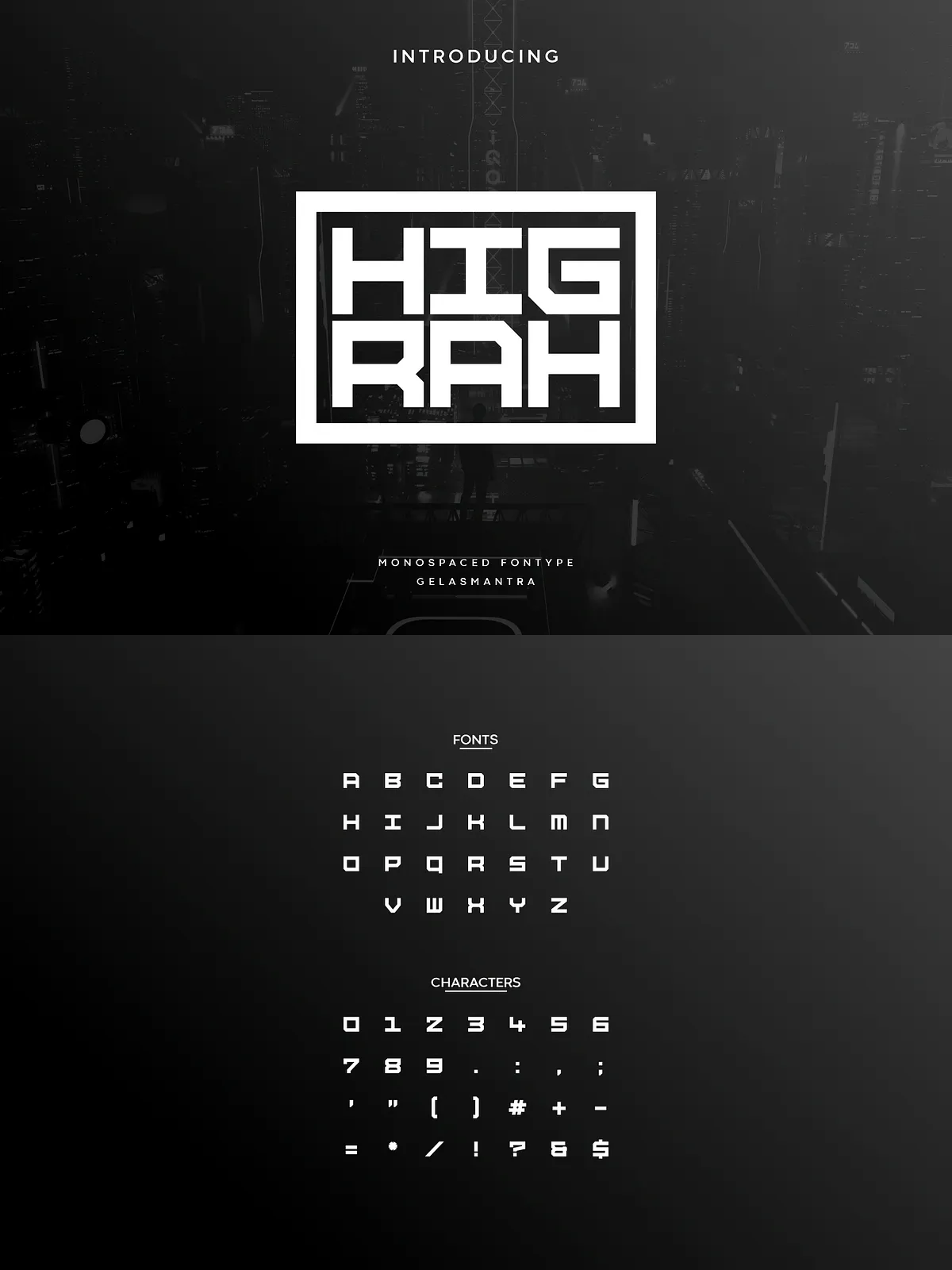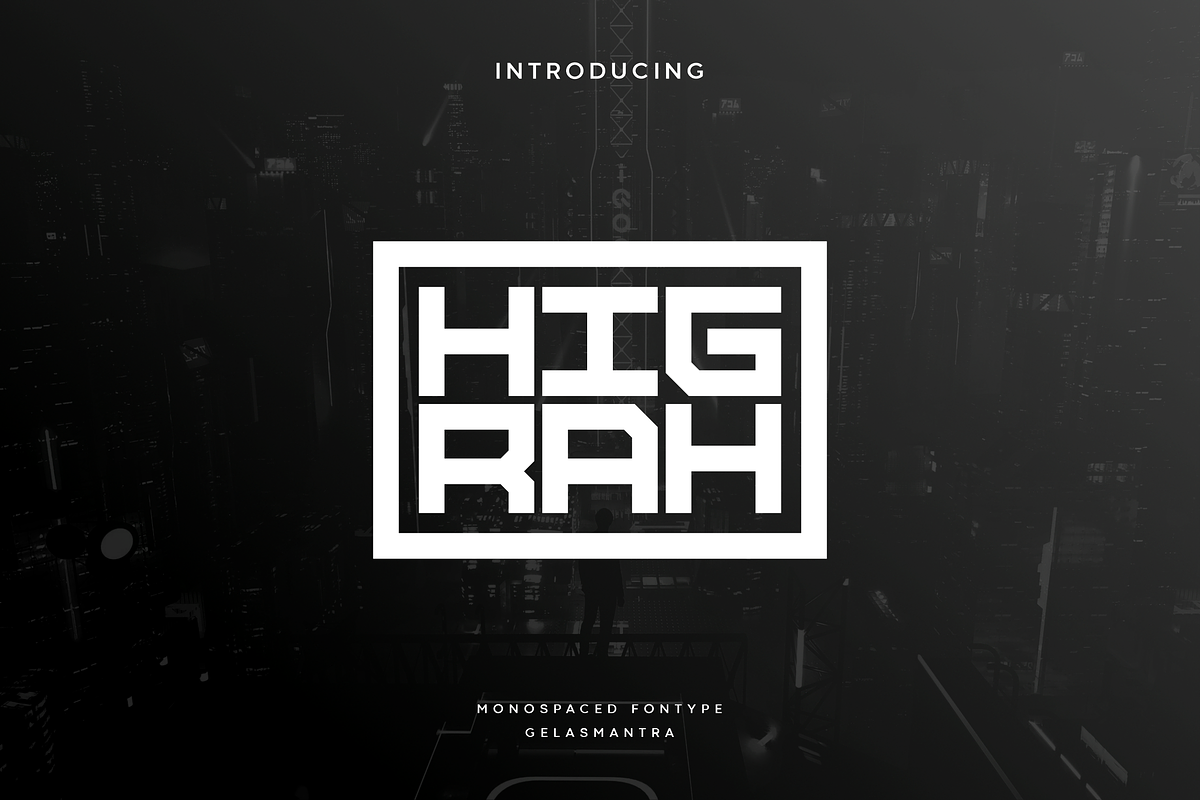
Higrah is an industrial monospace typeface that delivers a strong, masculine presence through squared letterforms and a distinctive approach to capitalization. Designed to communicate precision and technical clarity, Higrah works exceptionally well in display contexts where clarity and attitude matter. Use it to anchor titles, logos, posters, and technical illustrations that require a confident visual voice.
For a reference listing and sample visuals, see the online preview: [Higrah Font – Free Font – iFonts](https://ifonts.xyz/higrah-font.html).
Key Features
- Industrial Monospace Structure: Fixed-width glyphs create a consistent rhythm that enhances technical layouts and grid-based compositions.
- Square Geometry: Hardened terminals and square counters emphasize rigidity and engineered form, reinforcing an industrial aesthetic.
- Unique Capitalization Style: Distinct treatment of uppercase characters gives headlines and brand marks a memorable, sculpted silhouette.
- High Visual Impact: Strong strokes and compact spacing deliver boldness at large sizes while maintaining legibility in headlines and logos.
- Multilingual Support: Includes accented characters to support a range of Latin-based languages (confirm included glyph set with vendor).
Design Characteristics
Masculine and Technical Tone
Higrah reads as assertive and engineered. The square terminals and equalized glyph widths produce a precise rhythm that designers can use to convey structure, technical competence, and urban or industrial themes.
Geometry and Readability
Although Higrah emphasizes geometric rigidity, it maintains readable counters and distinctive letter shapes to avoid confusion between similar glyphs. This balance makes the font effective for both display headlines and information-driven graphics.
Practical Use Cases
Logos and Wordmarks
Leverage Higrah’s strong silhouettes to create compact, high-impact logos. The capitalization style can become a signature element in brand identities targeting technology, engineering, industrial manufacturing, and urban lifestyle sectors.
Titles, Posters, and Packaging
Use Higrah for prominent titles and poster headlines where an authoritative look is required. Its square forms translate well to packaging, product labels, and apparel graphics that demand a modern, engineered appearance.
UI, Dashboards, and Technical Documentation
Because of its monospace nature, Higrah suits grid-based interfaces, dashboards, or signage where alignment and consistent character width simplify layout and improve scannability.
Technical Details & Formats
- Common Deliverables: Check vendor packages for TTF/OTF formats and webfont options (WOFF/WOFF2) if you plan to embed the font online.
- OpenType Features: Verify whether alternates or contextual features are available. Some monospace display fonts may include stylistic alternates accessible via OpenType or PUA slots.
- Installation & Use: Install desktop fonts (TTF/OTF) for design apps and include webfont formats through @font-face or a webfont host for websites.
Pairing and Styling Tips
Complement with Neutral Sans
Pair Higrah with a neutral sans-serif for body copy to maintain readability and to let Higrah carry the display weight. A humanist or neo-grotesque sans will balance Higrah’s industrial hardness.
Contrast with a Soft Serif
For editorial or lifestyle projects, introduce a warm, low-contrast serif for long-form text. The serif’s softness offsets Higrah’s geometry and creates a compelling typographic hierarchy.
Licensing and Distribution
Always confirm licensing terms before deploying Higrah in commercial projects. Licenses typically vary between desktop, web, app, and extended commercial use. Review embedding rights if you intend to package the font with products or redistribute it in any form.
Included Glyphs and Support
Higrah commonly includes uppercase, lowercase, numerals, punctuation, and accented characters. Confirm the full glyph set and Unicode coverage with the vendor so you can plan multilingual projects without surprises.
Getting Started
Download the font package from your trusted vendor, inspect the included documentation, and test sample glyphs at target sizes. When composing with Higrah, experiment with tight tracking for compact wordmarks and loosened tracking for larger display headlines to control perceived weight. Apply consistent baseline and grid alignment to exploit the monospace rhythm and achieve precise visual layouts.