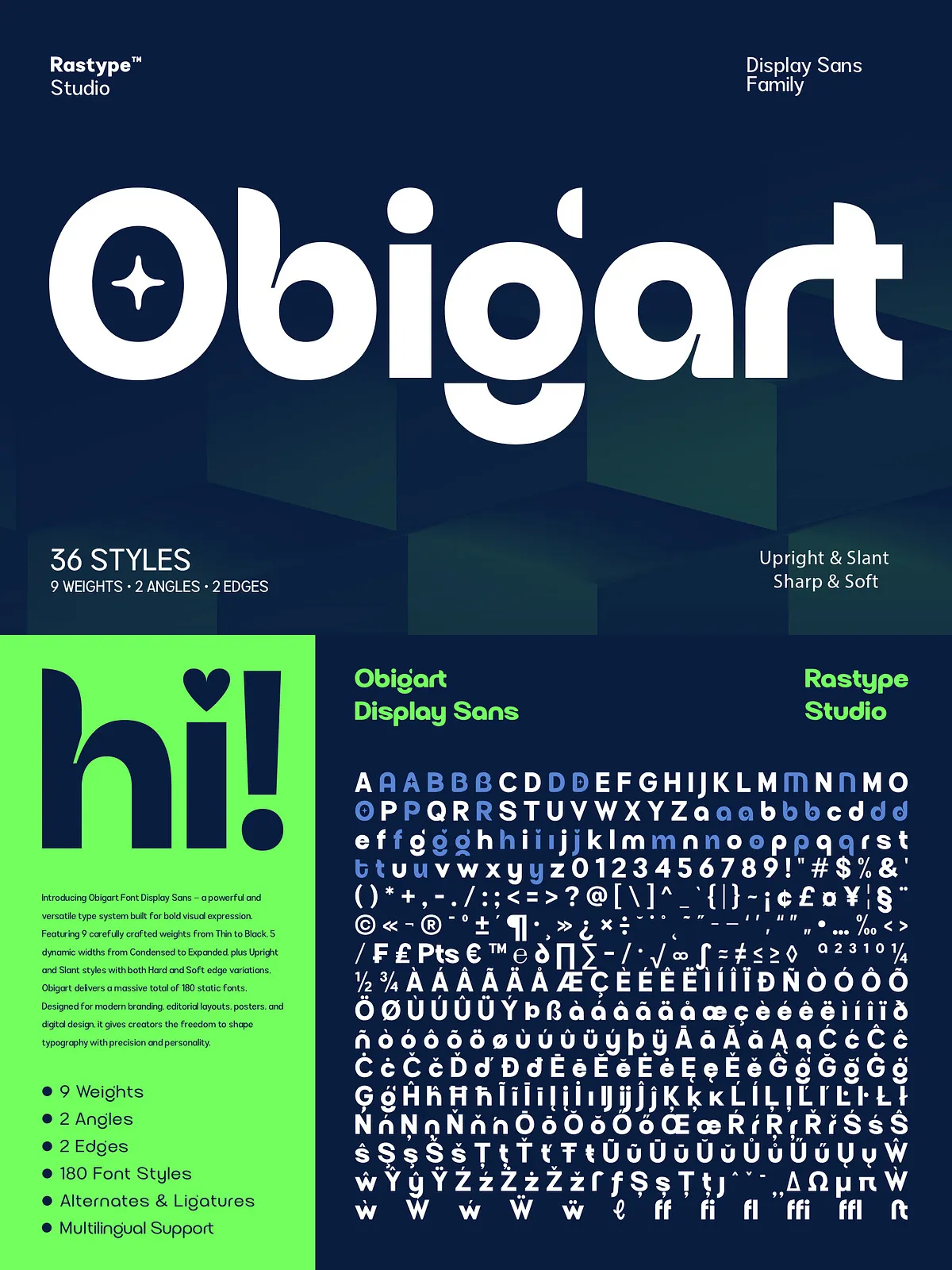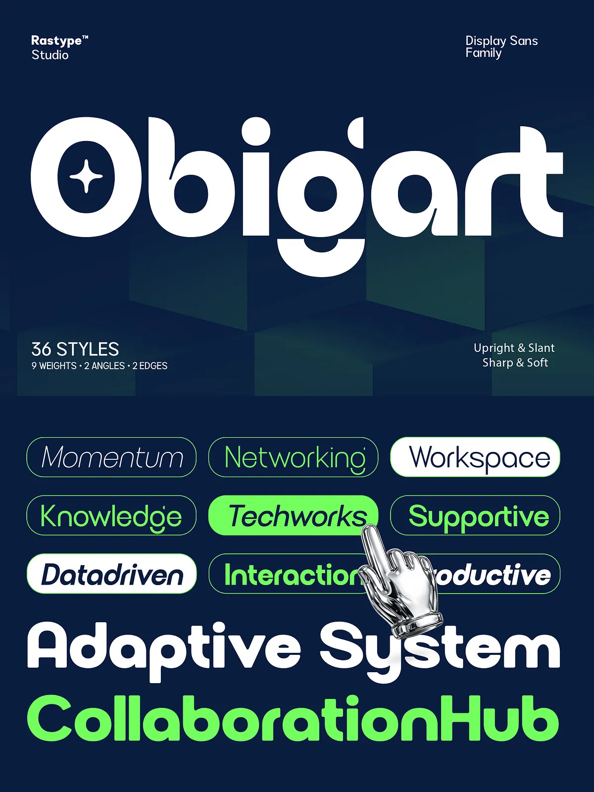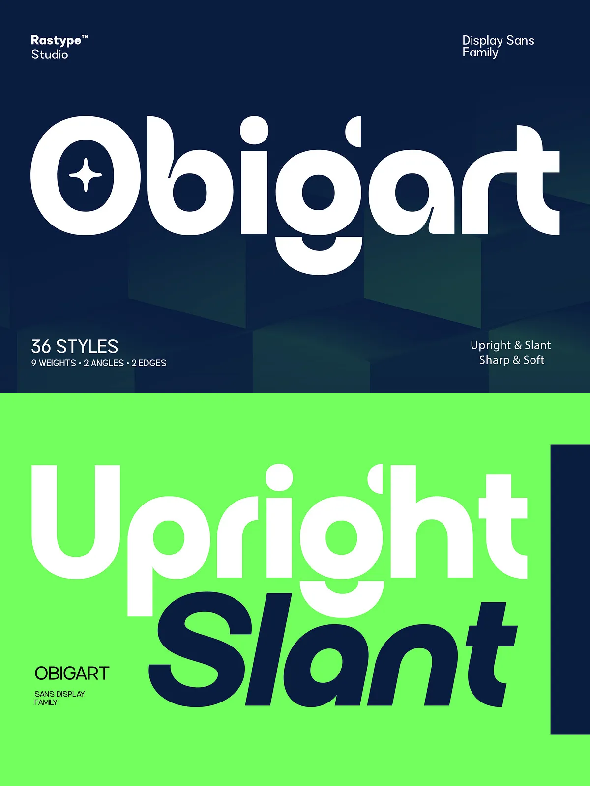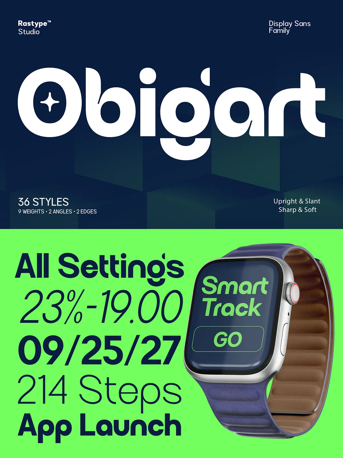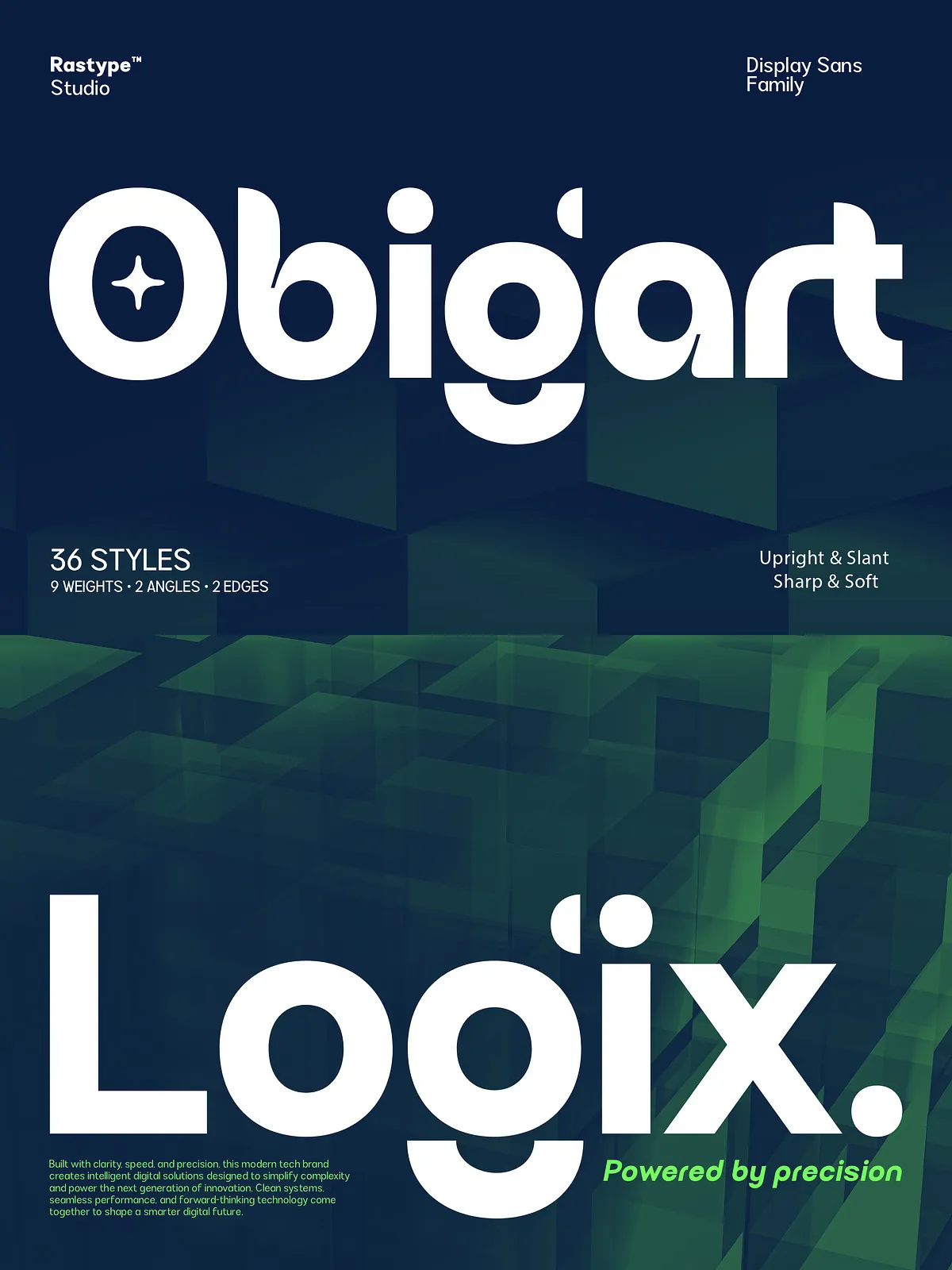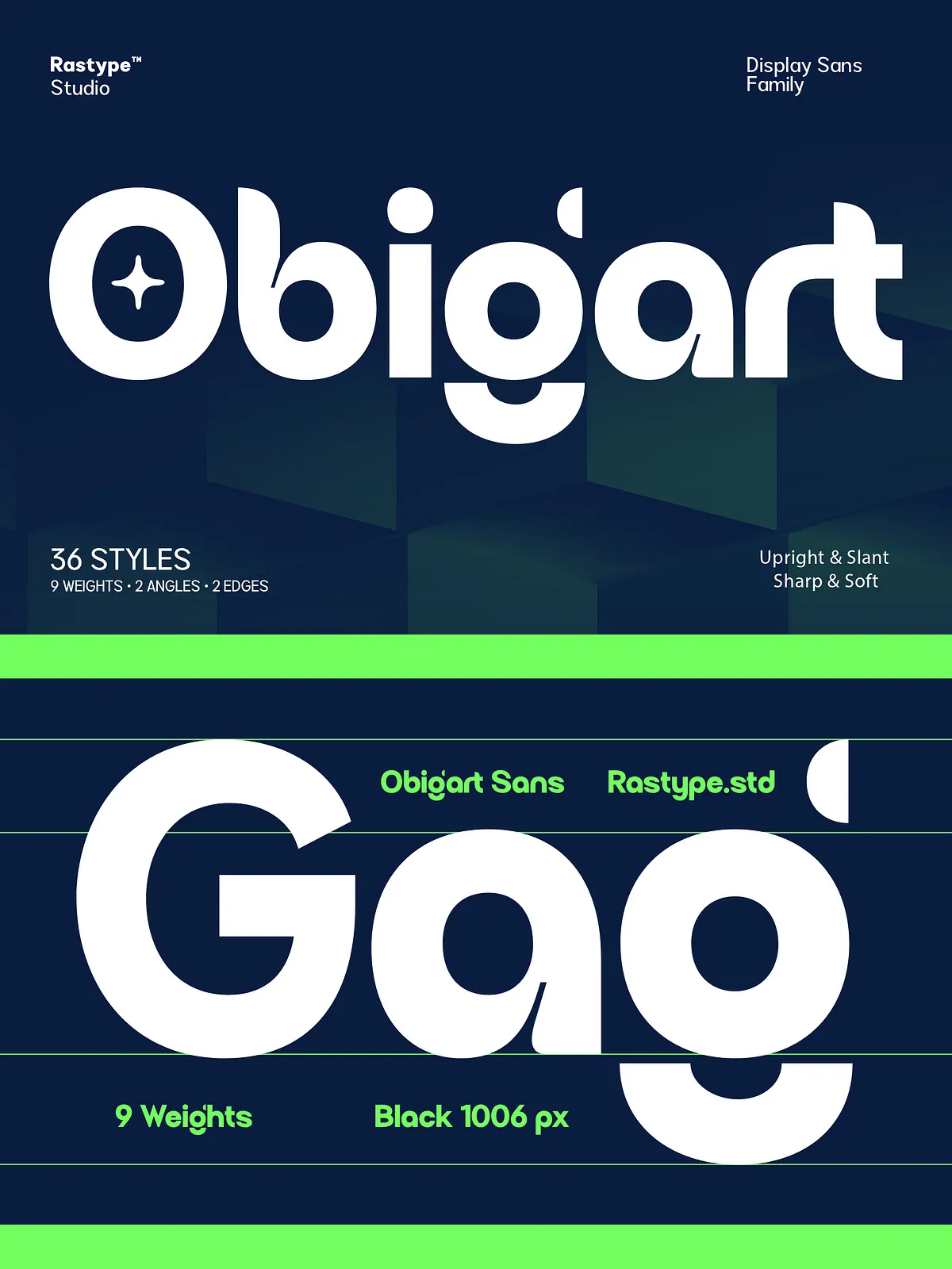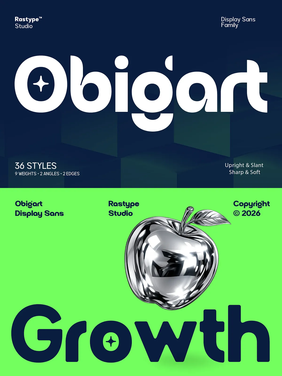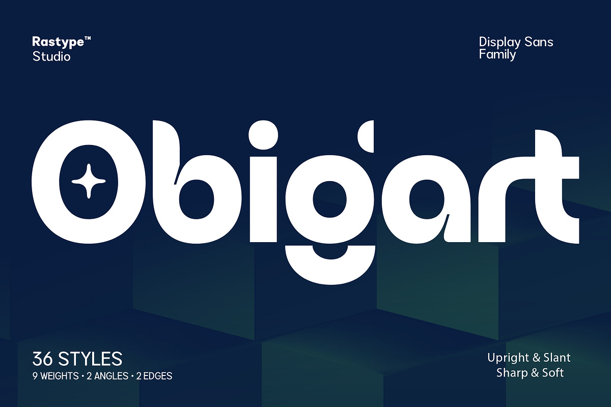

Obigart delivers a confident, modern voice through smooth geometric curves and robust proportions. Designed to perform across large-scale headlines and tight, attention-grabbing layouts, Obigart combines minimalism with friendly character details. The family includes multiple weights, upright and slanted variants, and sharp and soft edge options so designers can craft consistent systems that energize brands, campaigns, and products.
Key Features
Geometric Construction with Human Touch
Obigart balances a precise geometric skeleton with subtle humanist details. The result reads as contemporary and approachable: shapes feel engineered for clarity, while terminals and counters include small idiosyncrasies that avoid cold uniformity.
Multiple Weights and Styles
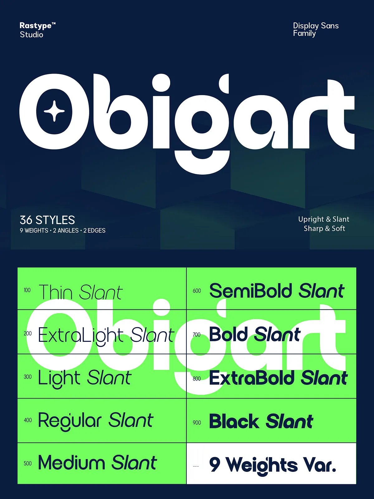
The family provides a broad weight range from light to extra bold, plus upright and slanted (italic) versions. Designers gain flexible typographic hierarchy and the ability to maintain voice across headlines, subheads, and display treatments.
Sharp and Soft Edge Variants
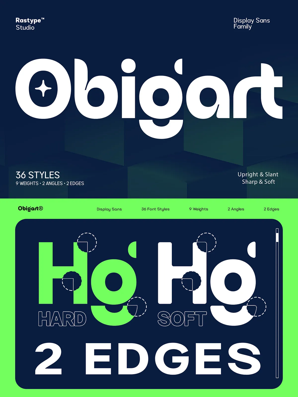
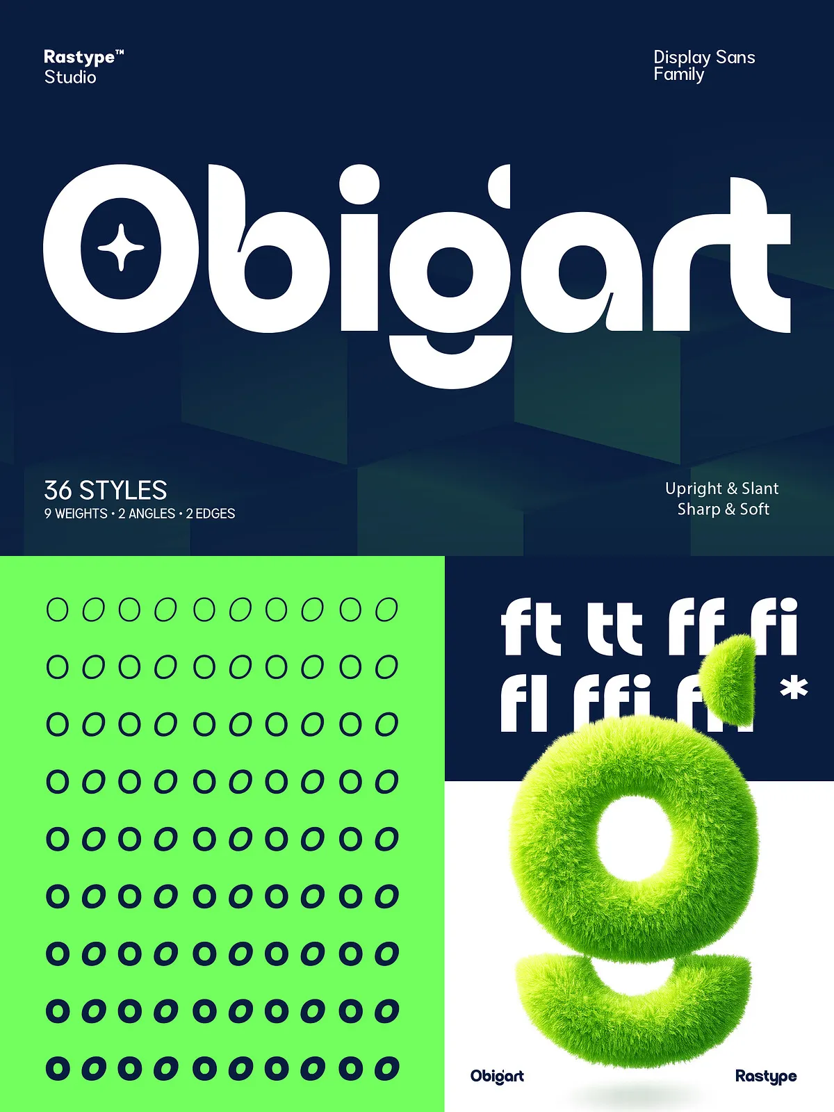
Choose between sharp-edge styles for a cutting, futuristic aesthetic or softened-edge cuts for warmer, friendlier applications. Both variants maintain consistent metrics so switching between them stays effortless during layout and branding workflows.
Outstanding Legibility and Presence
Obigart preserves excellent readability at large sizes while retaining strong recognition in shortened, bold headlines. Letterforms maintain generous counters and clear apertures to maximize clarity in print and digital contexts.
Recommended Uses
Branding and Identity
Obigart acts as a commanding primary or secondary brand typeface. Use heavier weights for wordmarks and shorter logotypes, and lighter weights for supporting brand materials to create a coherent, versatile identity system.
Advertising and Posters
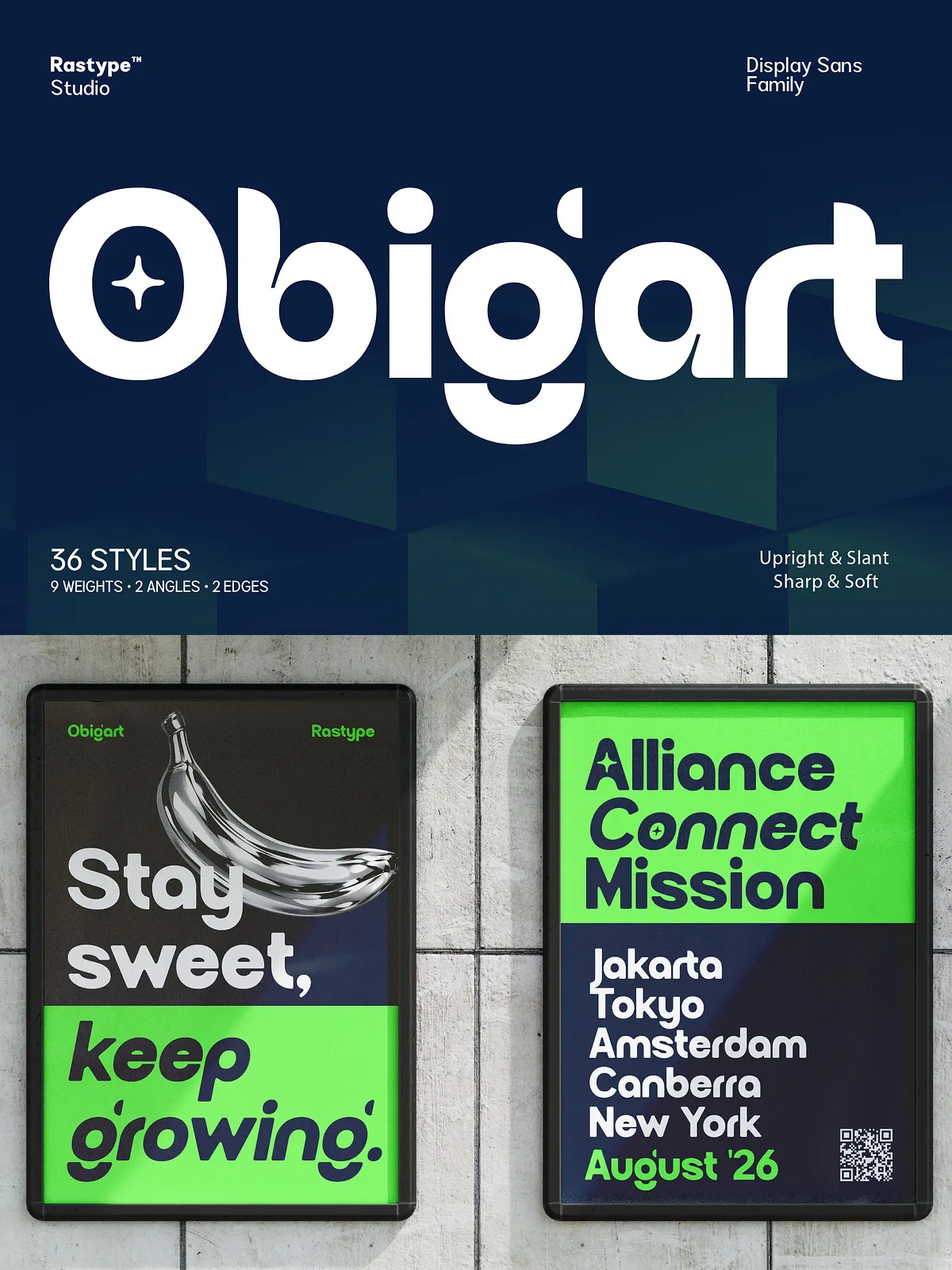
The family performs strongly in high-impact advertising and poster design. Its geometric bolds cut through visual noise and deliver instant legibility in outdoor, transit, and digital ad placements.
Packaging and Product Design
Obigart adapts to product labels and packaging through its weight and edge choices. Soft-edge variants pair well with organic or craft products, while sharp-edge styles emphasize premium, tech, or industrial positioning.
Editorial and Digital Layouts
Use Obigart for striking magazine covers, section headers, and hero web headlines. Its slanted styles provide energetic emphasis without sacrificing typographic control across responsive breakpoints.
Design and Pairing Tips
Pair with a Neutral Sans or a Reliable Serif
Complement Obigart with a neutral sans for body copy when you want a unified, minimalist feel. For more contrast and editorial flair, pair Obigart with a readable serif for long-form content to create a clear typographic hierarchy.
Use Edge Variants Strategically
Reserve sharp-edge Obigart for technology, architecture, or luxury contexts where precision amplifies the message. Opt for soft-edge versions on consumer-facing products and lifestyle brands to communicate warmth and accessibility.
Color and Scale
Obigart thrives in high-contrast color schemes and bold palettes. Scale the heavier weights for hero headlines and reduce tracking slightly for compact display use. Lighter weights and slanted styles excel in secondary headings and pull quotes.
Technical Details
- Formats: OTF/TTF included; webfont formats (WOFF/WOFF2) available on request
- Styles: Multiple weights, upright and slanted styles, sharp-edge and soft-edge variants
- Compatibility: Works with Photoshop, Illustrator, InDesign, Figma, Sketch, Canva (where custom fonts are supported), and modern web environments
- Languages: Latin script support; extended character sets available depending on package
Why Choose Obigart
Obigart empowers designers to make a bold statement without sacrificing control. Its geometric foundation supplies clarity and modernity, while character details and edge options add personality and versatility. This family actively solves common design challenges: establishing hierarchy, maintaining brand consistency, and delivering immediate legibility at any scale.
Quick Usage Examples
- Logo: Set primary marks in Obigart Extra Bold (sharp-edge) for maximum presence.
- Campaign: Use Obigart Slanted Bold for dynamic headlines and Obigart Regular for captions.
- Packaging: Apply soft-edge Obigart Medium on labels to communicate approachability while keeping ingredient lists in Obigart Light for readability.
Installation and Support
Install OTF/TTF files via standard OS flows (Font Book on macOS, double-click & Install on Windows). Request WOFF/WOFF2 files for web use and verify licensing options for desktop, web, and app embedding. For technical assistance, specify your operating system and design tool so support can reproduce and resolve any issues quickly.