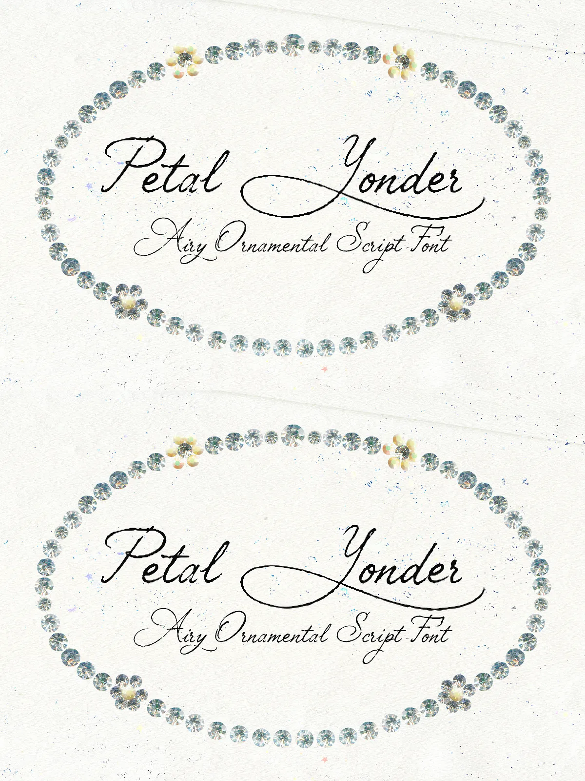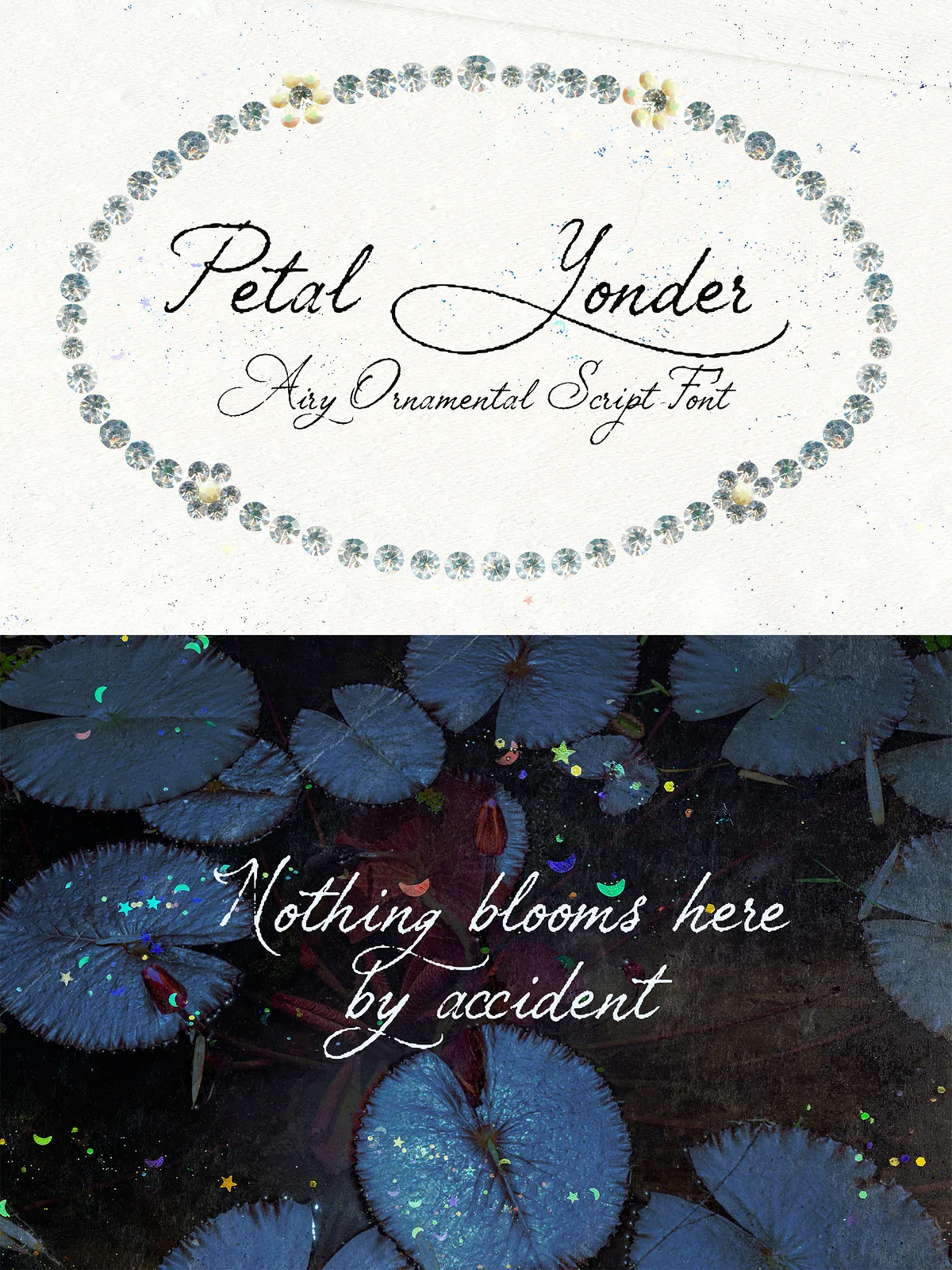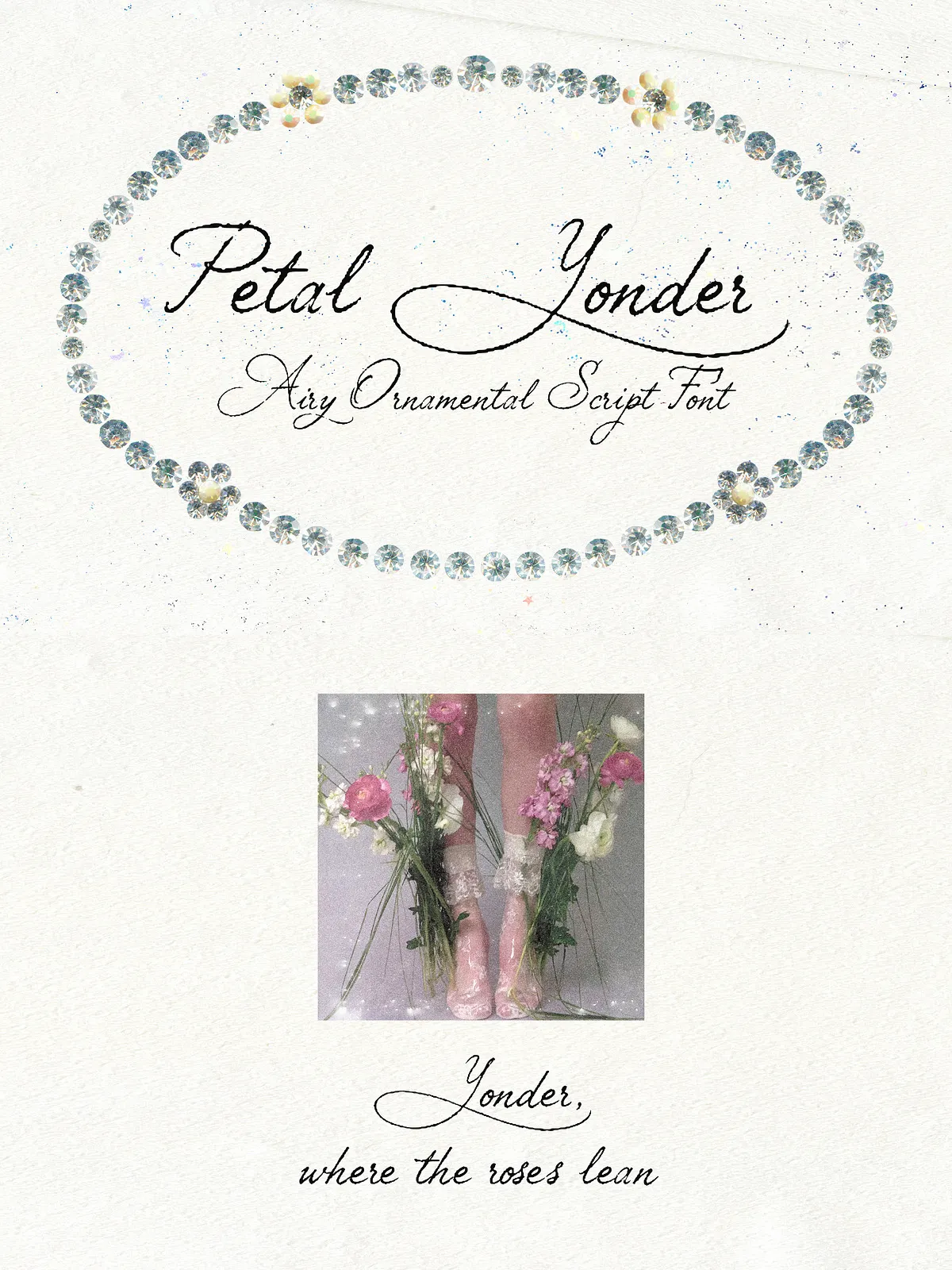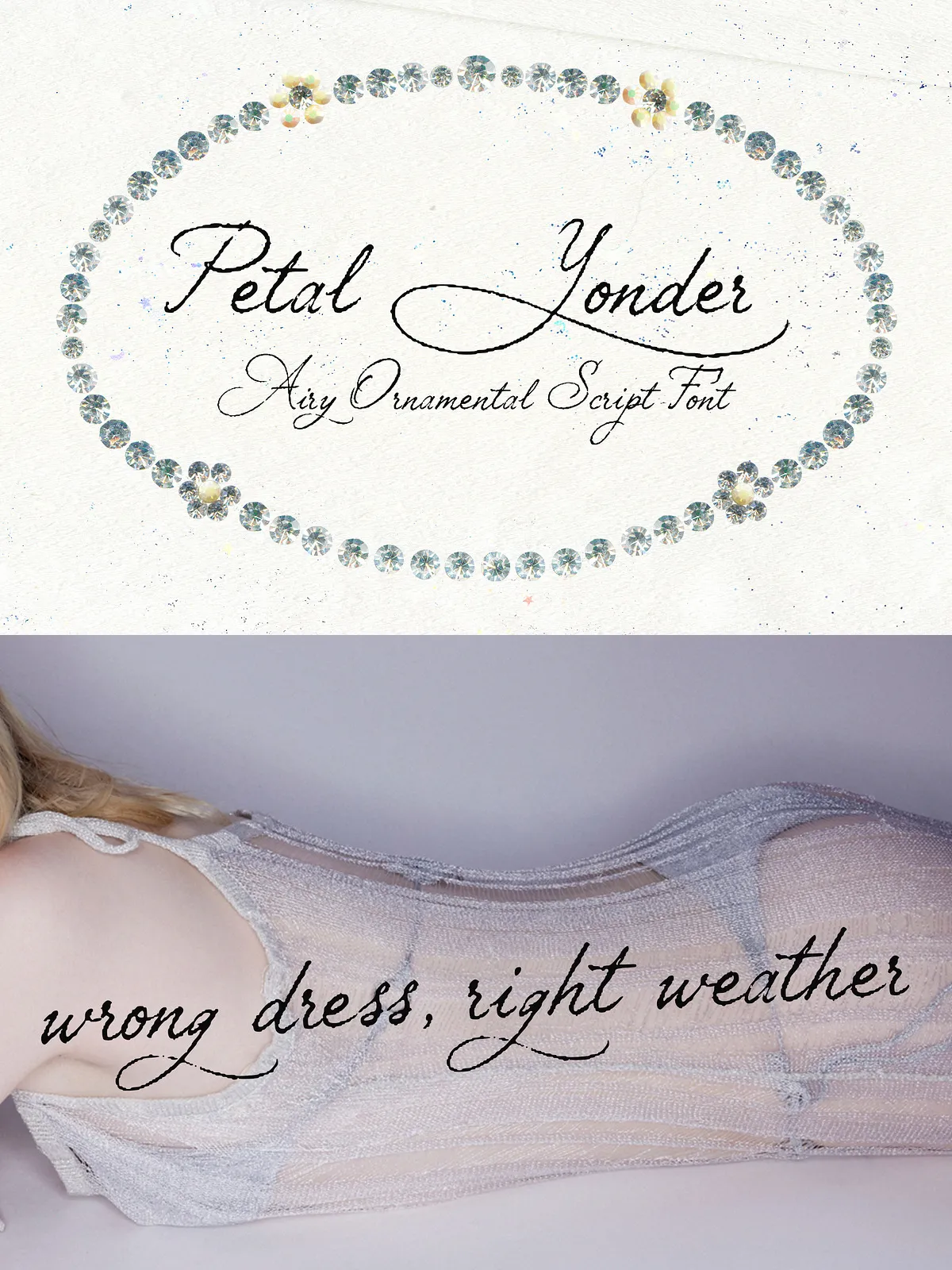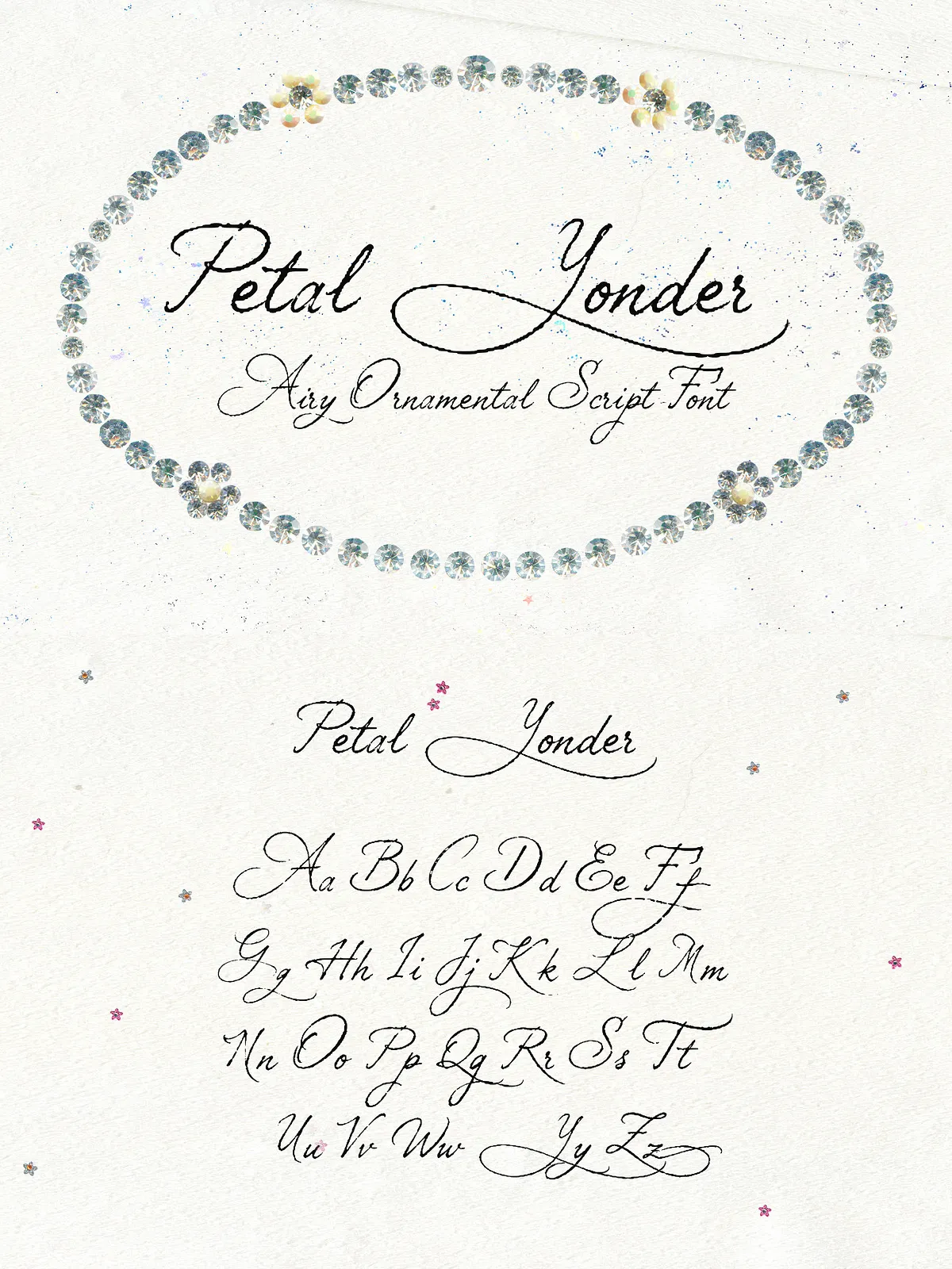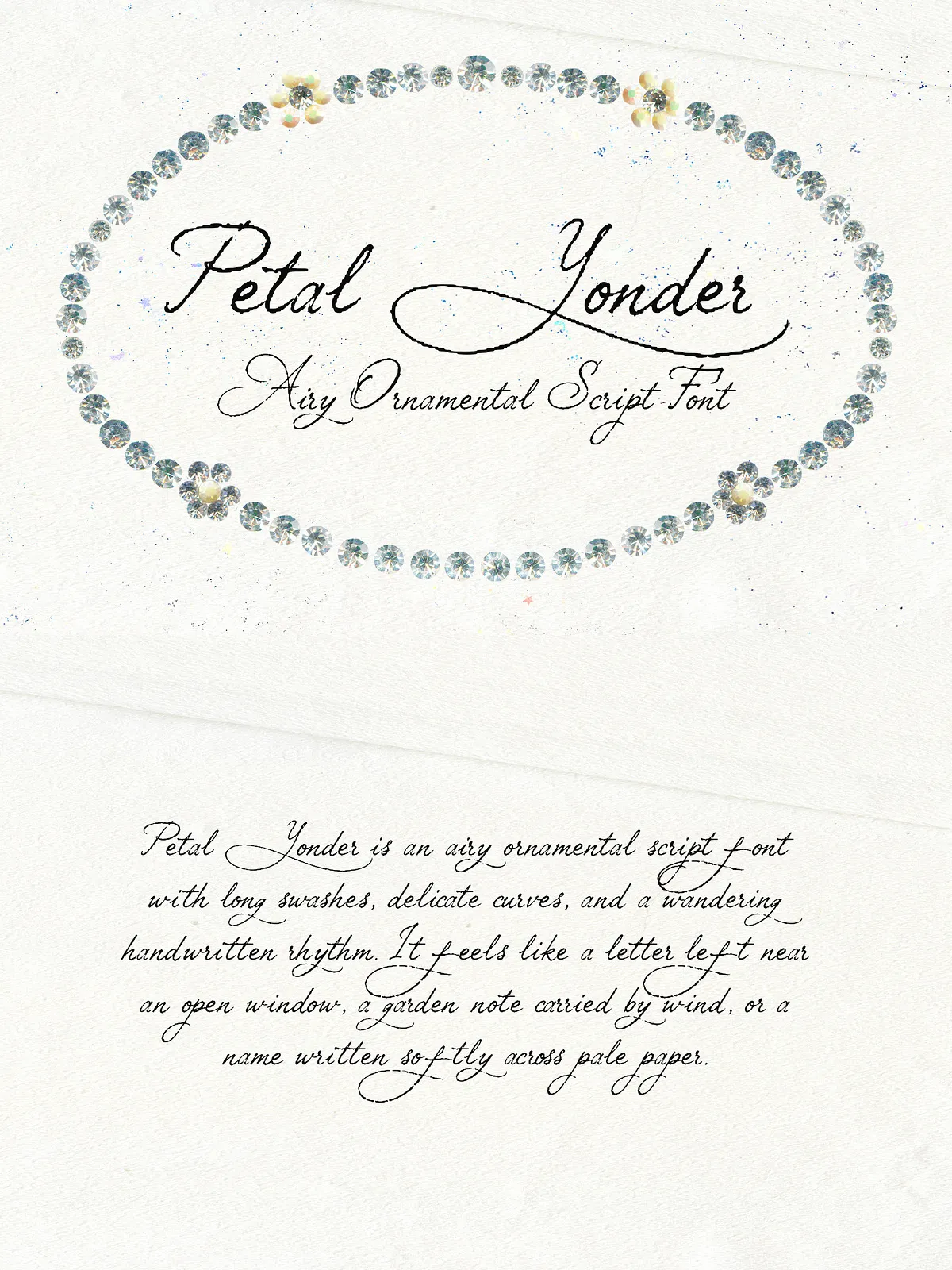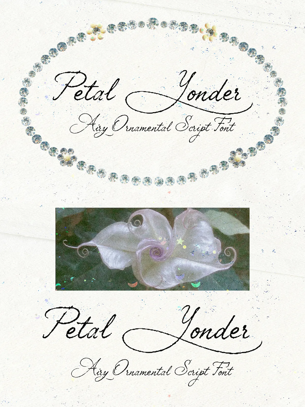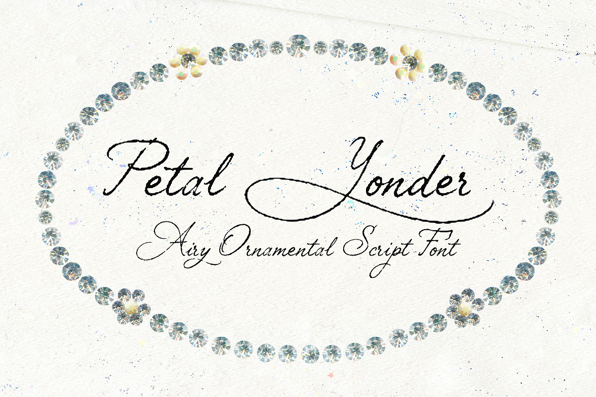

Petal Yonder delivers a weightless, wind-drifted aesthetic that reads as both romantic and slightly untamed. Long, sweeping swashes and airy curves create graceful movement across words and headlines. The letterforms carry a lightly imperfect texture that evokes vintage handwriting and floral lettering while remaining contemporary and ornamental. This script acts boldly: it leads the eye, creates atmosphere, and transforms simple copy into lyrical identity.
Voice and Intent
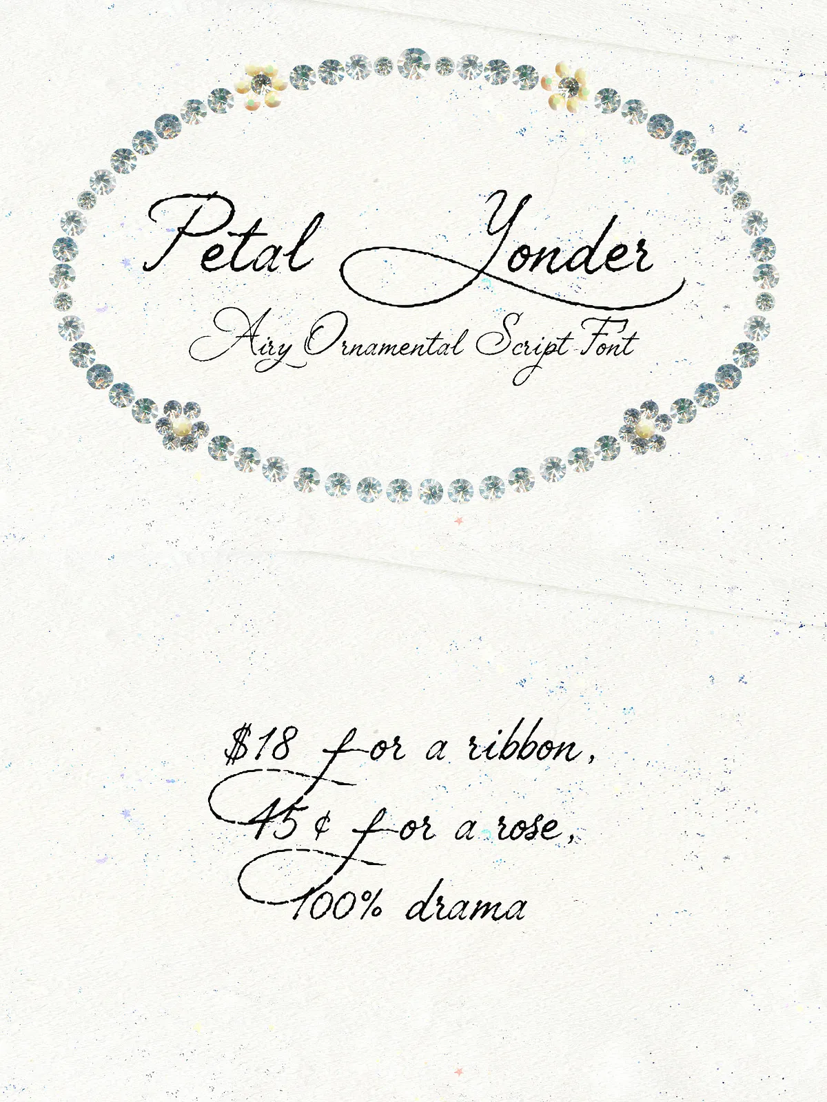
Use Petal Yonder when you want designs that feel soft yet expressive. The typeface projects a dreamy silhouette and a sense of movement that suits romantic brands, beauty visuals, and editorial features. Petal Yonder does not sit quietly — it loops, trails, leans, and leaves an intentional trace that amplifies emotional and aesthetic storytelling.
Key Visual Features
Distinctive Elements
- Long swashes that extend into decorative tails and frames.
- Delicate, slightly irregular texture that suggests handcrafted ink and vintage charm.
- Fluid connections between letters that maintain legibility at display sizes.
- Balanced contrast and open counters for an airy, readable silhouette.
Technical Qualities
- Available in standard desktop font format (.OTF) for immediate use in design applications.
- Optimized spacing and kerning for headline and logo use.
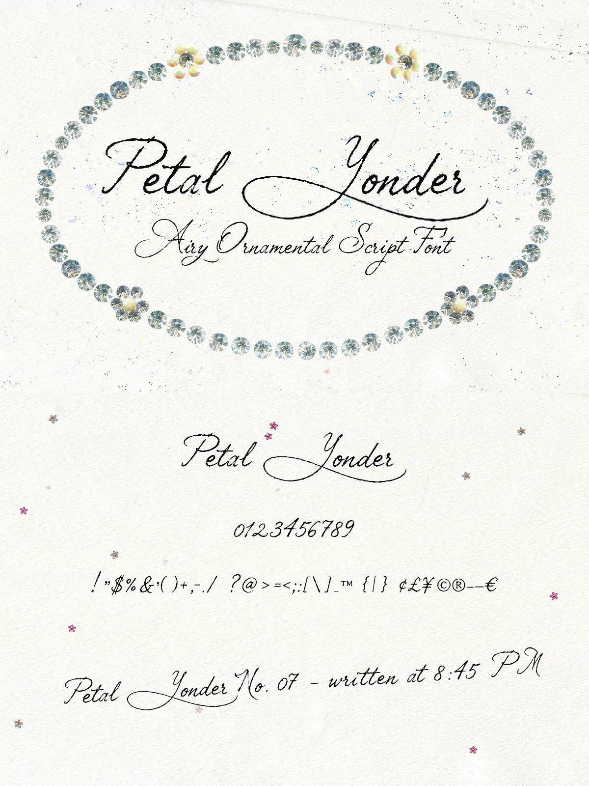
- Simple character set including uppercase, lowercase, numbers, and basic punctuation to support most display needs.
What’s Included
Package Contents
- 1 OTF font file: Petal Yonder.
- Full uppercase alphabet.
- Full lowercase alphabet.
- Numerals and standard punctuation.
Best For
Primary Applications
- Branding and identity for boutique, floral, beauty, or lifestyle brands.
- Delicate logo work and wordmarks that require expressive swashes.
- Wedding stationery and event invitations with romantic or whimsical themes.
- Feminine packaging, cosmetic labels, and luxury beauty visuals.
- Editorial layouts, lookbooks, and quotes where decorative headlines enhance tone.
- Social media graphics, mood boards, and promotional assets that need an emotive script voice.
Practical Usage Guidance
Pairing Recommendations
Pair Petal Yonder with a neutral sans-serif or a restrained serif to preserve hierarchy. For body copy, choose a clean humanist sans with moderate x-height to balance the script’s ornamentation. When creating logos, combine Petal Yonder with a minimal geometric sans to keep the overall mark modern and legible.
Size, Spacing, and Readability
Reserve Petal Yonder for headlines, logos, and short phrases — its decorative swashes perform best at larger sizes. Increase tracking slightly when using multiple words to prevent swashes from colliding. Adjust kerning manually for logotypes to refine letter-to-letter rhythm and ensure the decorative tails flow naturally.
Web and Print Considerations
Use the OTF file for print and desktop applications (Adobe InDesign, Illustrator, Photoshop). For web use, request or convert to a webfont format (.WOFF/.WOFF2) and enable font-display swap to preserve rendering performance. When rendering on-screen, apply slight smoothing and test across browsers to maintain the font’s delicate texture.
Licensing & Support
License Notes
Confirm permitted uses in the bundled license. The default package typically covers desktop use; contact the vendor for web embedding, app integration, or extended commercial licensing. If you need installation help, pairing samples, or export-ready mockups, provide your intended platform and I can generate tailored guidance or CSS snippets.