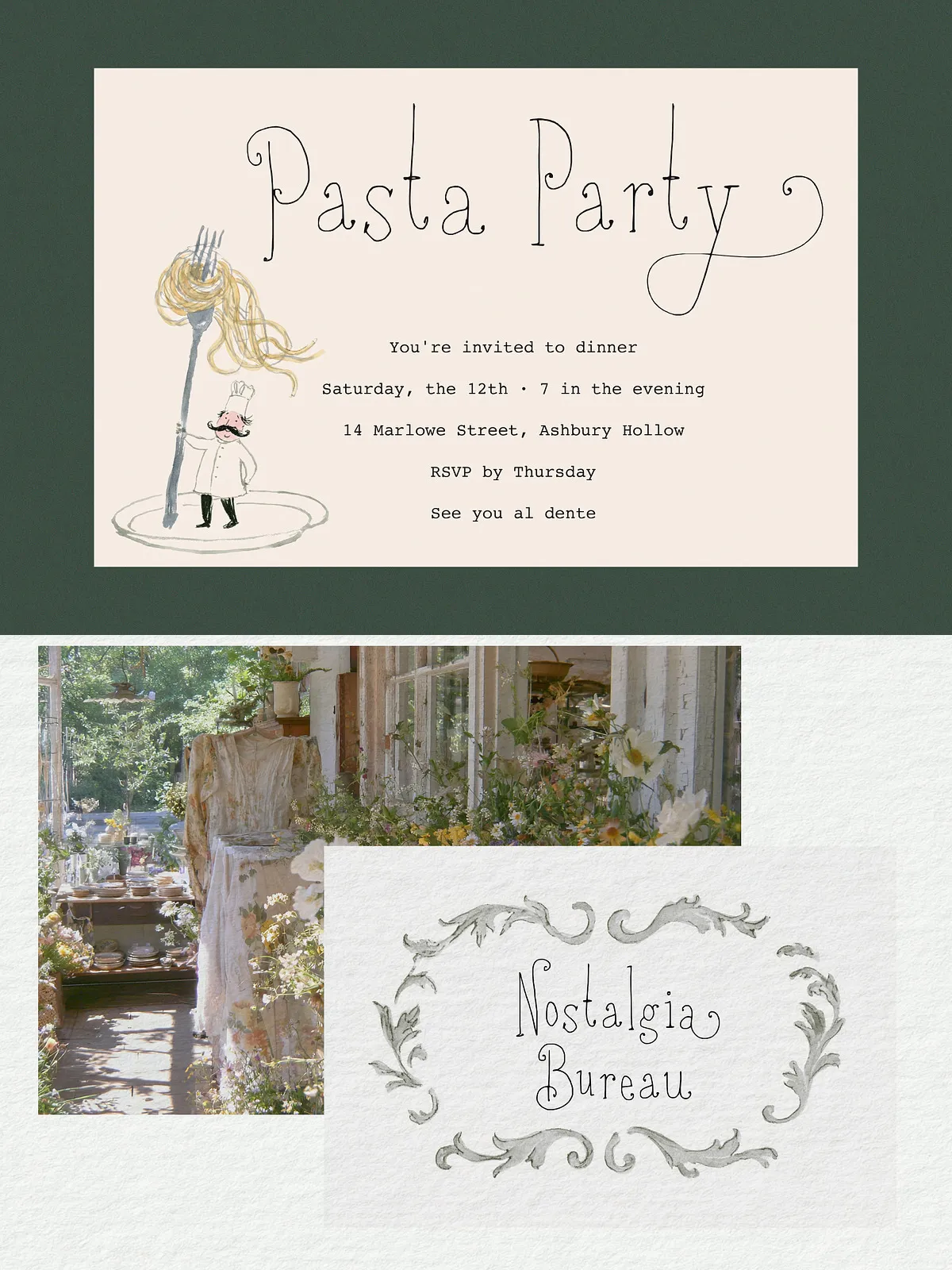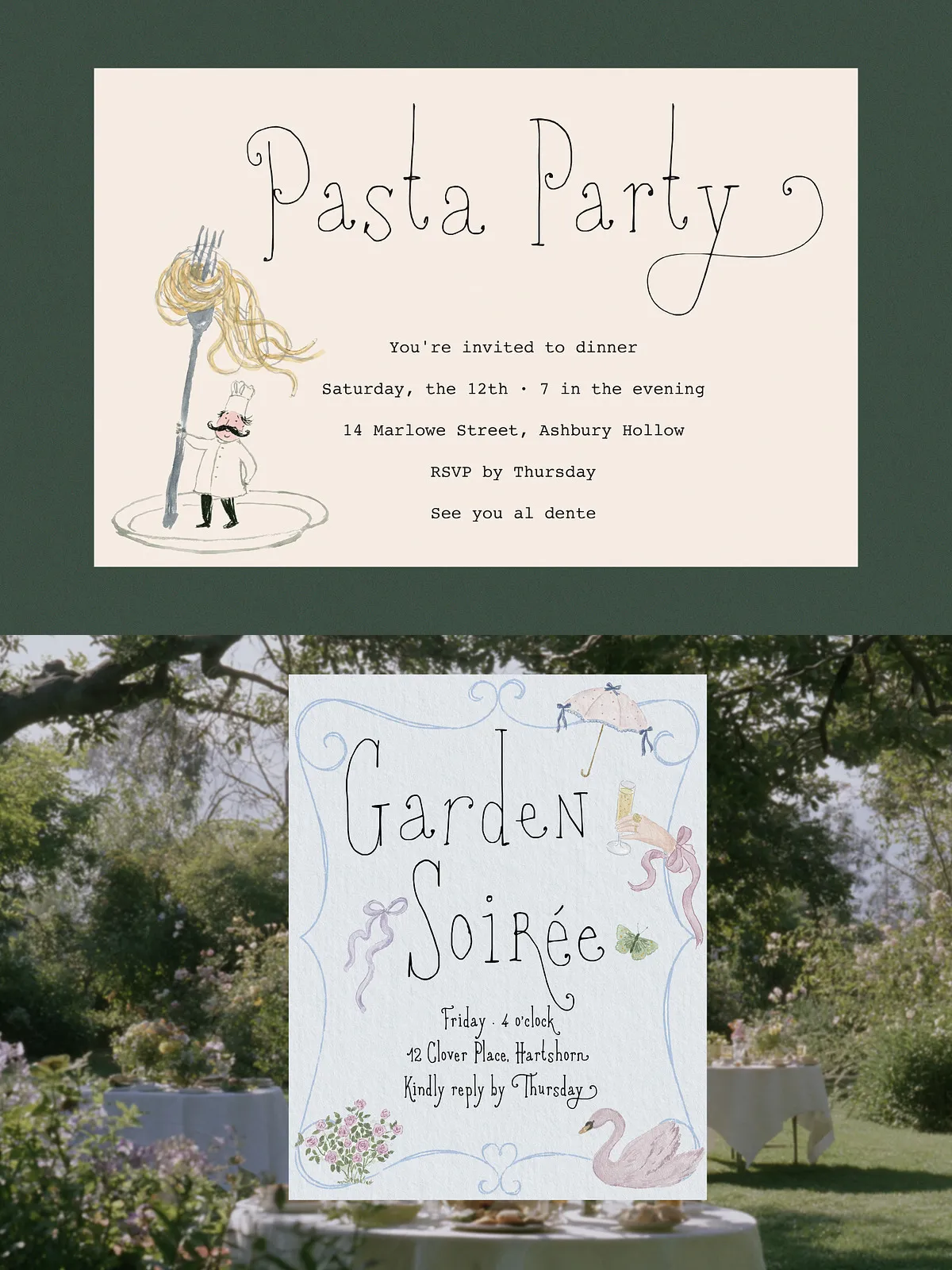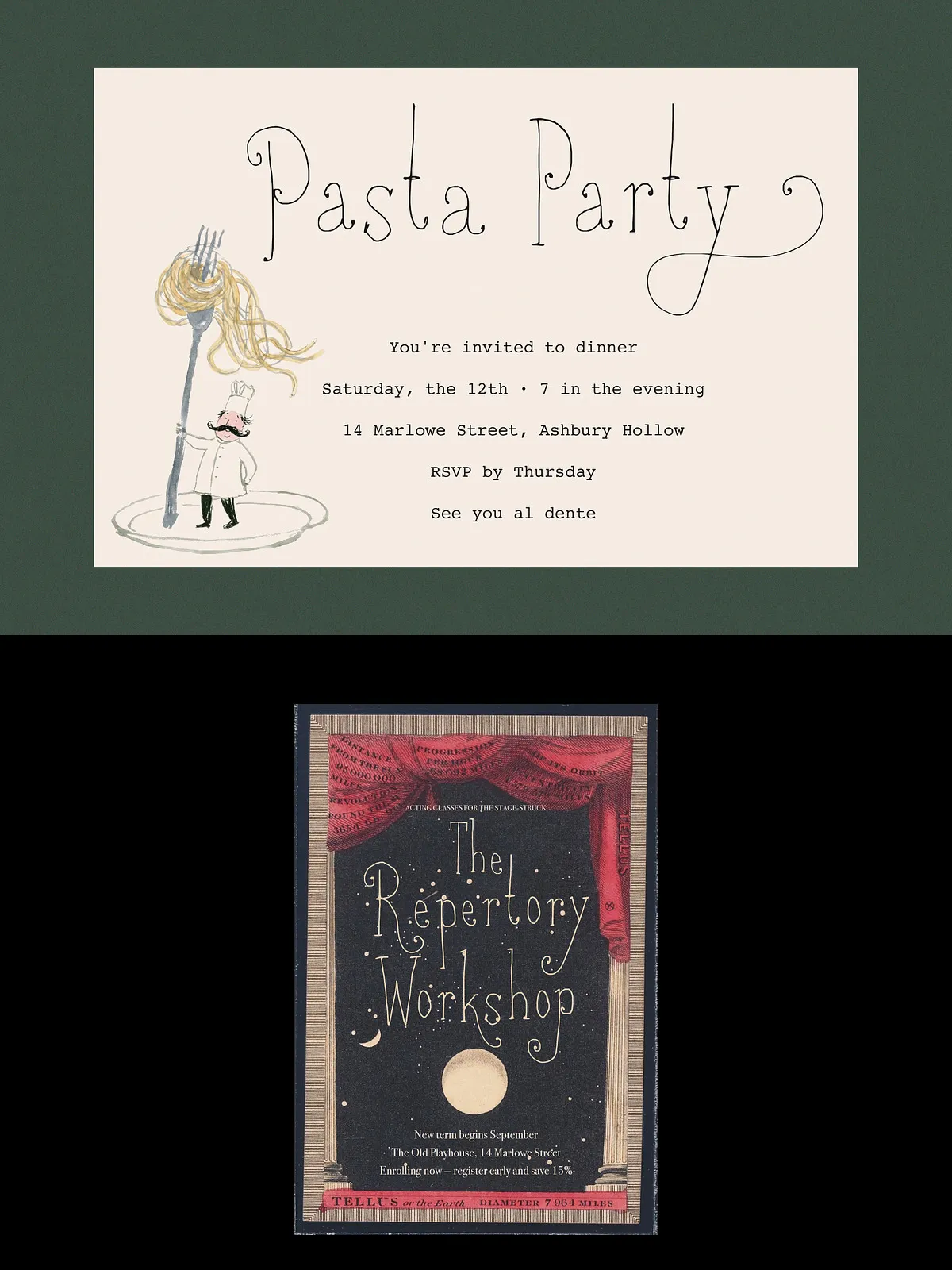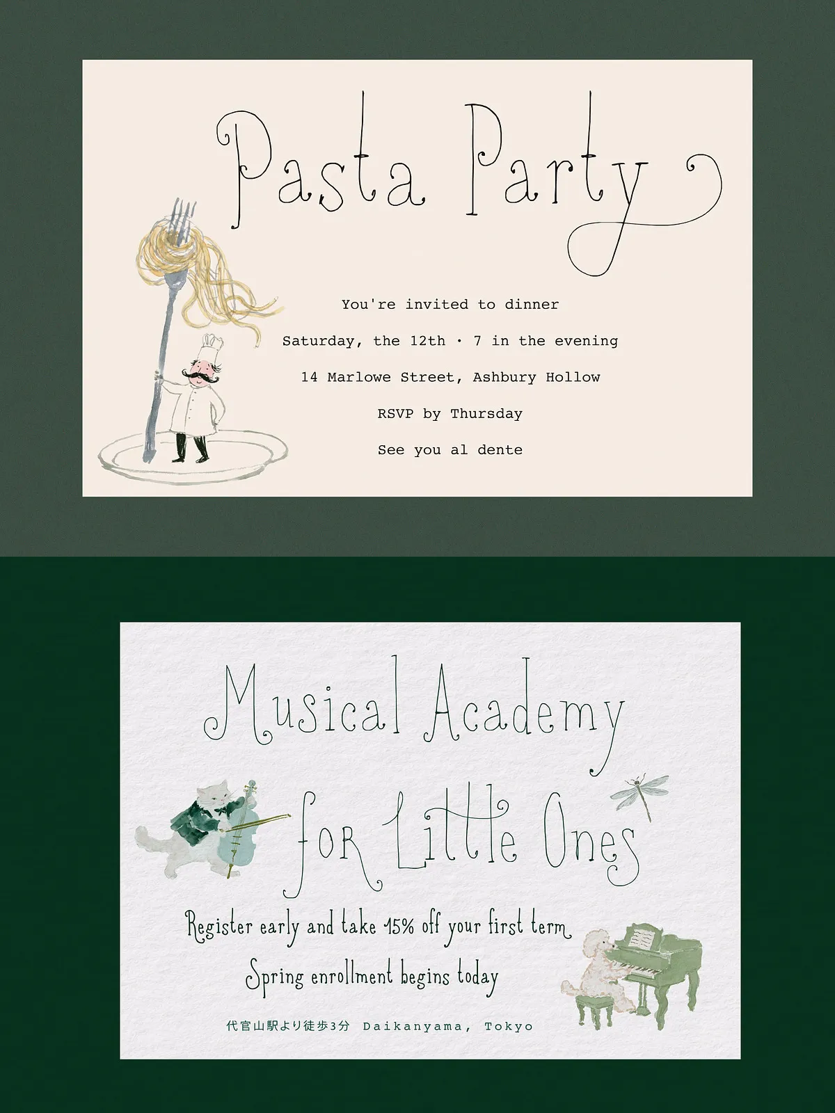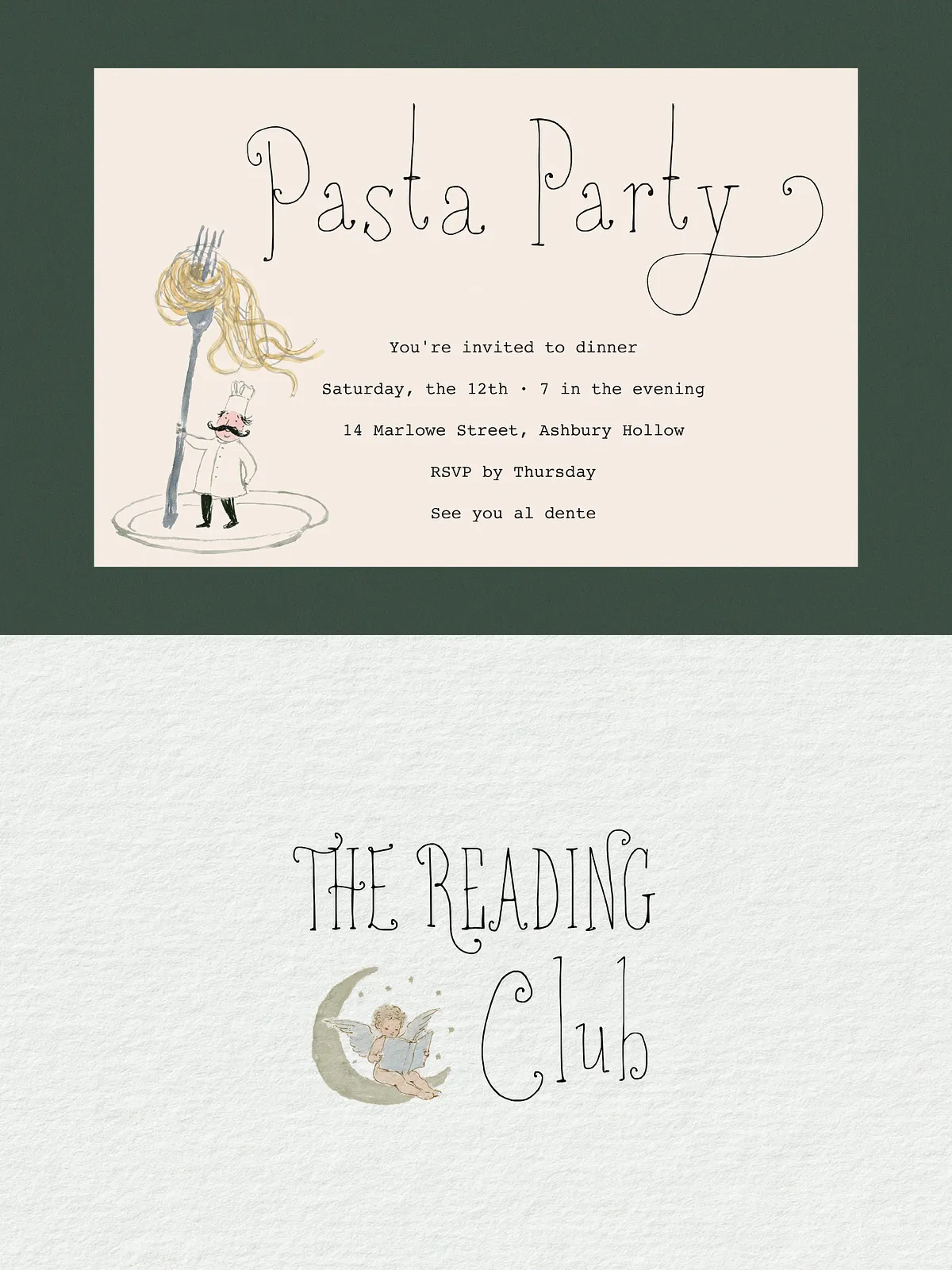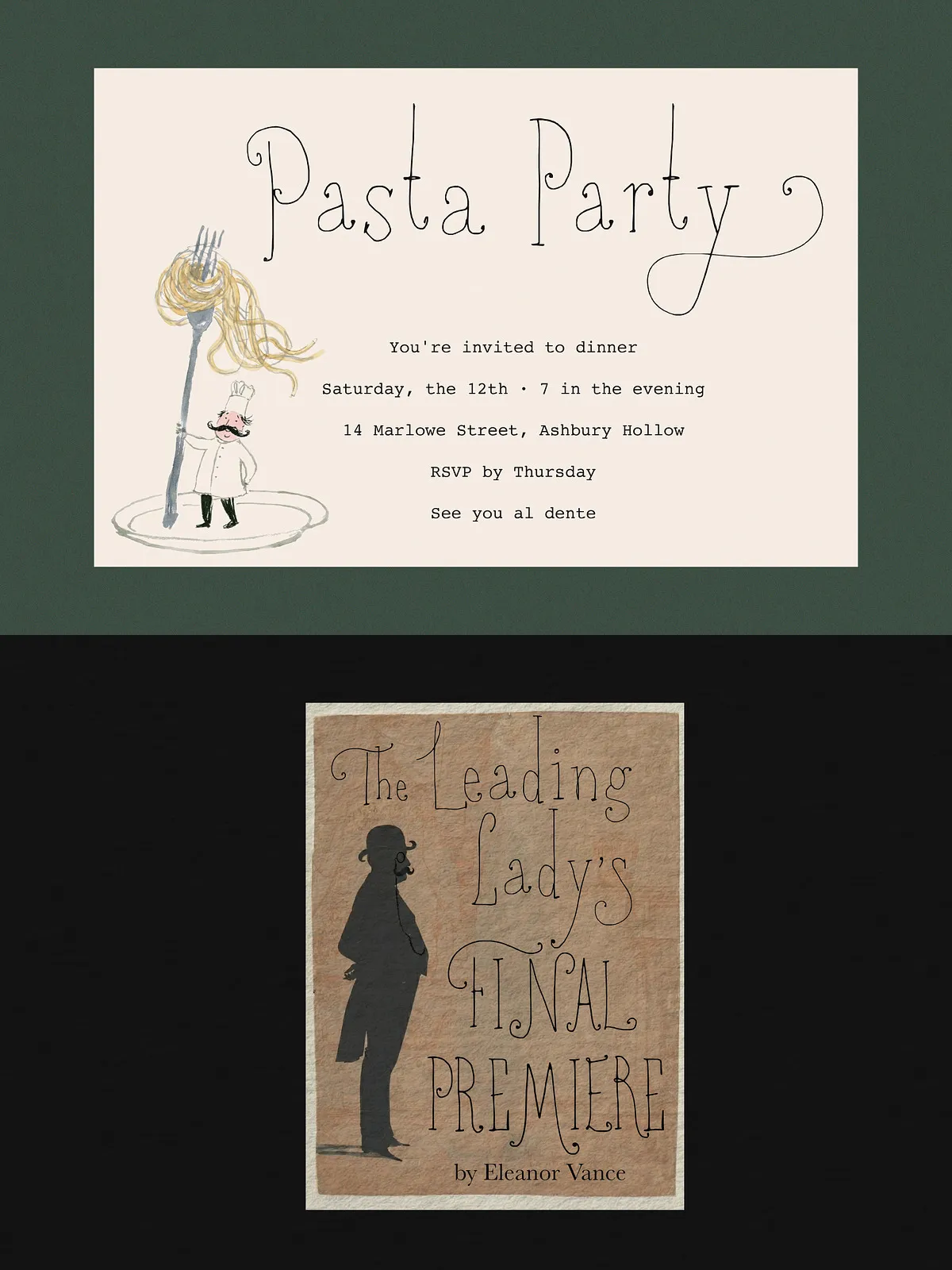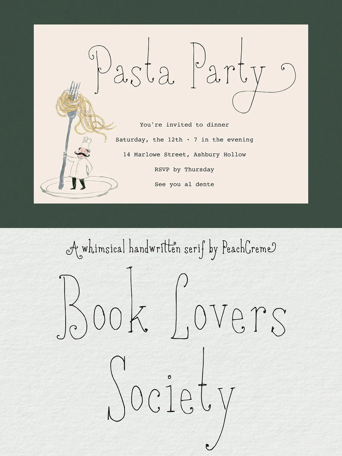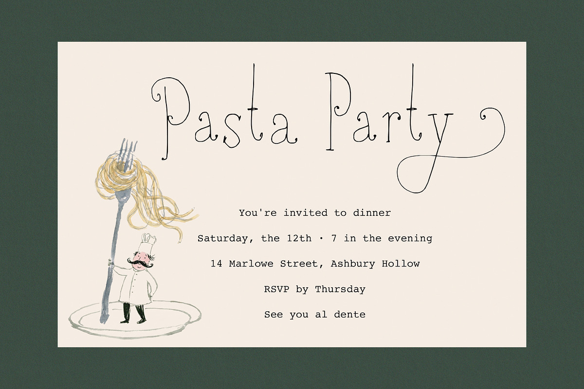

Book Lovers Society is a hand-drawn display serif that combines tall, delicate proportions with intentionally shaky, organic lines. The result reads as equal parts classic serif and whimsical handwriting: refined enough for editorial and branding use, yet warm and characterful for designs that require personality. This typeface performs strongly in display contexts where atmosphere and voice matter—headlines, covers, invitations, and decorative packaging.
Design Characteristics
Distinctive Letterforms
The design emphasizes vertical rhythm and slender strokes. Serifs remain subtle and slightly irregular, reinforcing the handcrafted aesthetic without sacrificing legibility. Letterforms show a gentle, human-led variation: terminals, stroke endings, and small counter shapes display handcrafted quirks that give each word an intimate, storybook feel.
Texture and Rhythm
The intentional shakiness and organic line quality create a tactile texture that reads particularly well on textured or warm paper stocks. At display sizes the font reveals its personality—swashes, alternate endings, and decorative shapes—while at modest sizes it preserves clarity and an inviting tone.
Character Map & Alternates
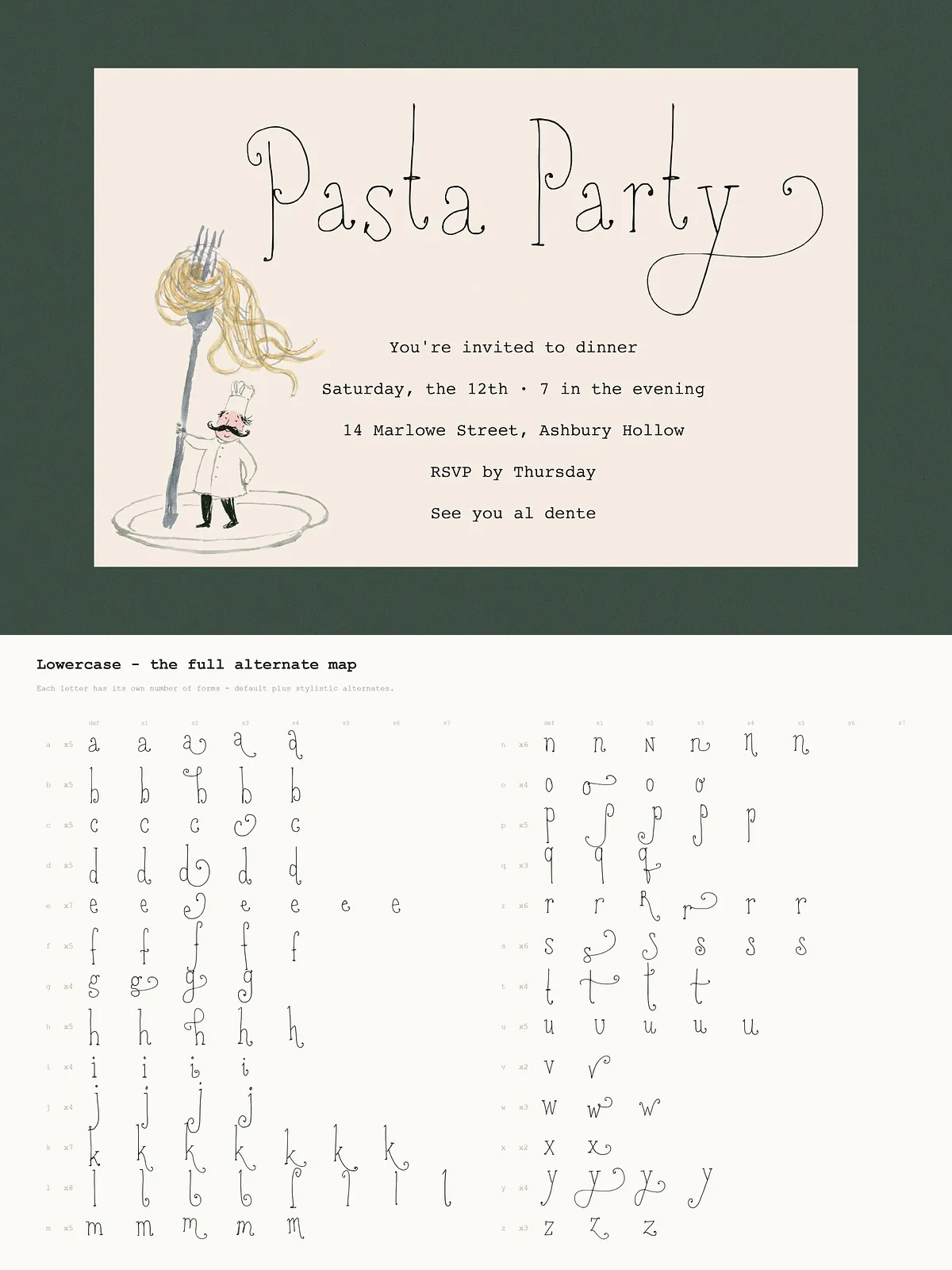
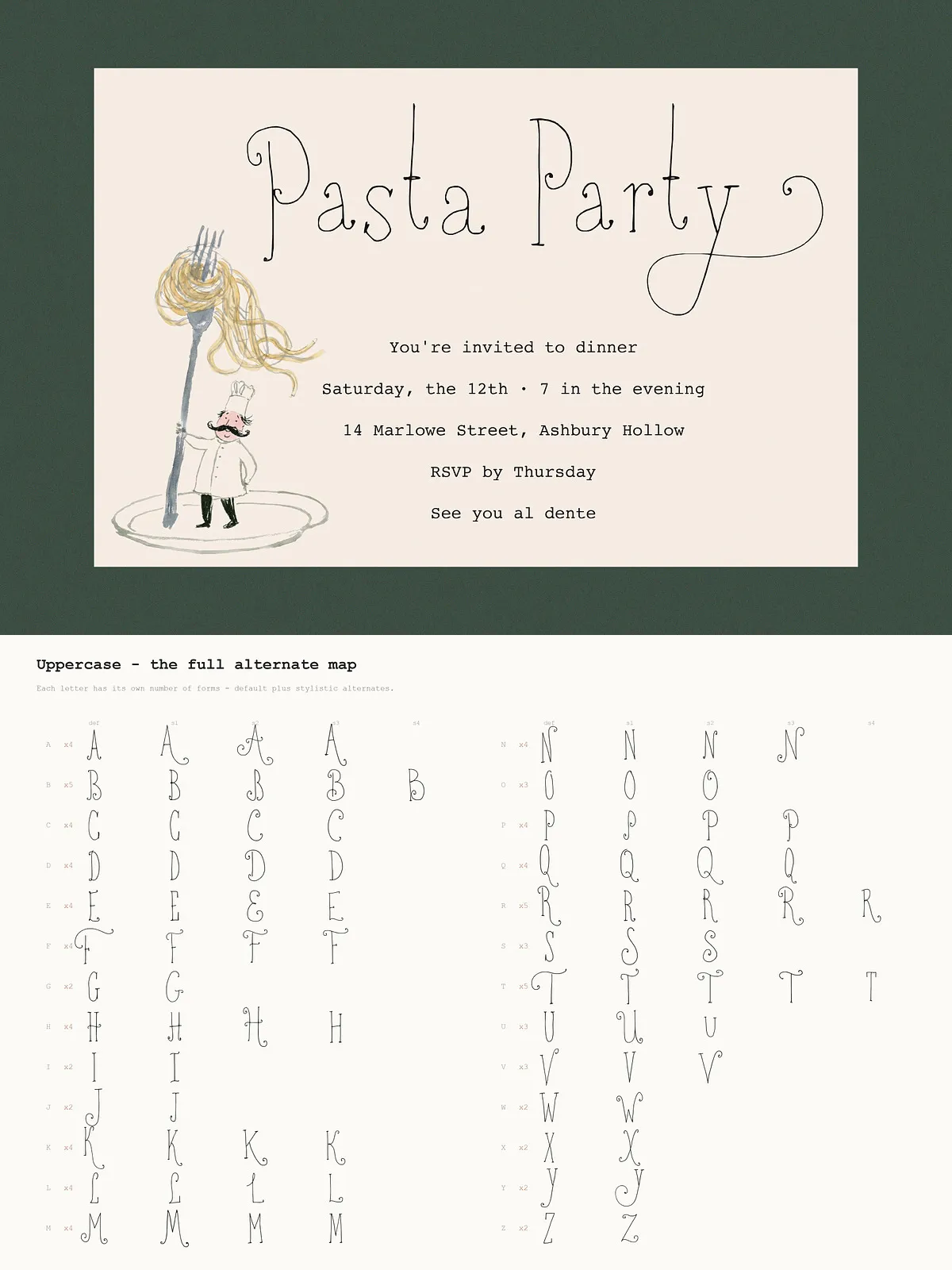
About the Stylistic Alternates
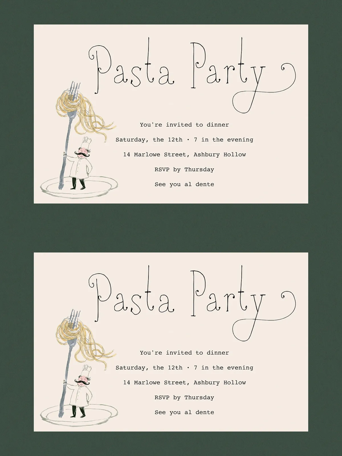
Book Lovers Society includes an extensive set of stylistic alternates to introduce natural variation and avoid mechanical repetition. Note that alternates are not distributed evenly across every glyph: some letters offer many swashes, ligatures, and decorative forms, while others remain simpler. This uneven distribution supports realistic handwriting behavior—frequent characters display multiple variants to create organic wordflow, while less-used glyphs retain straightforward forms.
How to Use Alternates
Enable OpenType features or manually swap alternates in your design software to build varied, natural-looking text. Use alternates sparingly for body copy; reserve plentiful alternates for names, titles, and logos where visual interest improves impact. Review the preview images or specimen PDF to see the complete alternate map and choose the best alternates for each composition.
Available Weights
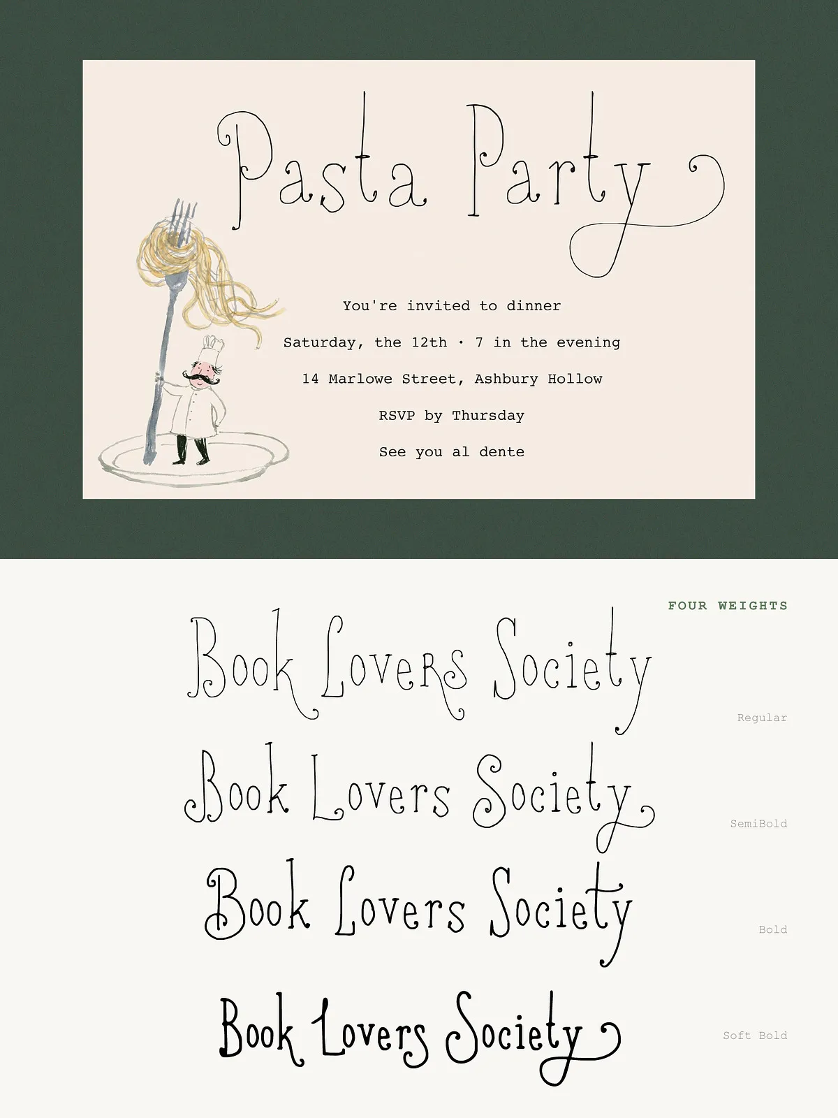
Four Purposeful Weights
- Regular — Fine, spindly, and airy. Use this weight for delicate headings and text that should maintain a light, refined presence.
- Semi Bold — A balanced middle weight that preserves the hand-drawn texture while increasing visibility. Ideal for subheads and short paragraphs.
- Bold — Adds presence without sacrificing character. Use Bold for strong headlines and cover titles that need to stand out.
- Soft Bold — A rounded, softer heavy weight designed to avoid harshness. This option retains organic charm while delivering extra emphasis for whimsical or narrative-driven designs.
Primary Uses
Where the Font Excels
Designers will find Book Lovers Society especially useful for:
- Wedding invitations and stationery that require a romantic, handmade voice.
- Branding and logos for cafés, indie publishers, boutique shops, and artisan goods.
- Children’s books, storybook covers, and illustrated editorial spreads that need a narrative tone.
- Packaging for small-batch foods, candles, and craft items where warmth and authenticity sell the product.
- Posters, flyers, and social media headers that aim to evoke nostalgia and approachability.
Pairing and Styling Tips
Recommended Combinations
Pair Book Lovers Society with a clean, neutral sans serif for body copy to create contrast and modern balance. For vintage or layered looks, combine it with a light serif or slab to enrich texture. Use the Regular or Semi Bold for longer copy only in short paragraphs; reserve heavier weights for display elements to maintain legibility.
Practical Typographic Advice
Tighten tracking slightly for display lines to maintain continuous flow. Enable discretionary ligatures and contextual alternates in logo work for a handcrafted result. When preparing files for print, test on a few paper stocks and weights to choose the finishing that best complements the type’s organic texture.
Technical Details & Licensing
Formats and Support
Book Lovers Society is provided in common desktop and web formats (OTF/TTF, WOFF/WOFF2) and supports OpenType features for alternates and ligatures. Always check the license for permitted commercial use and web embedding. For extended product embedding or app distribution, acquire the appropriate extended license. Contact the font author for installation guidance or any technical questions.