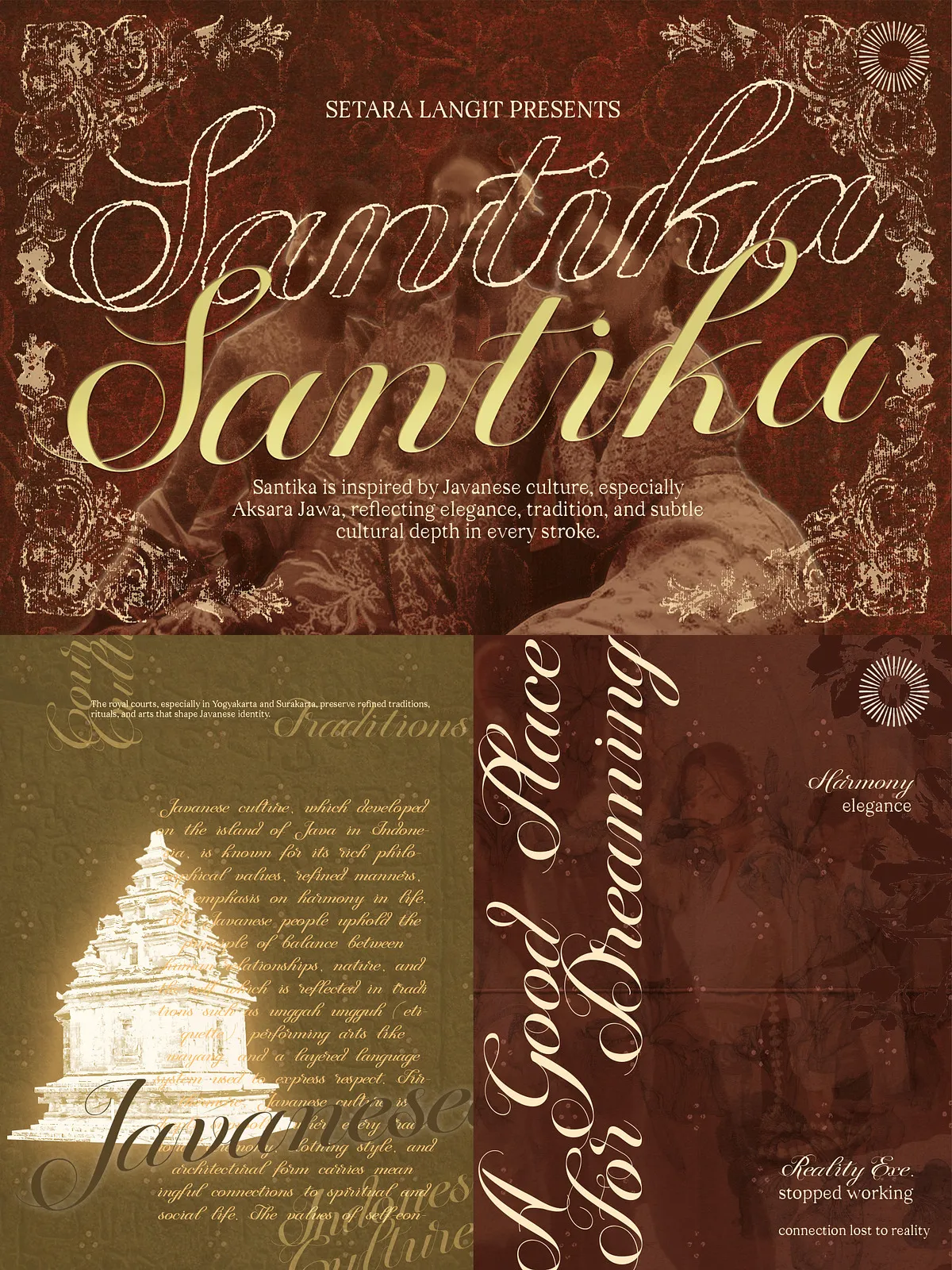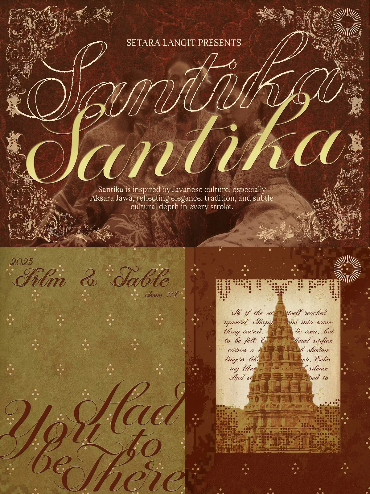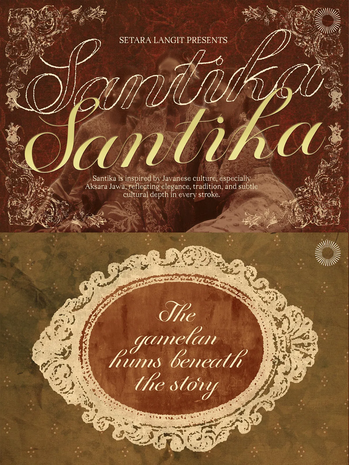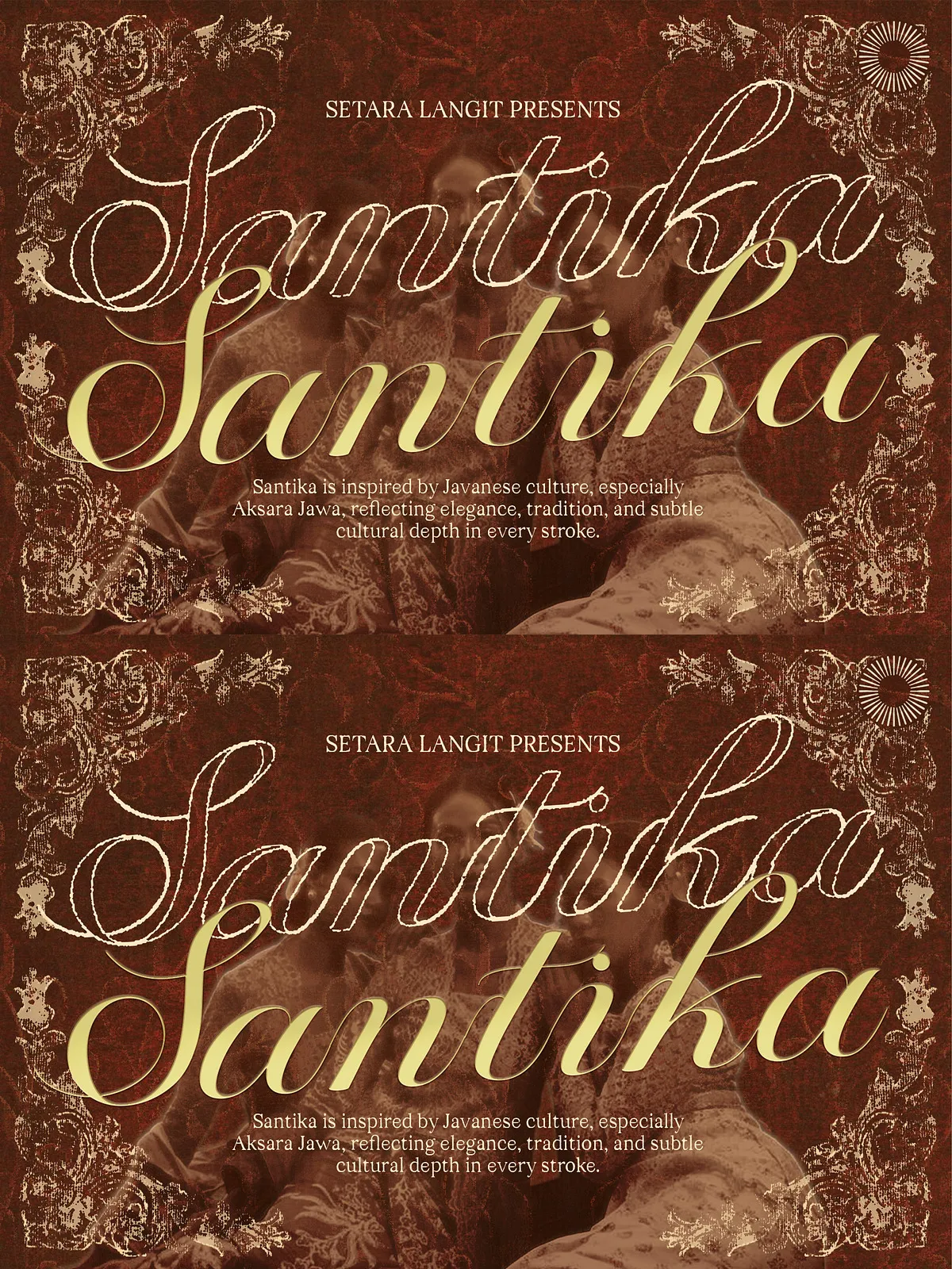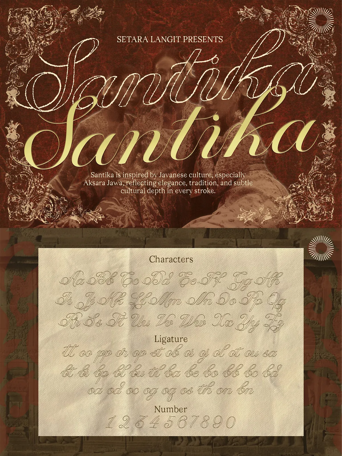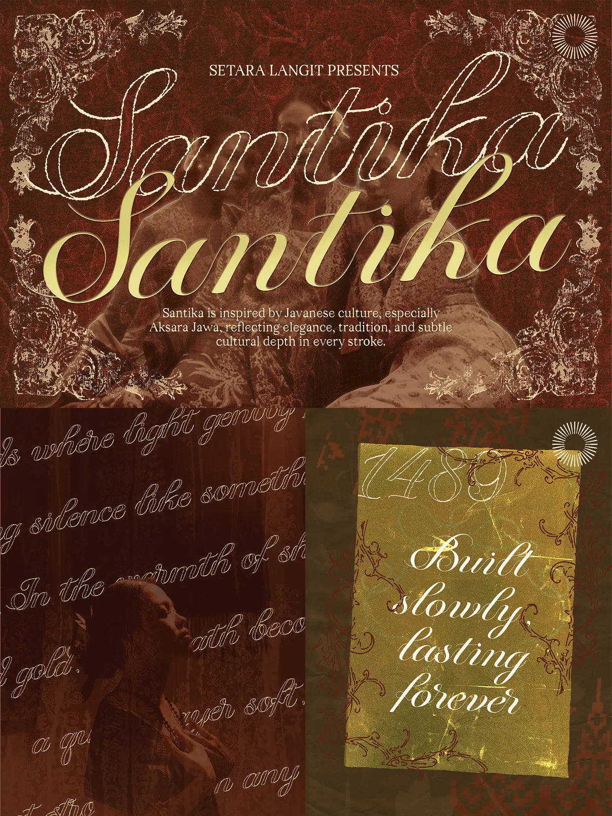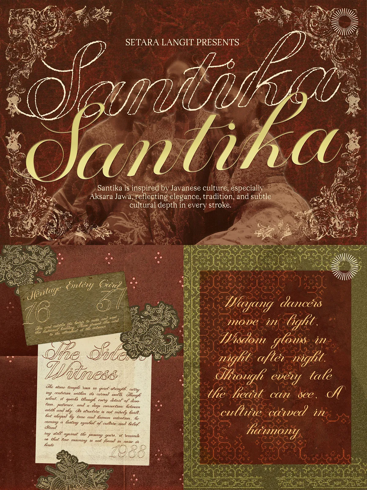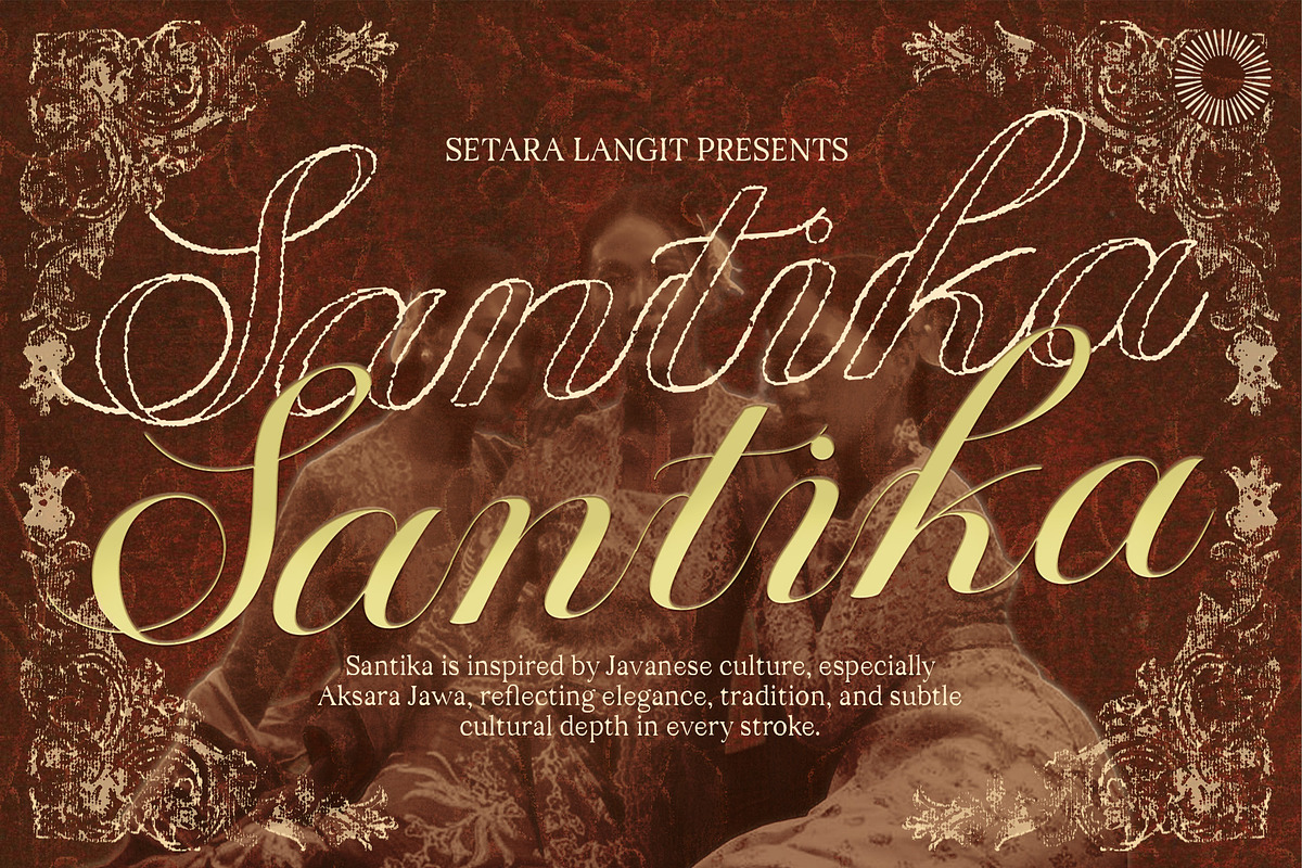

Santika channels the graceful forms of Aksara Jawa into a modern, usable script. It balances flowing calligraphic curves with clear, contemporary proportions to create a typographic voice that feels both heritage-rich and immediately relevant. Use Santika to evoke warmth, tradition, and a refined sense of place.
Key Features
Flowing Curves and Refined Details
Santika features purposeful stroke transitions, tapered terminals, and subtle ornamental flourishes that echo Javanese letter rhythms without compromising readability. Each glyph reads smoothly at display sizes and performs elegantly in headline and logotype contexts.
Contemporary Usability
While rooted in cultural references, Santika prioritizes practical use: consistent baseline behavior, generous x-height choices for select forms, and carefully tuned spacing let designers apply the type quickly across print and digital workflows.
Ligatures and Stylistic Nuance
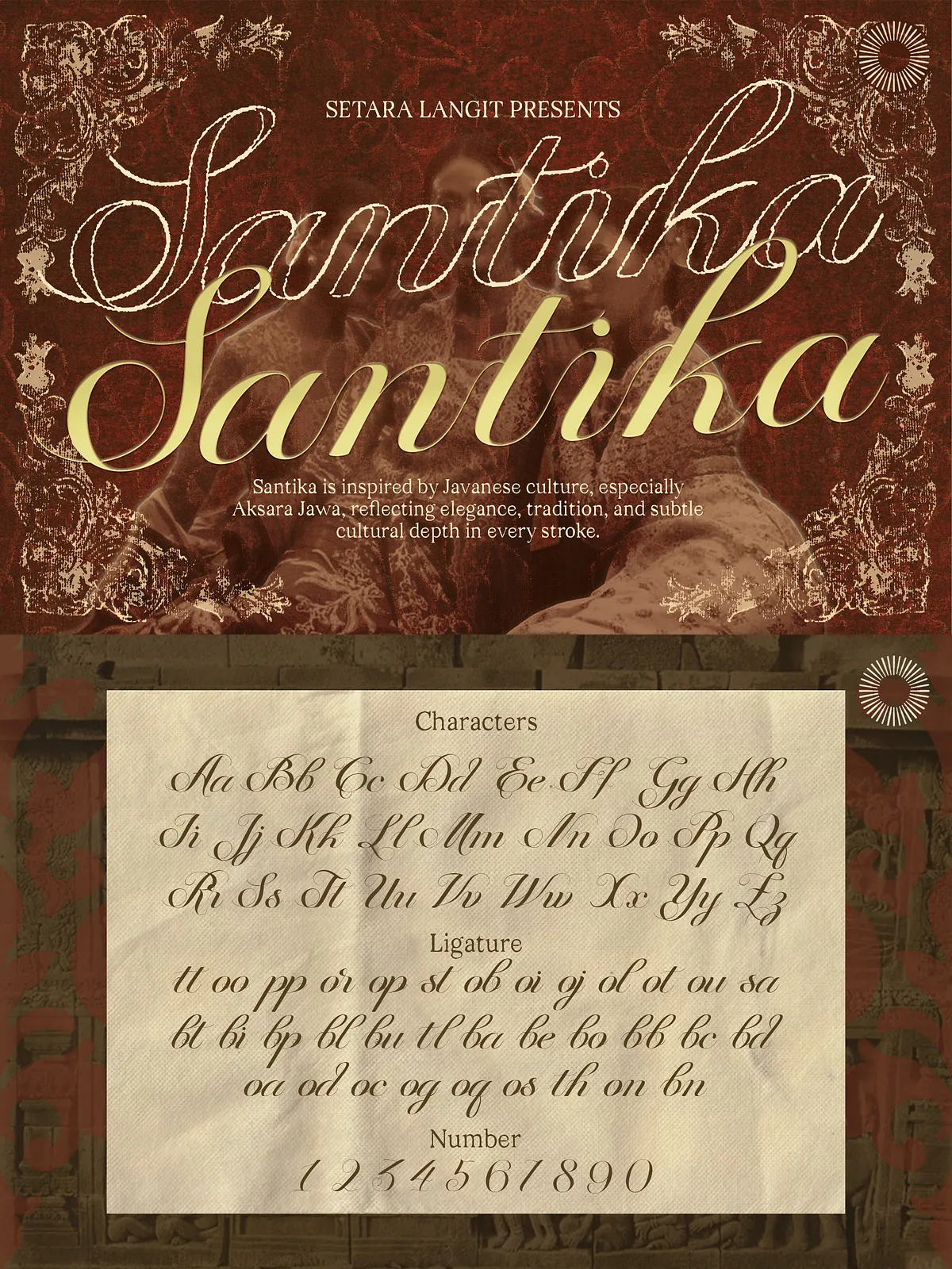
Santika includes elegant ligatures and contextual alternates that let text adopt a more handcrafted cadence. These features produce natural joins and decorative options for brand marks, packaging headlines, and invitation copy.
What You Get
Included Glyphs and Formats
- Complete uppercase and lowercase alphabets with refined stroke endings.
- Numbers, punctuation, and essential diacritics for broad language support.
- Elegant ligatures and selected stylistic alternates for display use.
- Deliverables in common desktop and web formats (OTF/TTF, WOFF/WOFF2) for broad compatibility.
Perfect For
Recommended Project Types
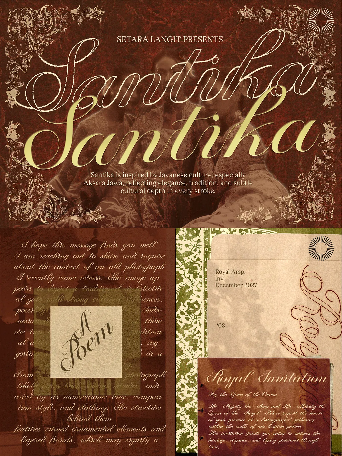
- Luxury branding and identity systems that need cultural authenticity and visual refinement.
- Packaging and product labels that require a premium, handcrafted tone.
- Editorial spreads and headlines where heritage and elegance are central themes.
- Hospitality and travel branding that want to anchor experiences in local culture.
- Invitations, event materials, and fashion campaigns that demand a distinct, graceful script.
Styling and Pairing Advice
How to Combine Santika with Other Typefaces
Pair Santika with a neutral sans-serif for body text to maintain readability while letting the script carry the brand’s personality. For more traditional layouts, combine Santika with a restrained serif to create a layered, editorial feel. Use heavier weights or condensed sans companions to anchor compositions that rely on Santika for expressive headings.
Practical Styling Tips
- Enable contextual alternates and ligatures for longer display lines to achieve a more natural flow.
- Reserve ornamental alternates for short headlines and logo marks to avoid visual clutter.
- Test letter spacing at the intended final size and medium—printed labels and embossed materials may require adjusted tracking.
Technical Details
File Formats and Compatibility
Santika ships in OTF/TTF for desktop use and WOFF/WOFF2 for web embedding. It supports major design applications including Adobe Creative Cloud, Affinity, and common web font stacks. For cutting or embossing workflows, convert text to outlines and verify stroke thickness on the target substrate.
Licensing and Support
Usage Rights and Assistance
Review the provided license to confirm permitted commercial uses—desktop, web, app, and enterprise licenses vary by project scope. If you need installation help, pairing advice, or file-format recommendations, contact the font author or vendor for usage guidance and technical support.