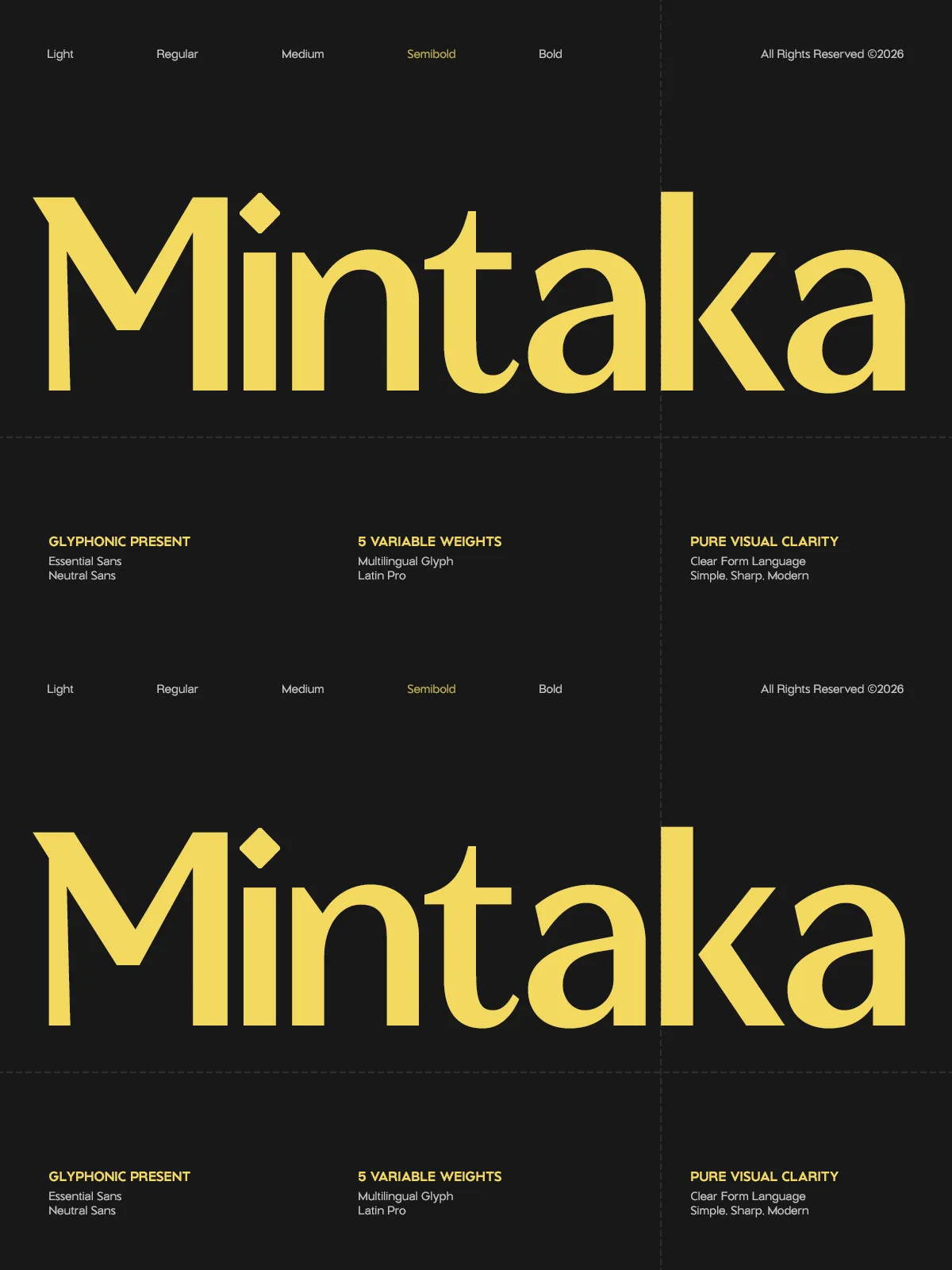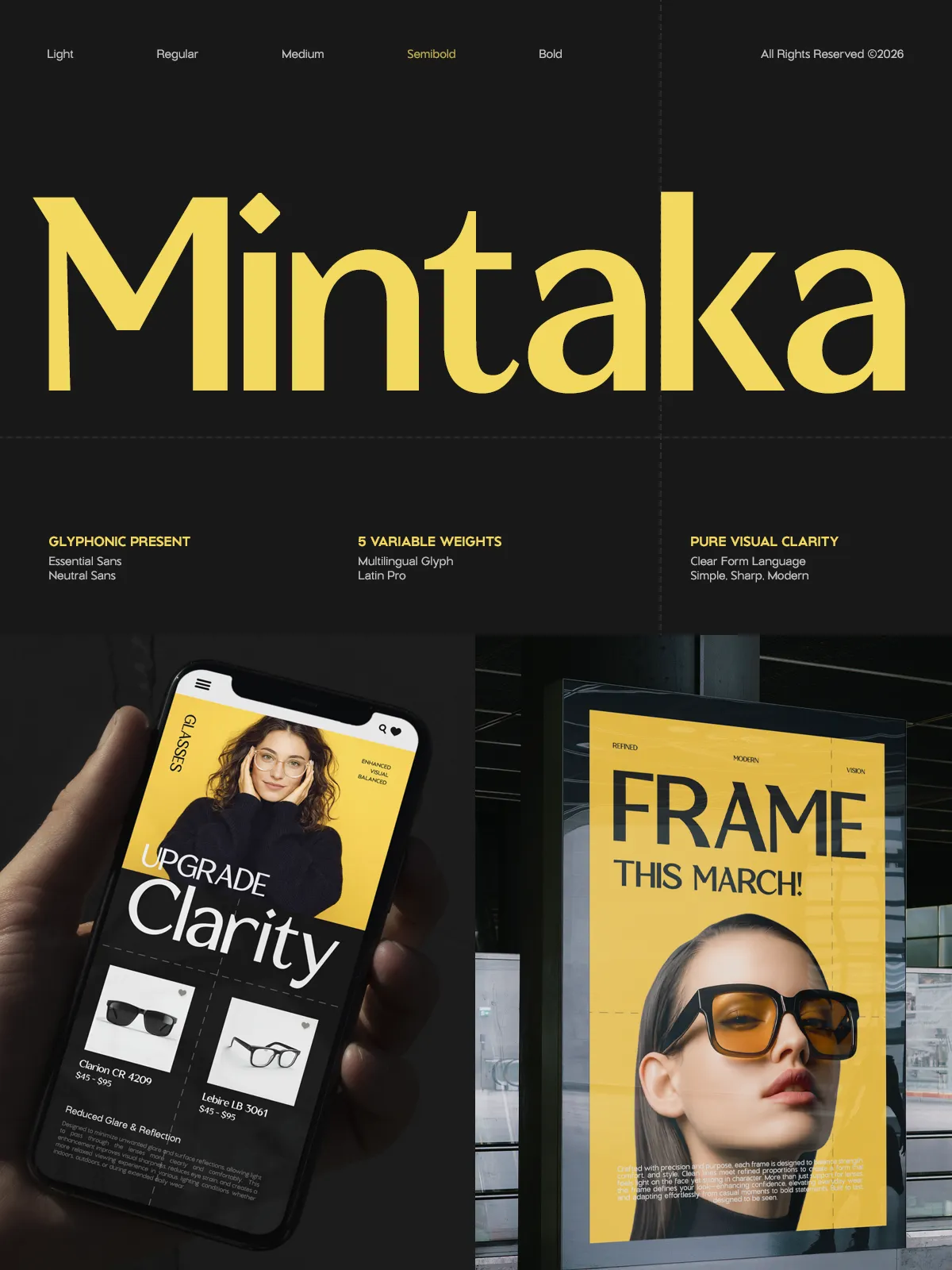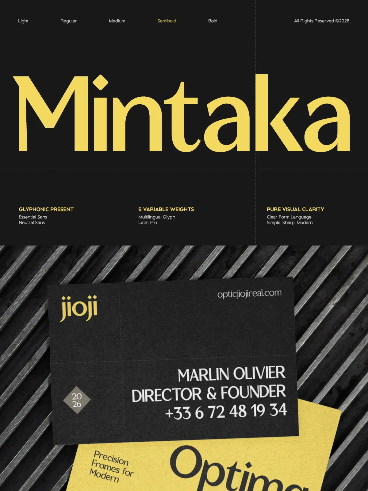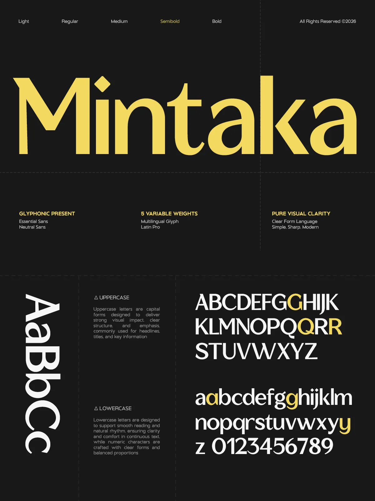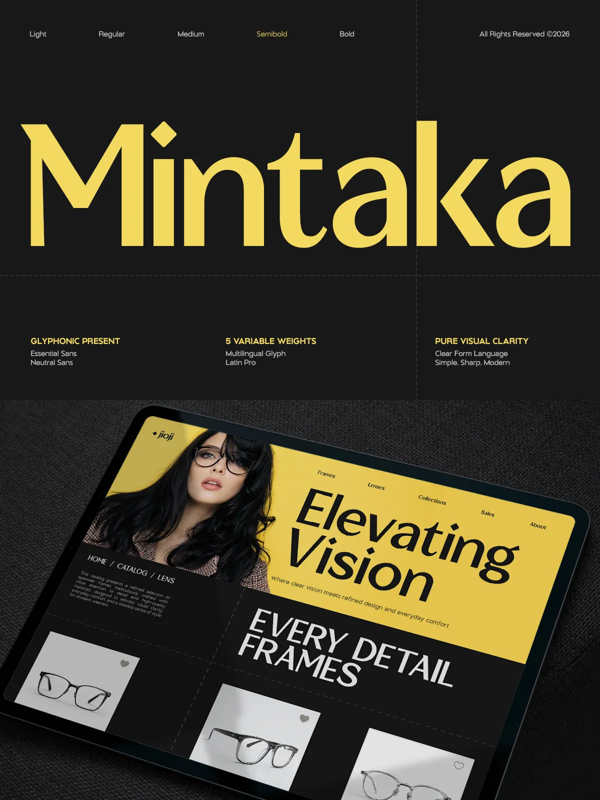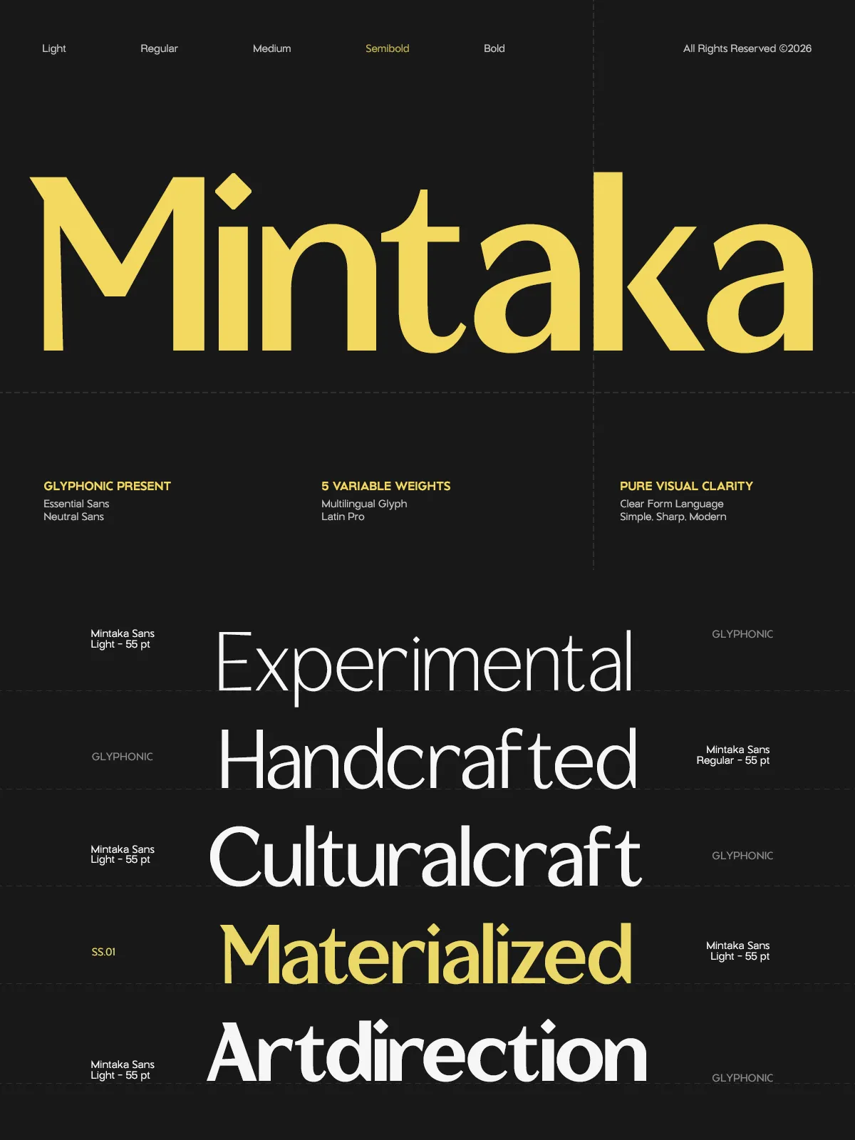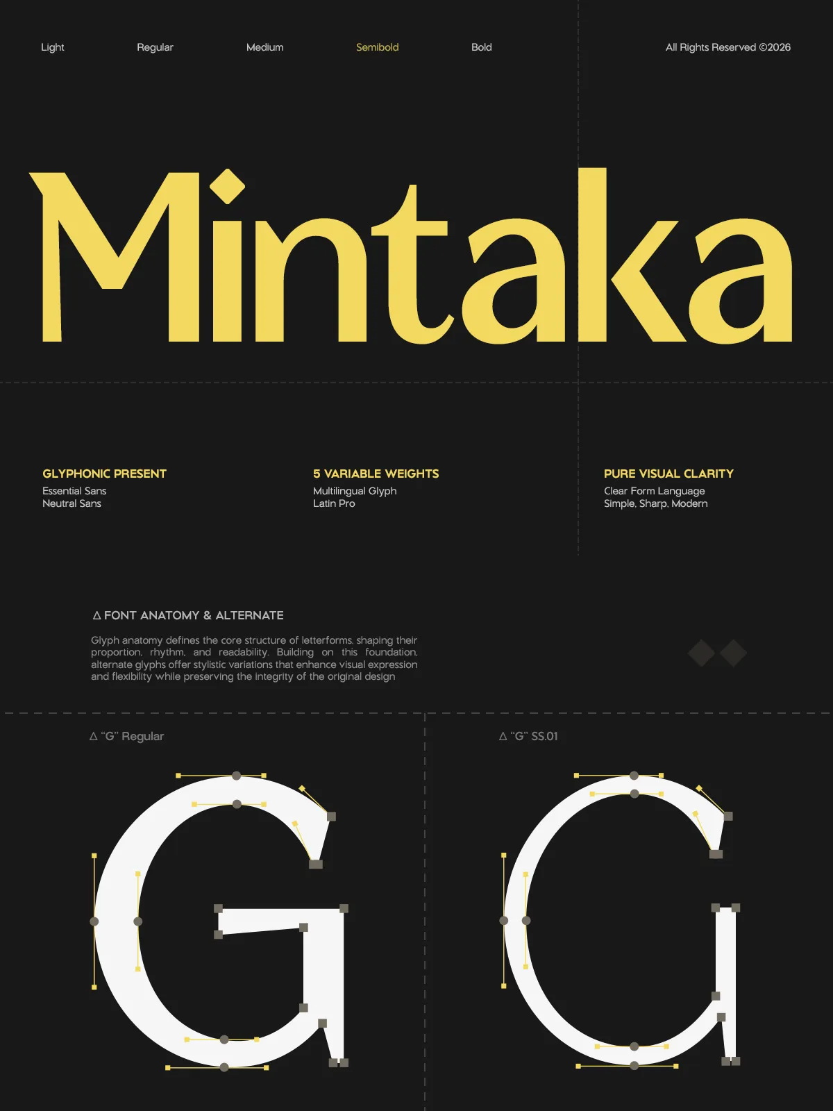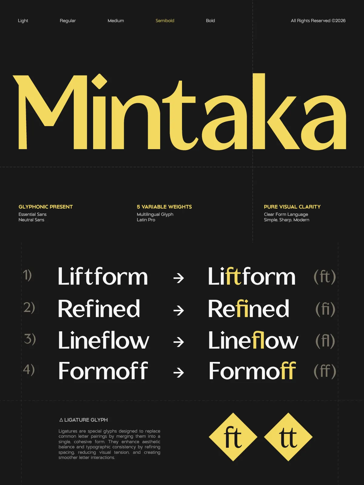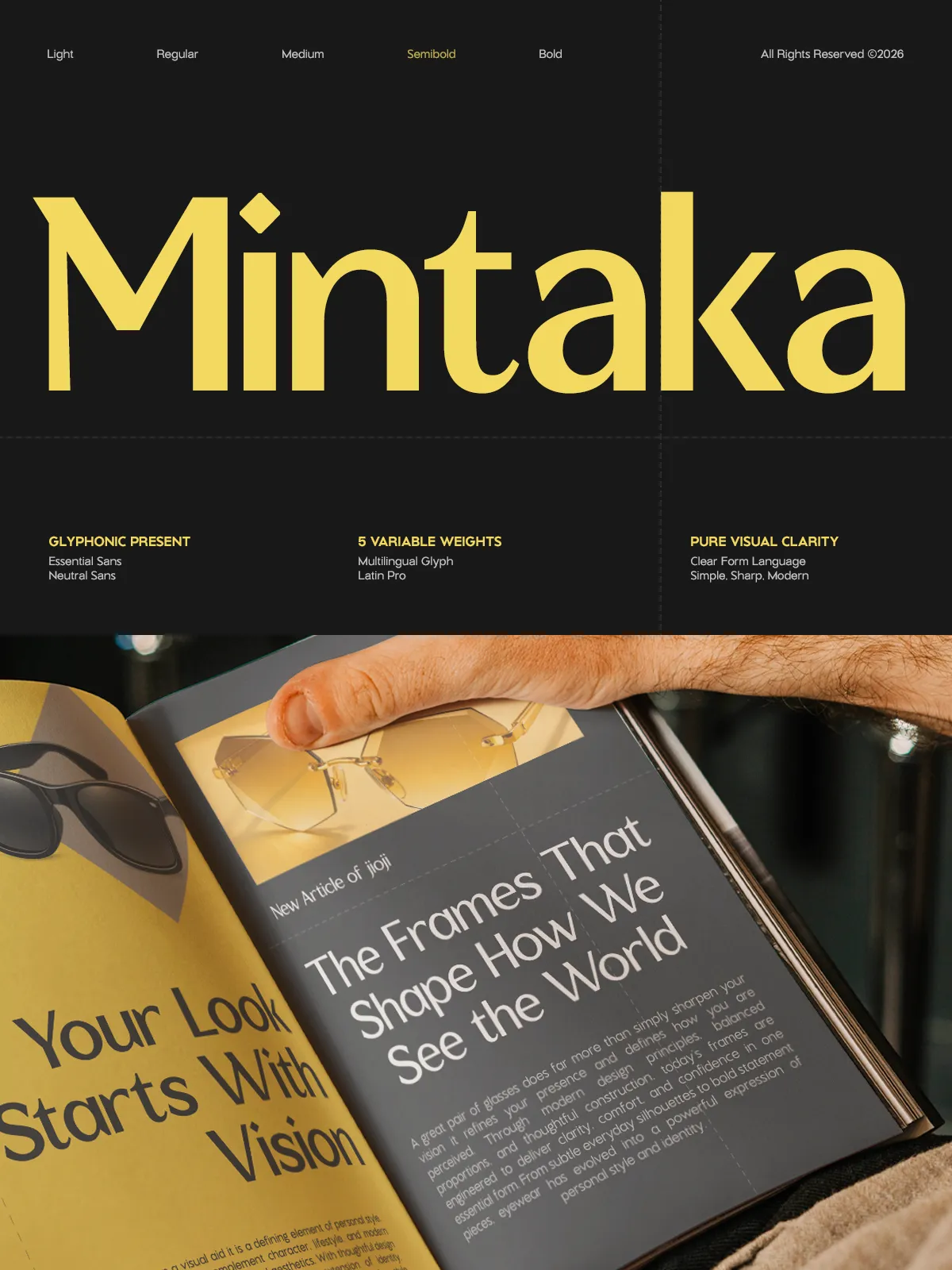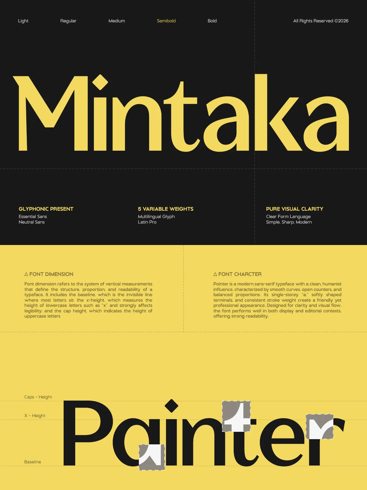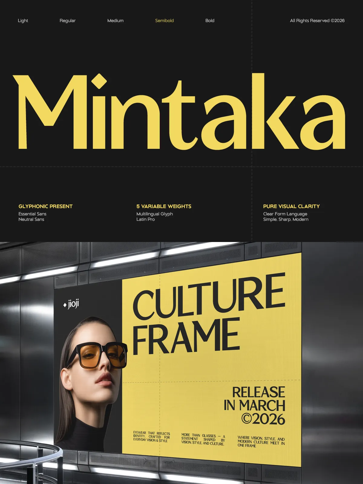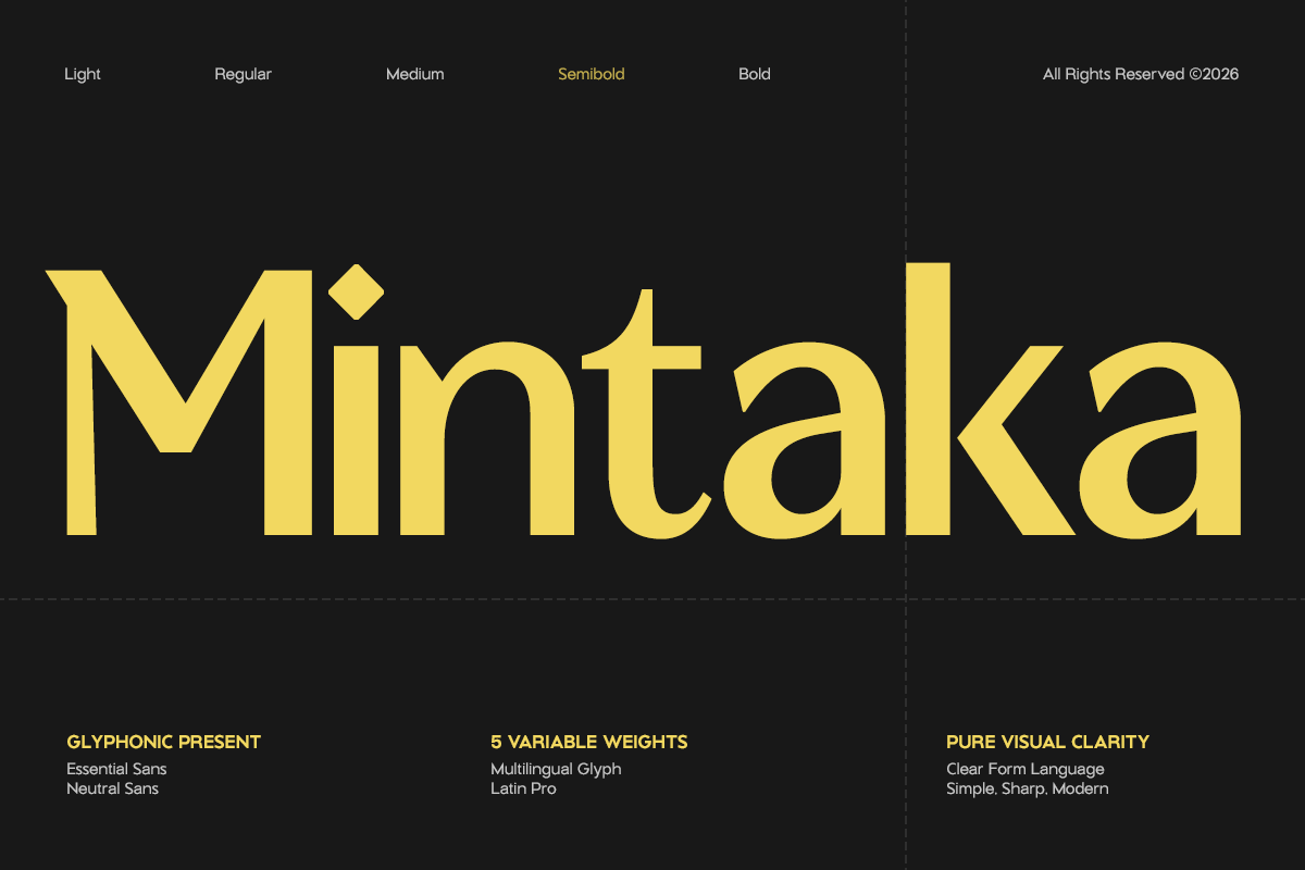

GC Mintaka stands as a testament to the power of simplicity in type design. This elegant display sans typeface rejects visual clutter, focusing instead on the purity of form, balanced proportions, and the subtle grace of refined curves. By stripping away the unnecessary, Mintaka allows the essential character of each letterform to shine, creating a sophisticated visual presence that commands attention without shouting.
Designed for the contemporary designer, Mintaka bridges the gap between minimalist aesthetics and expressive potential. Its smooth construction and sharp, contemporary detailing ensure that every word carries a sense of premium quality. Whether you are designing a high-end fashion magazine or a sleek tech startup website, GC Mintaka provides a versatile foundation that adapts seamlessly to your creative vision.
Why Choose GC Mintaka?
The Power of Variable Typography
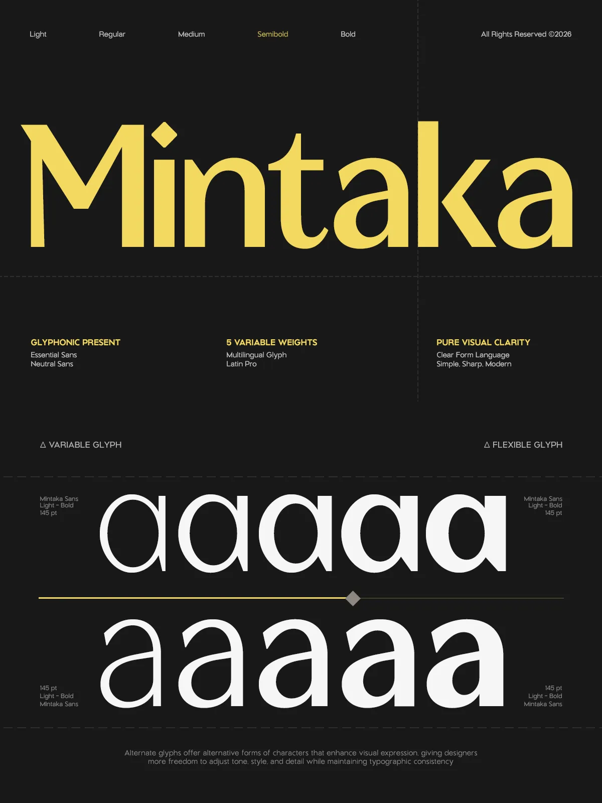
At the heart of GC Mintaka lies its powerful variable font engine, which offers five distinct weight options within a single file. This flexibility allows you to create nuanced typographic hierarchies with unprecedented control. From the airy delicacy of the Light weight, perfect for subtle backgrounds, to the commanding presence of the Bold weight, ideal for statement headlines, you can fine-tune the voice of your text to match the exact mood of your project.
This variability is not just a technical feature; it is a creative tool. You can interpolate between weights to find the perfect sweet spot for your layout, ensuring that every letter fits its context flawlessly. The consistency of the design across all weights means that your typography remains cohesive and professional, regardless of the visual impact you aim to achieve.
Geometric Precision Meets Humanist Warmth
While GC Mintaka is built on a clean geometric structure, it avoids the coldness often associated with pure geometric sans serifs. The letterforms possess a subtle warmth and organic flow that makes them inviting to read. The rounded terminals and carefully tuned spacing give the type a sense of movement and life, preventing it from feeling static or rigid.
This balance of geometry and humanity makes Mintaka exceptionally adaptable. It works equally well in rigid, structured layouts where order is key, and in more organic, flowing compositions where a touch of elegance is needed. The result is a typeface that feels both modern and timeless, technical and approachable.
Comprehensive Feature Set
Essential Glyphs for Global Use
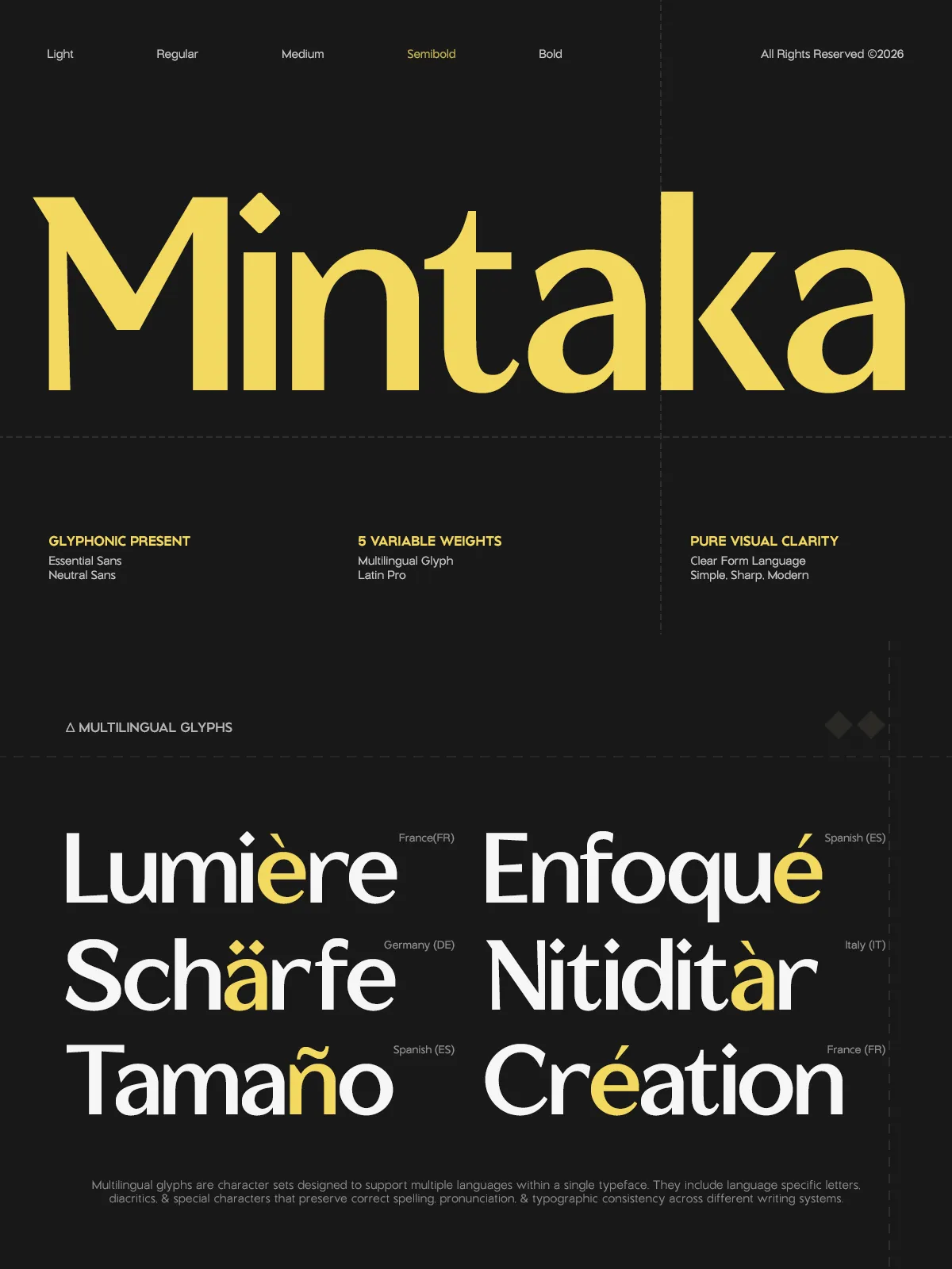
GC Mintaka is built to support a global audience. With robust multilingual support covering over 170 languages, it includes the necessary diacritics, punctuation, and special characters required for European, Asian, and other international scripts. This extensive language support ensures that your brand message translates accurately across borders, maintaining its elegance and clarity in every language.
The font includes a complete set of uppercase and lowercase letters, numerals, and punctuation marks. Every glyph has been meticulously crafted to maintain the integrity of the design system. Whether you are setting a name in French, a title in German, or a description in Spanish, GC Mintaka delivers consistent quality and stylistic harmony.
File Formats and Compatibility
Understanding the diverse needs of modern workflows, GC Mintaka is delivered in multiple formats to ensure maximum compatibility. You receive OTF and TTF files for traditional desktop publishing and print production, ensuring perfect integration with Adobe InDesign, Illustrator, and Photoshop. Additionally, Webfont formats (WOFF/WOFF2) are included, allowing you to embed the font directly into websites for consistent rendering across all browsers and devices.
Ideal Applications
Branding and Identity
The clean, sophisticated nature of GC Mintaka makes it an outstanding choice for brand identities. Use it for logos, stationery, and brand guidelines to convey a message of professionalism, clarity, and modern elegance. The variable weights allow you to create a strong, memorable logotype while using lighter weights for taglines and supporting text.
Editorial and Fashion
For fashion magazines, lookbooks, and editorial spreads, GC Mintaka adds a layer of high-end refinement. Its elegant display characteristics shine in headlines and pull quotes, while its readability ensures that body text (when paired with a complementary serif or sans) remains accessible. The font’s ability to convey luxury makes it a favorite among creative directors in the fashion and lifestyle sectors.
Digital Interfaces and Web Design
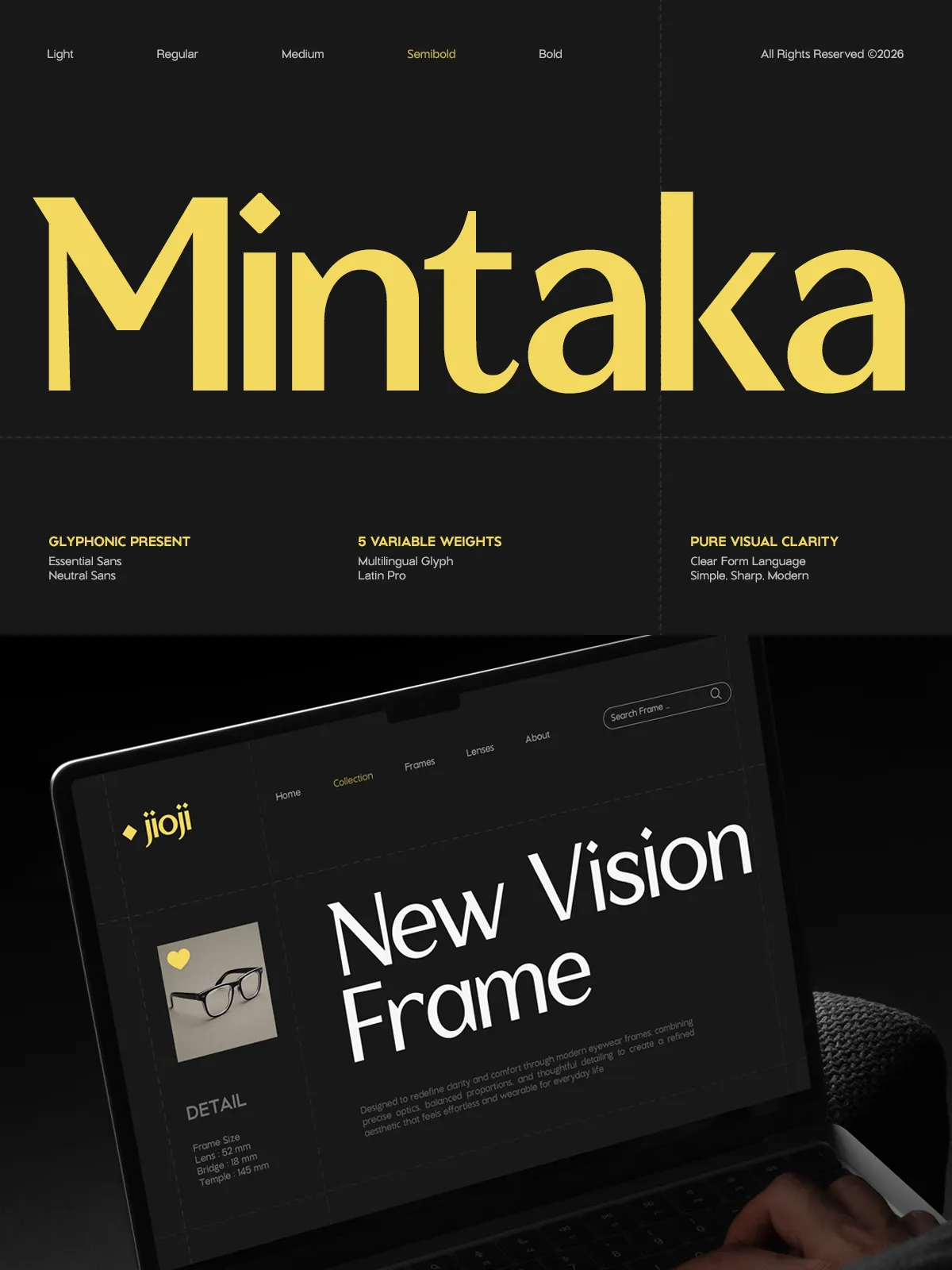
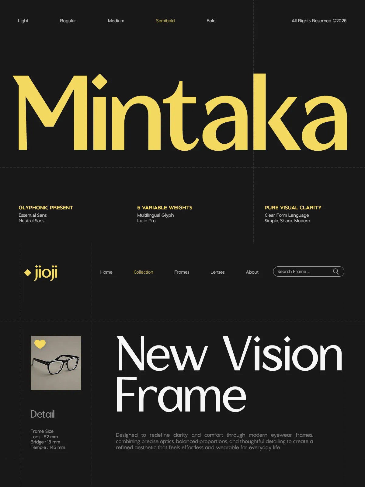
In the digital space, GC Mintaka offers clarity and impact. Its legibility at small sizes makes it suitable for UI elements, navigation menus, and app interfaces. The variable font capabilities allow for smooth animations and interactive typographic effects, adding a dynamic layer to user experience design. Use it to create landing pages that feel premium and trustworthy.
Posters and Marketing Materials
For posters, event invitations, and marketing campaigns, GC Mintaka’s bold weights demand attention. The geometric purity of the letters creates strong visual anchors that guide the viewer’s eye. Combine bold headlines with lighter descriptive text to create striking posters that balance impact with readability.
Styling Recommendations
Pairing Strategies
Because GC Mintaka is a display sans with strong character, it pairs beautifully with a variety of companion typefaces. For a modern, minimalist look, pair it with a neutral geometric sans for body text. To add warmth and contrast, combine it with a humanist serif. This contrast allows Mintaka to take center stage in headlines while providing a stable, readable foundation for longer text blocks.
Technical Tips
When using GC Mintaka, take advantage of its variable nature. Experiment with subtle weight shifts in digital designs to create hover effects or dynamic transitions. For print, consider the physical medium; on glossy magazine paper, the lighter weights will appear delicate and sophisticated, while on matte labels, the heavier weights will provide excellent contrast and legibility.