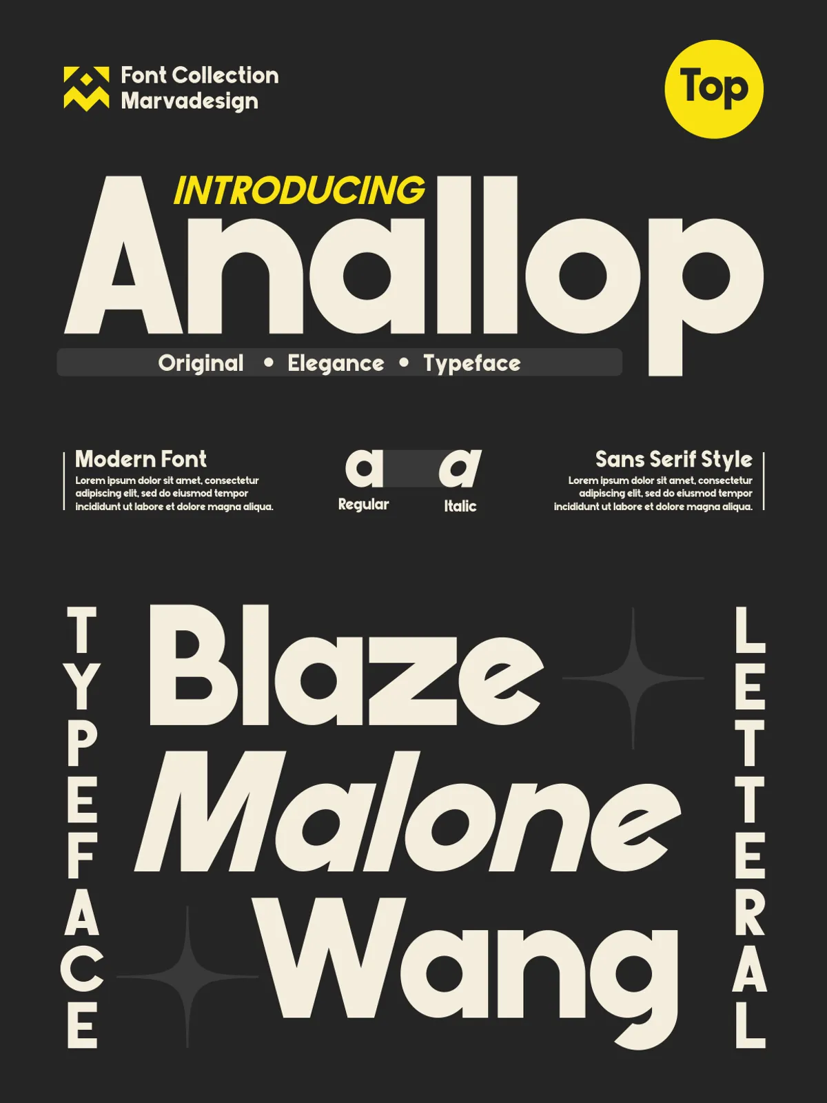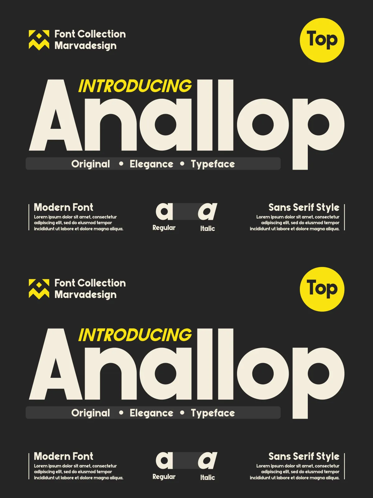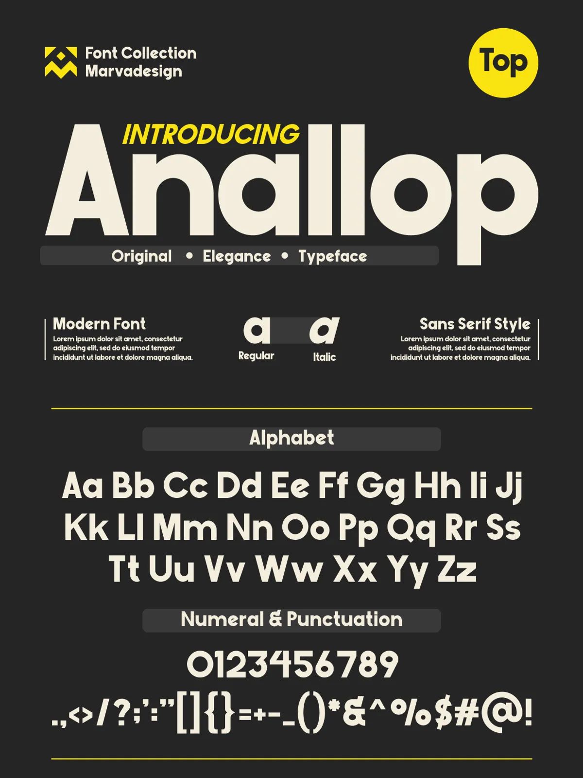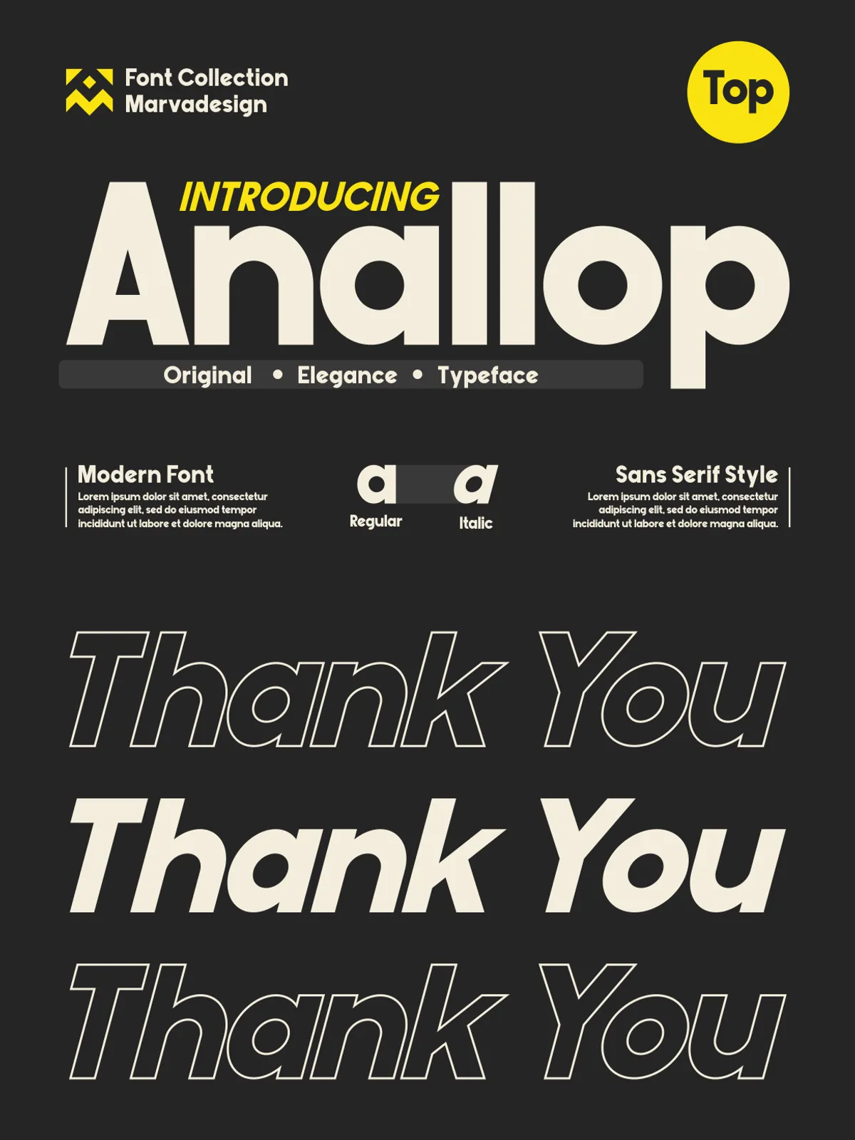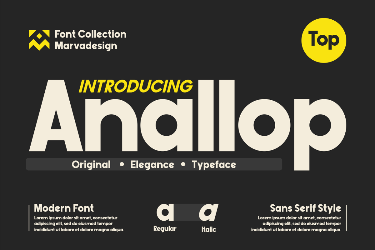

Anallop is a bold geometric display sans serif engineered to command attention. With oversized proportions, thick uniform strokes, and rounded geometric forms, this typeface delivers a strong, contemporary presence. Designers who need headlines that stop scrolls and signage that reads from a distance will find Anallop purposeful and persuasive. The typeface balances confident weight with approachable curves, making it a versatile tool for editorial spreads, brand identities, packaging, and large-format graphics.
Key Features
Bold Geometric Construction
Anallop uses clean geometric foundations—circles, squares, and straight strokes—to create letters that read as modern and intentional. The simplified shapes and consistent stroke width produce a cohesive system that reads clearly at display sizes while retaining character and personality.
Oversized Proportions & Generous Counters
The typeface features wide letterforms and roomy counters that improve legibility and create dramatic visual impact. Oversized proportions let headlines breathe and establish strong typographic hierarchy without sacrificing readability.
Rounded Forms & Friendly Tone
Rounded terminals and soft curves temper Anallop’s boldness, yielding a friendly yet assertive voice. This balance helps the typeface perform across diverse contexts—from modern tech branding to lifestyle packaging—where clarity and approachability matter.
Robust File Support
Anallop ships in standard desktop formats to integrate smoothly into design workflows: OTF and TTF files allow easy installation across operating systems and professional design software.
What’s Included
- Anallop Regular (OTF)
- Anallop Regular (TTF)
- Full Uppercase set
- Full Lowercase set
- Numbers, punctuation, and basic symbols
- Installation and licensing documentation
Why Choose Anallop
Choose Anallop when you need a headline-driven aesthetic that feels modern and confident. The typeface accelerates brand recognition by delivering immediate visual weight, while its geometric clarity supports legibility in both print and digital environments. Use Anallop to create bold statements: logotypes, posters, hero banners, storefront signage, and product labels that demand attention.
Applications & Use Cases
Anallop excels in any project that benefits from strong, readable display type. Typical applications include:
- Brand identities and logo systems—establishing a bold typographic voice
- Packaging design—creating shelf-ready, attention-grabbing headlines
- Editorial covers and magazine spreads—anchoring layouts with commanding display type
- Advertising and outdoor signage—ensuring legibility at scale and distance
- Web hero sections and UI headings—providing clear hierarchy and modern styling
Pairing & Design Tips
Establish Clear Hierarchy
Use Anallop for primary headlines and display elements. Pair it with a neutral, readable serif or a clean humanist sans for body text to preserve contrast and readability. Let Anallop carry the visual weight while the companion typeface supports long-form content.
Control Scale and Tracking
At large sizes, allow the shapes to breathe and reduce tracking slightly to maintain compact, impactful headlines. For smaller digital headings, increase tracking and maintain high contrast with the background to preserve legibility.
Use Color and Texture Strategically
Apply bold color blocks, gradients, or subtle textures behind Anallop to amplify emphasis. The typeface’s geometric clarity holds up well against complex backgrounds when contrast remains strong.
Installation & Licensing
To install Anallop, download the ZIP archive, extract the OTF/TTF files, and install them via your operating system’s font manager or design software. Review the included license file to confirm permitted uses—desktop, web, app embedding, and commercial usage vary by license. Contact the vendor for extended licensing or custom usage rights if your project requires server-side embedding or multi-user deployments.