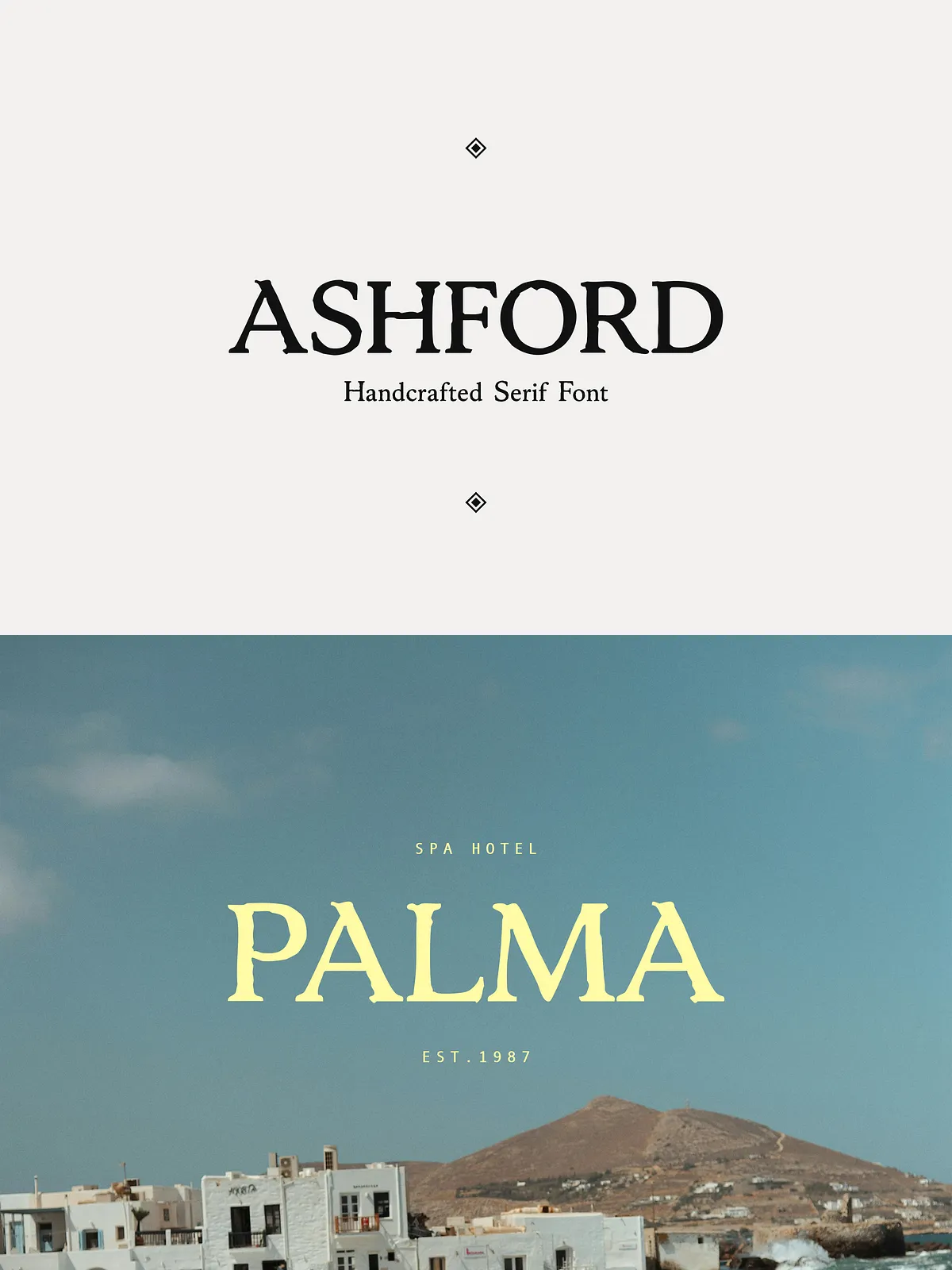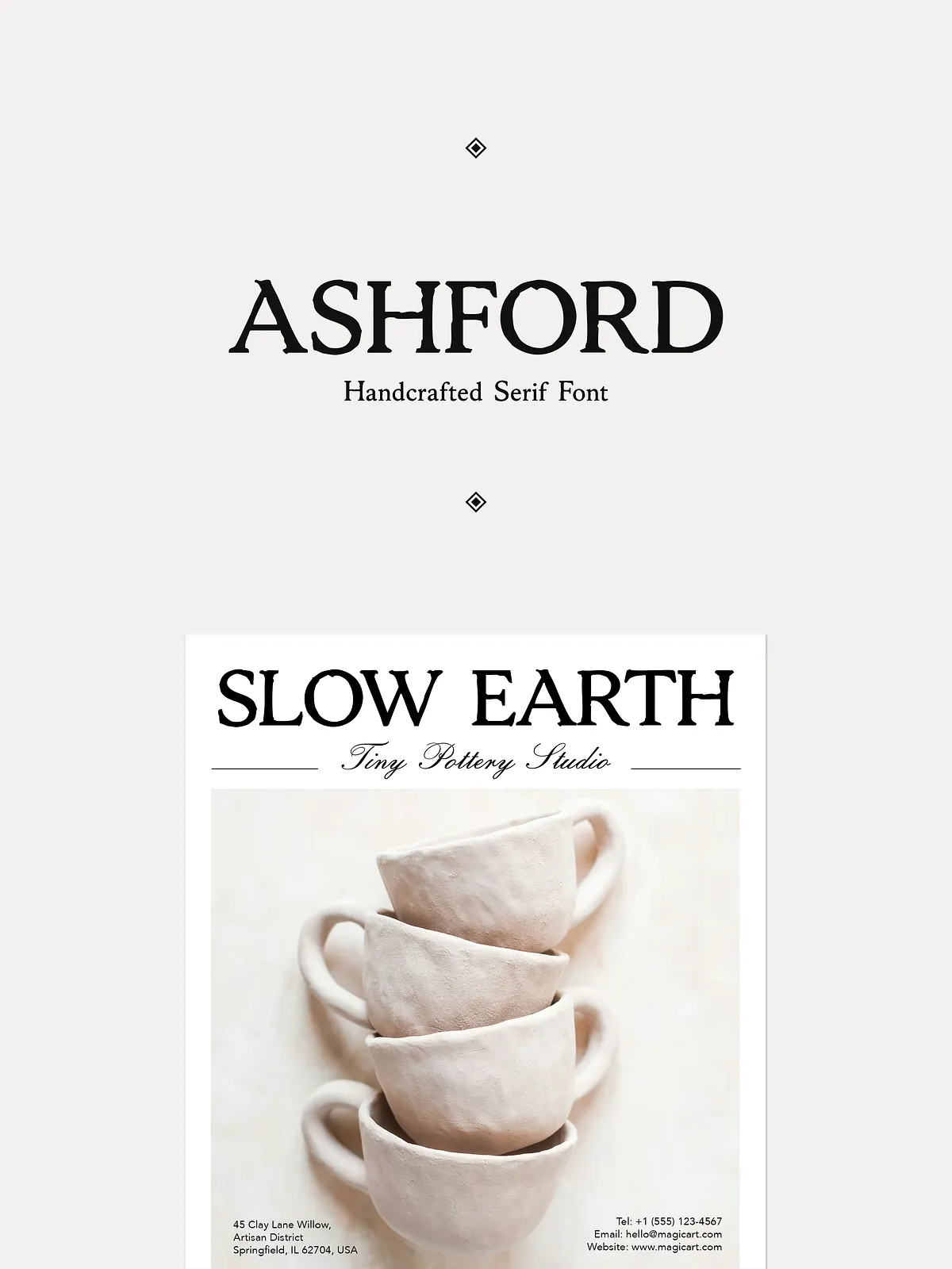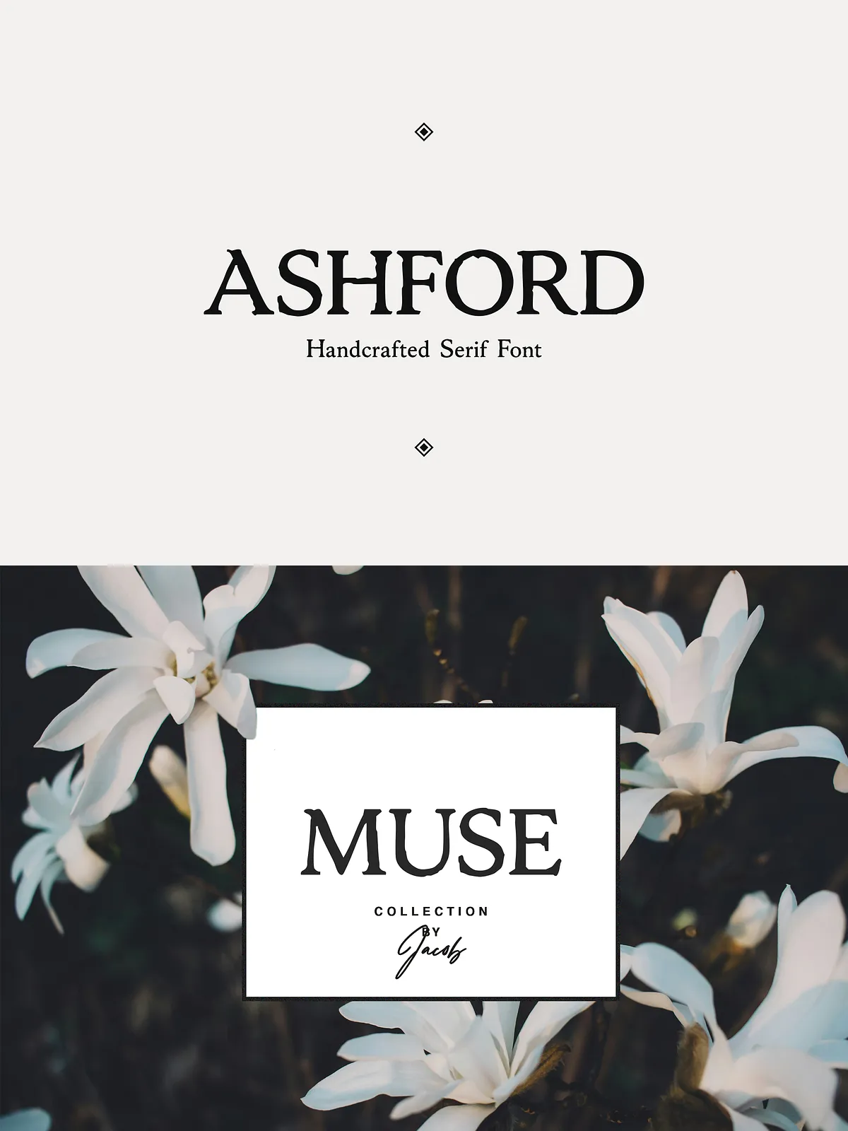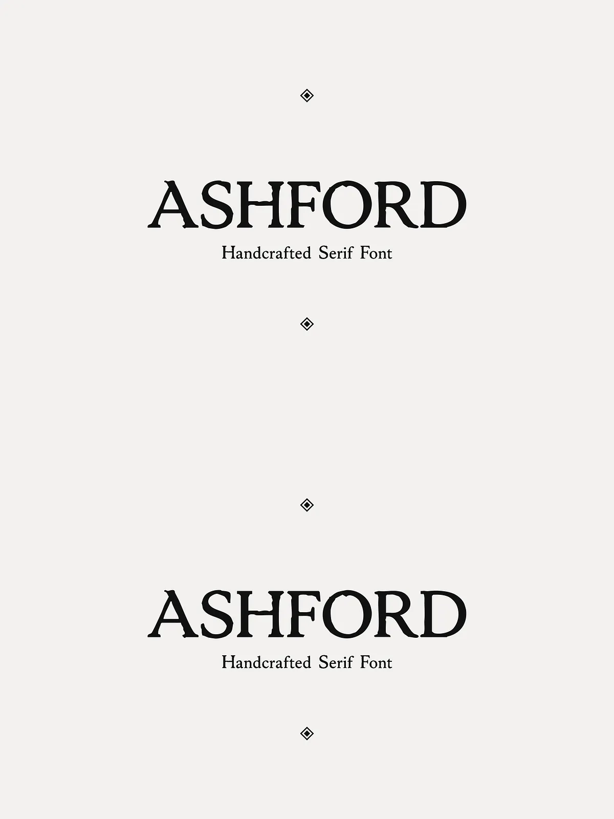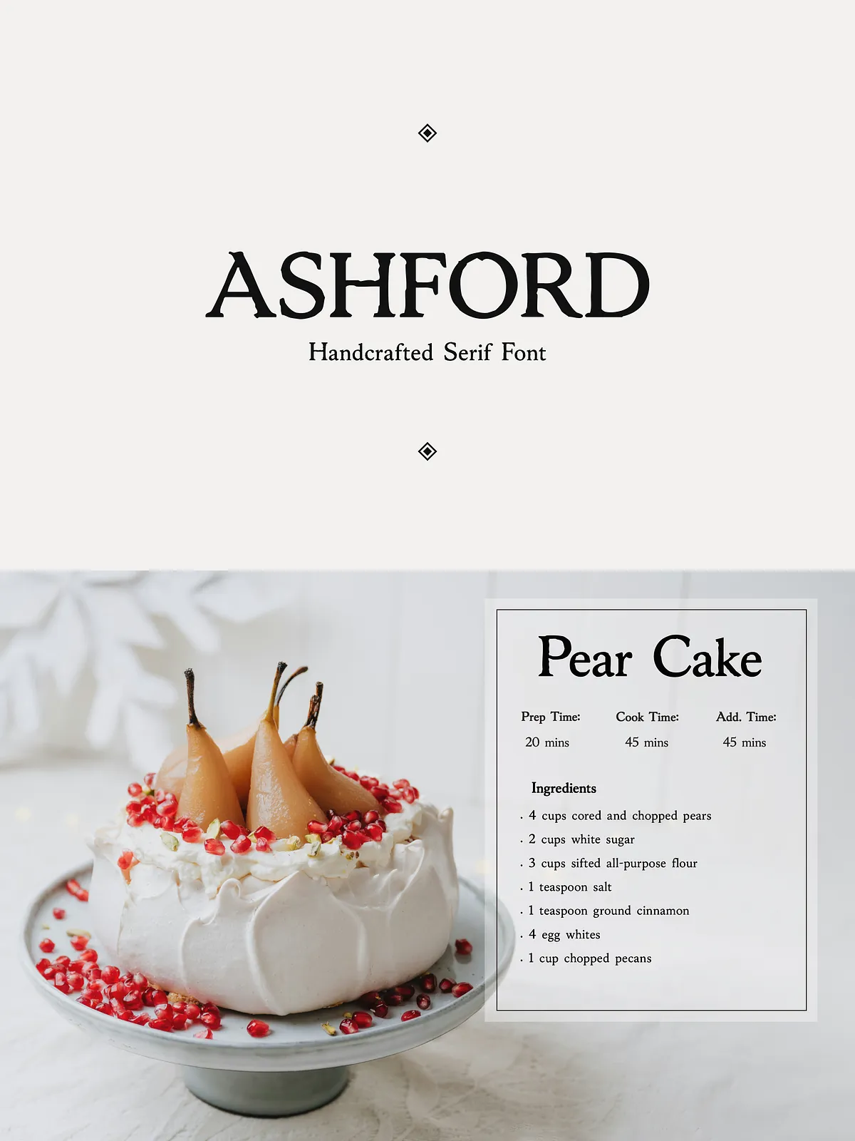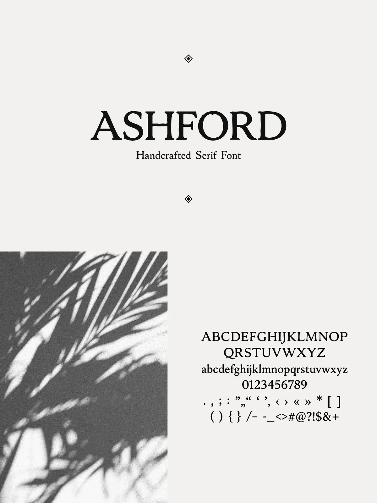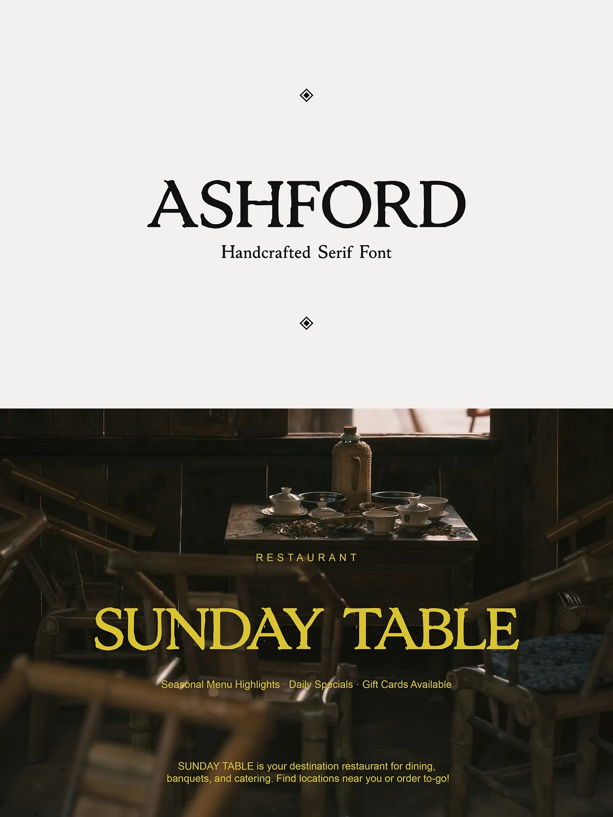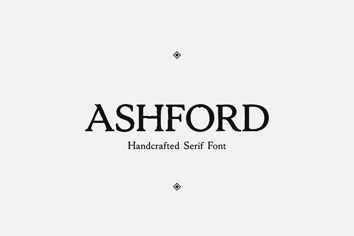

ASHFORD is a vintage-inspired serif that brings handcrafted warmth to modern design. Drawing from old-world botanical labels, cozy restaurant signage, pottery studio marks, and apothecary aesthetics, ASHFORD combines classic serif structure with subtly imperfect details that communicate authenticity. Use ASHFORD when you want type that feels both timeless and approachable—an elegant anchor for brands, packaging, and editorial layouts that value craft and personality.
Design character
Elegant strokes with an organic touch
ASHFORD features slightly irregular terminals and measured contrast to create a human, hand-formed impression without sacrificing legibility. The letterforms lean into an artisanal rhythm: graceful serifs, warm proportions, and refined rhythm that read clearly across headlines, labels, and short blocks of text. These design choices let ASHFORD perform as both a display face and a signature text voice.
Primary uses
Where ASHFORD performs best
- Logos & Branding: Create memorable marks that suggest heritage, craft, and thoughtful curation.
- Wedding Invitations & Stationery: Impart a soft, romantic tone that pairs well with hand-lettered accents and botanical motifs.
- Product Labels & Packaging: Communicate small-batch quality for ceramics, food goods, candles, and apothecary-style products.
- Menus & Signage: Anchor a cozy restaurant or café identity with readable, characterful typography.
- Social Media & Promotional Art: Use ASHFORD to craft visual posts that feel grounded and artisanal.
Practical features
What designers will appreciate
ASHFORD balances decorative personality with practical usability. Its consistent baseline, open counters, and modest contrast make it easy to set at display sizes and short body copy. The typeface supports cohesive branding systems: pair ASHFORD with a clean sans for body text, or combine it with a delicate script for refined invitations. Because ASHFORD emphasizes subtle flaws, it helps projects avoid sterile uniformity and instead read as intentionally crafted.
Workflow tips
Get the most from ASHFORD
- Pair ASHFORD with a neutral geometric or humanist sans for stable body copy and clear information hierarchy.
- Reserve tight tracking for headlines; open letter-spacing slightly for all-caps treatments to enhance readability.
- Layer faint paper textures or muted grain behind titles to emphasize the handcrafted quality without reducing legibility.
- Use color palettes with warm neutrals, muted greens, and earthy tones to reinforce botanical and rustic narratives.
Technical details & compatibility
Formats and implementation
ASHFORD typically ships in standard desktop and web font formats that integrate into common workflows. Install desktop OTF/TTF files with your system font manager for print and design apps, and use webfont formats (WOFF/WOFF2) or @font-face for online use. Check the specific product files and documentation for language support, OpenType features, and file package contents before publishing.
Licensing & usage
Confirm allowed uses
Review the license that accompanies ASHFORD to confirm permitted commercial and client uses, web embedding, and any restrictions on resale. Many font vendors provide both standard commercial licenses and optional extended licenses for high-volume or product-embedded applications—select the license that matches your project scope.