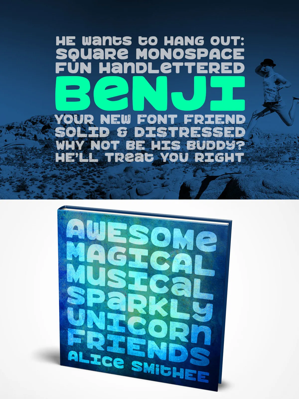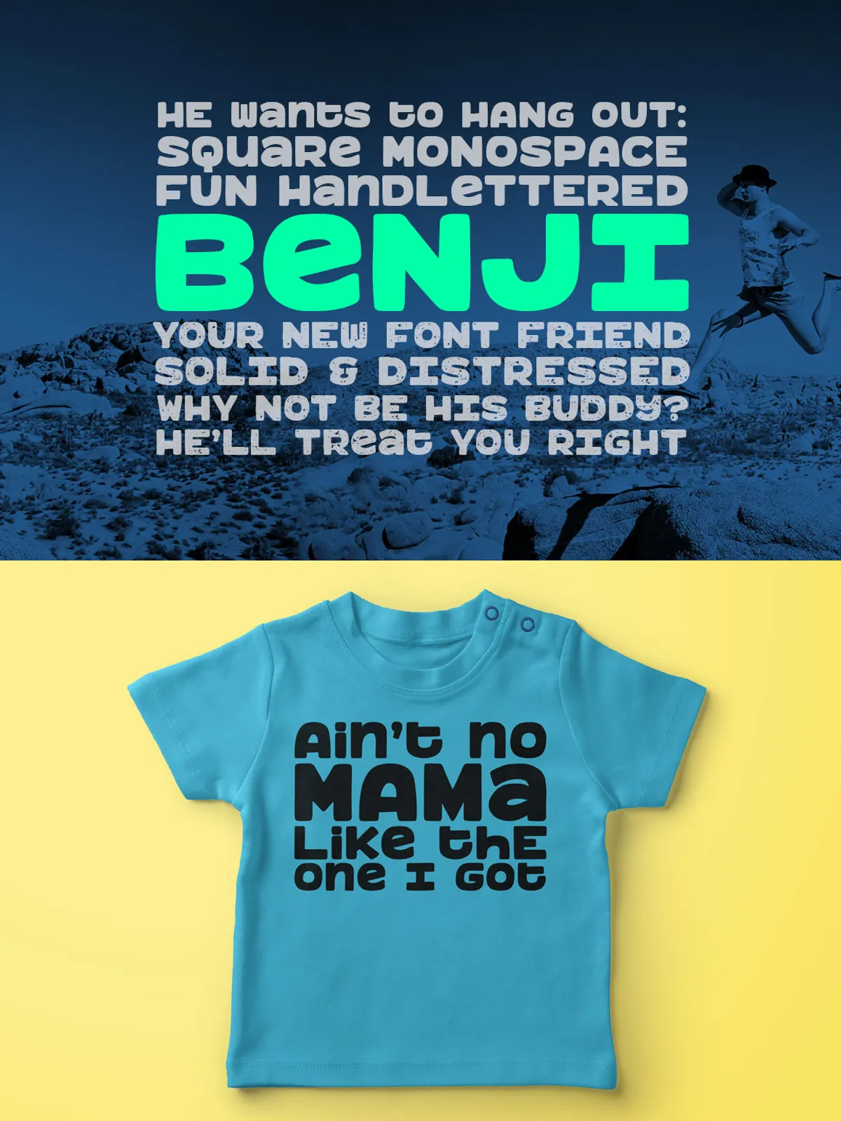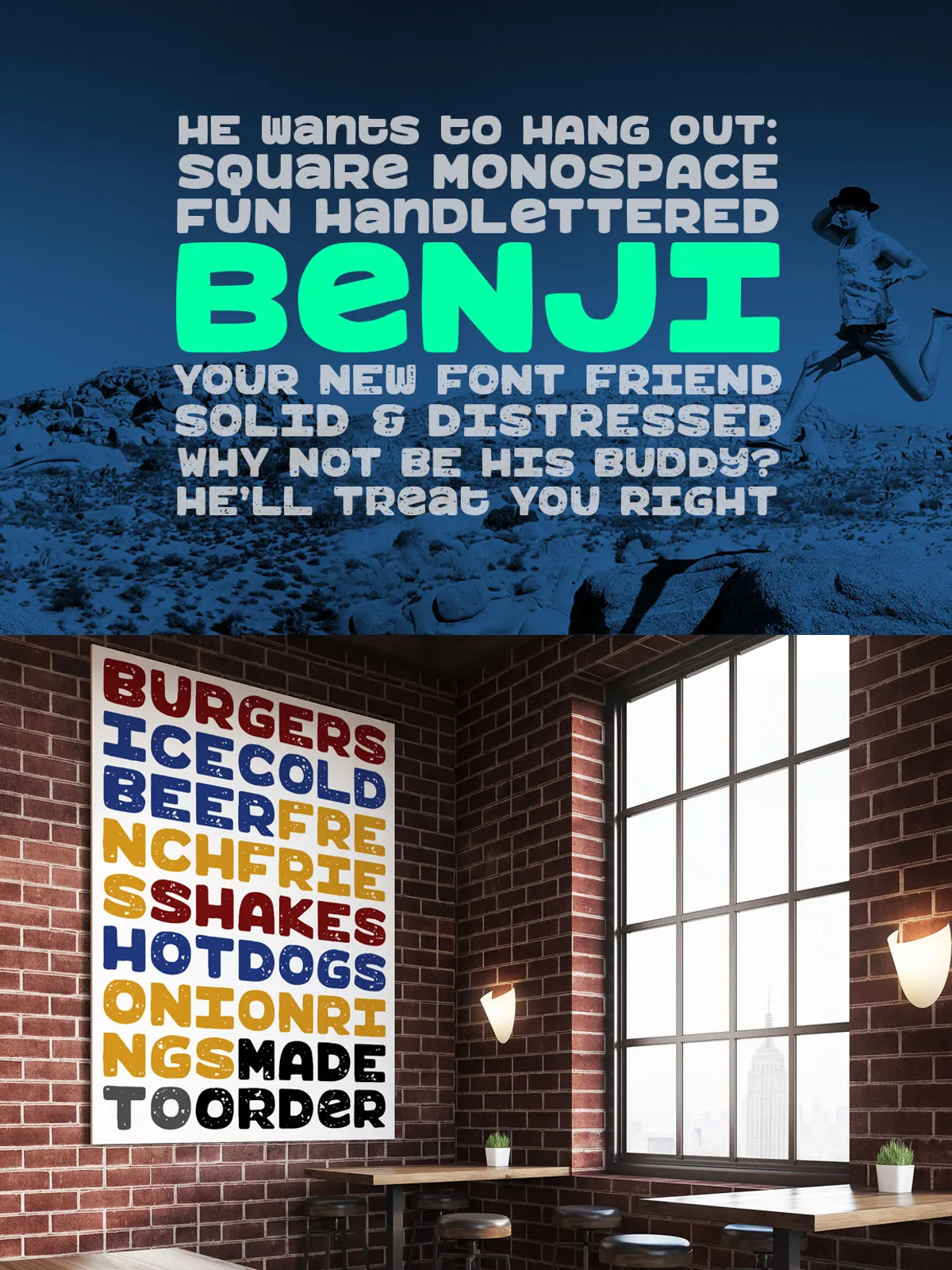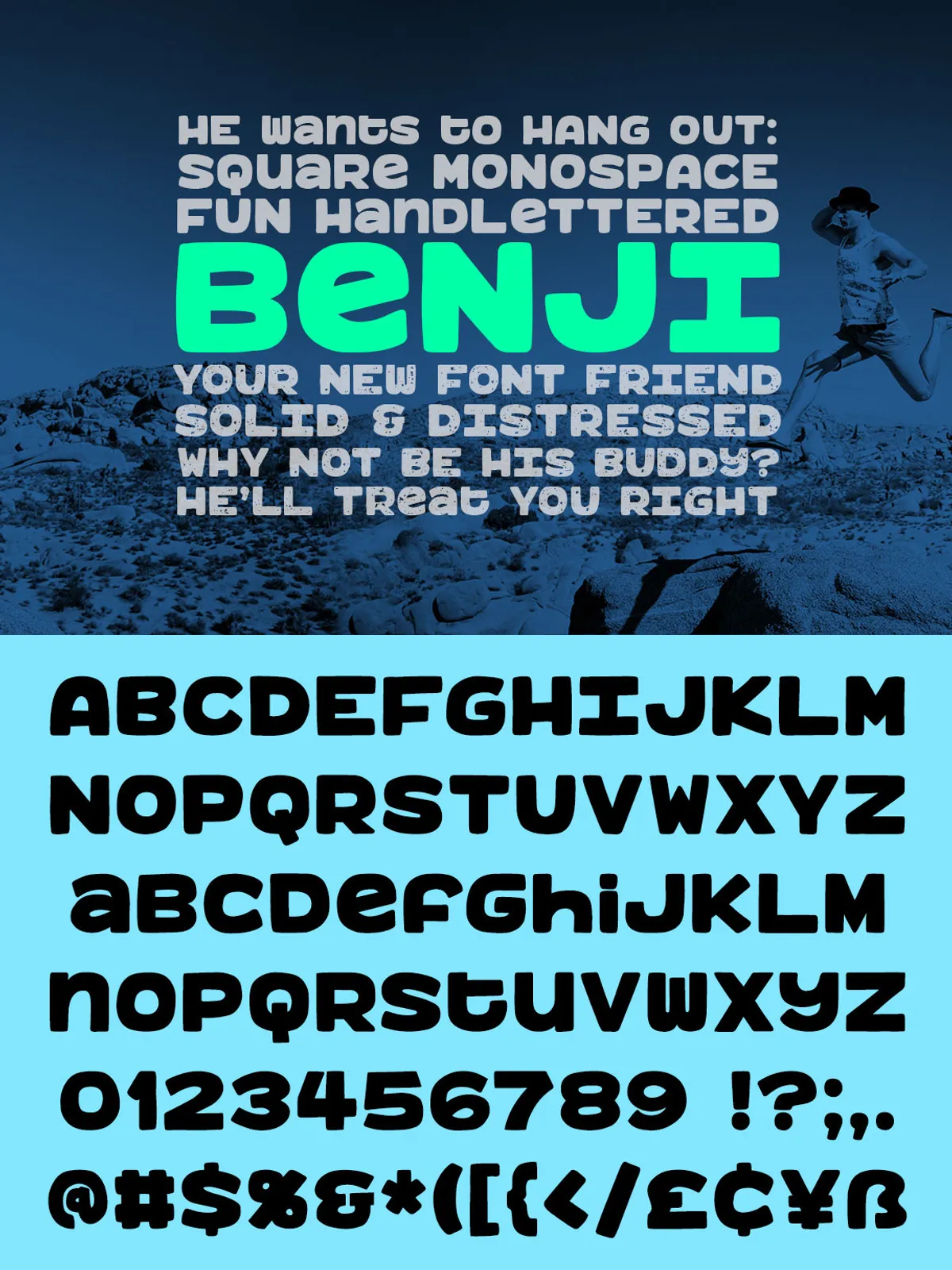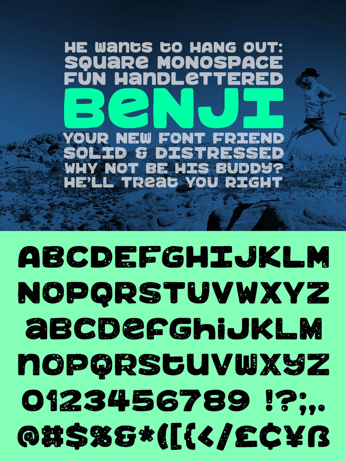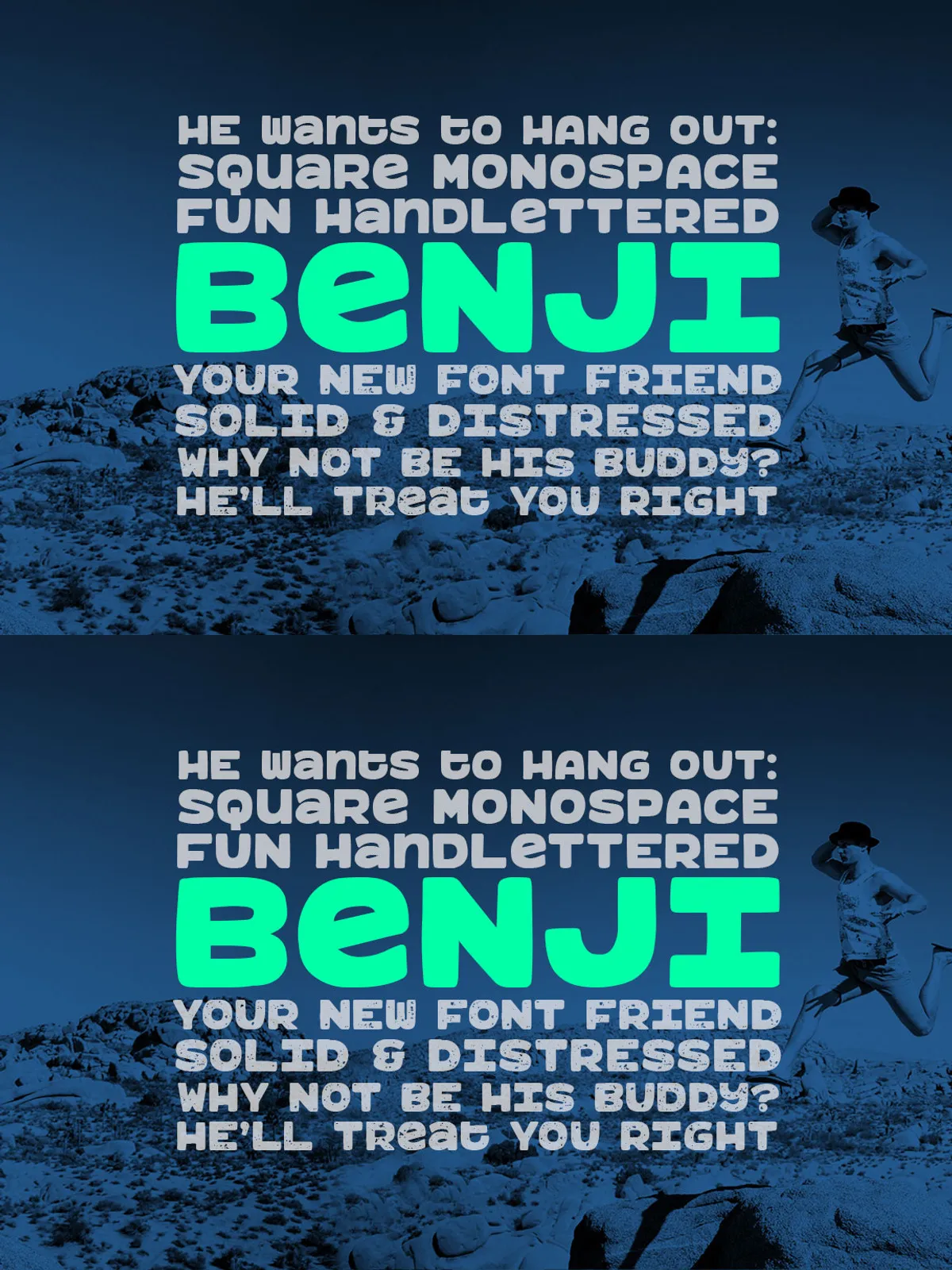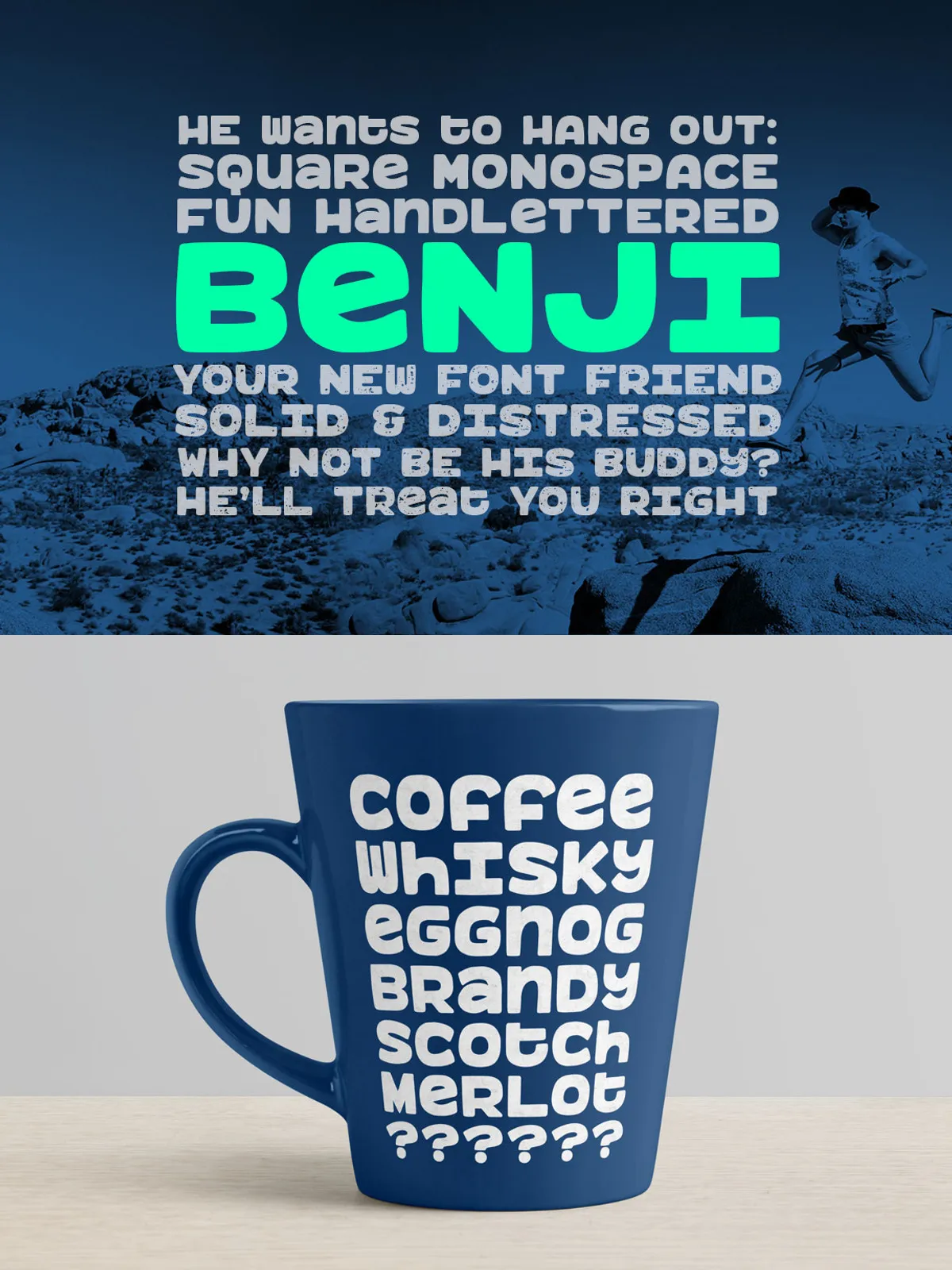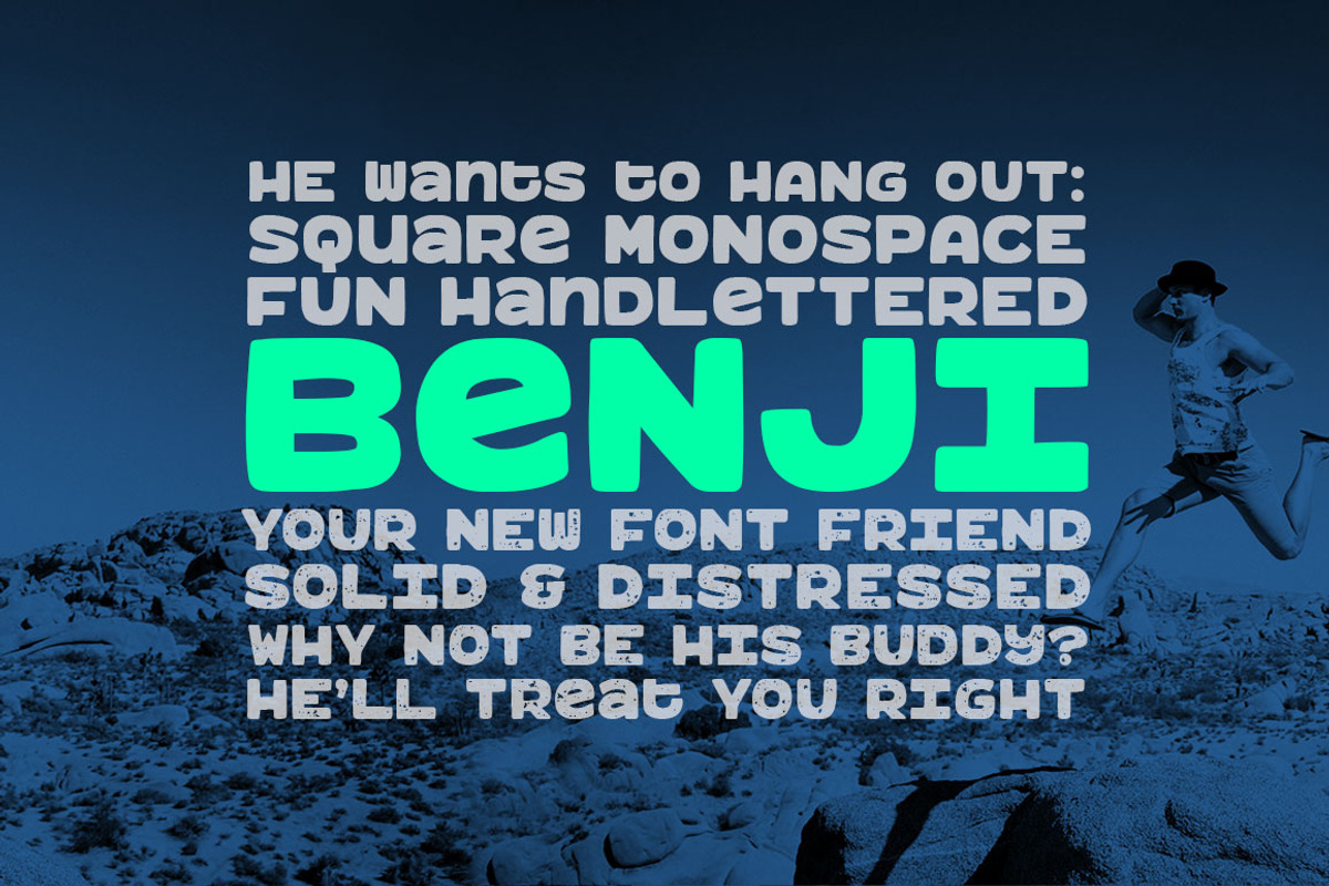

Benji delivers a powerful, playful voice through a thick, square-shaped design that reads clearly at large sizes and stacks perfectly in tight layouts. Designed with consistent square proportions, Benji works horizontally or vertically and converts easily into a monospaced system by disabling built-in kerning. The family includes the clean original Benji, the pre-distressed Benji Rough, and newly added Benji Mono and Benji Rough Mono — giving designers raw texture and precise monospaced behavior in one package.
Key Features
Square-Based, Stackable Geometry
Every letter and numeral in Benji is built on the same square metric, creating visual harmony and enabling vertical stacking without awkward spacing. This geometry makes Benji ideal for product labels, signage, and craft projects that require perfectly aligned characters.
Bold Display Presence
Benji’s heavy strokes and compact counters create a strong headline presence. Use Benji to anchor logos, packaging, posters, and web hero sections where bold identity and instant legibility matter.
Benji Rough — Pre-Distressed Texture
Benji Rough ships pre-distressed for a hip, grungy aesthetic that reads as handcrafted and authentic in print and apparel. Mix Benji and Benji Rough to add contrast: clean weight for logotypes and rough texture for secondary elements or illustrations.
True Monospaced Variants
Benji Mono and Benji Rough Mono remove kerning and fix punctuation spacing so every glyph occupies identical horizontal space. These mono variants deliver full monospaced behavior across letters, numbers, and punctuation — perfect for signage systems, cuttable vinyl, pixel-aligned graphics, and any application that requires columnar alignment.
Extensive Glyph Set & Web Support
Both Benji and Benji Rough include over 450 glyphs: A–Z, a–z, 0–9, punctuation, and extensive Latin accents for multilingual use. The package now includes WOFF webfont files so you can deploy Benji on websites with consistent rendering across browsers.
Handy Extras
Benji contains alternate characters (including an alternate #1), a heart (mapped to the bar key) and a square (mapped to the tilde key), and PUA-encoded glyphs for easy access via Character Map or Font Book. Built-in kerning remains available but can be disabled when you want true mono behavior.
Use Cases
Cutting Vinyl & Paper Crafts
Benji’s uniform square shapes cut cleanly in vinyl and paper. The regular Benji is ideal for precise vinyl cutting, stickering, and stencil work. If you want pre-distressed results for screen printing or craft labels, choose Benji Rough.
Branding & Product Packaging
Benji’s bold geometry creates memorable logos and pack layouts. Use the rough version to convey artisanal or vintage character; pair the regular weight for legible ingredient lists, tags, or price labels.
Print & Apparel
Benji scales well for posters, T‑shirts, and merch. The textural details of Benji Rough hold up in screen printing and heat transfer, while the mono variants support aligned typographic systems for numbered lists or product codes.
Web & UI
With included WOFF files, Benji works as a headline or display face on the web. Use the webfont for strong, branded headings and reserve neutral body typefaces for long-form copy.
Technical Details, Licensing & Installation
Formats Included
The download typically includes OTF/TTF for desktop use and WOFF/WOFF2 for web deployment. Verify the specific files in your package and upload the WOFF files to your web host or font service for reliable web rendering.
Licensing
Read the license that accompanies your purchase. Standard licenses commonly cover desktop and web use for a single user. Purchase extended or commercial licenses for embedding into products for resale or distributing the font inside digital goods.
Installation & Workflow Tips
Install desktop OTF/TTF files via your OS to activate Benji in Illustrator, Photoshop, and other design tools. For vinyl cutting, export vector outlines at the necessary size; for web use, load WOFF or WOFF2 and reference with @font-face rules or your CMS font loader.
Pairing Suggestions & Best Practices
Complement with Neutral Bodies
Pair Benji with a simple sans serif or a low-contrast serif for readable body text. The strong display personality of Benji works best when balanced by neutral, unobtrusive type for paragraphs and interface copy.
Spacing & Kerning
When you want monospaced alignment, disable built-in kerning or use the Mono variants. For expressive headlines, keep kerning enabled and adjust letter-spacing manually for visual balance, especially when combining Benji with decorative swashes or logotype elements.