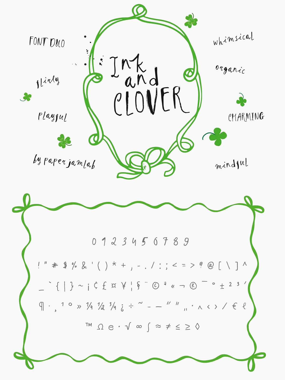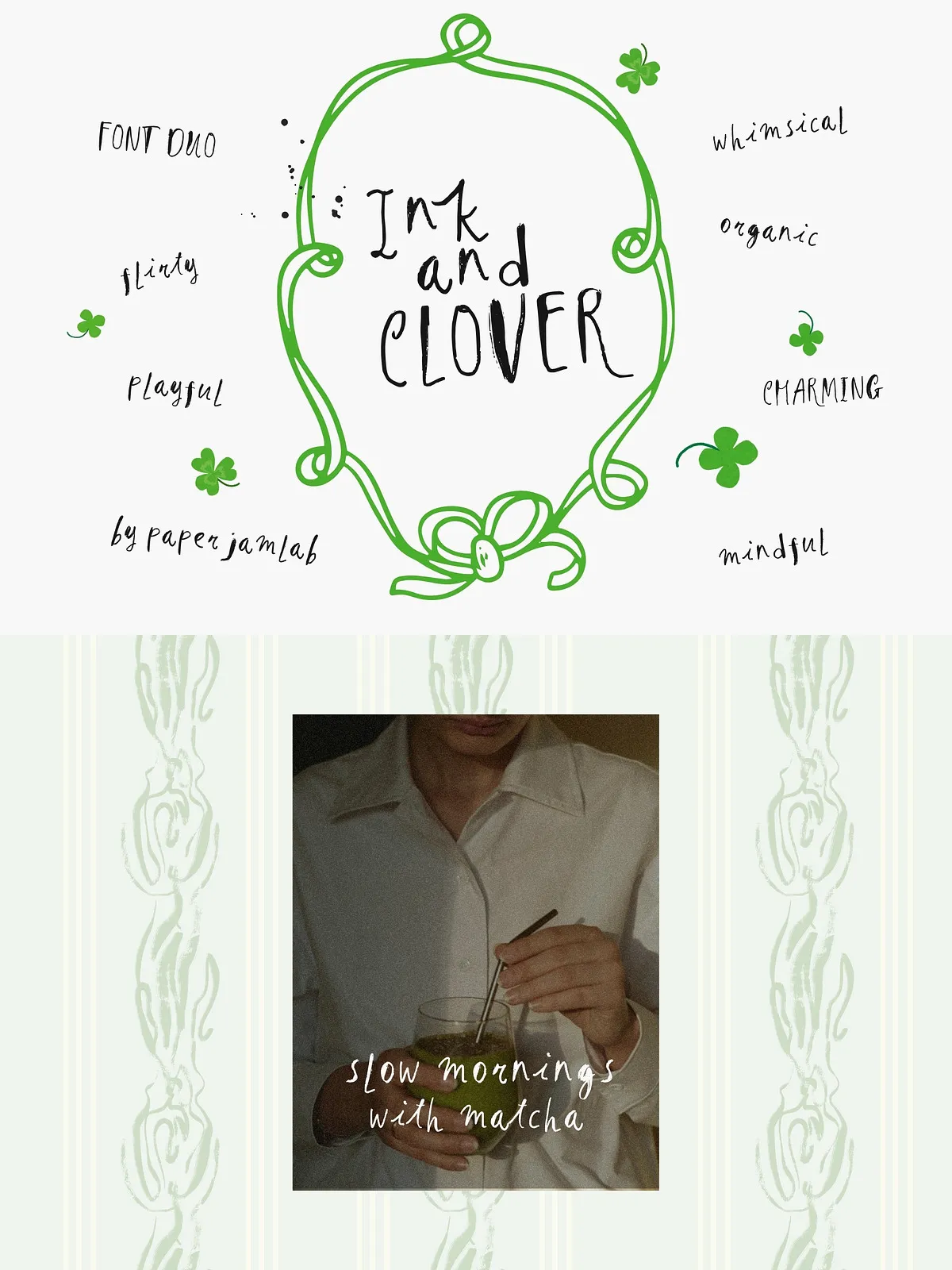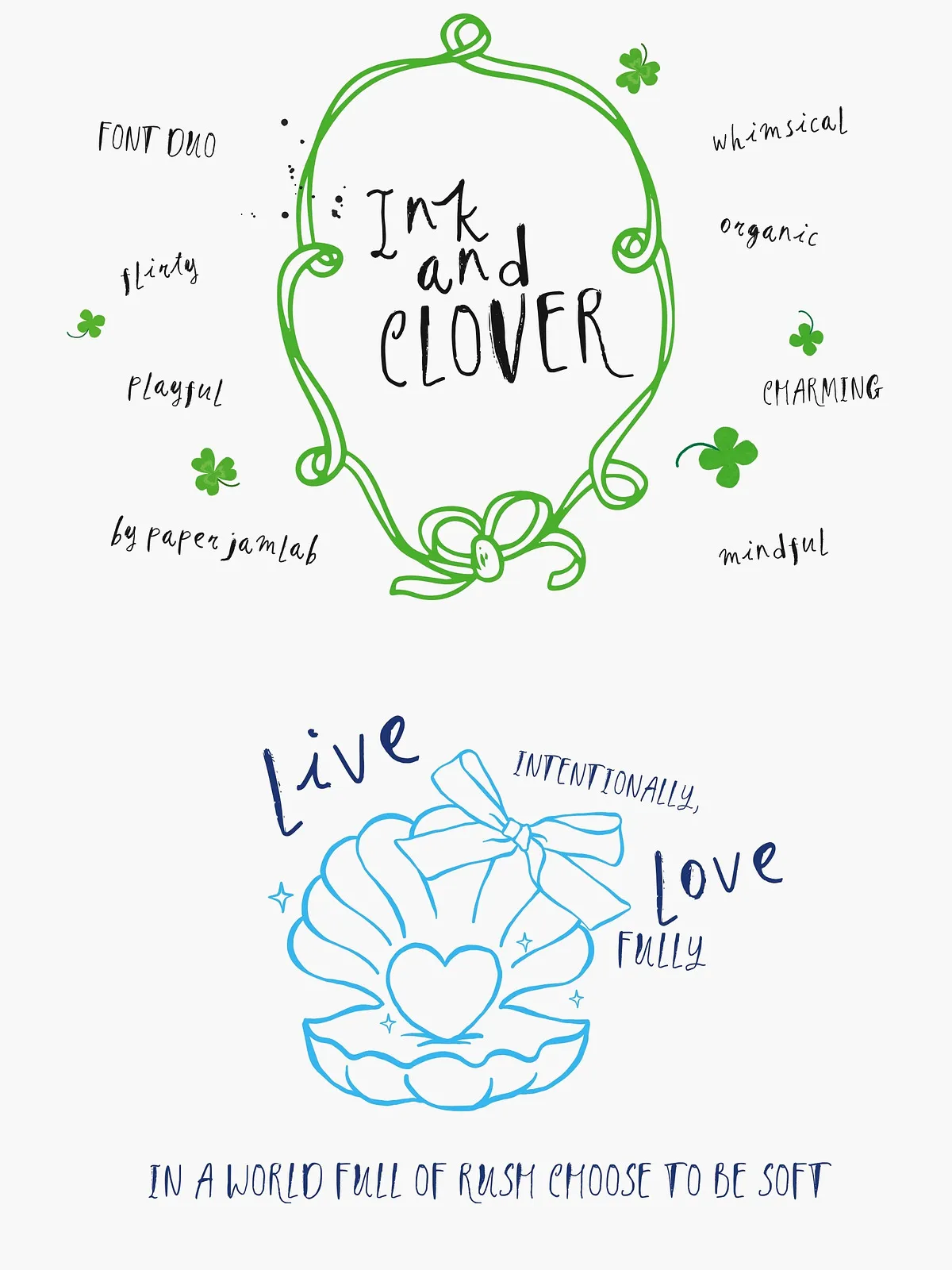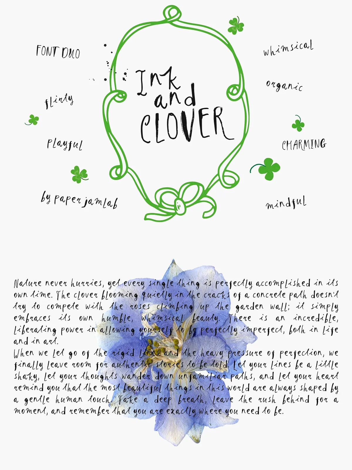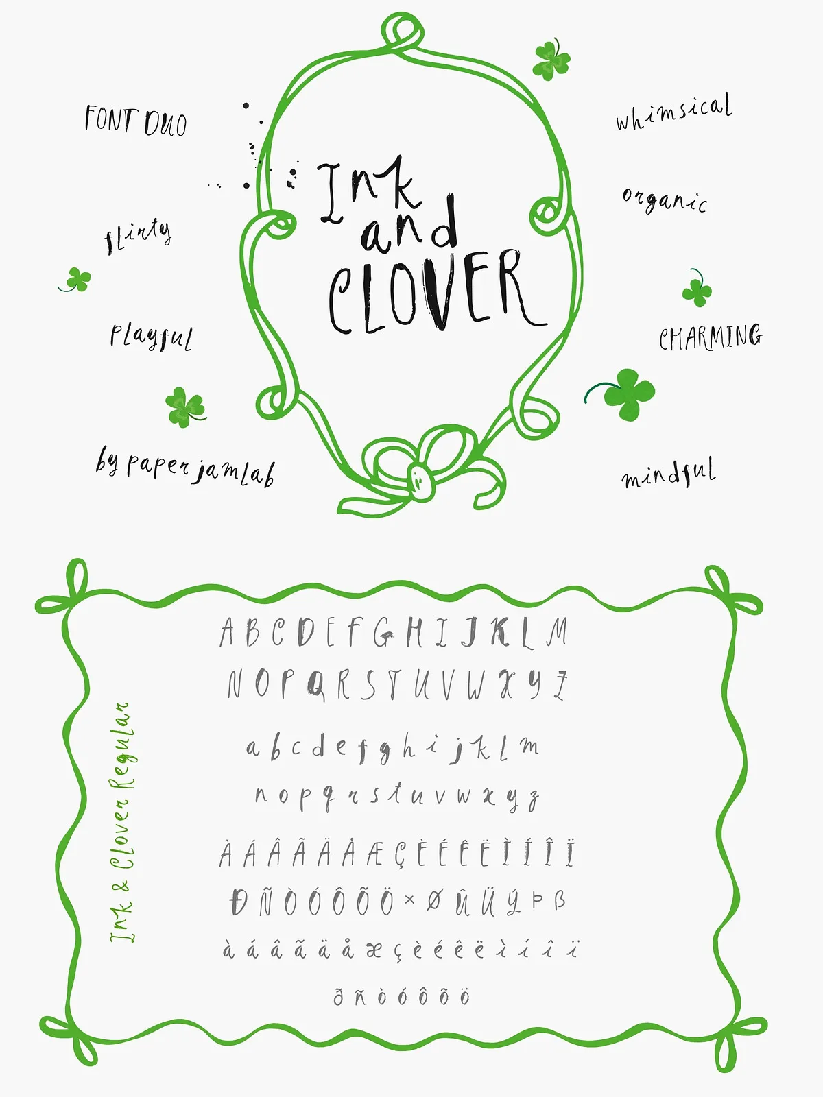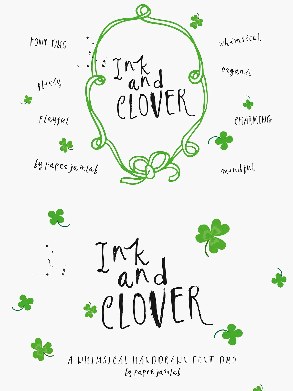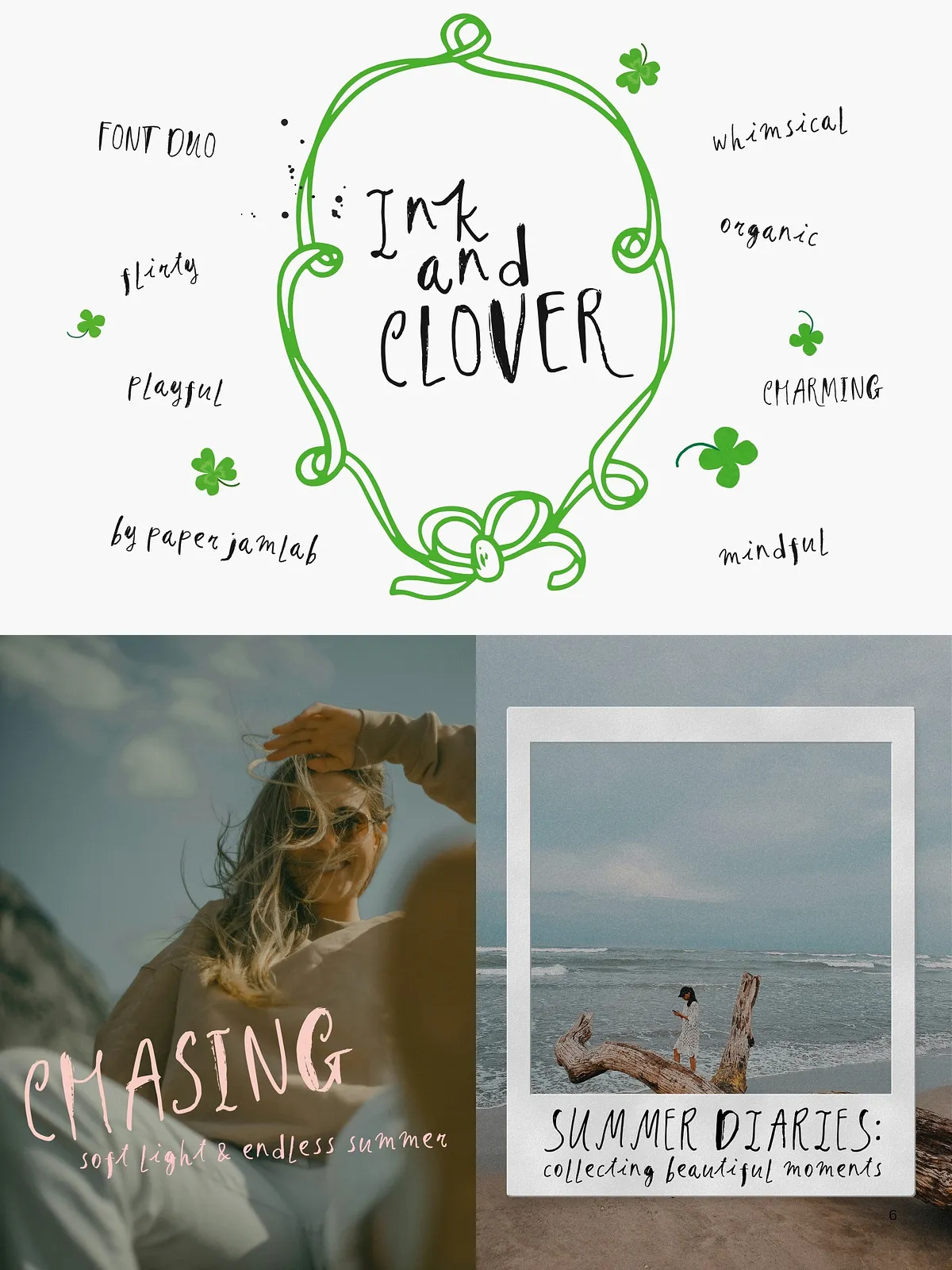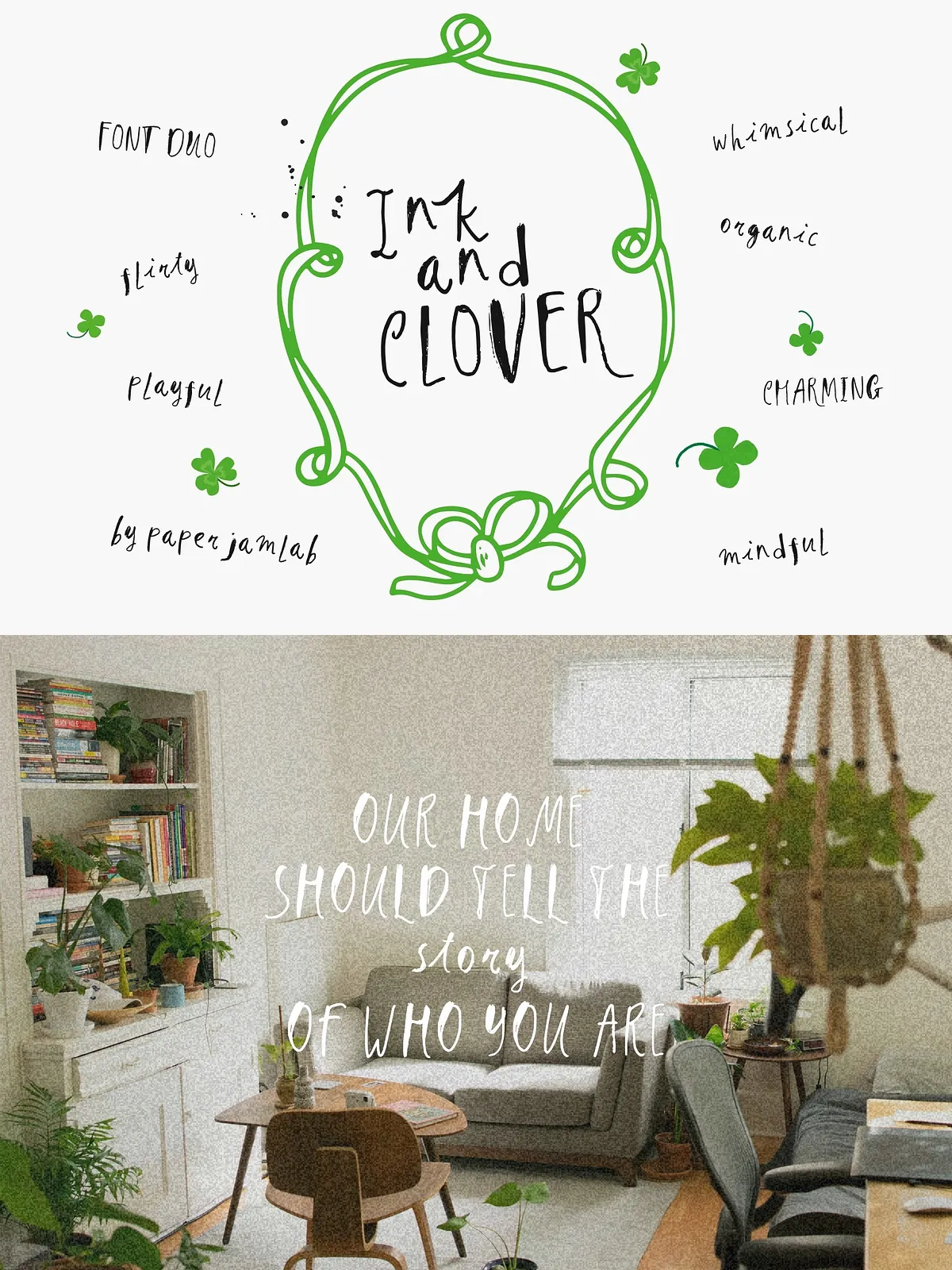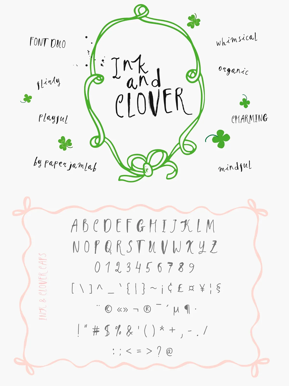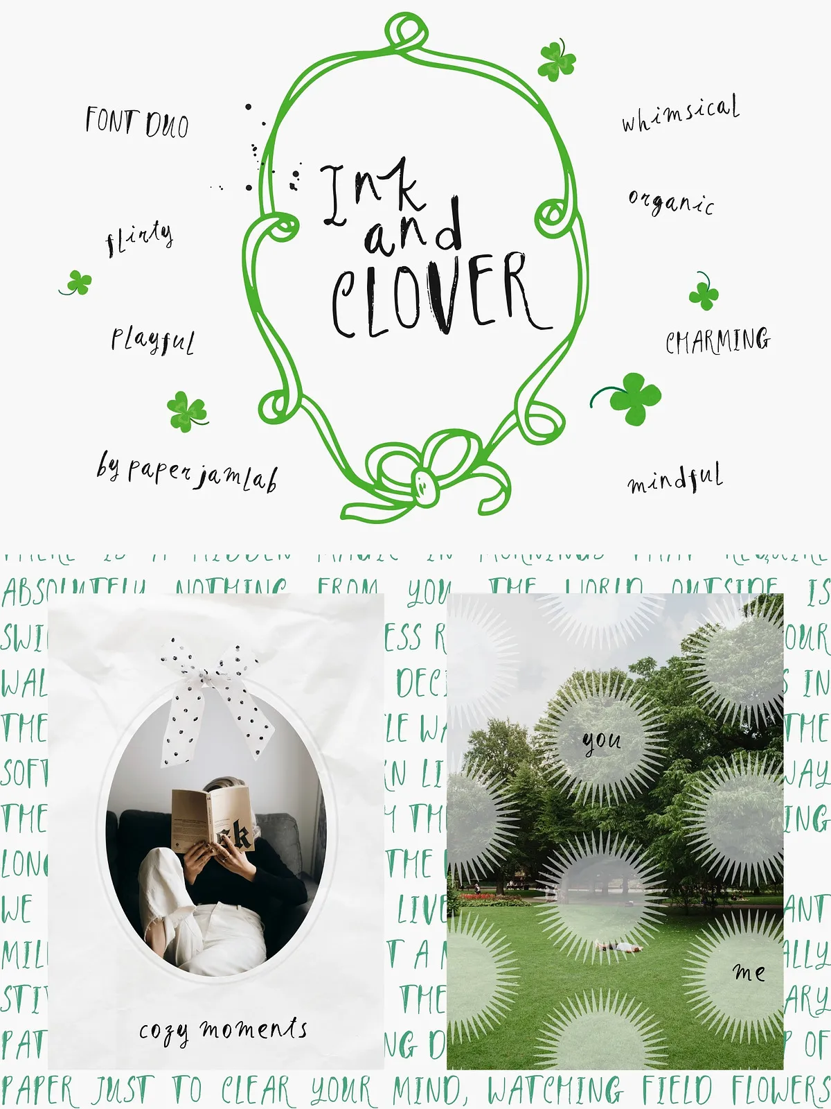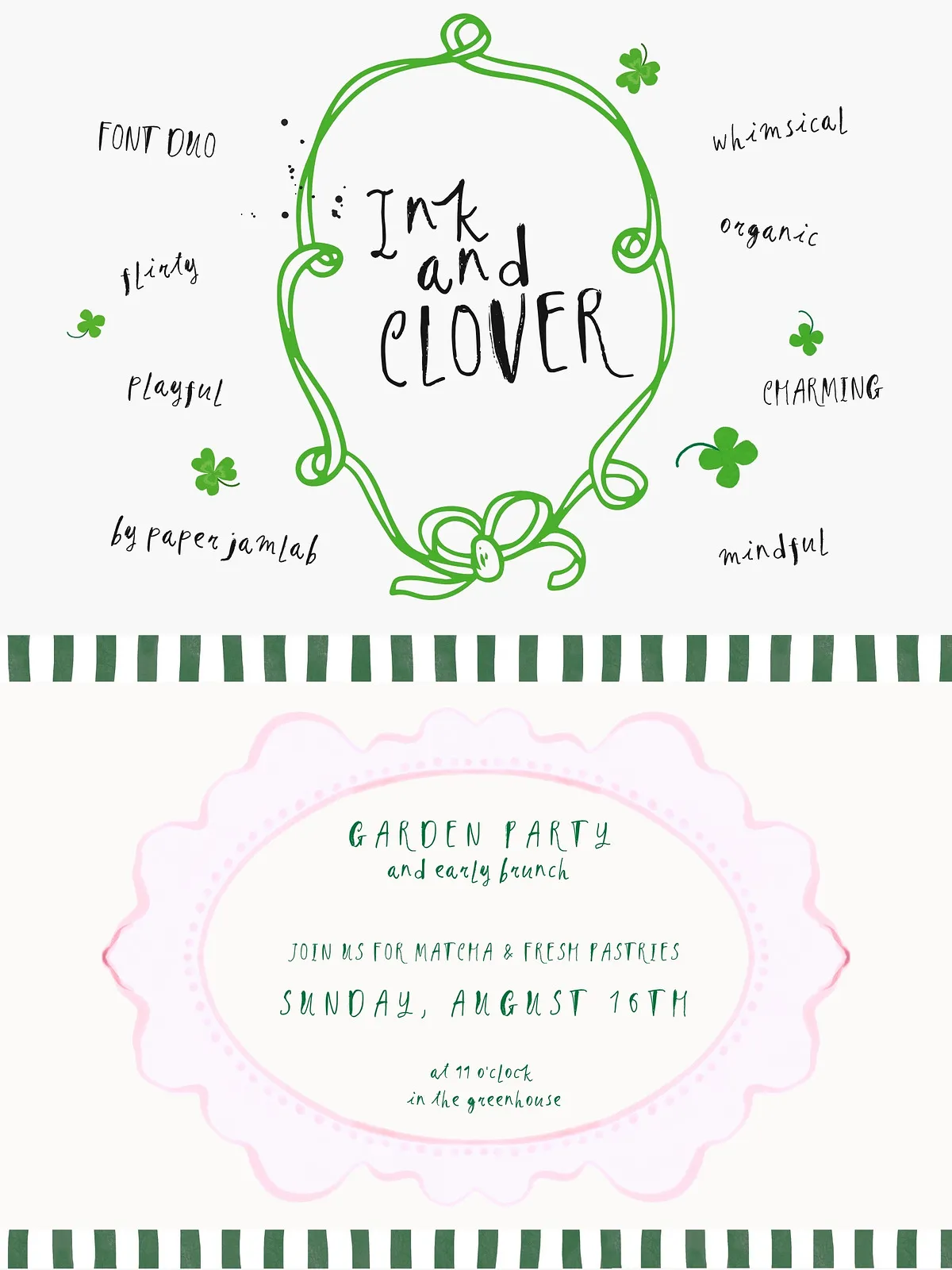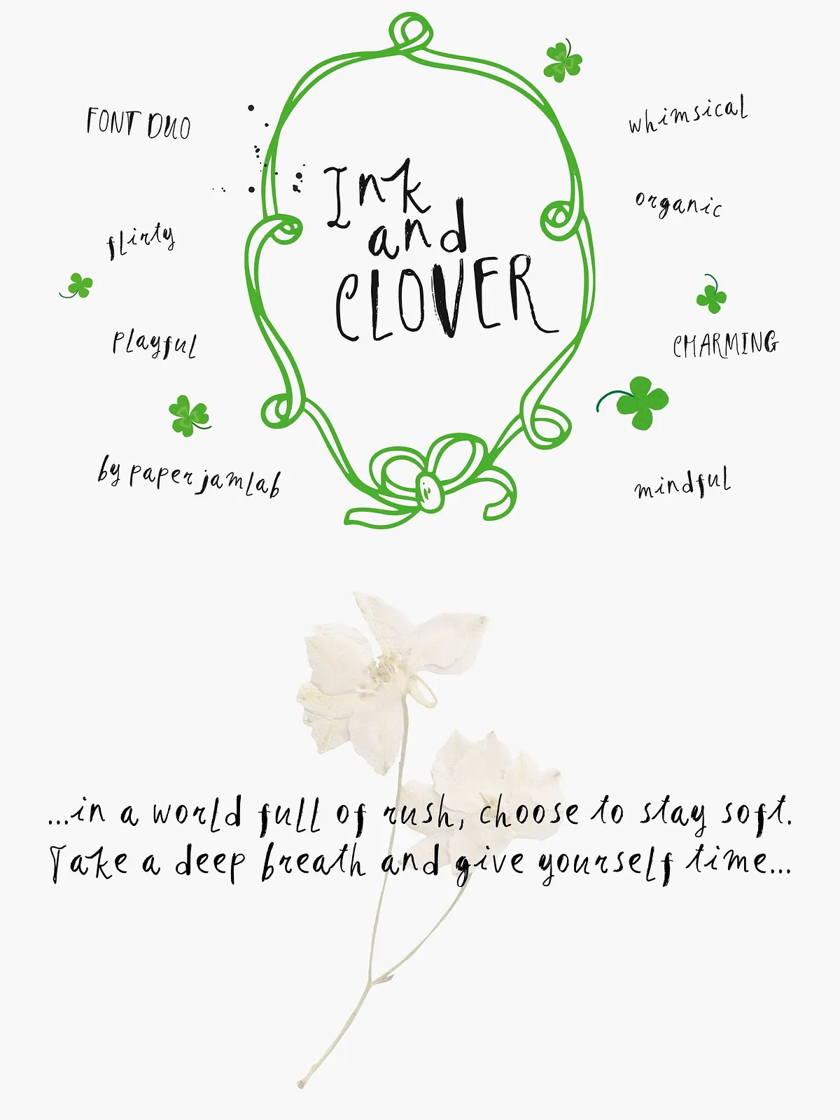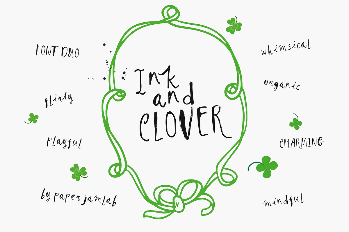

Ink & Clover combines a bold, raw-textured caps font with a delicate, flowing brush script to create a versatile, expressive type system. Designed for slow-living aesthetics and intimate lifestyle brands, this duo brings an authentic, handmade voice to every project. The all-caps Ink font provides confident headlines with tactile ink edges, while Clover’s connected brush strokes add warmth and organic rhythm to longer phrases, quotes, and accent copy. Together they offer a complete toolkit for designers who want to convey handcrafted quality and modern indie charm.
Design Character
Ink (Caps): Bold, Raw, Authentic
Ink delivers a strong, hand-drawn display with realistic ink textures and irregular edges that read as intentionally imperfect. It anchors compositions with presence and character, making product names, packaging headlines, and editorial mastheads instantly memorable. The typeface emphasizes heavy forms and open counters to preserve legibility while retaining a crafted, textured feel at display sizes.
Clover (Script): Flowing, Elegant, Connected
Clover responds with graceful, continuous strokes that mimic a casual brush pen. It flows naturally across words, offering a friendly, human touch that pairs beautifully with Ink’s boldness. Use Clover for taglines, subheadings, invitations, and social-media quotes where you want an intimate, handwritten personality without sacrificing clarity.
What’s Inside
- Ink & Clover Font Duo in OTF and TTF formats for desktop use.
- Web-ready WOFF files included for fast online deployment.
- Uppercase, lowercase (where applicable), numerals, punctuation, and basic diacritics for multilingual Latin support.
- Alternate glyphs and stylistic options for Clover to vary the feel of hand-lettered text.
- Kerning and spacing optimized for display and headline use.
- Simple installation instructions and a usage guide to help implement the duo consistently.
Perfect For
- Cozy lifestyle and slow-living brand identities
- Product packaging: candles, soaps, tea blends, and artisan goods
- Wedding stationery, save-the-dates, and event invitations
- Indie magazines, editorial layouts, and zines
- Greeting cards, recipe books, planners, and journaling pages
- Social media templates, Pinterest pins, and Instagram stories
Usage & Pairing Tips
Creating Visual Hierarchy
Let Ink handle primary visual weight: use it for headlines, labels, and focal product names. Reserve Clover for accent lines, signatures, or softening subheads. Emphasize contrast by increasing Ink’s tracking slightly for dramatic headlines while keeping Clover tighter to maintain natural flow.
Color, Texture, and Substrate
Neutral palettes, natural paper textures, and muted earth tones enhance the duo’s artisanal quality. Pair with kraft paper, recycled stocks, or soft-touch finishes to amplify warmth. For premium work, apply metallic foils sparingly to highlight names or key elements without overwhelming the handmade feel.
Technical Recommendations
Web & Print Delivery
Use WOFF/WOFF2 files for the web and serve subsets for optimal load times. Export OTF/TTF files for print production and provide outlined versions when required by printers. Test scaled sizes in both digital and print contexts to ensure ink texture and brush detail reproduce cleanly.
OpenType & Accessibility
Enable stylistic alternates in professional design apps to access Clover’s variant forms. Provide readable line-height for longer script passages and avoid using Clover at tiny sizes where stroke detail may lose clarity. Ensure color contrast meets accessibility standards when using the fonts for UI or on-screen text.
Licensing & Delivery
Include a clear license file specifying permitted commercial use, web embedding rights, and redistribution limits. Offer extended licensing for product resellers or app integration. Deliver source files, web-ready formats, and a short usage guide so clients implement the duo consistently and confidently.