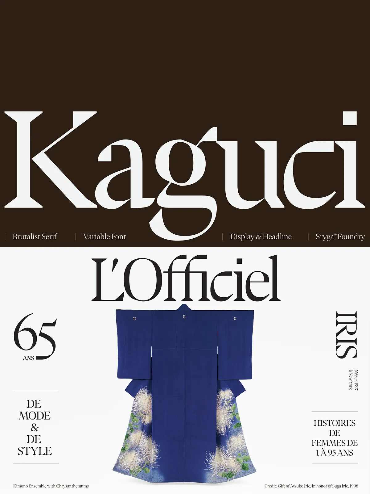
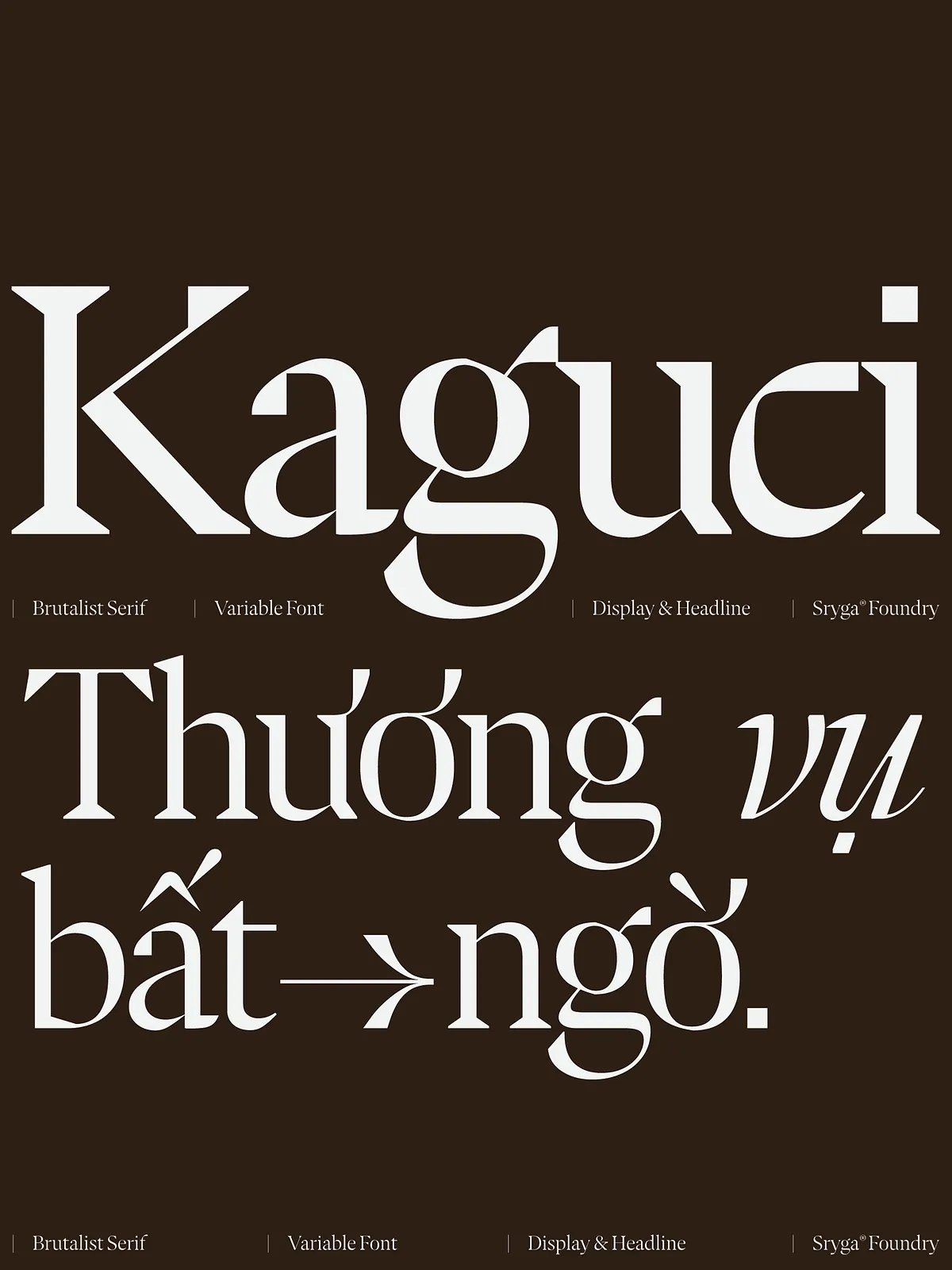
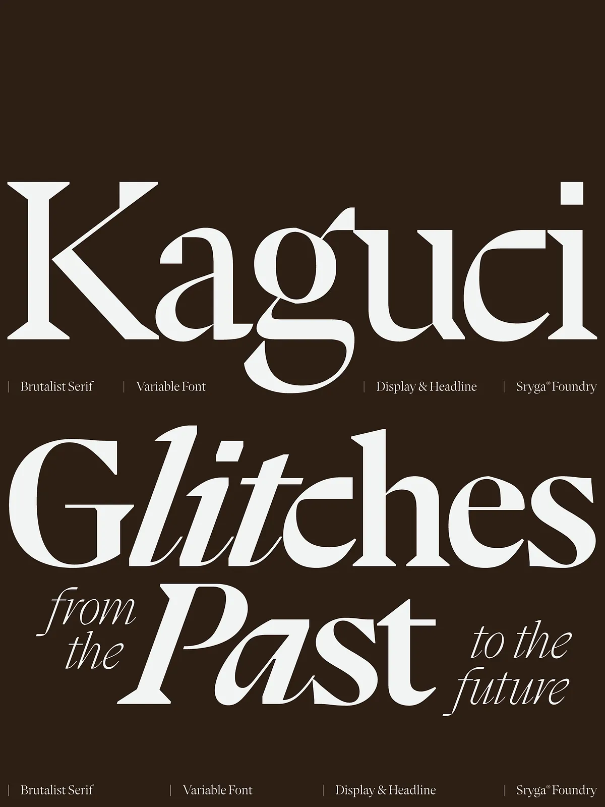
Ignite your designs with Kaguci, a typeface that fuses classic serif tradition with a striking digital glitch. Born from the intersection of heritage and futurism, Kaguci shatters expectations, delivering bold contrast, organic curves, and a dynamic energy that propels any project into a new visual era.
Why Kaguci Redefines Modern Typography
Heritage‑Inspired Roots Meet Glitch‑Driven Innovation
Kaguci draws its foundation from time‑tested serif structures, yet it injects a deliberate digital distortion that feels alive. The result is a font that honors the past while embracing the avant‑garde, allowing designers to craft pieces that feel both timeless and cutting‑edge.
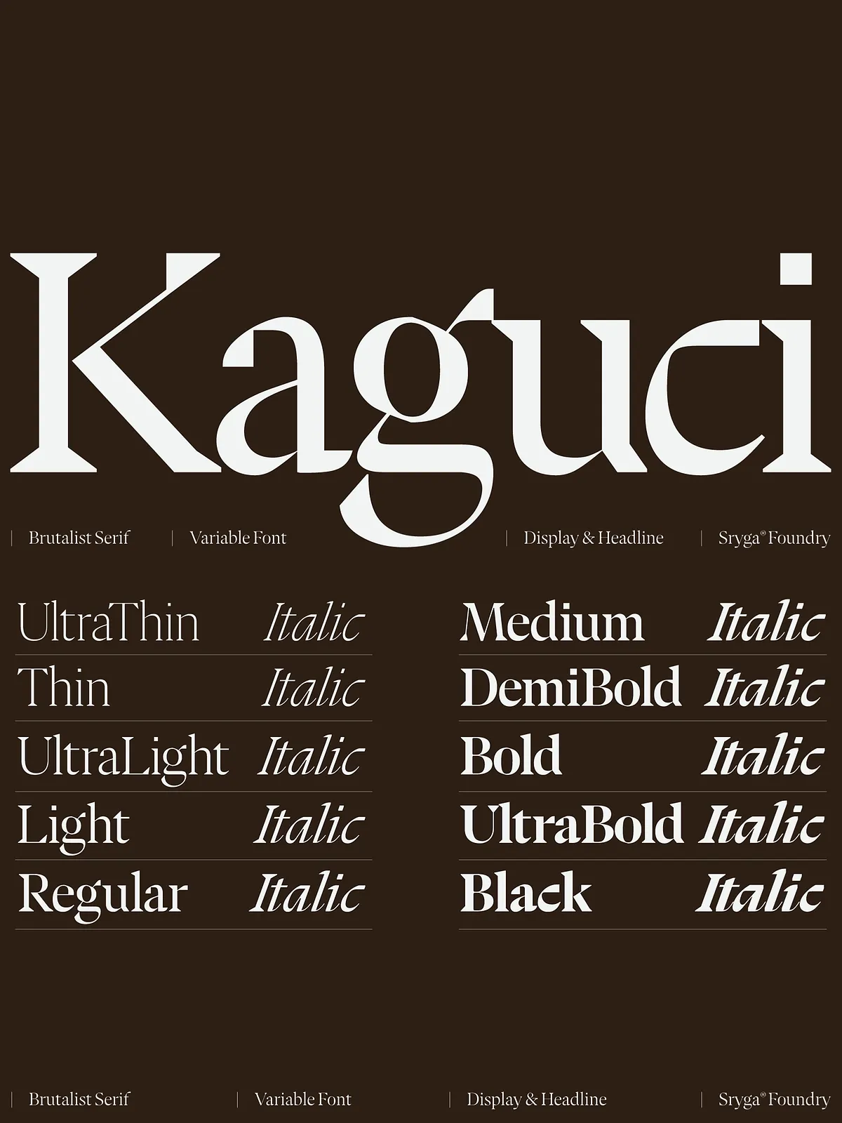
Ten Weight Cuts for Unmatched Flexibility
From ultra‑thin to deep black, Kaguci offers 10 distinct weight cuts. Each step maintains visual harmony, ensuring seamless transitions across headlines, body copy, and everything in between. Pair any weight with the true italic counterpart for a fluid, expressive typographic voice.
Key Features and Technical Specs
Variable Font Architecture
Both Roman and Italic axes are available as variable fonts, enabling instant weight and style adjustments via CSS. This reduces page load times and simplifies font management while delivering pixel‑perfect rendering across devices.
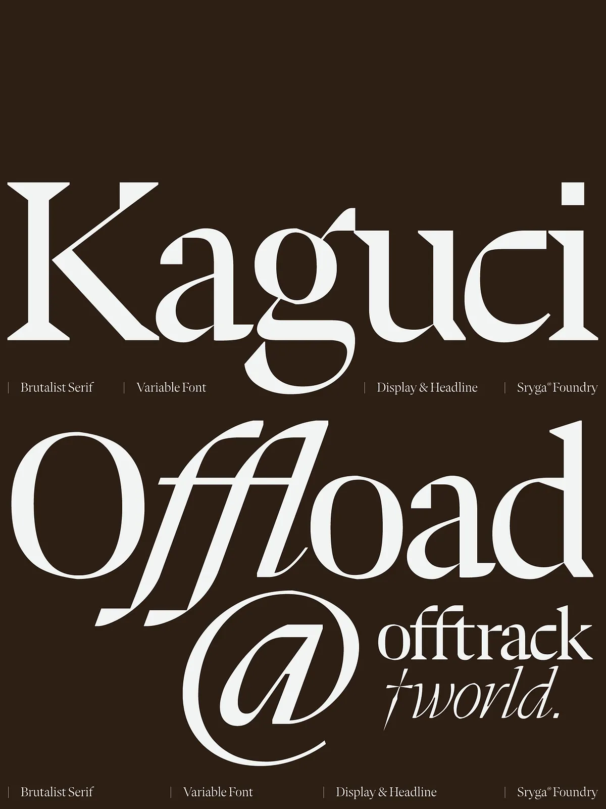
Organic Curves & Bold Contrast
The typeface balances rigid modernity with warmth. Its organic curves soften the stark contrast, producing a readable yet impactful visual rhythm that commands attention without overwhelming the viewer.
Comprehensive Language Support
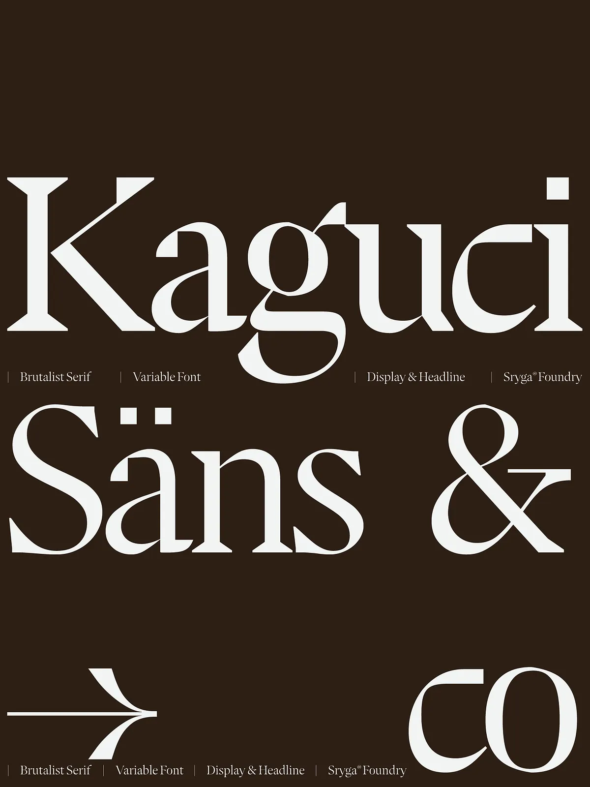
Kaguci supports the full extended Latin range, covering:
- Basic Latin – Core English and Western European characters.
- Latin‑1 Supplement – Accents for French, German, Spanish, and more.
- Latin Extended‑A – Central‑ and Eastern‑European glyphs.
This multilingual coverage ensures consistent branding across global markets.
Creative Applications
Brand Identity & Logo Design
Leverage Kaguci’s dramatic contrast and glitch aesthetics to create memorable logos that stand out on both digital and printed platforms. Its variable weights let you craft nuanced logotypes that adapt to different media without losing visual integrity.
Editorial & Magazine Layouts
Apply the ultra‑thin cuts for elegant body text and switch to bold weights for striking headlines. The true italics add a sophisticated flair to pull quotes and subheadings, elevating the overall reading experience.
Web & UI Design
Integrate Kaguci via @font-face or modern CSS font‑variation‑settings to achieve fluid typographic transitions that react to user interaction, scroll effects, or responsive breakpoints.
Performance Tips
- Subset the font to only the characters you need for faster loading.
- Serve WOFF2 format for modern browsers; provide WOFF fallback for legacy support.
- Combine font loading with your existing CSS bundle to reduce HTTP requests.
Licensing & Support
Flexible Licensing Models
Choose from Single‑Site, Multi‑Site, or Enterprise licenses, each granting full access to updates, web‑font kits, and commercial usage rights.
Ongoing Updates & Community
All license holders receive lifetime updates, ensuring Kaguci stays compatible with emerging web standards and design trends. A dedicated support team is ready to assist with integration, troubleshooting, and creative guidance.
Final Thoughts – Design the Future with Kaguci
Kaguci isn’t just a typeface; it’s an evolving organism that bridges past elegance with futuristic disruption. Its variable nature empowers designers to experiment, adapt, and innovate without sacrificing readability or aesthetic harmony. Whether you’re crafting a high‑impact brand identity, a sleek editorial spread, or a dynamic web interface, Kaguci provides the tools to articulate your vision with confidence and style.