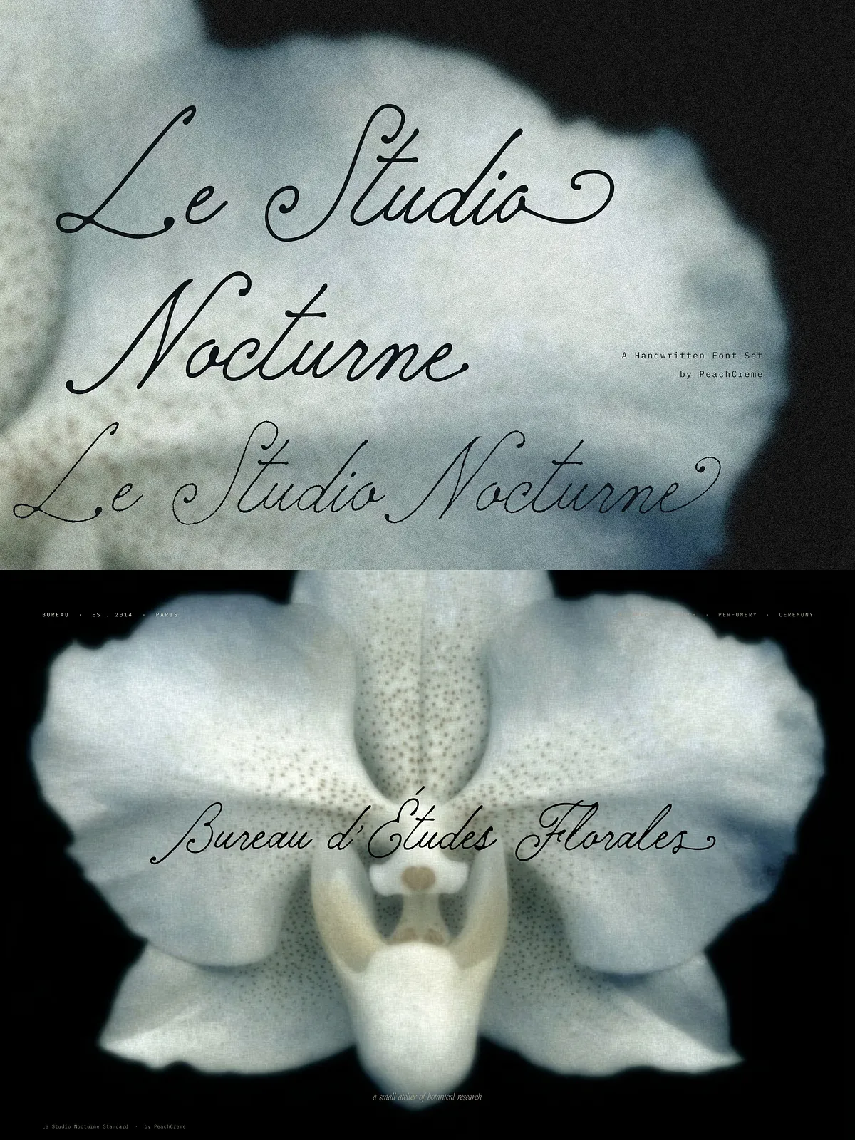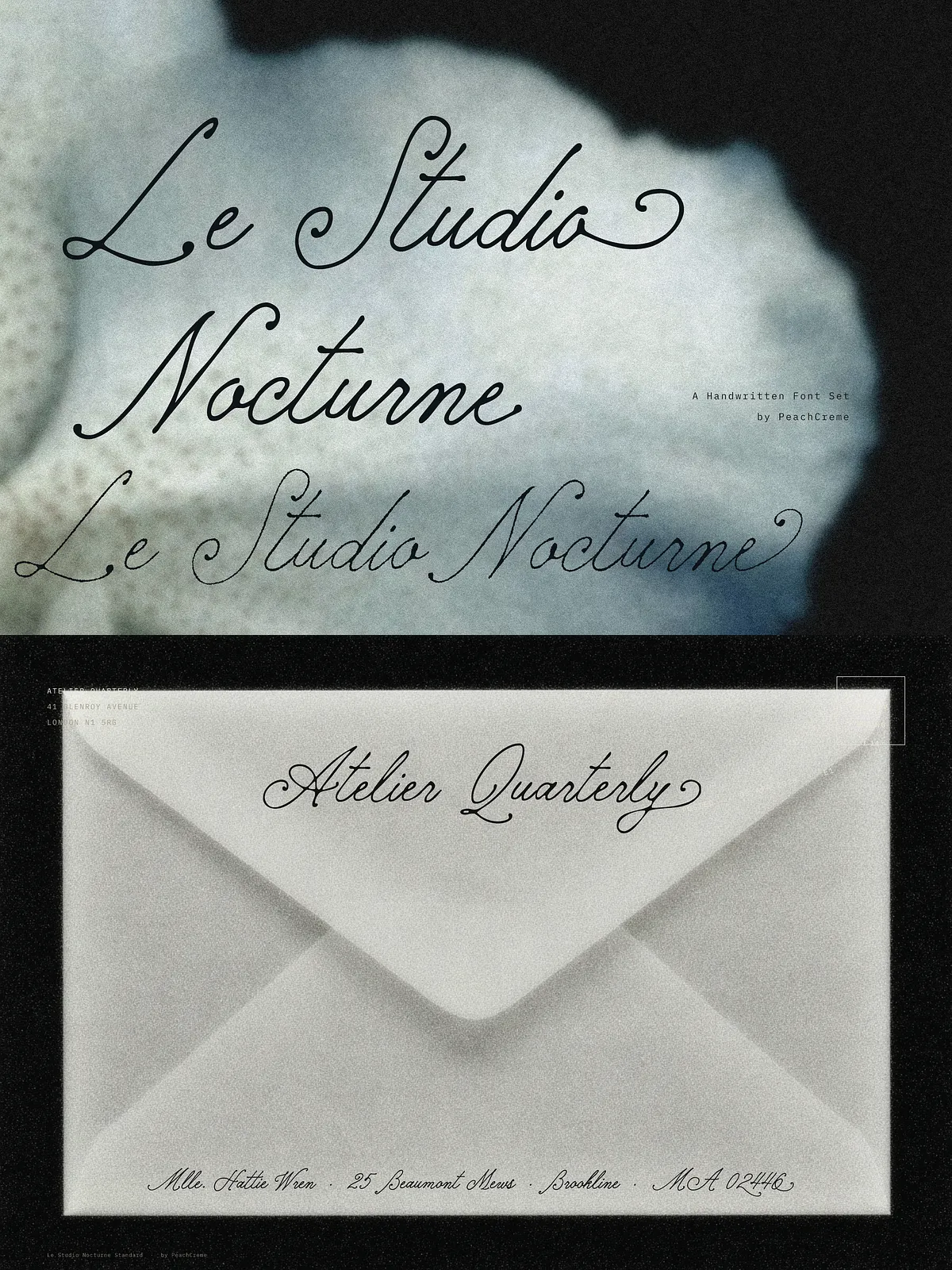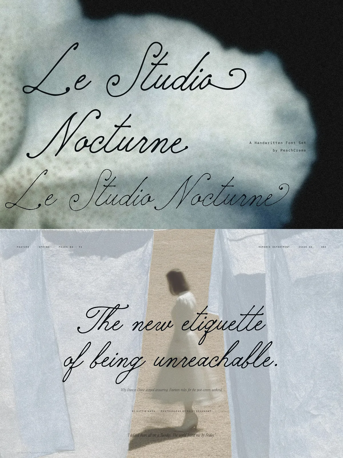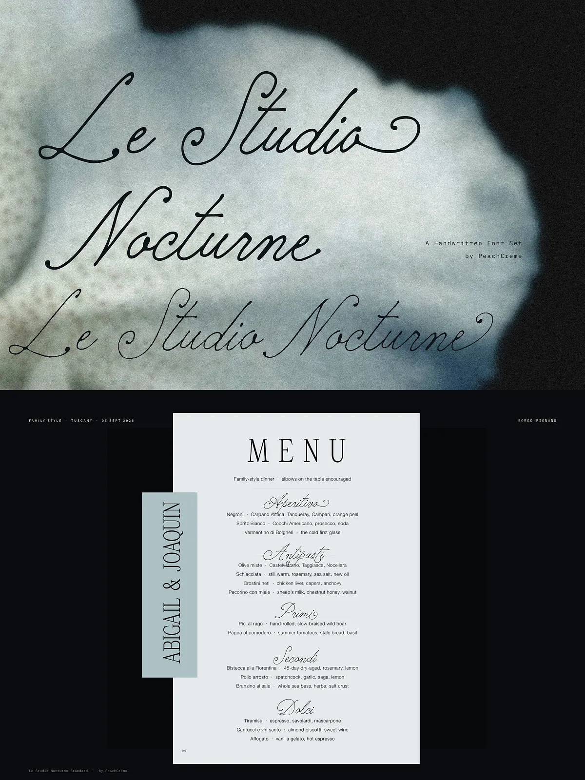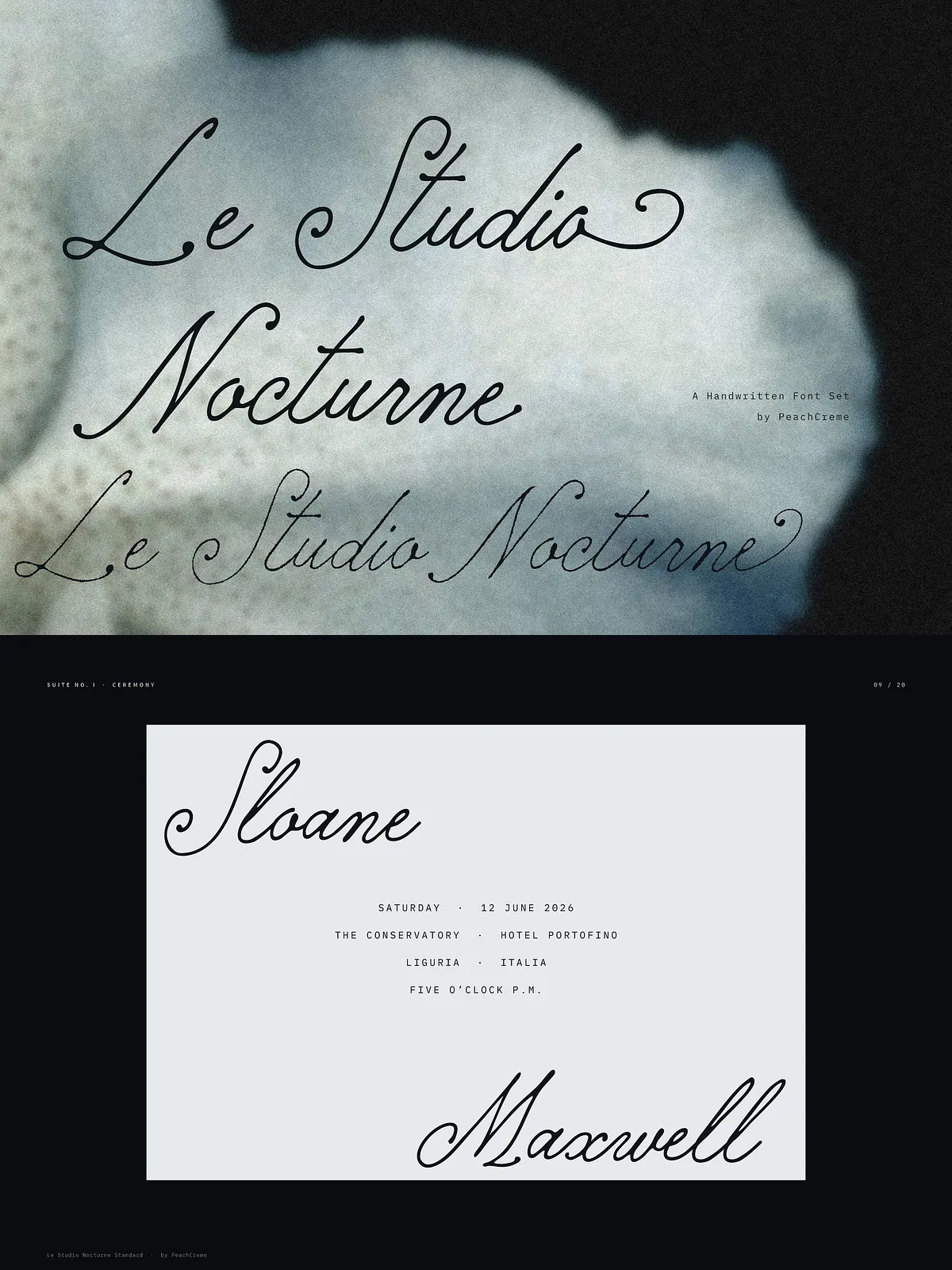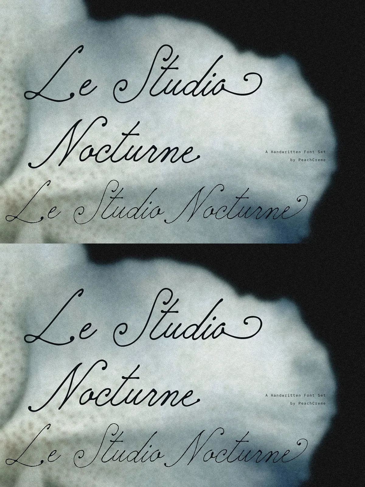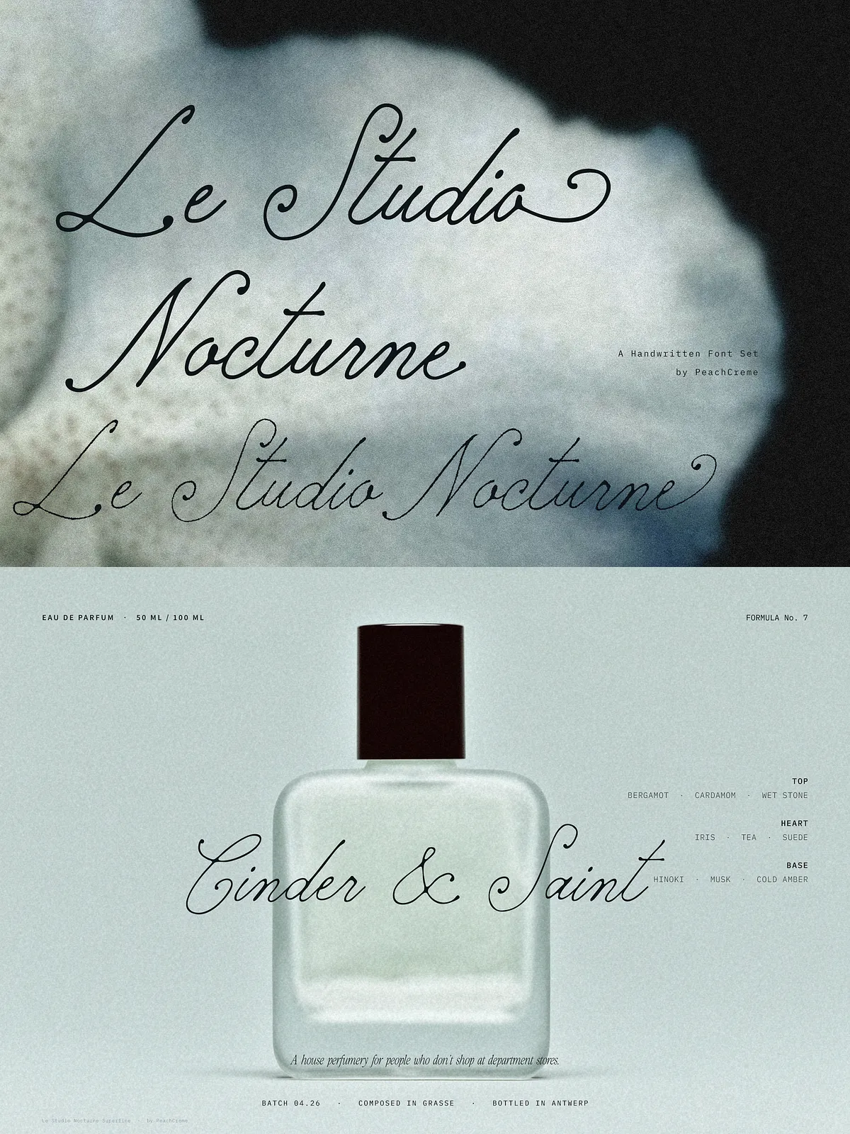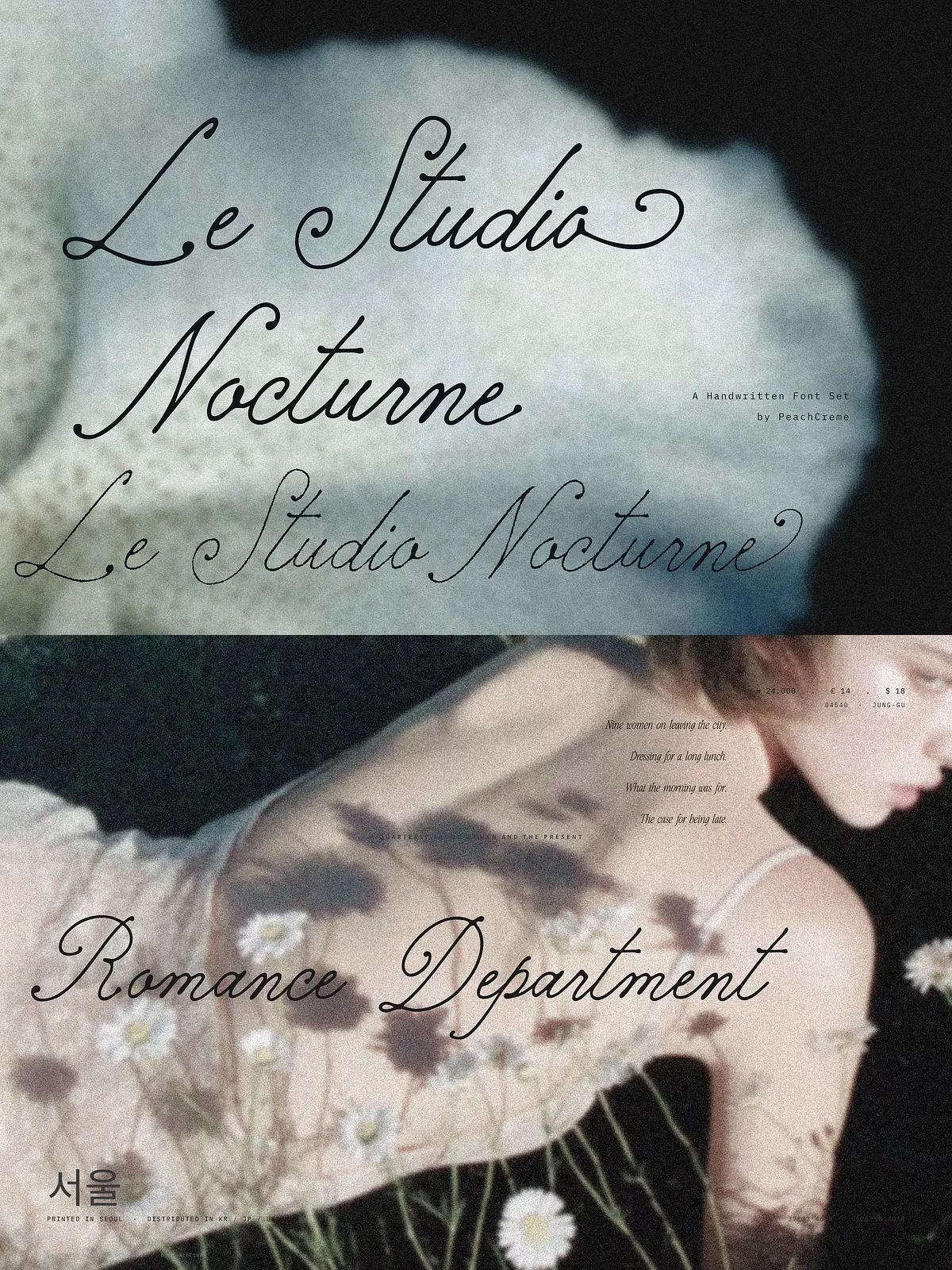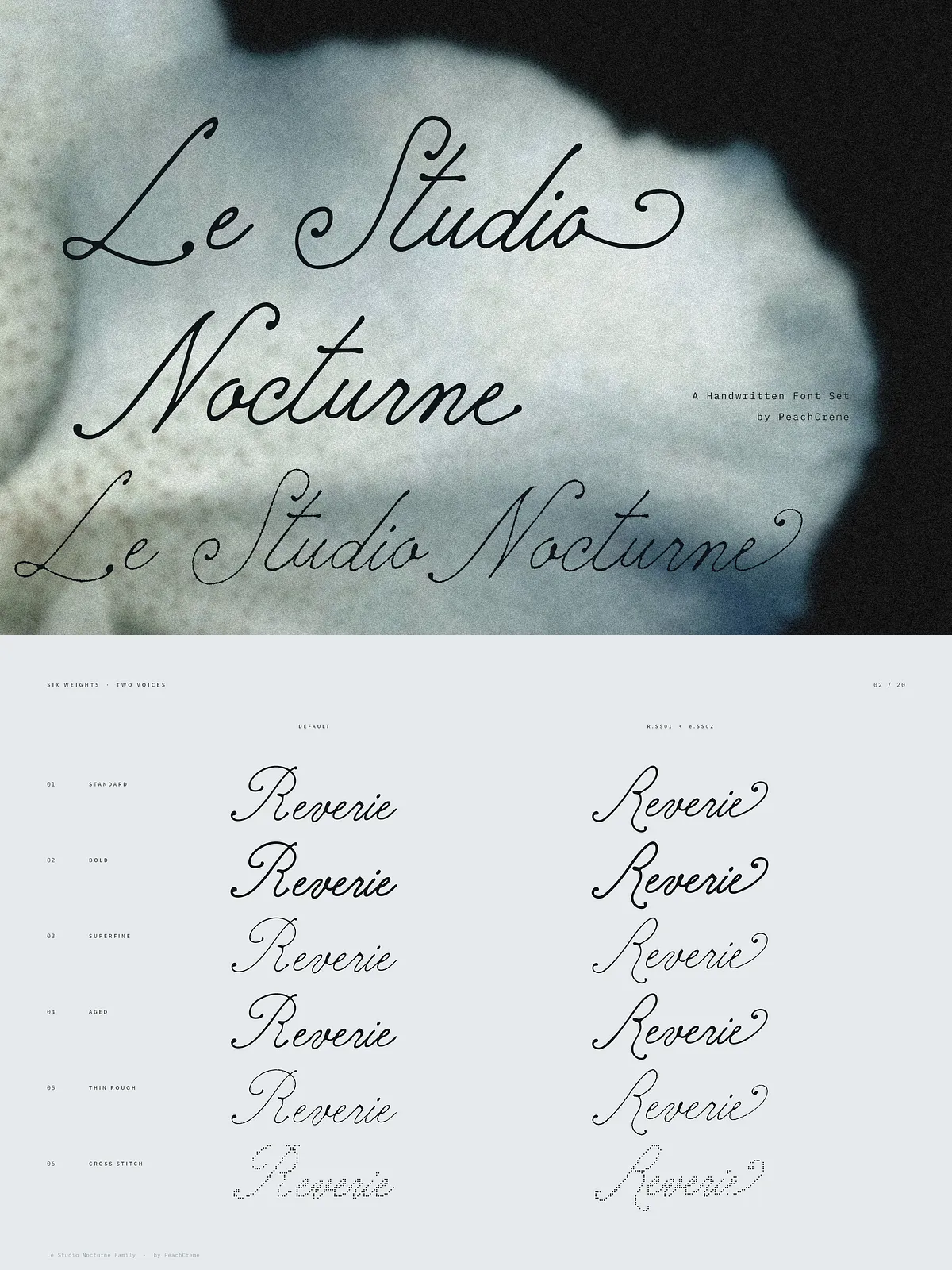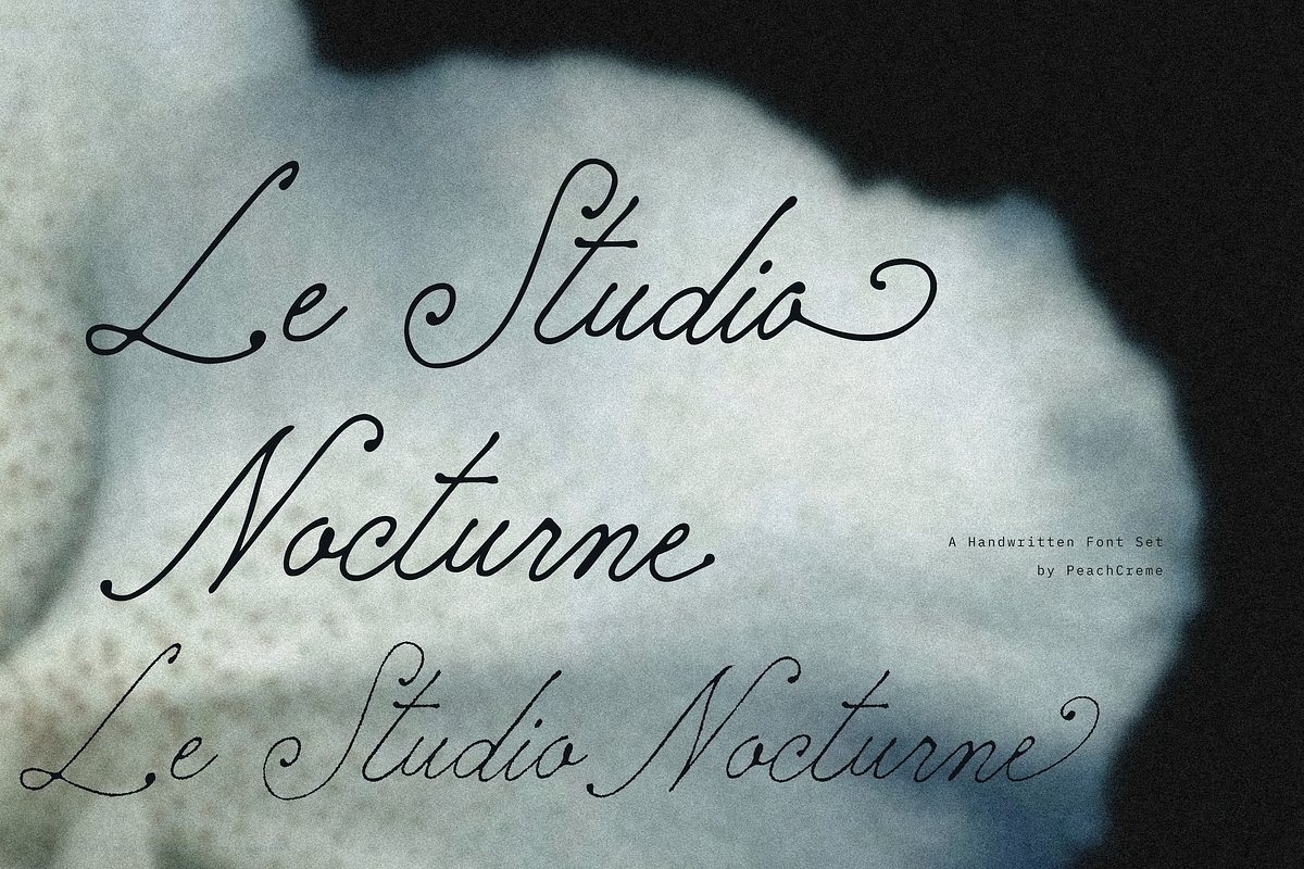

Le Studio Nocturne delivers a handcrafted voice tailored for projects that value slowness and tactility. It feels like ink on paper: intimate, slightly nostalgic, and deliberately unhurried. Use it when you want typography to feel written rather than typeset — perfect for perfume branding, wedding stationery, restaurant menus, and boutique editorial work.
Product page: [Le Studio Nocturne Set](https://www.peachcreme.com/products/le-studio-nocturne-set)
The Family
Six distinct styles to cover display and subtlety
This collection bundles six complementary fonts that share a cohesive voice while offering different textures and weights. Each style targets a specific role in your design system, giving you flexibility to mix and match while maintaining a unified look.
- Standard — the everyday script: balanced, readable, and ideal for body headlines or extended hand-lettered passages.
- Bold — heavier and more assertive for headlines, logos, and strong display uses.
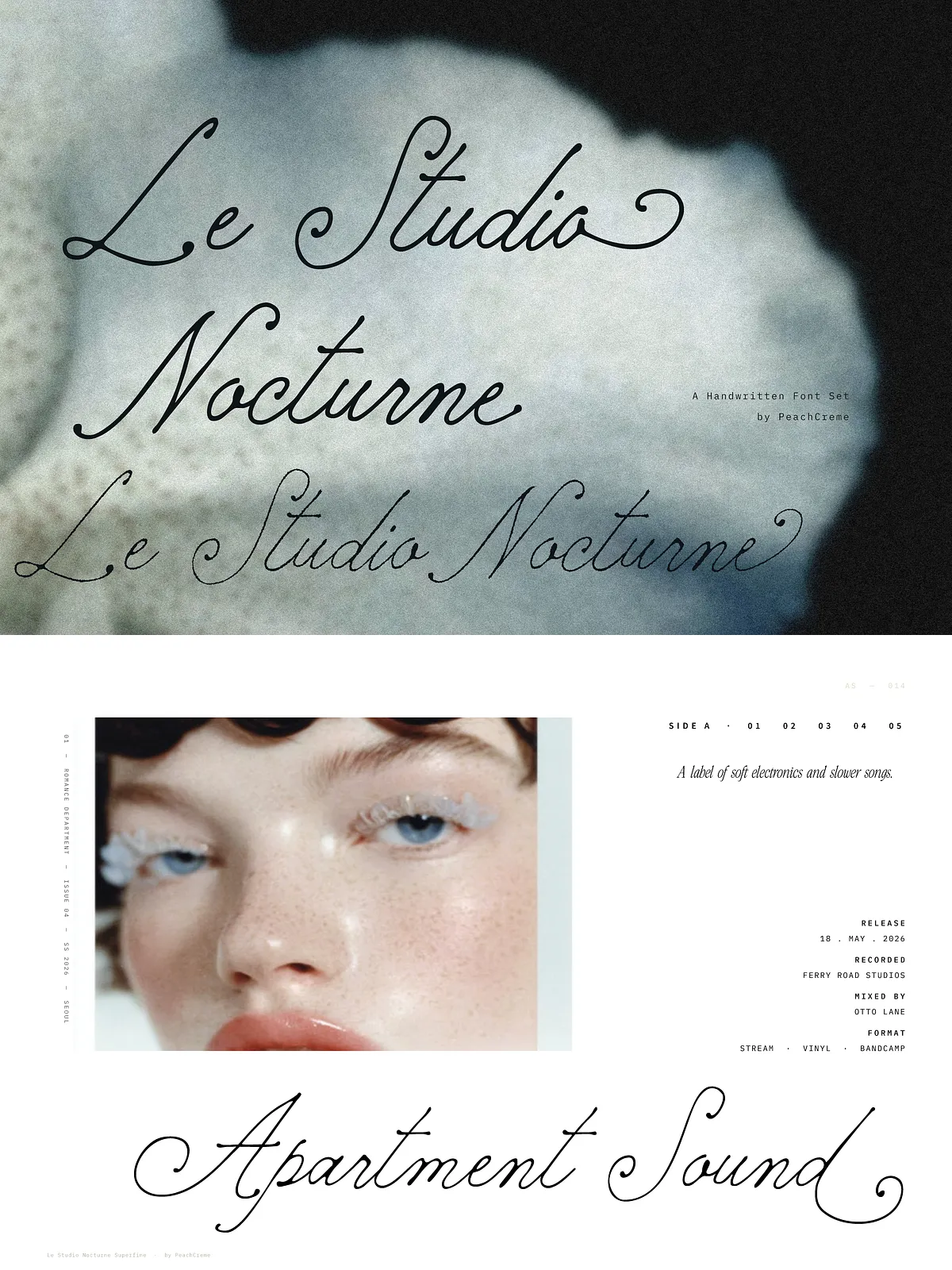
- Superfine — a hairline titling option crafted for elegant headings and refined, minimal treatments.
- Aged — softly distressed to introduce vintage character and a timeworn charm into packaging and print.
- Thin Rough — light with a pencil-like texture that adds organic imperfection for editorial accents or craft-focused products.
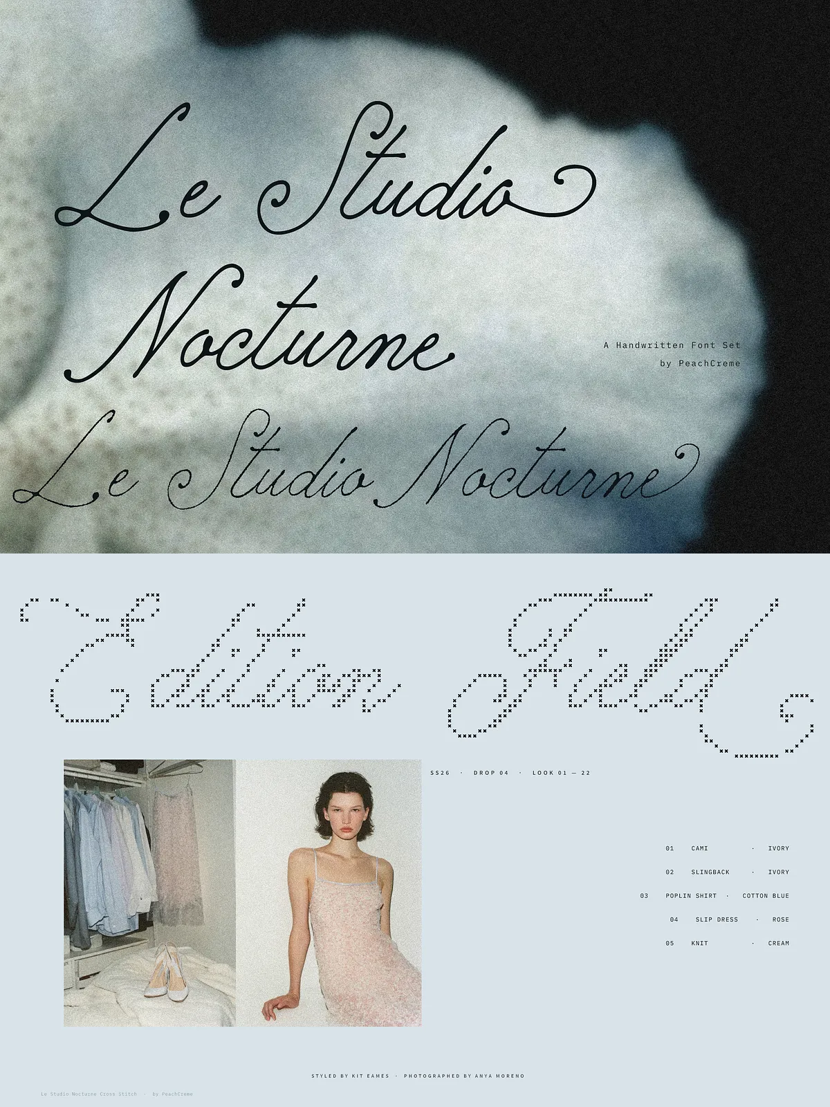
- Cross Stitch — a dotted, embroidery-inspired style for craft moods, labels, and decorative applications.
OpenType Features & Character Set
Built for natural rhythm and typographic precision
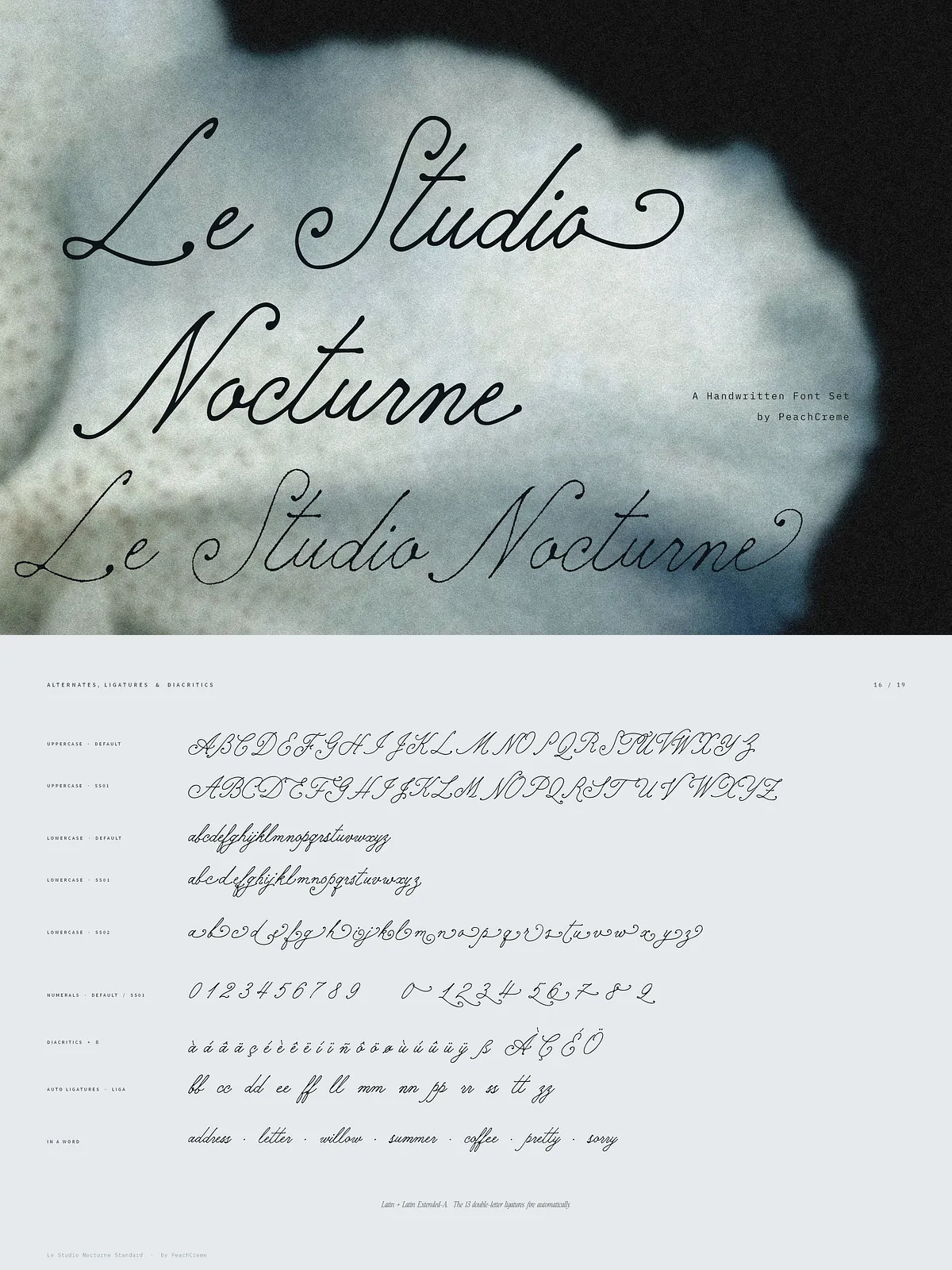
Le Studio Nocturne includes a robust set of OpenType features designed to simulate real handwriting and reduce mechanical repetition. For each uppercase letter there is 1 alternate, and for each lowercase letter there are 2 alternates. The set also includes alternate numerals and 13 automatic double-letter ligatures (bb, cc, dd, ee, ff, ll, mm, nn, pp, rr, ss, tt, zz) to preserve fluidity in repeated-letter combinations. The family supports Latin and Latin Extended-A characters, including ß and common diacritics, enabling broad multilingual usage.
Practical Applications
Where this font set shines
Deploy Le Studio Nocturne for projects that benefit from a personal, crafted tone:
- Perfume and beauty branding — labels, packaging, and scent narratives that require a refined, handwritten signature.
- Wedding stationery — invitations, place cards, and envelopes that read intimate and bespoke.
- Restaurant and café menus — elegant menu headings and section titles with a human touch.
- Editorial projects — feature headings, pull quotes, and special sections for lifestyle magazines and limited-edition prints.
- Craft and product labels — Cross Stitch and Thin Rough provide textured alternatives for handmade and artisanal goods.
Pairing & Styling Recommendations
How to combine and present the fonts effectively
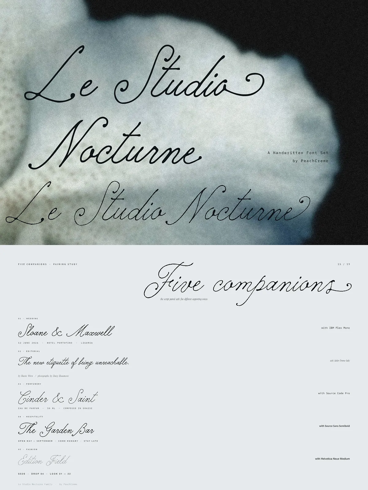
Pair the script with a neutral sans serif for longer copy to maintain readability while letting the handwriting supply personality. Use Superfine or Thin Rough for refined titling; reserve Bold for primary display. When the script overlays photography or textured backgrounds, add subtle contrast using soft shadows, light panels, or semi-opaque bars. Enable contextual alternates and ligatures in your design software to achieve the most natural flow.
Formats, Installation & Licensing
Technical and usage guidance
The package commonly includes OTF/TTF formats suitable for desktop and design apps. Install the fonts via your system font manager or directly within design tools. Review the provided license for permitted uses (personal, commercial, webfont embedding, or product resale). For extended or bespoke licensing (for example, multi-user enterprise installs or product resale embedding), contact the foundry or seller before distributing assets that contain the fonts.
Implementation Tips
Maximize impact with simple adjustments
Use generous line-height for longer set lines and slightly increased tracking for uppercase display to preserve legibility. For logotypes, combine Standard or Aged with Bold to create contrast. Use Cross Stitch sparingly for decorative elements rather than body text to keep readability intact. Test small print and reproduction sizes, especially for Superfine, to ensure strokes remain intact in print production.