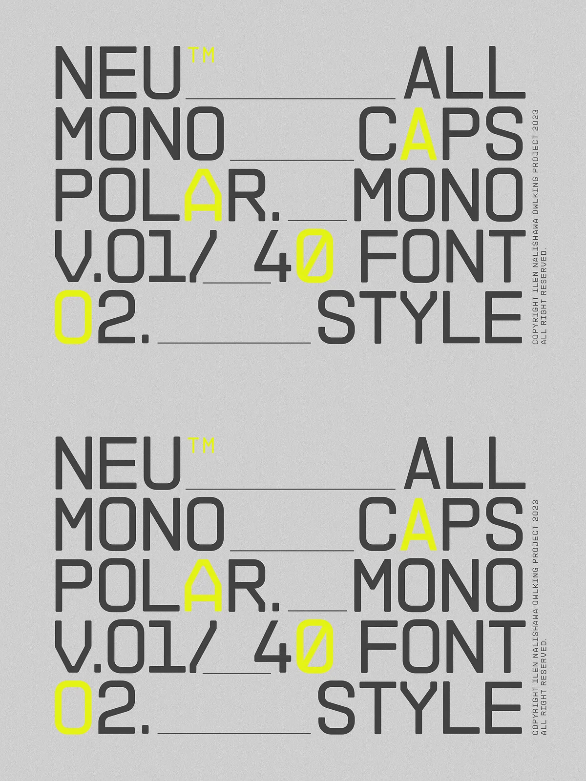
Meet NEUMONOPOLAR — a bold, futuristic monospace font duo designed for creators who crave innovation without compromise. V.01 delivers sharp, angular precision with bold impact. V.02 brings a new level of fluidity and grace with perfectly curved edges. Together, they form a powerful typographic ecosystem that adapts to your vision — whether you’re designing a sleek tech interface, launching a bold brand identity, or crafting experimental visual narratives.
Each version comes with a full family of 20 styles — from Thin to Extra Black, complete with italics — giving you total control over hierarchy, rhythm, and mood.
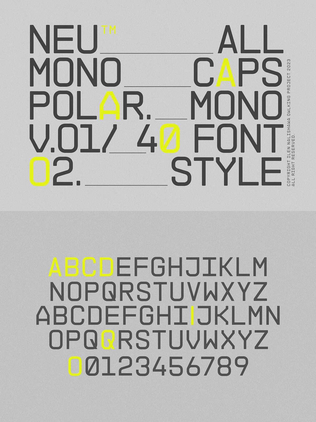
NEUMONOPOLAR V.01: The Sharp Edge of Tomorrow
Angular, bold, fearless — built for maximum impact
NEUMONOPOLAR V.01 is where architecture meets art. Its crisp, geometric forms and sharp edges create a sense of power, reliability, and digital futurism. Every stroke is intentional — clean, balanced, and engineered for high-contrast readability. The uppercase-only design gives it a commanding presence, ideal for headlines, logos, and branding statements that demand attention.
With 10 weights and 10 italics, this version excels in environments that require strong typographic hierarchy. Use it to emphasize key messages, anchor user interfaces, or make a statement in editorial layouts. It’s the font for those who believe design should challenge, not just inform.
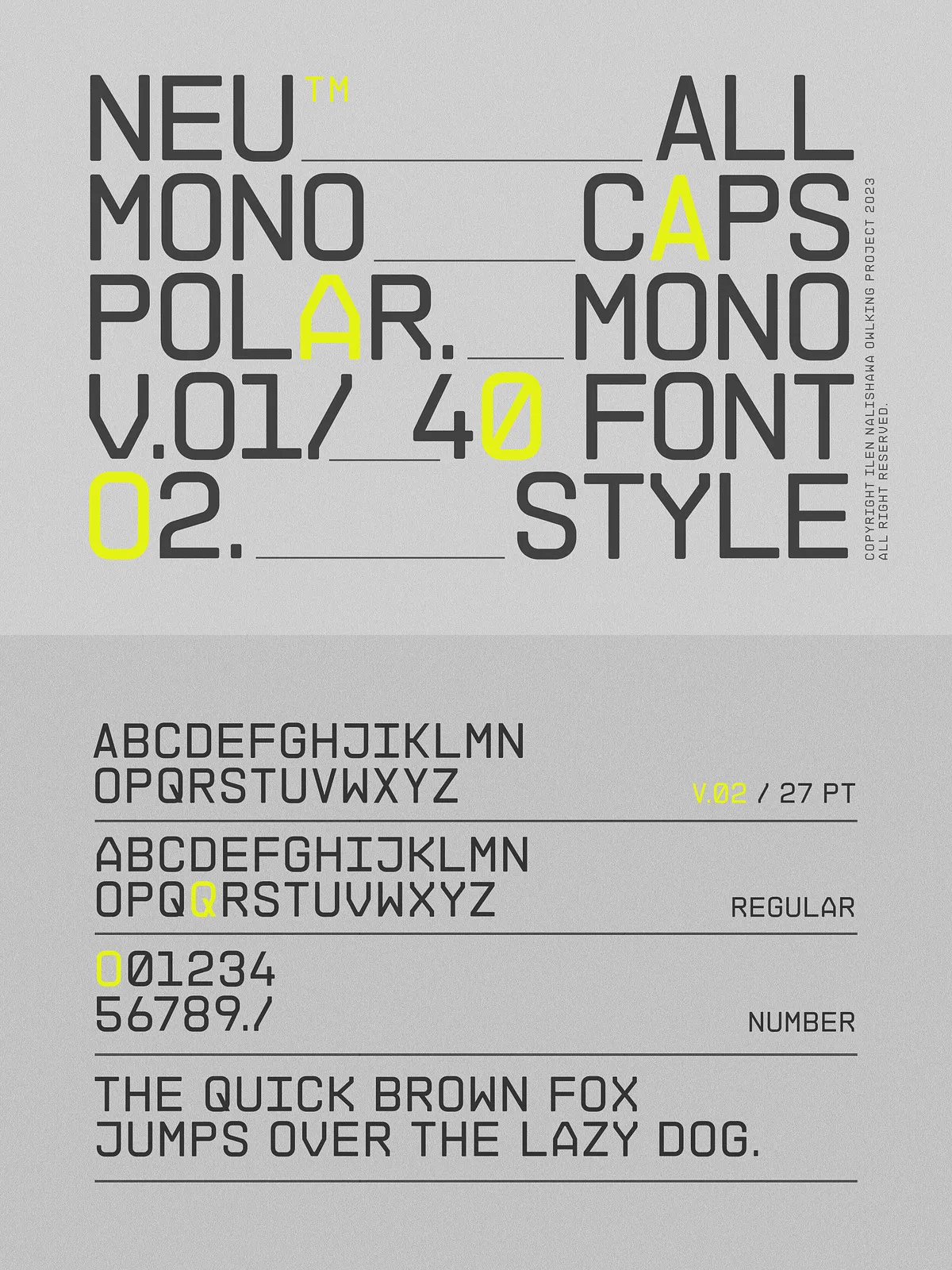
NEUMONOPOLAR V.02: The Smooth Evolution of Form
Refined, fluid, and surprisingly versatile — perfect for body text
NEUMONOPOLAR V.02 redefines the monospace experience with gentle curves, softer angles, and a naturally balanced rhythm. It’s built for readability without sacrificing style. The smooth, flowing design reduces visual fatigue, making it ideal for longer blocks of text — yes, even body copy.
This version shines in modern web design, content platforms, documentation, and product interfaces where clarity and comfort matter. Its harmonious proportions and consistent stroke width ensure consistent spacing and clean alignment, whether you’re setting short lines or full paragraphs. It’s not just a stylistic upgrade — it’s a functional breakthrough.
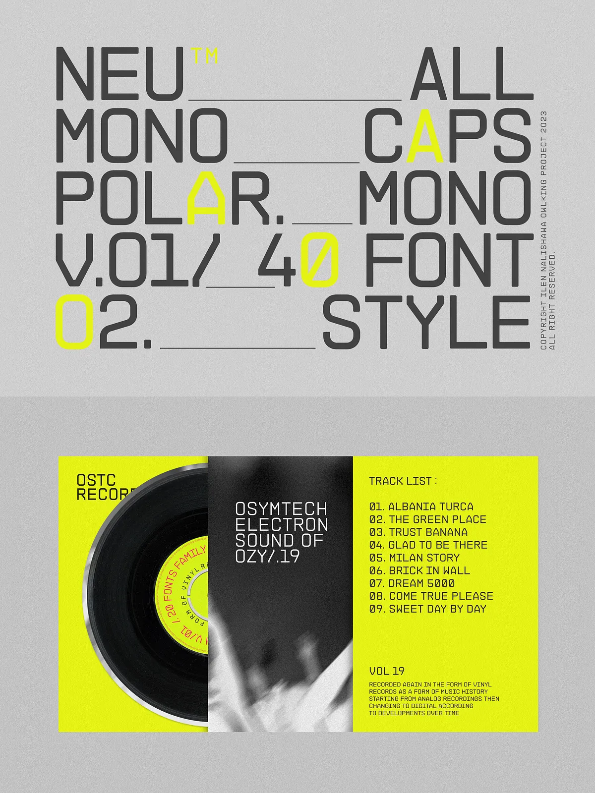
Why Use Both V.01 and V.02 Together?
Unlock a dynamic visual language with contrast and cohesion
The true power of NEUMONOPOLAR lies in combining the two versions. Use V.01 for bold headers, accent words, and high-impact graphics. Switch to V.02 for captions, definitions, or body text — creating a seamless, unified yet layered typographic experience.
Together, they form a flexible typographic pair that supports:
- Brand storytelling across platforms
- Technical documentation with visual personality
- Interactive interfaces that feel both modern and intuitive
- Innovative poster designs with rhythm and contrast
This dual functionality makes NEUMONOPOLAR a long-term asset for any creative professional.
Engineered for Designers, Built for Performance
20 styles, 2 variants, one seamless experience
Each font version includes:
- 10 regular weights (Thin to Extra Black)
- 10 italic variations
- Full OpenType support (ligatures, stylistic sets, fractions, case-sensitive forms)
- Extended language coverage (Latin, Western & Central European)
The OTF format ensures compatibility across Adobe Creative Cloud, Figma, Sketch, and web environments via CSS. No matter your workflow, NEUMONOPOLAR fits in — fast, clean, and reliable.
Design Smarter, Not Harder
Future-ready typography for real-world projects
NEUMONOPOLAR V.01 and V.02 aren’t just fonts — they’re tools. They empower you to:
- Convey boldness with confidence
- Enhance readability with elegance
- Build consistent brand language across digital and print
Whether you’re designing for technology, fashion, music, or education, these fonts elevate every detail.
Download the complete NEUMONOPOLAR V.01 V.02 duo today and transform your creative process. Let the future of typography lead your next project.