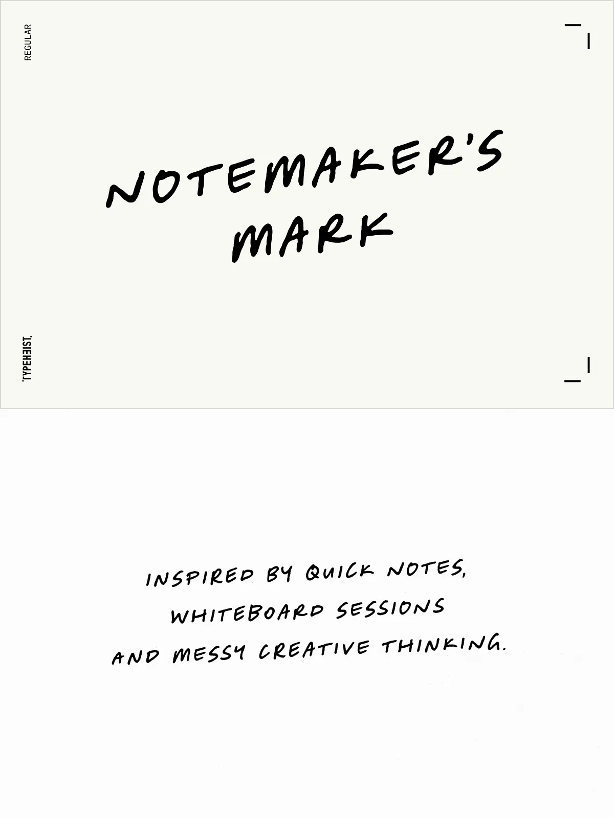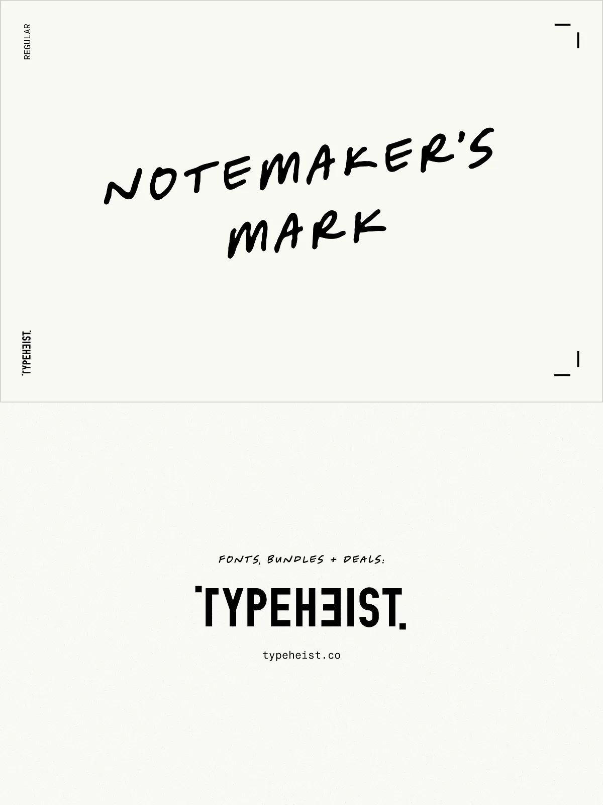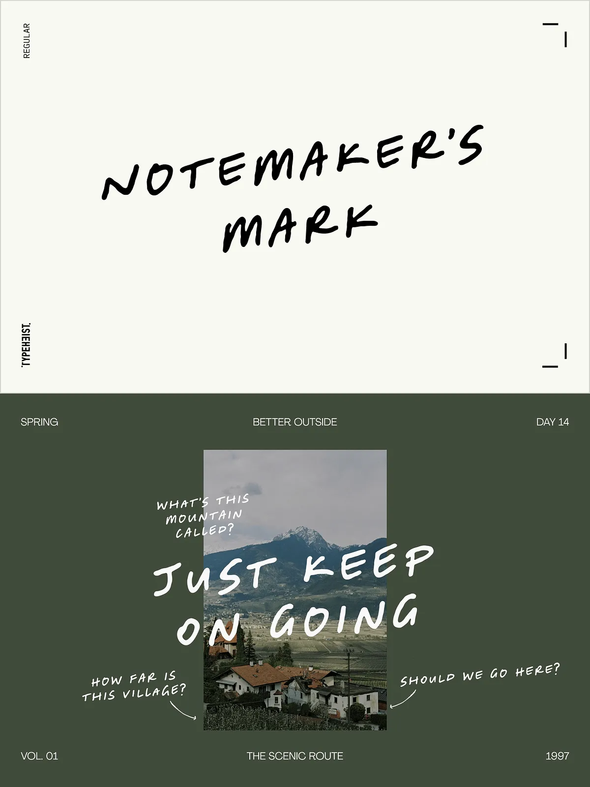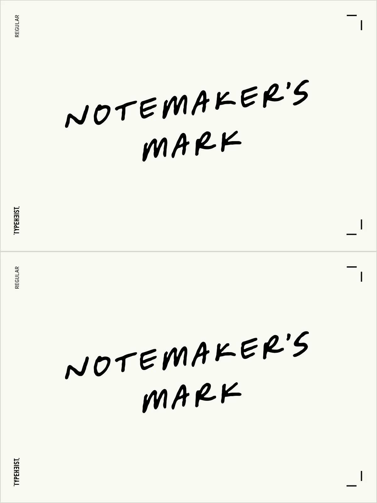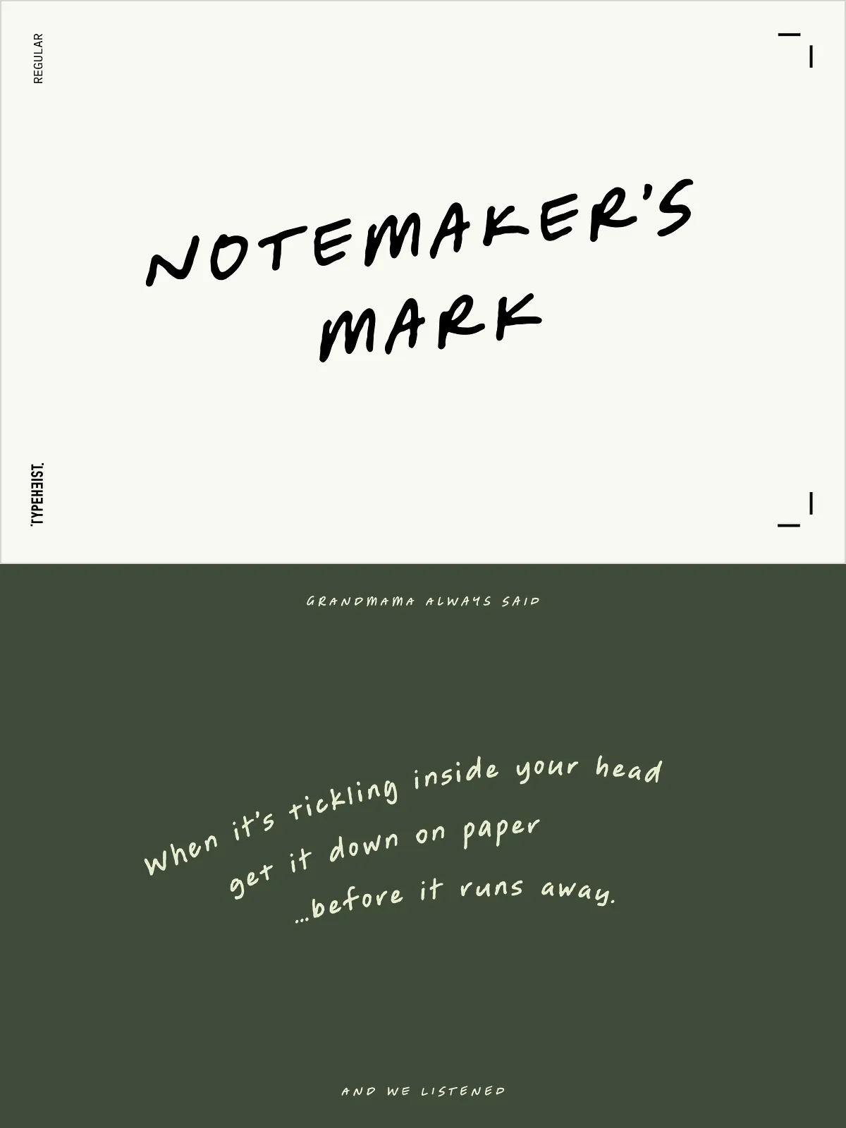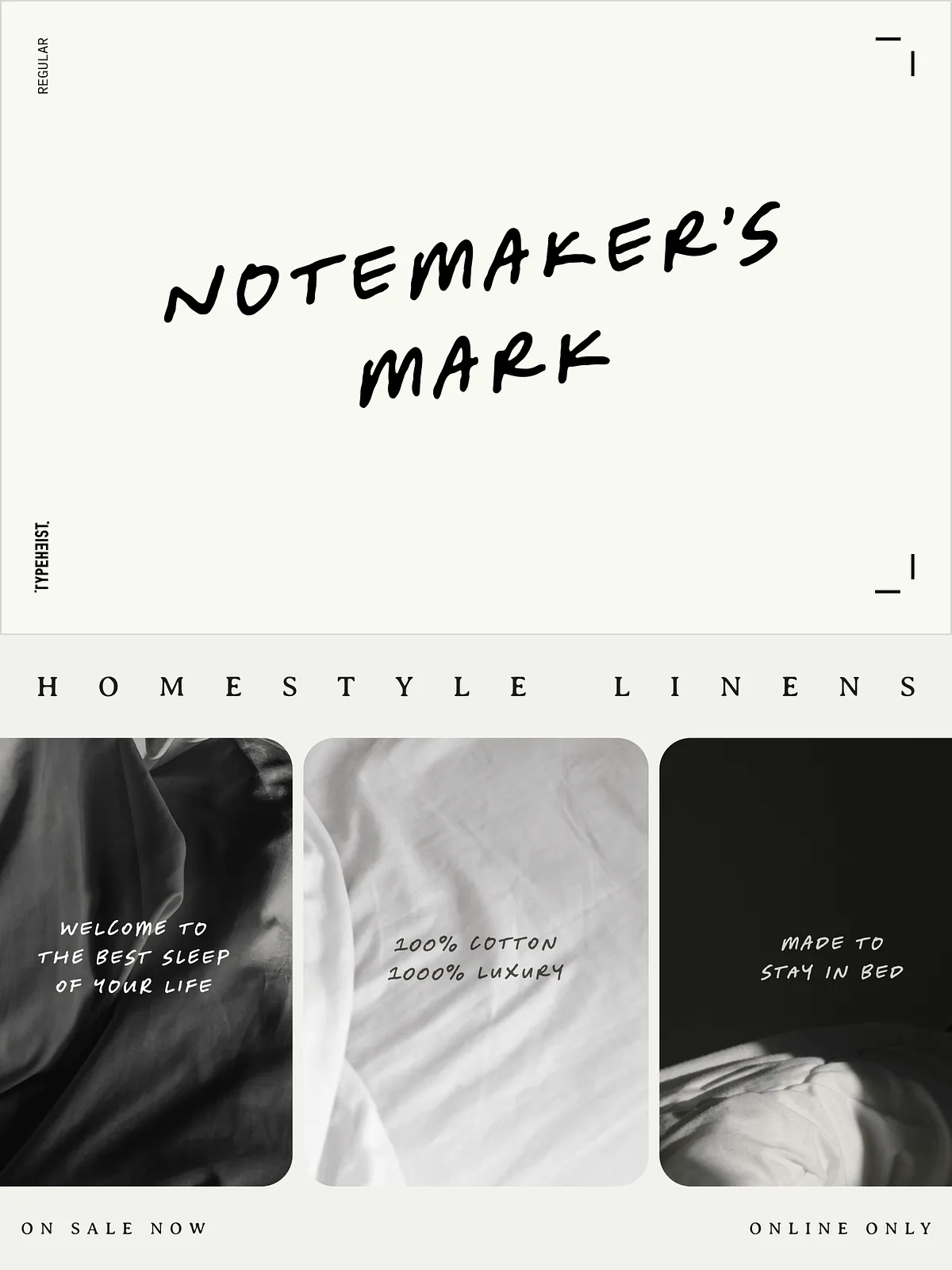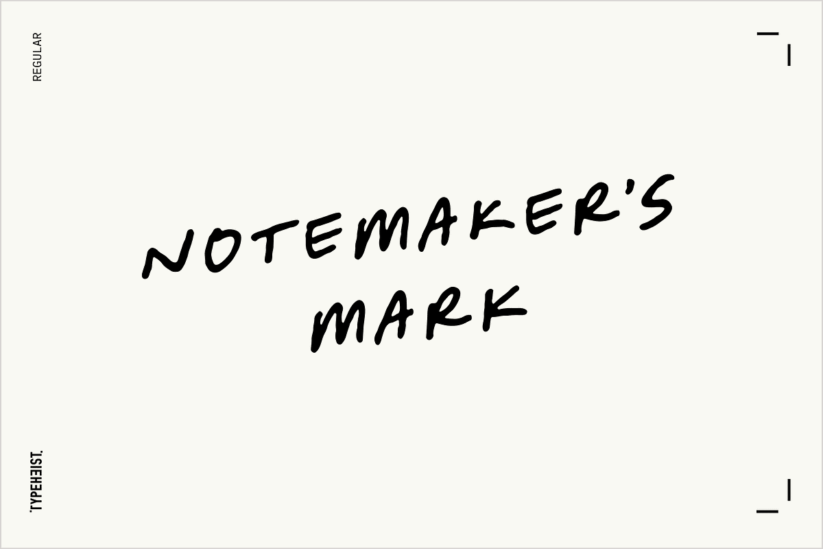

Notemaker’s Mark channels the quick, purposeful marks you make while thinking: the meeting notes, whiteboard scribbles, and sticky-note reminders that capture ideas the moment they spark. This typeface emphasizes natural motion and human spontaneity. It reads as authentic handwriting—loose, forward-leaning, and energetic—yet it remains disciplined enough for legibility in branding and editorial contexts. Use it when you want your designs to feel immediate, human, and decisively crafted.
Key Characteristics
Expressive, Forward-Leaning Motion
The letterforms tilt subtly forward to impart momentum and determination. Each stroke feels like a captured action, making headlines and callouts appear active and engaged. This forward slant gives compositions a lively directional flow, guiding the reader through the message with confident urgency.
Intentional Imperfection, Controlled Readability
Notemaker’s Mark preserves human irregularities—variable stroke widths, uneven baselines, and occasional ink-like quirks—while maintaining consistent spacing and clear letter shapes. The result reads organic without becoming messy: expressive personality that communicates warmth, approachability, and creative intent while staying usable across sizes.
Versatile Personality
Although grounded in handwritten authenticity, the font adapts to many design needs. It performs well in packaging, social content, editorial layouts, moodboards, lifestyle branding, and annotated materials. Designers can rely on its human tone to add credibility and a crafted feel to otherwise polished visuals.
What’s Included
- Notemaker’s Mark font file(s)
- Formats: OTF, WOFF, WOFF2
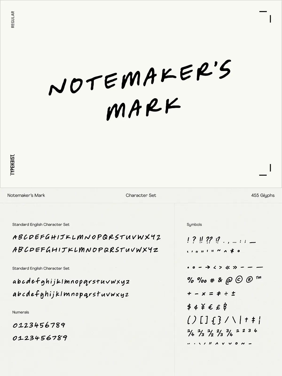
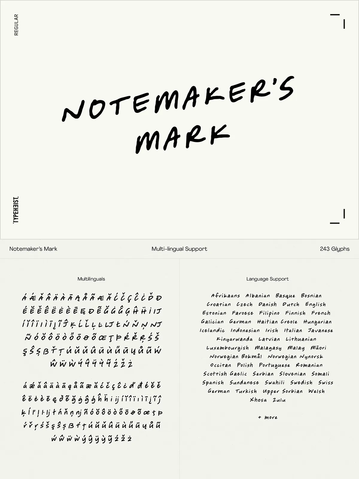
- 455 glyphs covering standard English/Latin characters
- One additional stylistic set for A–Z, a–z and 0–9
- Multilingual accented characters for extended Latin support
Design Uses & Applications
Branding and Packaging
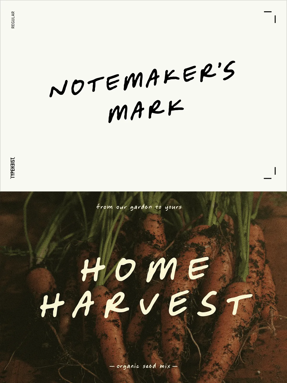
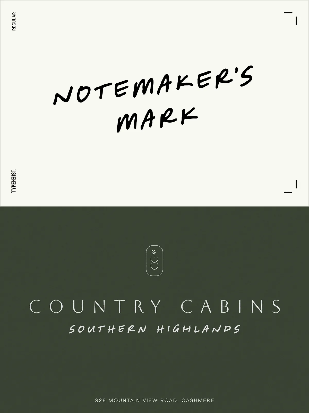
Apply Notemaker’s Mark when the brand needs a human voice—artisanal products, lifestyle labels, and service brands that want to feel personal rather than corporate. Use the stylistic set selectively for logotypes and primary wordmarks to preserve clarity while adding character.
Social Content & Advertising
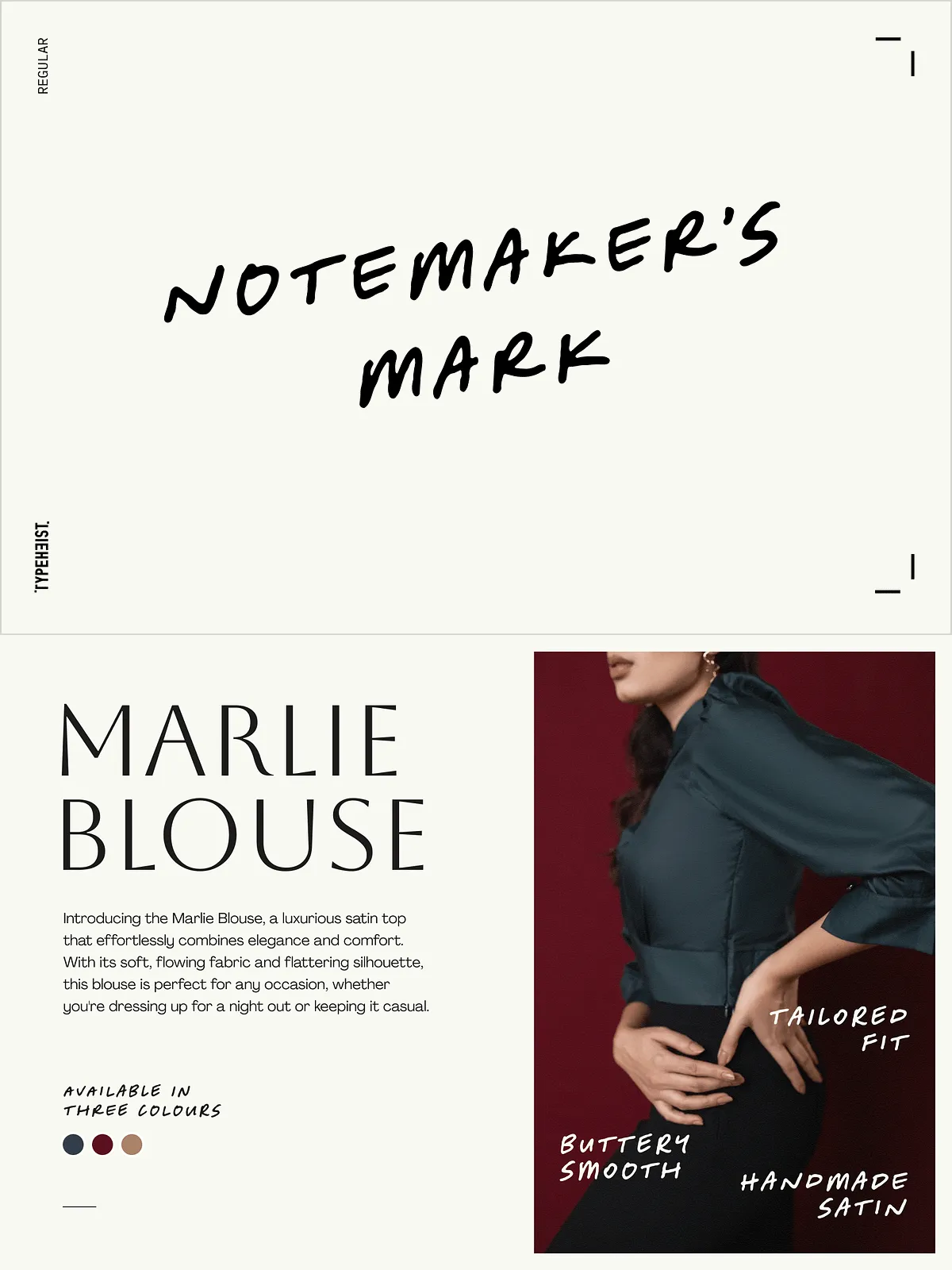
On social platforms, the font grabs attention and feels conversational. Pair it with bold photography or solid color fields to emphasize captions, quotes, and calls to action. Its spontaneous look encourages engagement and signals authenticity.
Editorial & Annotations
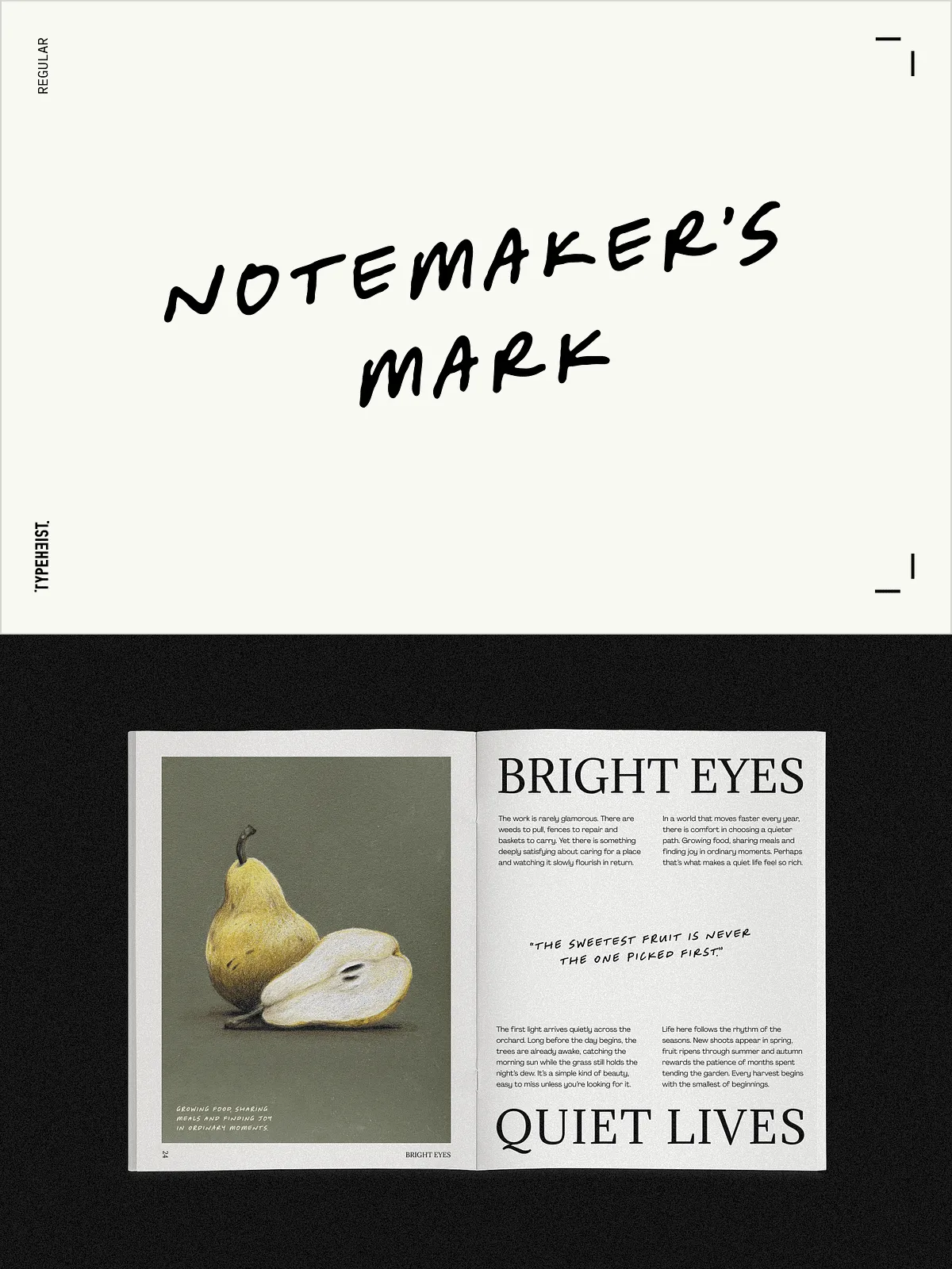
Use it for pull quotes, section headers, and annotation layers that call out insights or author notes. The font naturally distinguishes commentary from body text and gives editorial spreads a dynamic, handcrafted edge.
Technical Notes & Compatibility
Notemaker’s Mark ships in OTF, WOFF, and WOFF2 for broad desktop and web use. Install OTF/TTF on macOS and Windows; embed WOFF/WOFF2 for web projects. If you need guidance on installing fonts on macOS, see Apple’s instructions: [Install and validate fonts in Font Book on Mac](https://support.apple.com/guide/font-book/install-and-validate-fonts-fntbk1000/mac). Test the included glyphs in your design software and check the stylistic set in the character panel to access alternates.
Technical Support & Custom Requests
If a required glyph is missing or you need an alternate character or extended language support, contact the designer. Support requests are welcomed: provide the specific character or language requirement and the team will advise on custom options or updates. The font is tuned for clean kerning and sensible spacing across display sizes, but we recommend always testing text at the final output size.
How to Start Using Notemaker’s Mark
Download the font package, install OTF on your system or include WOFF/WOFF2 for web, and select the family in your design tool. Start compositions with the default set for consistent readability, then experiment with the stylistic set for emphasis. Use the font at headline and subhead sizes where its personality shows best; combine it with neutral body typefaces (clean sans or a neutral serif) to balance warmth with long-form readability.