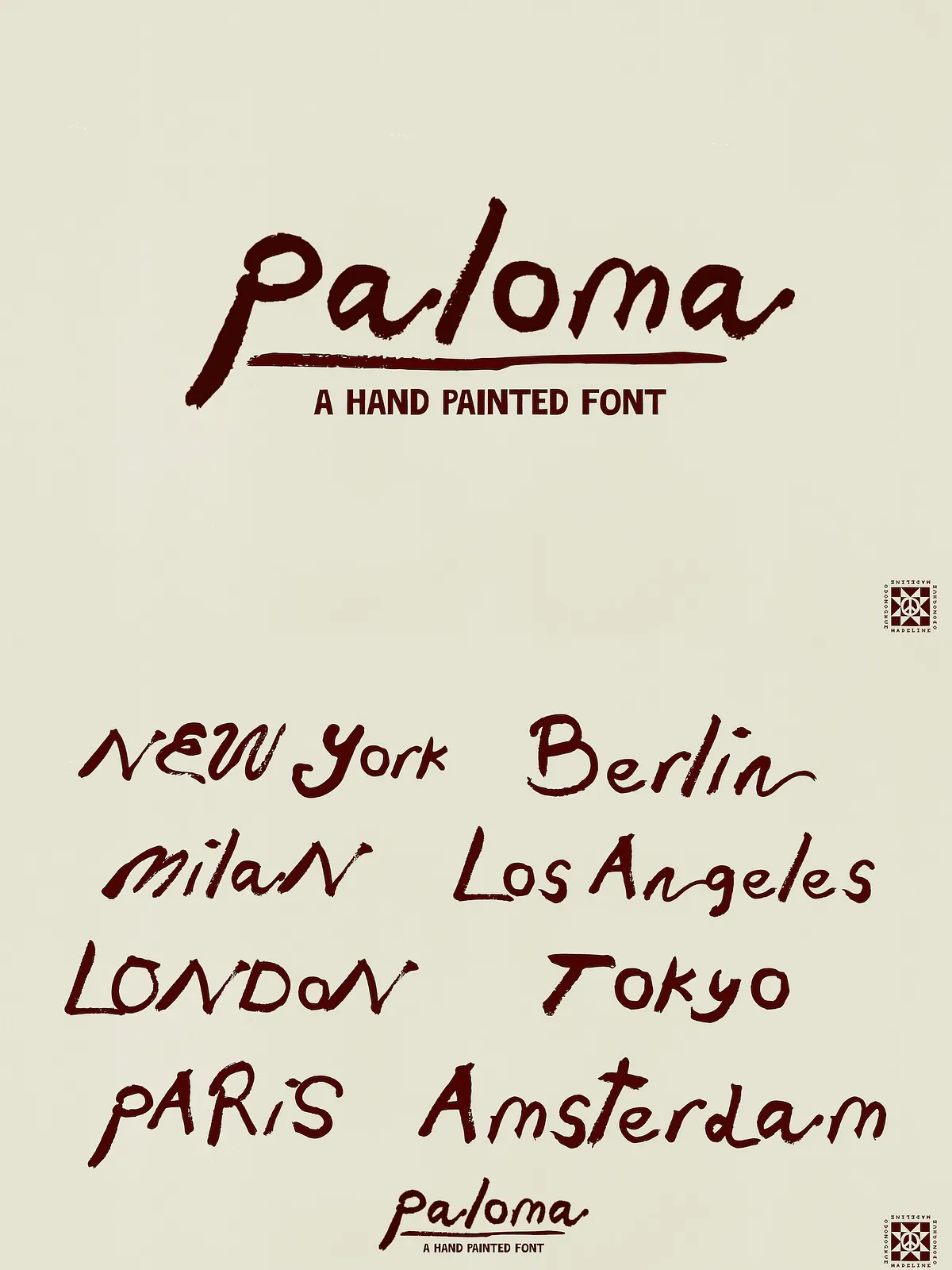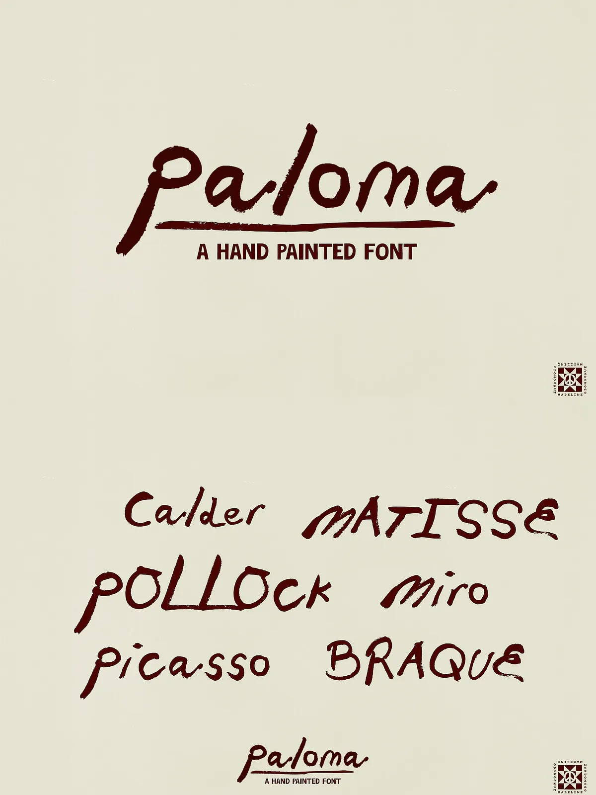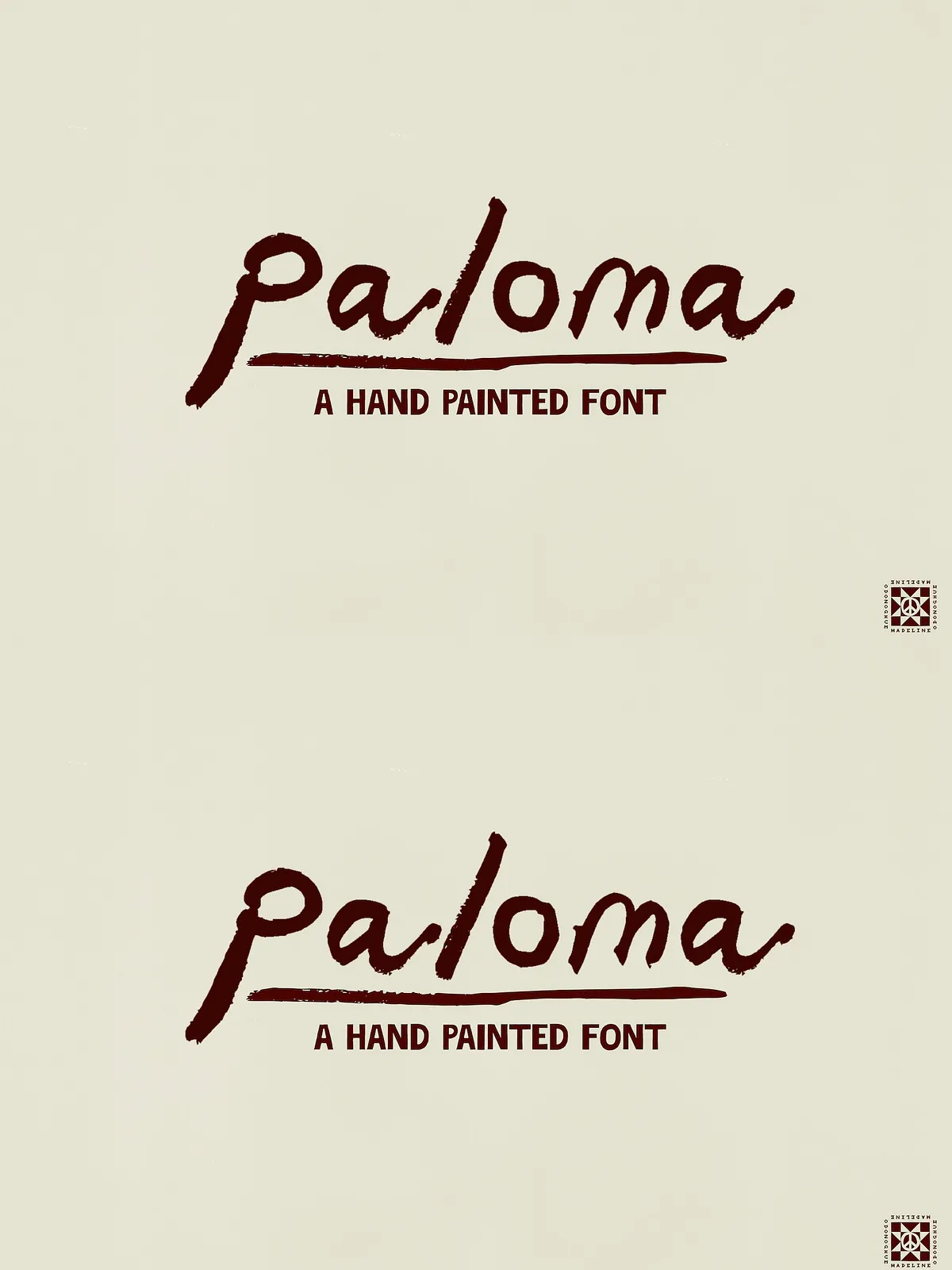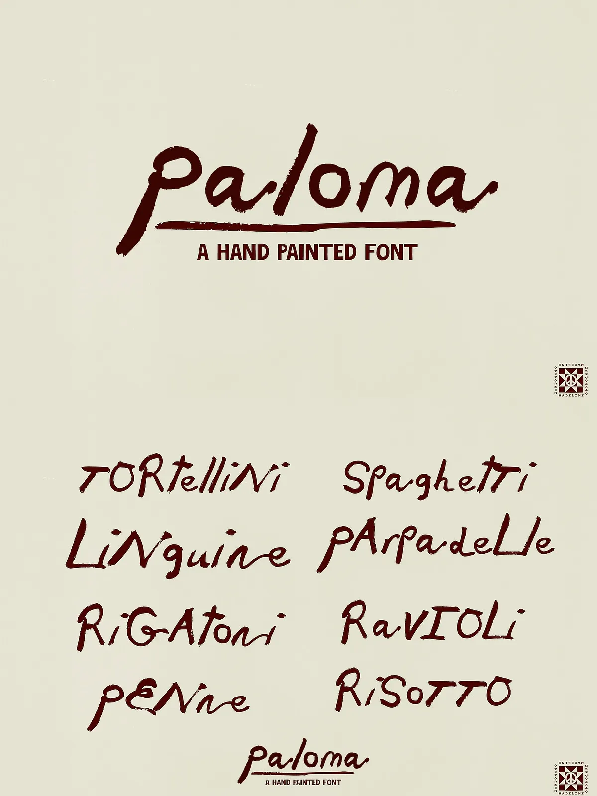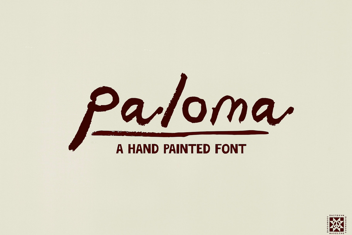

Paloma™ captures the organic energy of a loaded brush hitting paper. Built from real painted letterforms, this hand-painted display font celebrates expressive, uneven edges and natural stroke variation. Paloma moves with painterly rhythm and immediacy: each character reads like a confident signature, a quick sketchbook note, or a final brushstroke that completes a canvas.
Why Paloma Works
Authentic, Human Texture
Paloma preserves real brush detail: bristle marks, tapered stroke endings, and slight ink pooling. These characteristics give designs an authentic, human feel that digital brushes alone struggle to match. Paloma’s irregularities become design strengths—adding warmth, spontaneity, and personality to headlines and short passages.
Built for Creative Projects
Use Paloma when you want typography to feel handcrafted and personal. The font suits gallery promos, artist portfolios, boutique packaging, and editorial accents. It works particularly well where viewers expect an artisanal touch: menus, invites, craft product labels, and lifestyle branding. Paloma reads best at small to medium sizes where brush textures remain legible and add visual charm.
Explore brush font examples and inspiration here: [40 Best Brush Fonts to Maximize Your Designs](https://din-studio.com/best-fonts/brush-fonts/)
Perfect For
- Art galleries and exhibition graphics
- Creative studios and artist websites
- Restaurant menus and cafe signage
- Invitations, stationery, and greeting cards
- Packaging for handmade and craft goods
- Editorial headings and pull-quotes
- Social media graphics and lifestyle branding
What’s Included
Files
- Paloma.otf — OpenType file ready for professional design workflows
Character Set
- Uppercase letters
- Lowercase letters
- Numbers and basic punctuation
Usage Recommendations
Best Sizes & Contexts
Paloma excels at small-to-medium sizes where brush texture reads clearly—think subheads, logos, product names, and menu items. Avoid ultra-large display applications (such as billboard-scale signage) where handmade texture can become visually noisy. For text-heavy layouts, pair Paloma with a neutral sans or serif for body copy to maintain flow and legibility.
Design Treatments
Let Paloma breathe: use comfortable line-height and moderate letterspacing for longer headings. Contrast the rough brush forms with clean geometric shapes or white space to let the type sing. Subtle texture overlays or paper backgrounds enhance the font’s handcrafted character without competing with the letterforms.
Technical Notes & Licensing
Install the OTF file on desktop systems or drop it into professional apps (Photoshop, Illustrator, InDesign, Affinity, Figma). Review the included license for permitted uses; typical commercial licenses cover desktop use for branding and print, but verify terms for web embedding, app licensing, or multi-seat deployment. Contact the font provider for expanded or extended licensing options if needed.
Design Pairing Suggestions
- Pair Paloma with a clean sans-serif (for body copy and UI) to maintain hierarchy and readability.
- Combine with a low-contrast serif for editorial warmth in longer printed pieces.
- Use restrained color palettes or organic paper textures to emphasize the handcrafted look.