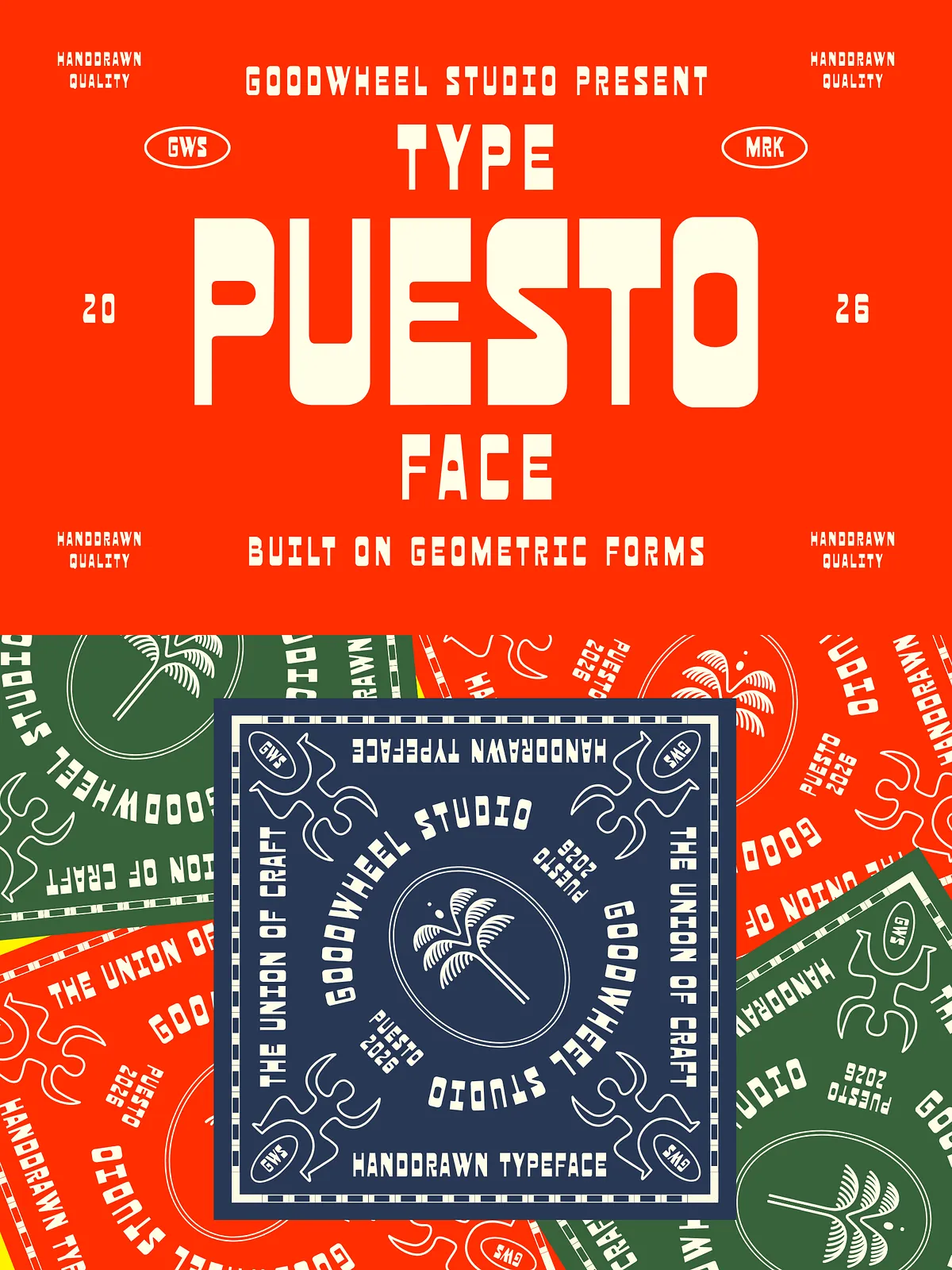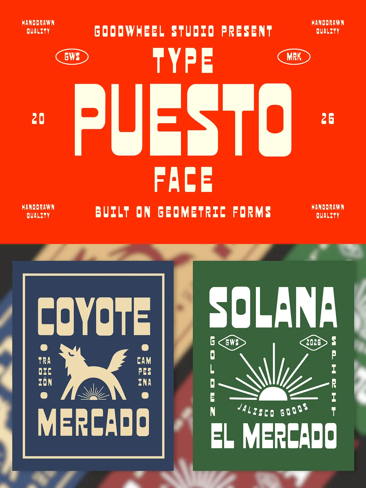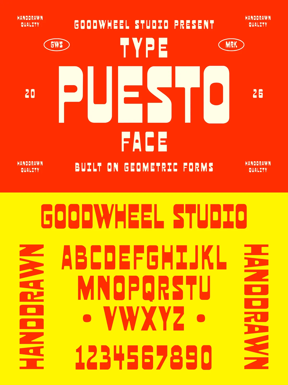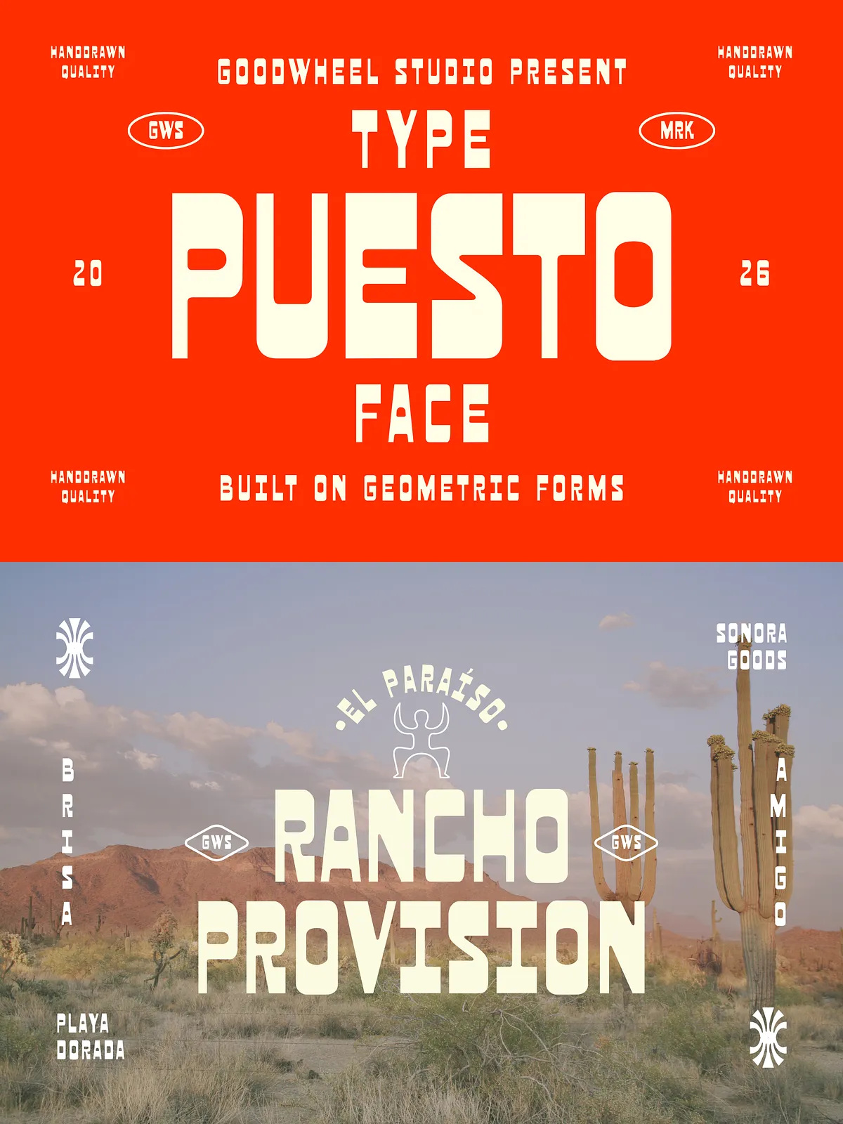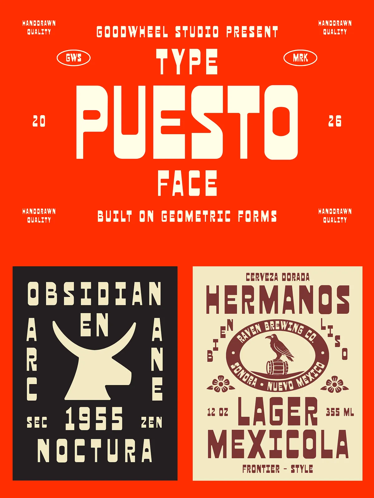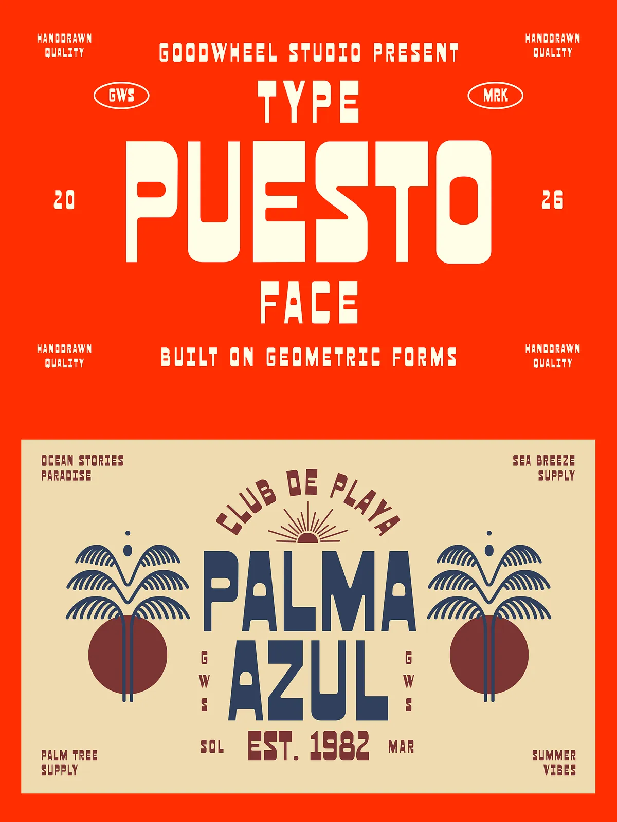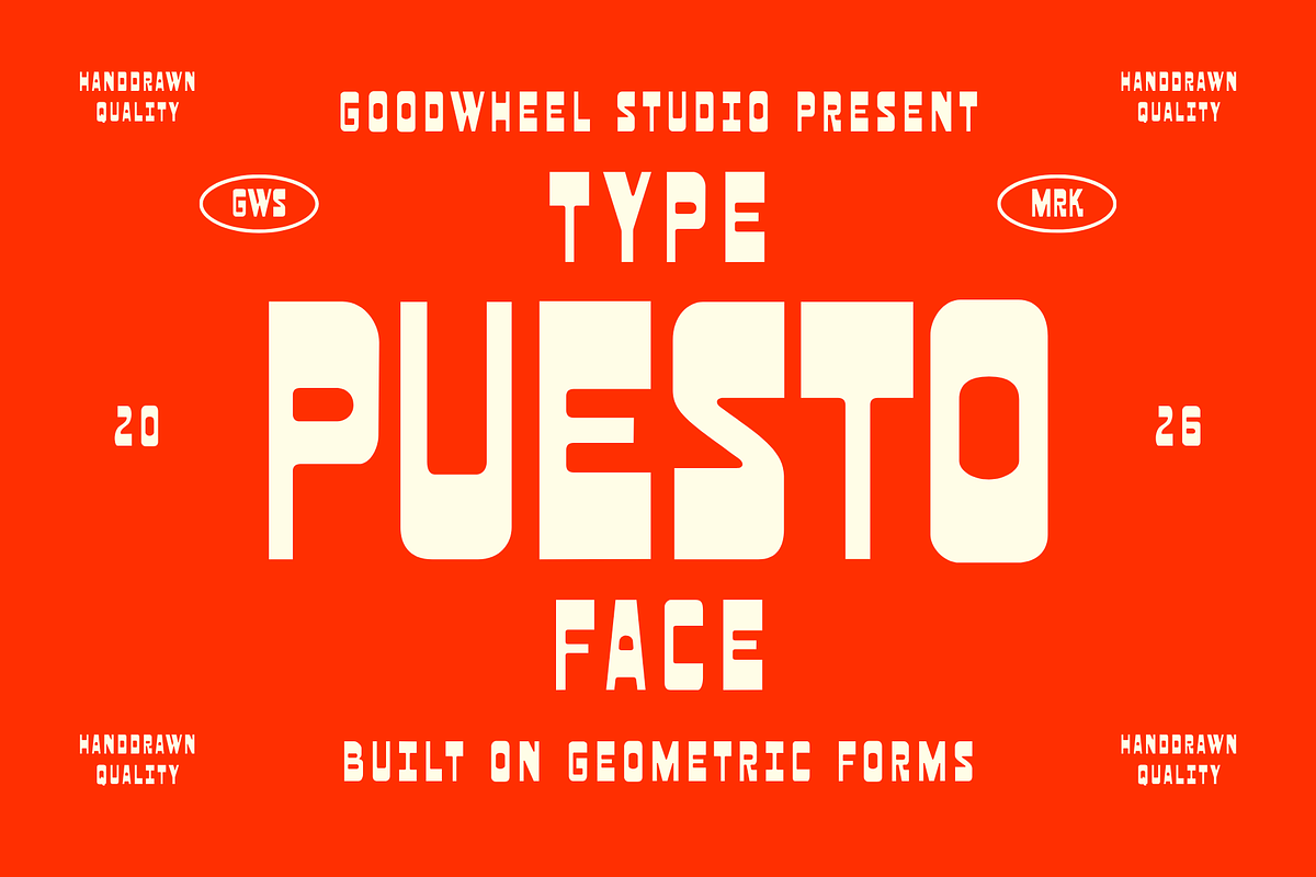

Puesto combines reverse-contrast letterforms with a warm, folk-inspired aesthetic to deliver a display typeface that feels both assertive and approachable. Designers will use Puesto when they want strong headline presence with handcrafted charm: it echoes traditional woodtype printing, vintage signage, and regional beverage labels while performing cleanly in contemporary layouts. The typeface emphasizes heavier horizontal strokes and lighter verticals, producing a distinctive silhouette that reads clearly at a range of sizes and creates instant visual personality for brand and packaging work.
Design Characteristics
Reverse-Contrast Construction
Puesto reverses the usual weight distribution: horizontals take on the bulk while verticals sit lighter. This choice produces high-impact shapes that feel vintage and hand-carved. The reversed contrast enhances display readability and draws immediate attention to headlines, titles, and logotypes.
Folk-Inspired Details
The letterforms incorporate subtle decorative touches drawn from folk art and traditional craftsmanship. Slight flares, small terminals, and modest seriffing deliver warmth and cultural texture without overpowering modern layouts. These details reinforce authenticity and help Puesto convey a handcrafted, heritage-driven voice.
Compact Geometry & Proportions
Puesto uses compact, geometric proportions to maximize space efficiency and punch. The condensed width and tight spacing work well on labels, posters, and stacked logotypes where economy and presence both matter. Designers can rely on its compact rhythm to create bold, dense compositions that still feel balanced.
Applications & Use Cases
Use Puesto wherever you need strong visual identity rooted in tradition:
- Restaurant, brewery, and beverage labeling — Puesto anchors product stories with heritage cues and clear shelf presence.
- Packaging and product identities — the typeface performs well on jars, tins, boxes, and wrapper treatments.
- Logos and wordmarks — designers will carve memorable logotypes that read sharply at display sizes.
- Posters and event promotions — Puesto grabs attention and pairs well with textured backgrounds or illustrative elements.
- Editorial headlines and mastheads — use Puesto for magazine covers and feature headings that require personality.
Pairing & Styling Tips
Establish Clear Hierarchy
Place Puesto at the top of your hierarchy for headlines and primary brand marks. Pair it with a neutral sans-serif for body copy to preserve legibility and avoid competition. The contrast between Puesto’s decorative weight and a clean, modern text face creates effective visual tension.
Color, Texture, and Backgrounds
Puesto thrives on textured, tactile surfaces like letterpress, kraft paper, woodgrain, and block-printed backgrounds. Use warm color palettes, muted earth tones, or rich beverage-inspired hues to reinforce its folk character. When you layer Puesto over patterned fields, apply subtle outlines or drop shadows to maintain legibility while preserving vintage appeal.
Layering & Decorative Usage
Apply Puesto as a primary headline and add simple ornamental elements — lines, stars, or borders — that echo its folk motifs. Use uppercase display settings for maximum impact, and introduce tight letterspacing for stacked compositions and bottle labels.
Technical Details & File Deliverables
- Formats: OTF and TTF for desktop use. Provide WOFF/WOFF2 for web embedding if needed.
- Weights: Single or multiple display weights depending on package; check the delivered files for weight options.
- Character Set: Latin A–Z, numerals, basic punctuation. Confirm diacritics and extended language support for multilingual projects.
- Vector Art & Export: For packaging and print, convert to outlines or supply EPS/PDF versions to ensure consistent output at high resolution.
Licensing & Support
Include a clear license file that explains permitted commercial use, web embedding rights, and any redistribution restrictions. If you need an extended license for product resale, multi-seat deployments, or app embedding, contact the foundry or seller to arrange expanded terms. Provide system and application details when requesting technical support so the vendor can reproduce and resolve issues quickly.
Quick Usage Guide
1. Install OTF/TTF files on desktop systems via Font Book (macOS) or right-click → Install (Windows).
2. For web use, host WOFF/WOFF2 files and reference them in your CSS with @font-face declarations. Test in target browsers and devices.
3. When preparing print-ready files, outline the type or embed fonts in your export to preserve appearance across printers.