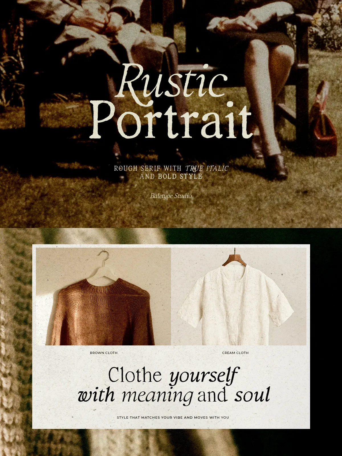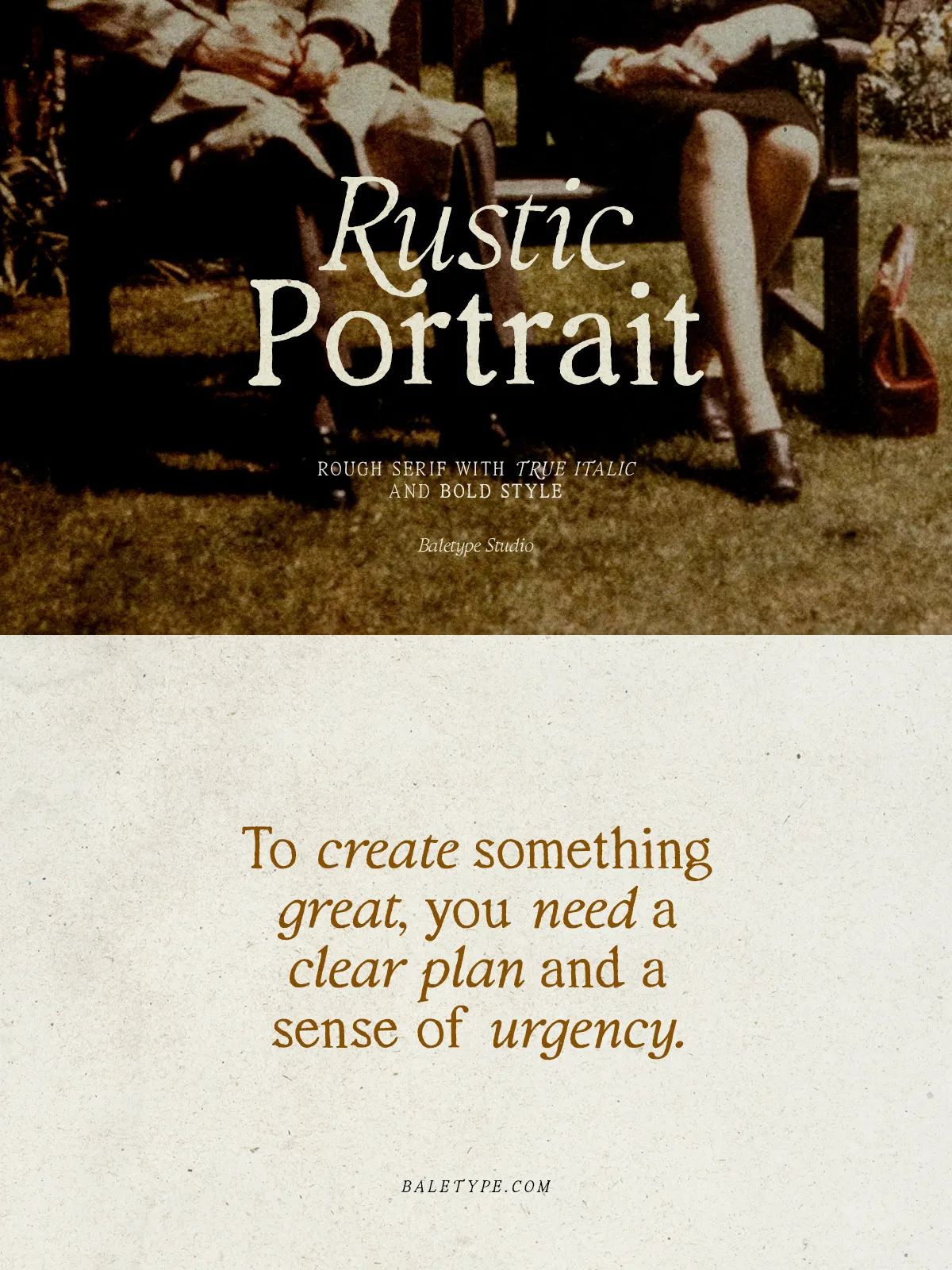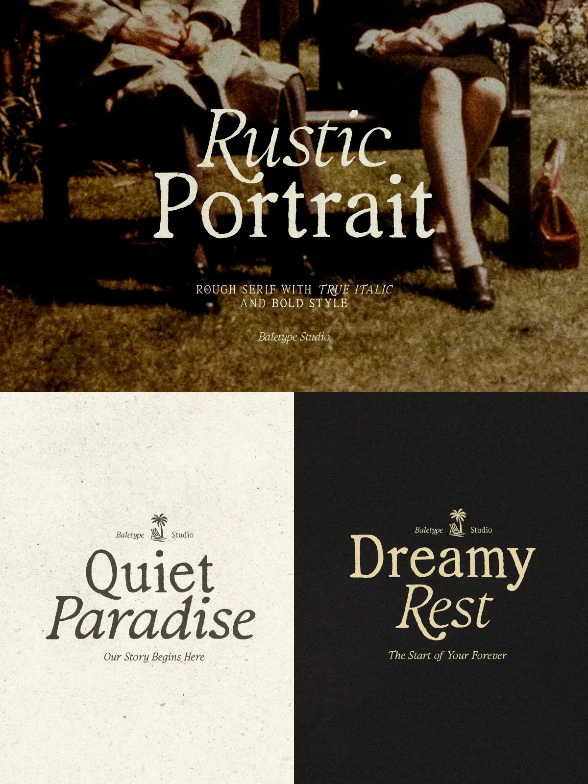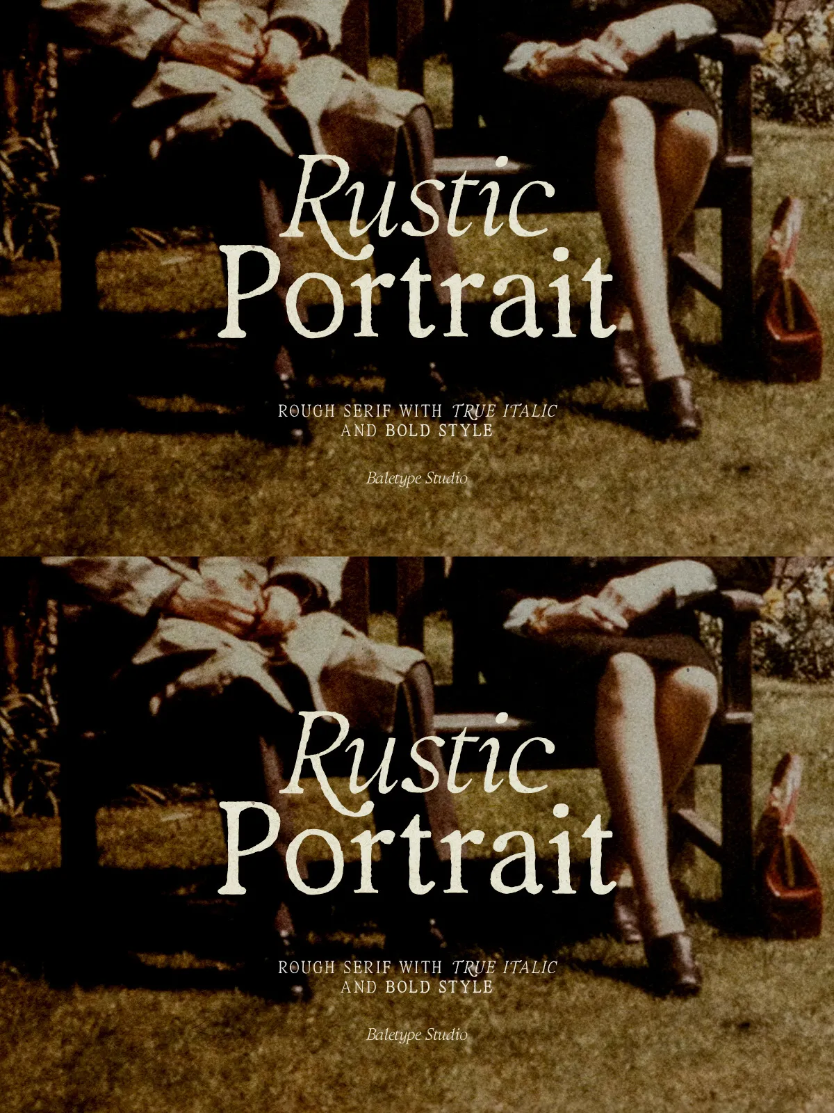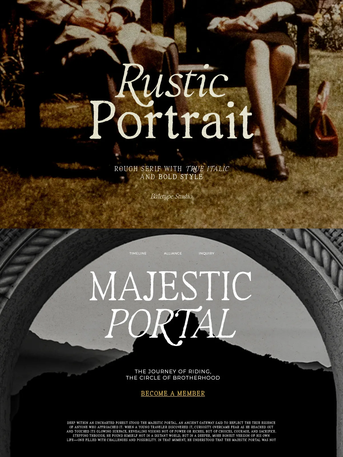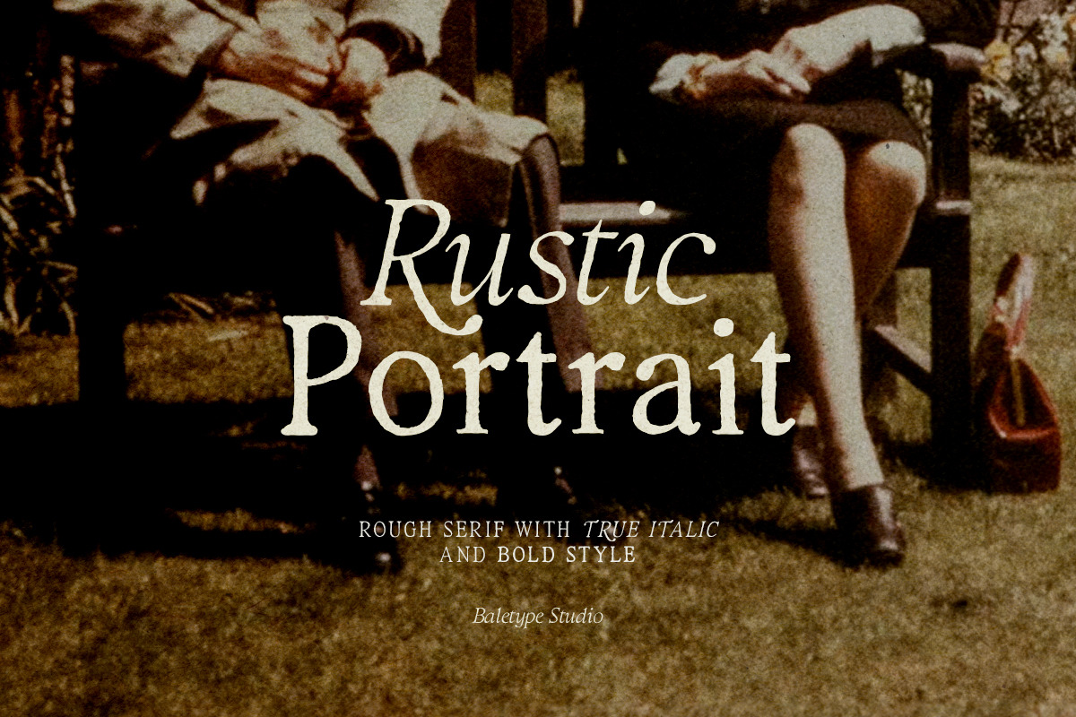

Rustic Portrait captures the tactile warmth of hand-lettered typography and brings it into modern design. This serif family displays a naturally textured, slightly rough finish that reads as authentic and crafted. Designed to inject personality and approachability, Rustic Portrait works equally well in prominent display settings and supportive typographic roles. Use it when you want type that feels handcrafted, durable, and human — not manufactured.
What’s Included
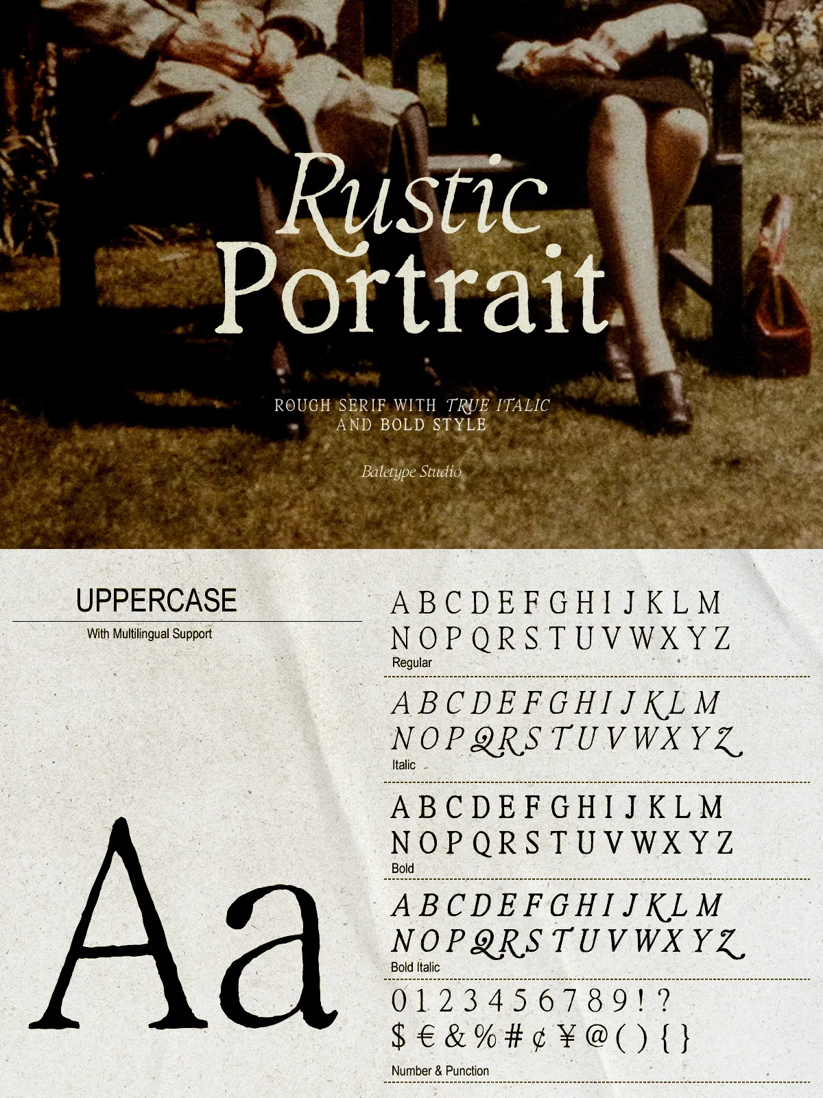
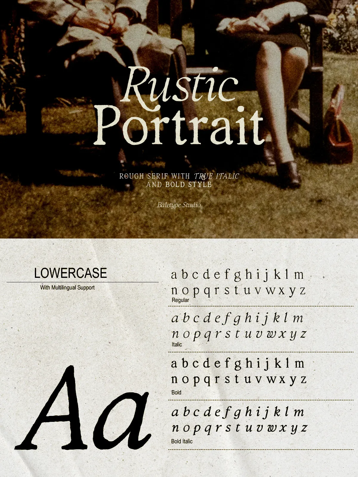
- RusticPortrait-Regular.otf — A balanced, readable weight for headlines and supportive body use.
- RusticPortrait-Italic.otf — A slanted companion with preserved texture for emphasis and elegant callouts.
- RusticPortrait-Bold.otf — A firmer, high-impact style that holds presence in packaging and signage.
- RusticPortrait-BoldItalic.otf — Bold and expressive with italicized motion for striking taglines and labels.
Key Features
Hand-Lettered Serif Texture
Each glyph in Rustic Portrait shows subtle irregularities and natural texture that simulate paper and pen work. These imperfections deliver an artisanal aesthetic that strengthens brand authenticity and visual storytelling.
Versatile Weight Range
The Regular-to-Bold range gives you the flexibility to craft clear hierarchies. Use Regular for supportive text or softer headlines, and Bold for packaging labels, posters, or any application that needs a confident voice.
Italic Companion for Nuance
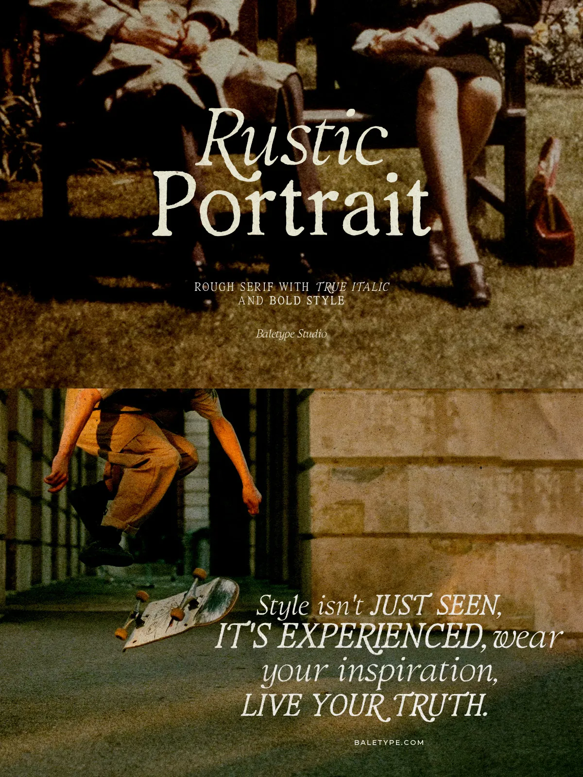
The Italic and Bold Italic styles introduce motion and emphasis without losing the family’s textured character. Apply italics for subheadings, pull quotes, or product descriptors to communicate nuance and craft.
Readable Display Performance
Rustic Portrait balances decorative texture with strong letterforms to maintain legibility at display sizes. The letter spacing and shapes work reliably for headlines, editorial lead-ins, and short-form copy where character matters most.
Ideal Use Cases
- Branding and logos — create an artisanal identity that suggests heritage and craftsmanship.
- Packaging and labels — present products as handmade, boutique, or small-batch with distinctive typography.
- Editorial layouts — give feature spreads and covers a warm, tactile feel that complements photography and illustration.
- Posters and signage — employ Bold for strong visibility and Regular for supporting copy.
- Presentations and proposals — add personality and trustworthiness to visual narratives and pitch decks.
Pairing & Design Tips
Create Contrast with Modern Sans
Pair Rustic Portrait with a clean sans-serif to balance the handcrafted texture. Use a neutral geometric or humanist sans for body text while reserving Rustic Portrait for headings and emphasis.
Color and Material Considerations
Earthy palettes, warm neutrals, and muted inks complement the rustic texture. For packaging, pair the font with uncoated papers, kraft stock, or letterpress effects to amplify the handcrafted quality.
Scale and Spacing
Increase tracking slightly on large decorative headlines to let the texture breathe. For small caps or tight layouts, test at the intended size and adjust kerning to preserve clarity while retaining character.
Installation & Compatibility
Install the OTF files by extracting the ZIP and using your OS font installer or a font manager. Rustic Portrait functions across major design tools — Adobe Creative Cloud (Photoshop, Illustrator, InDesign), Affinity, Figma, Sketch, and common office apps. While the family focuses on display use, it also supports multilingual characters for broader global projects.