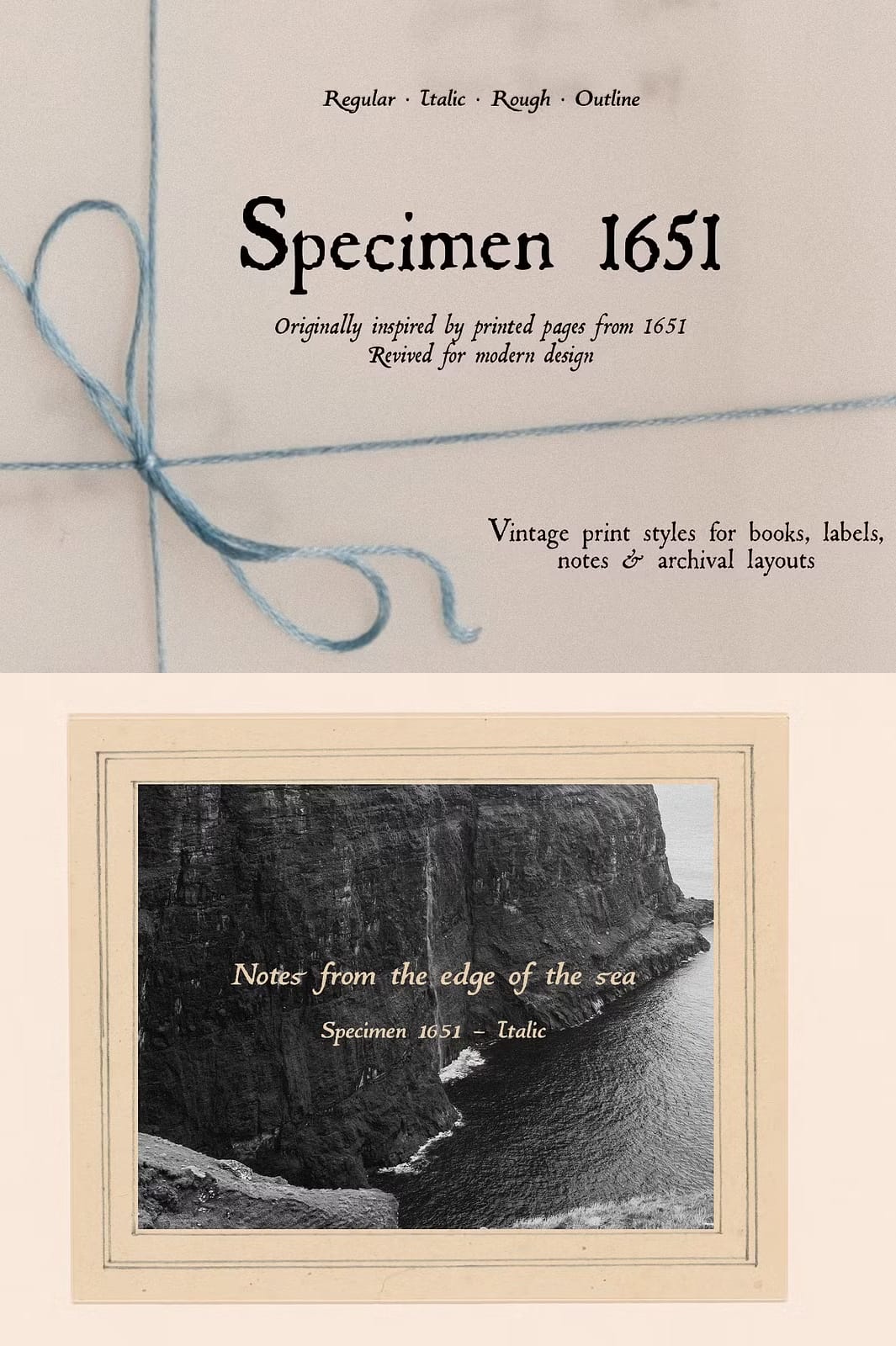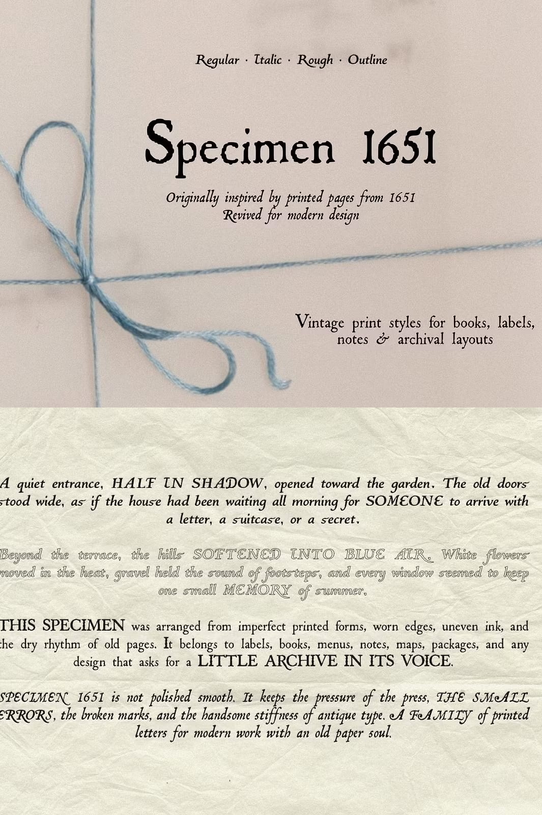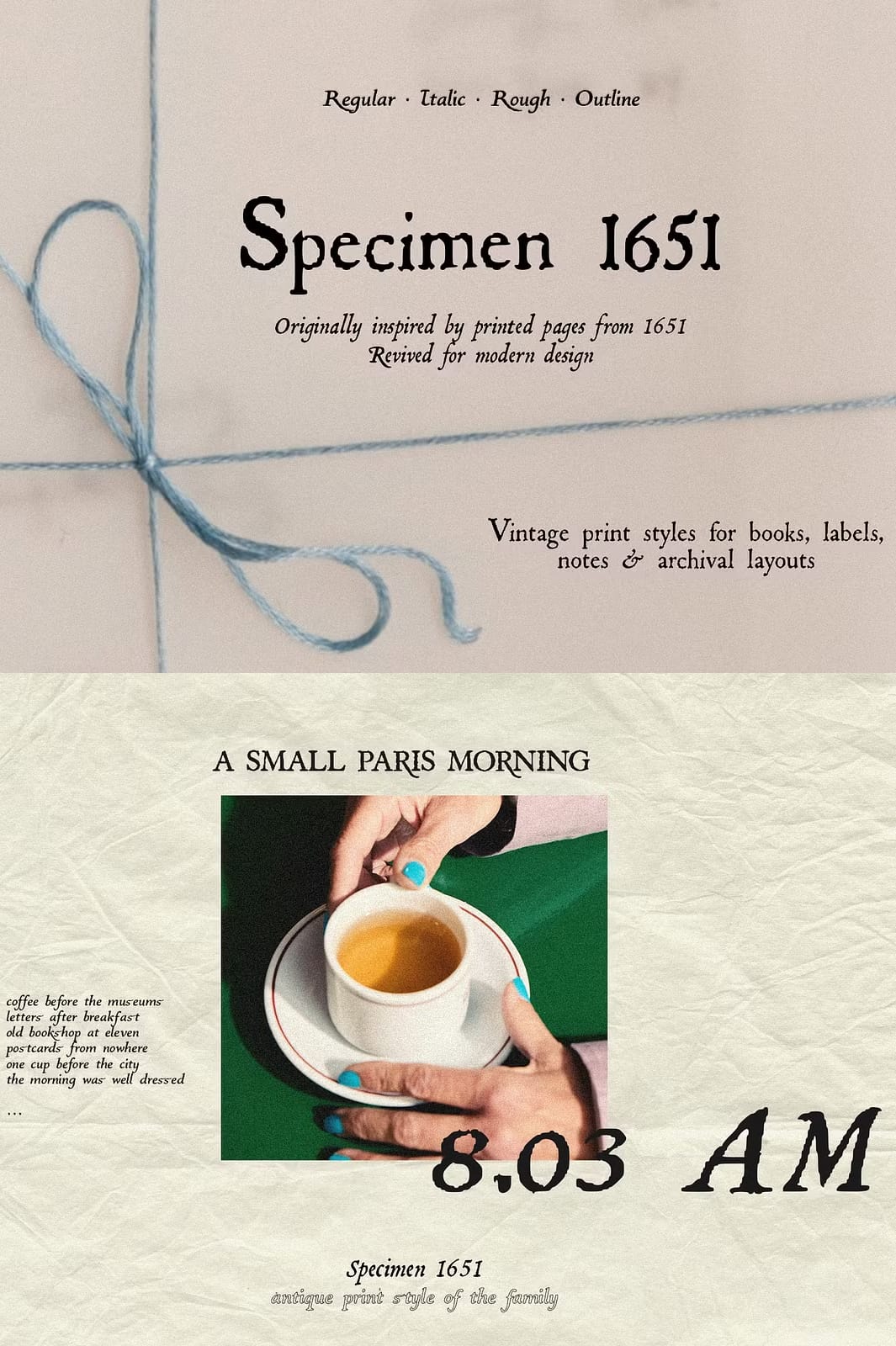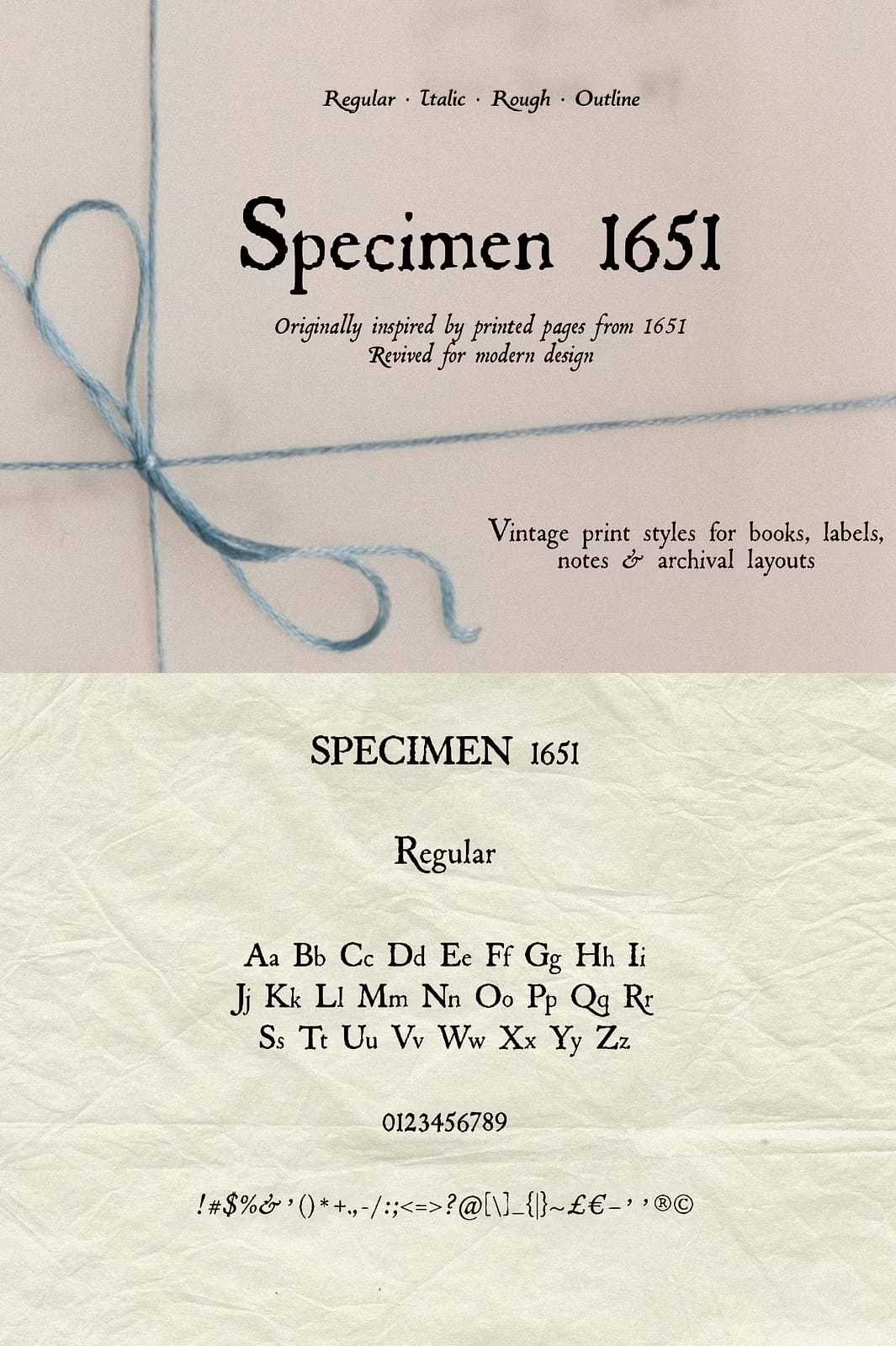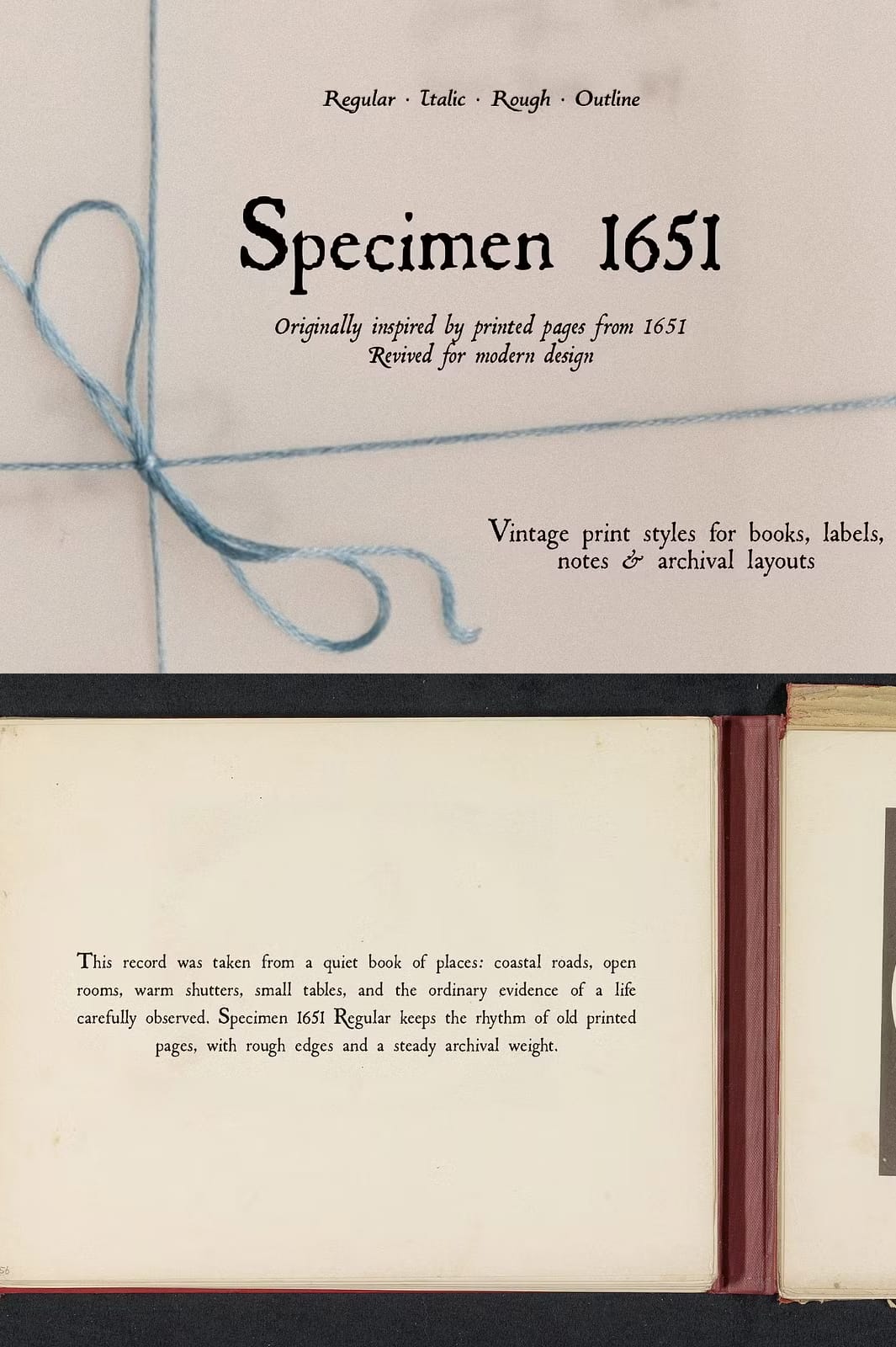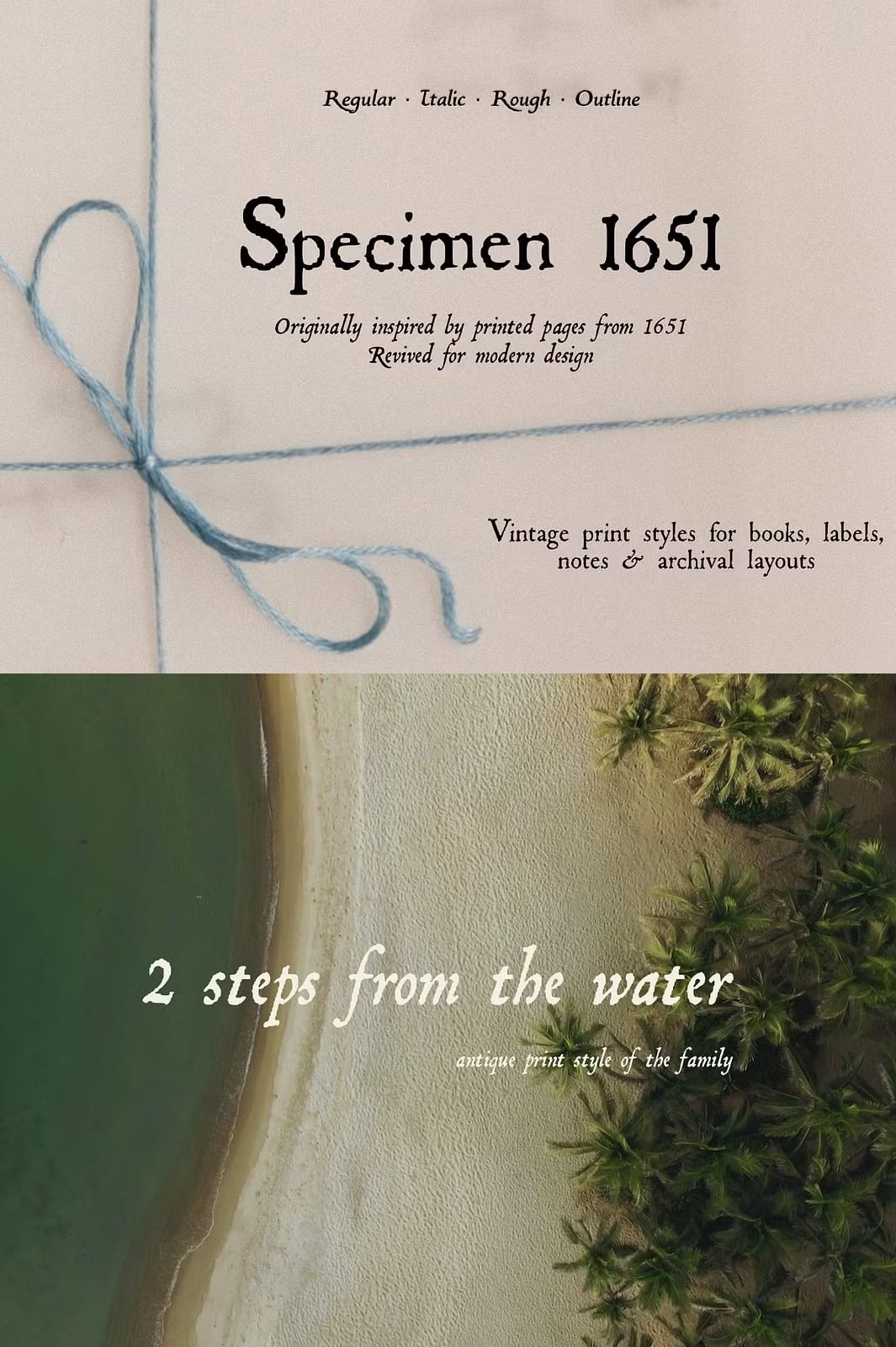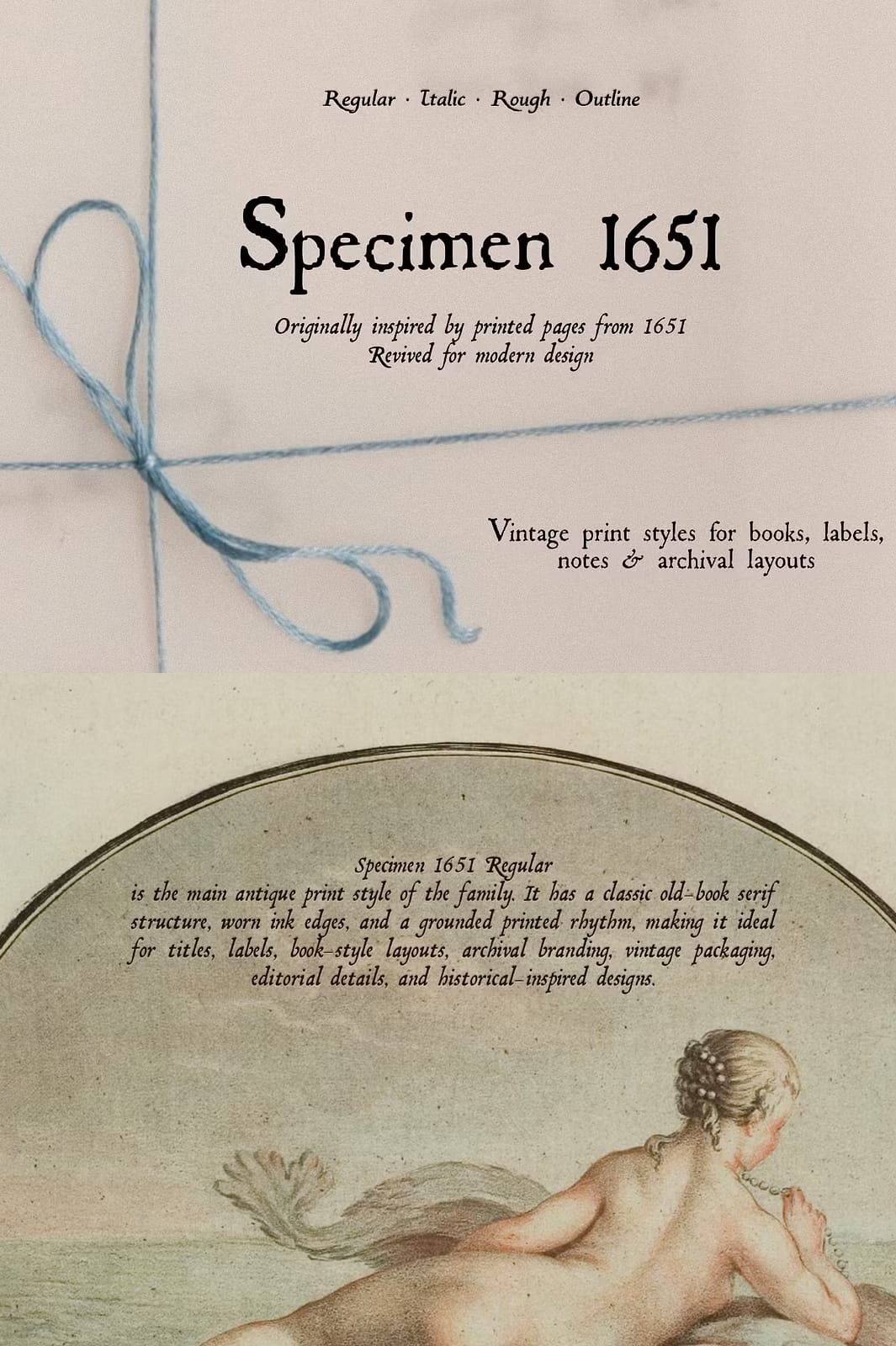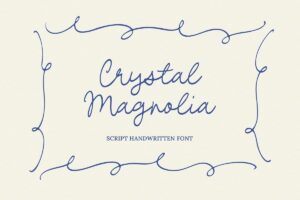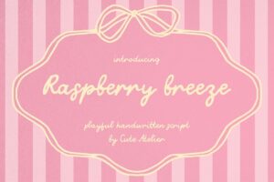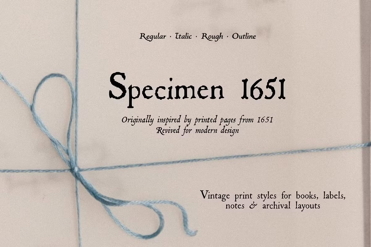

The family includes four styles: Regular, Italic, Rough, and Outline. Each one keeps a different part of the old press character: rough ink edges, imperfect weight, softened details, irregular texture, and letterforms that feel pulled from an archive rather than polished into something sterile.
Regular is the main printed serif style, made for titles, labels, book-inspired layouts, packaging, editorial details, and archival branding. Italic brings a more literary, slanted rhythm for captions, quotes, notes, and secondary text. Rough has a darker, more distressed press texture for designs that need stronger ink and historical grit. Outline gives the family a lighter decorative option for headings, specimen layouts, layered typography, and old-style display details.
This is not a perfectly smooth digital serif. It keeps the pressure of the press, the small breaks, the uneven edges, and the slightly damaged charm of archival typography, revived for contemporary layouts.
What’s included
- Specimen 1651 Regular OTF
- Specimen 1651 Italic OTF
- Specimen 1651 Rough OTF
- Specimen 1651 Outline OTF
Perfect for
Book covers, labels, packaging, menus, editorial layouts, vintage branding, archival graphics, stationery, notes, posters, product tags, album covers, museum-inspired design, moodboards, social media graphics, Canva templates, and old-world typography projects with modern use.