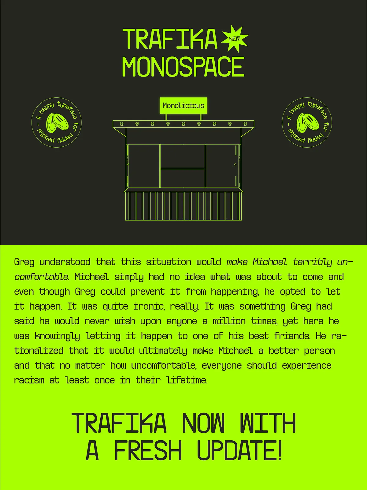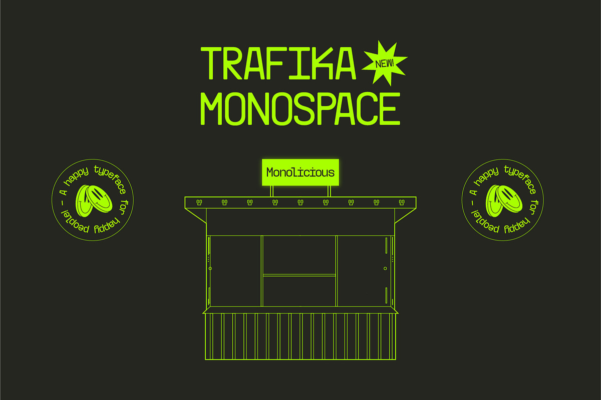
Trafika isn’t just a typeface — it’s a narrative etched in pixels and letterforms. Inspired by the modest yet enduring “Trafika” shops scattered across Prishtinë, many of which date back to the Yugoslavian era, this font carries the spirit of time, memory, and quiet resilience. Each character is a tribute to the craftsmanship of those small, enduring storefronts — built to last, designed with purpose, and quietly influential.
More than just a visual choice, Trafika invites you to design with intention. Its experimental nature challenges conventional monospace norms while maintaining functional clarity. The result? A typeface that stands out in digital environments without sacrificing legibility — a true bridge between art, history, and technology.
Minimalist Structure, Maximum Character
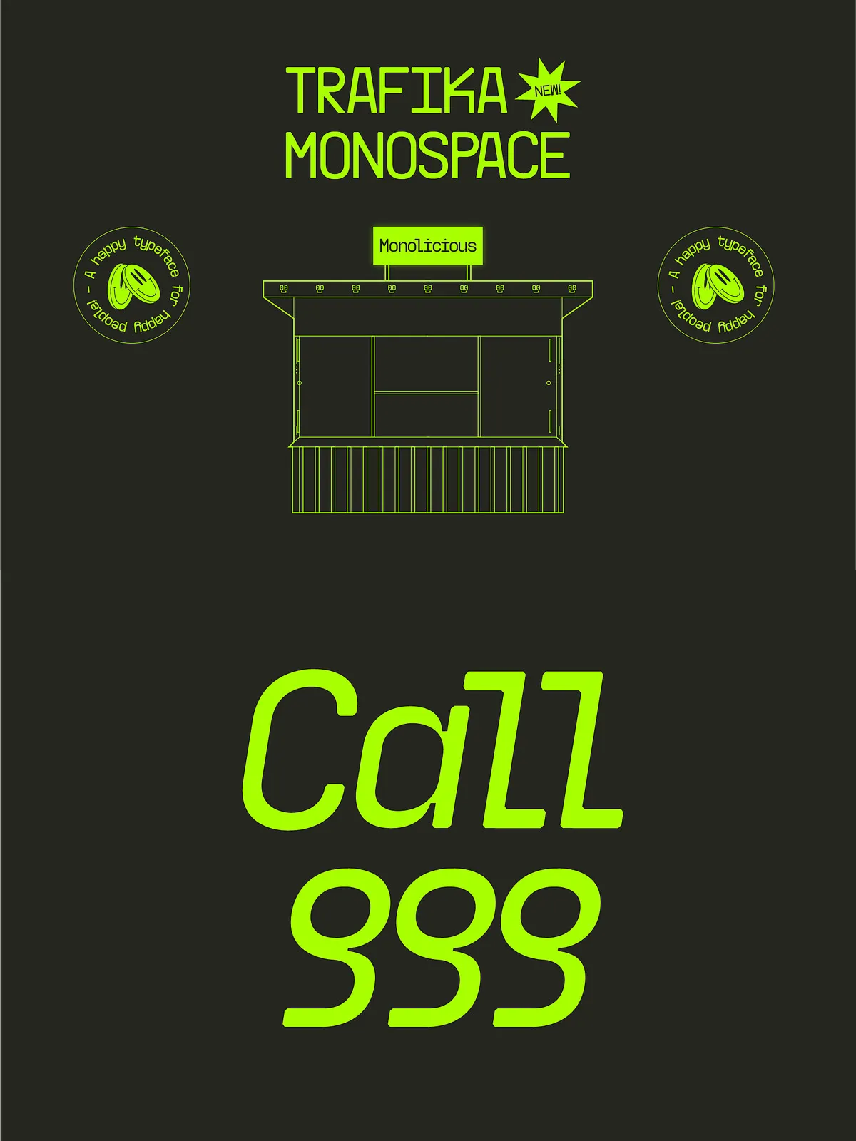
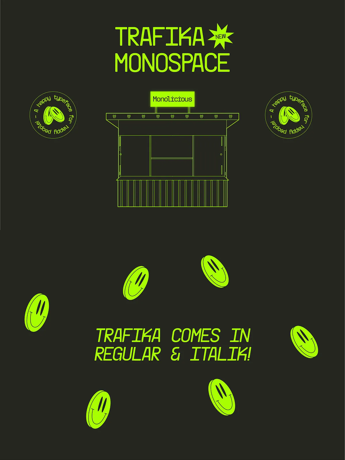
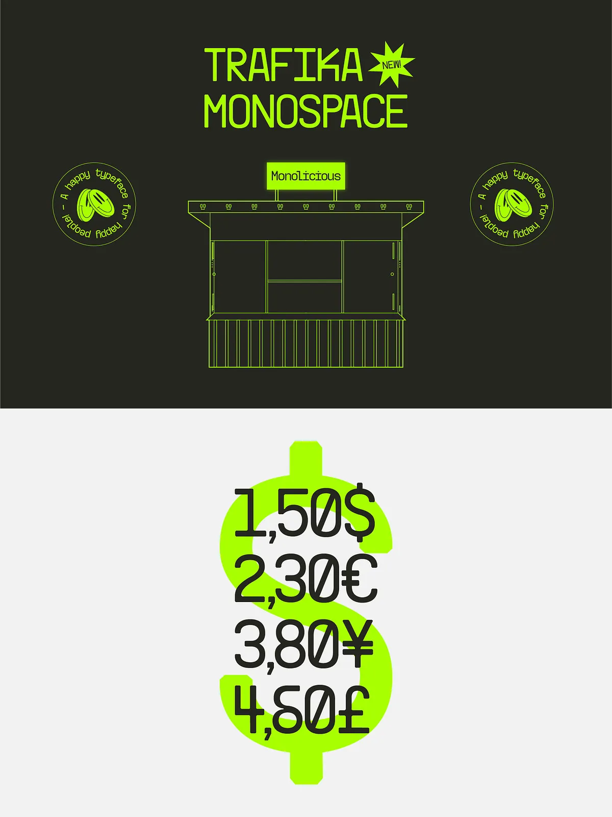
One weight, two distinct styles — versatility in simplicity
Designed with a singular weight foundation, Trafika offers two distinct stylistic variations to suit your creative needs:
- Regular Style: Clean, unadorned, and purposefully precise. Ideal for body text, code snippets, technical documentation, and minimalist branding.
- Retro-Fit Style: Infused with subtle imperfections and nostalgic flourishes — slightly irregular stroke transitions, intentional asymmetry, and soft terminal variations. Perfect for editorial pieces, art direction, and projects that tell a story.
Though limited in weight, this intentional restraint amplifies Trafika’s expressive potential. The contrast between the two styles allows designers to create narrative rhythm, even within a single project — from formal to artistic, from functional to emotional.
Design for Digital Spaces That Demand Character
Optimized for coding, UI design, editorial layouts, and experimental typography
While rooted in history, Trafika thrives in the future of digital design:
- Coding & Terminal Interfaces: The consistent monospaced structure ensures perfect alignment in code blocks, logs, and shell commands. Its distinctive character shapes help reduce eye strain and improve readability during long sessions.
- UI & UX Design: Use Trafika in dashboards, navigation labels, or digital signage to inject personality without overwhelming the user experience.
- Editorial & Creative Projects: Its narrative depth makes it ideal for magazine spreads, art books, travel writing, and cultural documentation where text becomes part of the visual story.
- Branding & Identity: Stand out in a sea of generic fonts — Trafika adds emotional weight to logos, slogans, and taglines with its unique origin and aesthetic.
Whether you’re building a responsive web interface or a print zine, Trafika brings depth, authenticity, and a sense of place to every character.
Technical Strength, Seamless Integration
Engineered for pros who value precision and flexibility
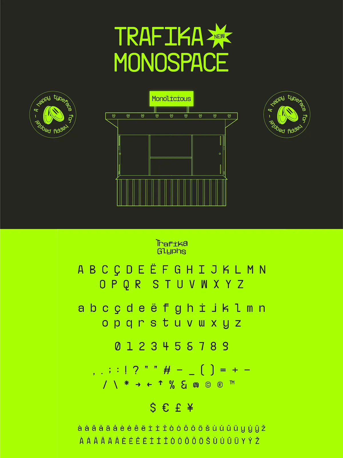
Trafika is delivered in professional OpenType (OTF) format with full support for advanced typographic features:
- Stylistic alternates for both styles — enabling creative variation without compromising alignment.
- Comprehensive character set: Supports Latin, extended Latin, diacritics, and special symbols.
- Highly compatible: Works flawlessly with Adobe Creative Suite, Figma, Sketch, Webflow, CSS, and web applications.
- Scalable to any size — from small UI elements to large-format display.
Install once, deploy everywhere — from website headers to mobile screens to print layouts. Trafika adapts to your workflow, not the other way around.
Elevate Your Work with Trafika — Where Design Meets Story
Choose a font that doesn’t just communicate — it remembers
Reject the ordinary. Move beyond predictable monospaced fonts that blend into the background. Choose Trafika — a typeface that carries history, challenges conventions, and sparks curiosity.
Download Trafika today and give your next project a voice rooted in culture, bolded by design, and built for the future.