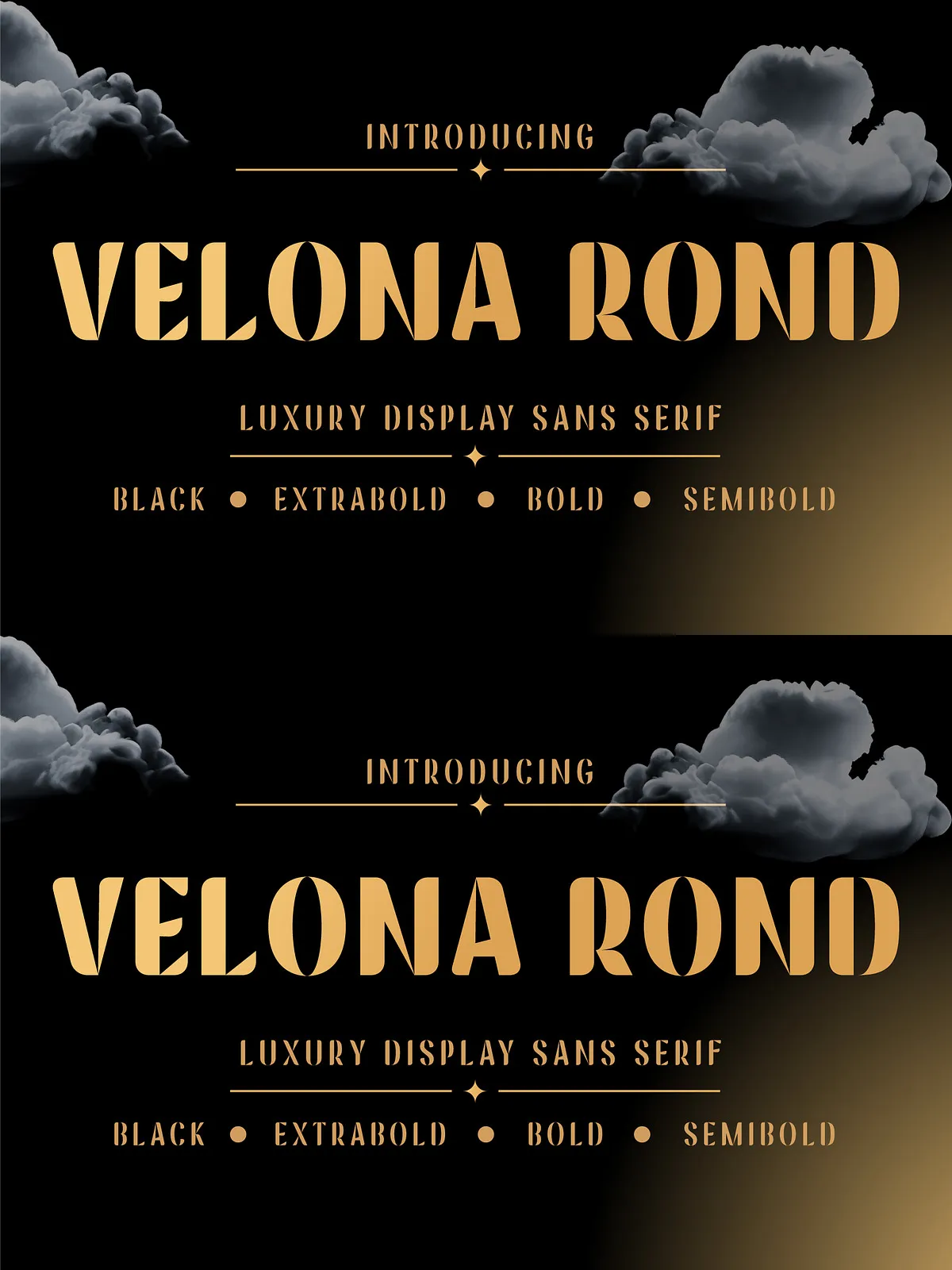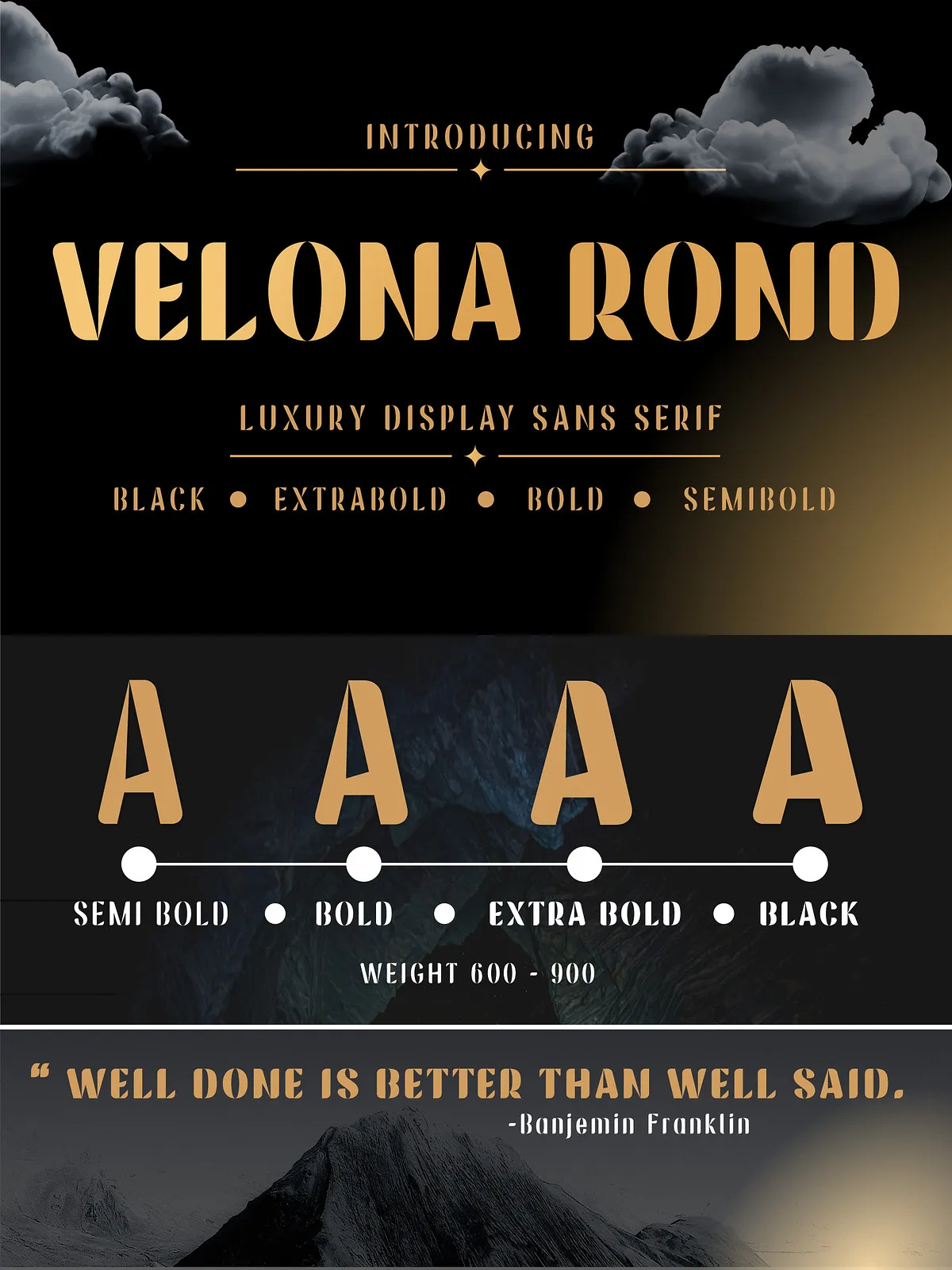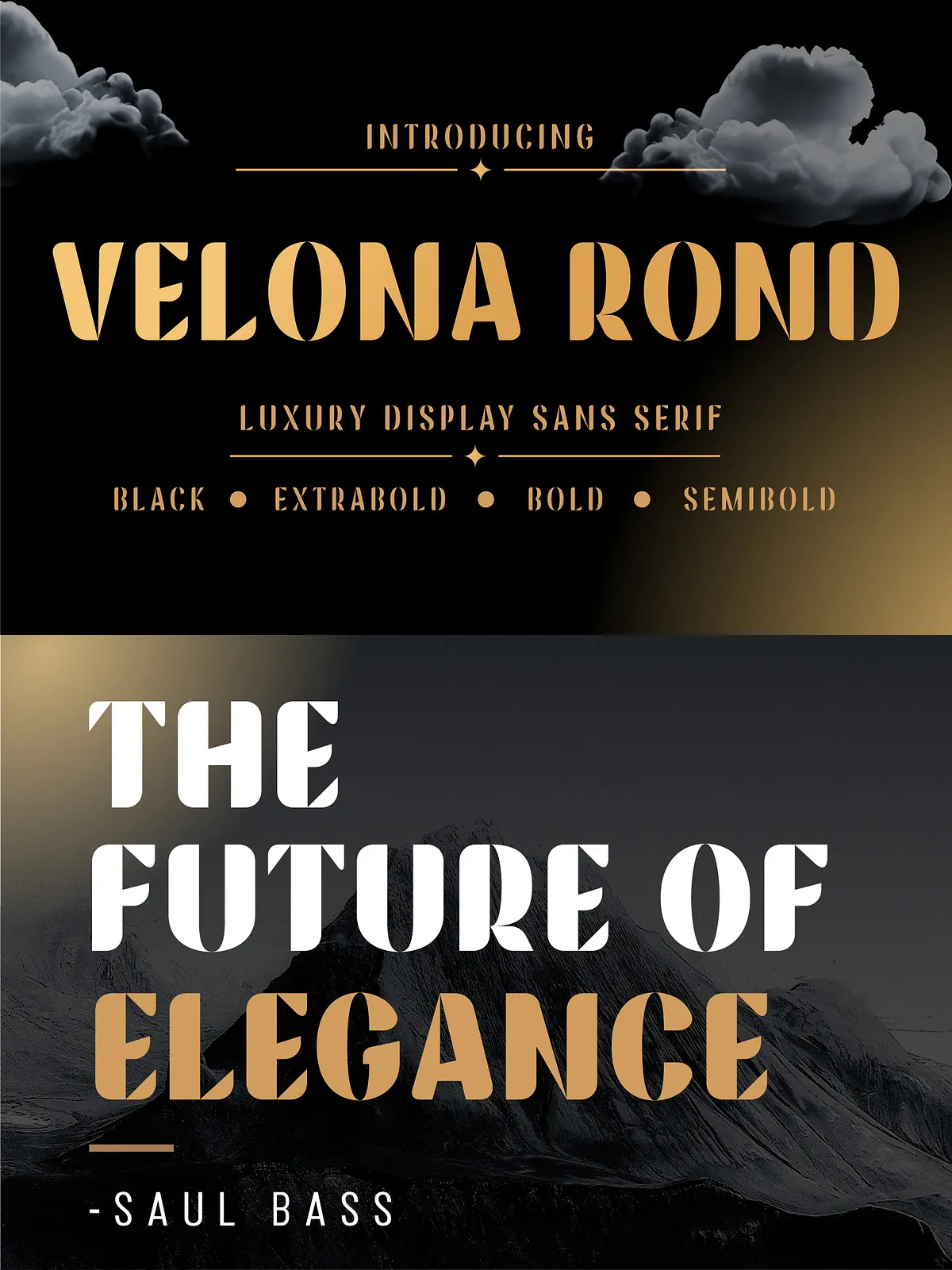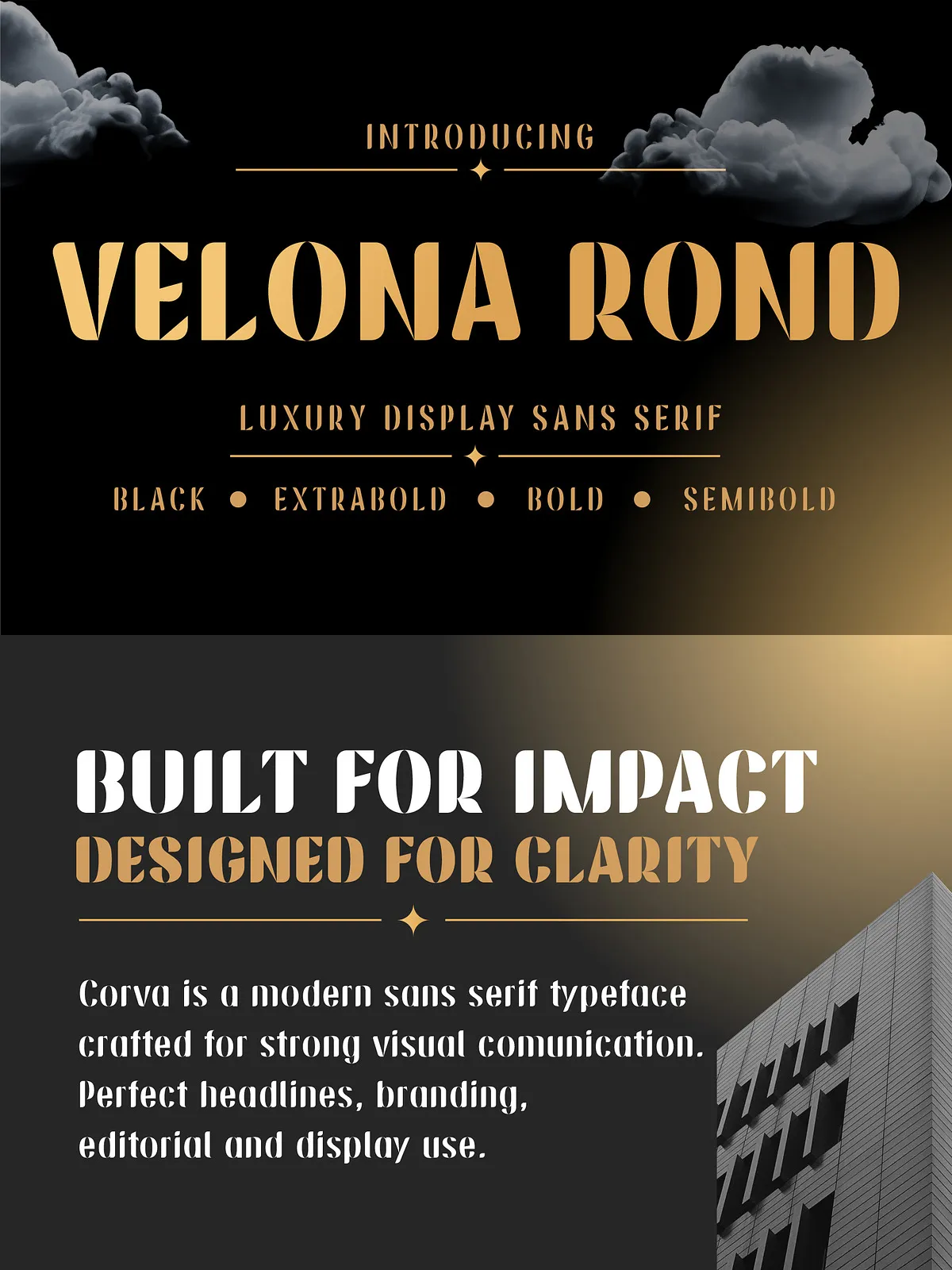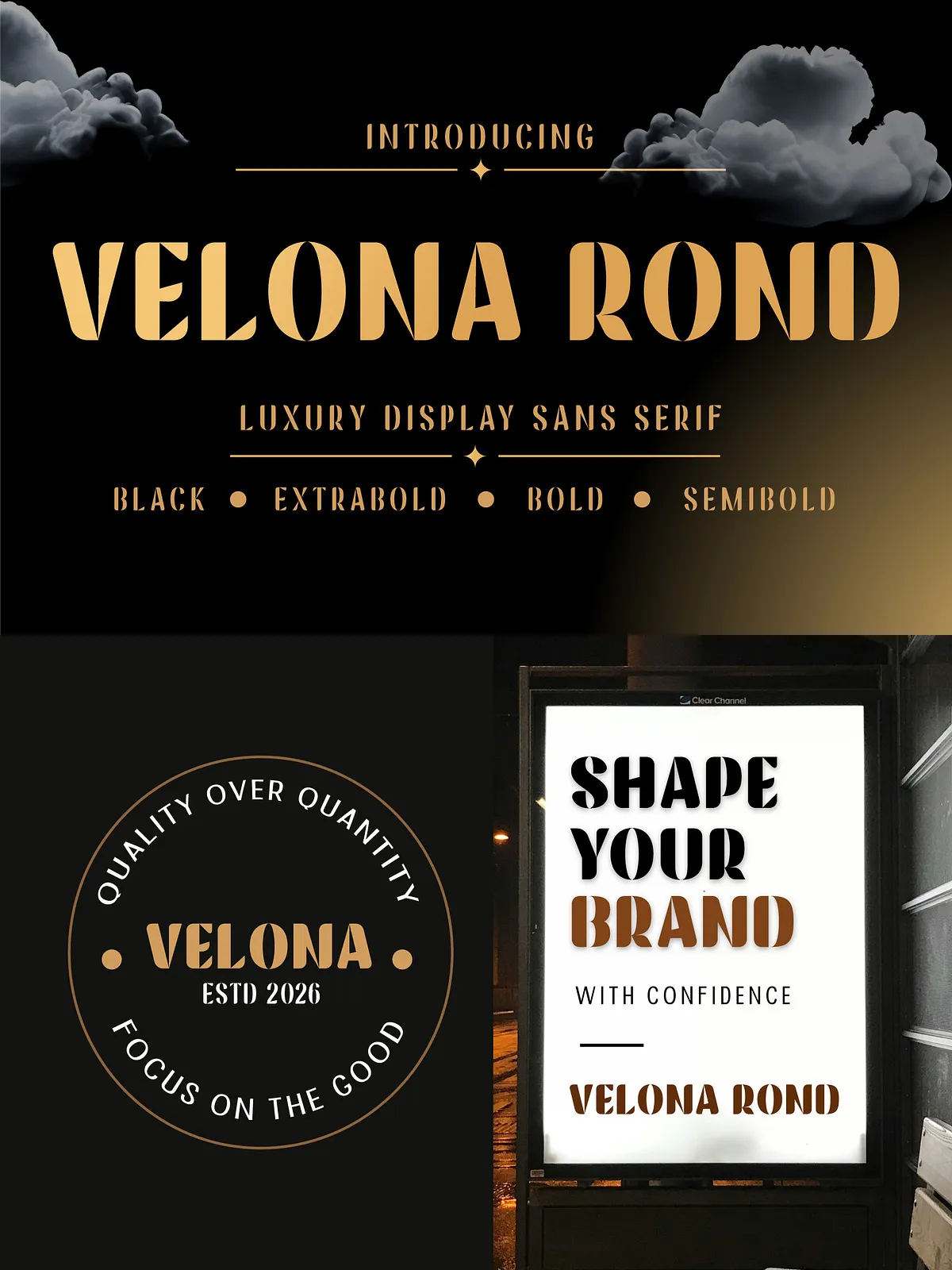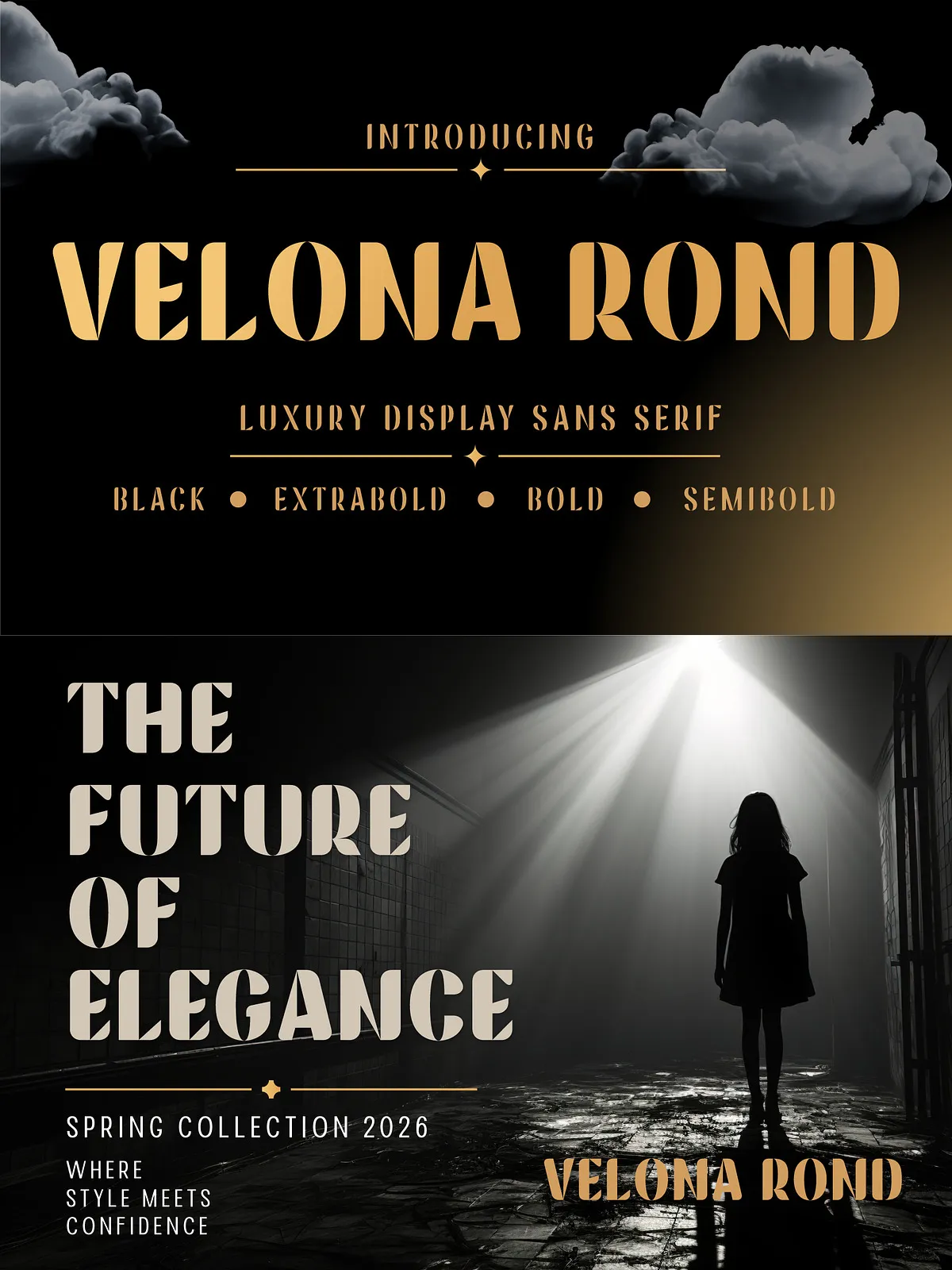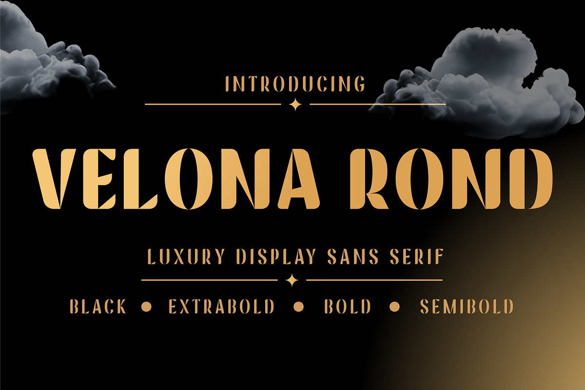

Velona Rond blends Art Deco sophistication with modern geometric clarity to deliver a striking display sans serif. Bold letterforms, high-contrast curves, and purposeful negative-space cuts create an immediate, glamorous presence. Designed to perform across luxury branding, packaging, fashion editorials, and high-impact identity projects, Velona Rond actively elevates visual systems and strengthens brand recognition.
Design Character
Art Deco Influence and Modern Geometry
Velona Rond draws on Art Deco’s geometric shapes and elegant symmetry while updating the aesthetic with contemporary rounded terminals and refined counter shapes. For reference on Art Deco typography characteristics and inspiration, see the Adobe curated selection: Art Deco fonts on Adobe Fonts.
Distinctive Details
The typeface emphasizes sculpted curves, strategic negative-space cuts, and high-impact strokes that hold up at display sizes. Rounded structures soften the overall look, producing a glamorous yet approachable voice. Decorative cuts and subtle flares deliver personality without sacrificing legibility in headline contexts.
Recommended Uses
Branding & Logos
Use Velona Rond to create memorable wordmarks and logotypes that communicate luxury and modern elegance. The heavier weights command attention in logotypes and signage, while medium weights provide clarity in supporting brand lockups.
Luxury Packaging & Labels
Velona Rond performs strongly on product packaging for beauty, fragrance, couture apparel, and boutique goods. Its high-contrast curves and decorative details convey craftsmanship and exclusivity on boxes, bottles, and labels.
Editorial & Posters
Apply Velona Rond for fashion editorials, covers, posters, and promotional campaigns where a bold, stylish headline is required. The family’s display-focused construction ensures visual impact on both print spreads and digital hero imagery.
Features
- File formats: TTF, OTF
- Weights: Semibold through Black (multiple display weights for hierarchy)
- Character set: Uppercase & Lowercase
- Numerals & punctuation
- Multilingual Latin support
- Optimized for large display sizes and identity use
Technical Details & Production Notes
File Formats & Web Use
Velona Rond ships in standard desktop formats (OTF/TTF). For web use, generate WOFF/WOFF2 from the provided OTFs to ensure fast load times and broad browser compatibility. Test boldest weights at final output sizes to confirm stroke fidelity on different printing processes.
Spacing & Kerning
Adjust tracking for large display settings to balance negative-space cuts and maintain even color. Slightly increase letter-spacing for ultra-large headlines to preserve clarity; tighten tracking for compact lockups to strengthen visual cohesion.
Pairing Recommendations
Pair Velona Rond with a neutral humanist or geometric sans for extended interface text, or with a low-contrast serif for editorial body copy to create an elegant contrast. When pairing, let Velona Rond act as the visual hero for headings and brand names while the secondary face handles longer passages.
Licensing & Delivery
Review the end-user license included with your purchase to confirm permitted commercial uses, web embedding allowances, and multi-user deployment. For enterprise or app embedding, obtain the appropriate extended license. If you require expanded language coverage, alternate glyphs, or bespoke kerning adjustments, contact the foundry or vendor for customization and licensing options.
Installation & Best Practices
Install OTF/TTF files on desktop platforms (Windows, macOS) for immediate use in design applications. For web projects, convert to WOFF/WOFF2 and host via your CDN or embed using @font-face. Test color, size, and printing techniques to ensure the decorative cuts maintain their intended contrast and legibility at production scale.