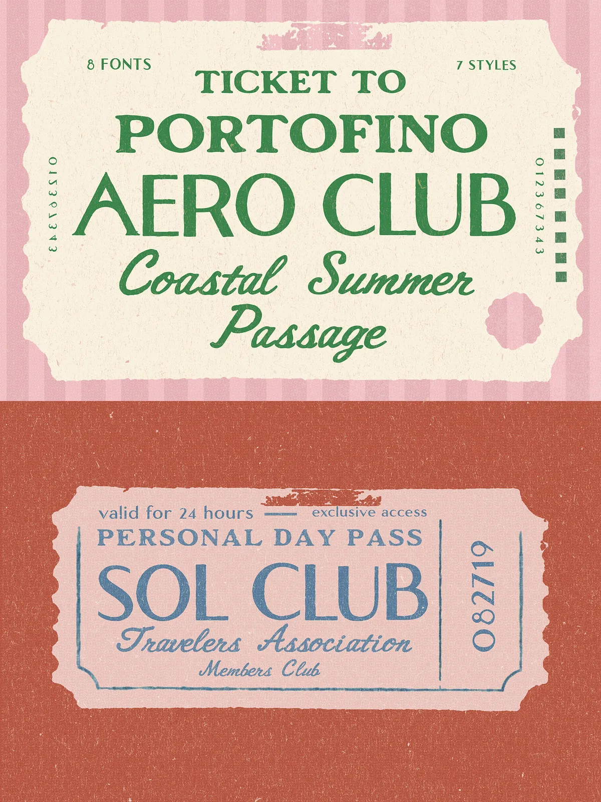
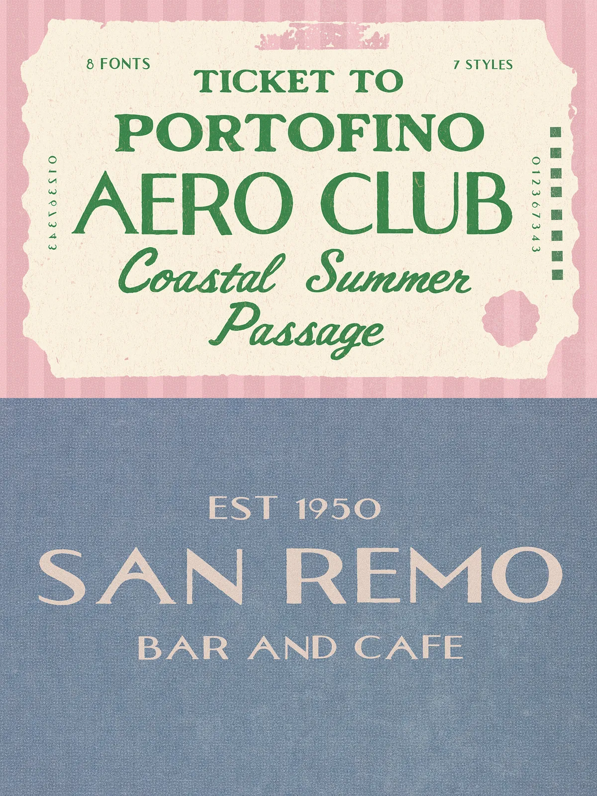
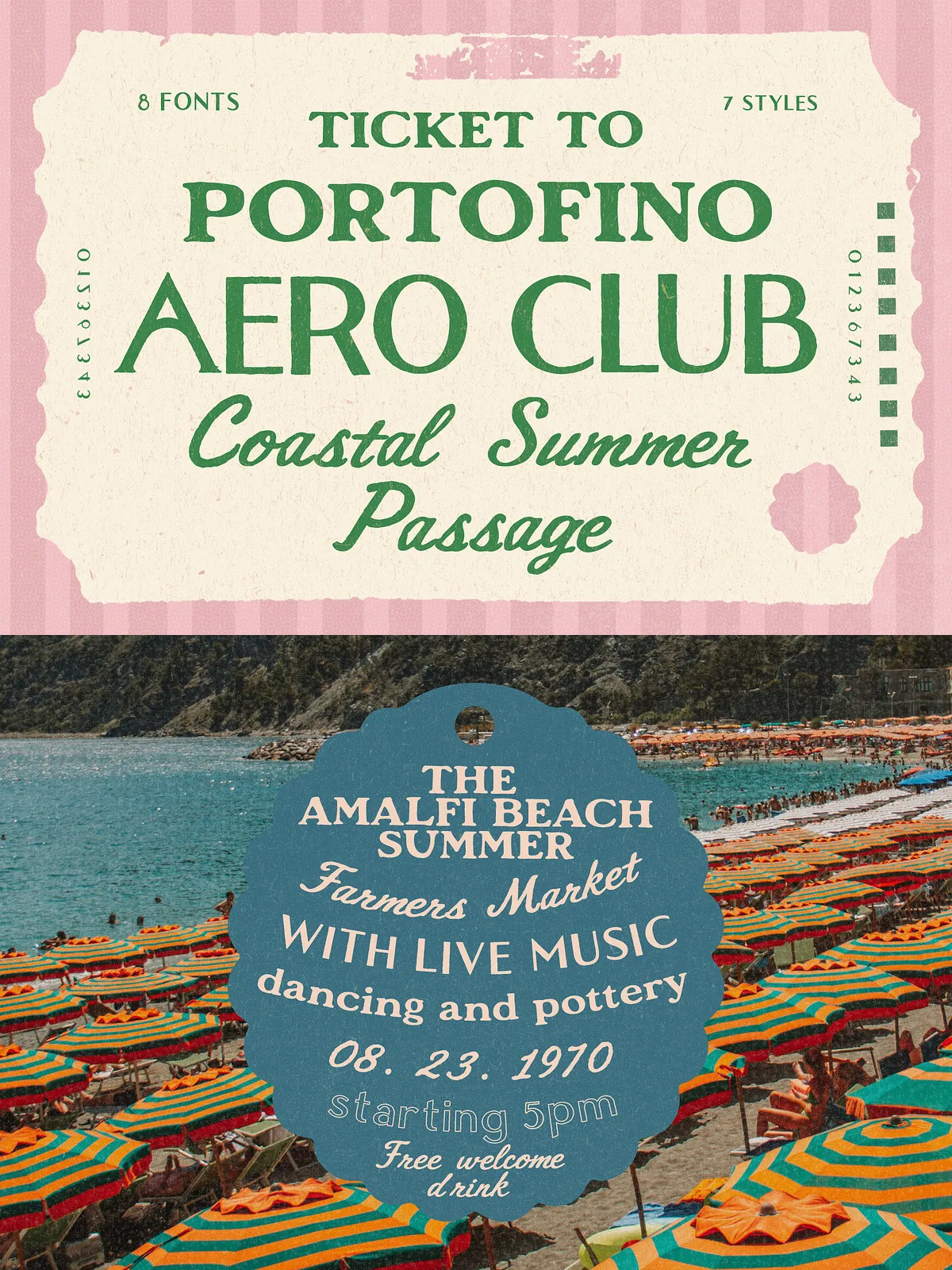
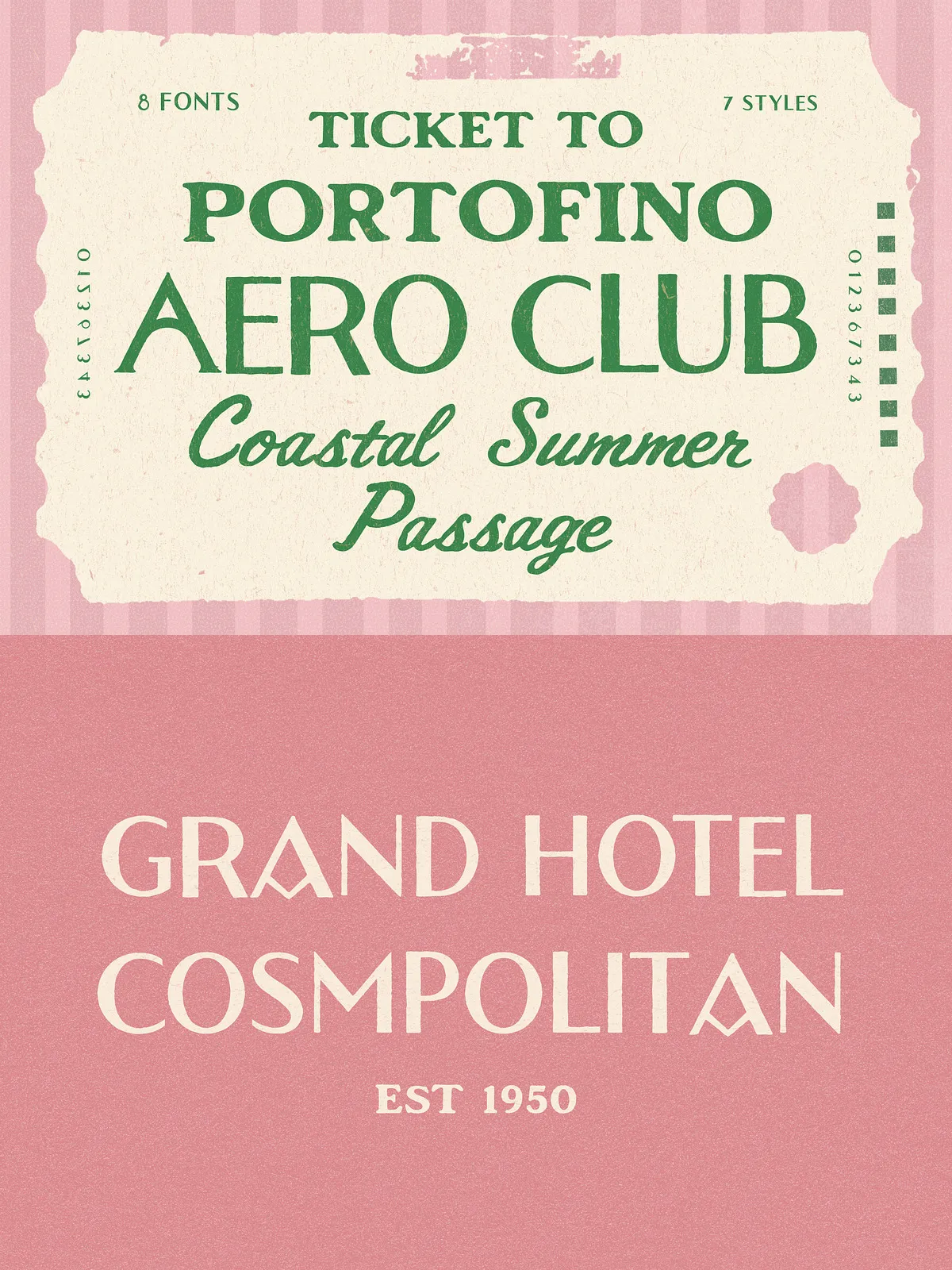
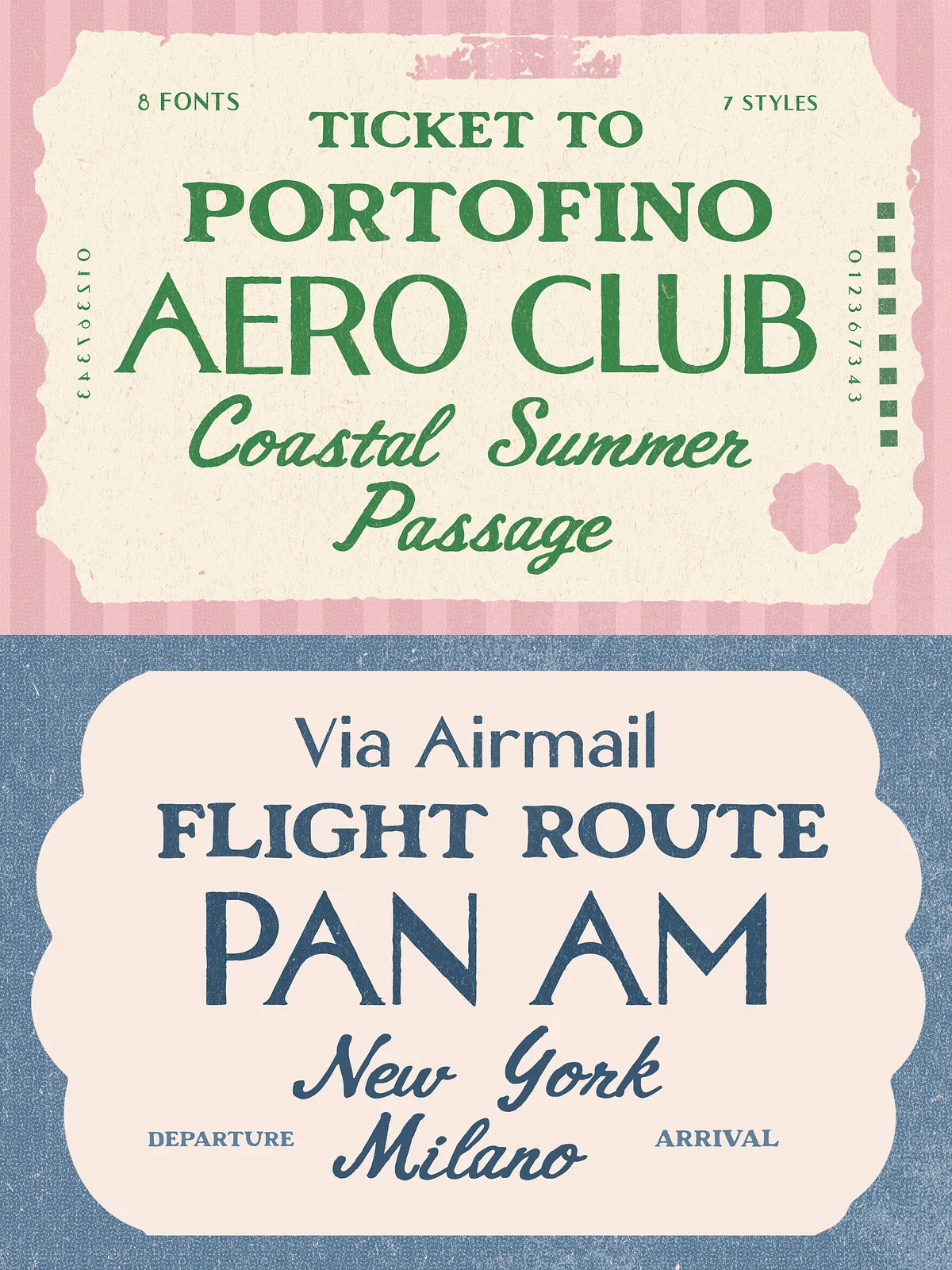
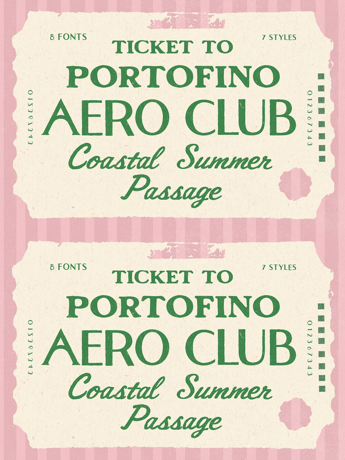
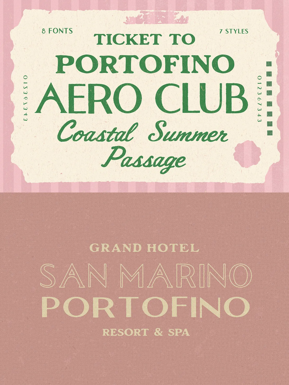
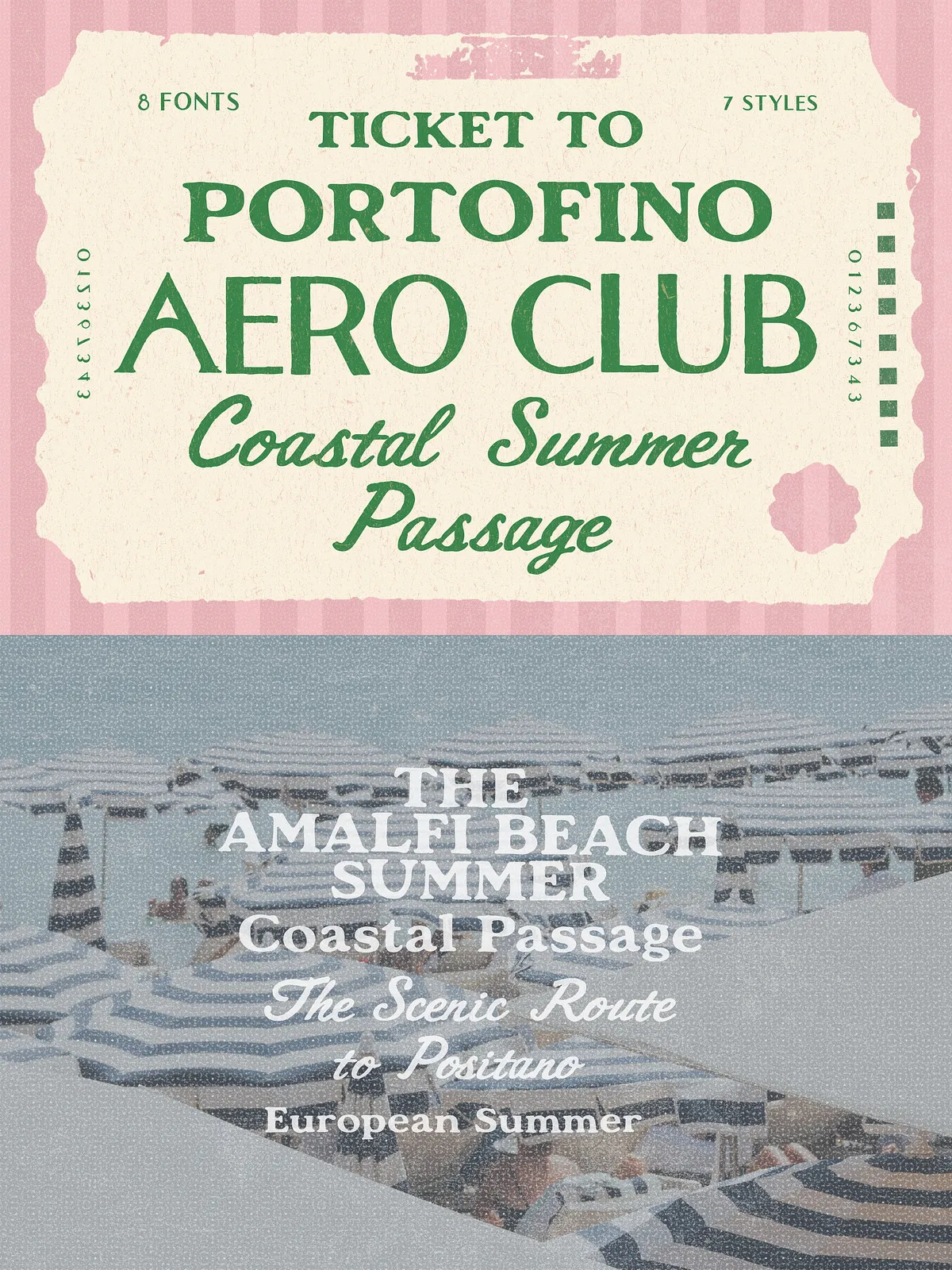
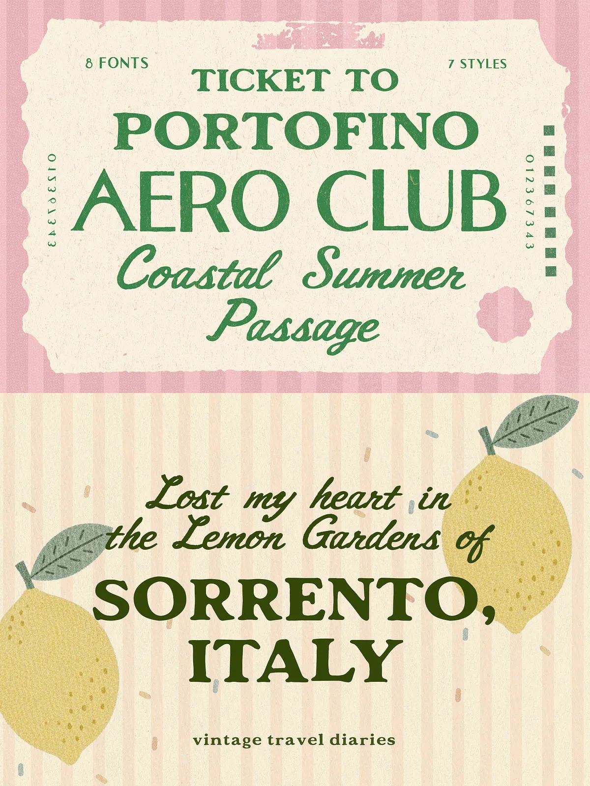
Ticket to Portofino & Aero Club delivers a warm, nostalgic typographic voice inspired by airmail tickets, coastal summer routes, and sun-faded travel documents. This carefully crafted font trio brings an authentic vintage atmosphere to modern design work. The family balances retro character with practical versatility so you can deploy it confidently across branding, packaging, editorial spreads, wedding stationery, and poster design. Each style captures a different facet of classic travel ephemera — from bold ticket stamps to refined airline signage — and combines them into a cohesive toolkit.
What’s Included
The family ships with eight styles across three paired fonts, providing layered options and typographic flexibility. Files included in the package:
- TicketToPortofino.otf
- TicketToPortofinoRough.otf
- TicketToPortofinoOutline.otf
- AeroclubSans.otf
- AeroclubSans-Bold.otf
- AeroclubSans-Outline.otf
- AeroclubSans-Wide.otf
- AeroClubScript.otf
Features & Styles
Rich, Complementary Trio
The core Ticket To Portofino style offers a classic display look that reads strongly in headlines and logotypes. The Rough variant adds texture and weathered character for authentic vintage treatments. The Outline version creates layered compositions when paired with the Aeroclub family, enabling ticket-style stamps, framed logos, and stacked type effects.
Aero Club Family
Aeroclub supplies clean sans weights and a complementary script to expand your toolkit. Use Aeroclub Sans for functional signage, labels, and body headings; switch to Aeroclub Bold or Wide for emphatic display use. AeroClubScript introduces a human, hand-lettered contrast that pairs beautifully with the rigid ticket forms for invitations or premium packaging.
Creative Uses
Branding & Logos
Designers use this family to craft identities that evoke seaside resorts, vintage travel agencies, and boutique hospitality brands. Combine the solid ticket face with the script to build sophisticated, nostalgic wordmarks that feel handcrafted and intentional.
Packaging & Labels
Layer the Outline and Rough styles to simulate printed tickets and stamped seals on product packaging. The fonts retain legibility at a range of sizes, so they perform well on boxes, tags, and wraps where texture and personality matter.
Posters, Editorial & Events
Use Ticket to Portofino for retro-themed posters and editorial headlines. Pair with Aeroclub Sans for supporting text to maintain clarity while amplifying the retro mood. For weddings or event materials, the script offers an elegant counterpoint to the display styles.
How to Use & Pairing Recommendations
Start with TicketToPortofino for your primary headline or logo. Add AeroclubSans (Regular or Wide) for subheadings and navigational elements. Apply TicketToPortofinoRough to backgrounds or overlays where you want weathered texture. Use the Outline files to create two-layered compositions: place the Outline style behind a filled weight at slight offset to emulate stamped or printed tickets.
Practical Tips
- Increase letter-spacing slightly for display sizes to enhance the retro ticket appearance.
- Pair script sparingly for accents, such as signatures or event dates.
- Test textured styles at final print size to ensure the rough details reproduce cleanly.
Technical Details & Licensing
The package includes OpenType font files (.otf) for straightforward cross-platform use. Each font contains uppercase and lowercase characters, numerals, punctuation, and essential glyphs for common languages. Confirm permitted uses and distribution in the included license file. Typical license options may include desktop, webfont, and extended commercial use — verify the vendor’s license to match your project needs.