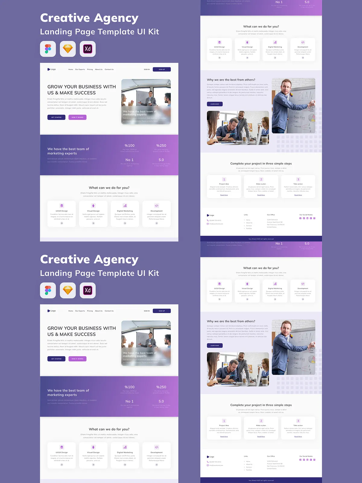
Transform your next web project with a powerful, ready-to-use Creative Agency Landing Page UI Kit—engineered for speed, scalability, and stunning visual impact. Crafted by design experts, this comprehensive set delivers the foundation for a professional, conversion-focused website that captures attention, communicates value, and drives results. Whether you’re launching a new startup, rebranding an existing agency, or building client portfolios, this UI Kit gives you a head start with premium components and pixel-perfect layouts.
Why This UI Kit Is Tailored for Creative Teams & Agencies
Unlike generic templates, this landing page kit is built with the demands of modern creative agencies in mind. It balances aesthetic sophistication with technical precision—ideal for designers, developers, and product managers who want to ship faster without sacrificing quality.
- 100% Scalable Vector Assets: All screens and components are built using high-resolution vectors—ensuring flawless clarity at any screen size or zoom level, from mobile to 4K desktop.
- Complete Layer Organization: Every component is grouped and labeled with precision. No confusing layers. Just intuitive structure that accelerates your workflow and eliminates time wasted on cleanup.
- Modern, Cohesive Color Scheme: The kit features a thoughtfully curated palette—crafted to reflect professionalism, creativity, and brand trust. Easily swap colors to match your identity with a single click.
- Ready-to-Code Architecture: Export-ready layouts follow clean, semantic structure so developers can implement with confidence. Use directly in React, Vue, or hand-code the frontend—no friction.
- Platform-Agnostic Compatibility: Fully optimized for Figma, Sketch, and Adobe XD. No matter your design stack, you can start, edit, and share with your team seamlessly.
Core Features & Screen Breakdown
Each screen is a standalone component, designed to be mixed and matched for unique user journeys. Below is a detailed breakdown of what’s included:
- Hero Section Template: A bold, attention-grabbing introduction with dynamic CTA buttons, animated typography, and modular space for video, testimonials, or feature highlights.
- About Us Page Layout: Story-driven design featuring team avatars, mission statements, and impact metrics—all customizable to showcase your agency’s personality and expertise.
- Services Showcase Grid: Interactive card system that highlights services with hover effects, icons, and concise descriptions—perfect for service-based agencies.
- Case Study Preview Carousel: Responsive, swipe-friendly layout for displaying real client results with before/after visuals and quantified outcomes.
- Contact & Inquiry Form Module: Clean, minimal form with validation states, success feedback, and integration-friendly structure to capture leads effectively.
- Footer with Newsletter & Social Grid: A professional footer design that enhances SEO and reinforces branding through consistent visual cues.
Why Choose This Creative UI Kit Over Generic Templates?
Generic UI kits often lack flexibility, coherence, or depth. This one is built for real-world use. Every element is optimized for performance, accessibility, and design harmony. You aren’t just downloading static screens—you’re gaining:
- Speed-to-Market: Skip the wireframing and layout stage. Jump straight into visual refinement and content integration.
- Design Consistency: Maintain visual harmony across your entire website with reusable components and shared styles.
- Future-Proof Scalability: Add new sections, modify layouts, or extend functionality without breaking the design system.
- Client-Ready Presentation: Impress stakeholders with polished, professional mockups that reflect your team’s standards.
How to Use This Kit in Your Workflow
Start by importing the file into your preferred design tool. Use the main “Landing Page” file as a base, then clone and branch screens for different variations (e.g., SaaS, creative studio, consulting). Replace placeholder text with your own messaging, swap out stock images (shown for presentation only), and adjust color variables to align with your brand.
For developers: Export assets with clean layer names, use the style guides to apply consistent spacing and typography, and leverage the component library to build a responsive, accessible frontend. The code structure is compatible with modern frameworks and supports dark mode transitions.