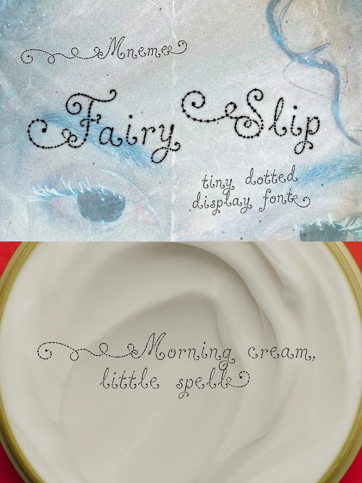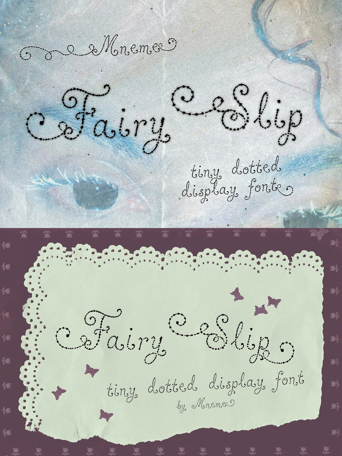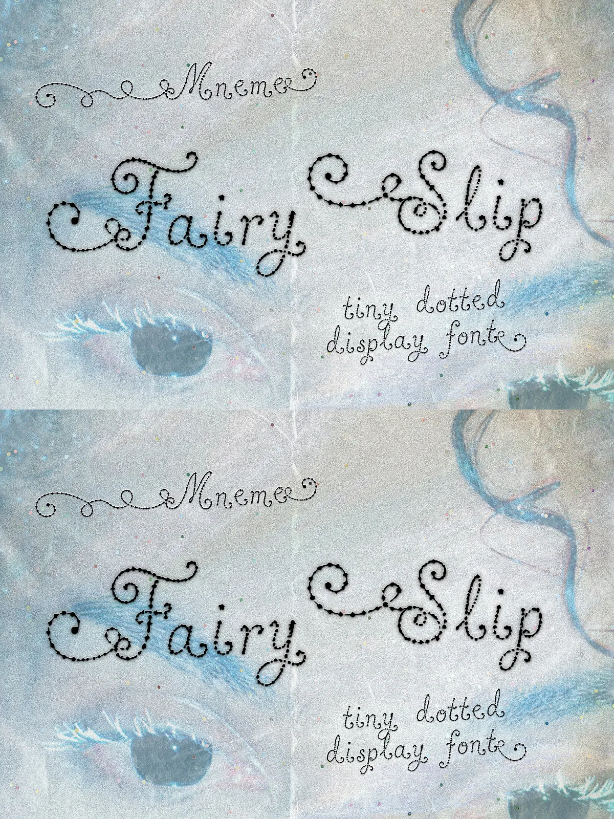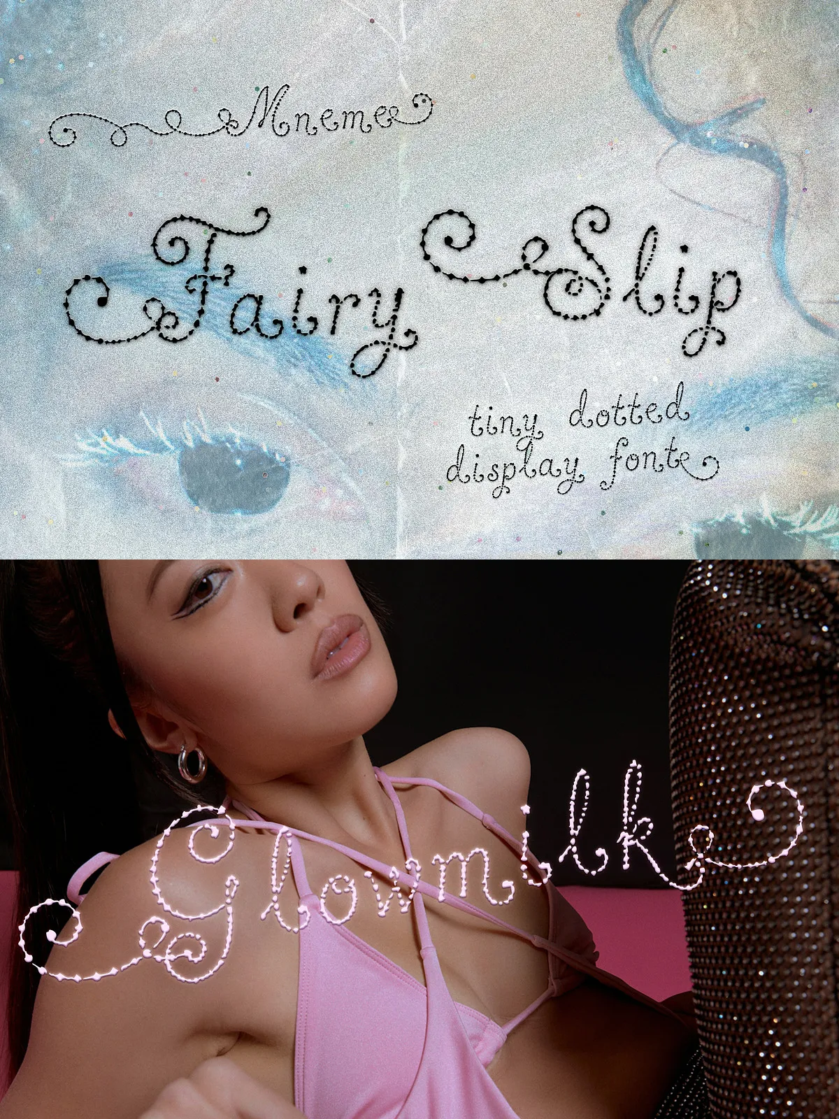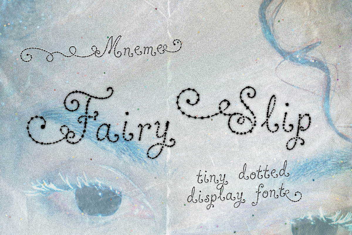

Fairy Slip is a refined display typeface that deliberately embraces a dotted ink texture, thin ornamental turns, and soft serif details to produce a light, magical aesthetic. The design reads like letters formed from pollen and tiny pin-pricks, delivering a fragile rhythm that performs best at small display sizes. Use it to give packaging, labels, invitations, stickers, and soft editorial touches a handcrafted, fairycore sensibility.
Design Characteristics
Delicate, Decorative Forms
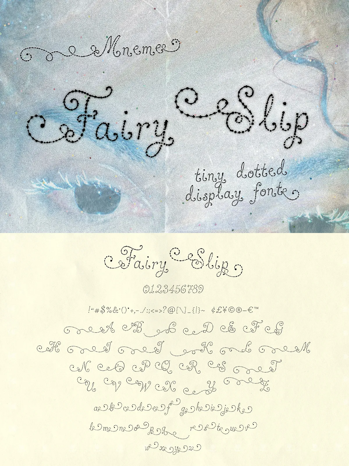
Each glyph in Fairy Slip features gentle curves and subtle serif cues that suggest careful handwork. The dotted texture creates visual airiness while maintaining legibility for short display lines. Numbers and punctuation follow the same delicate treatment so numerals, price lines, and short captions match the font voice seamlessly.
Light Magical Feeling
The overall personality reads soft and whimsical without becoming overly ornate. Designers will find the typeface balances decorative detail and restraint, making it suitable for premium beauty labels, garden-shop aesthetics, stationery, and subtle editorial accents.
Technical Details
Files Included
- Fairy Slip OTF font file
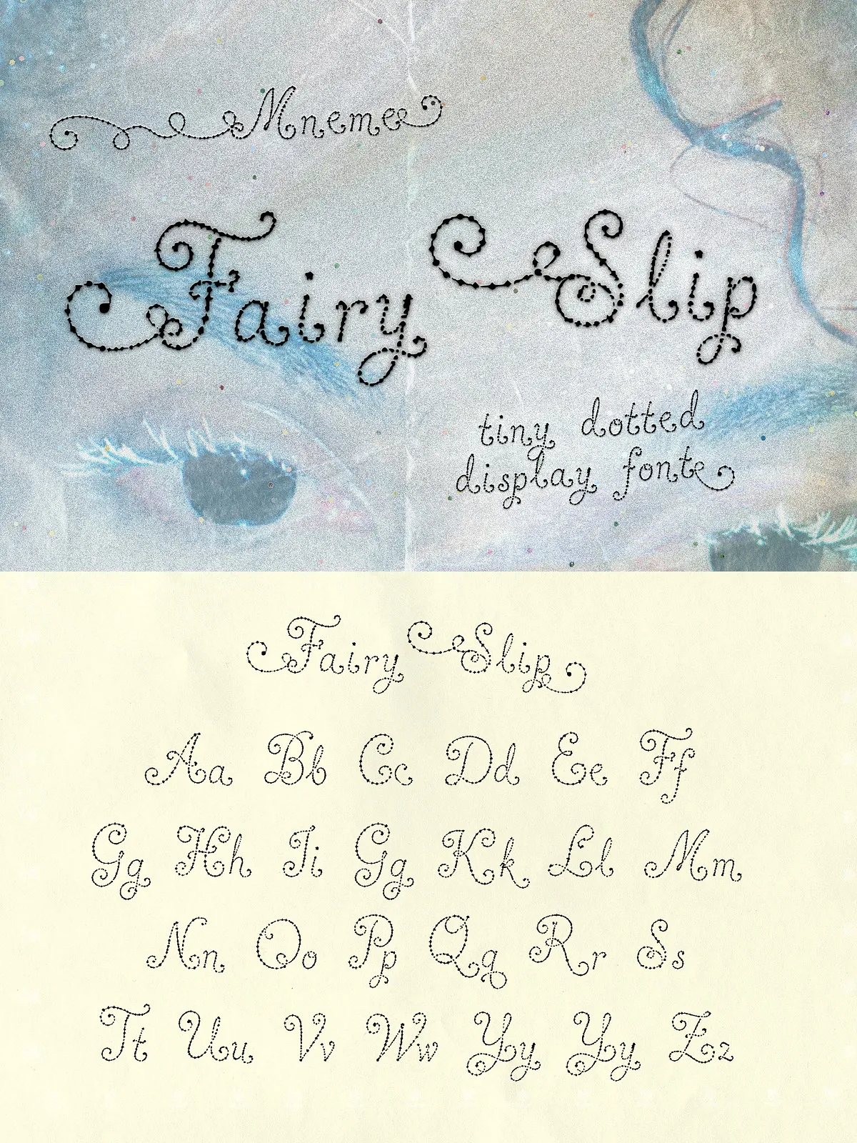
- Uppercase and lowercase letters
- Numbers, punctuation, and basic symbols
System Compatibility
Install the OTF on Mac or Windows and use Fairy Slip in most design tools that accept custom fonts, including Adobe Photoshop, Illustrator, InDesign, Figma, Affinity Designer, Affinity Publisher, Canva, Procreate, Cricut, and Silhouette. Test the font in your target application to confirm feature support and rendering of the dotted texture at final sizes.
Usage Recommendations
Best Sizes & Contexts
Fairy Slip performs strongly at small display sizes such as labels, product tags, secondary headlines, sticker art, and short lines of copy on packaging. The dotted detail shows character at close viewing distances—avoid using it as long-form body text. Use it for:
- Beauty and skincare labels
- Delicate invitations and RSVP cards
- Fairycore social graphics and moodboards
- Small editorial details and captions
- Sticker sets and boutique packaging
Color, Contrast, and Backgrounds
Keep high contrast between the font and background to preserve the dotted texture. Light, muted backgrounds and soft pastels complement the font’s personality; darker backgrounds can work if the font color remains bright and the scale allows the pin-prick details to remain visible. Avoid heavily textured or noisy backgrounds that compete with the dotted strokes.
Spacing and Pairing
Increase tracking slightly when setting short headlines or tags to let the dotted terminals breathe. For supporting copy, pair Fairy Slip with a neutral sans (grotesk or humanist) or a low-contrast serif to preserve readability and frame the decorative display voice. Use scale and weight contrast to emphasize the display nature of Fairy Slip.
Practical Notes
Workflow Tips
- Enable higher-resolution previews in your design app to inspect the dotted texture at final export size.
- For vinyl cutting or die-cut stickers, test a sample to confirm the dotted detail survives the production method. Consider slightly thicker strokes or increased scale for physical production.
- When exporting for web, use SVG or high-quality PNG to preserve the delicate dots at small sizes.
Licensing and Distribution
Check the included license to confirm permitted uses for commercial packaging, product resale, apps, or web embedding. Purchase the appropriate license for desktop, webfont (if available), or cutting-machine use. Keep a record of licensing terms to ensure consistent brand use across touchpoints.