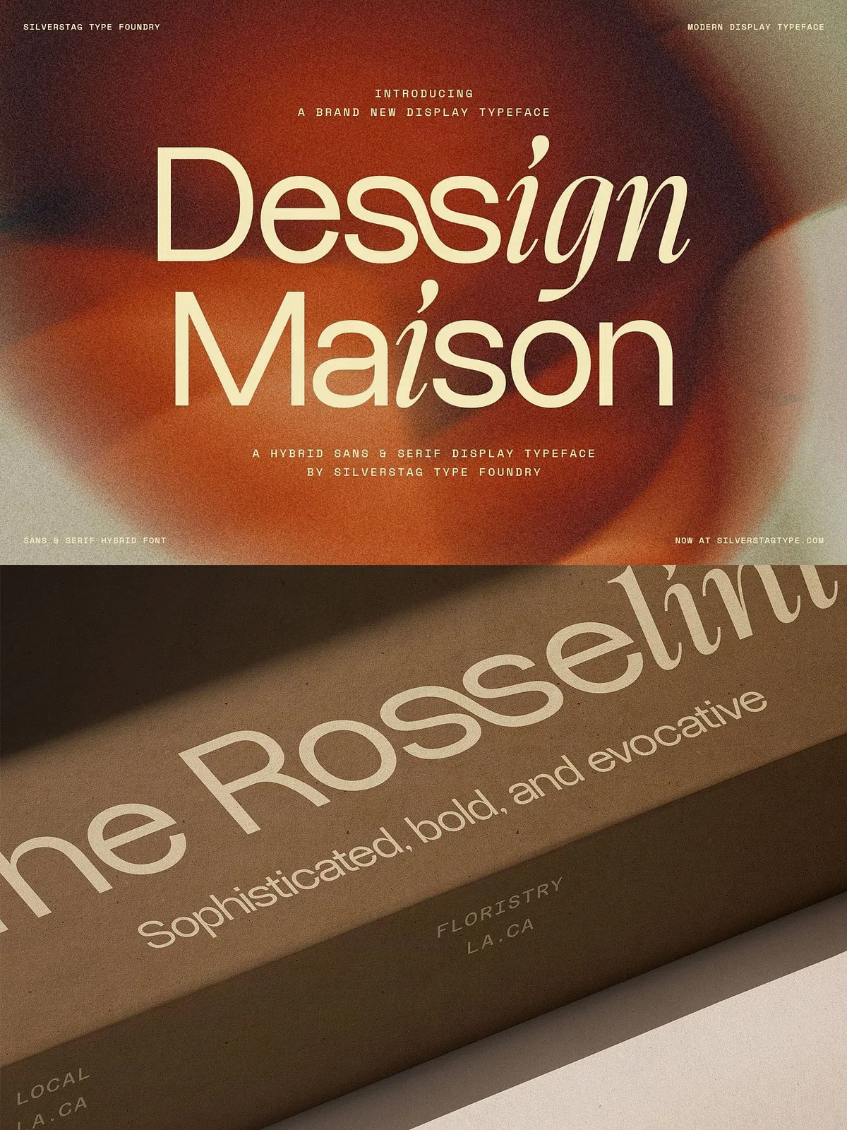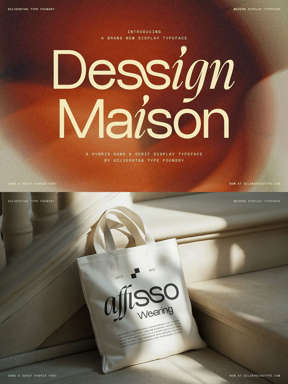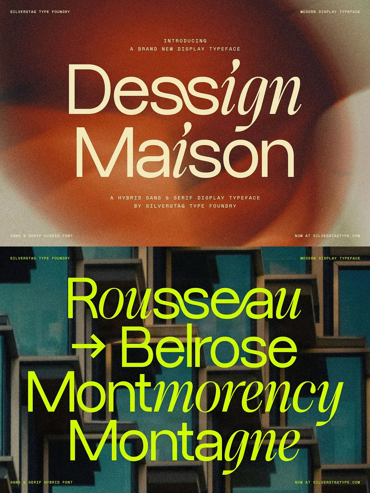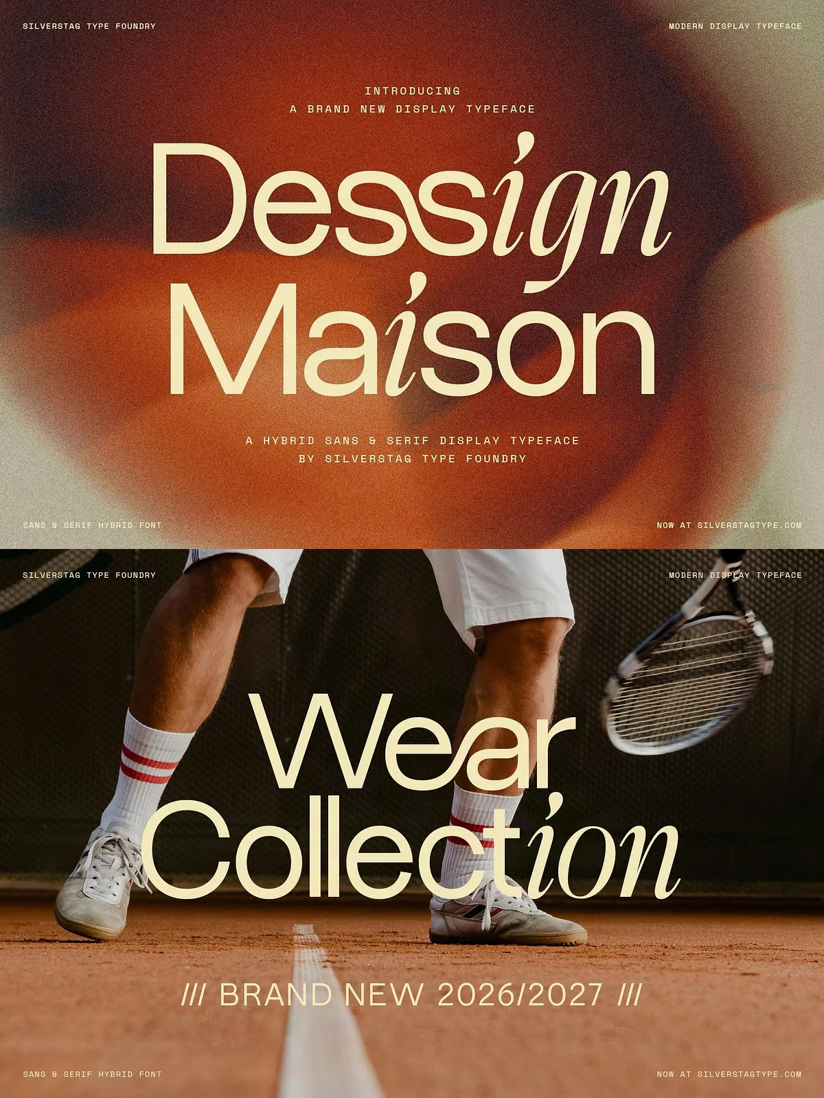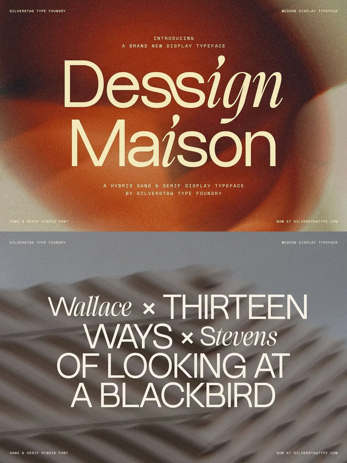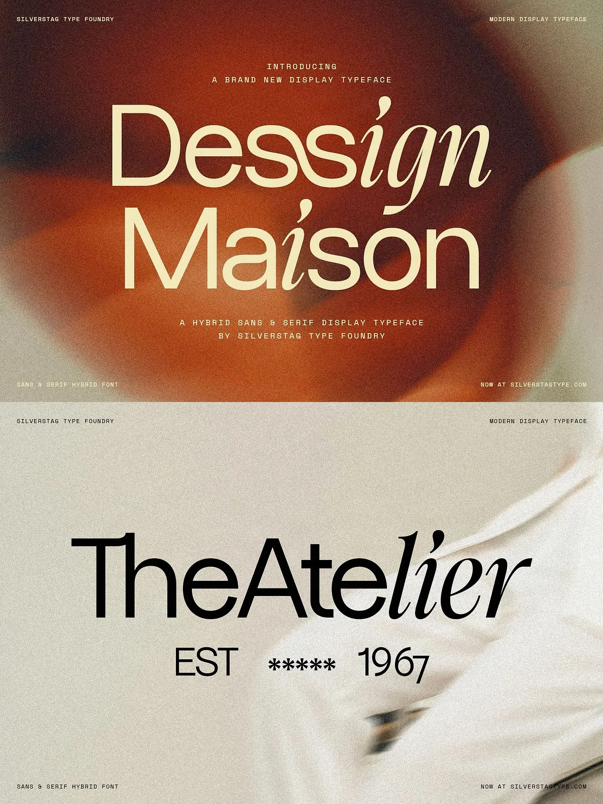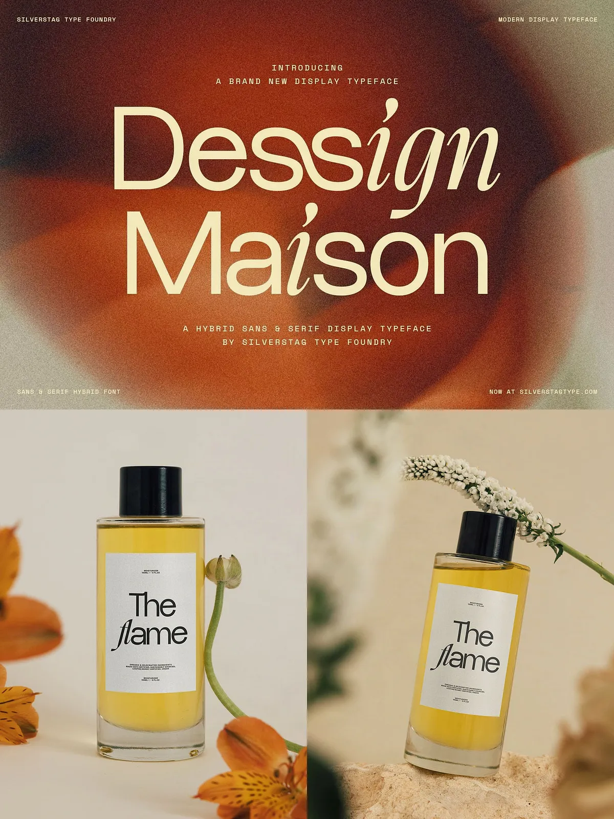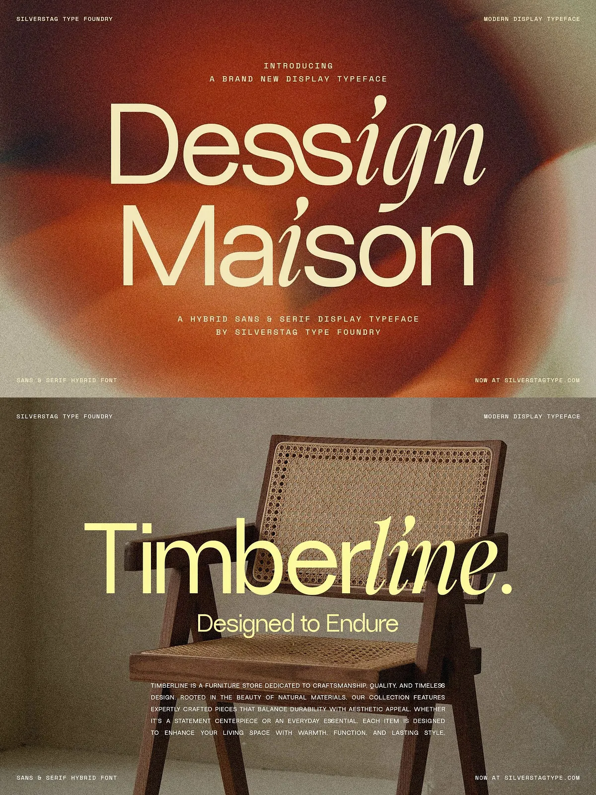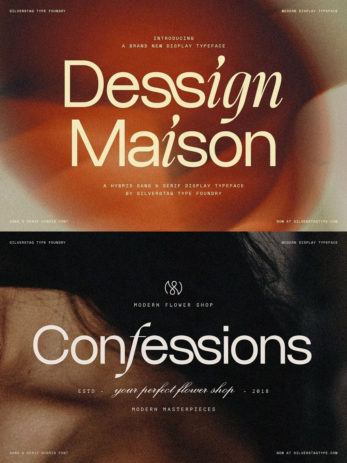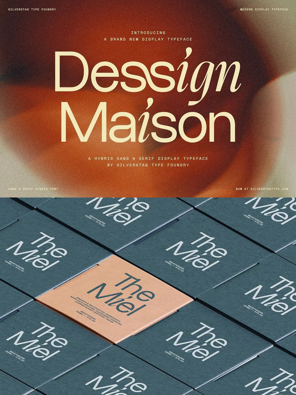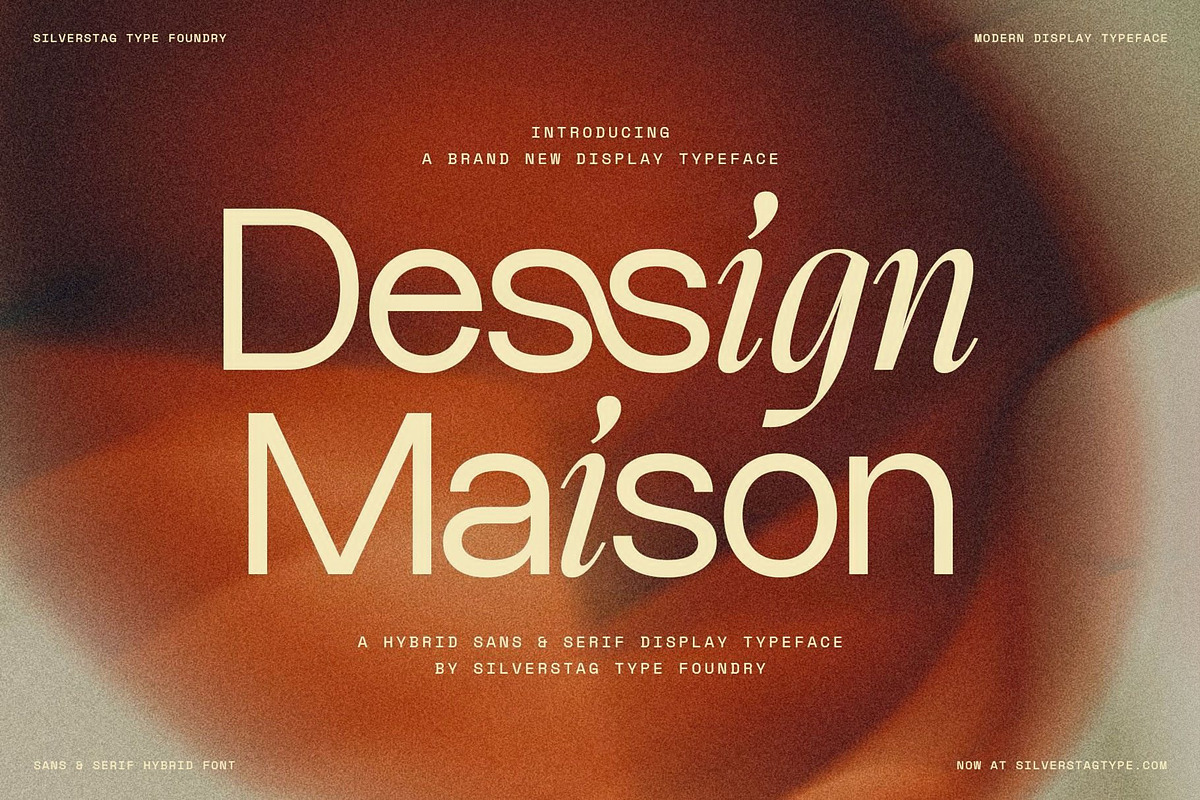

SLTF Dessign Maison is a hybrid display typeface that combines the clarity of a geometric sans with the expressive motion of calligraphic strokes, all inside the same glyphs. This single-font solution presents a deliberate tension: modern structure and spontaneous hand-driven form coexist without forcing you to switch families. Instead of pairing two separate typefaces, Dessign Maison embeds both characters into one cohesive system so every word reads as simultaneously refined and alive.
Design Concept and Voice
Hybrid Letterform System
The hybrid effect lives in the letterforms themselves. You will notice teardrop terminals, crossbars that echo hand-drawn gestures, and predominantly clean, geometric stems that maintain strong typographic rhythm. Letters like i carry teardrops, while characters such as f cross with calligraphic flair—yet surrounding characters stay disciplined and neutral. The combination produces a distinctive voice that feels editorial, upscale, and approachable at once.
Built-in Tension That Works
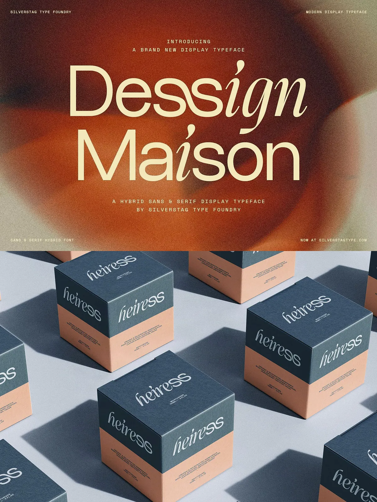
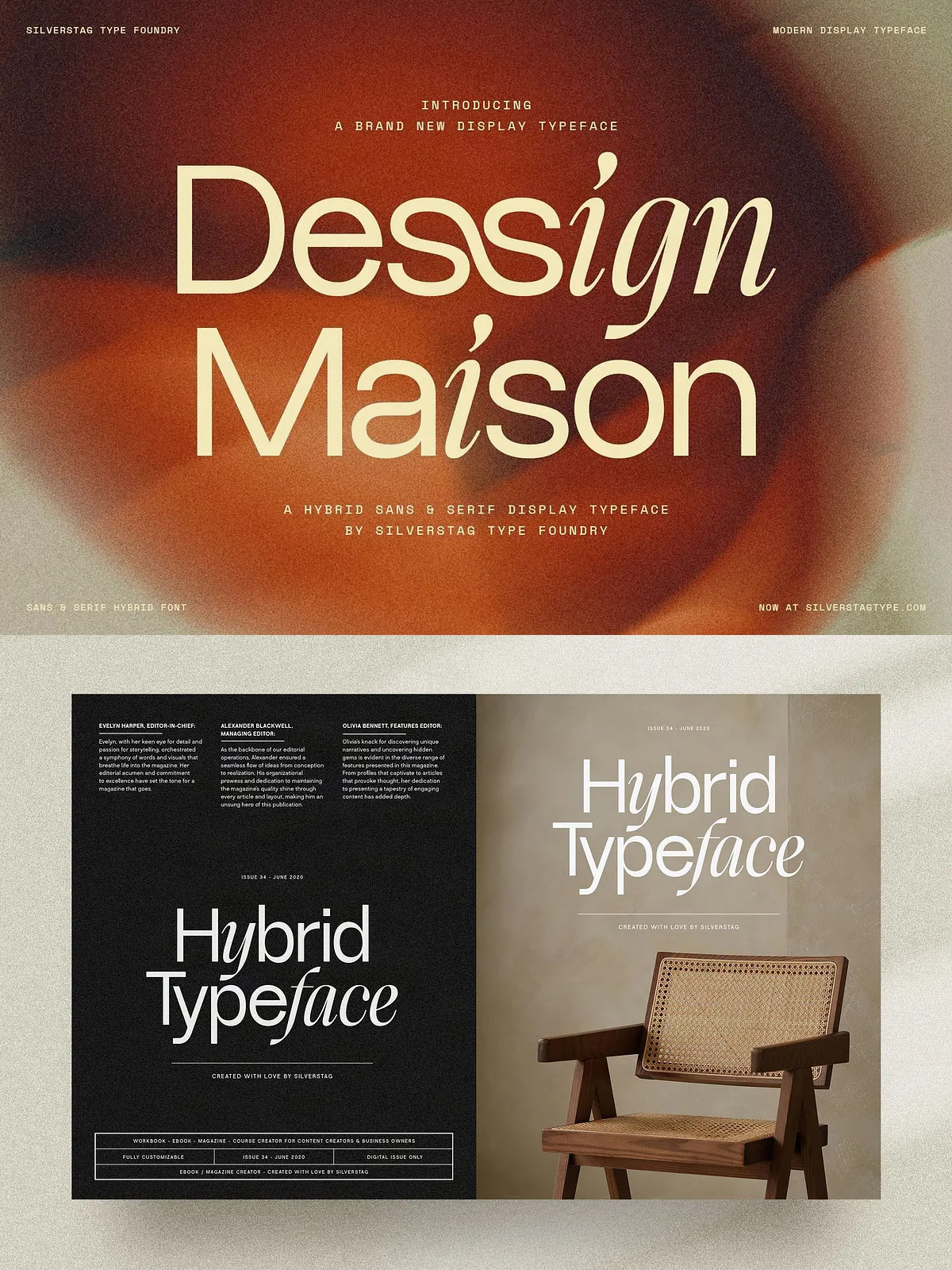
That structured-versus-fluid tension powers Dessign Maison across a wide range of briefs. Use it where you want presence without pretension: fashion labels, luxury packaging, editorial mastheads, hospitality identities, premium food and beverage, and bold advertising campaigns. The typeface asserts authority while suggesting craft and personality.
Technical Details
Files and Formats
SLTF Dessign Maison ships as 1 font: Regular, provided in standard desktop formats (OTF/TTF). Depending on licensing, webfont formats (WOFF/WOFF2) may be available for responsive, on-brand web deployment.
OpenType Features
The font includes useful OpenType features to refine typographic color and expression: stylistic alternates and ligatures. These features help you tune the balance between geometric precision and calligraphic flourish. Activate stylistic alternates to reveal optional glyph shapes and ligatures to improve common letter combinations for smoother display set typography.
Language Support
SLTF Dessign Maison supports 100+ languages via Latin Extended coverage. It accommodates most Western and Central European languages and many additional Latin-based scripts—confirm specific characters by testing sample text in your design environment.
Compatibility & Workflow
Applications
The typeface works across modern design tools: Adobe Illustrator, Photoshop, InDesign, Figma, Affinity Designer, Affinity Publisher, Canva Pro, Sketch, and any application that supports OTF/TTF fonts. For consistent expressive behavior, enable OpenType features (Stylistic Alternates / Ligatures) in your application’s typography panel.
How to Use
Use Dessign Maison at display sizes for logos, headlines, mastheads, and packaging headlines where its hybrid characteristics can show detail. For body text, pair it with a neutral sans or a modest serif to preserve readability. When you need more restraint, switch on stylistic alternates or reduce ornamental alternates. For maximum expression, let the default alternates play and allow the calligraphic strokes to breathe.
Practical Applications & Pairing
Recommended Uses
- Fashion brand identities and lookbooks
- Luxury packaging and product labels
- Editorial mastheads and magazine covers
- Hospitality branding and signage
- Premium food and beverage labeling
- Advertising headlines and promotional displays
Pairing Suggestions
Pair SLTF Dessign Maison with a neutral grotesque or humanist sans for clear support text. For longer editorial blocks, introduce a serif with restrained contrast to complement the hybrid display voice while maintaining legibility. Use color, scale, and spacing to emphasize the hybrid personality without overpowering supporting copy.
Licensing & Best Practices
Verify and purchase the appropriate license for desktop, web, app, or product manufacturing. Test the font in print proofs and digital mockups to ensure the hybrid details reproduce correctly at final sizes and on selected substrates. Document which OpenType features should remain enabled to maintain typographic consistency across brand touchpoints.