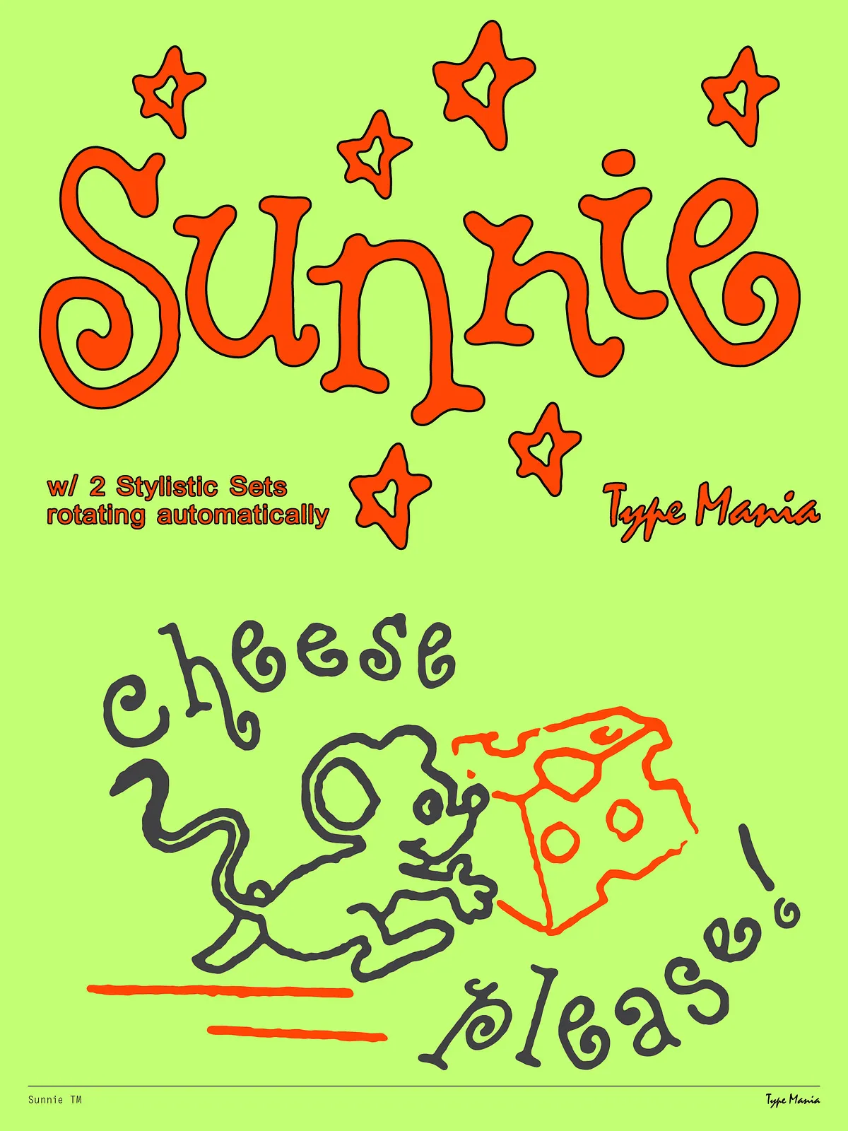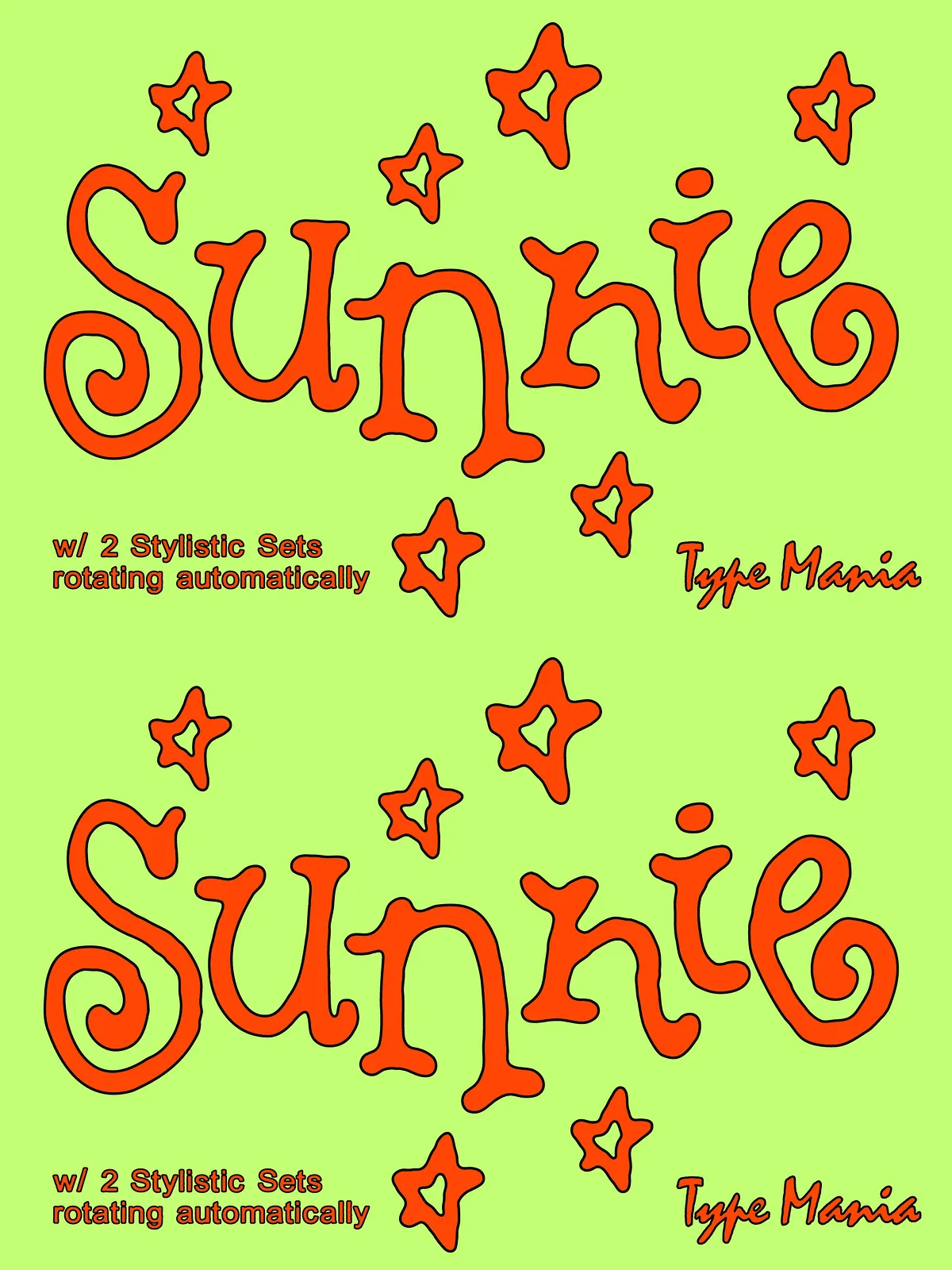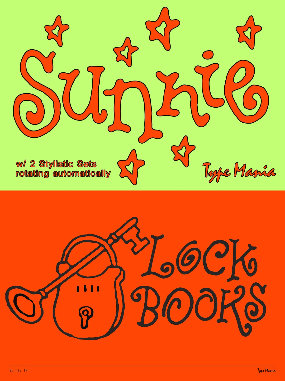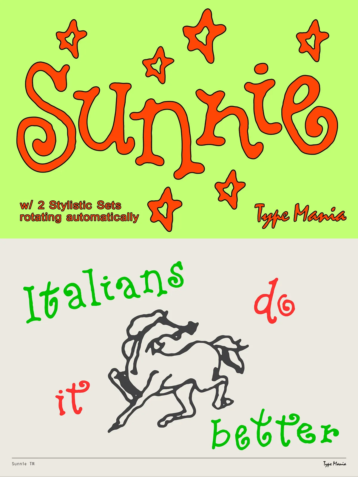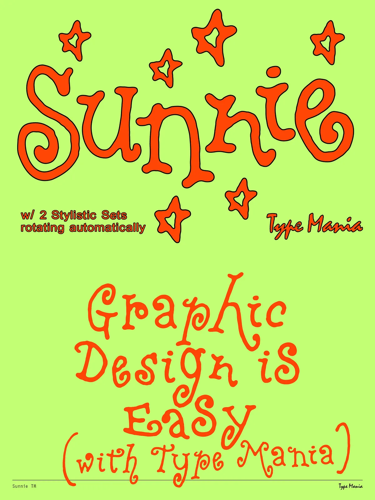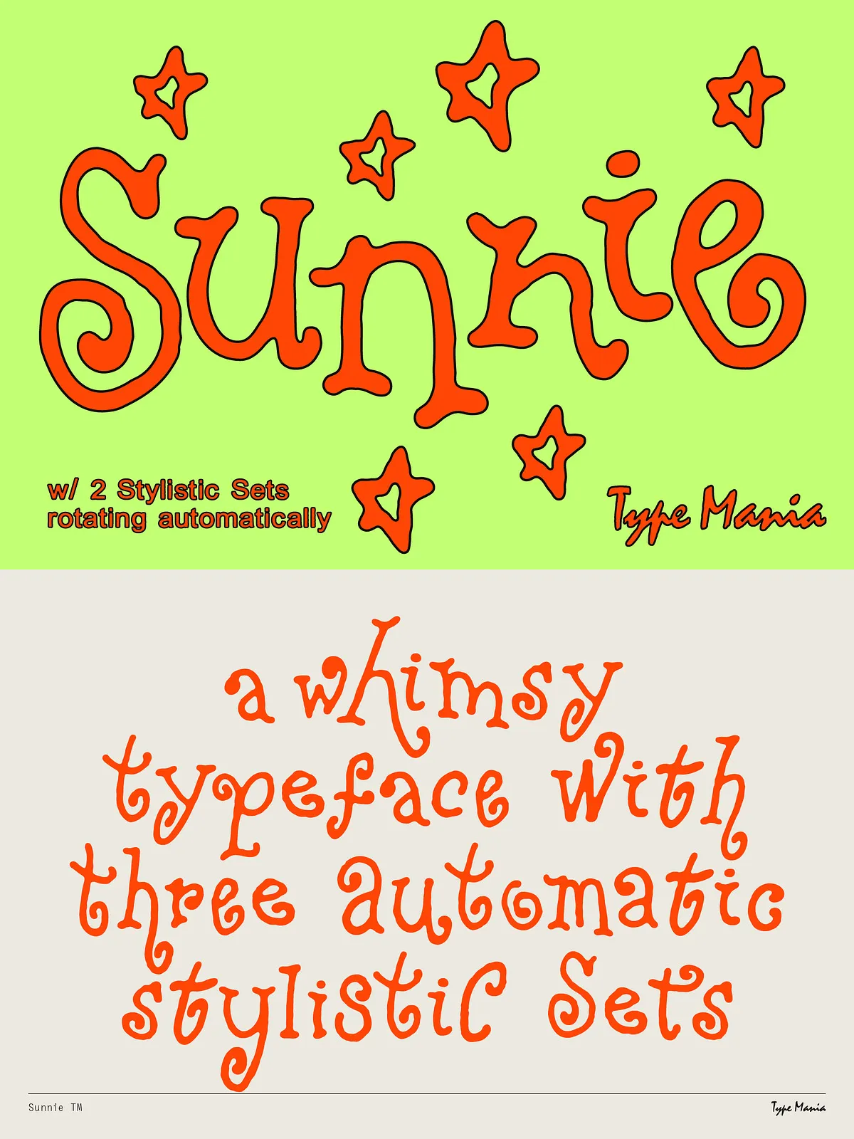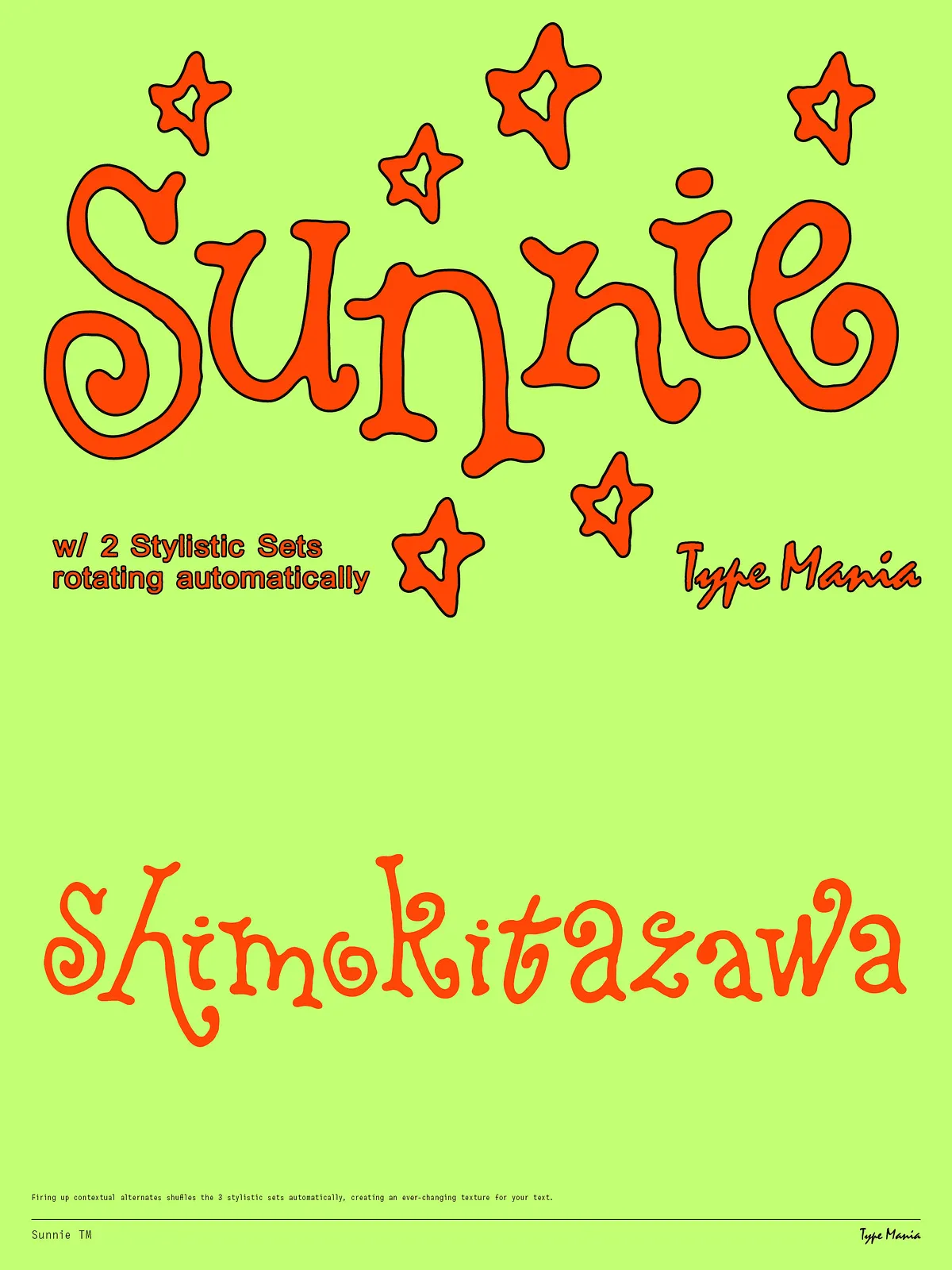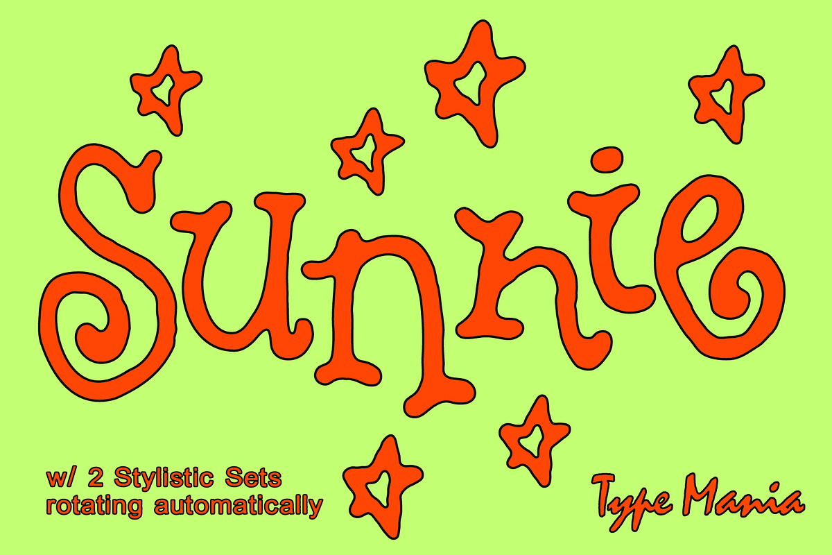

Sunnie TM is a lively, loose scribble display font designed to deliver an authentic, human handwriting feel immediately. The font automatically cycles through three stylistic sets when contextual alternates are enabled, producing a natural rhythm and varied letterforms without extra effort. Sunnie TM lets your headlines, logos, social posts, and packaging copy read like genuine handwriting—fresh, dynamic, and full of character.
Design Features
Three Stylistic Sets
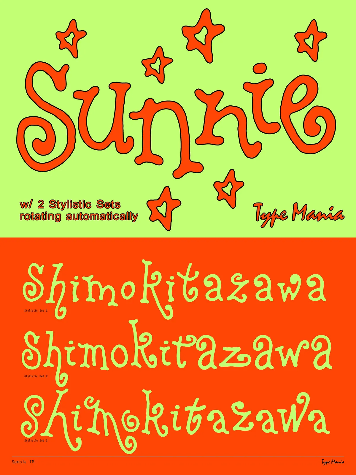
Sunnie TM includes three distinct stylistic sets that vary letter shapes and terminal treatments. The font is programmed to rotate between these sets automatically, so repeated letters and common letter combinations avoid mechanical repetition. This automatic variation mimics real handwriting behavior and enhances the organic texture of text at display sizes.
Contextual Alternates
Contextual alternates drive the automatic switching behavior. When you enable OpenType contextual alternates in your design app, Sunnie TM intelligently swaps glyphs to create smoother, more natural-looking word shapes. The result: flowing lines, less repetition, and stronger emotional impact for designs that rely on a handmade aesthetic.
Loose, Handcrafted Rhythm
Letterforms in Sunnie TM emphasize fluid strokes, irregular connections, and slight angle shifts to capture a spontaneous, off-the-cuff voice. These deliberate imperfections read as warmth and authenticity rather than errors—perfect for brands and projects that seek a personal, approachable tone.
OpenType & Technical Details
OpenType Features
- 3 stylistic sets that rotate automatically
- Contextual alternates to enable natural glyph switching
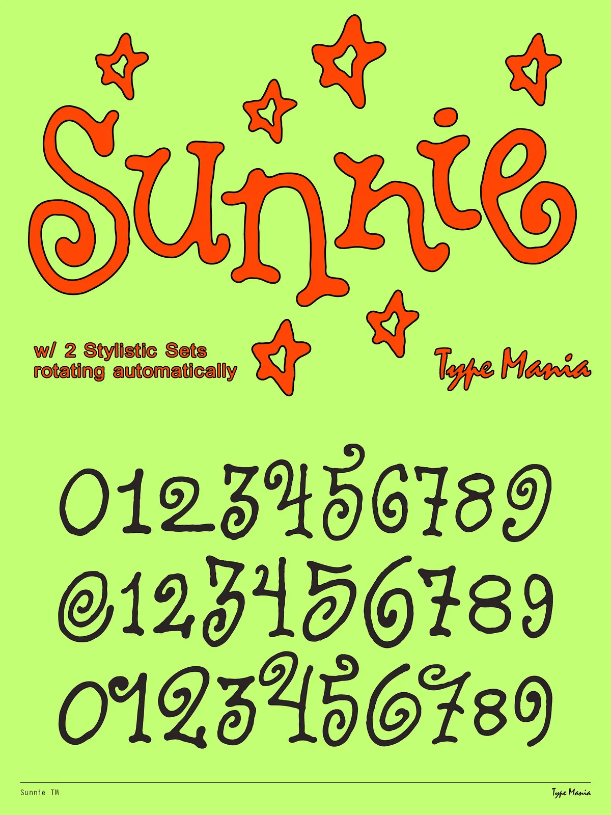
- Standard punctuation and numerals
Language Support
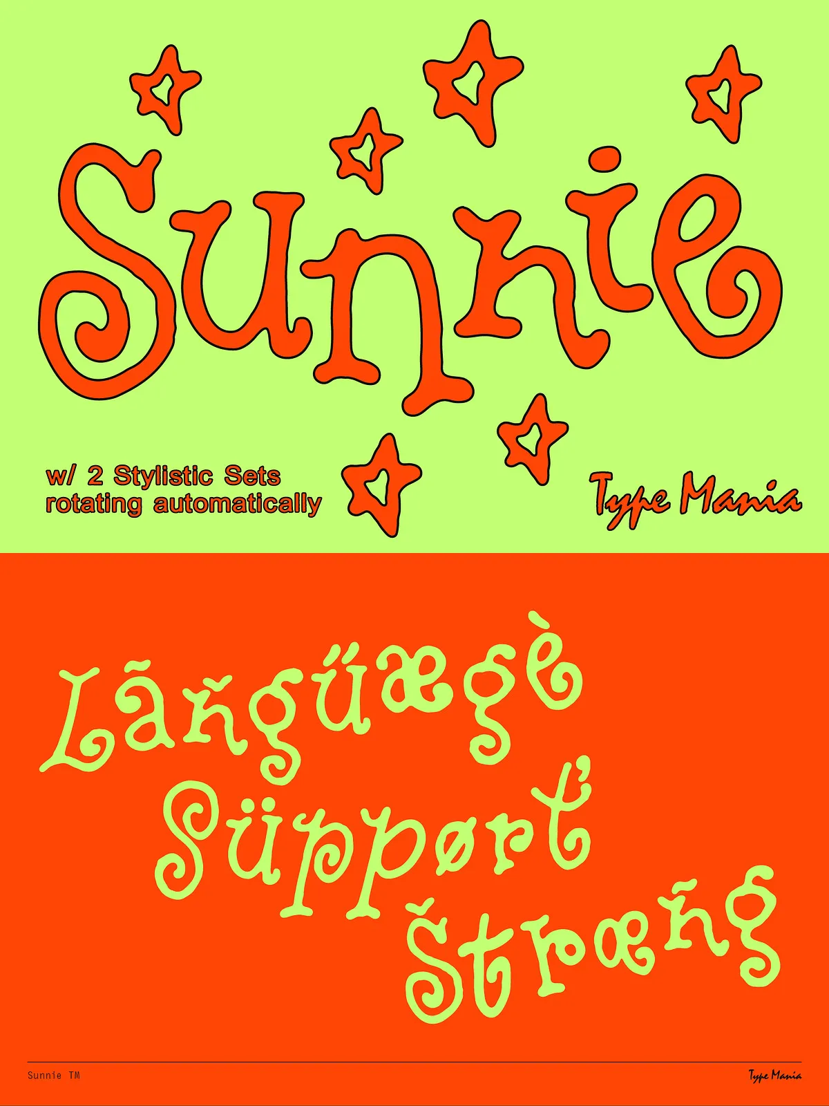
Sunnie TM supports Basic Latin, Western European, Euro, Central European, and Pan African Latin character sets. This coverage makes it suitable for a wide range of western and pan-African languages—confirm specific glyphs by testing sample text in the font preview box before finalizing designs.
Formats and Compatibility
The font typically ships in common desktop formats (OTF/TTF). Webfont formats (WOFF/WOFF2) may be available depending on licensing. Sunnie TM works well in Adobe Creative Cloud apps, Affinity products, and standard operating system font managers. To get the full automatic stylistic behavior, enable OpenType features (Contextual Alternates / Stylistic Sets) in your design software.
Practical Uses and Applications
Recommended Uses
- Branding and logos that require a handcrafted, accessible voice
- Packaging and product labels for artisanal goods or lifestyle brands
- Social media headers, post graphics, and story templates
- Editorial headlines, pull-quotes, and magazine feature typography
- Invitations, greeting cards, and stationery that benefit from a personal touch
Pairing Tips
Pair Sunnie TM with a clean sans-serif for body copy to preserve legibility and visual hierarchy. For more contrast, combine it with a neutral serif for longer editorial text. Use Sunnie TM sparingly for body paragraphs—its lively forms shine as display type for headlines, short phrases, and logo marks.
Workflow Tips & Accessing Features
How to Enable Rotating Sets
In most apps, activate OpenType features to let Sunnie TM rotate stylistic sets: in Adobe Illustrator and InDesign, open the Character panel > OpenType > enable Contextual Alternates and Stylistic Sets; in Photoshop, open the Glyphs panel and enable relevant OpenType options. When enabled, the font will shift glyphs automatically so repeated letters alternate and maintain a handwritten flow.
Spacing and Readability
Because Sunnie TM embraces natural rhythm, slightly increasing tracking for small sizes can improve readability. At display sizes, let the font’s organic details breathe; avoid heavy letter-spacing that flattens the intended hand-drawn texture.
Licensing and Best Practices
Verify and purchase the correct license for your intended use—desktop, web, app, or commercial product manufacturing. Test the font in print proofs and digital mockups to ensure the stylistic rotation reads well at the final size and on the chosen substrate. For brand systems, document which OpenType features should remain enabled to keep typographic behavior consistent across platforms.