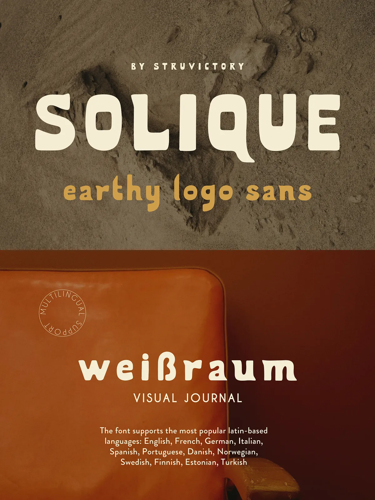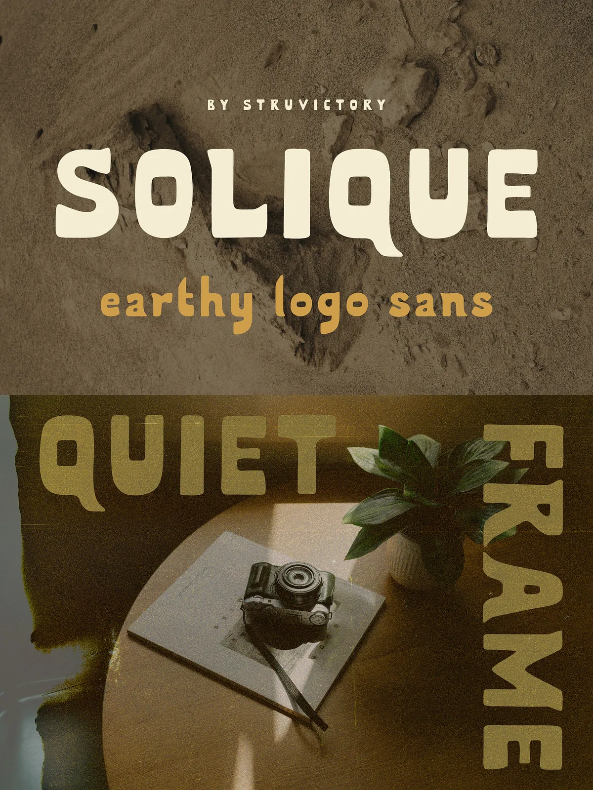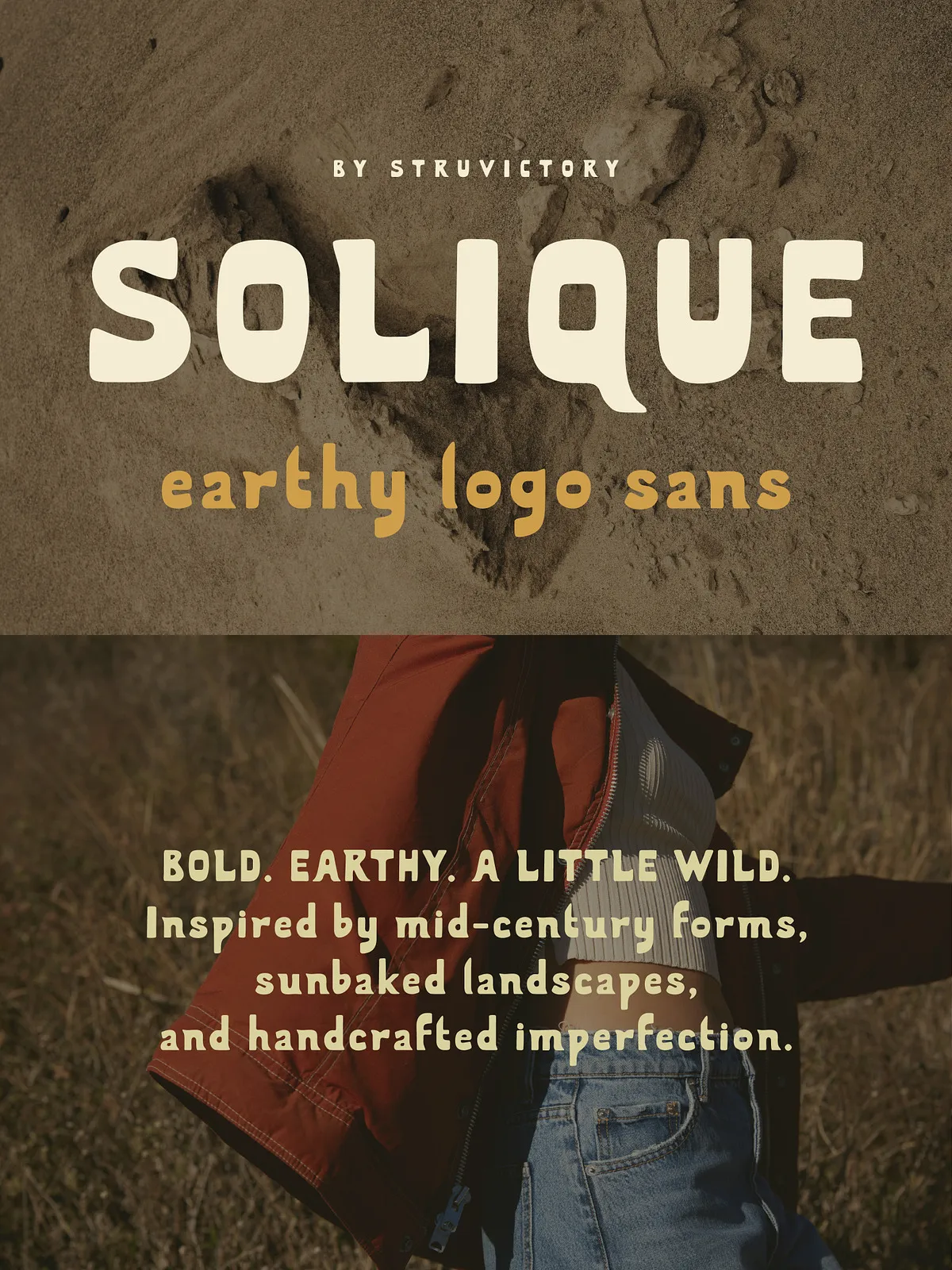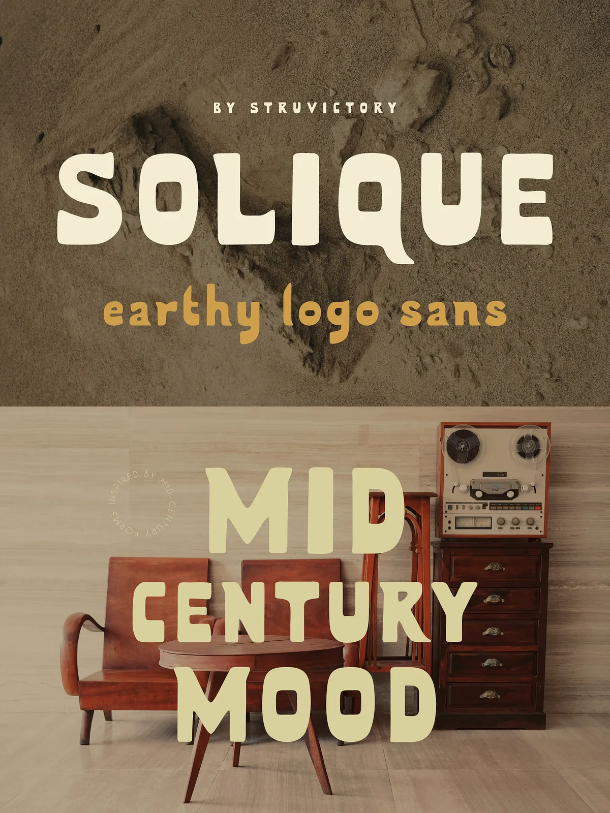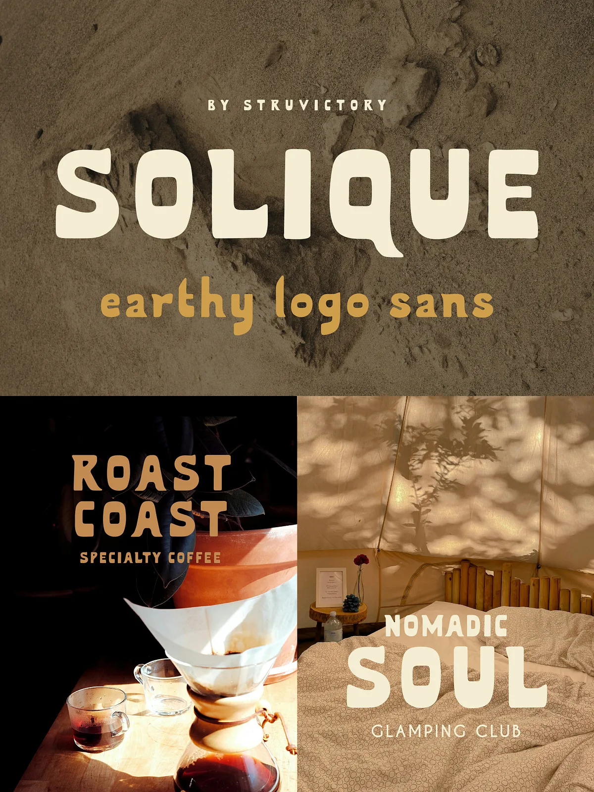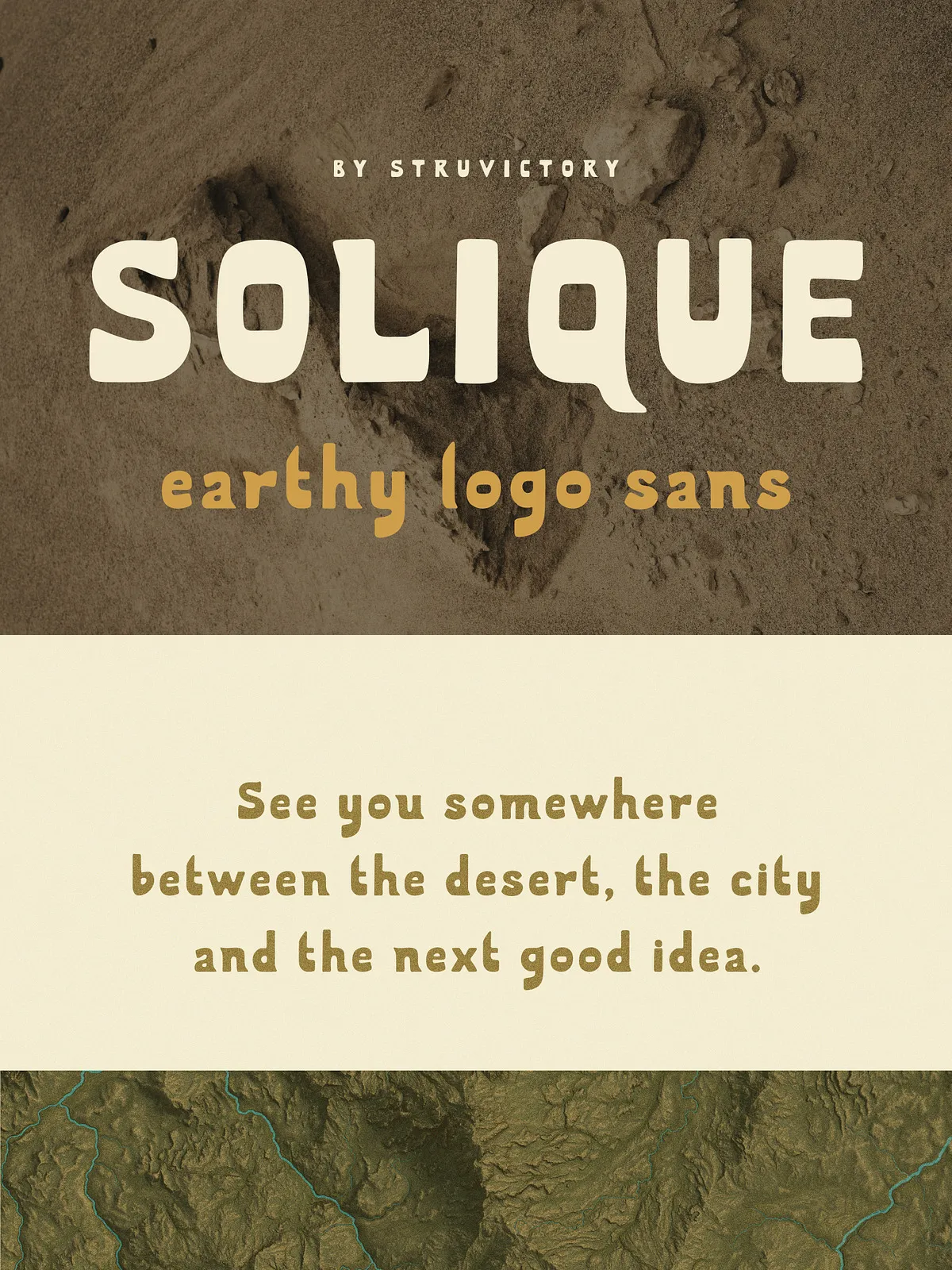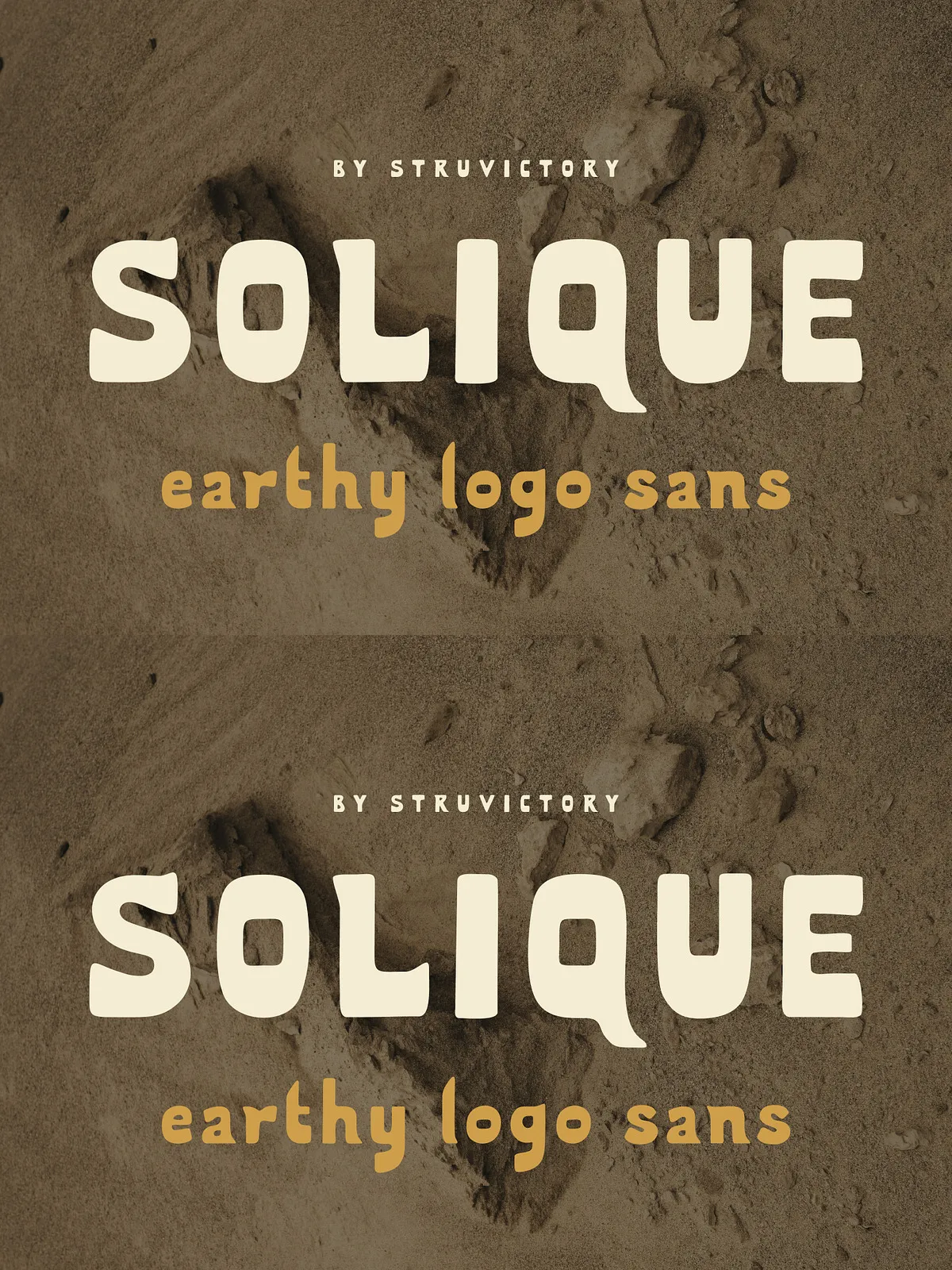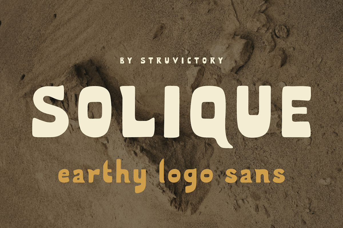

Solique delivers a bold, earthy sans serif that channels sunbaked landscapes, mid-century lettering, and the tactile charm of handcrafted type. Its chunky organic shapes, subtle imperfections, and friendly rhythm give each word a grounded, approachable personality. Solique balances presence with readability so designers can apply it confidently across packaging, branding, editorial layouts, posters, café signage, outdoor labels, and lifestyle products that need warmth and timeless character.
Design Character
Organic Forms and Human Touch
Solique emphasizes rounded terminals, generous counters, and a slightly condensed silhouette that reads strong without feeling mechanical. The letterforms incorporate small irregularities and soft edges that suggest handcraft rather than machine precision. These deliberate imperfections create texture at display sizes while preserving clarity for shorter headlines and labels.
Mid-Century Influence, Modern Utility
Rooted in mid-century signage and lettering traditions, Solique reinterprets classic warmth for contemporary use. It maintains a sturdy rhythm suitable for modular layouts, yet its playful proportions bring personality to boutique goods and editorial features. The typeface actively connects retro aesthetics with modern visual systems.
Recommended Uses
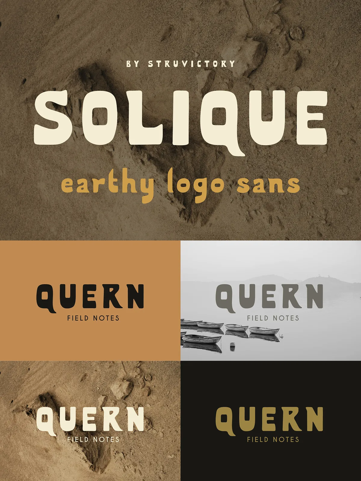
- Brand identities and logos that need bold, warm presence
- Product and vintage-inspired packaging for food, beverages, and lifestyle goods
- Editorial headlines, pull quotes, and magazine covers that demand character
- Signage, menus, and wayfinding for cafés, shops, and hospitality venues
- Posters and promotional materials designed for outdoor or tactile print finishes
Technical Details and Language Support
Character Set and Compatibility
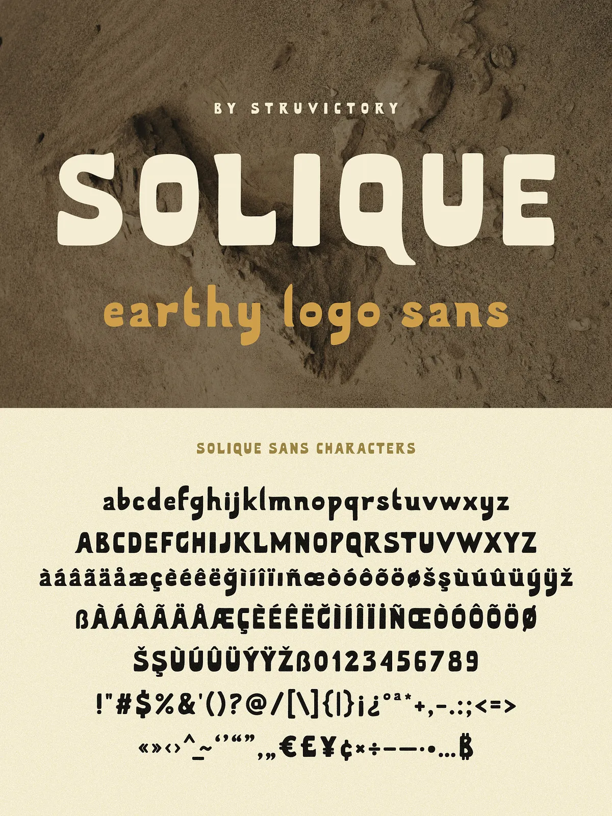
Solique supports the most popular Latin-based languages and includes standard punctuation, numerals, and essential diacritics for Western European usage. To confirm specific glyphs or language coverage, type sample words in the font preview box on the product page or in your design app before committing to large projects.
Formats and Installation
The font ships in common desktop formats (OTF/TTF) compatible with Adobe Creative Cloud apps, Affinity products, and standard OS font management. Webfont packages are available where licensing permits—use them to embed Solique in headers and hero banners for consistent cross-platform branding. Install the desktop files for print and in-app design workflows; add the webkit-ready webfont kit for online use when your license covers web embedding.
Pairing and Usage Tips
Complementary Type Choices
- Pair Solique with a neutral sans-serif for body copy to preserve legibility and visual hierarchy.
- Combine with a light or condensed geometric sans to create contrast while keeping a modern tone.
- Introduce a narrow serif or an elegant script sparingly for secondary accents, such as taglines or packaging descriptors.
Layout and Treatment
Use Solique confidently at large sizes to highlight textures and organic details. When applying it at smaller sizes, increase tracking slightly to improve legibility. For packaging and signage, consider pairing Solique with tactile print effects—embossing, matte stock, and spot varnish reinforce its handcrafted appeal. When designing digital UI, use it for prominent headings and CTAs to convey a grounded, human brand voice.
Licensing and Best Practices
Always verify the license scope before deploying Solique in commercial products, broadcast, or resale items. Purchase the appropriate license tier for web embedding, app integration, or large-scale manufacturing. For packaging and print proofs, run test prints to ensure the font’s organic details translate well to the chosen substrate and finishing processes.