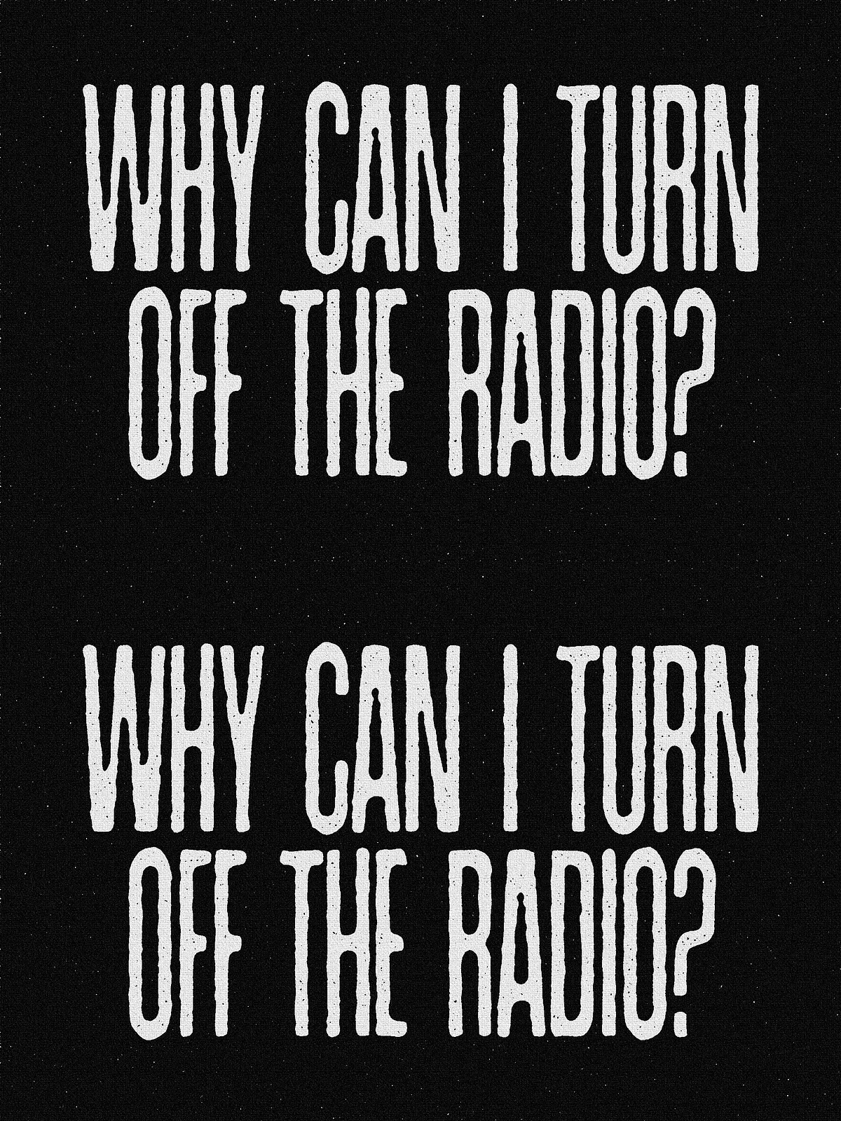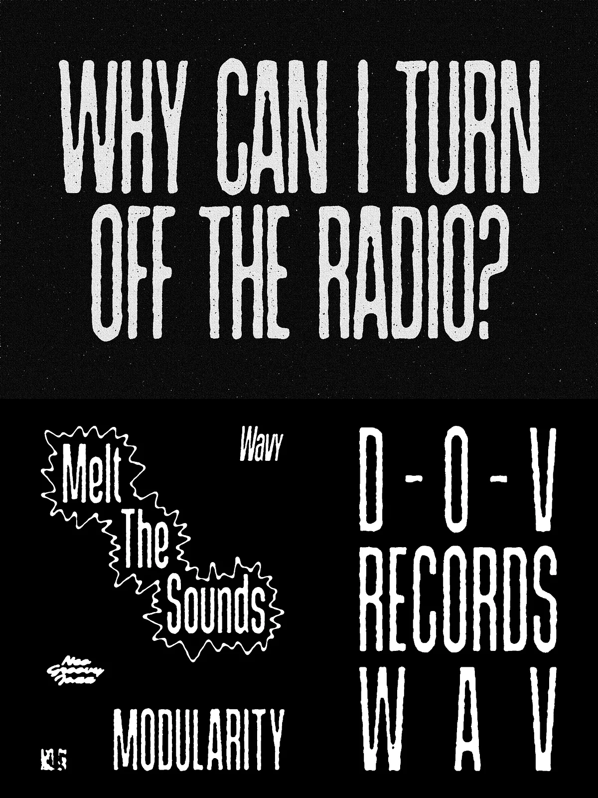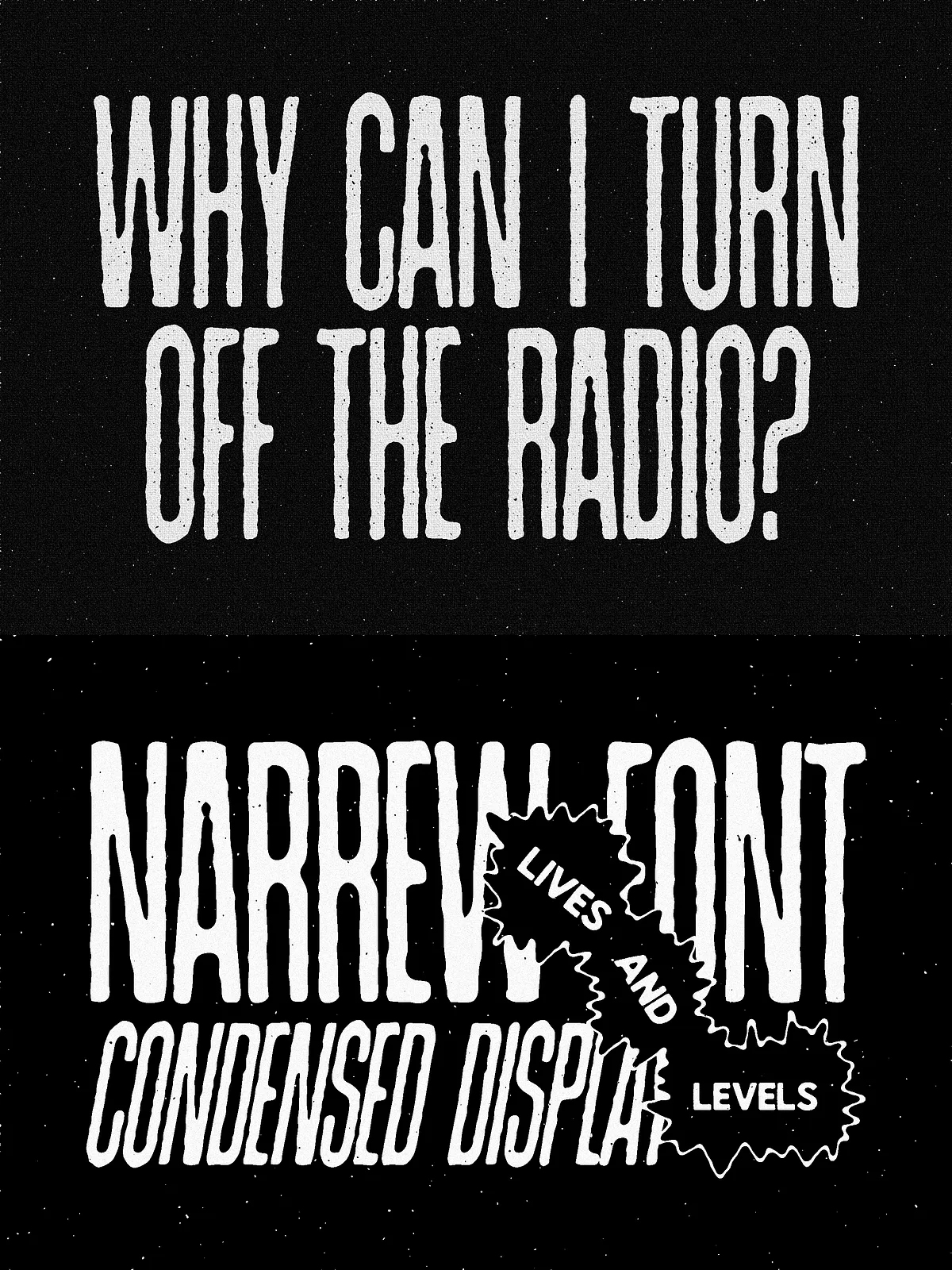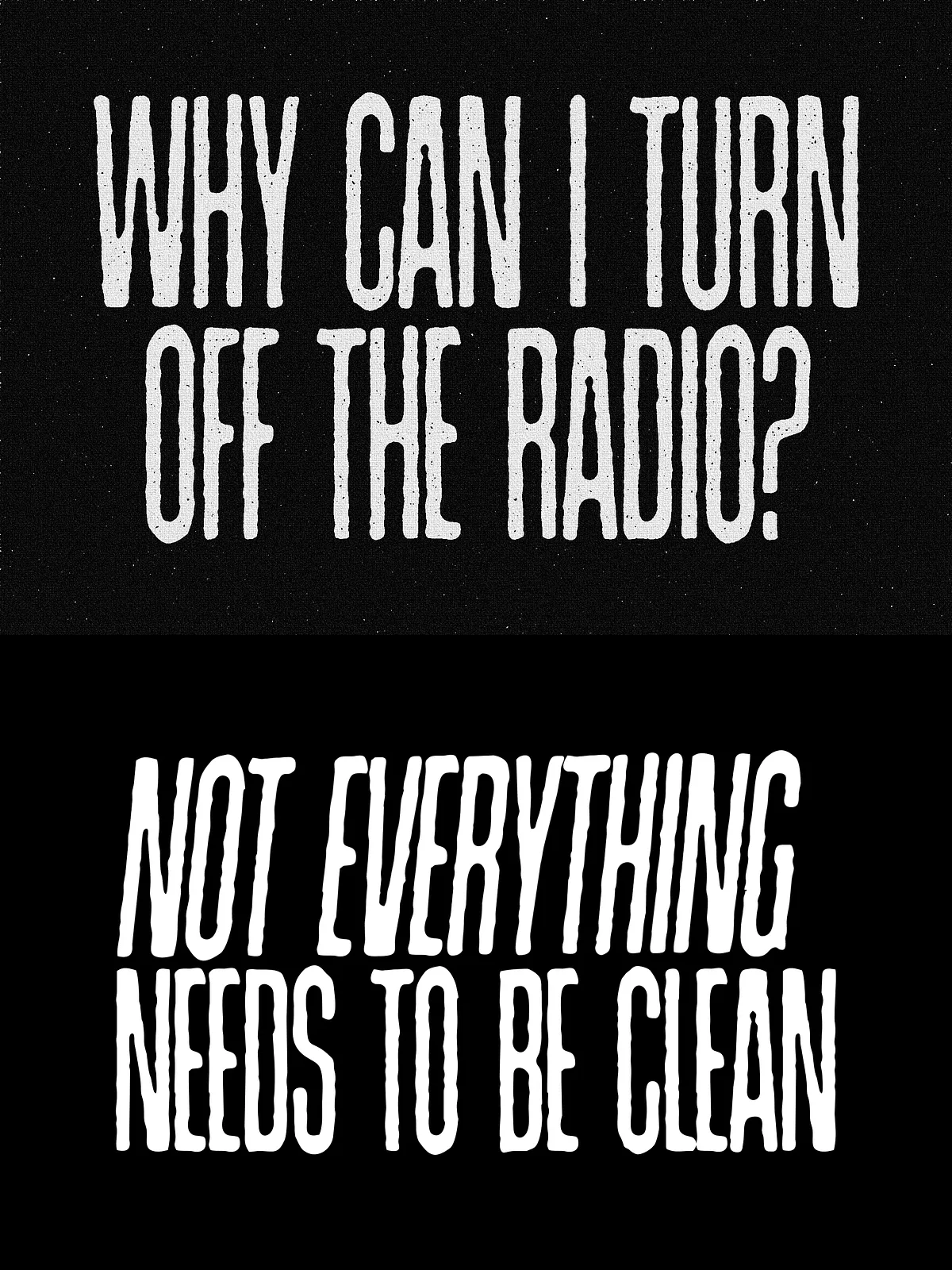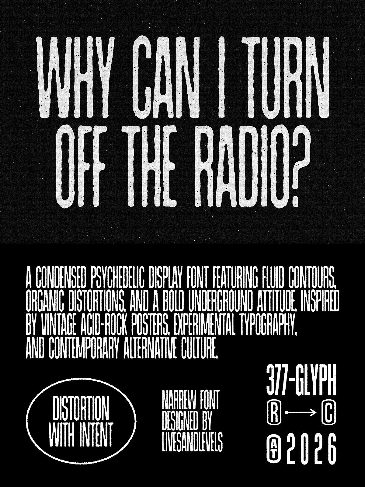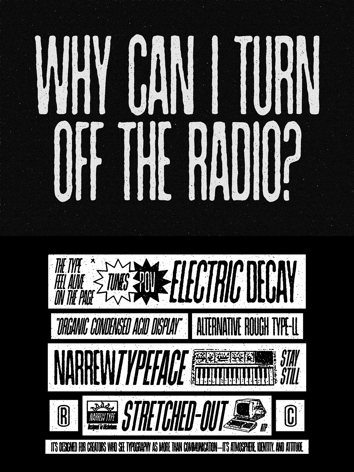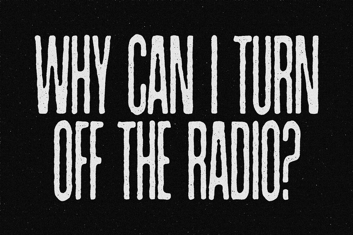

This condensed display typeface delivers a striking vertical rhythm through tall, compressed letterforms and a bold elongated structure. Designed to make headlines and posters immediately arresting, the face balances raw expression with clear readability. Slightly irregular edges and subtle distortions give each glyph an organic, handcrafted personality that works equally well for vintage horror aesthetics and contemporary experimental typography. Use this font to create tension, mystery, and dramatic branding that stands out in print and on screen.
Key Features
Bold, Tall Proportions
The typeface emphasizes verticality and compression. Letterforms appear elongated and dense, producing an impactful silhouette that commands attention at display sizes. This structure creates strong typographic rhythm in headlines, mastheads, and posters.
Handcrafted Texture & Subtle Distortion
Designed with slightly irregular outlines and controlled roughness, the font retains a handcrafted feel without sacrificing legibility. The deliberate imperfections add character and convey an authentic, tactile presence suitable for branding that seeks a vintage or unsettling mood.
Complete Character Set
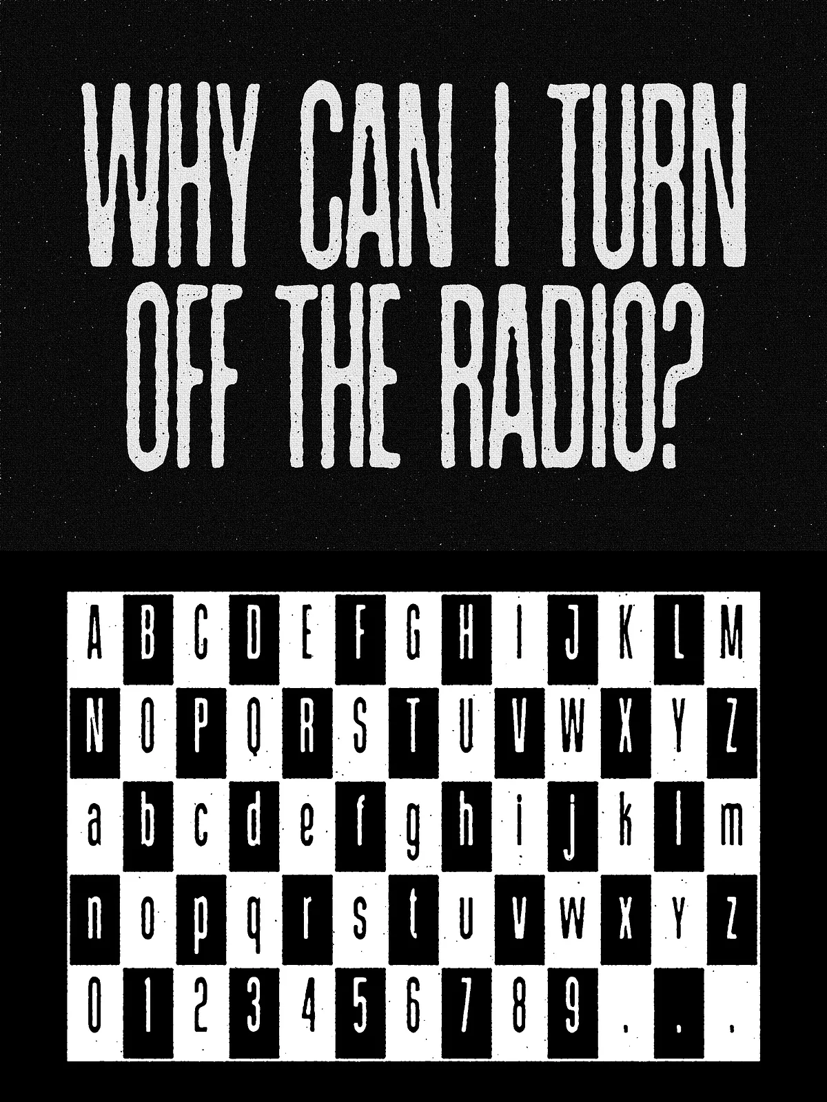
The family includes uppercase and lowercase letters, numerals, punctuation, and multilingual glyphs to support extended Latin languages. Clean kerning and thoughtful spacing ensure the font reads well in large display settings and short editorial blocks.
Four Styles for Flexible Hierarchy
- Regular — balanced display weight for titles and editorial use.
- Rough — textured variant with pronounced edge irregularities for atmospheric compositions.
- Bold — heavier weight for maximum impact on posters and packaging.
- Black — ultra-heavy style for dominant branding headlines and logotypes.
What’s Included
- OTF, TTF and WOFF font files
- 4 styles: Regular, Rough, Bold, Black
- Full Latin character set with multilingual support
- Kerning and spacing tuned for display use
Recommended Uses
Headlines & Posters
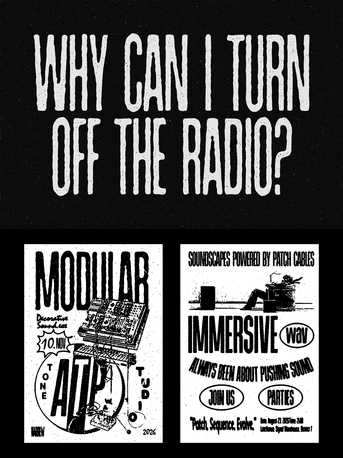
Exploit the tall, condensed shapes to craft headlines that dominate layouts. The strong vertical rhythm works well on movie posters, event flyers, and album covers where a dramatic tone enhances the message.
Branding & Logotypes
Use the Bold or Black styles for logotypes that require authoritative presence. The Rough style adds a handcrafted or distressed personality for brands inspired by Americana, horror, or retro industrial themes.
Editorial & Packaging
Apply the typeface to magazine covers, feature spreads, labels, and packaging where a bold, distinctive display face provides instant recognition and visual hierarchy.
Pairing and Design Tips
Pair with Neutral Bodies
Balance the display font with a neutral sans-serif or a clean serif for body copy. Let the condensed face carry the headline and accents while the support font manages readability in paragraphs.
Scale and Tracking
For maximum effect, use larger sizes and slightly increased line-height to enhance the vertical rhythm. Tighten tracking subtly at very large sizes to maintain compact visual weight, and increase tracking for small display contexts to preserve legibility.
Texture and Effects
When you want more grit, apply texture overlays, halftone screens, or subtle grain to complement the Rough style. For modern editorial work, pair the Regular style with minimal textures and high-contrast photography.
Technical Details & Compatibility
Provided in OTF, TTF, and WOFF formats for broad compatibility with desktop and web environments. Install OTF/TTF on macOS and Windows, and use WOFF for web embedding. Kerning pairs and spacing are optimized for display use. The multilingual feature set supports most Western and Central European languages.
Licensing & Support
This product includes a standard desktop license. Contact the vendor for extended or webfont licensing, app embedding, merchandising rights, or enterprise distribution. If you need additional language support, custom alternates, or technical assistance, reach out to customer support for tailored options.
How to Get Started
Download the font files, install the OTF/TTF on your system, and select the family in your design software. Start with the Regular style for balanced layouts, then switch to Bold or Black for emphasis. Use Rough when you want a distressed, handcrafted effect. Always test at intended output sizes and convert text to outlines for final print production when necessary.