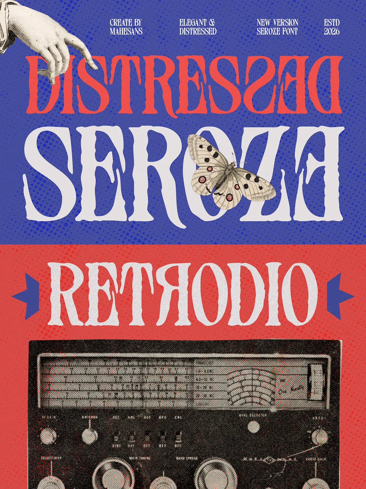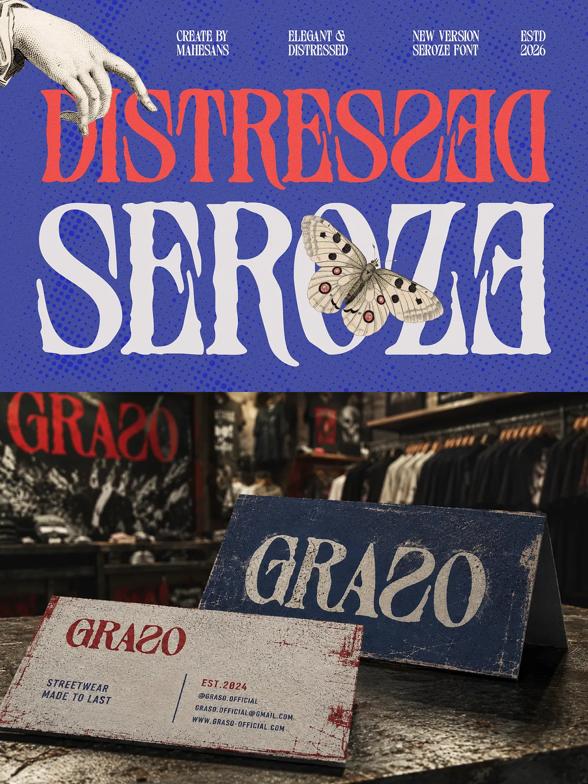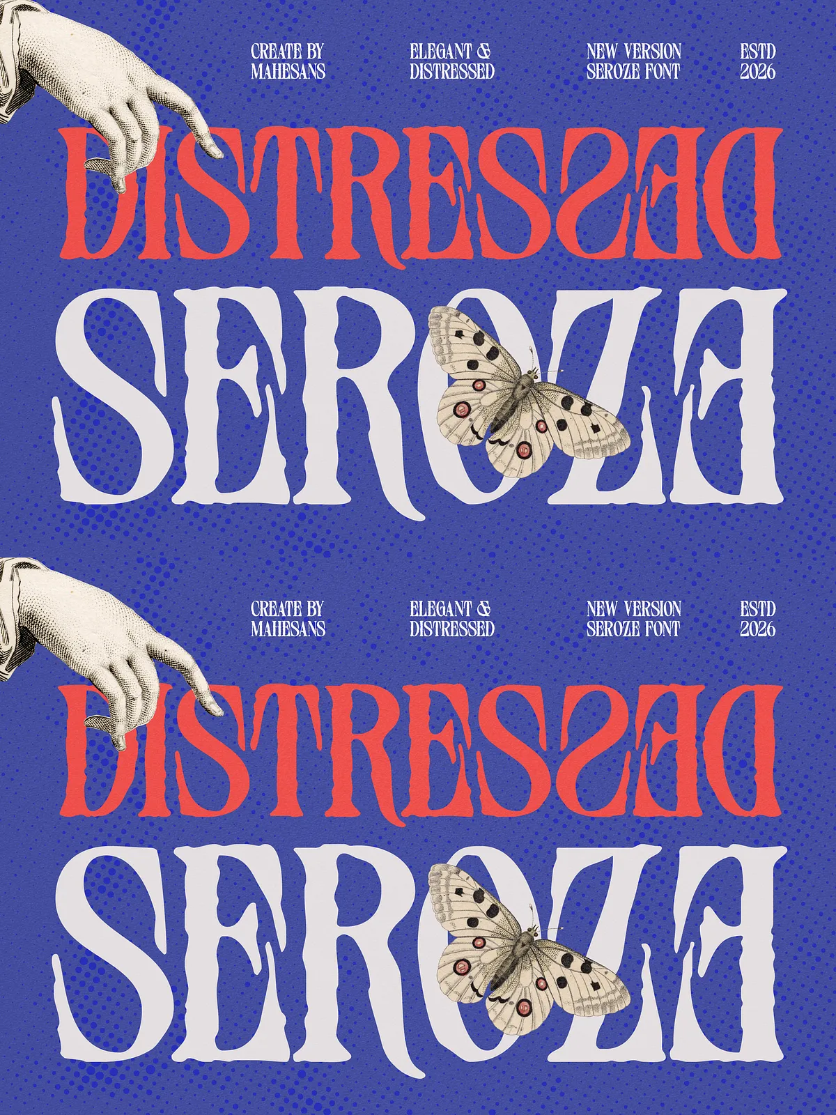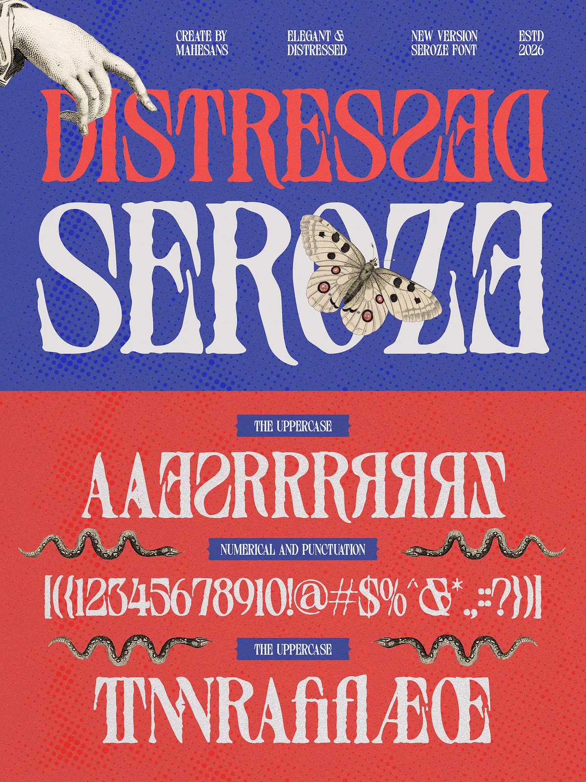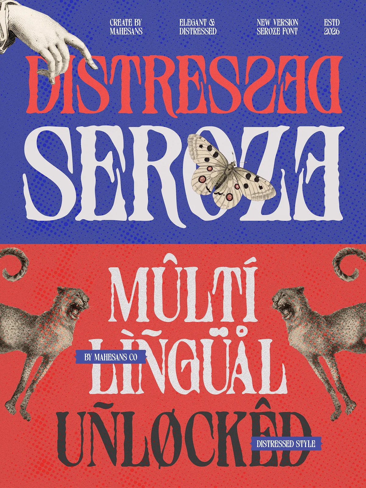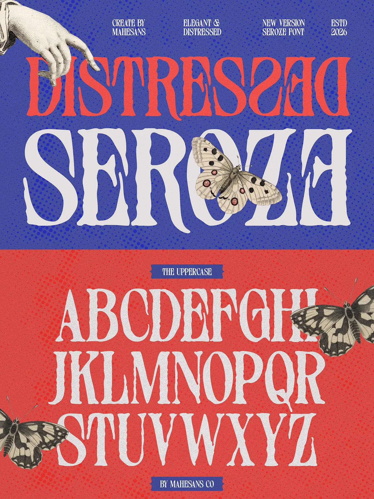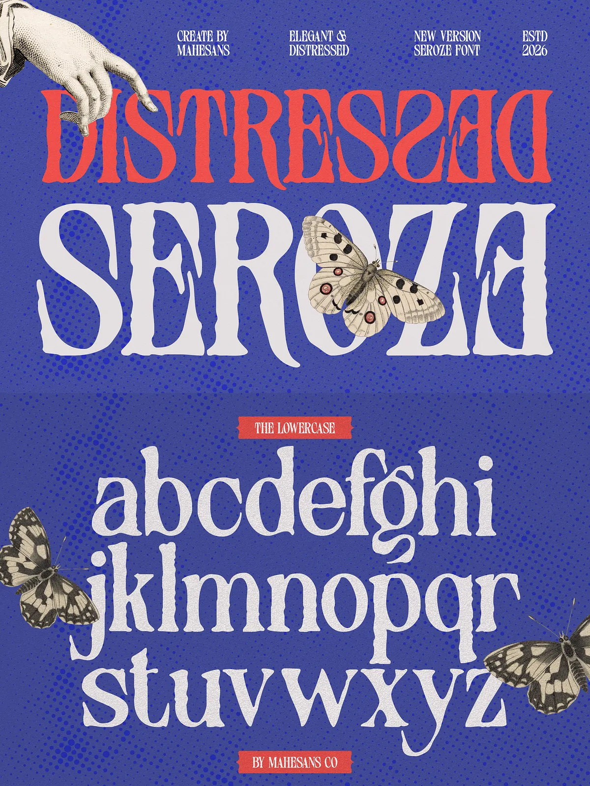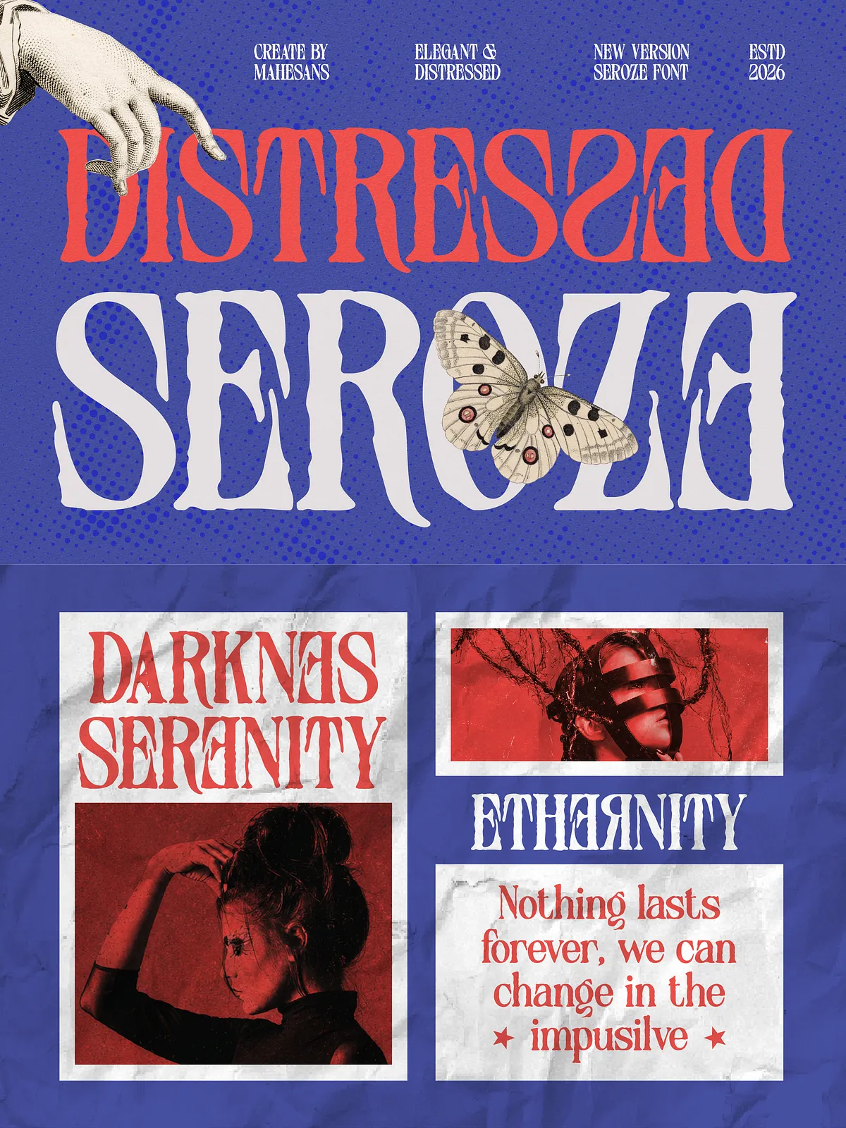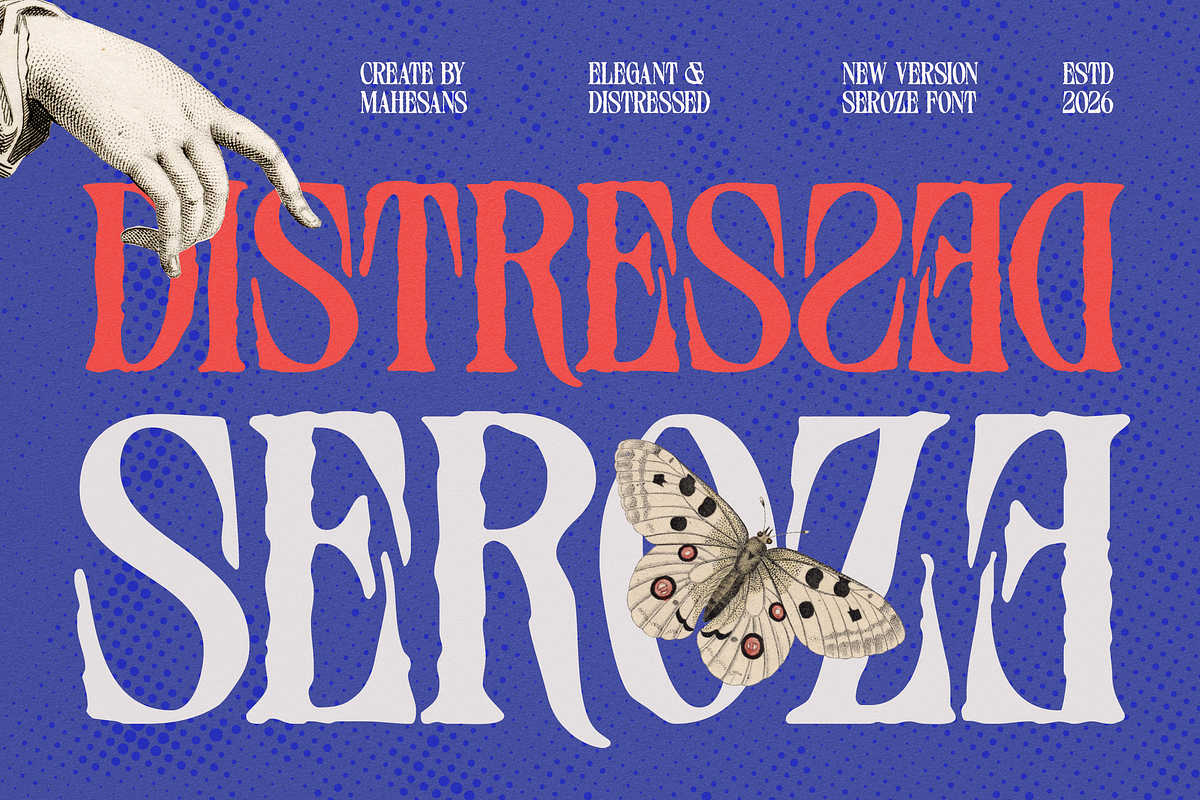

Seroze injects refined personality into designs by combining classic serif forms with organic distressed textures. Crafted to read clearly while displaying handcrafted imperfections, Seroze delivers a confident voice that suits luxury and fashion applications as well as bold editorial and packaging work. The typeface balances flowing curves, distinctive terminals, and subtle roughness so your layouts feel expressive without losing legibility.
Design Features
Organic Distress and Authenticity
Seroze uses hand-placed distressing and natural wear to create a lived-in appearance. These imperfections read as deliberate texture rather than noise, giving headlines and logos a tactile, authentic quality. The distressed details add personality while preserving the underlying serif structure.
Elegant Serif Structure
The core letterforms follow classical serif proportions: refined stems, balanced counters, and graceful curves. This foundation ensures that Seroze performs well at display sizes — the elegance of the shapes remains intact even when the distressed overlays are applied.
Expressive Terminals and Ligatures
Seroze includes distinctive terminals and thoughtfully designed ligatures that enhance rhythm and flow in wordmarks and headlines. These features let you craft logotypes and editorial headings that feel bespoke and carefully composed.
Included Glyphs & Technical Details
- Uppercase and lowercase alphabets
- Numerals and punctuation
- Common ligatures for smoother display text
- Multilanguage support (check delivered files for full coverage)
- Formats: OTF, TTF, WOFF, WOFF2 for desktop and web use
- Simple installation on PC and Mac
Recommended Applications
Fashion & Luxury Branding
Seroze enhances brand identities that require sophistication with an edge. Use it for couture or boutique logos, monograms, and identity systems where a hint of rebellion supports a premium position.
Editorial Design & Magazine Covers
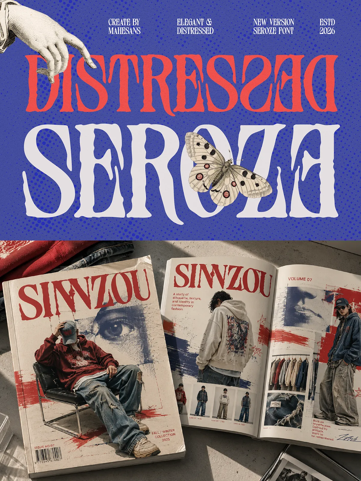
Use Seroze for cover headlines and feature titles to instantly communicate tone: elegant yet uncompromising. Its distressed textures add visual interest while the serif structure preserves readability in large display sizes.
Packaging & Product Design
Seroze performs strongly on packaging — especially for limited editions, premium goods, or retro-inspired products. The font’s tactile distressing complements textured materials like kraft, linen, and coated stocks, reinforcing perceived craft and quality.
Posters, Album Artwork & Social Media
Apply Seroze where a bold visual statement matters: posters, album covers, campaigns, and social graphics. Its combination of classic form and distressed detail delivers immediate presence across both print and digital platforms.
Styling & Pairing Tips
Pair with Clean Sans-Serifs
To highlight Seroze’s decorative attributes, pair it with a neutral sans-serif for body text. The contrast between crisp text and textured display elements maintains readability and accentuates headline personality.
Color, Texture and Background
Let Seroze breathe on subtle backgrounds or tactile paper stocks. Use restrained palettes—muted neutrals, rich jewel tones, or monochrome treatments—to let the distressed detail remain legible and elegant. When placing the font over busy imagery, apply overlays, outlines, or subtle shadows to preserve clarity.
Files, Licensing & Support
Deliverables typically include OTF/TTF for desktop, and WOFF/WOFF2 for web. Include a license file clarifying permitted commercial uses and web embedding rights. For extended commercial uses (product resale, app embedding, or multi-seat licensing) request an extended license from the seller. Provide system and application details when contacting support to expedite troubleshooting.
Quick Installation Guide
1. Desktop: Install OTF/TTF via Font Book (macOS) or right-click → Install (Windows).
2. Web: Host WOFF/WOFF2 and reference via @font-face in CSS; test across browsers.
3. Print: Embed fonts in PDFs or convert to outlines for press-ready artwork.