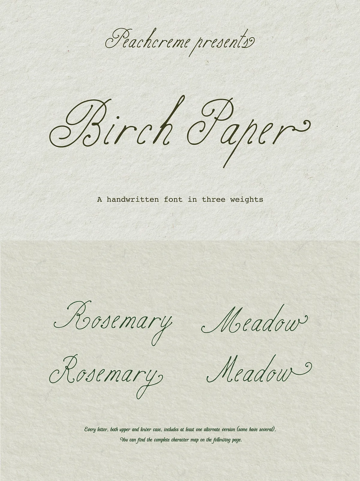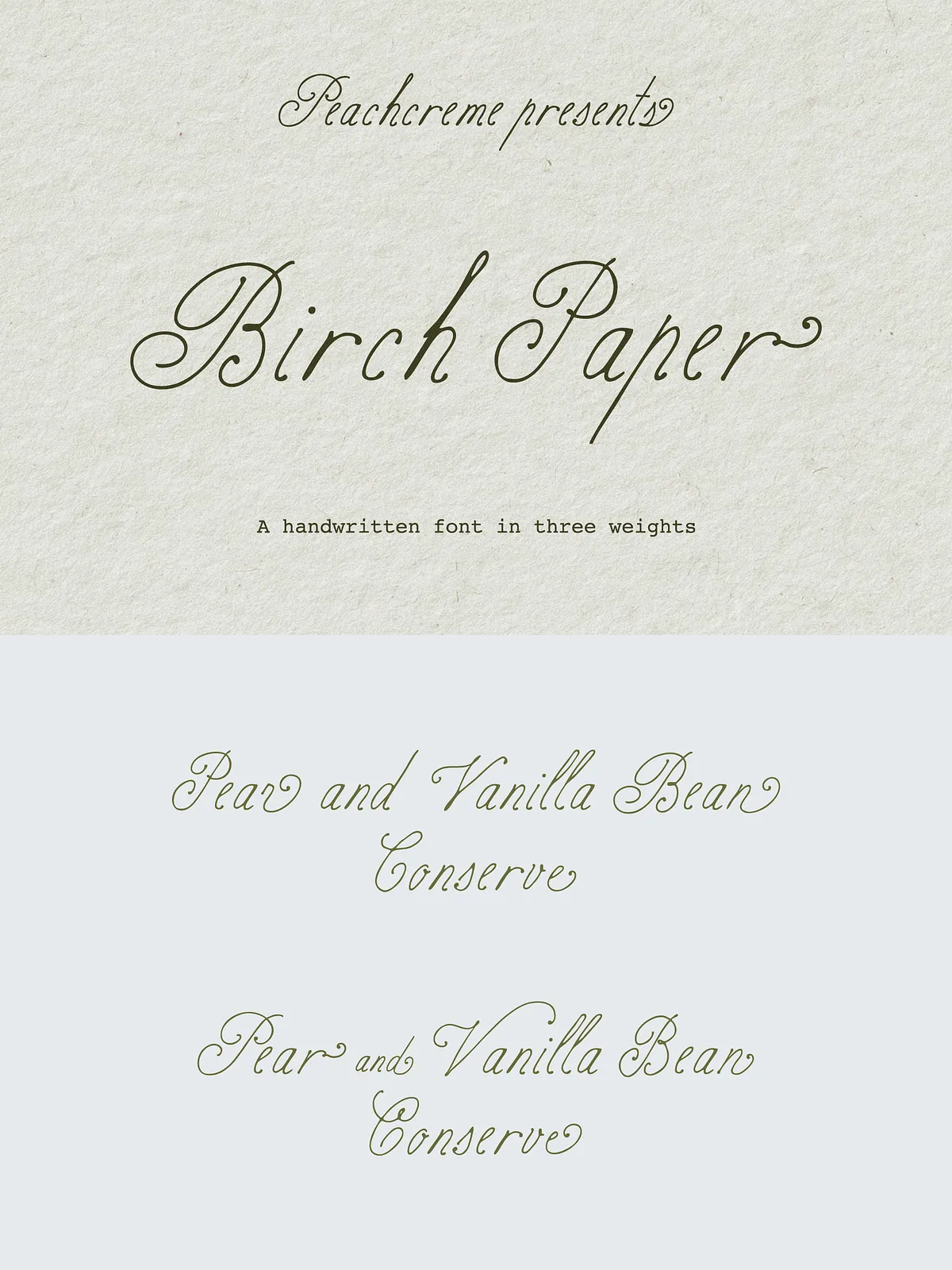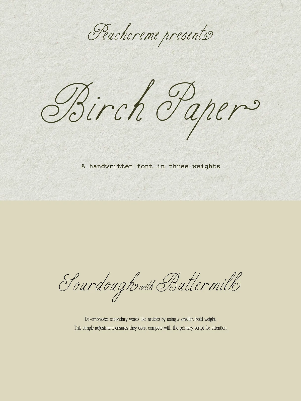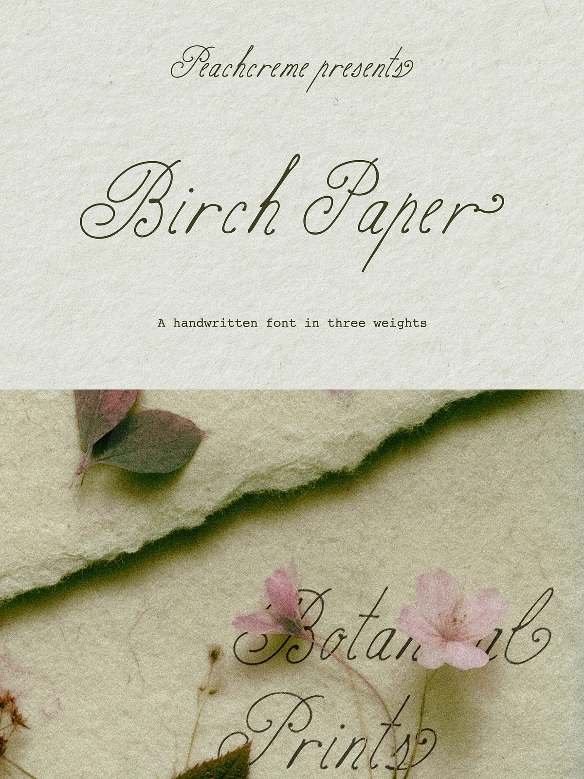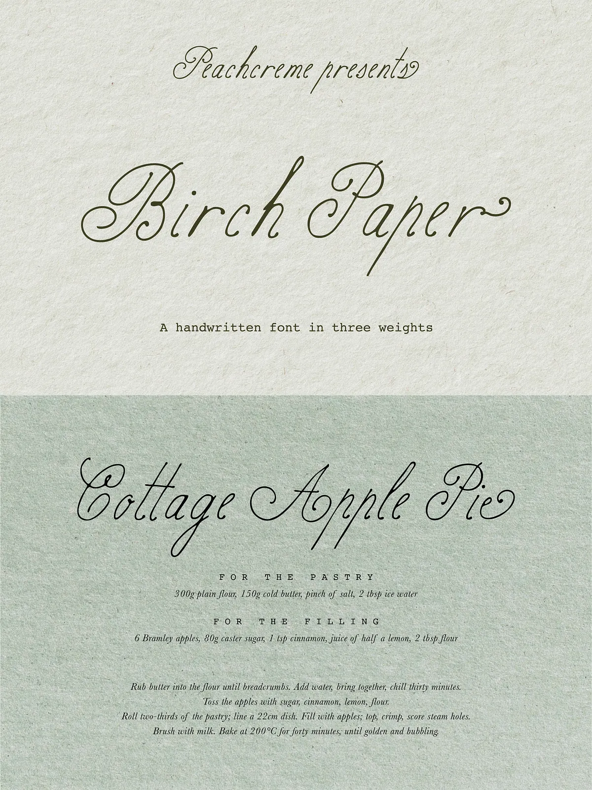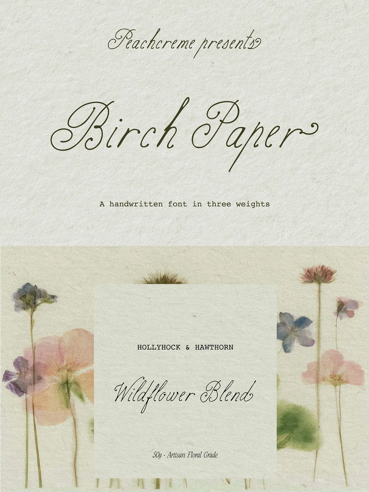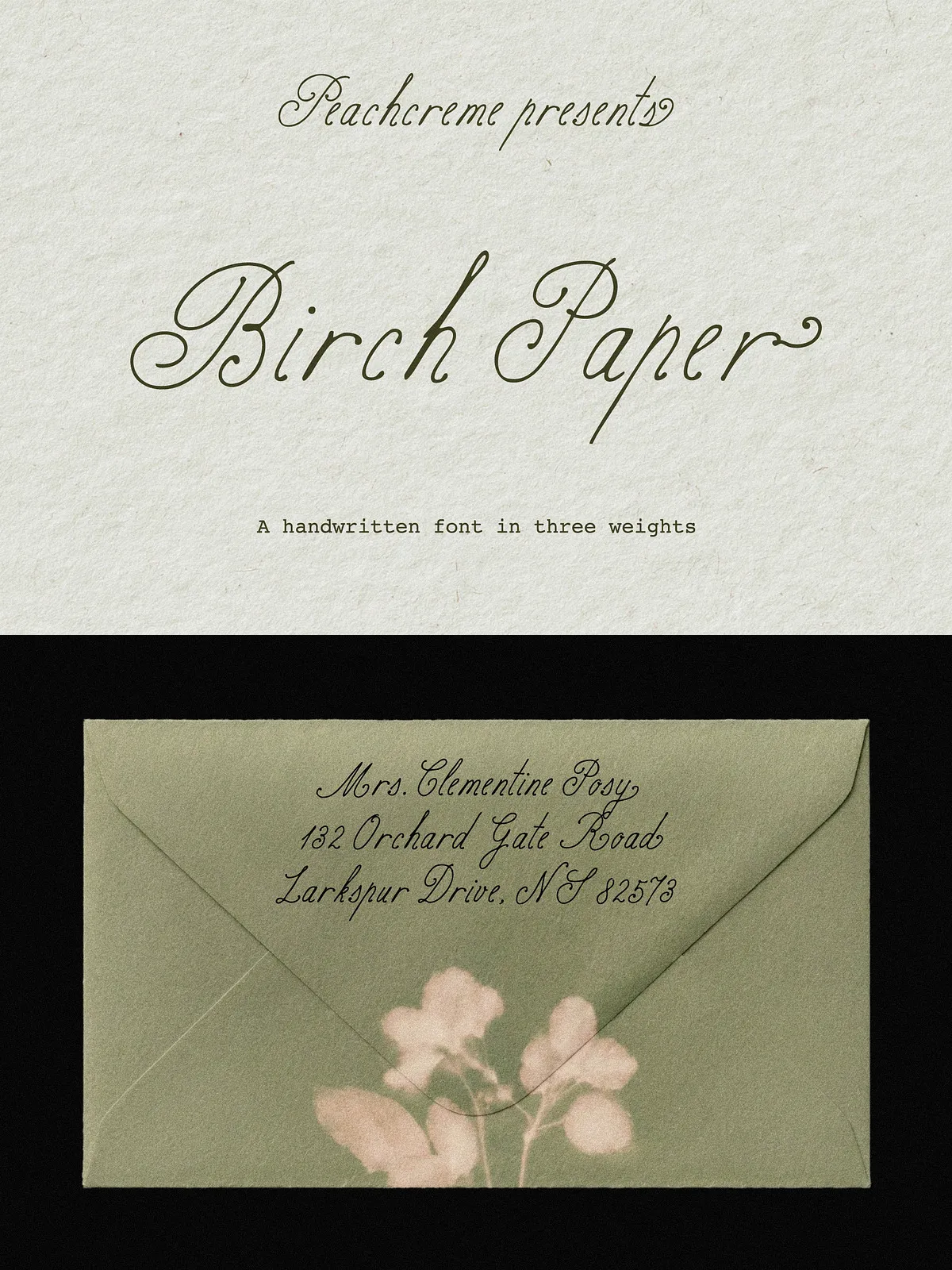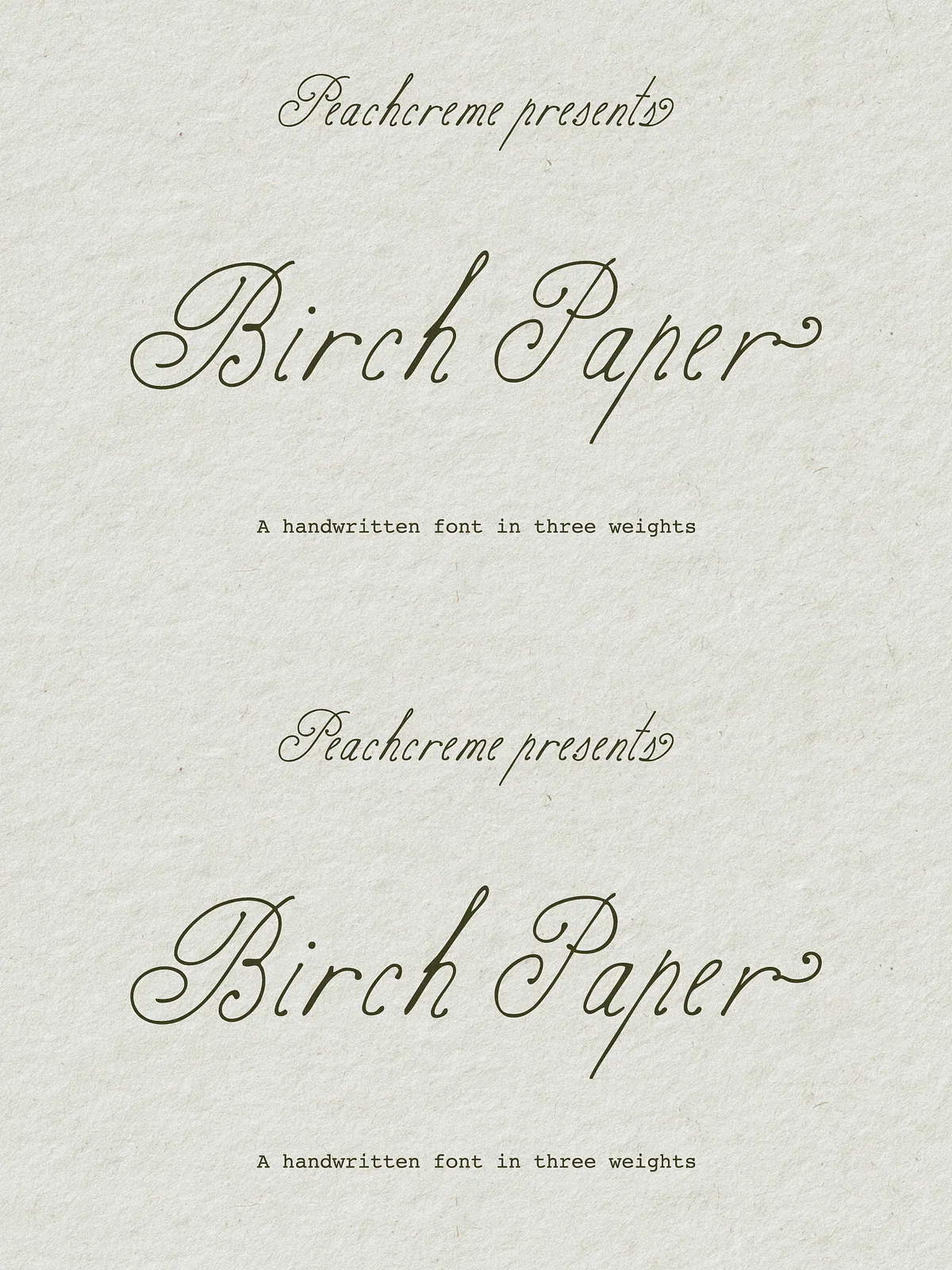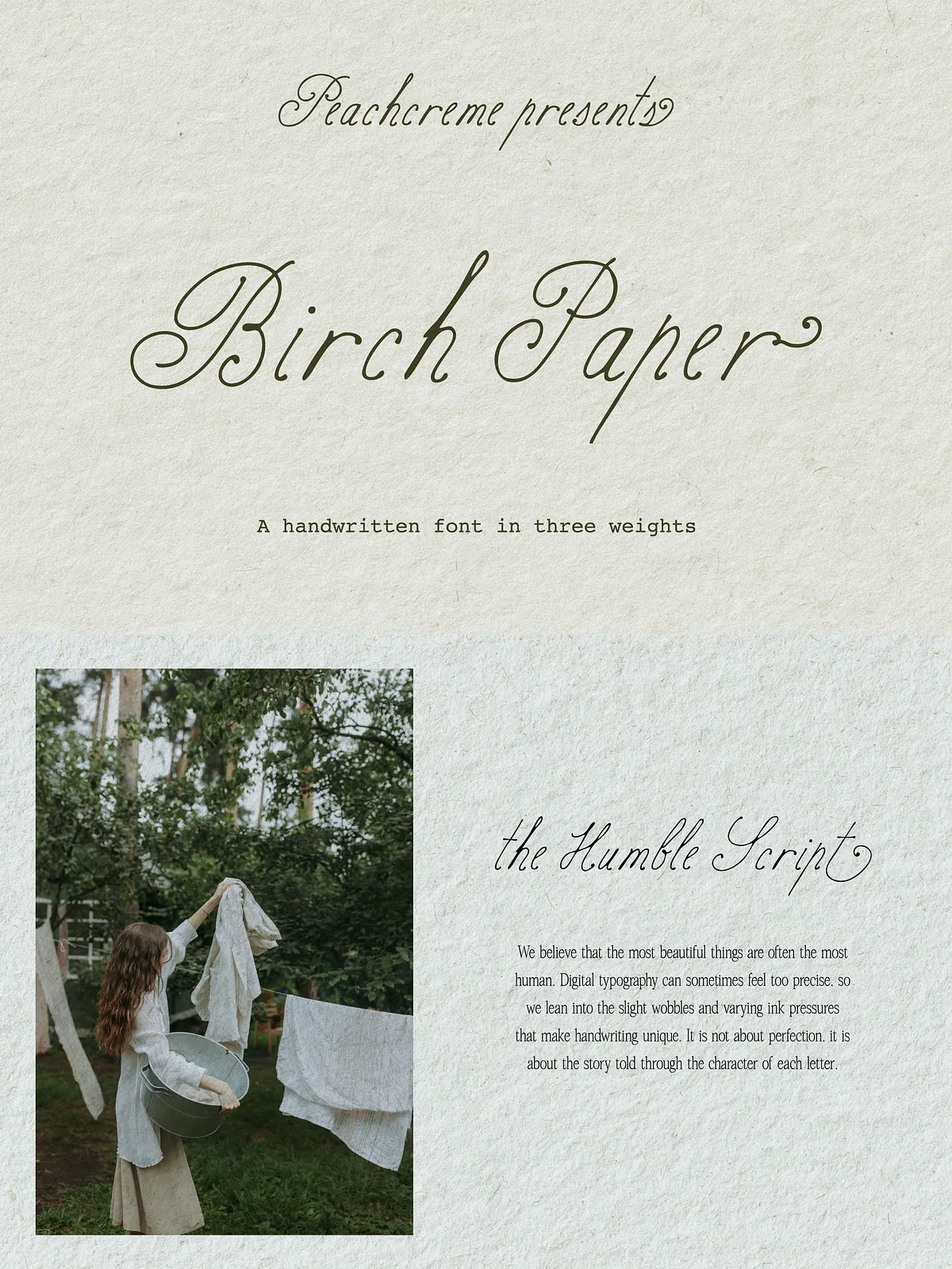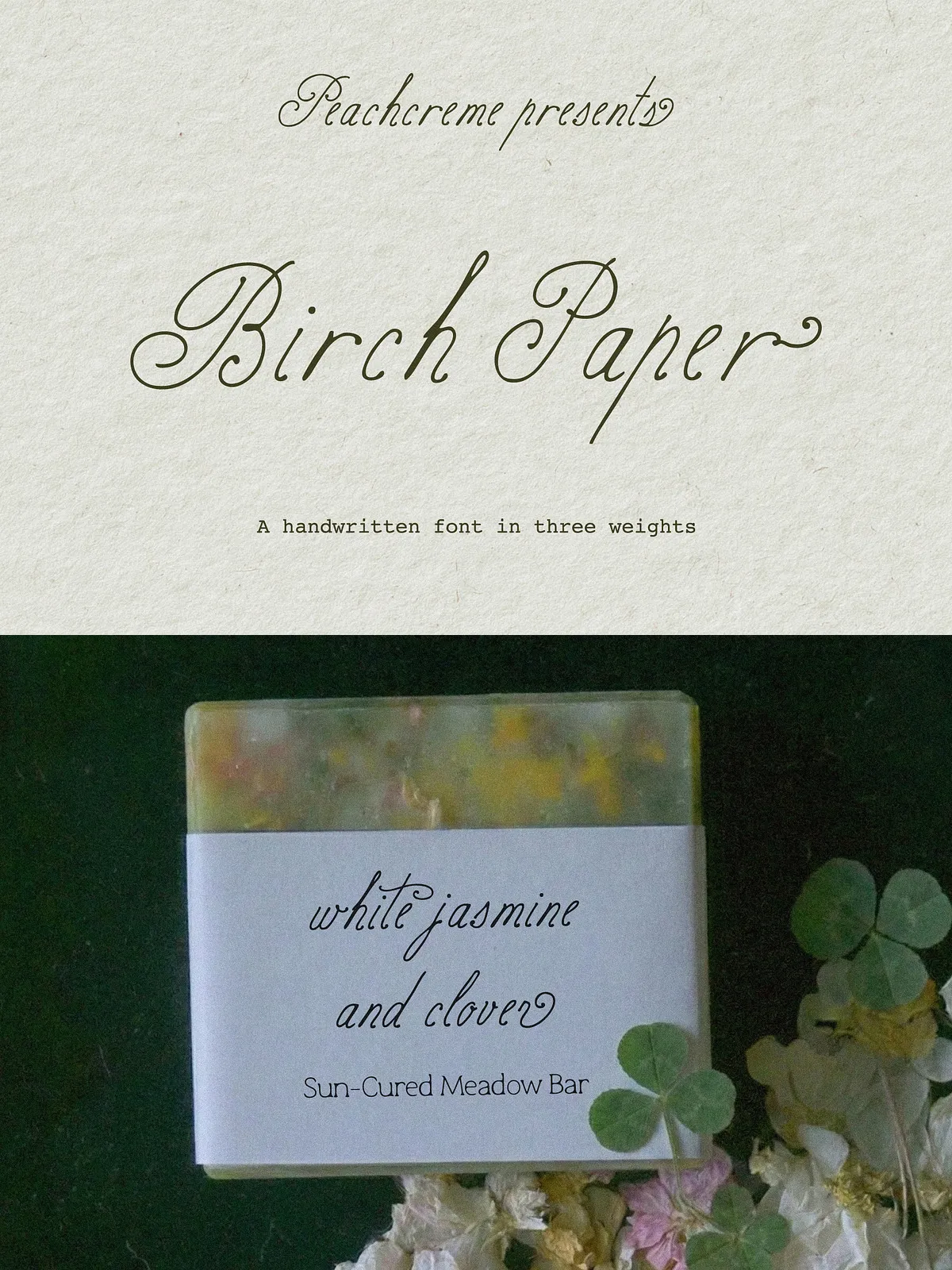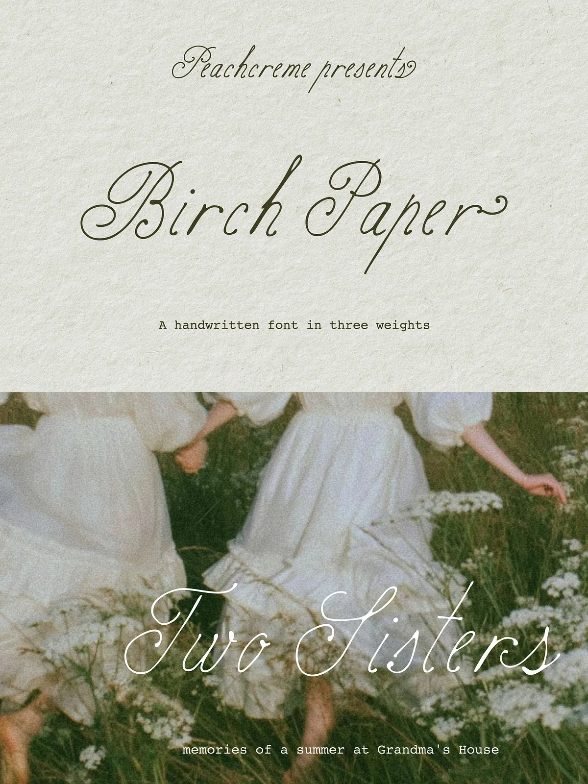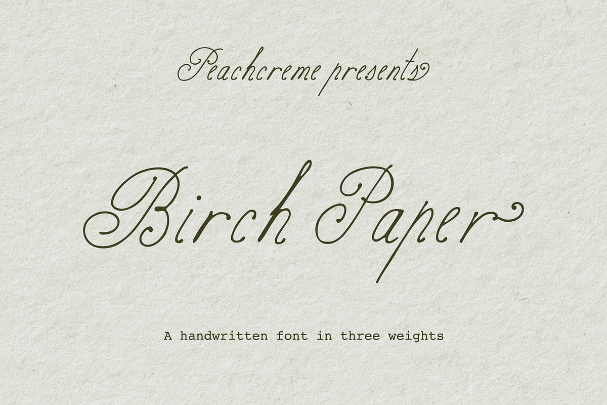

Birch Paper captures the subtle imperfections and human energy of real handwriting. Instead of polished calligraphic perfection, this script embraces slight wobbles, varied stroke pressure, and natural rhythm. The result gives your projects an authentic, handcrafted personality that reads as warm, approachable, and distinctly human. Use Birch Paper to add intimacy and character to brand identities, invitations, packaging, social graphics, and editorial layouts.
The Collection
Three weights tuned for versatility
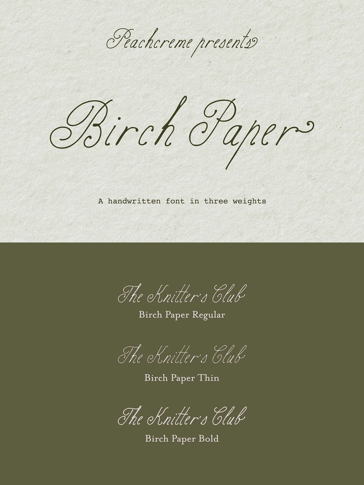
The family provides three complementary weights that preserve the same skeletal structure while offering different visual strength and presence:
- Birch Paper Thin: a delicate, airy stroke that works well for subtle accents, fine print, and layered compositions where a light touch supports the design.
- Birch Paper Regular: a balanced everyday weight ideal for body headlines, friendly brand text, and primary usage across both digital and print media.
- Birch Paper Bold: a stronger expression that maintains the hand-drawn character while increasing readability at larger sizes or on textured backgrounds.
Features
Designed for natural flow and flexibility
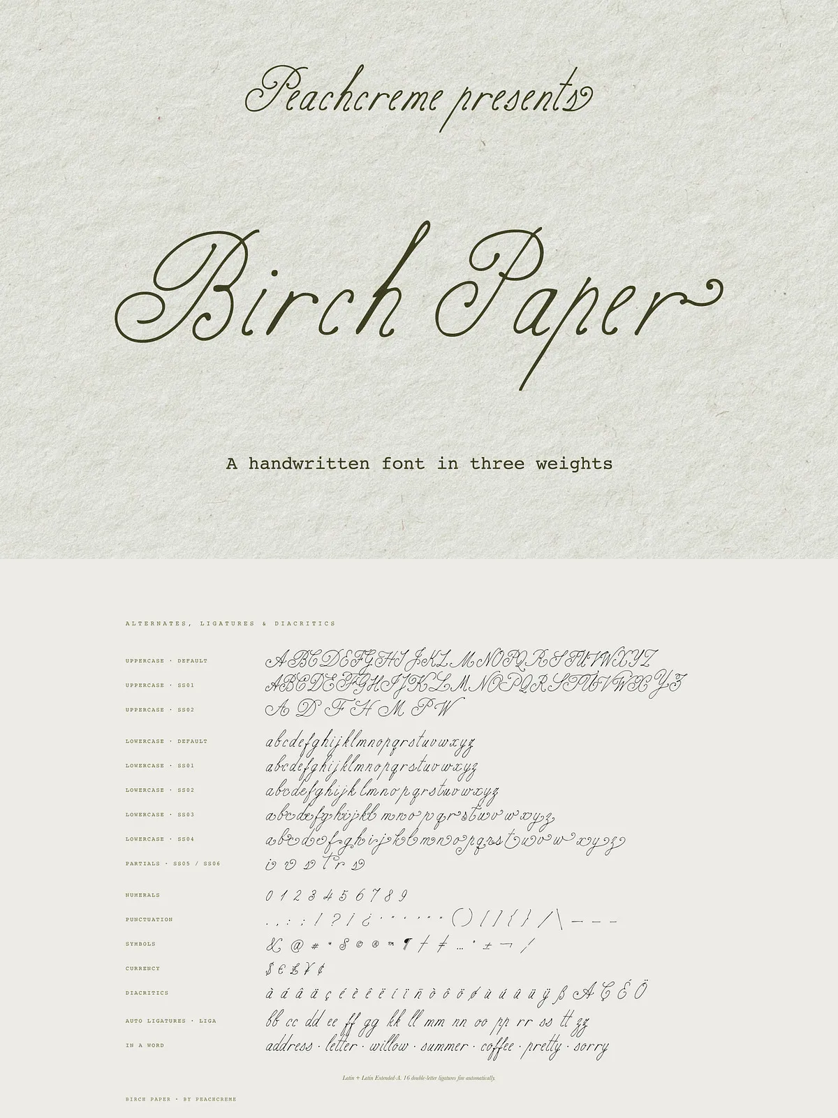
Birch Paper includes alternate characters for uppercase and lowercase letters to reduce mechanical repetition and produce a convincing handwritten rhythm. These alternates let you create varied word shapes and avoid an artificial, repeated look. The family also supports standard punctuation, numerals, and commonly used marks so you can set full sentences and formatted content without workarounds.
Alternates & Character Behavior
How alternates improve realism
Every letter in Birch Paper offers at least one alternate form. Use alternates to build lively word shapes and authentic run-on strokes. When you enable alternates and contextual alternates in your design tool (OpenType features where available), the font swaps characters automatically to mirror natural handwriting behavior. For manual control, you can pick alternates from the glyph panel to fine-tune specific words or lock in a preferred style.
Practical Applications
Where Birch Paper performs best
- Brand identity — craft approachable logos and tagline treatments that feel personal and artisanal.
- Wedding stationery — compose invitations, RSVP cards, and envelopes with a warm, handwritten tone.
- Product packaging — add a handcrafted touch to labels, tags, and small-batch product branding.
- Social media graphics — create personable headlines and overlays that connect with audiences at a glance.
- Editorial design — deploy Birch Paper as pull quotes, section headers, or special-callout type to introduce contrast and personality.
Pairing and Styling Tips
Combine Birch Paper with neutral companions
Pair Birch Paper with a clean sans serif for body text to preserve readability while letting the script supply warmth. For a refined look, combine the script with a restrained serif for captions and long copy. Use generous line-height and letter spacing when setting longer lines to preserve legibility. When layering the script over textured or photographic backgrounds, add subtle contrast (shadows or translucent panels) to keep strokes clear.
Installation, Formats & Licensing
Getting started and complying with usage terms
Install Birch Paper using your system font manager or the design app’s font installer. The package typically includes common formats such as OTF and TTF — check your download bundle for exact file types. Review the included license file to ensure your intended use (personal, commercial, webfont, or extended resale) complies with the terms. If you need clarification or a custom license, contact the seller or foundry before embedding the font in products for resale.