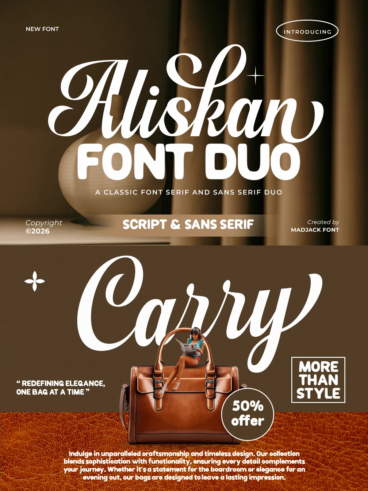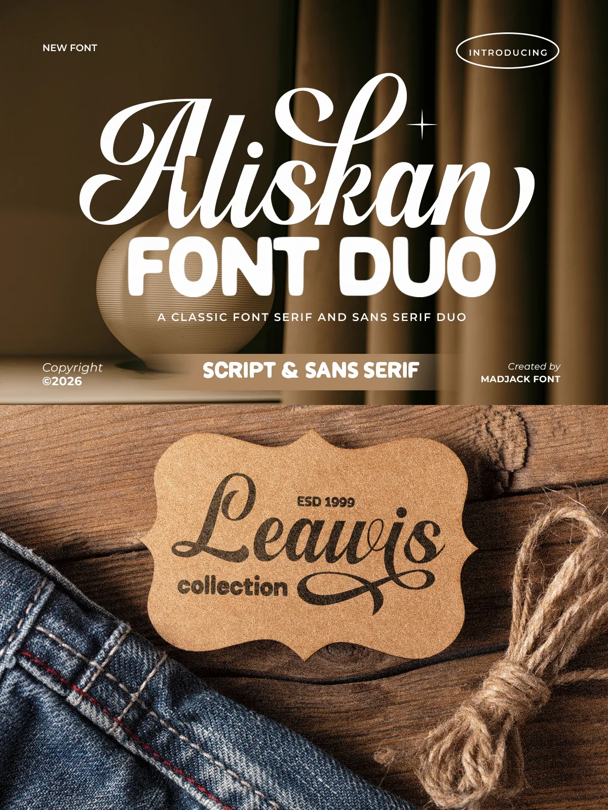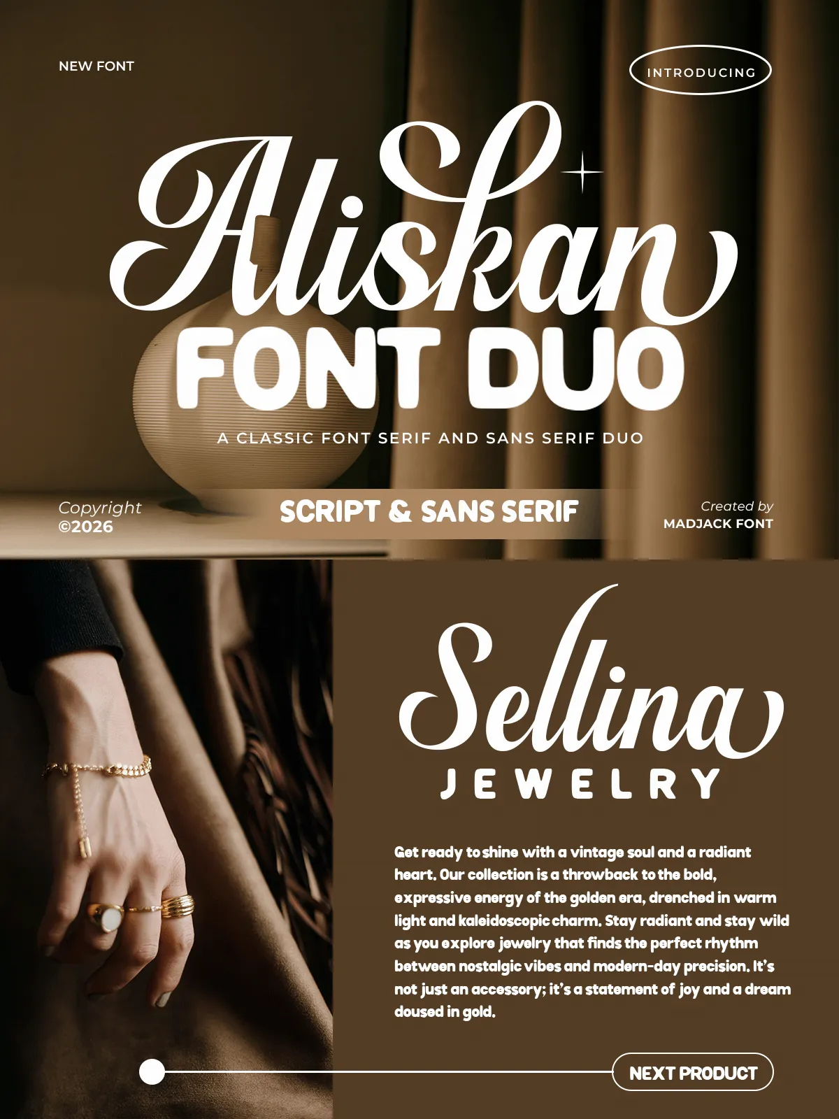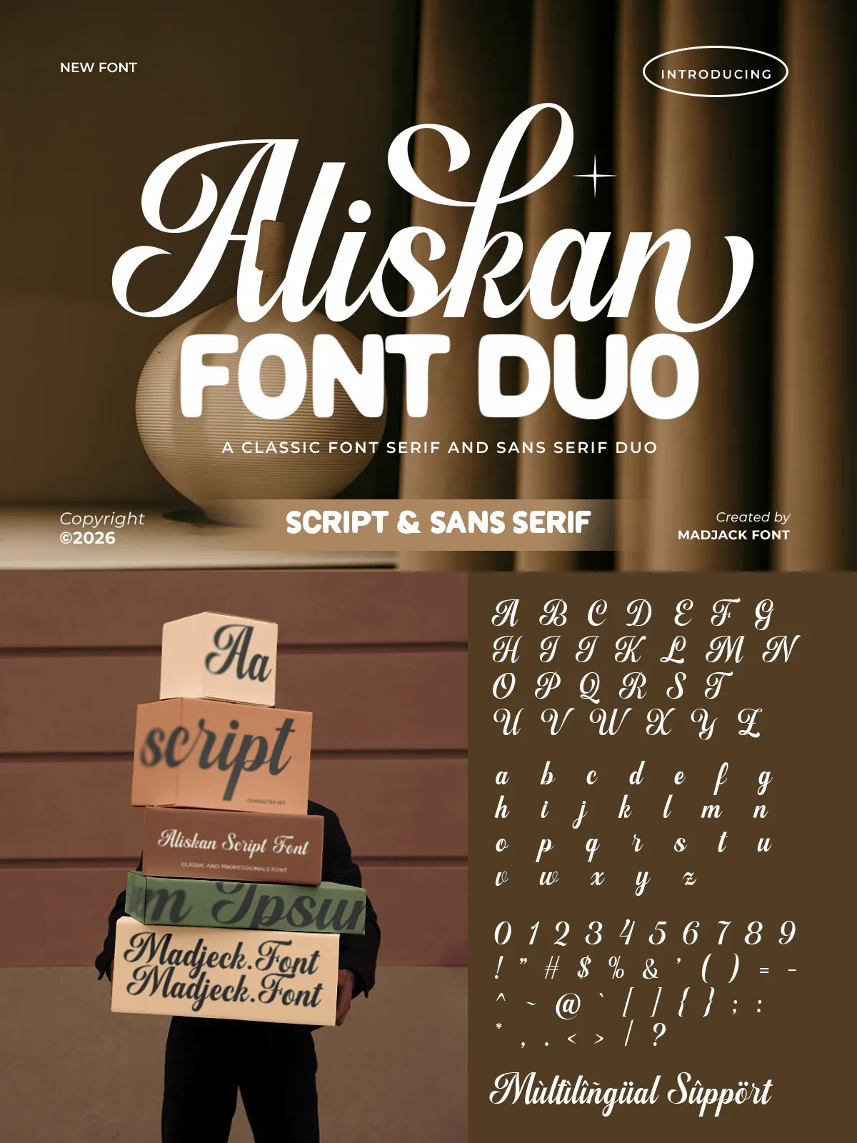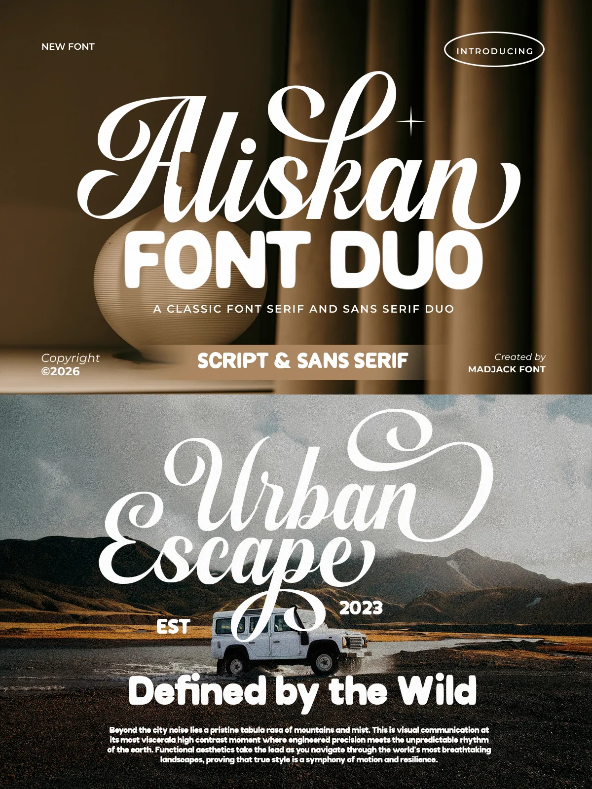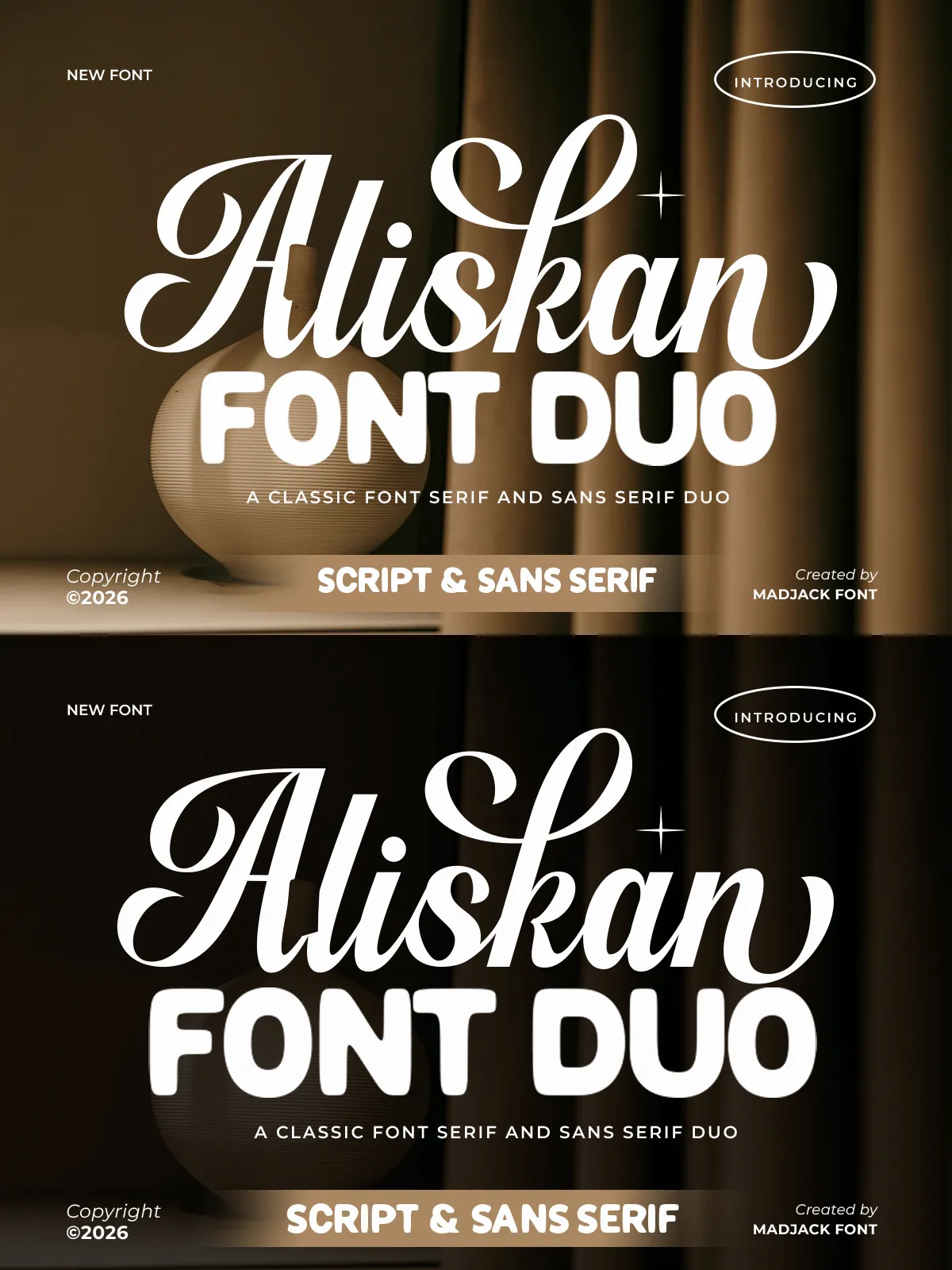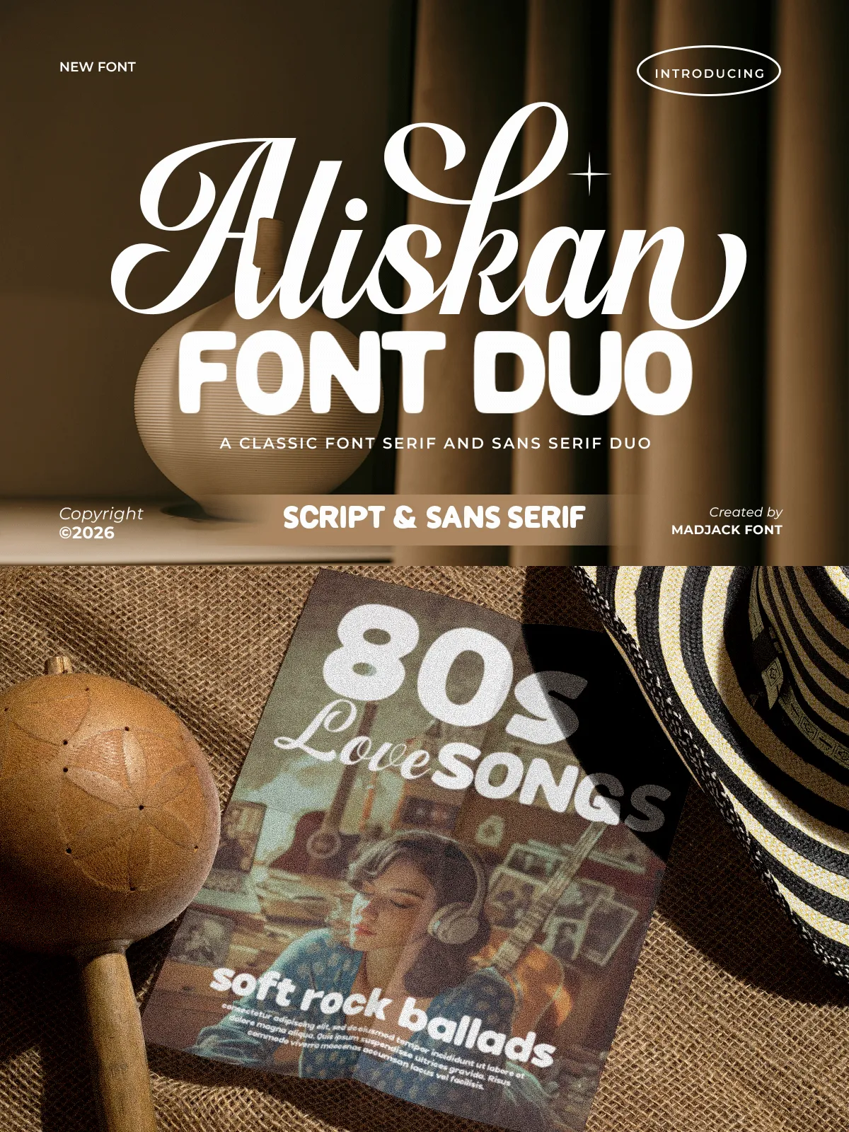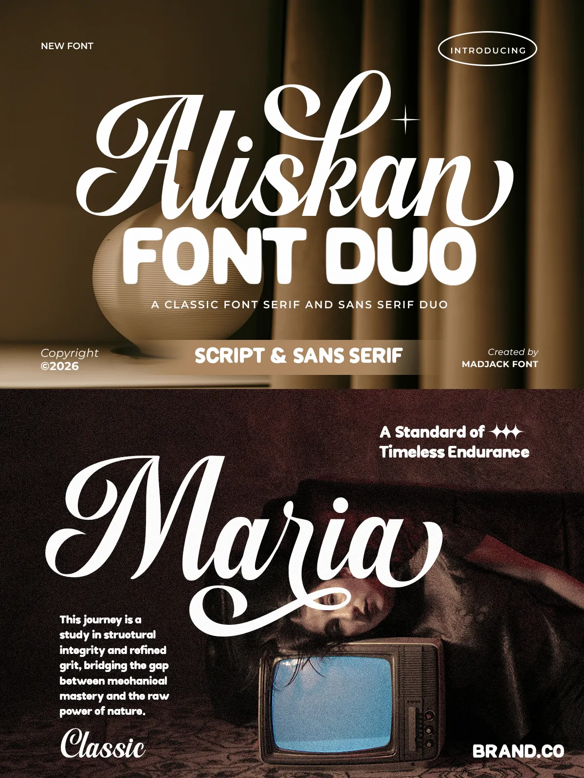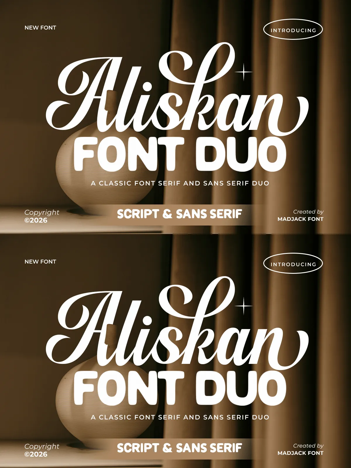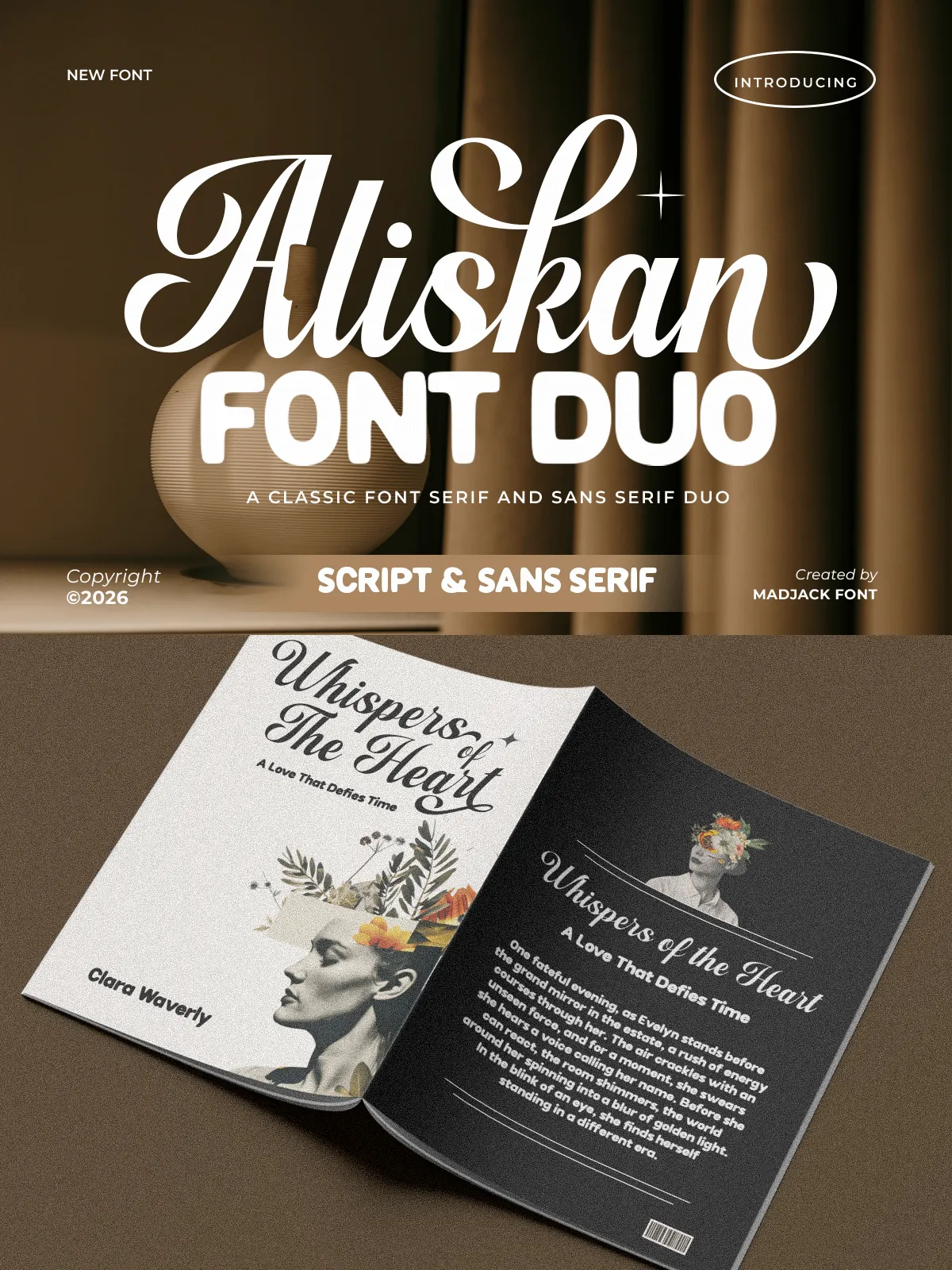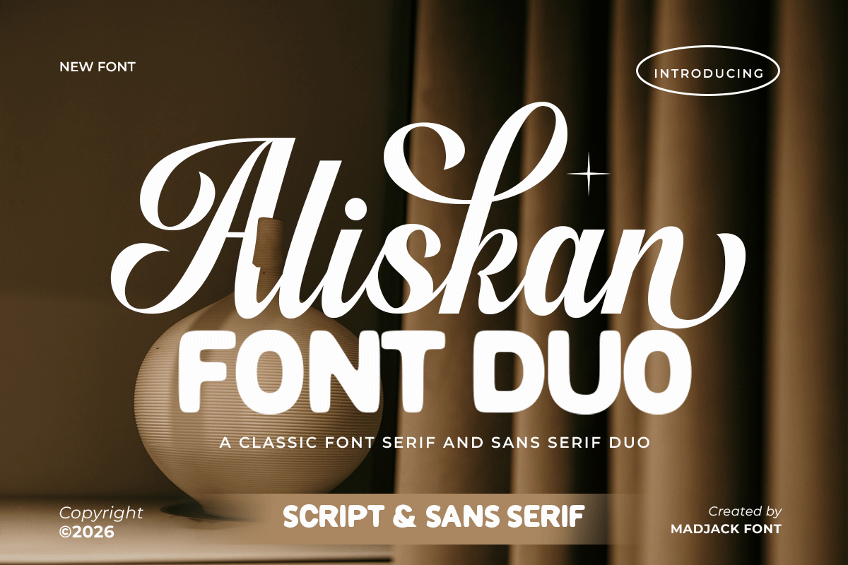

Aliskan Font Duo combines a refined, elegant serif with a clean, contemporary sans to create a versatile typography system that elevates visual identity across print and digital work. Designed with subtle curves, carefully crafted ligatures, and complementary weight contrast, Aliskan provides designers with a cohesive toolkit for building premium brands, wedding stationery, packaging, editorial layouts, and social media assets. The duo balances classic beauty with modern clarity, allowing you to make confident typographic choices that read as both timeless and current.
Design Features
Craftsmanship and character
The serif member of the duo presents graceful terminals, moderate contrast, and refined proportions that read beautifully at display sizes. It lends character and a sense of heritage to headlines, logos, and invitations. The sans companion offers neutral geometry, generous x-height, and approachable forms that maintain legibility in body copy and UI. Together, the pair provides visual hierarchy and flexibility: use the serif to announce and the sans to inform.
Primary Uses
Where Aliskan performs best
- Branding & Logos: Create distinctive marks that feel curated and premium by pairing the serif for the brand name with the sans for taglines and submarks.
- Wedding Invitations & Stationery: Deliver a romantic, elegant tone with serif headlines and clean sans supporting details for RSVP cards, signage, and programs.
- Packaging & Labels: Communicate craftsmanship and quality on product labels, cosmetics, and boutique food packaging by combining stylized display serif with practical sans copy.
- Editorial & Lookbooks: Structure spreads with striking serif headings and readable sans body text for fashion editorials and luxury catalogs.
- Digital & Social Design: Craft cohesive feed templates and promotional graphics that maintain clarity across screen sizes.
Type System & Options
Weights, styles, and OpenType features
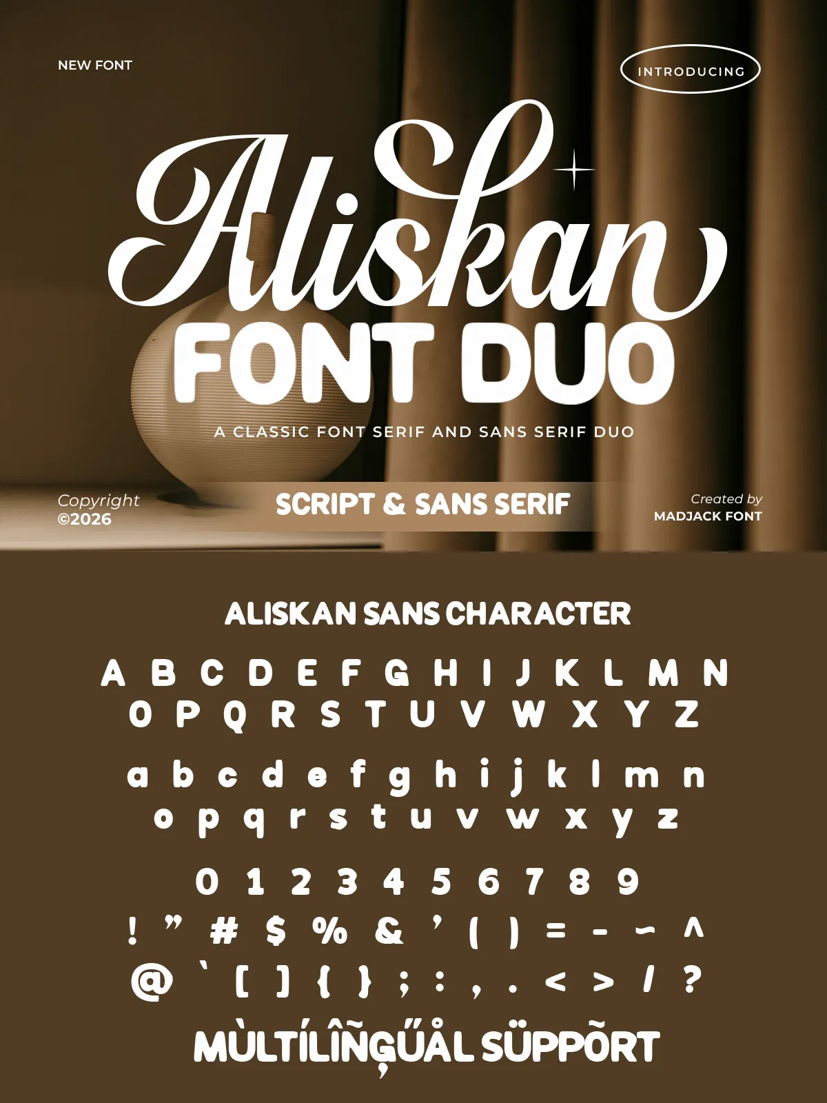
Aliskan Font Duo ships with a thoughtful range of weights for both serif and sans members, enabling flexible typographic rhythm. Expect multiple weights (Light to Bold), essential italics, and OpenType features such as ligatures, discretionary alternates, and small caps where appropriate. These features let you refine logo treatments and editorial hierarchies while keeping type consistent across applications.
Pairing Recommendations
How to combine Aliskan effectively
For polished identity systems, use the serif for primary headlines and brand marks, then apply the sans for navigation, captions, and long-form content. When designing invitations, set names and venue titles in the serif at larger sizes and use the sans for details like dates and addresses. Pair Aliskan with warm color palettes, tactile paper stocks, or subtle paper textures to emphasize an artisanal, high-end feel.
Technical Delivery & Formats
Implementation and workflow tips
Aliskan integrates smoothly into typical design workflows. Install desktop OTF/TTF files for print and layout tools, and use webfont formats (WOFF/WOFF2) or @font-face for online use. When working in CSS, define distinct font-family fallbacks for serif and sans roles to preserve hierarchy if webfonts fail to load. Optimize letter-spacing for display serif titles and slightly tighter tracking for sans body copy to enhance readability.
Licensing and Support
Choose the right license for your project
Confirm the license bundled with Aliskan to ensure permitted commercial use, client work, web embedding, and product distribution. If you plan to include fonts in merchandise or high-volume applications, consider extended licensing options. Consult vendor documentation for language support, kerning details, and installation instructions.