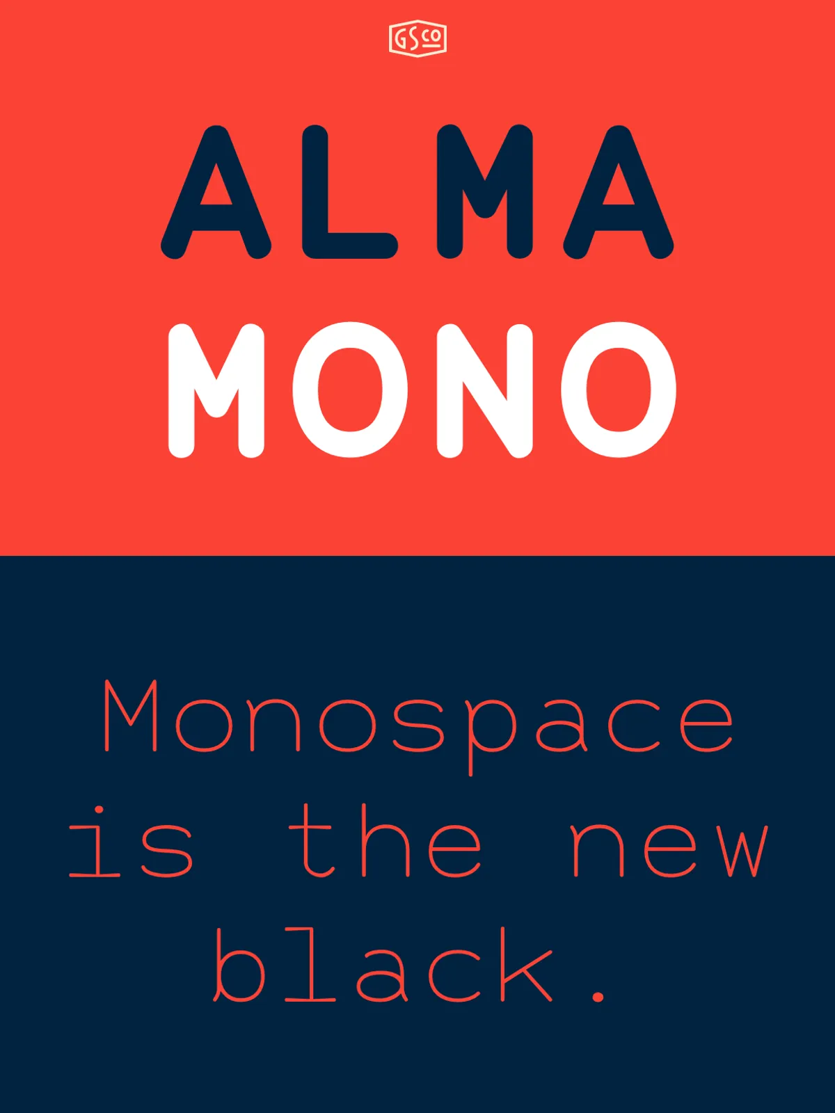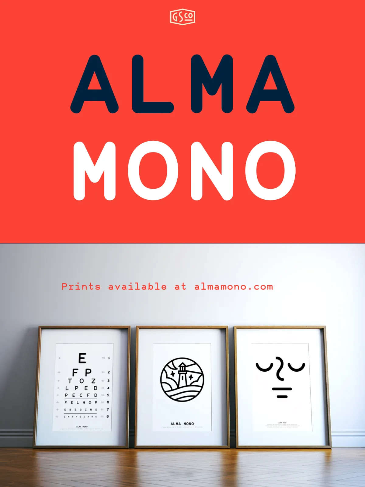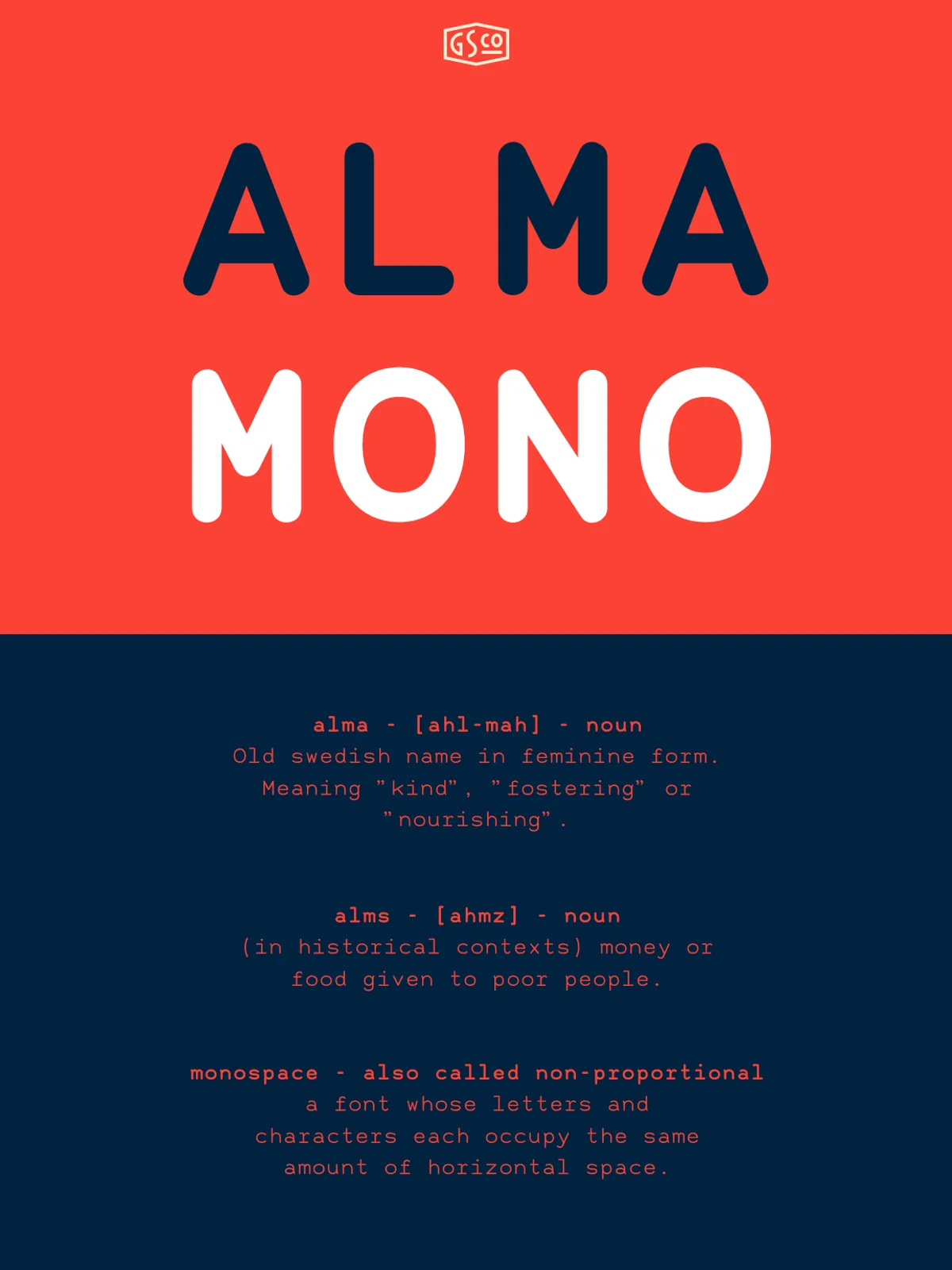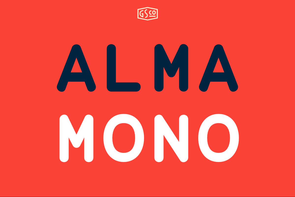
Alma Mono breaks the mold of cold, rigid monospace fonts with a refreshingly human touch. Designed for those who value clarity but also appreciate warmth, this typeface brings a friendly personality to every character. Its rounded terminals soften the mechanical rigidity traditionally associated with monospaced fonts, making it ideal for interfaces, code, and narrative text alike.
Unlike older typewriter-style monospaced fonts, Alma Mono balances structure with approachability. Every letter—whether a lowercase “i” or a capital “M”—occupies the same width, preserving consistent alignment across columns and code blocks, while subtle curves inject visual rhythm and ease of reading.
Five Weights for Every Design Need
From delicate detail to bold statement
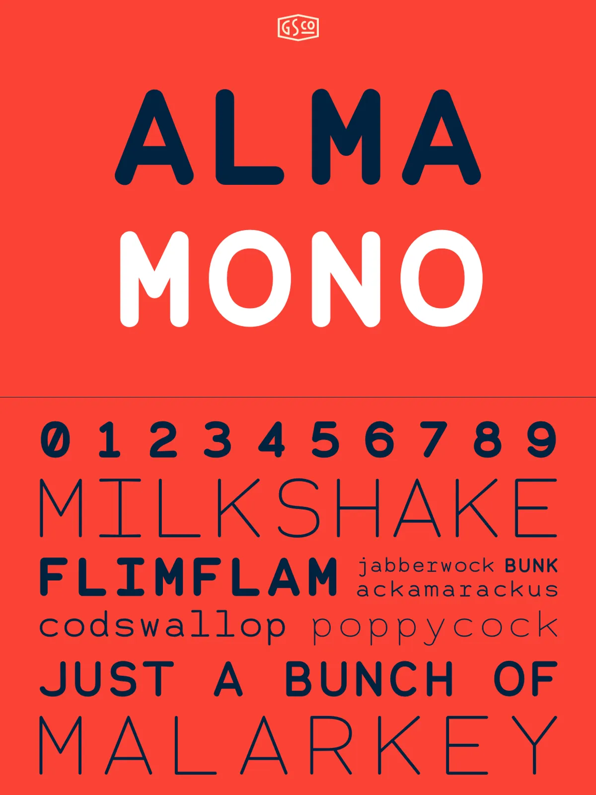
With five distinct weights—Thin, Light, Regular, Medium, and Bold—Alma Mono offers unmatched versatility. Use the lighter weights for elegant body text in digital articles, documentation, or blog layouts. Shift to Medium or Bold for impactful headlines, UI labels, or display text where presence matters.
Its range ensures seamless transitions between micro and macro typographic elements. Whether you’re coding in a clean editor, crafting a designer portfolio, or drafting a manifesto, Alma Mono adapts without losing its distinctive voice.
Engineered for Both Code and Creativity
Designed to perform, not just look good
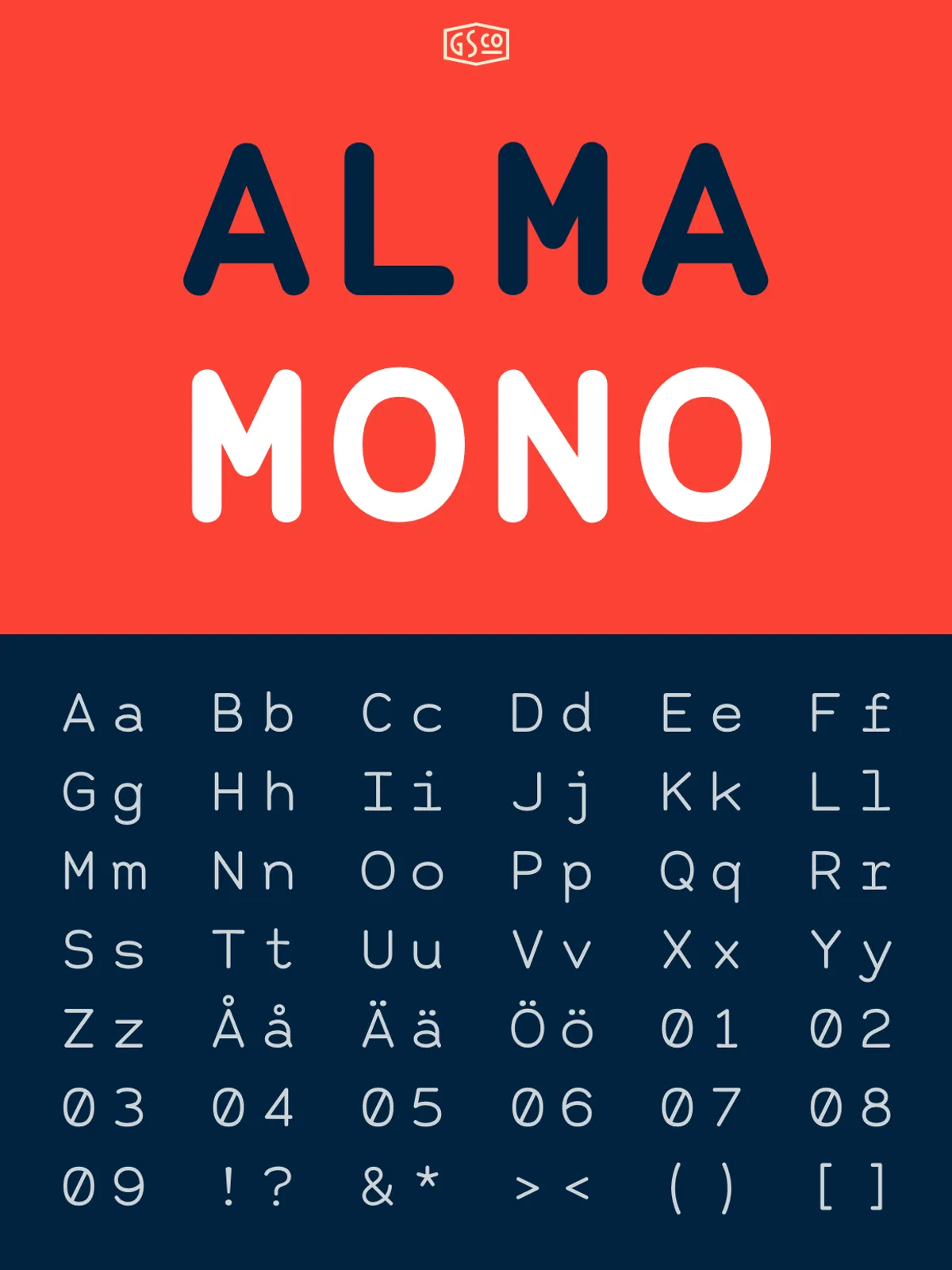
Alma Mono thrives in high-demand environments. Its consistent spacing and legible character forms prevent fatigue during long coding sessions. The clear distinction between glyphs—like the open center of “0”, the dot on “i”, and the bracketed tail of “l”—reduces cognitive load, minimizing mistyped characters and speeding up development workflows.
Beyond code, Alma Mono performs exceptionally in design. Use it in branding for tech startups, in editorial design for creative publications, or in motion graphics where readability under stress is crucial. This isn’t just a font for developers—it’s a full-featured tool for visual storytellers.
Perfect for Long-Form Reading and Digital Interfaces
Warmth without compromise on clarity
Traditionally, monospaced fonts struggle with long-form readability due to their blocky, rigid form. Alma Mono overturns this limitation. Its rounded terminals create a more fluid reading experience, reducing visual static and letting readers focus on content rather than font fatigue.
Tested across mobile screens, tablets, and wide desktop displays, Alma Mono maintains high legibility at any size. It’s a standout choice for markdown content, API documentation, digital zines, and responsive websites that demand both aesthetic harmony and practical function.
Unleash Your Typography with Alma Mono
Build with intention. Design with warmth.
Alma Mono is more than a typeface. It’s a philosophy of design—one where technology meets empathy. Whether you’re a programmer writing clean code, a designer crafting intuitive interfaces, or a writer sharing stories through digital platforms, Alma Mono delivers precision with a smile.
Discover the future of monospaced type—where functionality meets friendliness. Download Alma Mono today and transform how your words are seen, read, and remembered.