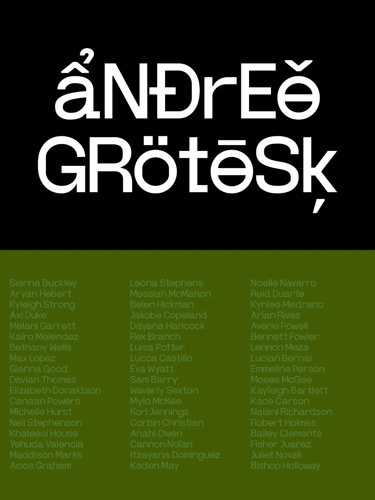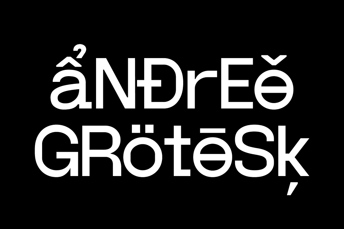
Andree Grotesk originates from the combined sensibilities of a graphic designer and a type designer. The family intentionally shifts emphasis away from pure, neutral readability and toward visual interest. Each glyph asserts a distinct personality: stems push, counters breathe, and terminals show attitude. The result actively communicates mood and tone as much as content.
Visual Characteristics
Bold, expressive letterforms
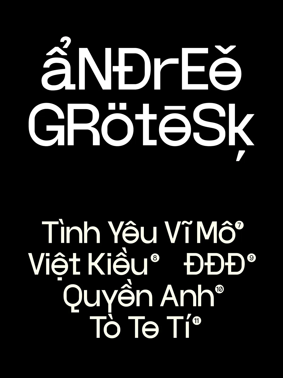
Andree Grotesk features exaggerated proportions and unexpected details that draw the eye. Letters may display playful or assertive curves, asymmetric terminals, or distinct junctions that break from the orthodox grotesk model. These choices create visual tension and energy, making headlines and display text feel alive and deliberate.
Contrasts and rhythm
The typeface balances measured contrast with irregular accents. Designers crafted open counters and purposeful stroke modulations so the face reads as lively at large sizes while maintaining sculptural clarity in mid-scale editorial use. The rhythm of repeated forms creates a recognizable voice across words and lines.
Intended Use & Applications
When to choose Andree Grotesk
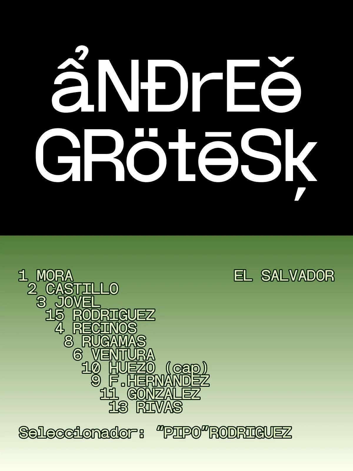
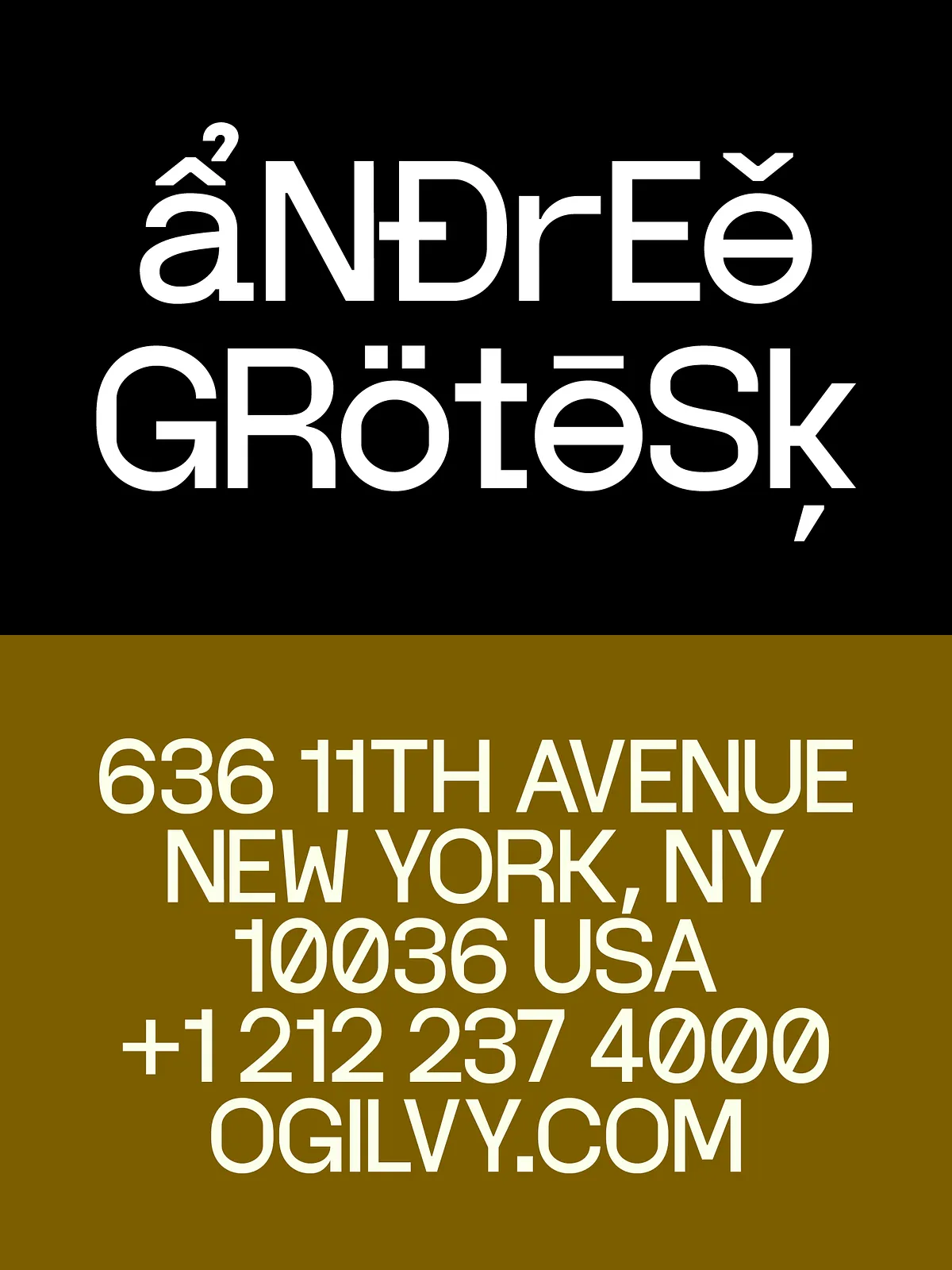
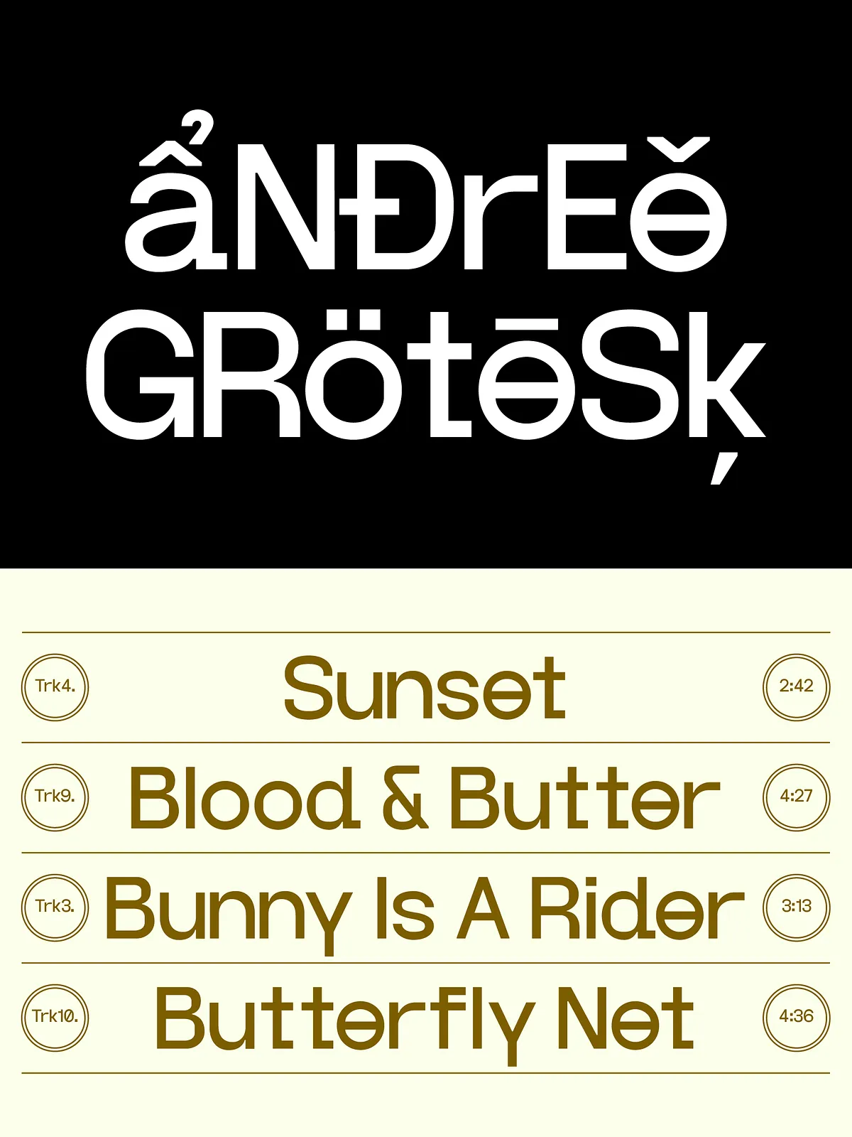
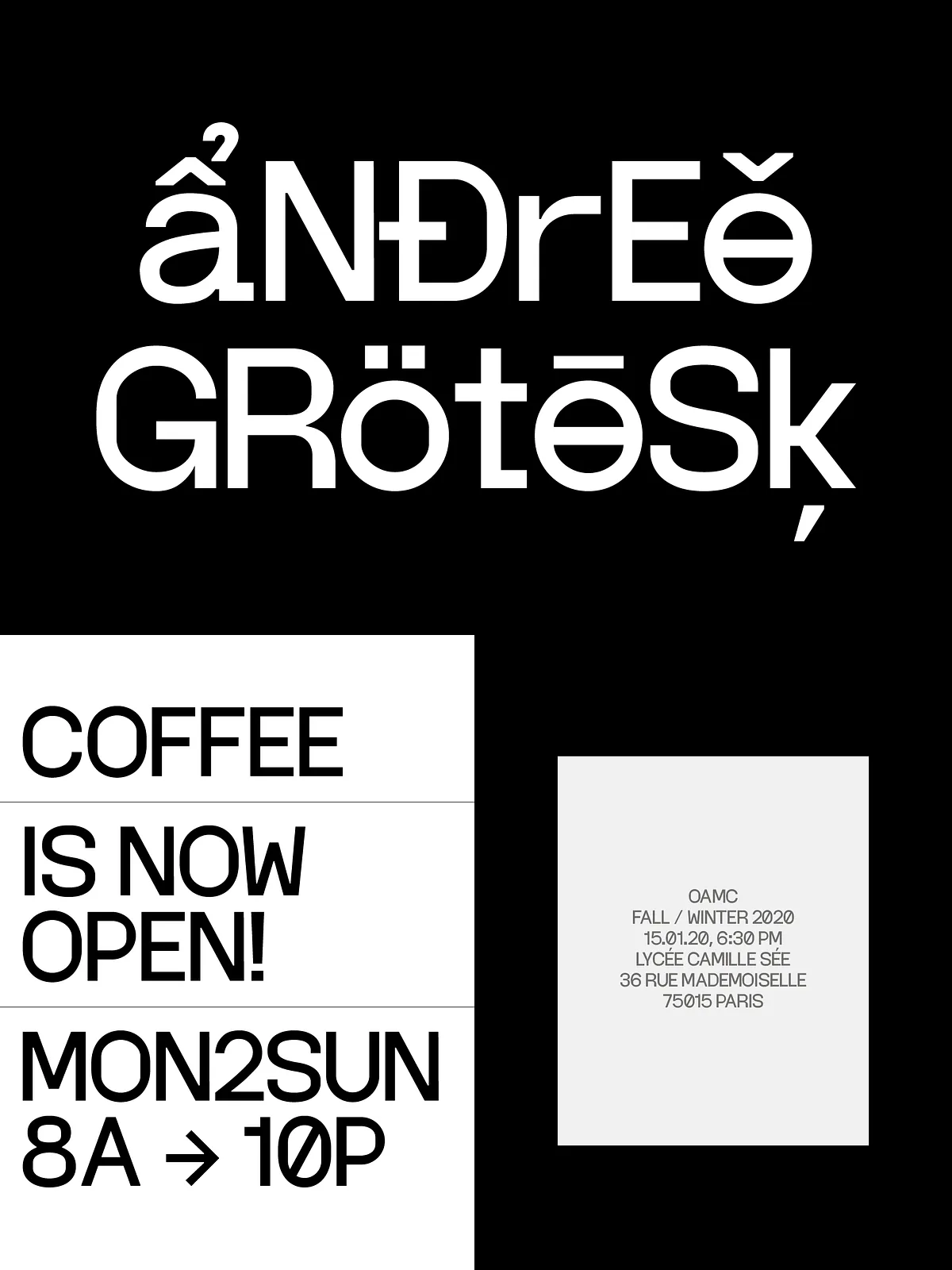
Use Andree Grotesk when personality matters more than neutral invisibility. It excels in branding, posters, fashion editorials, album art, packaging, and website hero headlines. The face commands attention in environments where a distinctive typographic voice enhances messaging and sparks emotional resonance.
When to avoid it
Because Andree Grotesk prioritizes visual expression, avoid using it for long passages of small body text, dense documentation, or UI microcopy where maximum legibility and unobtrusive neutrality are required. For those contexts, pair it with a neutral text face to maintain readability without losing the brand voice.
Pairing & Styling Tips
Complementary type pairings
Pair Andree Grotesk with a calm, humanist or geometric sans serif for body copy. Let Andree Grotesk take the lead in headlines and display settings while the secondary face supports reading flow. For editorial spreads, contrast the grotesk’s personality with a restrained serif to create elegant tension.
Practical styling advice
- Use generous tracking for large headlines to let the unique shapes breathe and register.
- Reserve tight letterspacing for bold, compact display blocks where energy and density suit the layout.
- Experiment with case and size hierarchy—Andree Grotesk performs strongly in uppercase for assertive statements.
- Combine color and texture to highlight distinctive terminals and counters; the type’s personality responds well to expressive color palettes.
Technical Details
Character set and formats
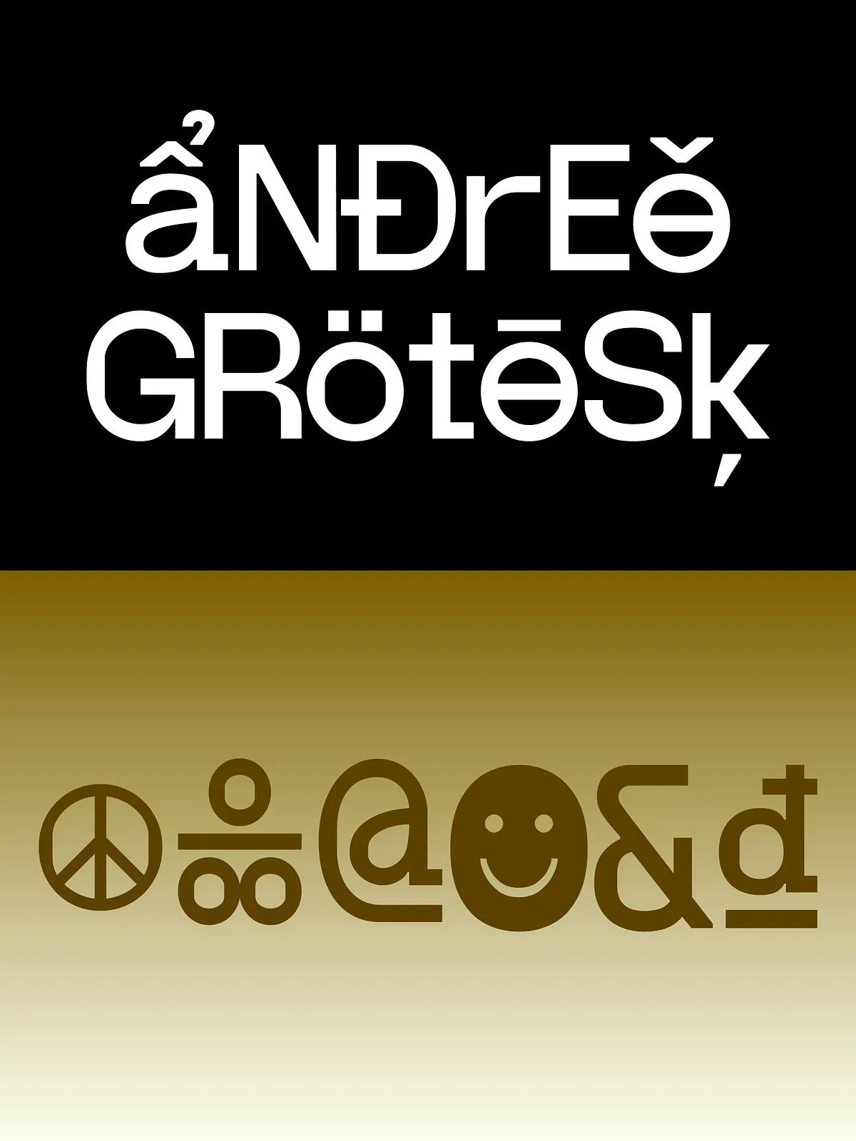
The family ships with a thoughtfully constructed character set that covers essential Latin glyphs and common punctuation. Depending on the release, Andree Grotesk may include stylistic alternates, small caps, and variable weight options to increase flexibility in design systems.
OpenType features
OpenType features such as discretionary ligatures and stylistic sets unlock alternate letter treatments that enhance the expressive potential of the face. Designers can toggle these features to dial the voice up or down according to the project’s needs.
Licensing & Usage
Commercial and editorial use
Review the provided license to confirm permitted uses for web embedding, desktop applications, app integration, and commercial distribution. If you plan widespread redistribution, multi-seat deployments, or embedding at scale, contact the foundry or author to obtain the appropriate license.