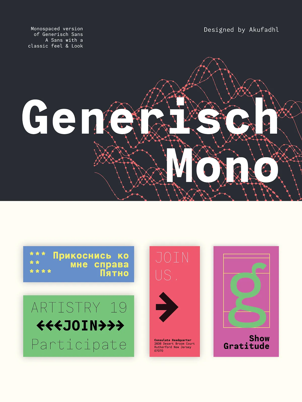
Generisch Mono brings the restrained clarity of Generisch Sans into a true monospaced format. Built for designers, developers, and publishers who want a neutral yet characterful monospace, Generisch Mono balances historical grotesk influences with modern production needs. It performs reliably in code editors, UI mockups, tables, and editorial settings where fixed-width alignment matters without sacrificing typographic nuance.
Design and inspiration
Roots in early 20th-century grotesks
The design channels the functional simplicity of early grotesk typefaces from the first decades of the 1900s. Generisch Mono preserves that straightforward, utilitarian spirit while refining proportions for contemporary screens and print. Letters read cleanly at small sizes; at larger display sizes the family reveals subtle personality in stroke endings and terminal shapes. The monospaced metrics capture rhythm and regularity, giving layouts a stable, engineered feel.
Distinguishing features
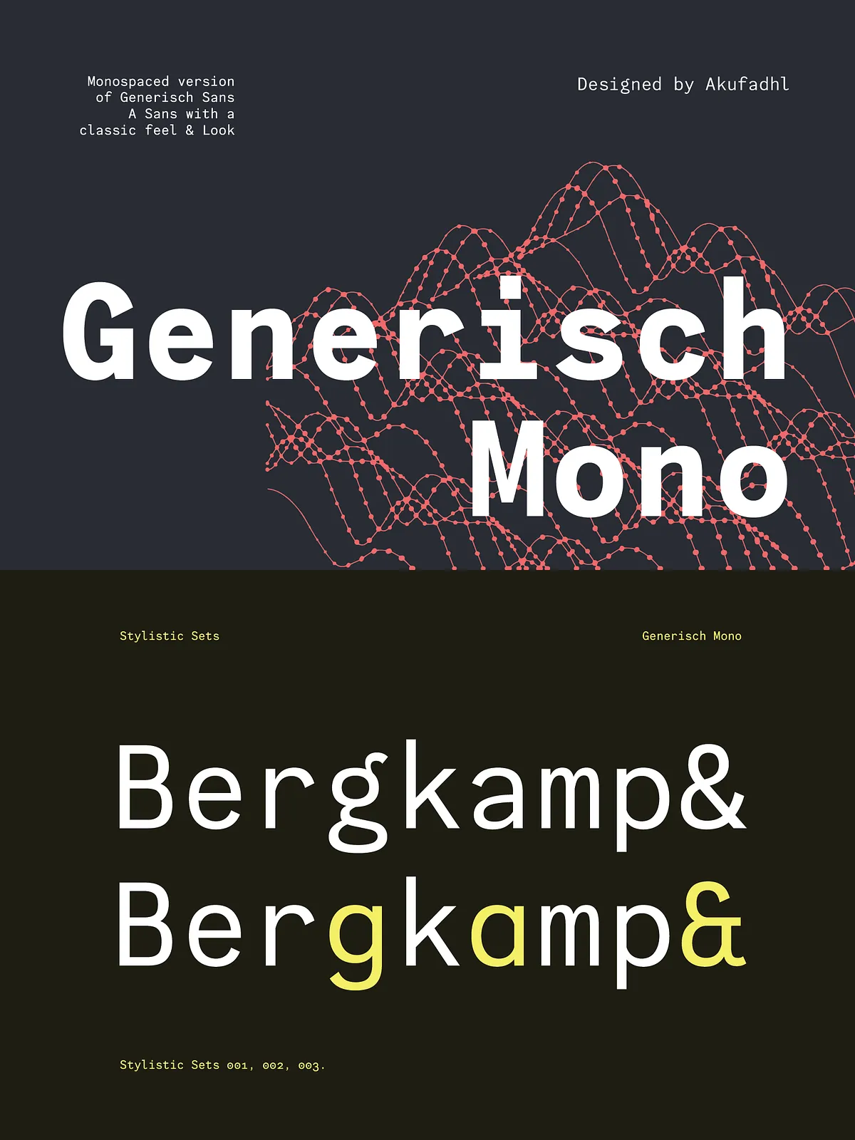
Generisch Mono includes several practical features that boost typesetting quality and creative flexibility. The face carries selected historic ligatures — including “ch”, “ck”, and “ng” — to echo traditional typesetting conventions and to provide smoother visual joins where appropriate. The family also supplies an old-style numeral set to improve the appearance of numeric text in continuous paragraphs, bills, and editorial copy. These touches support better typographic color and more refined text blocks than typical geometric monospaces.
Language support and growth
Current scripts and planned expansions
Generisch Mono currently supports Latin script with coverage for over 30 languages, making it suitable for broad Western and Central European projects. The family also includes basic Cyrillic support, allowing straightforward use for simplified Cyrillic-language text. The foundry plans to expand language coverage over time: Arabic support is in development and expected to arrive next year, and additional Latin and Cyrillic glyphs will continue to roll out to accommodate international projects.
Use cases and practical applications
Where Generisch Mono excels
Adopt Generisch Mono whenever you need consistent character widths and a neutral, professional voice. Use it for code editors, terminal emulators, design systems, UI prototypes, and data tables where alignment matters. Its old-style numerals and selected ligatures also make it a good choice for editorial work that requires monospaced alignment — for example, poetry, code examples in books, or side-by-side translation layouts. Branding and packaging projects that require a mechanical or technical aesthetic can rely on Generisch Mono to communicate clarity and purpose.
Technical notes and typesetting
OpenType features and typographic behavior
Generisch Mono ships with thoughtfully selected typographic features. Use the old-style figures for body text to blend numbers with lowercase letters more harmoniously; enable discretionary ligatures for a more refined text flow when appropriate. Because it is a true monospace, each glyph occupies identical horizontal space, which ensures consistent grid alignment for tabular data and code blocks. The design favors legibility: counters, stroke contrasts, and x-height are tuned for clear reading on screens and print.
Licensing and availability
Where to preview and download
You can preview Generisch Mono on common font directories and download sources that host the family for desktop or web use. For the most current specimens, licensing options, and download packages, consult the font distribution page linked below. Always review the license terms to confirm permitted uses (web embedding, desktop installation, app integration, and commercial reproduction).