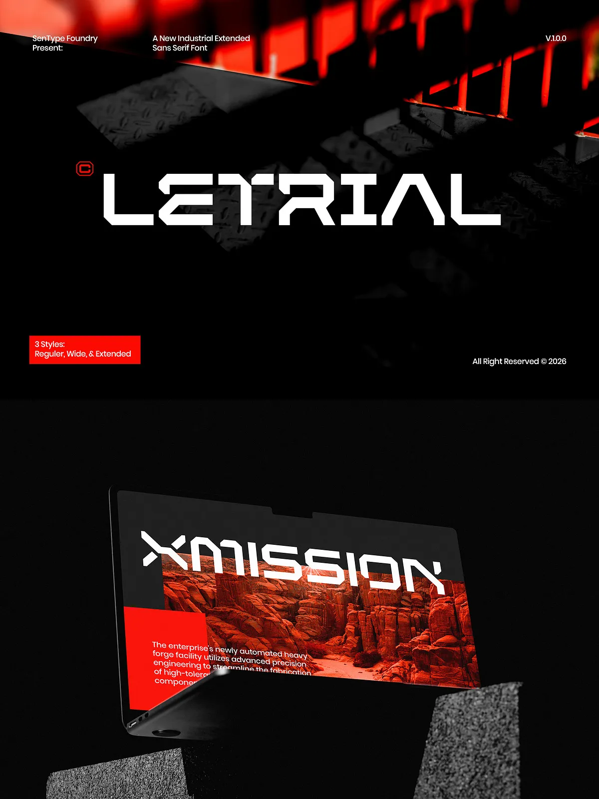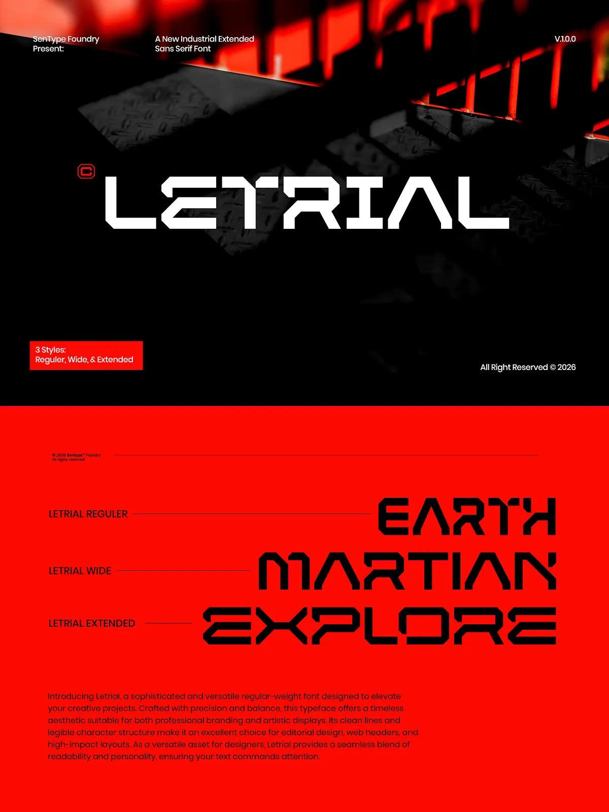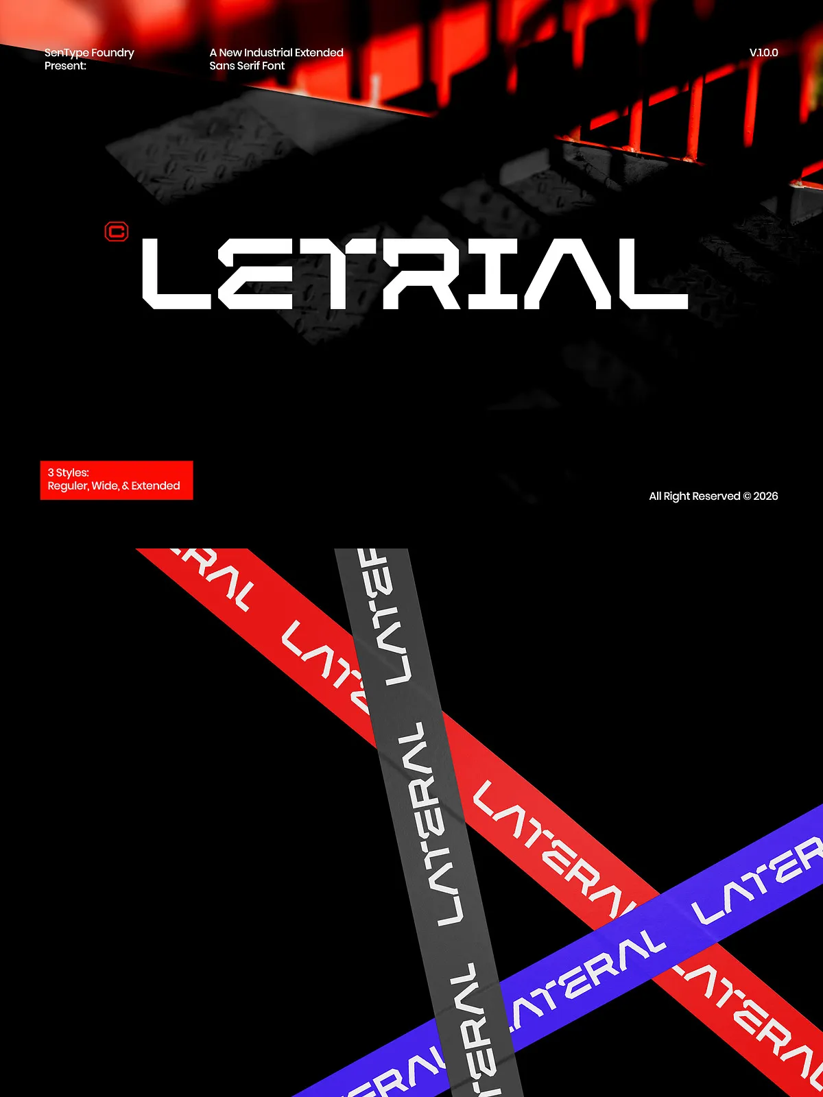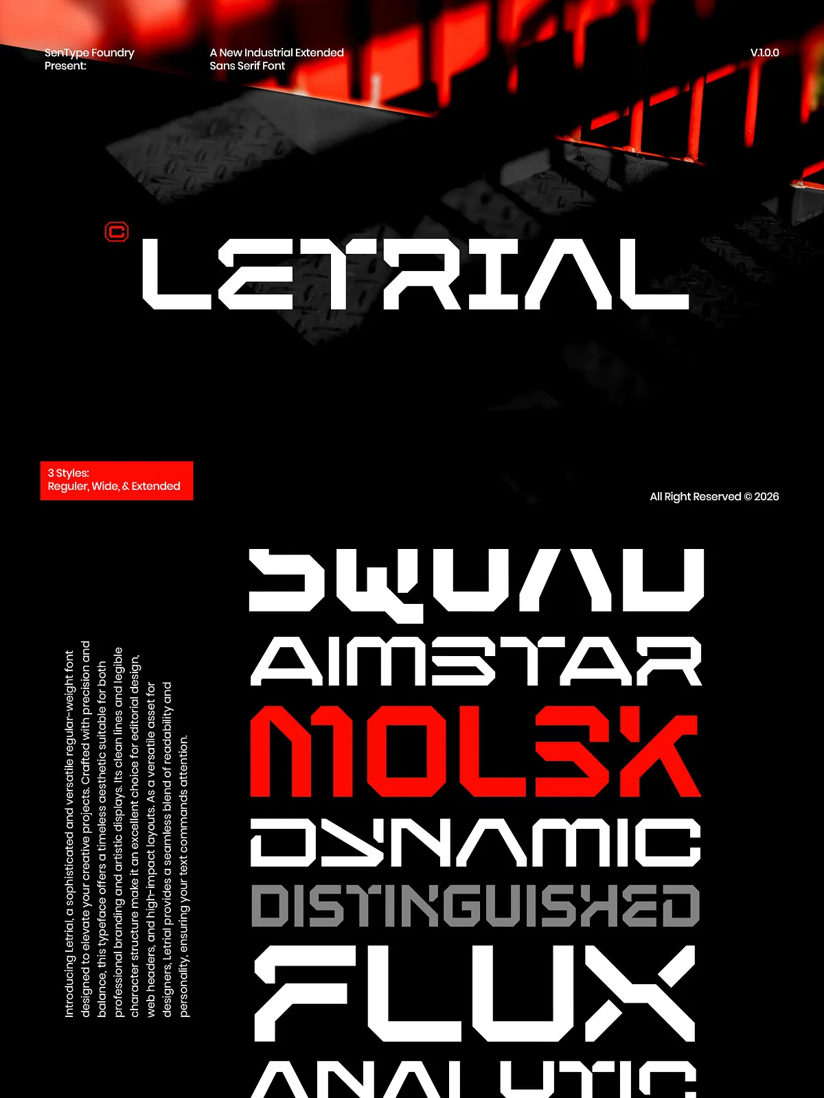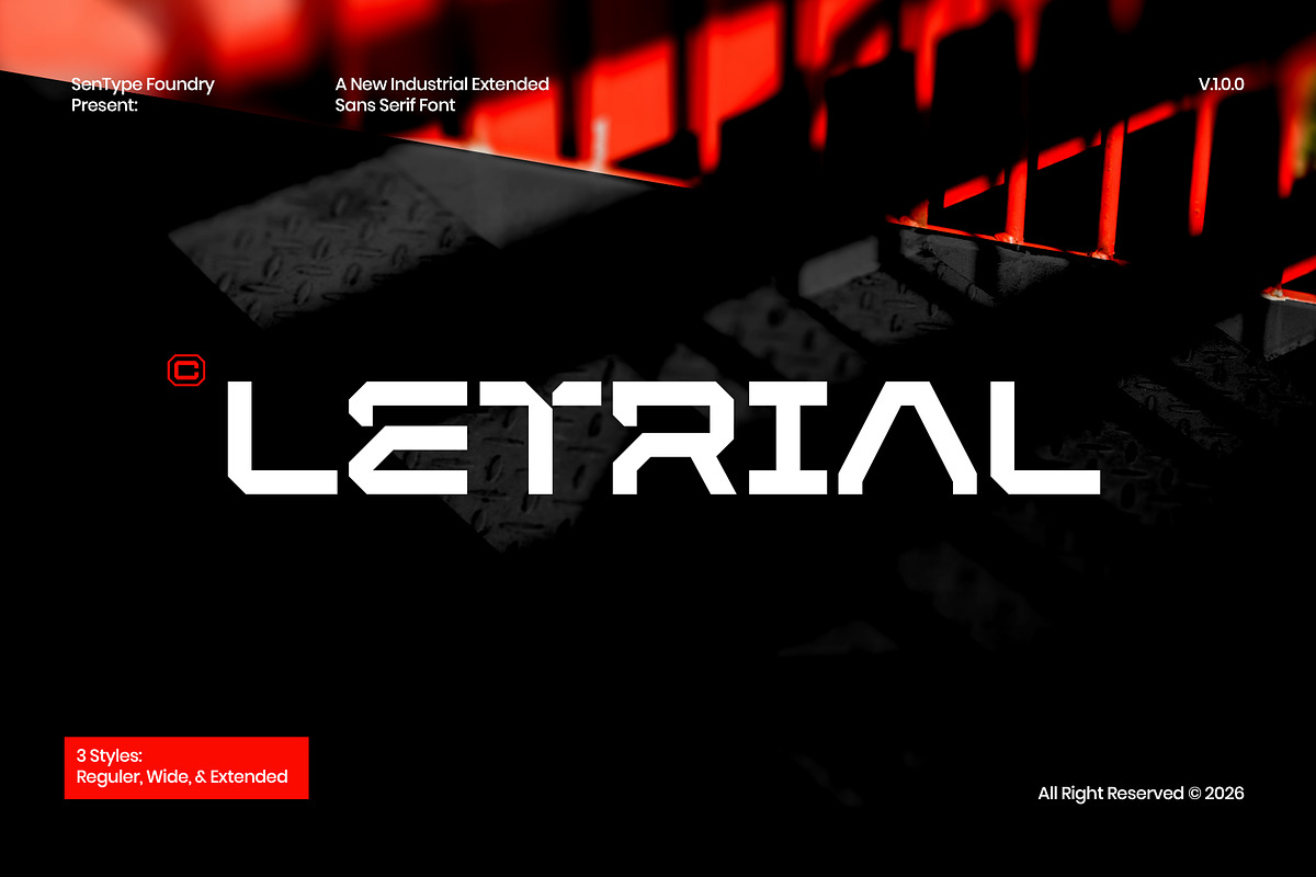

Introducing Letrial, a sophisticated and versatile regular-weight font meticulously crafted to elevate the visual impact of your creative projects. Designed with precision and an unwavering commitment to balance, this typeface offers a timeless aesthetic that seamlessly adapts to both professional branding strategies and artistic displays. Its clean lines and highly legible character structure make it an exceptional choice for editorial design, web headers, and high-impact layouts that demand clarity and elegance.
As a versatile asset for designers, Letrial provides a seamless blend of readability and subtle personality, ensuring that your text commands attention without overwhelming the viewer. The font’s thoughtful design ensures that every letterform contributes to a cohesive visual narrative, making it an ideal foundation for any design system. Whether you are crafting a corporate identity, designing a magazine layout, or building a website, Letrial offers the reliability and style necessary to bring your vision to life.
Key Features and Benefits
Timeless Aesthetic and Versatility
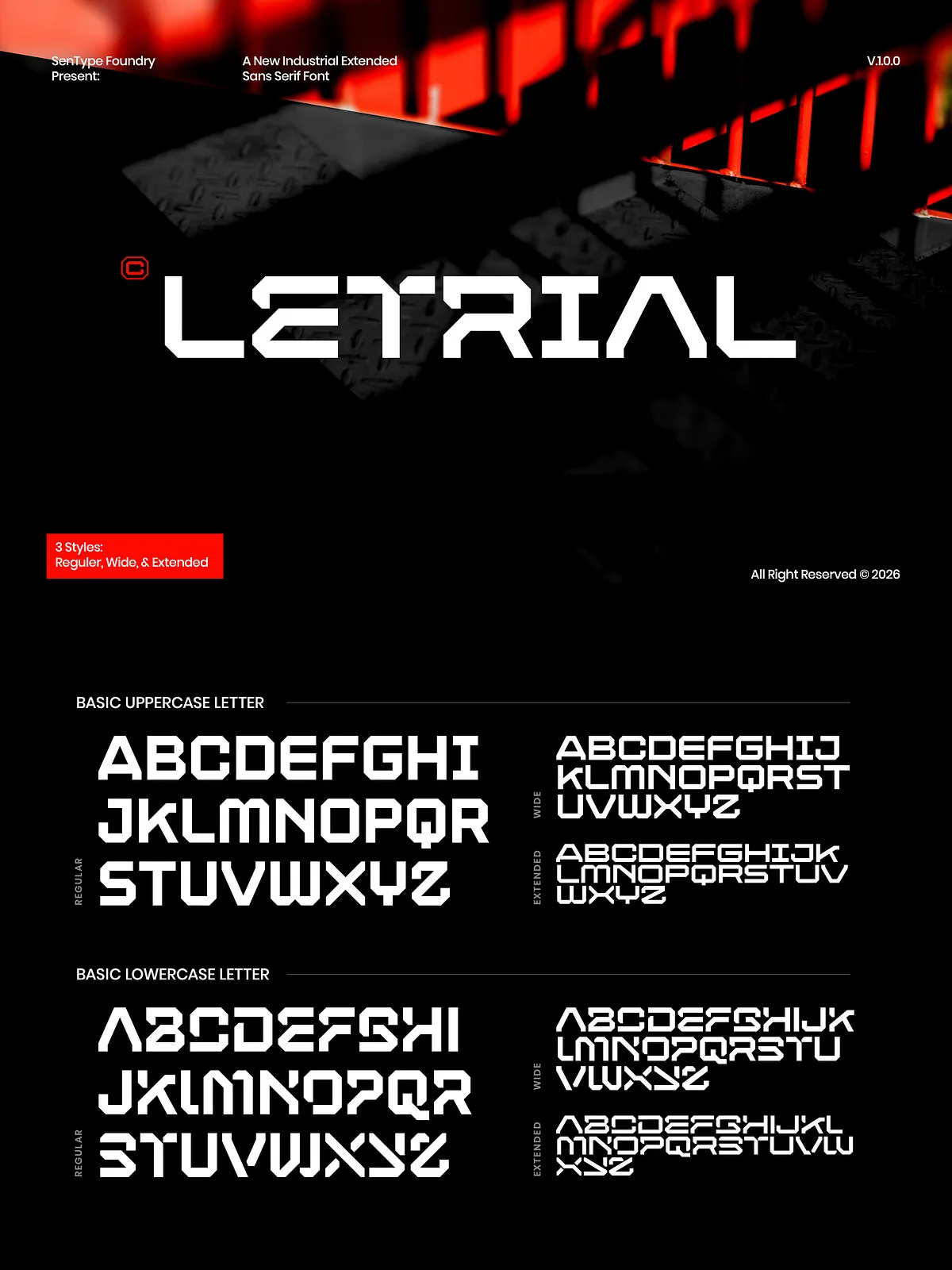
Letrial stands out as a typeface that transcends fleeting trends, offering a timeless appeal that remains relevant across various design contexts. Its regular weight strikes the perfect balance between visibility and subtlety, allowing it to function effectively in both headline and body text roles. This versatility makes it a powerful tool for designers who need a single font that can handle multiple typographic tasks with grace and consistency.
The font’s design philosophy centers on clarity and elegance. By stripping away unnecessary embellishments, Letrial focuses on the essential beauty of the letterforms. This approach ensures that the content remains the primary focus, allowing your message to shine through with enhanced clarity and impact. The result is a typographic presence that feels professional, polished, and inherently trustworthy.
Comprehensive Character Support
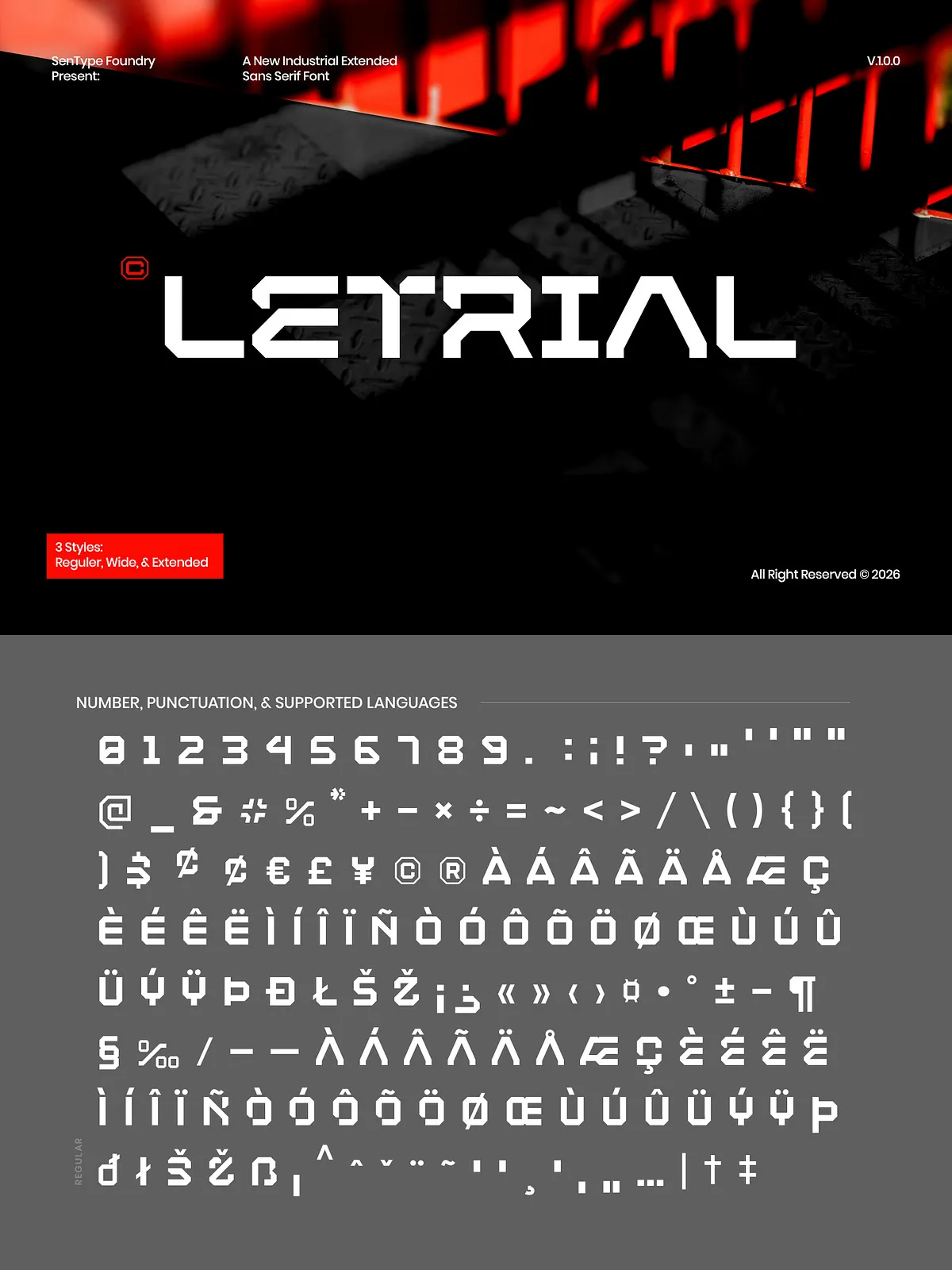
Designed with the modern designer’s workflow in mind, Letrial includes a comprehensive character set that supports a wide range of languages and special characters. This extensive glyph coverage ensures that you can maintain typographic consistency across multilingual projects, from English and Western European languages to more specialized scripts. The thoughtful inclusion of punctuation, numerals, and currency symbols further enhances the font’s utility in real-world design scenarios.
This comprehensive support means you can rely on Letrial for diverse publishing needs, whether you are producing localized marketing materials, international web content, or global brand assets. The consistency in style across the entire character set ensures that your designs remain cohesive and professional, regardless of the language or region you are targeting.
Ideal Applications
Editorial and Print Design
Letrial excels in editorial environments where readability and elegance are paramount. Use it for magazine articles, book interiors, and newspaper layouts where long-form text must remain engaging and easy to read. Its clean lines reduce eye strain, making it an excellent choice for extended reading sessions. Additionally, its aesthetic appeal makes it suitable for headlines and pull quotes that need to stand out within a page of text.
Web and Digital Design
In the digital realm, Letrial provides a crisp and clear presence that enhances user experience. Use it for website body text, navigation menus, and content cards where legibility is crucial. Its regular weight ensures that text remains readable across various screen sizes and resolutions, from desktop monitors to mobile devices. The font’s timeless design also ensures that your web content feels authoritative and professional, building trust with your audience.
Branding and Corporate Identity
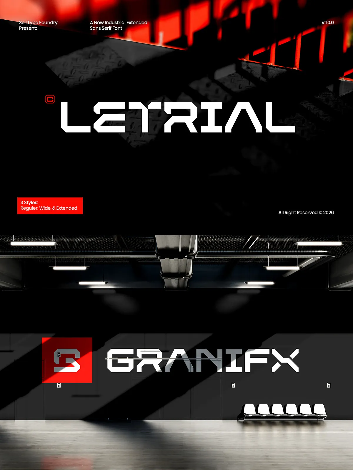
For brands seeking a sophisticated and approachable identity, Letrial offers the perfect typographic voice. Use it for business cards, letterheads, and corporate presentations to convey professionalism and attention to detail. Its versatile nature allows it to adapt to various brand tones, from conservative and traditional to modern and minimalist. By choosing Letrial, you invest in a typographic asset that supports a strong, cohesive brand image.
Artistic and Creative Displays
Beyond its professional applications, Letrial also serves as a compelling choice for artistic and creative projects. Its clean, balanced forms provide a sophisticated backdrop for creative compositions, allowing other design elements to shine. Use it in poster design, exhibition materials, or creative portfolios where a refined typographic presence enhances the overall aesthetic. The font’s understated elegance adds a layer of sophistication to any creative endeavor.
Technical Specifications
File Formats and Compatibility
Letrial is delivered in industry-standard file formats to ensure maximum compatibility with your design software and workflows. You will receive OTF (OpenType) and TTF (TrueType) files, which are compatible with a wide range of applications including Adobe Creative Cloud, Microsoft Office, and other major design platforms. This ensures that you can easily integrate Letrial into your existing design toolkit without technical hurdles.
Optimized for Readability
The font is engineered with optimized spacing and kerning to ensure smooth reading experiences. The attention to detail in the spacing between characters allows text to flow naturally, reducing the need for excessive adjustment in most design contexts. This technical excellence ensures that Letrial performs beautifully in both tight and loose layouts, providing consistency and quality in every application.