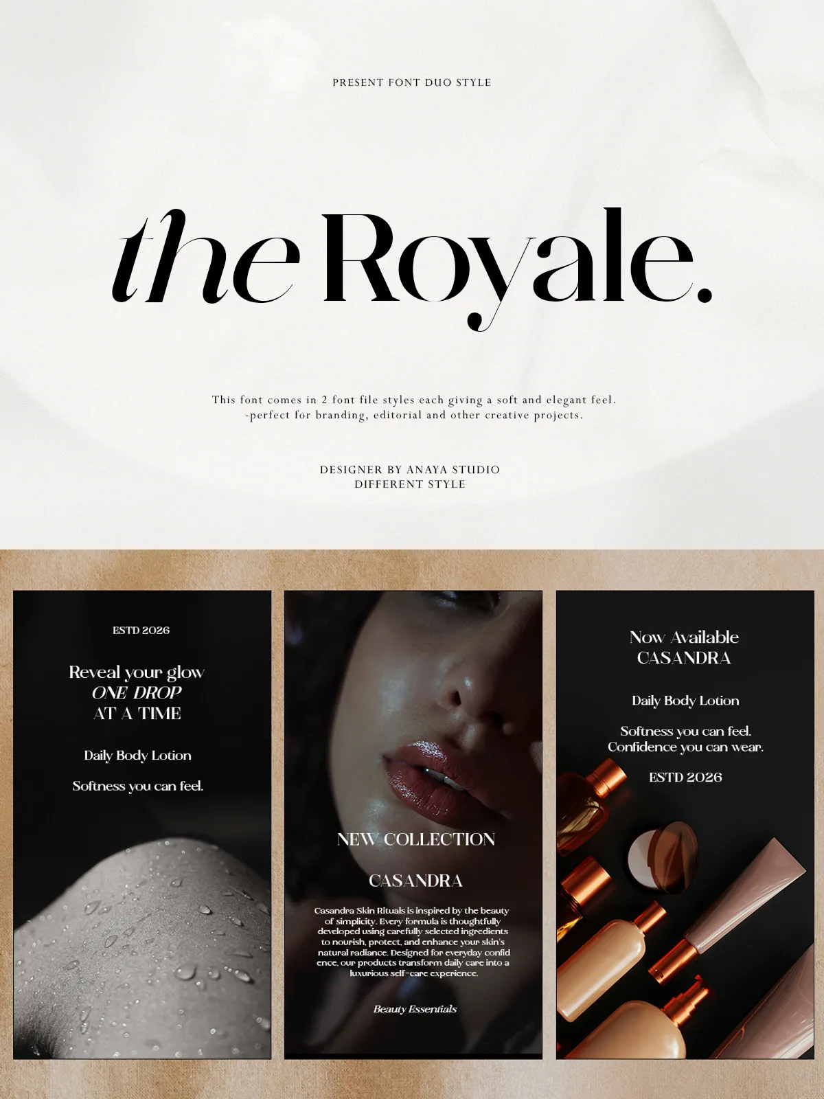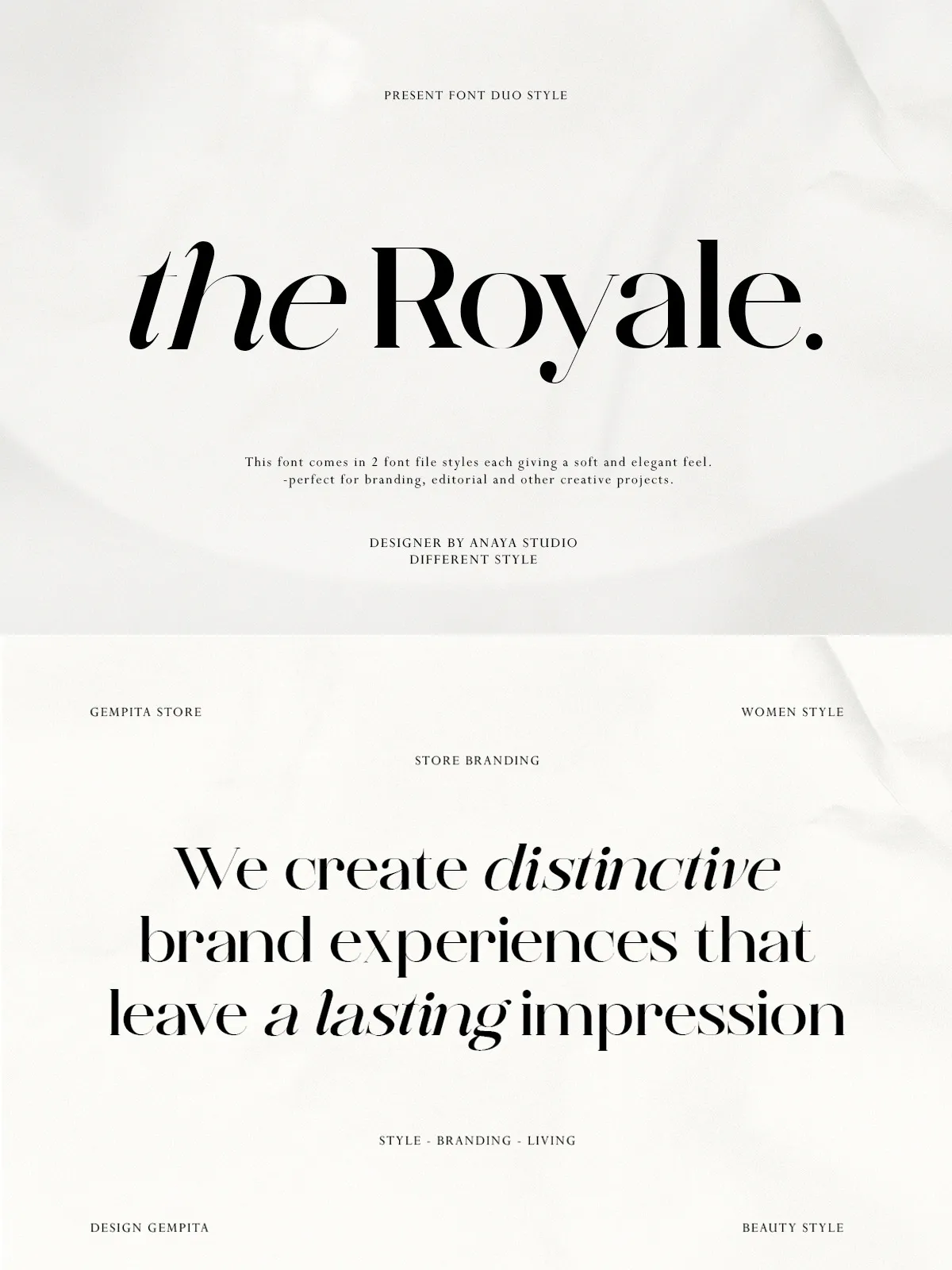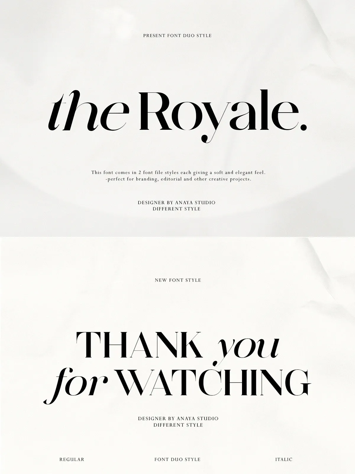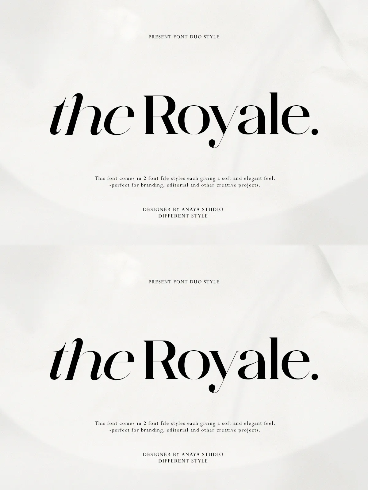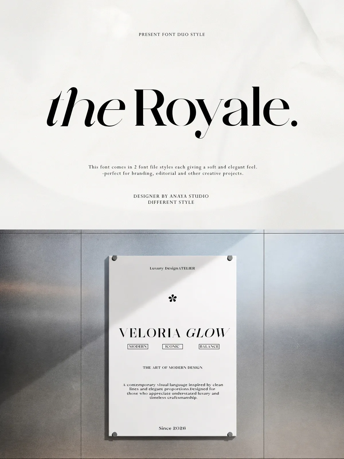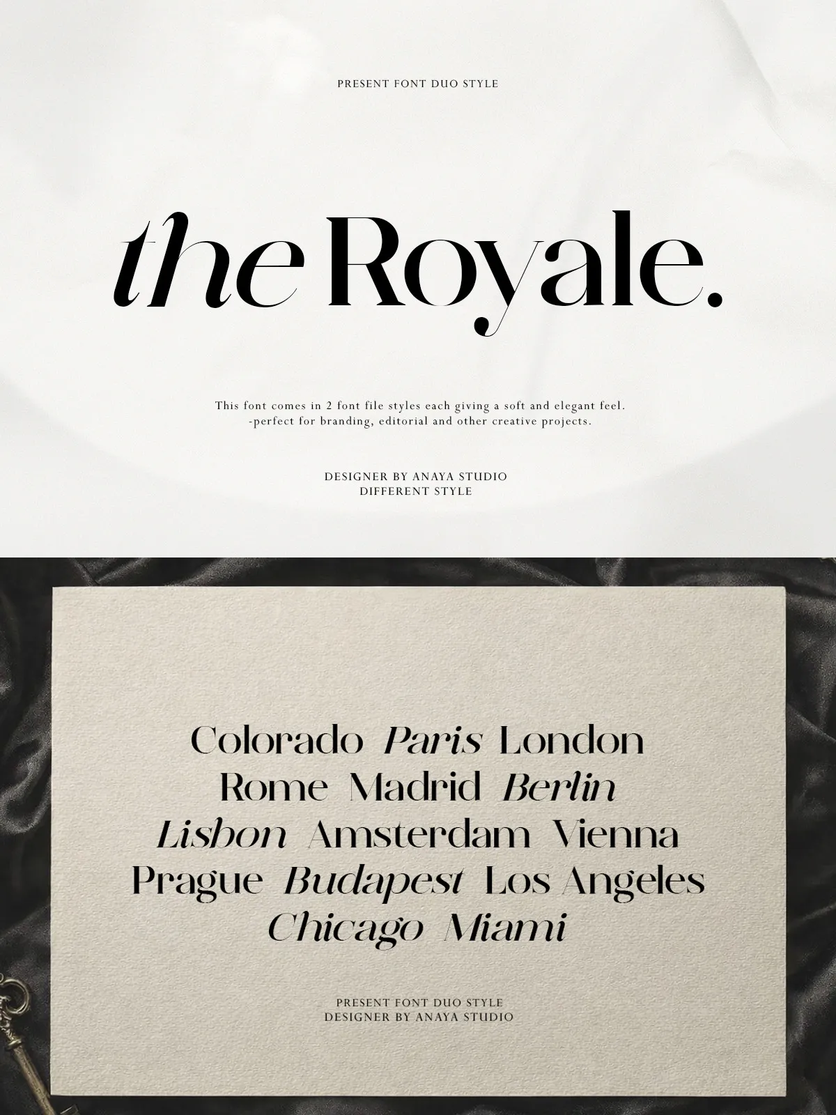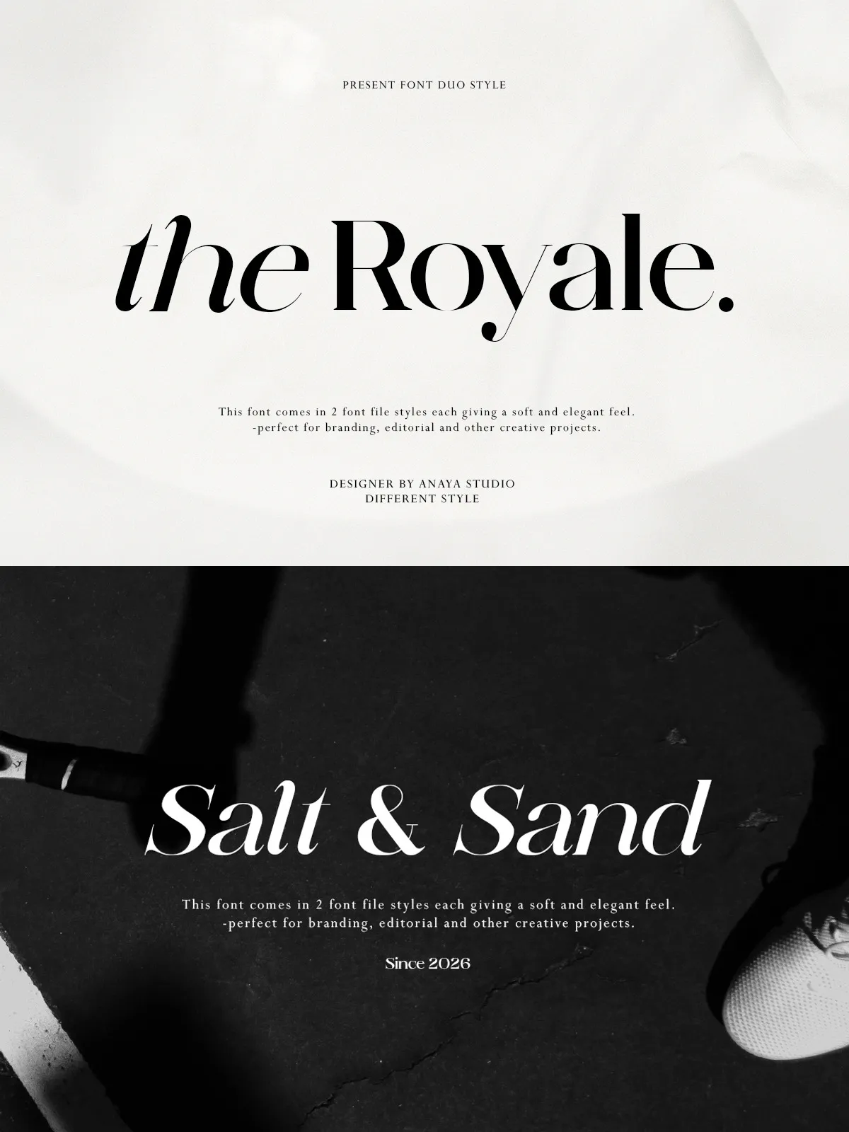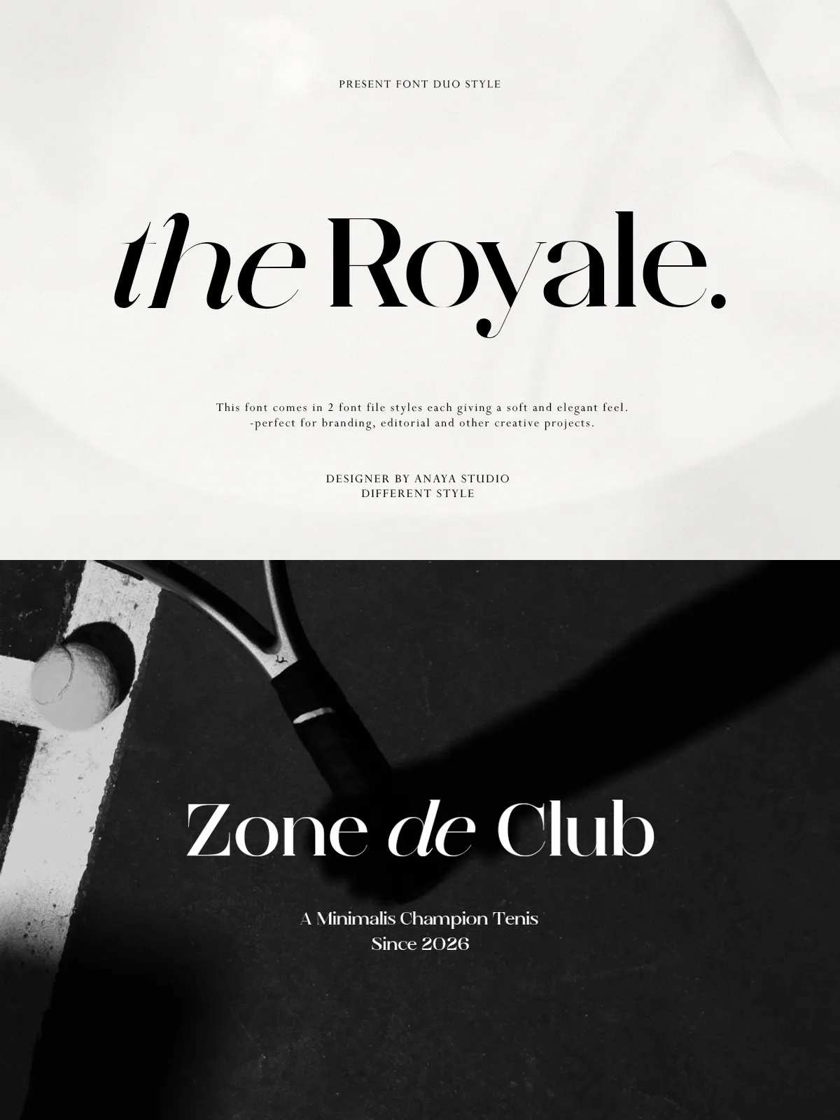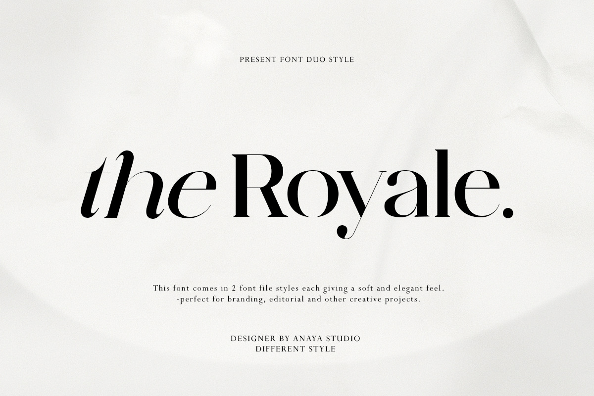

Royale stands as a testament to the harmonious union of timeless elegance and contemporary luxury. This sophisticated serif typeface is meticulously crafted to exude a premium feel, making it an indispensable asset for designers who demand excellence in their visual communications. Featuring high-contrast strokes that dance between thick and thin, graceful curves that guide the eye with natural fluidity, and refined letterforms that speak volumes, Royale is designed to elevate any project to new heights of sophistication. Its unique duo-style concept offers unparalleled flexibility, allowing you to toggle between classic gravitas and modern锐利 aesthetics with ease.
Whether you are crafting a high-end fashion campaign, designing intricate editorial layouts, creating luxury packaging, or producing elegant wedding stationery, Royale delivers a stylish and authoritative presence. Each character is not just a symbol but a carefully sculpted piece of art, designed to strike a perfect balance between beauty, legibility, and artistic expression. By choosing Royale, you are investing in a typeface that commands attention and conveys a sense of exclusivity and refinement.
Key Features and Benefits
High-Contrast Elegance
The defining characteristic of Royale is its dramatic high-contrast stroke weight. This feature allows the font to create stunning visual hierarchies, drawing the viewer’s eye to key messages with immediate impact. The contrast between the thick and thin strokes adds a layer of dynamism and sophistication that flat or uniform fonts often lack. This makes Royale particularly effective in headlines and display typography where you need to make a bold statement. The high-contrast nature also gives the typeface a editorial quality, reminiscent of high-fashion magazines and luxury brand identities from the golden age of typography, yet updated for the modern digital landscape.
Refined Letterforms and Curves
Royale’s letterforms are engineered with precision. The graceful curves and smooth transitions between strokes ensure that the font remains legible even at larger sizes, while maintaining its elegant character. The serif details are sharp and well-defined, adding a touch of classic refinement without becoming cluttered or distracting. This attention to detail in the letterform design ensures that every word set in Royale feels intentional and polished. The curves are not arbitrary; they are designed to mimic the natural flow of human handwriting, yet with a structured discipline that speaks to professional craftsmanship.
Versatile Duo-Style Concept
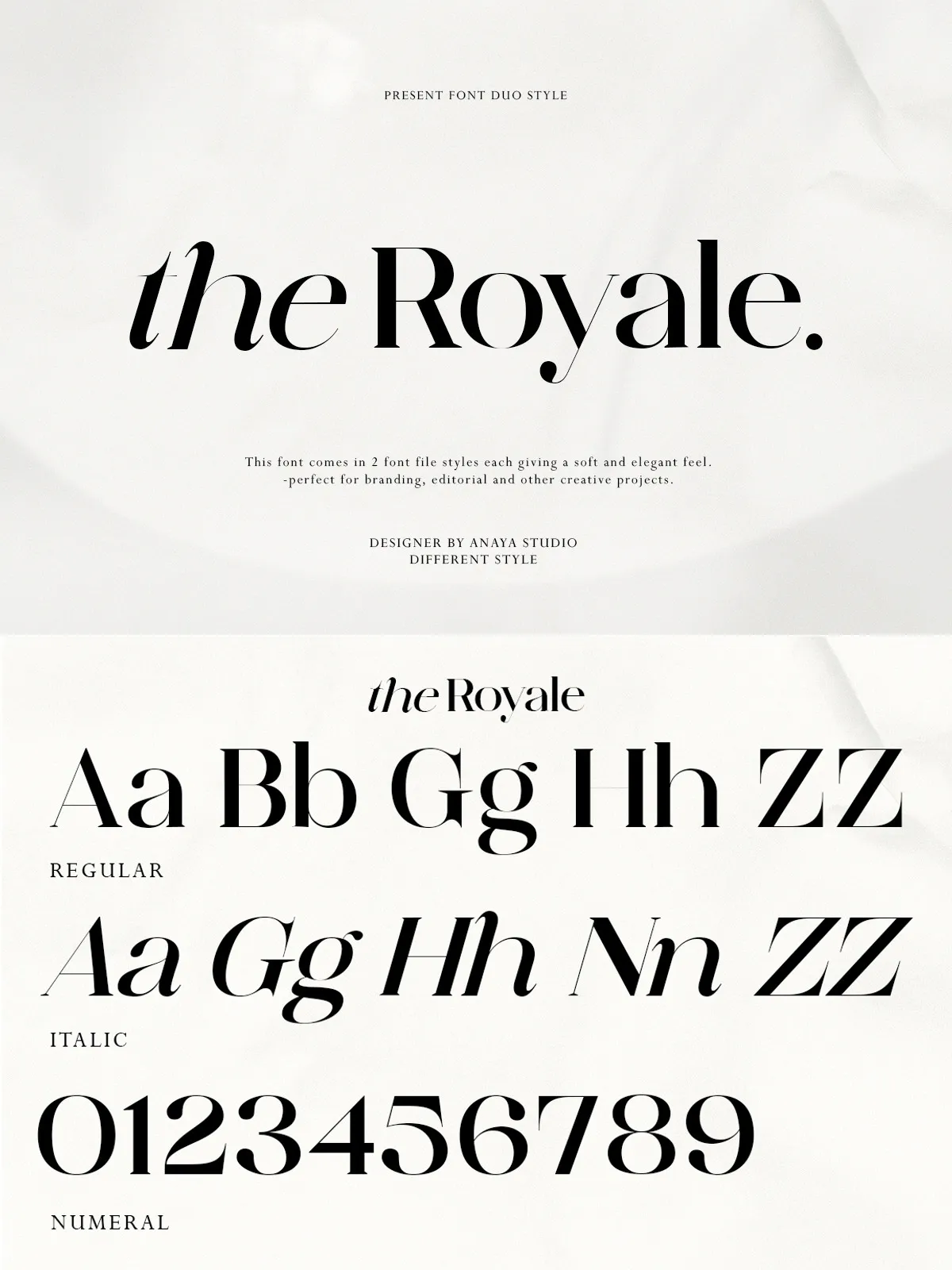
Royale’s unique duo-style concept is its greatest strength. This flexibility allows designers to adapt the typeface to a wide range of contexts. You can use the heavier weights for powerful headlines that demand attention, and lighter weights for body text that requires readability and subtlety. This versatility makes Royale suitable for a variety of applications, from social media content that needs to pop on small screens to large-format billboards where every detail counts. The ability to mix and match weights allows for creative typographic layouts that add depth and interest to your designs.
Ideal Applications
Fashion and Lifestyle Branding
In the fast-paced world of fashion, Royale is a perfect companion. Use it for brand identities, lookbooks, and campaign materials where you need to convey a sense of style and exclusivity. The font’s elegant curves and high-contrast strokes resonate with the aesthetic values of high-end fashion brands, helping you to create a visual identity that is both memorable and sophisticated. Royale can turn a simple logo or tagline into a powerful statement of brand values.
Editorial and Publication Design
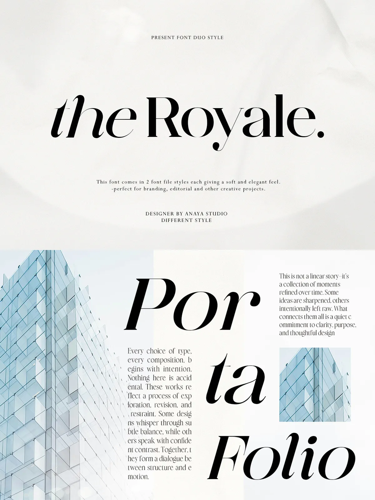
Royale excels in editorial contexts. It is an ideal choice for magazine covers, article headers, and pull quotes where you need to capture the reader’s attention immediately. The font’s readability and elegance make it suitable for long-form content as well, ensuring that the reader remains engaged throughout the piece. Whether you are designing a print magazine or a digital publication, Royale adds a layer of authority and style that enhances the content’s perceived value.
Luxury Packaging and Stationery
For brands that sell physical products, packaging is a critical touchpoint. Royale is perfect for luxury packaging, where the typography needs to reflect the quality of the product inside. Use it for wine labels, cosmetic packaging, or high-end gift boxes. Similarly, Royale is an excellent choice for wedding stationery, business cards, and letterheads. The font’s elegance and refinement help to create a first impression that is both welcoming and impressive, setting the tone for the entire interaction with the brand or event.
Social Media and Digital Content
In the digital realm, Royale stands out in a crowded feed. Use it for Instagram graphics, Facebook covers, and YouTube thumbnails where you need to grab attention quickly. The font’s bold presence and elegant curves make it highly effective for creating visually striking social media content. Additionally, Royale is suitable for website headers and landing pages where you want to convey a sense of professionalism and style. Its versatility ensures that it looks good on any device, from smartphones to desktop monitors.
Technical Specifications
Complete Character Set
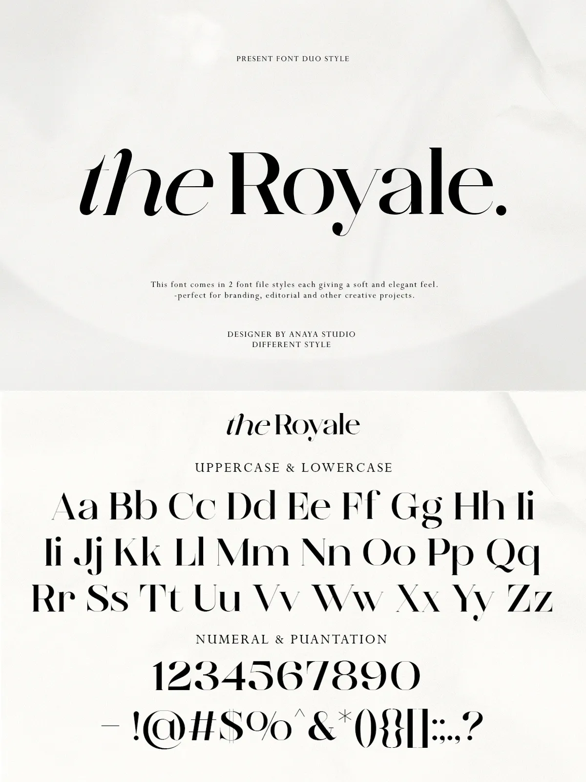
Royale comes with a comprehensive character set that includes a wide range of Latin characters, punctuation marks, and symbols. This extensive support ensures that you can use Royale for projects in multiple languages, particularly those that use Western European languages. The inclusion of currency symbols and numbers further enhances the font’s utility for commercial and business applications.
Multiple Weights and Styles
The font family includes multiple weights, allowing you to create diverse typographic hierarchies. From thin and light weights for subtle accents to bold and heavy weights for powerful headlines, Royale offers a range of options to suit your design needs. All weights are designed with consistent styling and proportions, ensuring that your typography remains cohesive and professional across different contexts.