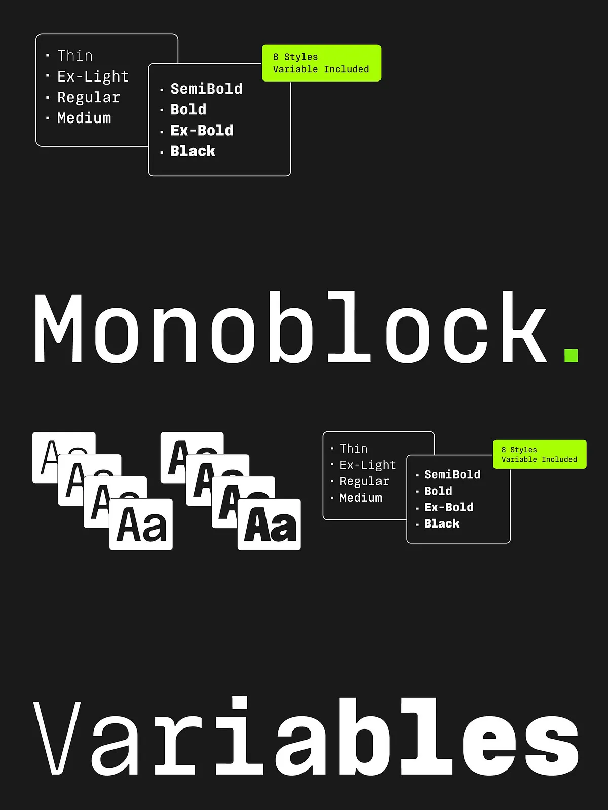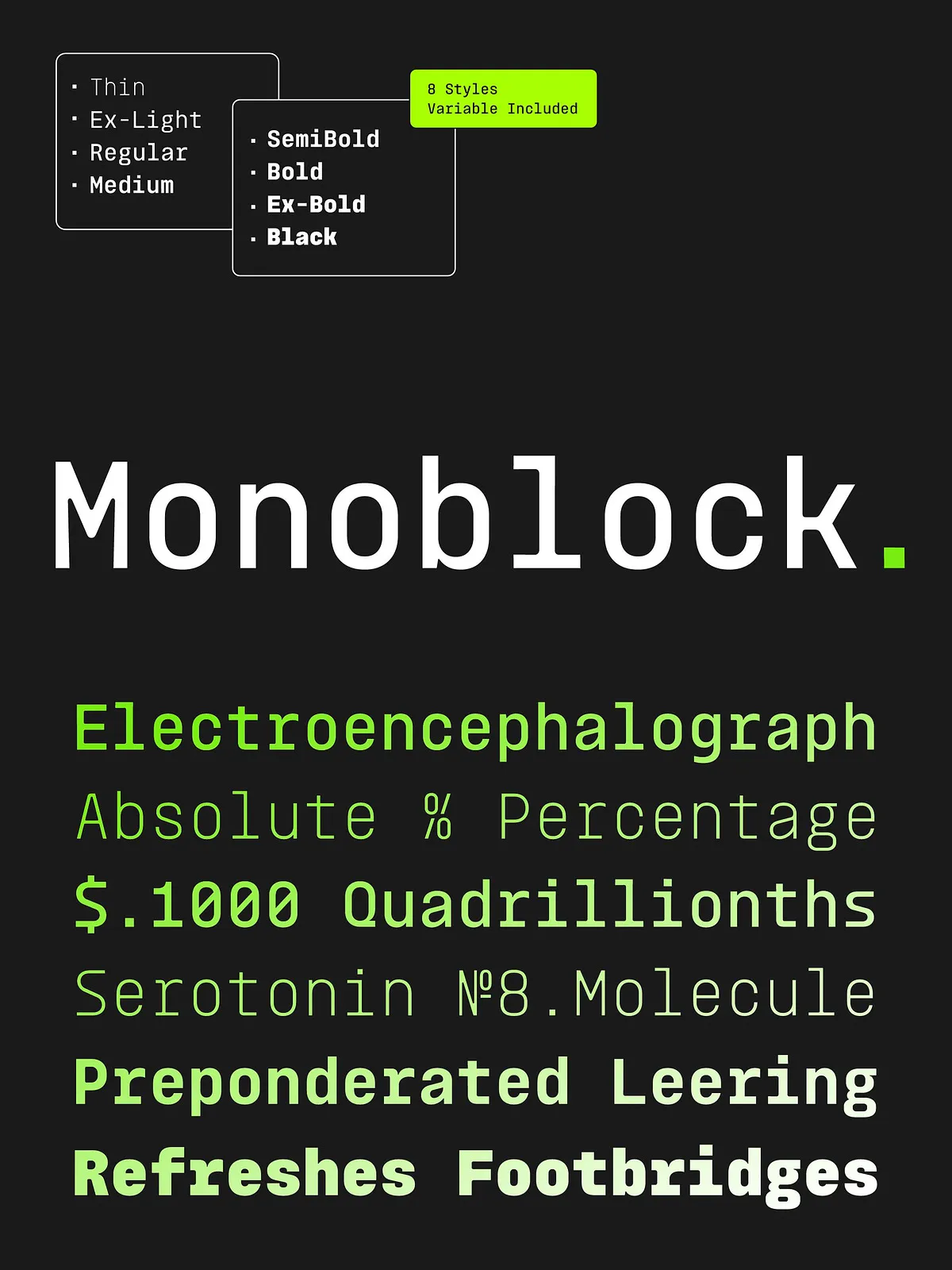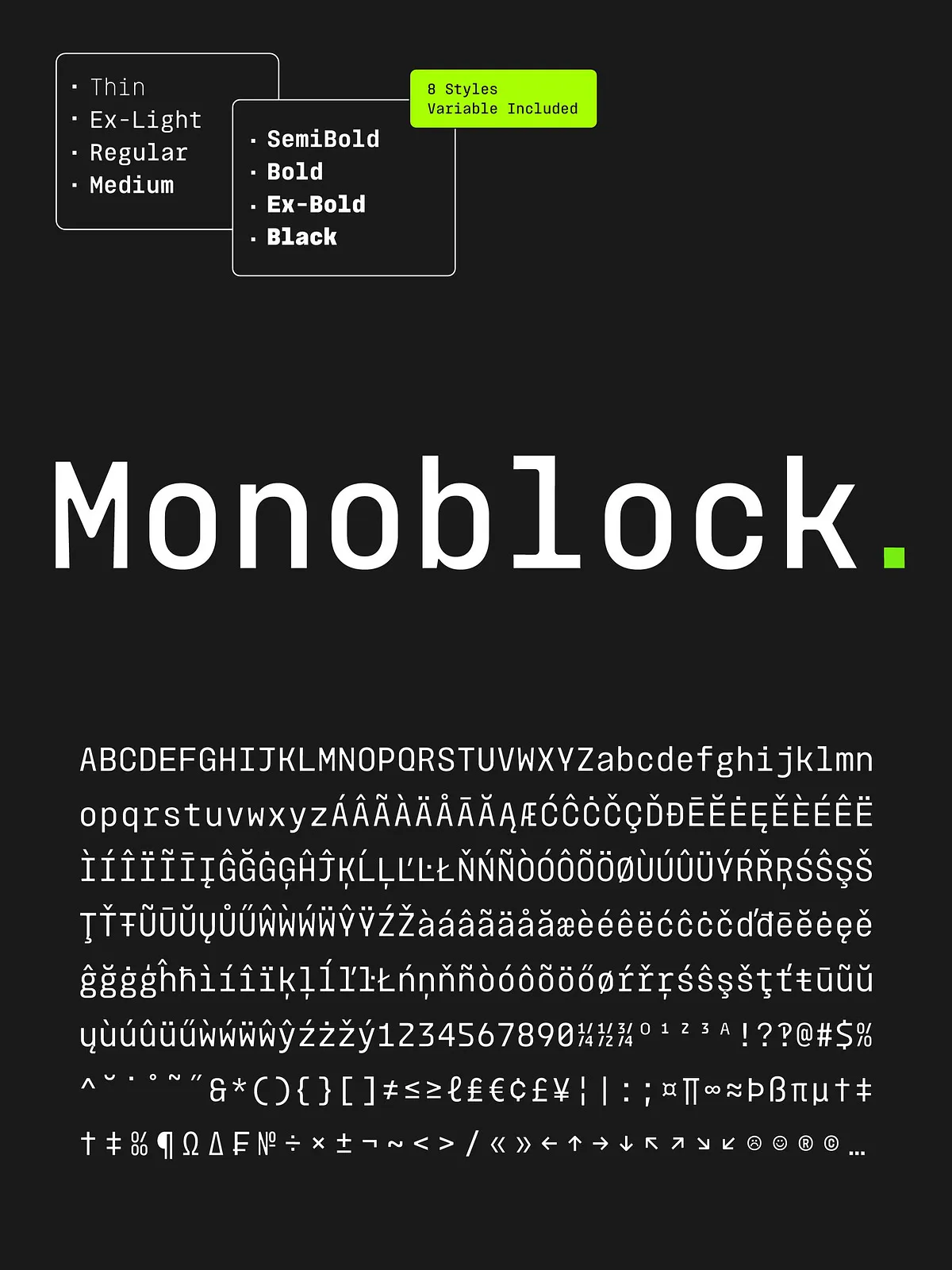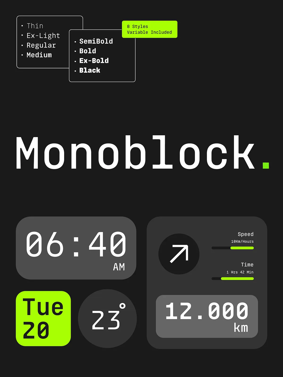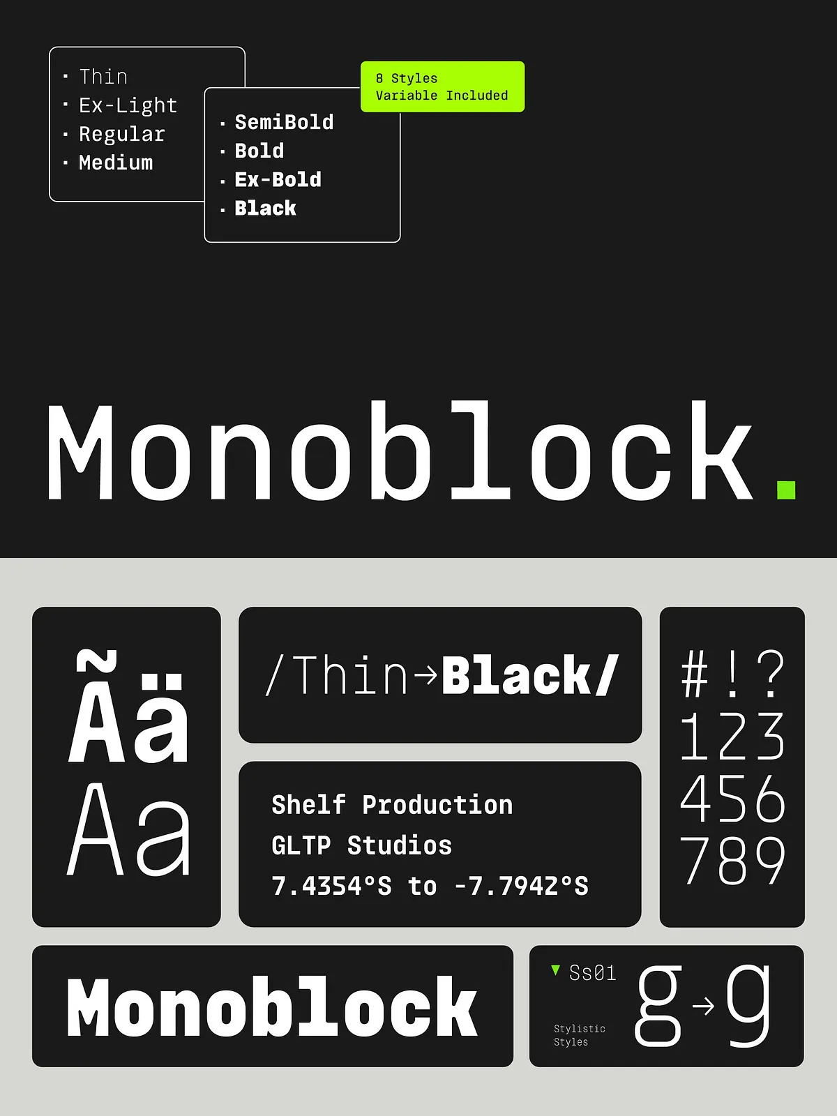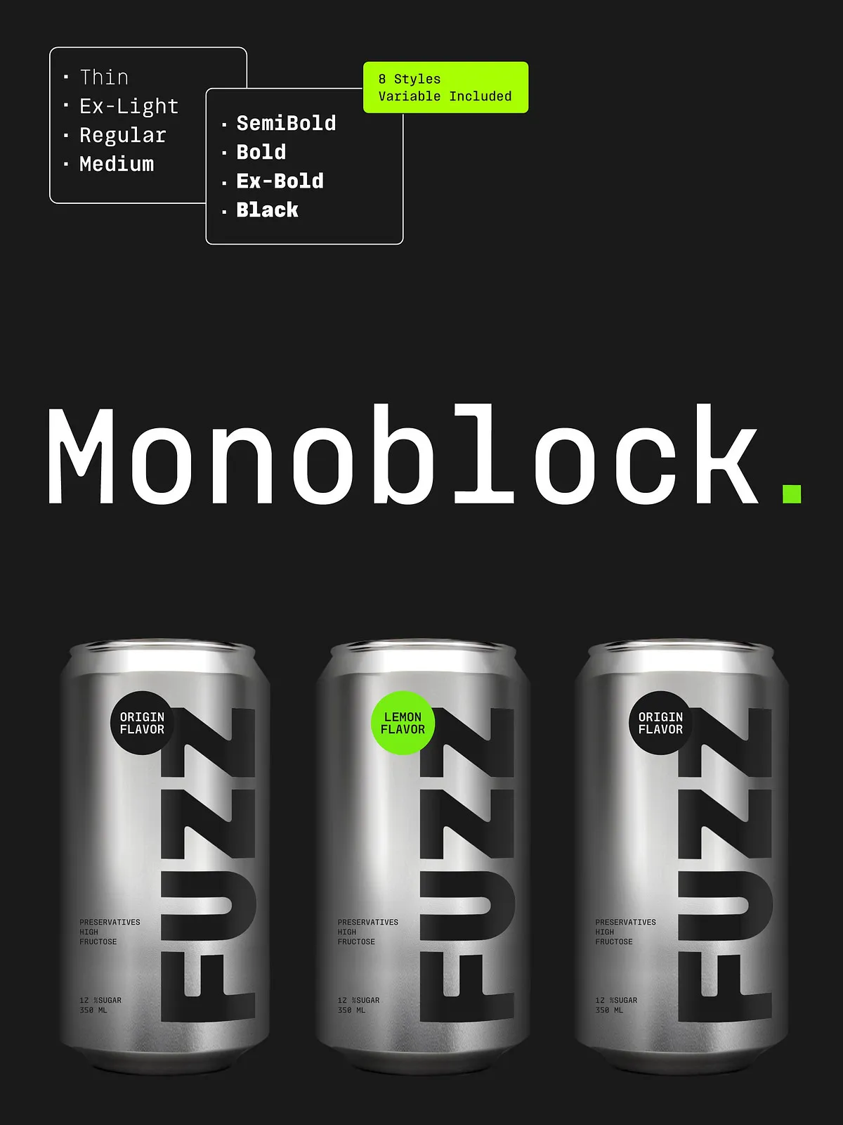
Monoblock is a modern monospaced typeface family engineered for precision, legibility, and consistent rhythm. Rooted in the heritage of classic typewriter faces, Monoblock refines that foundation for today’s digital interfaces, technical documentation, and editorial systems. The family delivers uniform character widths to ensure alignment and predictable layout behavior across environments. Designers and developers turn to Monoblock when they need a neutral, reliable mono face that performs equally well in code editors, dashboards, tables, and brand systems.
Key Features
Consistent Monospaced Metrics
Every glyph in Monoblock uses a fixed advance width. This consistency prevents reflow when characters change and preserves grid alignment when swapping weights. Use Monoblock to build templates, tabular layouts, and UI components that accept variable content without needing spacing adjustments.
Versatile Weight Range
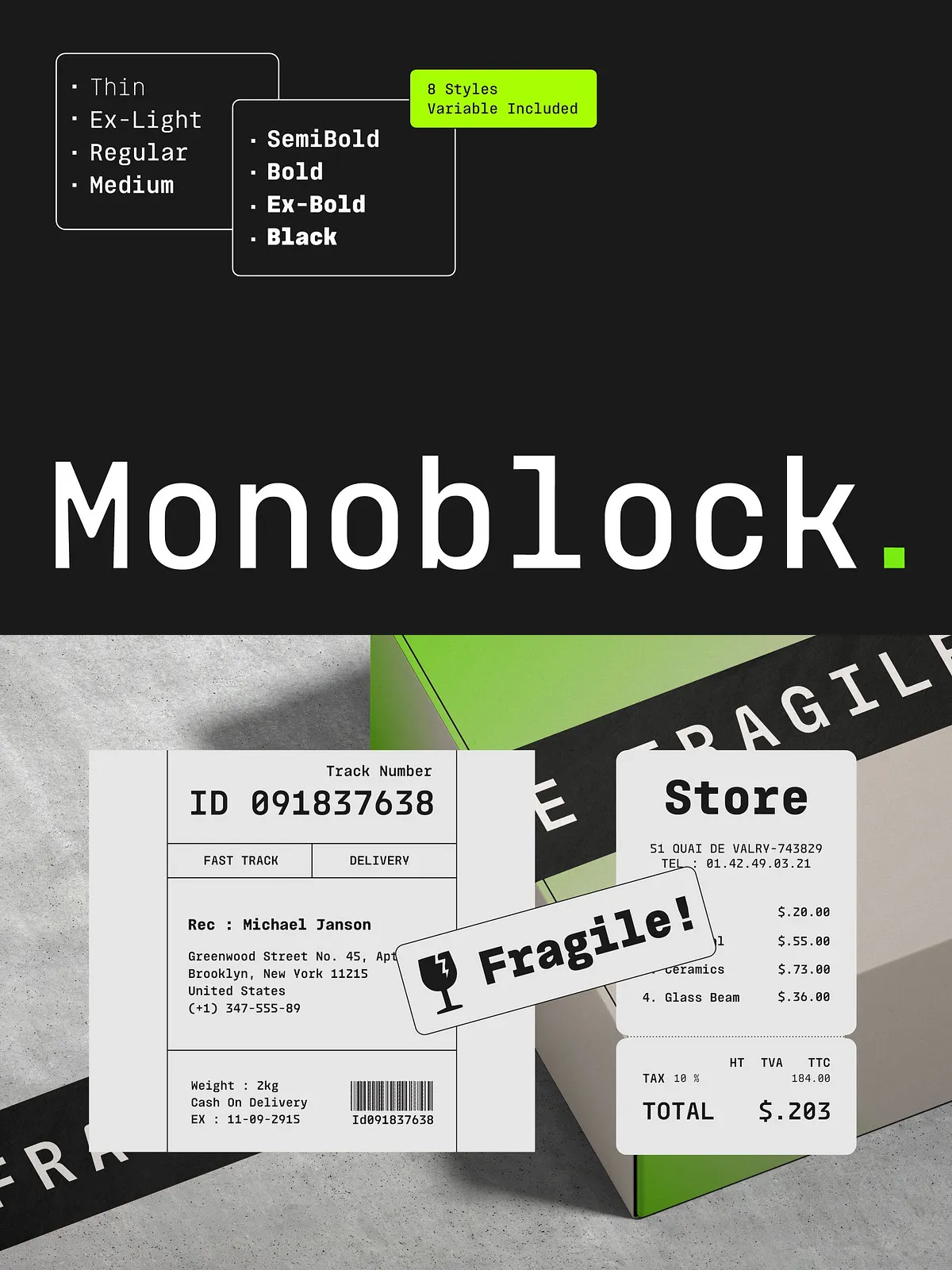
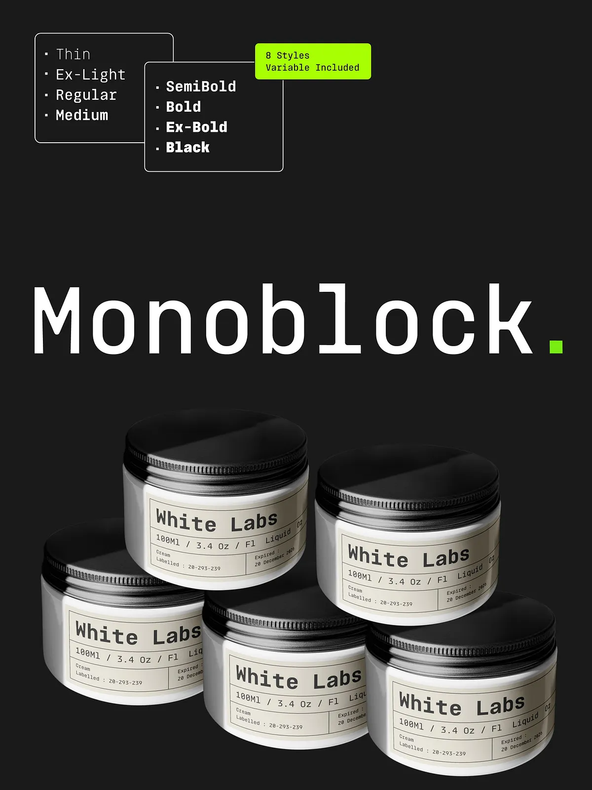
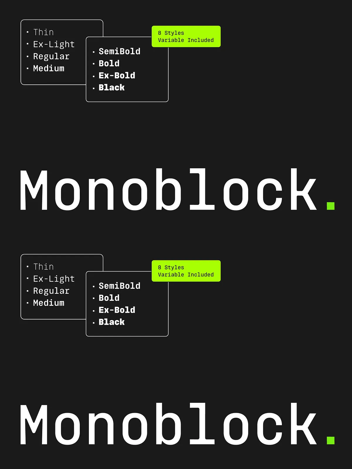
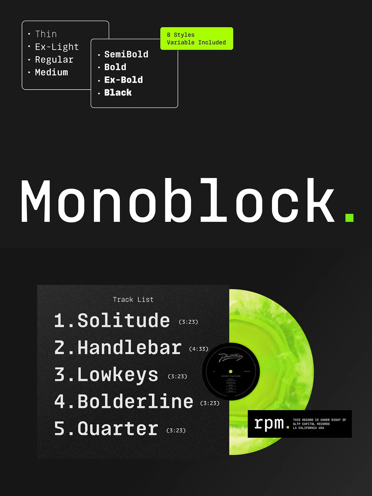
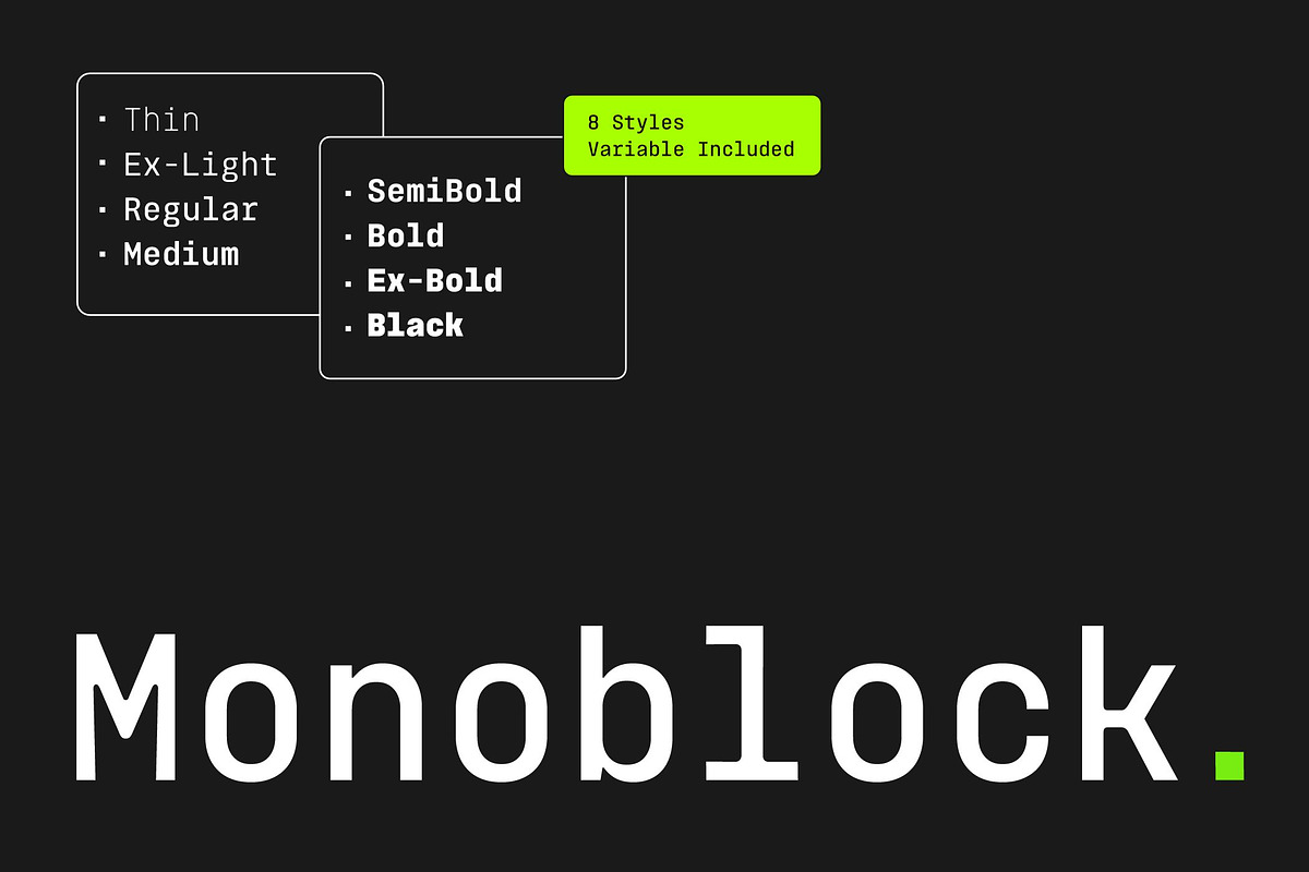
Monoblock includes a broad weight spectrum—from Thin to Black—giving you control over hierarchy and emphasis without sacrificing the family’s mechanical stability. Apply lighter weights for extended on-screen text and heavier weights for compact headlines, labels, and code emphasis.
Technical Clarity and Readability
The design prioritizes clear counters, open apertures, and distinct numerals so code, identifiers, and tabular figures remain easy to scan. Monoblock focuses on character distinction to reduce ambiguity in mixed alphanumeric strings and technical contexts.
Applications and Use Cases
Coding and Development Environments
Monoblock excels in IDEs and terminals where alignment and clear numeric representation matter. Its predictable spacing helps maintain neat columns and improves readability in long sessions of code review or debugging.
User Interfaces and Dashboards
Use Monoblock for data tables, control labels, and UI components that require precise alignment. The family’s structured geometry helps maintain a rational visual hierarchy and reduces layout surprises when content or style changes.
Editorial and Branding
Monoblock adapts well to editorial layouts that call for a rational, minimalist tone. Combine Monoblock with a neutral proportional type for headlines or body copy to create contrast while keeping technical or tabular content consistent. Brands that want a utilitarian, modern voice will find Monoblock effective for product specs, packaging labels, and corporate identity systems.
Technical Notes & Implementation
Web and Desktop Installation
Install Monoblock by adding the provided webfont files to your project or by installing the desktop fonts for design applications. Because Monoblock maintains fixed metrics across weights, you can swap styles in templates without recalculating layout constraints.
Spacing and Layout Best Practices
Leverage Monoblock’s predictable width by designing modular components that accept variable-length content. For dense tables or complex dashboards, increase line-height slightly to improve vertical rhythm when using heavier weights. When mixing Monoblock with proportional typefaces, use the mono face only for code, tables, captions, or labels to preserve reading flow.
Licensing & Support
Check the font package for licensing details covering desktop use, web embedding, and redistribution. Contact the foundry or vendor for commercial licensing questions, extended embedding rights, or custom support. The distribution typically includes font files, specimen files, and basic implementation notes to speed adoption.