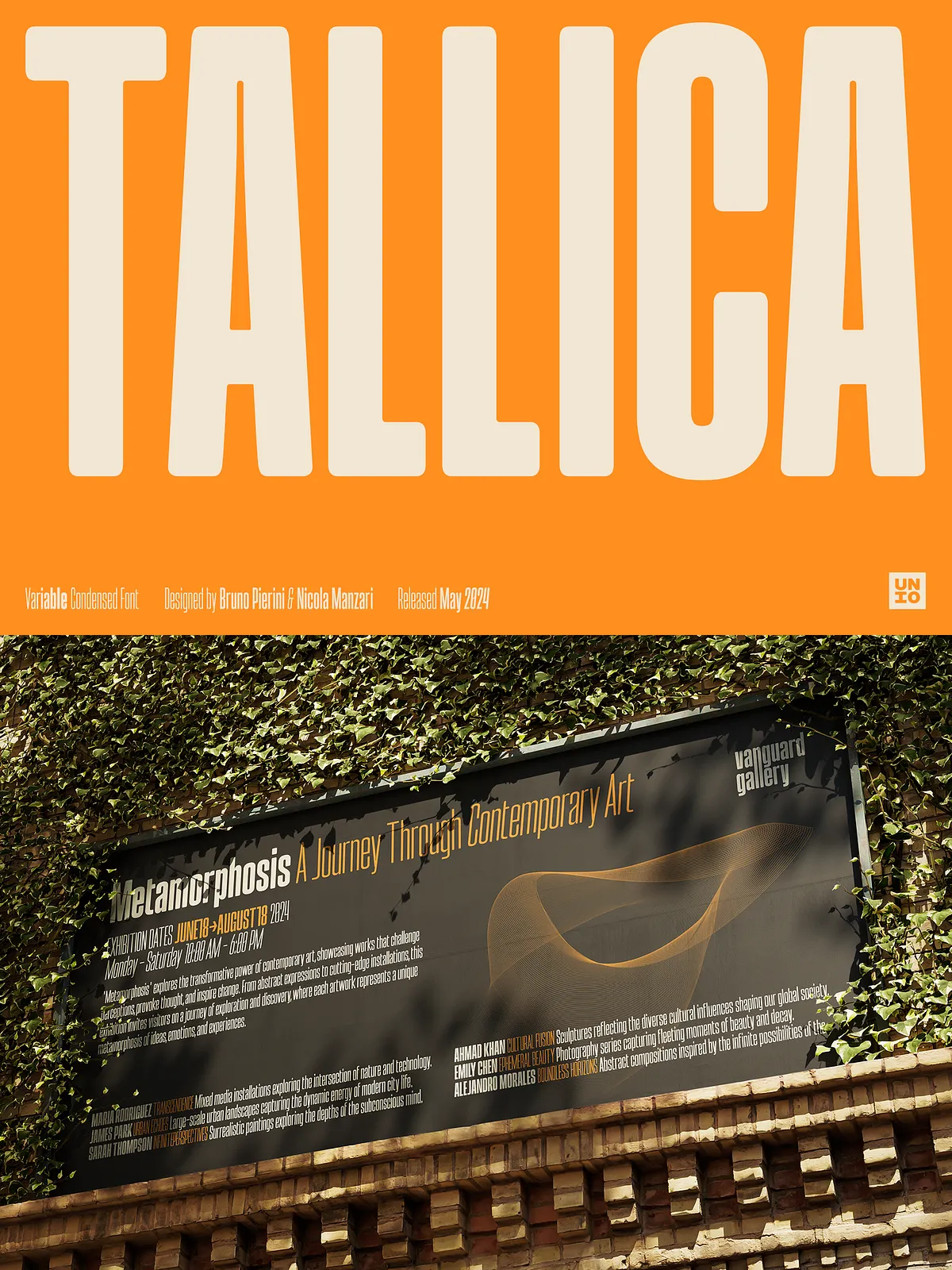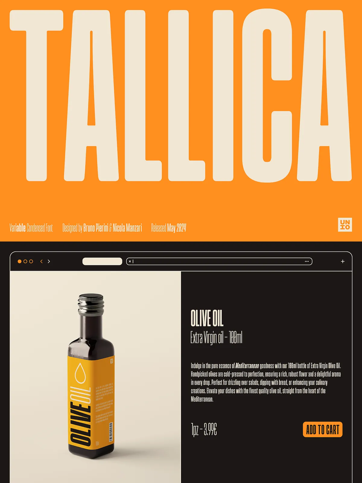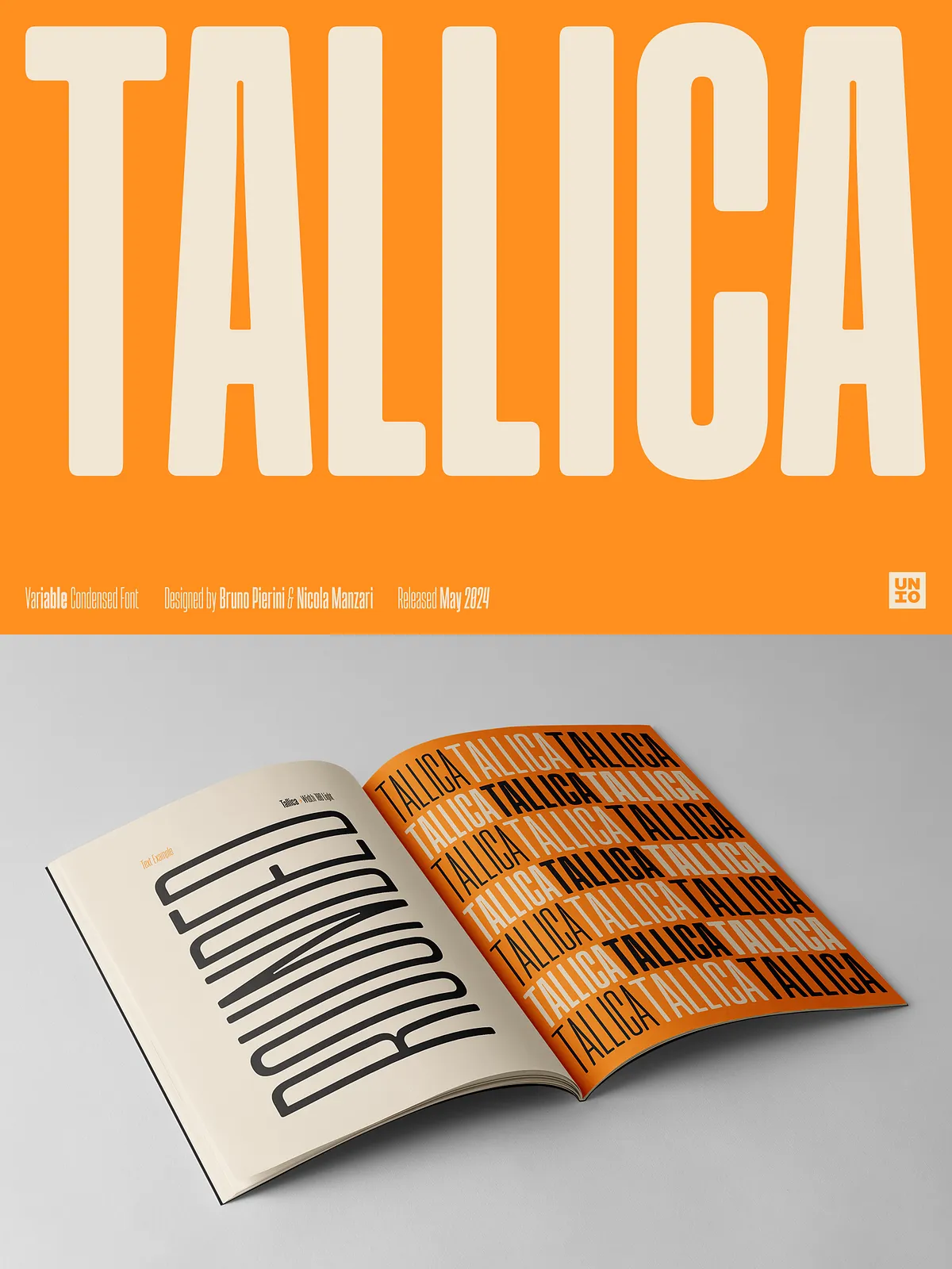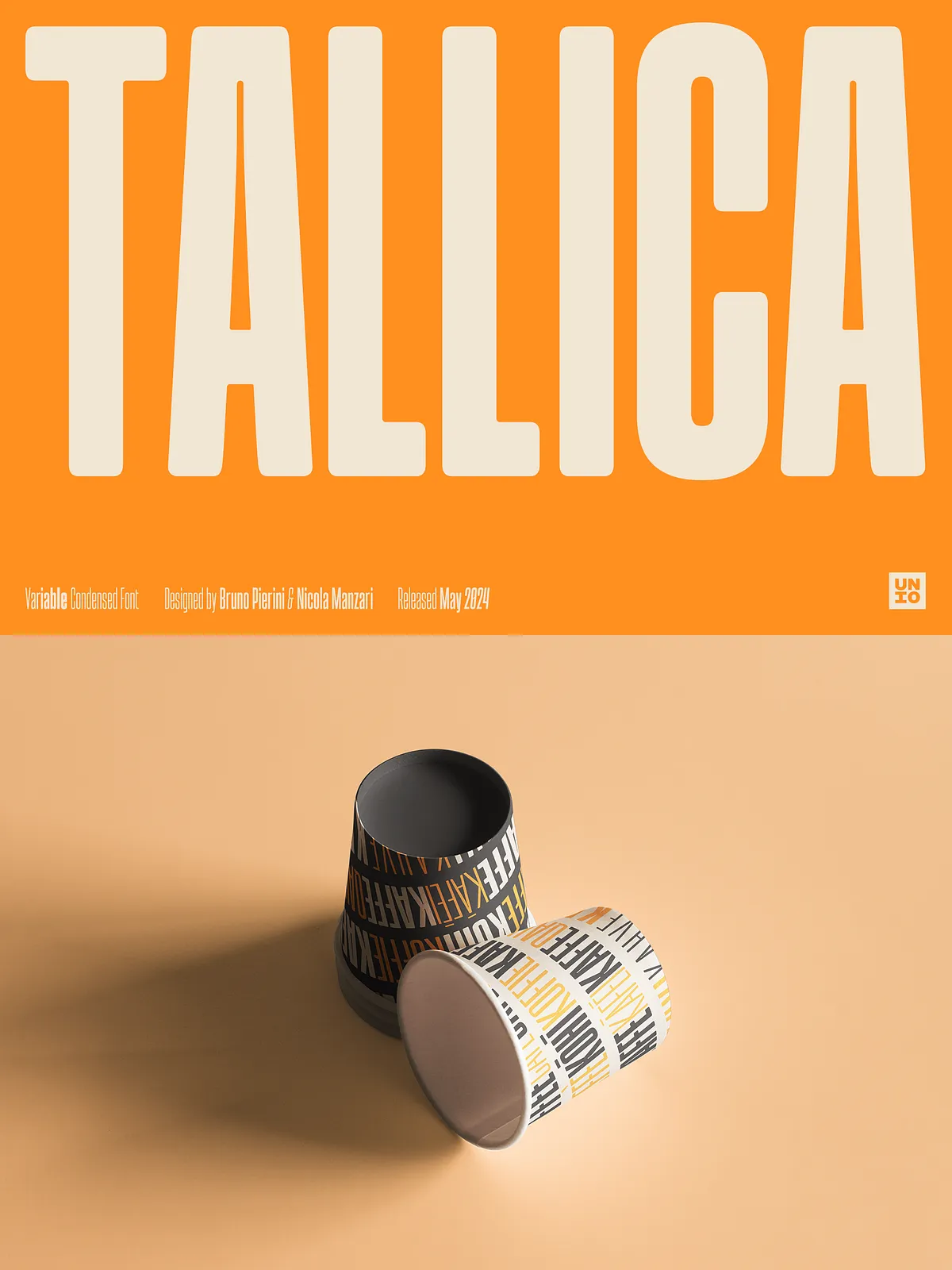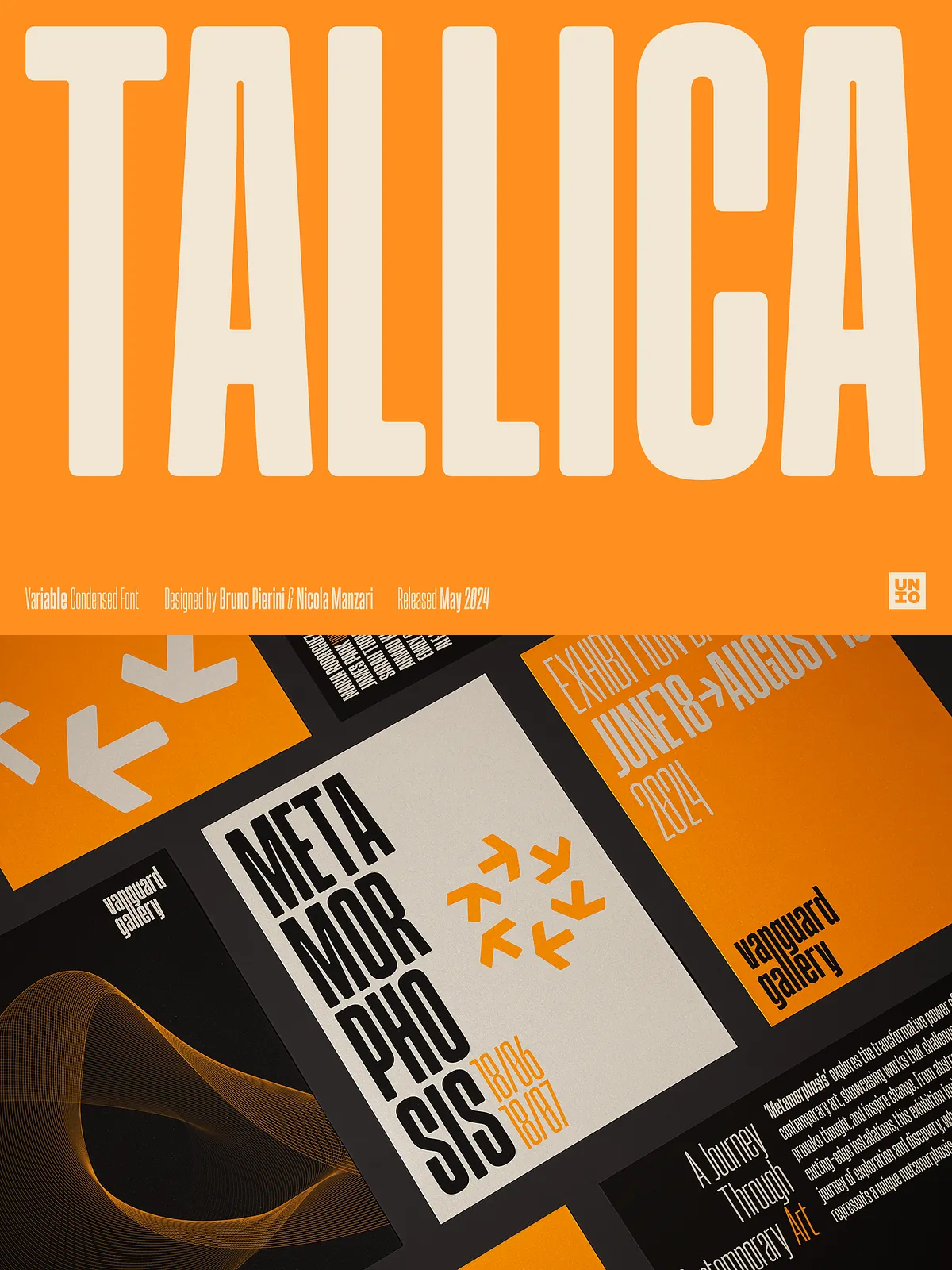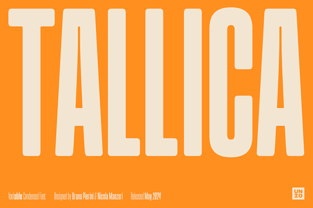
Tallica arrives as an extra condensed grotesque designed to steal attention and maximize visual impact in tight layouts. Its meticulously shaped, ultra-compressed letterforms pack striking presence into narrow columns and compact designs. Tallica combines bold display energy with thoughtful engineering to ensure clarity and legibility even at the most condensed widths. Whether you design editorial spreads, packaging, logos, or bold advertising headlines, Tallica performs reliably and beautifully.
Engineered for Readability & Versatility
Clarity at Condensed Widths
Many condensed typefaces trade legibility for density; Tallica rejects that compromise. The design incorporates a generous x-height and carefully calibrated counters so each glyph reads clearly at display sizes. Tight but balanced spacing maintains rhythm across words and lines, allowing Tallica to remain both assertive and readable.
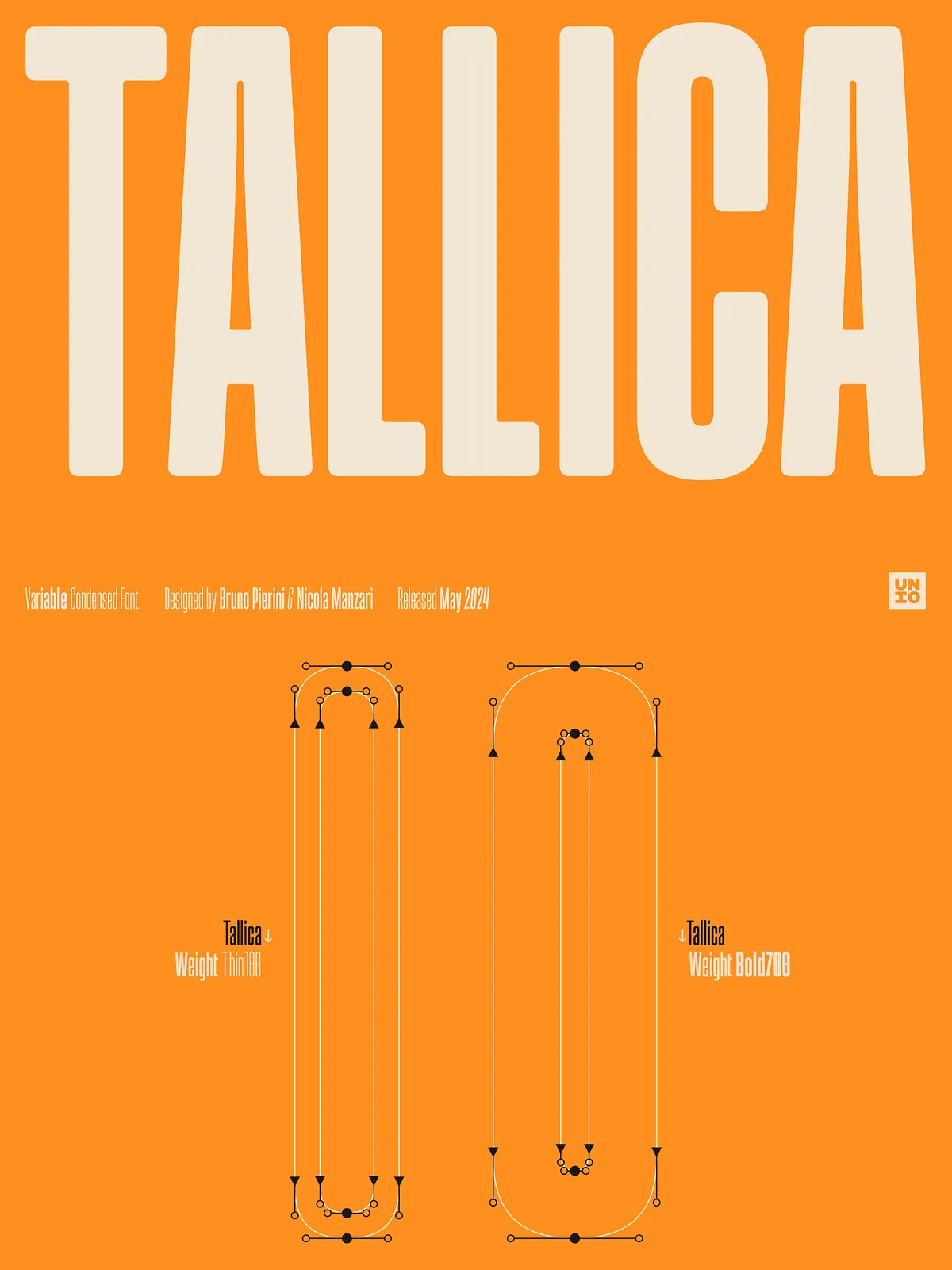
Variable Family with Seamless Transitions
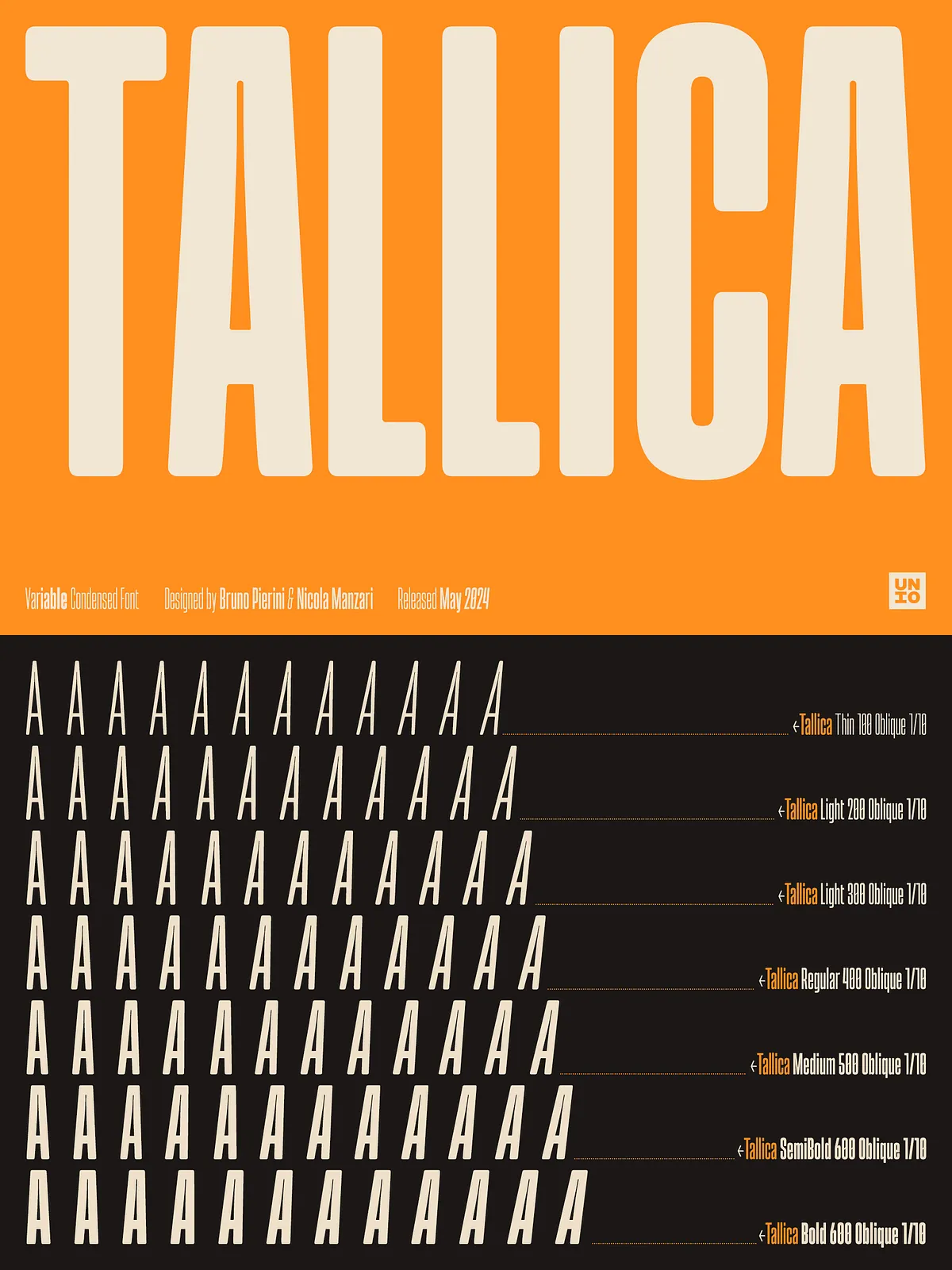
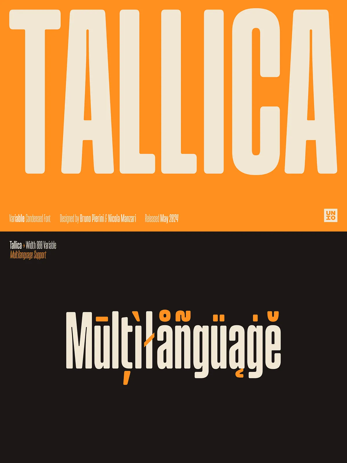
Tallica ships as a variable font offering a continuous range of weights from Thin to Bold, plus matching obliques. Designers can dial weight precisely to fit composition needs, then switch to an oblique for emphasis or aesthetic variation without breaking visual harmony. This fluid weight control makes Tallica ideal for responsive design and multi-platform branding.
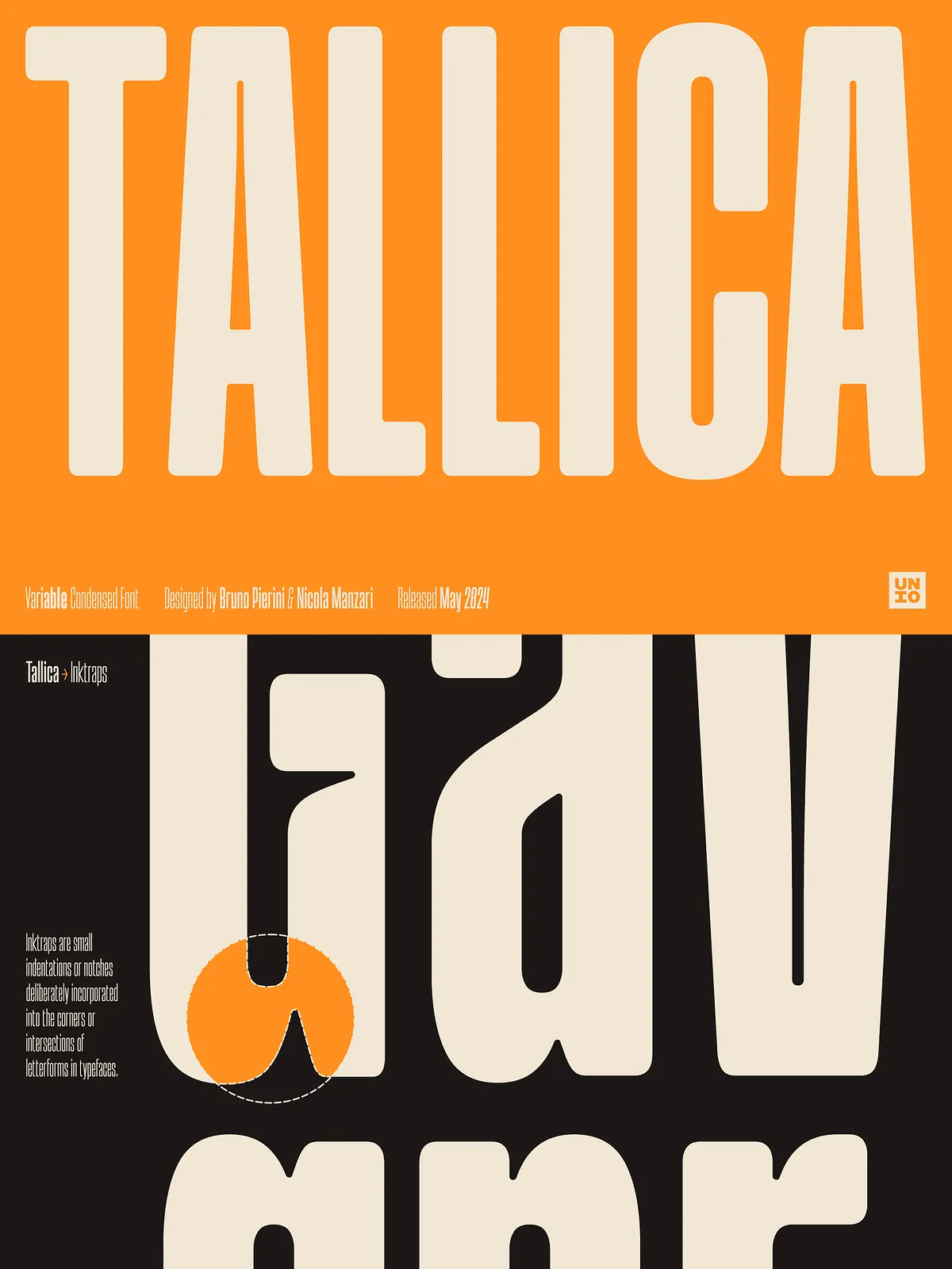
Modern Ink Traps and Detail
Tallica integrates modernized ink traps that support clean printing without feeling antiquated. The ink traps use subtle, rounded solutions that help ink flow on press and preserve sharp counters in small-sized text and dense settings. These details boost print performance while adding a distinctive, contemporary character to the face.
Key Features
- Extra condensed grotesque style optimized for impactful headlines and tight layouts.
- Generous x-height and thoughtfully tuned spacing for excellent legibility.
- Variable .ttf plus static .ttf options, enabling flexible weight control and compatibility.
- Range of weights from Thin to Bold with matching obliques for expressive typography.
- Modernized ink traps and rounded corners to support print clarity and a refined aesthetic.
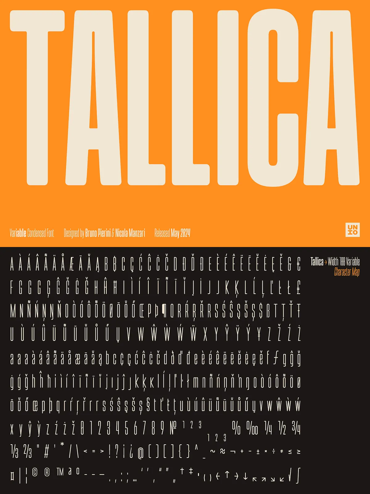
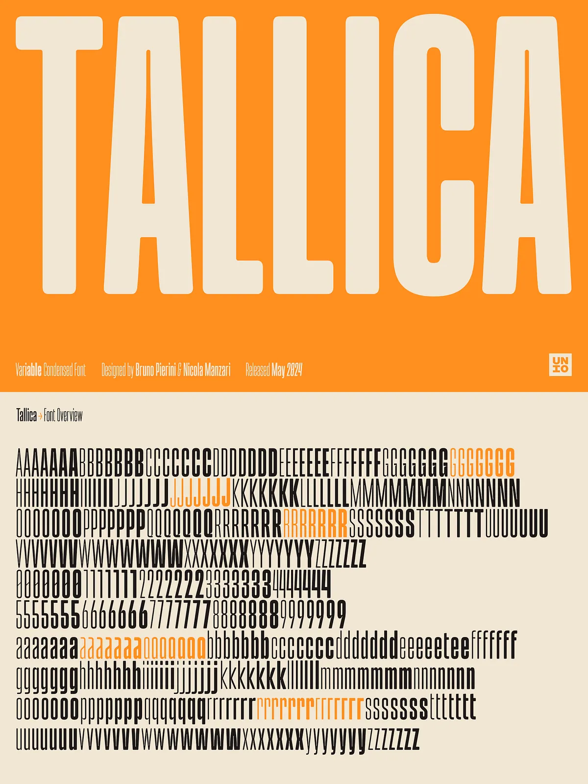
- Global language coverage with 400 glyphs supporting multiple scripts and diacritics.
Recommended Use Cases
Use Tallica whenever space is limited but visual impact remains essential. Recommended applications include:
- Magazine cover headlines and editorial mastheads — maximize presence without sacrificing composition.
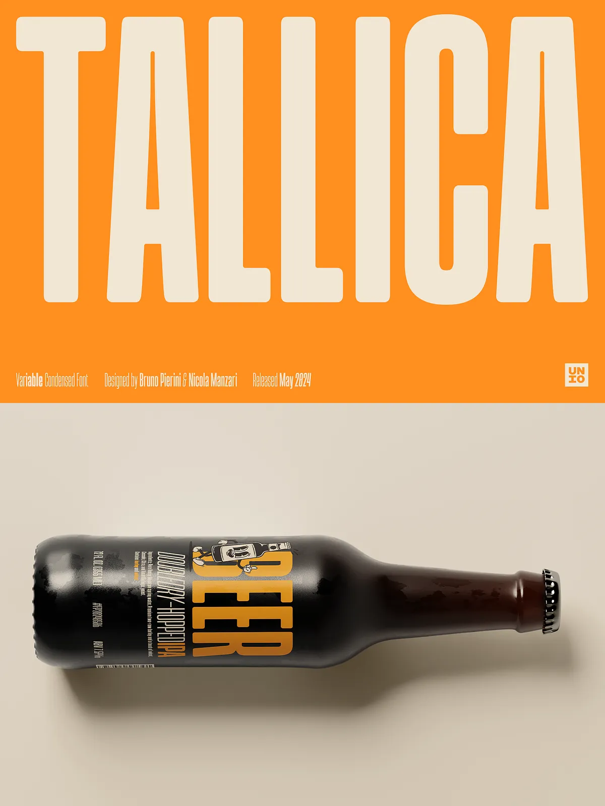
- Product packaging and labels — fit bold branding into narrow spines and compact panels.
- Logotypes and identity systems — craft condensed, memorable wordmarks with strong personality.
- Posters, billboards, and outdoor advertising — deliver readable statements at a distance and in dense layouts.
- Book covers and titles — pair Tallica with complementary text faces for modern editorial design.
Typeface Specifications
- Format: Variable .ttf, Static .ttf
- Weights included: Thin to Bold, including matching obliques
- Glyphs: 400+ glyphs supporting extended Latin and common diacritics
- OpenType features: Kerning, basic ligatures, and stylistic alternates where applicable
How to Use
Install the variable or static font files on your system, then select Tallica in your design application. Use the variable axis to fine-tune weight for responsive layouts or pick specific static instances for consistent outputs. Pair Tallica with neutral text faces for body copy to preserve hierarchy, or experiment with tight tracking and large sizes for high-impact displays. In print, test ink settings and substrate choices to retain the crisp counters and subtle ink-trap benefits.
Licensing & Support
Tallica includes a standard desktop license; extended or webfont licenses are available separately depending on use. Refer to the included license file for permitted uses and embedding rules. For installation help, kerning adjustments, or pairing advice, contact the designer or vendor support listed on the product page.