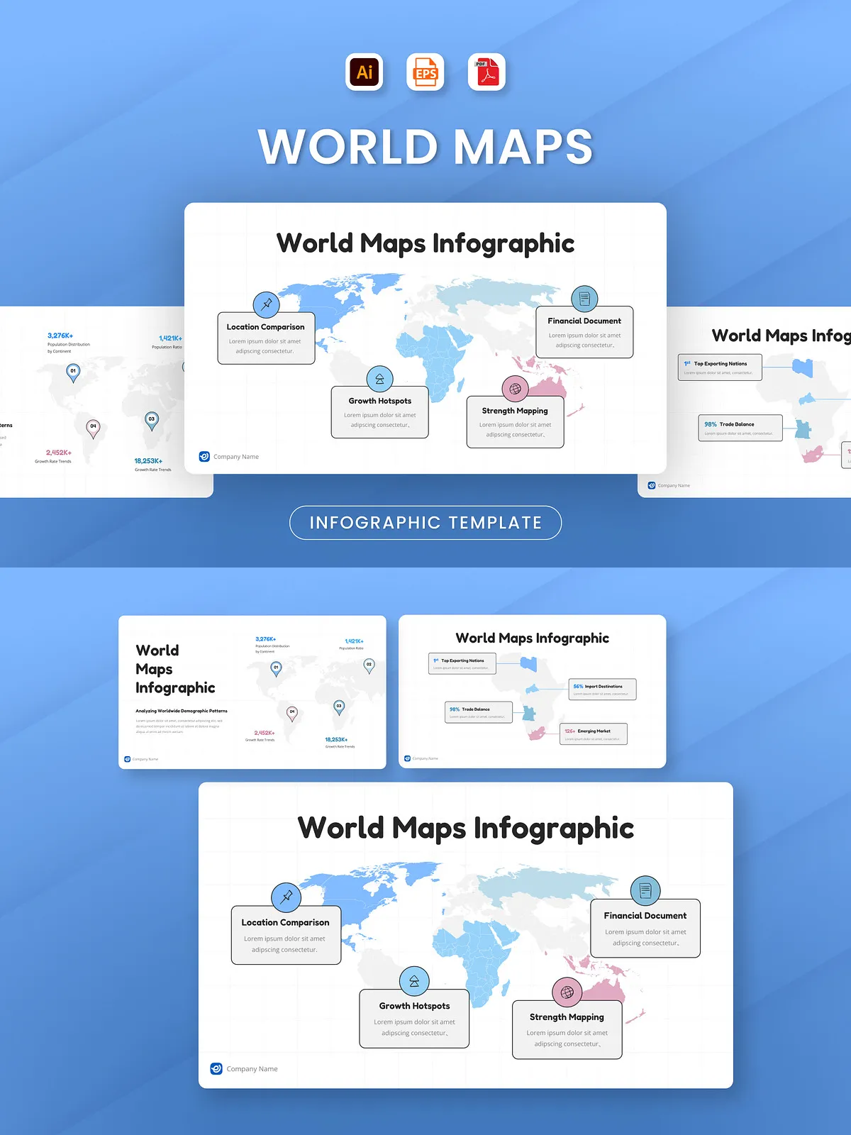
Stop relying on cluttered, outdated maps that confuse rather than clarify. This World Maps Infographic delivers a powerful, modern solution for communicating global trends, regional performance, and cross-border data with unmatched professionalism. Designed with sharp vector elements and balanced composition, it helps you spotlight countries, regions, and key metrics in a way that’s easy to read, visually engaging, and instantly credible. Whether you’re briefing investors, teaching geography, or reporting on international operations, this template ensures your message lands with impact.
Built for Real-World Use – From Strategy to Presentation
Each of the three uniquely designed infographic slides serves a distinct purpose: one for country-level comparisons, one for regional trend analysis, and one for global performance summaries. This structure lets you tailor your narrative based on audience needs and data complexity. All map regions are fully editable — customize colors, labels, and borders to match your brand, data set, or presentation theme. With clean lines, consistent typography, and intuitive visual hierarchy, your audience can follow the story without effort.
Why This Template Works for Every Global Project
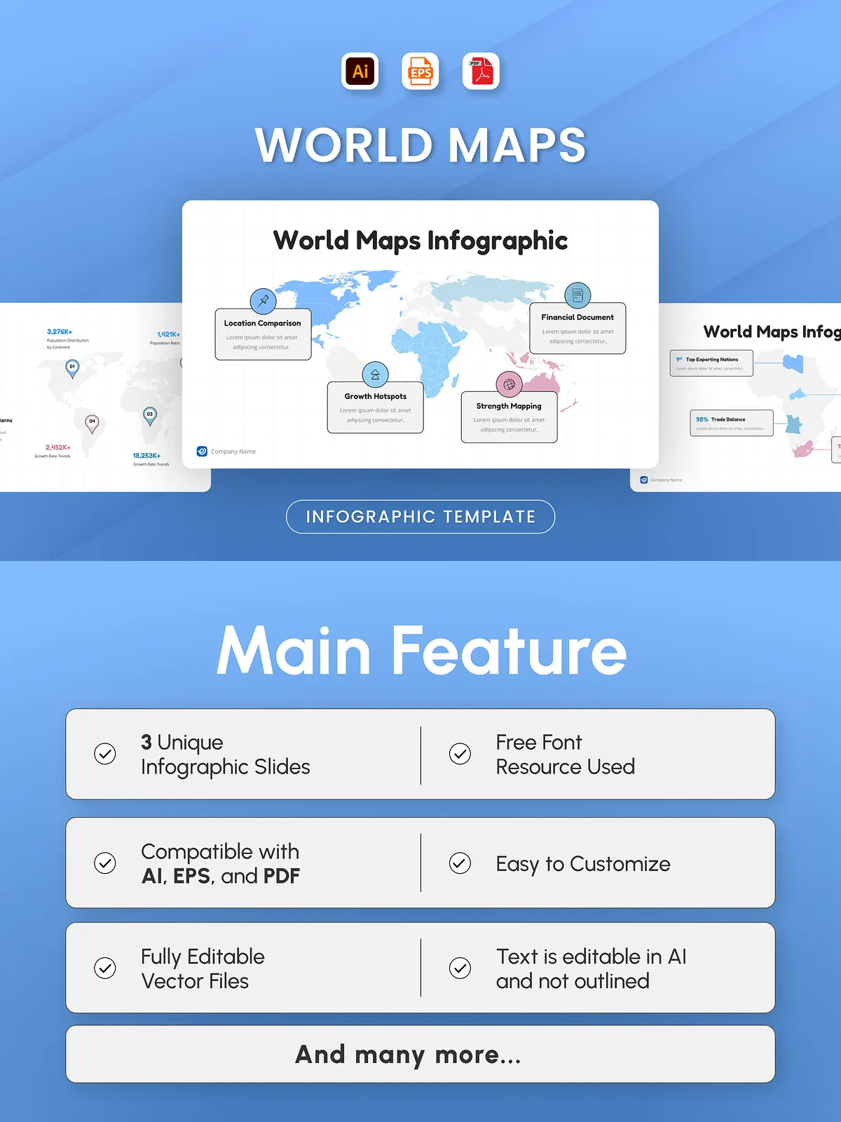
- 3 Customizable Infographic Slides – Target different audiences: executives, educators, project stakeholders, or policymakers.
- Editable Vector Files – Use in Adobe Illustrator (AI), EPS, and PDF formats. Scale to any size without losing quality.
- Text-Editable Layers – All labels, titles, and annotations remain fully editable — no need to retype or retrace.
- Professional Vector Mapping – Regions are cleanly isolated for easy highlighting, color-coding, and dynamic visual emphasis.
- Free & Safe Fonts – Includes only free-to-use fonts, ensuring no licensing conflicts for commercial or educational use.
- Quick Customization – Update data, change colors, swap icons, and reposition content in minutes — no design experience required.
Perfect For: Global Teams, Educators, and Decision-Makers
This infographic isn’t just a visual — it’s a strategic communication tool. It empowers you to turn complex geographic data into clear, persuasive stories:
Who Should Use This Template?
- Corporate Strategists – Present international market expansion plans, regional sales performance, or global supply chain status with confidence.
- Global Development Professionals – Share progress reports, humanitarian initiatives, or sustainability projects across countries.
- University Educators & Students – Teach world geography, international relations, or global economics with accurate, engaging visuals.
- Nonprofits & NGOs – Illustrate program reach, country impact, or donor contributions across borders.
- Business Analysts & Consultants – Deliver region-specific insights during client presentations or executive reviews.
- Travel & Tourism Agencies – Showcase tour destinations, visitor demographics, or travel trends by country or continent.
Outperform Generic Maps with Smart Visual Storytelling
Unlike static or generic map graphics, this design avoids visual noise and focuses on data clarity. Color accents guide the eye to high-priority areas without overwhelming. The layout supports multiple data layers — from population density to economic output — making it ideal for layered reporting. The neutral base colors ensure brand flexibility, while the emphasis on typography and spacing keeps content front and center.
Seamless Integration Into Any Workflow
- Update country-specific data in seconds
- Recolor regions to match your branding
- Export high-resolution versions for print or digital slides
- Insert into PowerPoint, Google Slides, or web content
- Use across multiple projects with consistent look and feel
Transform Global Complexity Into Clear, Actionable Insight
When international data matters, your visuals must match the stakes. This World Maps Infographic gives you the edge: professional, editable, and built for real-world results. No more guessing how to make maps look good — just deliver polished, powerful visuals that command attention and inspire action.
Download the World Maps Infographic today and give every global report the professional polish it deserves.